Buyer Fit Snapshot
| Best fit | Printed Inserts for Subscription Boxes projects where brand print, material claims, artwork control, MOQ, and repeat-order consistency need to be specified before quoting. |
|---|---|
| Quote inputs | Share finished size, material target, print colors, finish, packing count, annual reorder estimate, ship-to region, and any compliance wording. |
| Proofing check | Approve dieline scale, logo placement, barcode or warning zones, color tolerance, closure strength, and carton packing before bulk production. |
| Main risk | Vague material claims, crowded artwork, missing packing details, or unclear freight terms can make a low unit price expensive after revisions. |
Fast answer: Printed Inserts for Subscription Boxes: Design & Strategy should be specified like a repeatable production item. The safest quote records material, print method, finish, artwork proof, packing count, and reorder notes in one written spec.
Production checks before approval
Compare the actual filled-product size with the drawing, then confirm tolerance on folds, seals, hang holes, label areas, and retail display edges. Reserve space for logos, QR codes, warning copy, and material claims before decorative graphics fill the panel.
Quote comparison points
Review material grade, print process, finish, sampling route, tooling charges, carton quantity, and freight assumptions side by side. A quote is only useful when the supplier can repeat the same color, closure quality, and packing count on the next order.
Printed Inserts for Subscription boxes do far more than sit in the bottom of a mailer and keep the void from looking empty. They greet the customer, explain the product, nudge the next purchase, and make the whole shipment feel considered. That is a lot of work for one flat sheet, but the best printed inserts for subscription boxes carry it quietly, the way a good stage set makes the performance look effortless.
Teams sometimes treat the insert as the final checkbox, which is exactly how a strong packaging program starts to feel improvised. A carton can be structurally perfect and still look unfinished if the insert feels rushed, underwritten, or visually disconnected. Printed inserts for subscription boxes solve that problem quickly, because they sit at the point where branding, operations, and customer experience overlap.
Small detail, large effect. A crisp insert can turn a routine monthly delivery into a ritual customers remember. For Subscription Brands That care about retention, fewer service questions, and a cleaner launch, printed inserts for subscription boxes deserve the same attention as the outer mailer and the product inside it. I have seen a good insert do more for perceived value than a much pricier outer box. That still surprises people, but it happens all the time.
What Printed Inserts for Subscription Boxes Really Do
Printed inserts for subscription boxes begin with a deceptively simple task: make the first moment inside the box feel deliberate. That first moment is brief. Tape gives way, flaps open, tissue shifts, and the customer decides almost instantly whether the brand feels premium, practical, or disposable. A good insert organizes that split second. It gives the eye a place to land before the product takes over.
From an editorial point of view, the insert is often the clearest brand sentence in the whole package. It can welcome, instruct, redirect, or sell without crowding the box. One card can say thank you, point to a QR code, explain the month’s theme, and still leave room to breathe. Printed inserts for subscription boxes work best when the message is narrow and the visual hierarchy is obvious. The customer should know, at a glance, what to read first and what to do next.
The practical value is easy to overlook because it is not flashy. Printed inserts for subscription boxes reduce confusion by showing how to use a product, how to care for it, or how the pieces in a set relate to one another. That matters in categories where the shipment contains samples, apparel, multi-step kits, food accessories, wellness items, or giftable objects. A concise insert can answer the question a customer was about to email about. That saves time, yes, but it also prevents a minor uncertainty from becoming a ding in the brand relationship.
Retention is where the logic gets interesting. A well-written insert can guide the next order, explain why a specific item was chosen, or remind the customer that the brand exists beyond a single shipment. Research on packaging behavior has long shown that presentation influences perception before the product is fully tested. In a subscription model, that first impression repeats month after month. Printed inserts for subscription boxes become the recurring voice of the brand, and repetition makes tone matter more, not less.
A good insert answers the next question before the customer needs to ask it.
That line may sound simple, but it captures the real job. Printed inserts for subscription boxes are not decoration. They are compact communication tools that make the box function better. In one program they welcome, in another they instruct, in another they sell, and in some cases they do all three without feeling crowded. The challenge is keeping the piece readable while it carries that load.
For brands still shaping the outer carton or mailer, the insert should be planned as part of the same packaging family. If you need a broader starting point, our Custom Packaging Products page shows how the insert fits alongside the carton, mailer, and other printed components.
How Printed Inserts for Subscription Boxes Work
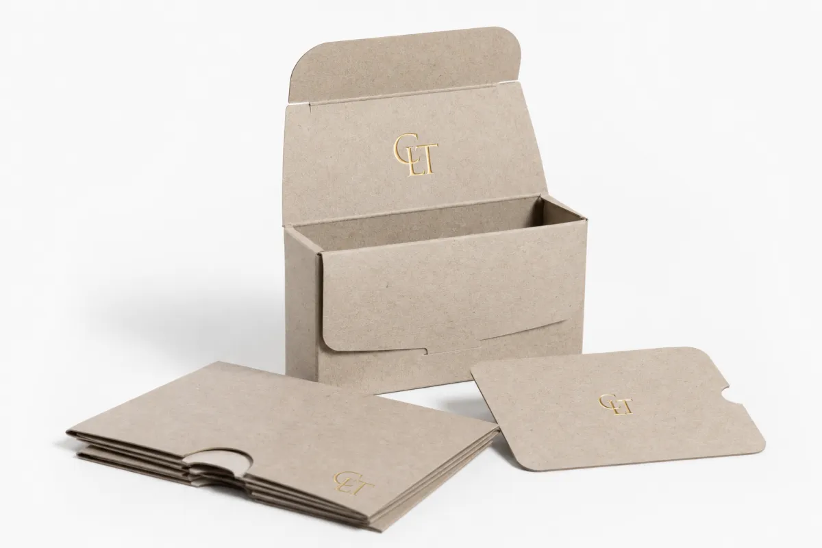
Most printed inserts for subscription boxes start life as a flat sheet, a scored card, or a die-cut component sized to the box’s internal footprint. The format sounds uncomplicated until the box is filled. Then the details start to matter. The insert has to coexist with tissue, filler, dividers, and the product itself. It cannot curl, crack, lift, or drift around the package after packing. An insert that sits on top of the product needs different tolerances than one tucked beneath it or used as a divider between items.
The design process usually begins with box dimensions and product placement, not artwork. That order matters. A printer or designer then builds bleed, trim, score, and safe-zone boundaries around those measurements. Printed inserts for subscription boxes often fail when someone treats the file like a digital flyer instead of a physical object. A logo too close to a fold can vanish into the crease. A QR code near a cut edge may stop scanning. A headline that looked balanced on a monitor can feel cramped once the insert is folded and packed.
Prepress is where problems get caught cheaply. Printed inserts for subscription boxes should be reviewed the way a folding carton proof would be reviewed: image placement, fold direction, text legibility, and the location of any adhesive or tuck feature if the piece is being assembled into a pocket or holder. A white mock-up can reveal more than a polished PDF ever will. The hand notices things the eye on a screen misses, especially when the piece has to fit around an actual product.
The insert can also perform a physical role. In some kits, printed inserts for subscription boxes act as spacers so the contents do not rattle. In others, they become dividers, thank-you notes, care instructions, or promotional cards for a future order. Die-cuts can frame the reveal. Tabs can hold another card in place. Small structural decisions like that change the rhythm of the unboxing and make the package feel composed rather than accidental.
For teams comparing the insert with the rest of the package, it helps to think in layers:
- Outer layer: the mailer or shipper that protects the shipment.
- Middle layer: tissue, filler, or structural supports that stabilize the contents.
- Insert layer: the printed piece that communicates, directs, and adds polish.
That middle layer is where printed inserts for subscription boxes earn their place. They do not need dramatic size to matter. They need correct scale, correct placement, and a design that respects the way the package is actually packed. If the insert fights the packing flow, customers feel the friction almost immediately.
For brands building a broader packaging system, it often helps to review the full mix before approving artwork. A wider set of printed packaging options can make it easier to compare materials, sizes, and finishing methods before the first proof is signed off.
Materials, Layout, and Print Choices That Shape the Insert
Material choice changes the feel in the hand and the behavior on press. Printed inserts for subscription boxes are often made from cardstock, paperboard, coated sheets, or uncoated stock, and each one brings a different tradeoff. Lighter paper is easier to mail if the insert travels separately, but it can feel too thin for a premium unboxing. Heavier board brings more presence, though it raises cost and can crack at the fold if the score is weak.
A common premium spec is 350gsm C1S artboard with soft-touch lamination. It gives printed inserts for subscription boxes a richer surface, stronger color, and a more expensive feel in the hand. That is not the right answer for every brand. A natural uncoated stock can be the better fit for earthy, minimal, or sustainability-led packaging, especially when the typography does the visual work and the ink coverage stays controlled. Stock should match message, not habit.
Finishes alter the reading experience more than many teams expect. Matte lamination cuts glare and tends to photograph well when customers share the unboxing. Gloss pushes color harder and can make a design feel brighter, though it is less forgiving if the tone should stay restrained. Aqueous coating is often a useful middle ground for recurring subscription runs because it adds practical protection without making the surface overly slick. No coating can be the right choice for a recycled look, but the tradeoff is obvious: the surface may scuff more easily in transit and during kitting.
Layout is where printed inserts for subscription boxes either stay clean or slide into noise. The insert needs a clear hierarchy: headline first, supporting line second, action third. If the piece includes a discount code, QR code, or social handle, each element needs room. White space is not wasted space. It keeps the message legible when the box is opened under poor light, on a kitchen counter, or in a rush between errands.
Several layout choices pay off quickly:
- Single-sided print keeps the message simple and can lower cost, while double-sided print creates more room for instructions or storytelling.
- Scored folds help thicker boards fold cleanly and reduce cracking along the crease.
- Die-cuts and windows can spotlight a product, a label, or a coupon code without crowding the page.
- Tabs, pockets, and slits can hold another card or sample, though every extra feature adds production steps.
Materials deserve a practical sustainability conversation, not a slogan. Paper stocks can often be aligned with FSC-certified sourcing, and the FSC system at fsc.org is a useful reference point for buyers who want chain-of-custody clarity. If the brand wants end-of-life guidance, the EPA's recycling resources are another sensible checkpoint, especially when the insert is printed on paper-based stock that should enter normal paper recovery streams where local programs allow it.
Color management is another place where printed inserts for subscription boxes can drift off course. Heavy ink on a porous uncoated sheet can look flatter than expected. Pale colors can disappear if the stock absorbs too much ink. Proofing on the actual material matters more than approving a screen render. For recurring fulfillment, repeatable color often matters more than dramatic color that only works on one run and nowhere else. I have watched a bright coral turn dull pink on an uncoated sheet; nobody was thrilled, and the fix was not expensive once we caught it early.
In practice, the best insert usually looks easy because someone made the hard choices early. The stock behaves the way it should. The fold lands cleanly. The finish matches the brand promise. Printed inserts for subscription boxes should not feel improvised. They should feel like they were built for the exact handoff they need to make inside the package.
Brands that want the insert to match the rest of the kit can save time by comparing the component mix early. A broader look at subscription box packaging solutions helps keep the insert aligned with the carton, the mailer, and the rest of the printed system.
Cost, Pricing, and MOQ for Printed Inserts
Pricing for printed inserts for subscription boxes turns on a handful of variables: size, quantity, stock, ink coverage, print sides, folds, die-cuts, and any hand assembly or kitting work. Shift one variable and the quote changes. Sometimes the move is modest; sometimes it is not. A flat single-sided card on 14 pt stock belongs to a very different production lane than a folded, scored, soft-touch insert with a pocket or a specialty cutout.
MOQ matters because many printers price more efficiently at higher volumes. Printed inserts for subscription boxes are often ordered on recurring schedules, which helps if the design stays stable across runs. The moment artwork changes every month or the box dimensions shift from shipment to shipment, optimization gets harder. Stable specifications usually win because they allow the printer to plan paper usage, setup time, and finishing with less waste.
Vague quote requests almost always come back cautious. Uncertainty gets priced in. A better request includes exact dimensions, stock preference, finish, print sides, quantity, fold direction, and whether the piece needs scoring or die-cutting. Printed inserts for subscription boxes are much easier to price accurately once the supplier can see the production path from start to finish.
Here is a practical way to compare common pricing structures. These are planning ranges, not fixed prices, but they help a team evaluate options before requesting formal quotes.
| Insert Type | Typical Stock | Common Use | Approx. Unit Cost at 5,000 Units | Notes |
|---|---|---|---|---|
| Flat single-sided card | 14 pt C1S or C2S | Welcome note, promo code, QR card | $0.10-$0.18 | Best for simple messaging and fast production |
| Double-sided insert | 14 pt to 16 pt cover | Product story, care steps, referral prompt | $0.14-$0.24 | More content room, slightly more press time |
| Folded scored sheet | 100 lb text to 18 pt board | Multi-step instructions, seasonal content | $0.18-$0.30 | Requires clean scoring and fold control |
| Die-cut premium insert | 16 pt to 20 pt board | Reveal card, holder, branded divider | $0.25-$0.45 | Costs rise with tooling, cuts, and assembly |
| Soft-touch laminated piece | 16 pt cover or artboard | High-end presentation insert | $0.22-$0.40 | Tactile feel is strong, but finish adds cost |
Those ranges shift with coverage and setup. Rich black backgrounds and full-bleed images usually cost more than light layouts with one accent color. Printed inserts for subscription boxes also get more expensive when the quantity is low enough that press setup dominates the job. In many cases, the first way to improve margin is not to cut quality. It is to remove unnecessary variation.
A few trade-offs tend to protect budget without hurting the customer experience:
- Simplify the artwork so it uses fewer special treatments and less heavy ink coverage.
- Standardize the size across multiple box SKUs so one insert spec can serve more than one program.
- Choose one finish that works across seasons instead of changing coatings with every run.
- Confirm the reorder point before launch so reprints do not become rush jobs.
For many brands, printed inserts for subscription boxes sit in a practical middle zone. They are not the cheapest printed item in the kit, and they are rarely the most expensive either. The money tends to go furthest where the customer can feel it. A cleaner score line or a better board can matter more than a decorative flourish nobody notices. If you are building the rest of the kit, pairing the insert with the right Custom Packaging Products configuration often protects budget better than overbuilding every piece.
Production Process and Lead Time: From File to Fulfillment
The production path for printed inserts for subscription boxes looks straightforward on paper. The brief comes first, then proofing, then print, cutting, scoring, folding, packing, and quality checks. The complexity shows up in the details. A simple insert can move quickly. A piece with folds, die-cuts, specialty coatings, or manual assembly needs more time because every extra operation creates another touchpoint where something can go wrong.
Lead time depends heavily on file readiness. Clean files with the right dimensions and bleed save days. Files that need layout cleanup, image replacement, or multiple proof rounds slow the job before the press even starts. Printed inserts for subscription boxes should also be planned with launch buffer, because the creative team, printer, and fulfillment partner each need time to review the physical component, not just the PDF. Internally, a schedule can look comfortable while production is already tight.
Drying or curing time matters too. Heavy ink coverage can change the way a sheet handles. Lamination, varnish, and specialty coatings may need additional time before cutting and packing. Printed inserts for subscription boxes that go straight into a fulfillment line also need to arrive flat, counted correctly, and packed so the edges stay clean. A scuffed insert does not read as minor damage; it reads as careless.
Transit expectations matter even for a small printed component. Standards and testing practices from ista.org are useful references when a packaged element has to survive handling, stacking, and shipping before it reaches the customer. The insert itself may not need formal transit certification every time, but the broader package should still be designed for actual movement, not only shelf appeal.
A realistic schedule for printed inserts for subscription boxes often looks like this:
- File prep and proofing: 1-4 business days, depending on artwork readiness.
- Print and finishing: 3-7 business days for simpler jobs, longer for complex builds.
- Assembly or kitting: 1-5 business days if the insert needs manual folding or pairing.
- Shipping to fulfillment: varies by location and carrier method.
Rush work is possible in some cases, yet it almost always brings trade-offs. Fewer proof rounds. Narrower material options. Higher freight. Less room for correction. Printed inserts for subscription boxes are a poor place to let speed erase review, because a small measurement error can turn into a batch problem that costs more to fix than the time saved.
If a launch depends on a fixed date, the safest move is to treat the insert like a core component, not a final add-on. Lock the content early. Approve the stock. Confirm the handoff to fulfillment before the final artwork is released. A well-timed insert supports the release. A late one can hold up the box even when every other piece is ready.
Common Mistakes to Avoid with Subscription Box Inserts
The first mistake is measuring only the outer box and ignoring the interior reality. Printed inserts for subscription boxes need to account for product height, tissue, filler, dividers, and fold thickness. A piece that fits in theory can still look sloppy in the box if the packing build changes by even a small amount. That risk rises when the subscription changes contents from month to month, because the insert still has to feel intentional across those shifts.
The second mistake is saying too much. A crowded insert usually performs worse than a concise one because the customer never gets a clear path through the message. Printed inserts for subscription boxes work best when one objective leads the layout: educate, retain, upsell, or refer. When teams try to do all four at once, the whole piece becomes easier to ignore. A single sharp prompt tends to outperform a page full of competing actions.
Proofing problems are another easy way to waste money. Missing bleed, incorrect score lines, low-contrast text, and artwork that looks fine on a monitor but disappears on the chosen stock often show up late if review is rushed. Printed inserts for subscription boxes should be proofed at actual size whenever possible, because a QR code, a coupon code, or a small instruction line can fail simply by being too small to read in the hand.
Operationally, the wrong stock creates trouble long after the first run. If the paper curls, tears, or scuffs too easily, the insert stops feeling premium the moment it touches the rest of the packaging. Reorder planning gets overlooked as well. Printed inserts for subscription boxes are recurring components, and recurring components need a reorder trigger. If the box is growing, the insert should be treated like part of the production system, not like a one-off print job that can be revisited whenever someone has time.
Here are a few warning signs that a program needs a reset:
- The insert is too large and crowds the product.
- The copy has more than one competing call to action.
- The finish looks great on screen but fingerprints or scuffs in packing.
- The team has no agreed spec sheet for the next reprint.
When printed inserts for subscription boxes go wrong, the failure is usually not dramatic. It is a chain of small misses: the size was guessed, the score was not tested, the copy was too dense, and the reorder point was never defined. The fix is not glamorous, but it works. Measure carefully. Proof physically. Keep the insert inside the production system from the beginning.
That is also why it helps to keep the insert specification tied to the rest of the package through a single reference point, such as packaging components for subscription programs. Once the carton, insert, and fulfillment flow are viewed as one system, the mistakes become easier to catch before they cost money.
Expert Tips and Next Steps for a Cleaner Launch
If I had to give one piece of advice on printed inserts for subscription boxes, it would be this: give each insert one primary job and let everything else support it. That one decision tightens the design, clarifies the quote, and simplifies the production path. A welcome card can be warm and branded. An instruction insert can be direct and compact. A referral card can be unmistakable. Trouble starts when one insert is forced to do everything.
A strong spec sheet saves time every single time. Keep the dimensions, paper choice, finish, approved color values, fold direction, and artwork version in one place, then reuse it for the next print run. Printed inserts for subscription boxes often outlive the seasonal campaign that created them, so a good spec sheet protects consistency when staff changes or a new vendor steps in. That is not glamorous work. It is the kind that keeps the whole program stable.
Before final approval, view the insert at arm's length, inside a mock box, with the actual product next to it. That test tells the truth faster than a screen review. The fonts should still read. The QR code should still scan. The color should still feel like the brand. Printed inserts for subscription boxes need to work in the hand, under imperfect light, during a quick unboxing moment, because that is the environment where they actually earn their keep.
For brands that care about sustainability, there are practical ways to keep the insert responsible without flattening the presentation. Use paper-based stock where possible. Align with FSC sourcing. Avoid extra finishing that makes the piece harder to recover locally. If one coating does the job, that is usually enough. If a lighter stock still carries the message clearly, that may be the smarter buy. Different brands need different material stories, and the packaging should reflect that honestly.
Here is a simple launch checklist that works well in practice:
- Gather the box measurements and the final product dimensions.
- Choose the stock and finish that match the message.
- Approve the layout on a physical proof or sample.
- Confirm the quote with quantity, timing, and shipping details.
- Set the reorder trigger before the first shipment leaves.
If the wider package is still being refined, this is the moment to line up the insert with the rest of the system. A box that feels polished usually comes from clear structure, good materials, and consistent print execution. Printed inserts for subscription boxes stop being a small add-on at that point and start acting like part of the brand's operating rhythm.
Done well, printed inserts for subscription boxes make the entire experience feel closer, clearer, and more intentional. Done badly, they become another sheet of paper that disappears into the tissue. The difference usually comes down to planning, spec discipline, and a realistic view of how the piece will be handled from press to packing to unboxing. If you are only going to tighten one part of the process this quarter, make it the insert spec before artwork starts. That one move prevents most of the expensive surprises later.
What are printed inserts for subscription boxes used for?
They welcome the customer, explain the product, and reinforce the brand experience right after the box is opened. They can also reduce support questions by giving clear setup, care, or reorder instructions in a compact printed format.
Which stock works best for printed inserts for subscription boxes?
The best stock depends on whether the insert needs a premium feel, strong color, or extra stiffness for folding and handling. Cardstock or paperboard is common when the insert needs to stand up in transit, while lighter sheets can work for simple notes or flyers.
How much do printed inserts for subscription boxes usually cost?
Pricing depends on size, quantity, stock, print coverage, finish, and whether the insert needs folding, cutting, or assembly. Unit cost usually drops as volume increases, so the most accurate quote comes from sharing exact specs up front.
How long does production take for printed inserts for subscription boxes?
Lead time depends on proof approval, print method, finishing, and whether the insert needs any manual packing or special cuts. Build extra time if the insert is tied to a product launch, because last-minute artwork changes can slow the schedule.
Can printed inserts for subscription boxes be personalized or folded?
Yes, they can be folded, scored, die-cut, or personalized depending on the design and the printing method chosen. Personalization works best when the data is clean and the layout is planned early, so the insert stays readable and production-friendly.
For brands chasing a cleaner unboxing, printed inserts for subscription boxes are one of the smartest places to focus. They are small, but they carry real weight in the customer journey, and the brands that treat them that way usually get a better result from the very first shipment. If you want the box to feel deliberate, printed inserts for subscription boxes are where that feeling starts.


