Buyer Fit Snapshot
| Best fit | Printed Kraft Boxes with Logo projects where brand print, material claims, artwork control, MOQ, and repeat-order consistency need to be specified before quoting. |
|---|---|
| Quote inputs | Share finished size, material target, print colors, finish, packing count, annual reorder estimate, ship-to region, and any compliance wording. |
| Proofing check | Approve dieline scale, logo placement, barcode or warning zones, color tolerance, closure strength, and carton packing before bulk production. |
| Main risk | Vague material claims, crowded artwork, missing packing details, or unclear freight terms can make a low unit price expensive after revisions. |
Fast answer: Printed Kraft Boxes with Logo: Board, Finish, Dieline, and Unit Cost should be specified like a repeatable production item. The safest quote records material, print method, finish, artwork proof, packing count, and reorder notes in one written spec.
Production checks before approval
Compare the actual filled-product size with the drawing, then confirm tolerance on folds, seals, hang holes, label areas, and retail display edges. Reserve space for logos, QR codes, warning copy, and material claims before decorative graphics fill the panel.
Quote comparison points
Review material grade, print process, finish, sampling route, tooling charges, carton quantity, and freight assumptions side by side. A quote is only useful when the supplier can repeat the same color, closure quality, and packing count on the next order.
Printed Kraft Boxes With Logo: A Practical Guide for Brands starts with a plain fact that many teams learn too late: packaging changes how a product is judged before the customer ever opens it. Printed kraft boxes with logo are not just brown containers with branding stamped across the surface. They shape shelf presence, shipping performance, the opening moment, and the degree of trust a buyer feels in the first few seconds.
Kraft is not a blank stage. The brown fiber tone changes the way white ink, pale shades, and small details appear once they hit the board, which means printed kraft Boxes With Logo do not behave like white paperboard or coated stock. A design that looks crisp on a screen can turn soft, dusty, or flat on kraft if the contrast is not planned with the material in mind. Some brands get that earthy, premium look right away. Others end up with art that feels weaker in print than it did in the mockup.
Brands choose printed kraft boxes with logo for retail launches, subscription kits, mailers, gift packaging, and sample sets because the material feels grounded and honest. That tactile quality fits a wide range of categories, from natural cosmetics to specialty foods and small hardware. If the structure, print coverage, and opening sequence are designed together, the box does more than protect the contents. It communicates value before the product is touched.
I have sat through enough packaging proofs to know that the hardest part is rarely the artwork itself. It is the gap between what looks clean in a PDF and what survives on an actual kraft board with folds, grain, and real ink behavior. That gap is where a lot of launches get a little messy, kinda needlessly so.
The breakdown below covers how printed kraft boxes with logo are made, what drives lead time and cost, and where production problems usually show up. If you are comparing vendors, you will also see how to read a quote, what to request in a sample, and how to avoid paying extra for mistakes that should have been caught earlier.
What Printed Kraft Boxes with Logo Really Are
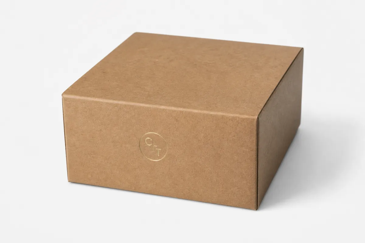
Printed kraft boxes with logo are paper-based packaging structures built from kraft board, kraft-lined corrugated board, or kraft-finish paperboard, then printed with brand elements such as a logo, product copy, graphics, handling marks, or interior messages. The construction may be a folding carton, a mailer, a sleeve, a tuck box, or a rigid presentation box. The shared purpose is simple: protect the product while carrying the brand story on the outside, and sometimes inside too.
From a buyer's point of view, the choice usually comes down to three questions. How much protection does the product need? How much brand visibility do you want? How much texture and material character should the customer feel in their hands? Printed kraft boxes with logo work best when the answer leans toward natural, practical, and grounded rather than glossy or highly decorative.
One common mistake is treating kraft as a downgrade. It is not. Kraft can look polished when the print is clean and the structure is proportioned correctly. It can also look cheap if the logo is too small, the ink coverage is uneven, or the board is too light for the contents. The package itself becomes part of the product's perceived value, so the print file and structural spec matter just as much as the artwork.
There is also a real visual difference between a brown kraft background and a white or coated background. Light inks need more thought, and a logo with thin strokes may need a heavier weight than it would on a white carton. On kraft, negative space, fiber grain, and the tone of the substrate all affect how printed kraft boxes with logo are read from arm's length, on a retail shelf, or at checkout.
"The box is often the first physical touchpoint a customer has with the brand. If the logo print looks weak, the whole package feels less certain, even when the product inside is excellent."
That is why brands use printed kraft boxes with logo for more than shipping. They show up in retail displays, e-commerce presentation, gift sets, influencer kits, and subscription packaging where the opening sequence matters. If you want a traditional carton, a mailer with a front-lock closure, or a sleeve over an inner tray, you can compare structural options alongside our Custom Packaging Products to see how the format changes the customer experience.
In practical terms, printed kraft boxes with logo are a packaging family, not a single product type. The right version depends on product weight, branding style, unboxing goal, and how the package moves through storage, shipping, and fulfillment.
Process and Timeline for Printed Kraft Boxes with Logo
The production flow for printed kraft boxes with logo usually begins with the product itself. Exact dimensions matter. Weight matters. Fragility matters. Once those details are set, the supplier can create or adapt a dieline, the flat template that shows panels, folds, glue areas, cuts, and safe zones. If the box is a mailer or folding carton, the dieline tells the designer where the logo can sit without landing on a score line or disappearing inside a flap.
Artwork comes next. Strong artwork for printed kraft boxes with logo is built around the dieline, not forced onto it after the fact. Logos should stay clear of folds, text should not sit too close to edges, and barcodes or compliance copy need enough room to stay readable after scoring and folding. If the design uses pale colors, the team should check those colors against the brown stock instead of trusting the screen preview.
Printing method changes the schedule in a big way. Digital printing is often the fastest route for shorter runs or artwork that may still be changing. Offset printing needs more setup, but it usually rewards the job with fine detail and steady color across larger quantities. Flexographic printing is common in higher-volume corrugated work, especially when the design is simple and production speed matters. For printed kraft boxes with logo, each method has a different rhythm, and that rhythm shapes the timeline.
A practical lead time for a straightforward digital run may fall around 7-12 business days after proof approval, assuming the dieline is already confirmed and the artwork is ready. Offset and flexo projects often need 12-20 business days or more, especially when plates, special coatings, or a sample round are part of the job. Those ranges are planning tools, not promises, but they help keep a launch from slipping because someone underestimated the prep.
Most delays show up during approval. Artwork revisions can stall if the file is missing bleed, if the safe zone is too tight, or if the client changes copy after the proof is already out. Material sourcing can add time too, especially if the job needs a specific kraft shade, a recycled content target, or FSC documentation. Last-minute changes after the sample arrives can add days or trigger another production round entirely.
Sampling is worth the time. A structural sample can expose problems a PDF never shows, such as a top flap that springs open too easily, a side panel that feels cramped, or an insert that squeezes the product too tightly. For printed kraft boxes with logo, a sample also shows how the logo reads on the brown base and whether the chosen finish still feels natural. If the box will move through distribution or direct-to-consumer channels, transit validation deserves attention too; the ISTA test standards library at ISTA is a useful reference for package performance testing.
Shipping and receiving belong in the lead time, not on a separate line in your head. Even after the boxes are printed, they still need to be packed, palletized, moved into your facility, checked, counted, and staged for assembly. A project for printed kraft boxes with logo is not finished when the press stops. It is finished when the inventory is on hand and ready to use.
Key Factors That Shape the Final Look and Performance
Material choice comes first. Kraft board ranges from lighter paperboard used in folding cartons to heavier corrugated or rigid stock used for mailers and gift packaging. Thickness, recycled content, and surface smoothness all affect the result. A smoother kraft finish usually gives ink cleaner edges, while a rougher sheet creates a more rustic look with slightly less precision. For printed kraft boxes with logo, that material decision is where appearance and protection meet.
Print coverage is next. A bold logo with a simple one-color layout often works well on kraft because it lets the natural fiber tone do part of the visual work. Dense imagery, pale gradients, and photo-style artwork can still be done, but they need tighter control and sometimes a white underprint or heavier ink laydown. Without that extra step, the design can lose contrast. This is why printed kraft boxes with logo need a real prepress review instead of a quick visual approval.
Finishes can support the kraft look or fight it. Aqueous coating and varnish are common because they improve handling resistance without making the surface feel overly plastic. Foil, embossing, and debossing can create a strong brand cue if used with restraint, but too much embellishment can erase the natural quality that made kraft appealing in the first place. Soft-touch is a mixed choice on kraft; it feels elegant, yet it changes the texture story quite a bit. The best finishes respect the base material instead of trying to hide it.
Structure matters just as much as print. A tuck-end carton works efficiently on retail shelves. A mailer box is better for direct-to-consumer shipping because the closure and side walls offer more confidence in transit. A sleeve can look refined for premium goods, but it often needs an insert or inner tray to keep the product from shifting. Window boxes can show the product without fully opening the package, which helps in certain retail categories. The right structure helps printed kraft boxes with logo do more than look good; it helps them work properly.
Shipping and sustainability enter the picture too. A box that folds flat saves freight and warehouse space. A design that uses less void fill can reduce packing material on the fulfillment line. FSC-certified fiber may matter to procurement teams or retail buyers, especially when sustainability claims are part of the brand story; if that is a requirement, confirm the documentation carefully through FSC rather than assuming a recycled-looking board is automatically certified. Clear sourcing is part of the value of printed kraft boxes with logo.
In many projects, the smartest packaging is not the fanciest one. It is the one that balances print clarity, board strength, material tone, and assembly speed so the box looks intentional and performs well in real use. That is where printed kraft boxes with logo earn their place.
Cost, Pricing, and MOQ for Printed Kraft Boxes with Logo
Price usually drives the first conversation, and that makes sense. For printed kraft boxes with logo, the final number depends on box size, board weight, print coverage, color count, finishing steps, total quantity, and how much manual work the job needs. A small mailer with a single-color logo on standard kraft board will price very differently from a heavy retail carton with foil, embossing, and a custom insert.
As a directional benchmark, short-run digital printed kraft boxes with logo can land around $0.55-$1.40 per unit for 500-1,000 pieces, depending on dimensions, coverage, and finish. Larger offset or flexo jobs can move into roughly $0.18-$0.75 per unit at higher quantities, but the exact number depends on how much setup work is required and whether the design is simple enough for efficient production. Those are planning ranges, not quotes, but they help you spot numbers that sit far outside the normal band.
| Print Method | Best Fit | MOQ Pressure | Cost Behavior | What It Usually Delivers |
|---|---|---|---|---|
| Digital | Short runs, quick launches, variable artwork | Lower minimums, often 250-1,000 pieces | Higher unit cost, lower setup burden | Good for proofing and smaller campaigns |
| Offset | Mid to large runs with detailed graphics | Moderate minimums, often 1,000-5,000+ pieces | Setup is higher, unit cost drops with volume | Cleaner detail and steadier color control |
| Flexographic | High-volume corrugated or simpler graphics | Higher minimums, often 5,000+ pieces | Efficient at scale, especially for repeat runs | Strong production speed and lower cost per unit at volume |
A fair quote comparison starts with matching specs. Two suppliers may both say they can make printed kraft boxes with logo, but one may be quoting a lighter board, fewer colors, and no coating, while another includes heavier stock, a sample, and freight. If you compare only unit price, you can choose the cheaper number and then spend more later on rework, shipping, or added packaging material.
Include the following in every quote request:
- Exact product dimensions, including any insert or accessory space.
- Product weight and whether the box will ship alone or inside a larger shipper.
- Box style, such as mailer, tuck, sleeve, folding carton, or rigid setup.
- Artwork files, logo format, and whether the design includes gradients, photos, or spot effects.
- Target quantity, reorder expectations, and desired delivery date.
- Shipping destination, because freight can change the landed cost by a meaningful amount.
Hidden costs show up often. Sampling, tooling, special coatings, freight, and reprints caused by late art changes can all affect the final spend. If a supplier says they can produce printed kraft boxes with logo for a very low number, ask whether that includes structural sampling, prepress checks, or delivery. A low quote can turn into a higher total cost once the missing line items appear later.
If you need a broader mix of package types for a line review or launch, our Custom Packaging Products page is a useful place to compare how different structures and material choices change cost. That broader view helps when you are deciding whether printed kraft boxes with logo should be paired with inserts, sleeves, or outer shippers.
The most useful habit is to compare like for like. Same size, same board, same print method, same coating, same quantity, same freight assumption. Once those variables line up, the real value of printed kraft boxes with logo becomes much easier to judge.
Step-by-Step Guide to Ordering Printed Kraft Boxes with Logo
Printed kraft boxes with logo move more smoothly when the project is treated like a packaging brief instead of a loose design request. Start by defining the product clearly. Measure the item at its widest and tallest points, note the weight, and decide whether the box needs to survive parcel shipping, retail handling, or both. A box for a 6-ounce sample kit does not need the same wall strength as a carton carrying glass jars or heavy hardware parts.
The second step is artwork setup. The dieline should be the center of the work, not an afterthought. Keep logos away from folds and glue zones, allow enough bleed on the outside edges, and leave a comfortable safe zone for text. If the design uses small type, build it at actual size and inspect it closely. On kraft stock, tiny text that looks fine on a monitor can fall apart in print, and that risk is even higher for printed kraft boxes with logo that rely on fine line work.
Step three is proofing. A digital proof helps, but a structural sample or printed sample is better when there is any real risk. Check the fit, the opening sequence, the closure strength, the print contrast, and how the logo reads at normal viewing distance. If the box has a tray, insert, or sleeve, make sure the product can be placed quickly without bruising corners or slowing the assembly line. For printed kraft boxes with logo, this step saves money later because it catches mistakes before the full run is committed.
Step four is final approval. Do not approve until you have checked the dimensions, quantity, board specification, coating, and finishing details. If the sample looks good but the finish is wrong, the production run may still miss the mark. Once approved, changes become expensive quickly. That is true with packaging in general, and it is especially true with printed kraft boxes with logo where the natural stock makes small differences easier to see.
Step five is receiving and assembly planning. Decide where the boxes will live, how they will be folded or stored, and who will handle the kitting or packing operation. If the boxes arrive flat, make sure there is enough clean space to stage them. If they arrive pre-formed, confirm pallet access and internal storage room. Many projects run late not because of printing, but because no one planned how the packaging would move once it reached the building.
A simple sequence keeps the process steady:
- Measure the product and confirm the box style.
- Request or review the dieline.
- Prepare artwork at final size.
- Review a sample or proof.
- Approve production details in writing.
- Plan receiving, storage, and assembly.
That list looks basic, and it is. It is also how successful printed kraft boxes with logo projects are handled in practice. The work lives in the details, not in the first mockup.
Common Mistakes to Avoid with Printed Kraft Boxes with Logo
The first mistake is trying to do too much with the artwork. Delicate lines, tiny copy, and low-contrast colors can disappear into the fiber tone of kraft, especially when the board has visible texture. A logo that looks elegant on a screen may look weak in production if the strokes are too thin. For printed kraft boxes with logo, a strong simple composition usually beats crowded detail.
The second mistake is expecting exact color matching without accounting for the brown base. Brown stock changes how white, cream, beige, light gray, and pastel colors behave. A designer may want a clean off-white, but the printed result can read warmer than expected because the substrate is doing part of the color work. That is not a defect. It is the nature of the material. The solution is to design with the stock, not against it.
The third mistake is ignoring fit and structure. A box can look beautiful and still fail if the product moves around inside it, crushes corners, or pops the closure open in transit. I have seen projects where the logo placement was perfect, but the insert was too loose and the contents rattled in shipping. A package should protect the product first and present it second. That balance matters with printed kraft boxes with logo.
The fourth mistake is skipping sample approval. A computer proof cannot show how a crease breaks a graphic, how ink density behaves on a fibrous board, or whether the top flap feels too tight when the box is fully loaded. A sample is not a luxury on a serious job; it is the fastest way to avoid expensive surprises. On a project with printed kraft boxes with logo, one sample can reveal more than ten email revisions.
The fifth mistake is moving too quickly on quantity. If the launch date is fixed but inventory estimates are fuzzy, a buyer can end up with too few boxes, too many boxes, or the wrong production schedule. That creates stress at exactly the point where packaging should be helping the brand move faster. Before you place the order, confirm the demand forecast, the lead time, and the warehouse space you actually have available.
One more practical note: do not assume every supplier defines printed kraft boxes with logo the same way. One quote may include only print on the outer panels, while another includes full interior print, special coating, and kitting. Ask what is in the number before you compare it, because packaging quotes can look similar while describing very different builds.
Expert Tips and Next Steps for Printed Kraft Boxes with Logo
If you want better results with printed kraft boxes with logo, start by building a short packaging brief. Keep it simple and specific: product dimensions, quantity, product weight, target use case, artwork format, finish preference, and delivery date. A brief like that gives a supplier enough context to recommend the right board and construction instead of guessing from a logo file alone.
Ask for material swatches or printed samples early, especially if you are choosing between several kraft shades or board weights. Small differences in fiber tone can change the whole look of the package. A warmer brown kraft may feel more artisanal, while a smoother, lighter kraft liner may make the logo read cleaner. That decision can matter more than the finish on printed kraft boxes with logo.
Build time into the schedule for revisions, freight, and receiving. A packaging project rarely slips because the idea was bad; it slips because the calendar was too tight for the number of decisions involved. If you are coordinating marketing, fulfillment, and procurement, a buffer of a few business days can save the launch from avoidable pressure. That is especially true when printed kraft boxes with logo are part of a seasonal campaign or a retailer delivery window.
Match the design to the sales channel. If the box ships directly to a customer, closure strength and transit performance matter more than a fancy opening reveal. If the box sits on a shelf, front-panel readability and color contrast matter more. If the box is a gift or sample kit, the interior experience matters a lot. Strong packaging starts with choosing the right job for the right format, then letting printed kraft boxes with logo do that job without overcomplication.
For teams that need to verify fiber sourcing or shipping performance, two helpful references are FSC for chain-of-custody and fiber claims, and ISTA for transit testing standards. Those references do not replace supplier communication, but they give you a stronger basis for asking the right questions and checking whether the packaging spec matches the claim.
Practical takeaway: measure the product, gather the artwork, request the dieline, and ask for a printed sample on the exact kraft stock before you approve production. That one step usually tells you more than any mockup ever will, and it is the cleanest way to keep printed kraft boxes with logo aligned with the product, the budget, and the launch date.
How long do printed kraft boxes with logo usually take to produce?
Turnaround depends on artwork readiness, print method, quantity, and whether the supplier needs to create a new dieline or sample. Smaller digital runs can move faster, while offset or flexo projects often need more setup and proofing time. Shipping and approval delays usually add more time than the press run itself, so build a buffer before launch.
What print method works best for printed kraft boxes with logo?
Digital printing is often a strong choice for shorter runs, fast turnarounds, or designs with frequent version changes. Offset printing can be a better fit when color consistency and finer detail matter across larger quantities. Flexographic printing is often used for efficient longer runs, especially when the design is simpler and the production volume is high.
Can printed kraft boxes with logo support heavier products?
Yes, if the board grade, box style, and closure design are chosen for the product weight and how the package will be handled. Heavier items may need thicker board, internal inserts, stronger folds, or a different carton style to prevent collapse. A supplier should test fit and structure before production so the box protects the product instead of just decorating it.
What affects the price of printed kraft boxes with logo the most?
The biggest pricing factors are box size, board thickness, print coverage, finishing choices, and total quantity. MOQ matters because setup costs are spread across the run, which is why smaller orders usually have a higher unit cost. Sampling, tooling, freight, and late changes can also affect the final number, so quotes should be compared on matching specs.
Do I need a dieline before ordering printed kraft boxes with logo?
A dieline is strongly recommended because it shows exact dimensions, folds, glue areas, and safe zones for artwork placement. Many packaging suppliers can provide a dieline once they know the product size and box style you need. Using a proper dieline reduces fit issues, print misalignment, and costly revisions after proofing, which is exactly why it matters for printed kraft boxes with logo.


