Buyer Fit Snapshot
| Best fit | printed kraft pouches with logo branding for packaging buyers comparing material specs, print proof, MOQ, unit cost, freight, and repeat-order risk where brand print, material, artwork control, and repeat-order consistency matter. |
|---|---|
| Quote inputs | Share finished size, material target, print colors, finish, packing count, annual reorder estimate, and delivery region. |
| Proofing check | Approve dieline scale, logo placement, barcode or warning zones, color tolerance, and any recyclable or compostable wording before bulk production. |
| Main risk | Vague material claims, crowded artwork, or missing packing details can create delays even when the unit price looks attractive. |
Fast answer: Printed Kraft Pouches with Logo Branding: Film, Closure, Print, and Fulfillment should be specified like a repeatable production item. The safest quote includes material, print method, finish, artwork proof, carton packing, and reorder notes in one written spec.
What to confirm before approving the packaging proof
Check the product dimensions against the actual filled item, not only the sales mockup. Ask for tolerance on folds, seals, hang holes, label areas, and retail display edges. If the package carries a logo, QR code, warning copy, or legal claim, reserve that space before decorative graphics fill the panel.
How to compare quotes without losing quality
Compare board or film grade, print process, finish, sampling route, tooling charges, carton quantity, and freight assumptions side by side. A lower quote is only useful if the supplier can repeat the same color, closure quality, and packing count on the next order.
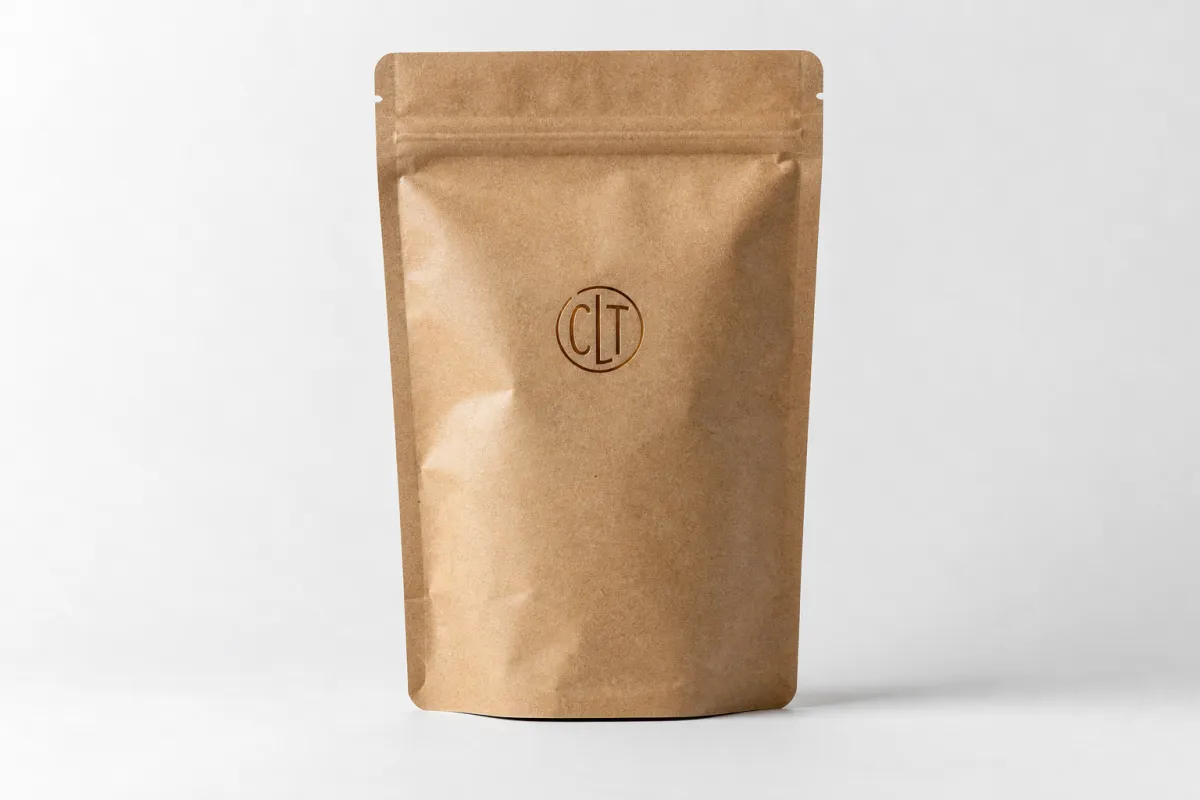
Printed kraft Pouches with Logo can make a product feel considered and trustworthy in a matter of seconds, or they can make it feel rushed just as fast. I have seen that happen on launches where the product itself was excellent, but the pouch design was fighting the material, the print method, or the shelf conditions. A kraft pouch with a clear logo, the right closure, and the right barrier structure can do a lot of heavy lifting, but only if the whole build is treated as packaging first and decoration second.
Brands keep choosing Printed Kraft Pouches with logo because the format has a natural look that fits private-label ranges, specialty goods, and small-batch products without forcing a complete identity change. The pouch can include a zipper, tear notch, hang hole, clear window, or rounded corners, so it is practical as well as visually recognizable. Kraft, though, does not automatically mean eco-friendly, premium, or durable. Those outcomes depend on the actual structure, and that is where a lot of briefs get a little fuzzy.
At Custom Logo Things, the same pattern shows up often enough that it is hard to miss: a team falls in love with the kraft look, rushes the artwork, and then wonders why the logo turns muddy on brown stock or why the pouch looks flat once it is filled. That problem is usually avoidable. If you plan printed kraft pouches with logo as a material-and-performance decision, not just a branding exercise, the result tends to be cleaner, calmer, and much easier to live with after launch.
Printed Kraft Pouches with Logo: Why They Stand Out
Printed kraft pouches with logo stand out because the visual signal is immediate. Brown kraft gives a natural cue right away, and the logo either strengthens that cue or gets swallowed by it. There is not much middle ground. On a shelf with too many competing packages, people scan quickly, and a simple logo on kraft can suggest artisan quality, clean-label positioning, or a more restrained premium feel without needing a noisy front panel. A front loaded with copy and icons usually works against that. It makes the pouch feel like it is trying too hard, and that rarely helps.
Most printed kraft pouches with logo are multilayer flexible packages rather than single-sheet paper structures. The outer layer may be natural kraft paper, bleached kraft, or a kraft-faced laminate, while the inner layer provides the barrier that helps protect against moisture, oxygen, aroma loss, grease, and handling damage. Depending on the product, the pouch may also include a zipper, tear notch, hang hole, or clear window. That combination matters because the pouch is not only a print surface. It is storage, protection, and shelf display all at once. A pretty logo cannot rescue a weak construction.
Brands choose printed kraft pouches with logo for a few practical reasons:
- Natural shelf presence: kraft brings a warm, tactile feel that reads differently from glossy plastic.
- Private-label scaling: one pouch family can be adapted across flavors, sizes, and seasonal SKUs without rebuilding the whole look.
- Unboxing value: the package feels intentional, which matters when the customer is opening it at home or at the counter.
- Format flexibility: the same visual system can work for snack packs, refill pouches, pet treats, powders, and more.
There is one misconception worth clearing up early. Printed kraft pouches with logo are not automatically sustainable just because they look paper-like. Many use laminated structures that are not accepted in standard curbside recycling streams, and some combine materials in ways that make separation difficult. If sustainability is part of the brand story, ask for the exact material stack, certification details, and any documentation behind environmental claims. The same caution applies to premium positioning. Premium is not just a brown color with a logo on it. Premium comes from print quality, structure, seal performance, and finish working together in a way that feels deliberate.
"If the logo disappears on shelf, the pouch is just expensive brown packaging."
That line sounds blunt, but it is true. Printed kraft pouches with logo win when the front panel is legible, the contrast is strong, and the pouch shape matches the product. Miss those basics, and the brand is paying for a look that never really reaches the customer.
How Printed Kraft Pouches with Logo Are Made
Printed kraft pouches with logo usually begin as a layered flexible material, not a single sheet of paper. The outer layer may be natural kraft paper, bleached kraft, or a kraft-look laminate, while the barrier layer underneath may be PET, PE, VMPET, or another film chosen for the product’s shelf-life requirements. After printing, the material is formed into a pouch, sealed, and finished with optional features like a zipper, tear notch, euro hole, or rounded corners. That sounds simple enough on paper. In real production, each layer changes how the pouch looks, feels, and performs.
The print method is where many buyers make avoidable mistakes. For larger repeat runs, flexographic printing is often the more economical choice because setup costs get spread across a higher number of units. For shorter runs, launches with frequent artwork changes, or product tests, digital printing is often easier to manage because setup is lighter and revisions do not carry the same penalty. Specialty finishes can be added to either route, but they increase cost and often extend lead time. On printed kraft pouches with logo, the print method affects both the appearance and the budget. That is not a side note. It drives the project.
Artwork setup deserves more attention than it usually gets. Kraft is not white paper, and the brown tone changes how colors behave, especially pale tones, muted neutrals, and logos that depend on delicate contrast. A light gold on kraft may nearly disappear. A thin gray line can look uncertain. Deep black, strong spot colors, rich greens, and white ink tend to hold up better. A proper dieline with correct bleed and safe zones also matters, because the logo needs room around folds, seals, and top closures. I have seen beautiful art become awkward simply because the team never checked how much of the front panel would actually survive the forming process.
Here is the practical version of the finishing choices:
- Matte finish: calm, modern, and often the safest choice for kraft.
- Gloss finish: more reflective and useful when extra shelf pop is needed, though it can compete with the natural look.
- Soft-touch coating: adds a velvety feel, although it is a choice, not a default requirement.
- White ink underprint: helps logos stand out on darker kraft surfaces.
- Foil accents: useful in small doses, but easy to overdo if the goal is a grounded look.
- Window panels: let the product do some of the selling, which works best only when the product itself looks clean and consistent.
If you want a broader technical baseline, the Flexible Packaging Association offers useful reference material, and FSC explains what certified paper claims actually mean at fsc.org. Those references do not replace supplier specifications, but they help separate marketing language from material reality. That distinction matters a lot more than most people expect.
Key Factors That Affect Printed Kraft Pouches with Logo
The first factor is size, because size shapes almost everything else. Printed kraft pouches with logo that are too small for the fill weight tend to bulge at the seams and look sloppy. Oversized pouches waste material, take up extra shelf space, and can make the brand feel less disciplined than it actually is. A pouch for 100 g of coffee is not the same thing as a pouch for 500 g of protein powder. The right format should be selected around fill weight, product density, and the headspace needed for a dependable seal.
Barrier requirements come next. Dry snacks, coffee, pet treats, powders, teas, cosmetics, and supplements all need different protection. Coffee often needs stronger aroma retention and oxygen barrier. Greasy snacks need better grease resistance. Powders need reliable seal integrity and sometimes better puncture resistance. Printed kraft pouches with logo can handle those jobs very well, but only if the inner layer is built for the product. Chasing the outside appearance while ignoring the inside structure is a good way to end up with packaging that looks right and fails quietly.
Logo visibility is where kraft either works beautifully or gets stubborn. The brown substrate lowers contrast, so bold type and simple shapes usually outperform crowded designs. Thin serif fonts, tiny taglines, and pale colors often disappear once the pouch is printed and folded. A strong logo placed on the main front panel, with enough breathing room around it, usually reads better than a layout trying to prove it has too many ideas. On printed kraft pouches with logo, clarity sells faster than cleverness.
Function choices influence brand perception more than many teams expect. A zipper that feels flimsy, a tear notch that rips sideways, or a pouch that will not stand upright can make the product feel cheap even if the artwork is attractive. If the pouch sits on a shelf, shelf stability matters. If it is mailed, puncture resistance matters. If it is opened every day, the zipper matters. Those are not packaging-nerd details. They are customer experience details, and customers notice them pretty quickly.
Compliance and product claims should be handled early, not after design approval. Food packaging may require food-contact-safe materials, suitable inks, and verified seal performance. Shelf-life targets may call for testing moisture vapor transmission rate or oxygen transmission rate, often using ASTM methods such as ASTM F1249 for MVTR. For shipping performance, some teams use ISTA test paths depending on the distribution lane. Printed kraft pouches with logo can be attractive, but compliance has to support the package all the way through distribution and storage.
One more point matters quite a bit: a logo that looks perfect on screen is not proof that it will look right on kraft. Ask for a physical sample or a proof on the actual substrate. The texture, absorbency, and color shift of kraft can change the final result more than some design teams want to admit. That is not a criticism; it is just how the material behaves.
Production Process and Timeline for Printed Kraft Pouches with Logo
The production process for printed kraft pouches with logo looks straightforward in theory and gets messy fast in real projects. A clean workflow usually follows this order: brief, spec confirmation, dieline preparation, artwork submission, proof review, sample approval, production, quality inspection, and shipping. Skip one of those steps and the risk rises. Print a pouch without agreeing on dimensions or closure style first, and everyone starts guessing. Guessing gets expensive very quickly, and usually in more than one place.
Timeline depends on method and complexity. Digital jobs can move faster, especially when the artwork is already locked and the pouch structure is simple. Flexo usually takes longer because of setup, plates, and press planning. Custom structures, heavier barrier builds, and special finishes extend the schedule further. A realistic range for printed kraft pouches with logo is often 10 to 18 business days after proof approval for simpler digital work, and 15 to 30 business days for more involved flexo or specialty builds. Shipping sits outside that window, and international freight is often the part that people underestimate until the last minute.
Delays usually show up in a few familiar places:
- Artwork keeps changing after the dieline is already approved.
- One person wants the logo larger, another wants more copy, and neither choice really helps the pouch.
- The supplier is waiting for quantity confirmation before locking the run.
- The color target was never defined, so every proof turns into a debate.
- The sample gets approved too late to protect the launch date.
Shortening the process starts with discipline. Lock the dimensions early. Choose one approver. Finalize the print method before the artwork is built. Make the logo placement decision on the actual dieline, not on a mockup with unrealistic proportions. Avoid changing copy after proof approval unless you enjoy paying to fix the same issue twice. Printed kraft pouches with logo are much easier to manage when the project owner behaves like a project owner.
Planning for reorders matters as well. The first order should leave room for demand spikes, freight delays, and the simple reality that a good launch can outrun the forecast. It is common to under-order because everyone wants to limit the first round of risk. That instinct makes sense. Still, if the product performs, the second order often has to land inside a narrow production window. If the supplier has not reserved capacity, the brand can end up with a sales problem that looks, frustratingly, like a packaging problem.
For brands that need a more controlled path, printed kraft pouches with logo work best when the team creates a simple approval stack: one technical contact, one design contact, one final approver. Three voices is manageable. Seven voices is how a packaging project turns into a long argument with no useful ending.
Cost, Pricing, MOQ, and Quote Basics for Printed Kraft Pouches with Logo
Cost is the point where printed kraft pouches with logo stop being a design discussion and become a buying decision. Final pricing depends on pouch size, material thickness, barrier level, print colors, closure type, finish, and order volume. Add a window, foil, matte coating, or custom zipper, and the price moves. Ask for a thicker barrier or a more complex structure, and it moves again. There is no honest way to give one universal number, because the structure matters more than the headline pouch shape.
For smaller custom runs, printed kraft pouches with logo often sit in a rough unit range of about $0.18 to $0.45 per pouch, depending on size and print complexity. Larger runs can fall lower, sometimes into the low teens per unit for simpler structures, but only when the volume is high enough to spread setup costs. Those ranges are practical, not promises. The lowest quote on paper can become the most expensive choice once freight, duties, inspection, and rework show up.
The MOQ tradeoff is simple enough. Lower quantities usually mean higher unit cost because setup fees do not disappear. Larger quantities improve unit economics, but they also increase inventory risk. If the product is still being tested, a smaller MOQ may be the safer move. If the packaging is stable and the SKU is proven, a bigger run often makes more sense. Printed kraft pouches with logo should be ordered with the sales forecast in mind, not just the per-unit price. Saving a few cents per pouch does not help if the boxes sit unused for months.
Here is a useful quote comparison framework:
| Option | Typical MOQ | Approx. Unit Cost | Lead Time | Best Fit |
|---|---|---|---|---|
| Digital print, simple structure | 1,000 to 3,000 pcs | $0.18 to $0.40 | Fastest | Launches, seasonal SKUs, design tests |
| Flexo print, standard structure | 5,000 to 20,000 pcs | $0.10 to $0.25 | Moderate | Core SKUs, stable artwork, repeat orders |
| Special finish, premium build | 5,000 pcs and up | $0.22 to $0.55 | Longer | Premium retail, gift packs, strong shelf theater |
Do not compare quotes only by unit price. Compare the full package. Ask whether the quote includes plates or tooling, sample fees, freight, customs duty, packing, and inspection. Ask whether the supplier is pricing a printed pouch that can stand on its own, not a flimsy bag that only looks good in a render. Printed kraft pouches with logo are one of those categories where fake savings show up later as quality trouble.
It helps to ask for two pricing snapshots: one at the minimum order quantity and one at a realistic reorder quantity. That shows where the breakpoint sits. Sometimes the smarter move is not the cheapest unit price. It is the option that keeps inventory from turning into a warehouse apology.
Common Mistakes With Printed Kraft Pouches with Logo
The biggest mistake is designing for white paper instead of kraft. It happens constantly. A logo that looks crisp on screen can turn dull or muddy on brown stock, especially if the palette is too soft or the lines are too delicate. Printed kraft pouches with logo need a design that respects the substrate. That means stronger contrast, simpler composition, and realistic expectations about how the brown background will behave under ink.
The second mistake is ignoring barrier and seal needs. That mistake turns into customer complaints, returned product, or a shelf life that falls short of the plan. A pouch that looks elegant but cannot protect the contents is a decorative failure. If the product is coffee, snack food, protein powder, tea, or anything moisture-sensitive, the build has to match the use case. Printed kraft pouches with logo should never be approved as artwork first and packaging second. That order is backwards.
Another common issue is approving art without a physical sample. Mockups help, but they are not proof. Real kraft has texture. Real kraft changes color. Real kraft folds and creases. If the logo has never been seen on the actual material, there is not enough information to sign off confidently. That is why a press proof or real sample is worth the time, especially for printed kraft pouches with logo where the brown substrate can surprise even experienced design teams.
Then there is the front-panel overload problem. Too many claims. Too many icons. Too many seal badges. Too many flavors trying to occupy the same small area. The result is a bag that looks busy from three feet away and chaotic from six inches. The front panel should do one thing well: communicate the brand and the product. Everything else can move to the back or side panel.
Finally, some brands chase the lowest MOQ without thinking through product changes. That is a reliable way to end up with boxes of the wrong pouch after the formula shifts, the flavor is renamed, or the fill size changes. Printed kraft pouches with logo work best when the team treats inventory risk as seriously as unit cost. Cheap packaging that cannot be used is not cheap. It is just expensive in a more embarrassing form.
One practical test helps a lot: hold the pouch at arm's length and ask whether the product name and logo are still readable. If they are not, the shelf will be less forgiving than your desk ever was.
Expert Tips and Next Steps for Printed Kraft Pouches with Logo
My first tip is straightforward: use the front panel like a billboard, not a brochure. One logo, one product promise, one visual cue. That is usually enough. Printed kraft pouches with logo rarely benefit from dense copy blocks or a long list of tiny selling points. The pouch has limited real estate, and the kraft texture already adds visual interest. Let the material carry part of the work instead of crowding it out.
Second, ask for a sample in the exact material and fill it with the product. Do not inspect the empty pouch and call the job done. Check zipper feel, seal stiffness, crease behavior, and shelf stance with the real fill weight inside. Printed kraft pouches with logo can look excellent flat and behave differently once filled. The customer sees the filled version, so that is the one that matters. If it feels awkward in your hand, it is probably gonna feel awkward on the shelf too.
Third, compare landed cost, not just unit price. A lower quote that comes with expensive freight, weak packaging, or a delay that pushes launch back three weeks is not the better deal. Printed kraft pouches with logo should be judged on what they cost to receive, store, and use. The math gets less glamorous, which is usually a sign that it is getting more useful.
Here is a launch checklist I would use before ordering:
- Dimensions: final width, height, and gusset depth.
- Barrier spec: moisture, oxygen, and grease resistance target.
- Closure type: zipper, tear notch, or both.
- Finish: matte, gloss, soft-touch, foil, or window.
- Artwork owner: one person responsible for final files.
- Proof date: a clear approval milestone.
- Ship date: realistic and padded for freight.
Fourth, do not let the project drift into endless revisions. A pouch design can be refined forever, which is another way of saying it can be delayed forever. Set the art direction, lock the structure, and move forward. Printed kraft pouches with logo are a packaging asset, not a design hobby.
The honest conclusion from a buyer's perspective is simple: the best printed kraft pouches with logo are the ones that feel easy to understand, easy to trust, and easy to reorder. They do not rely on noise to impress people. They win by being legible, functional, and consistent. If the logo is clean, the structure is right, and the quote makes sense, you are in good shape. If any of those three are off, fix them before you place the order.
Frequently Asked Questions
Are printed kraft pouches with logo suitable for food packaging?
Yes, if the inner barrier, inks, and seals are built for the product and the pouch is specified for food use. Dry snacks, coffee, greasy items, and powders all have different protection needs, so the structure should match the contents. Ask for compliance details, shelf-life expectations, and a product-specific recommendation before approving printed kraft pouches with logo for food.
What print method is best for small runs of printed kraft pouches with logo?
Digital printing is usually the easiest choice for small runs, quick changes, and multiple artwork versions. Flexo can make sense once quantities rise, especially if the design will repeat for a long time. The cleanest decision is to compare setup fees and unit cost at two quantities so the quote is not misleading for printed kraft pouches with logo.
How do I keep the logo visible on printed kraft pouches with logo?
Use strong contrast, bold type, and simple shapes instead of thin lines or tiny details. Consider white ink underprint or a darker logo treatment when the kraft background is too dominant. Test the design on the actual material, because kraft texture changes how colors read on printed kraft pouches with logo.
What MOQ should I expect for printed kraft pouches with logo?
MOQ depends on the pouch structure, print method, and supplier setup, so there is no single universal number. Custom pouches often have higher minimums than stock bags with label changes or simpler print setups. Ask for quotes at the MOQ and at a larger reorder quantity to see where the best unit cost starts for printed kraft pouches with logo.
How long does it take to produce printed kraft pouches with logo?
Lead time depends on sampling, artwork approval, production method, and shipping distance. Simple jobs move faster; custom structures, special finishes, and revision loops slow things down. Lock the specs early and give the supplier one clear approval path to avoid delay. That is the plain answer, but plain is usually cheaper when producing printed kraft pouches with logo.
Are all printed kraft pouches recyclable?
No. Some kraft-facing pouches use mixed materials that are difficult to recycle through standard municipal systems. If recyclability matters, ask for the exact film structure and get a clear statement from the supplier instead of assuming the paper look means paper recovery. That honest check saves confusion later and keeps printed kraft pouches with logo aligned with the right sustainability claims.


