Buyer Fit Snapshot
| Best fit | Printed Label Rolls for Jars projects where brand print, material claims, artwork control, MOQ, and repeat-order consistency need to be specified before quoting. |
|---|---|
| Quote inputs | Share finished size, material target, print colors, finish, packing count, annual reorder estimate, ship-to region, and any compliance wording. |
| Proofing check | Approve dieline scale, logo placement, barcode or warning zones, color tolerance, closure strength, and carton packing before bulk production. |
| Main risk | Vague material claims, crowded artwork, missing packing details, or unclear freight terms can make a low unit price expensive after revisions. |
Fast answer: Printed Label Rolls for Jars: Design, Cost, and Fit should be specified like a repeatable production item. The safest quote records material, print method, finish, artwork proof, packing count, and reorder notes in one written spec.
Production checks before approval
Compare the actual filled-product size with the drawing, then confirm tolerance on folds, seals, hang holes, label areas, and retail display edges. Reserve space for logos, QR codes, warning copy, and material claims before decorative graphics fill the panel.
Quote comparison points
Review material grade, print process, finish, sampling route, tooling charges, carton quantity, and freight assumptions side by side. A quote is only useful when the supplier can repeat the same color, closure quality, and packing count on the next order.
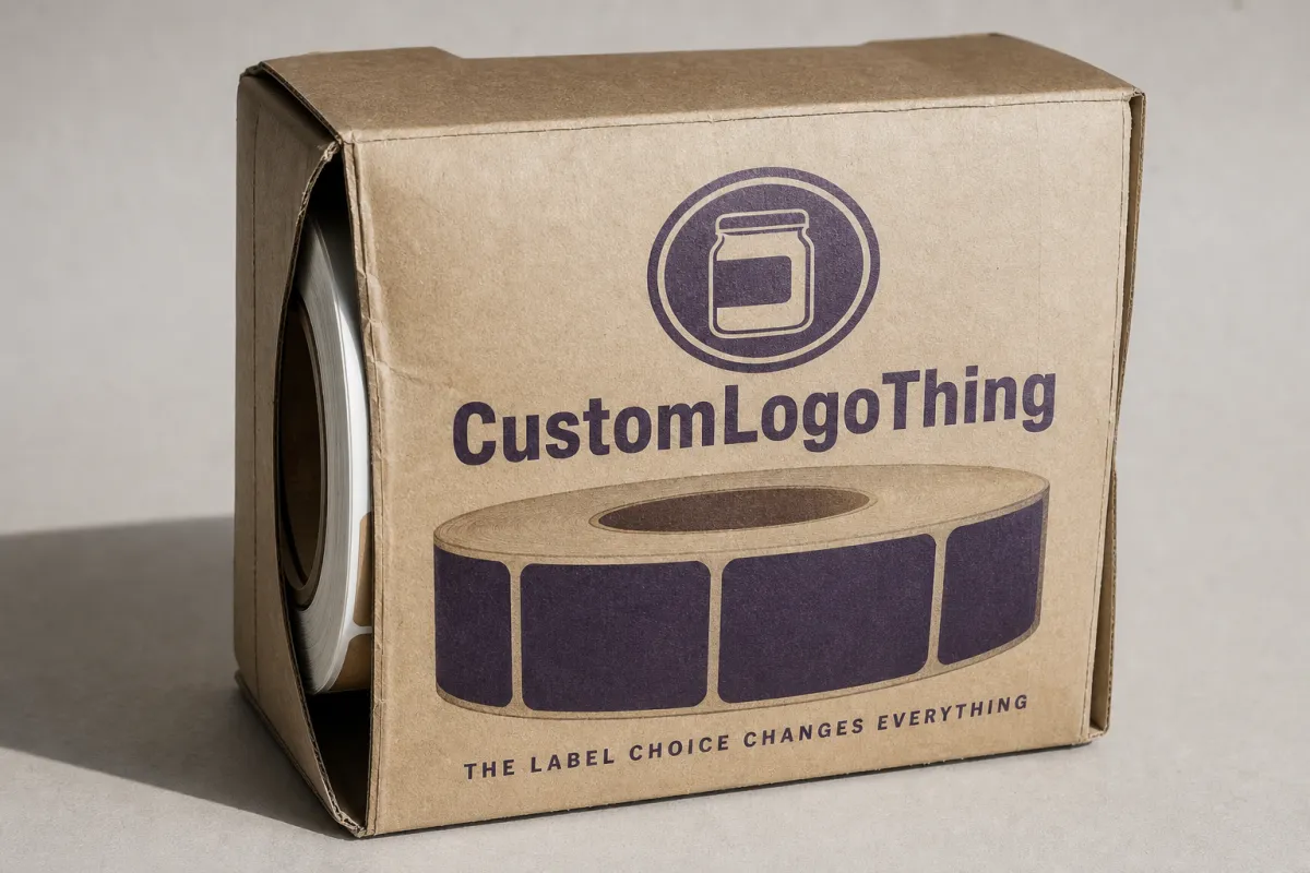
Printed Label Rolls for Jars: Design, Cost, and Fit
A jar can look perfect in a proof and still behave like it has a grudge on the filling line. That is the reality behind printed label rolls for jars: the artwork, adhesive, roll configuration, and container shape all have to work together, or the label becomes a delay instead of a selling point.
Sometimes the applicator misses the gap because the roll was wound a little too tight. Sometimes the adhesive gives up after a cold-room run. Sometimes a soft-touch finish looks expensive on screen and then starts picking up scuffs before the cartons are even sealed. None of that is unusual. It usually traces back to decisions made before the first label reaches an actual jar.
Food brands, cosmetics lines, wellness products, candles, sauces, and other jarred specialty goods often choose roll labels because they give a cleaner retail presentation and a steadier production flow. If you are comparing formats, our Custom Labels & Tags page shows how different constructions fit different packaging jobs.
Printed label rolls for jars: why the label choice changes everything
Printed label rolls for jars are pre-printed labels wound onto a core so they can be dispensed quickly, handled cleanly, and kept consistent from one run to the next. That sounds straightforward. In practice, the roll format sets the pace of the line. If the roll feeds cleanly, the work feels orderly. If it does not, even a small run turns into a nuisance.
Jar labels do a lot of work in a small space. The viewing distance is short. The container is usually curved. The label has to hold product name, variant, net weight, ingredients, warnings, barcode, and branding without looking cramped. If the size is off or the placement drifts, the package starts to look unfinished. A good label does more than sit there. It frames the jar and makes the product look deliberate.
That is why roll labels show up so often in packaged food, cosmetics, bath products, aromatherapy, and jarred specialty goods. These products need labels that survive shipping, shelf handling, and bright retail lighting while looking the same from unit to unit. Sheet labels can work for short runs or manual workflows, but roll format usually wins once speed and repeatability matter.
Packaging truth: a label does not earn its keep because it looked pretty on a screen. It earns its keep when it dispenses correctly, lands square on the jar, survives the product environment, and still looks clean after people touch it.
The visual payoff matters too. Roll-fed labels create a more repeatable application pattern, especially when every jar needs to look nearly identical from the front. That matters on a crowded shelf. A crooked label or a wrinkled edge can quietly drag down perceived value. Stable color, controlled finish, and the right proportions make the jar look designed, not improvised.
Premium presentation is easier to build into this format than many buyers expect. Paper, film, clear, matte, gloss, textured, and metallic finishes all work in roll form if the label dimensions and adhesive are matched to the jar and the application method. That last part gets missed a lot. The roll is not just a container for labels. It is part of the dispensing system.
How printed label rolls for jars are made and applied
The process usually starts with artwork setup and a spec review. A good supplier wants jar dimensions, label dimensions, finish, quantity, application method, and storage conditions before quoting or printing anything. Once the design is approved, the material gets selected, the print method is locked, and the labels move through die cutting, finishing, rewinding, and inspection before shipping.
That workflow looks routine, but each stage leaves a mark on the final result. A bad bleed can leave a thin white edge. The wrong material can haze up under condensation. A roll wound too tightly can curl or feed badly. Even rewind tension matters because some applicators need a stable roll that feeds evenly without slipping or telescoping.
Roll settings that keep the line moving
Roll format is where practical problems show up quickly. Core size, outer diameter, label gap, unwind direction, and sensor requirements all need to match the applicator or the manual setup. Hand-applied labels can tolerate more variation. Machine application is less forgiving. Put the roll on the wrong way and the labels come out upside down or backward for the operator. Make the gap too tight or inconsistent and the sensor starts missing the registration point. Then the line drifts and everyone gets to have a very long morning.
Most buyers do not need to memorize machine specs. A better question is simpler: how will the labels actually be applied? Hand placement means peel feel, comfort, and roll size matter most. Semi-automatic or automatic application makes roll diameter, unwind direction, core size, liner type, and spacing much more important. A label can print beautifully and still waste time if the roll configuration fights the equipment.
Label spacing affects throughput more than people expect. Too little gap makes feeding unreliable. Too much gap reduces the number of labels per roll and creates extra changeovers. The right answer depends on the applicator, the container size, and the production rate. A supplier with real roll-label experience should recommend a configuration that fits the line instead of sending whatever happened to come off the press.
Glass and plastic jars behave differently
Glass jars and plastic jars are different surfaces, so the adhesive has to respect that. Glass usually gives a stable, clean bond, but condensation becomes the real problem. Refrigerated foods, cosmetics stored in cool rooms, and jars filled warm and then chilled all create the same headache. Plastic jars vary more in surface energy, which means some films and adhesives bond better than others. If the jar is textured, lightly curved, or tapered near the shoulder, the label also has to conform without bridging or lifting at the edges.
Surface prep matters more than people like to admit. Dust, oil, condensation, and trace product residue can all weaken the bond. A label that sticks fine on a clean bench sample may struggle on a jar with a faint film from the filling process. That is why real testing matters. It shows whether the adhesive needs more tack, whether the face stock needs more stiffness, or whether the application needs to wait until the jar surface is dry.
After application, pressure-sensitive adhesives often need a short curing window before the package gets heavy handling or goes into secondary cartons. The exact timing depends on the adhesive and the environment, but many labels build stronger bond performance after they sit undisturbed for a while. Another reason to test before launch instead of assuming the proof table tells the whole truth.
Shipping-heavy products benefit from transit testing too. Standards and methods published by groups like ISTA help uncover scuffing, edge lift, and vibration-related wear before the product reaches a customer. The goal is not to make the process fussy. The goal is to stop avoidable damage before the jars start moving through cartons, pallets, and delivery networks.
Key factors that affect performance, appearance, and adhesion
The best jar label balances appearance and function. Material, adhesive, finish, container geometry, and regulatory content all shape the final result. Treating those as separate decisions is a good way to end up surprised later. Thinking through the whole system usually leads to a cleaner, cheaper, more reliable label.
Material choice is the first big decision. Paper labels can be economical and print very well, especially on dry shelf-stable products. Polypropylene and polyester films add moisture resistance and durability, which makes them better for cold storage, frequent handling, or products that get wiped during use. Clear film gives a no-label look, but it needs thoughtful design because contrast and readability matter more. Specialty stocks can add texture and a premium feel, though they also bring tighter print and conversion requirements.
Adhesive choice matters just as much. A permanent adhesive is common for retail goods because brands usually want the label to stay put for the life of the product. Removable adhesives work in some short-term or multi-use situations, though they are not right for every jar. Freezer-grade and refrigeration-grade adhesives matter for chilled products, and high-tack formulations are often better when the jar has mild texture, a curved shoulder, or a tricky surface.
Finish changes both appearance and handling. Matte finishes reduce glare and can make small text easier to read. Gloss finishes tend to make colors look brighter and richer. Soft-touch finishes bring a tactile, upscale feel, but they can scuff more easily if the pack line is rough. Clear labels can look modern on glass, though they need crisp white ink support and strong contrast anywhere text has to stay legible.
Jar geometry deserves real attention. A straight-sided jar is easier to label than one with a deep taper, rounded shoulder, or narrow print panel. Small jars leave very little room for required content, so the layout has to be disciplined. A label that wraps too far around a curved face can distort artwork or create a seam that breaks up the brand panel. Measuring the usable flat area is usually more useful than just measuring the full circumference.
Content needs also shape the design. Ingredient panels, warning statements, batch codes, date codes, barcodes, and net weight declarations all compete for the same limited space. Small jars leave no room for overthinking. Protect legibility first. Decorate second. That is not a design failure. It is packaging reality. Many brands keep critical copy at 6 point or larger where possible and protect barcode quiet zones so scanners read reliably.
For brands that want certified sourcing, FSC-certified paper can be a smart fit if the product environment suits a paper label. Certification does not fix moisture problems, but it can support sourcing claims and sustainability planning. More detail is available through FSC. The bigger point stays the same: the right face stock is the one that works for the package and the product environment.
Print consistency matters too. Multi-color artwork, fine gradients, and metallic effects can look excellent, but they demand tighter control over color, ink laydown, and substrate behavior. If the brand needs a sharp logo and strong shelf presence, a smooth, stable material usually prints better than a rough or highly absorbent stock. That is one reason many food and wellness brands choose film labels in humid environments even when paper looks cheaper on a spreadsheet.
Here is a practical comparison of common label options for jars:
| Label option | Typical use | Estimated unit cost at 5,000 pcs | Strengths | Watch-outs |
|---|---|---|---|---|
| Paper label roll | Dry goods, shelf-stable food, candles | $0.05-$0.12 | Good print quality, familiar look, lower cost | Less moisture resistance, more prone to scuffing |
| BOPP film label roll | Cosmetics, wellness, refrigerated products | $0.08-$0.18 | Moisture resistant, durable, strong shelf appearance | Can cost more, needs careful artwork and adhesion planning |
| Polyester label roll | Cold chain, harsh handling, long-life products | $0.12-$0.24 | Tough, stable, better wear resistance | Higher price, may be more than a simple jar needs |
| Clear film label roll | Premium glass jars, minimal branding, no-label look | $0.14-$0.30 | Modern appearance, clean visual effect on clear jars | Needs strong contrast, white ink, and precise alignment |
The ranges above are working numbers, not promises carved into stone. A small simple label can land below the range. A custom shape, tight tolerance, white ink build, or premium finish can push the number upward fast. Material is only one piece of the quote. Print method, die cutting, finishing, and quantity all move the price too.
Cost and pricing: what drives the quote for jar label rolls
Buyers often ask for a price before the spec is clear, and that usually produces a number too vague to be useful. For jar label rolls, cost comes from a handful of variables: material selection, print method, label size, finish, quantity, and whether the design uses special inks or effects. Once those are locked in, the quote becomes much easier to compare.
Small runs usually have a higher unit cost because setup time gets spread across fewer labels. That includes prepress, press setup, die cutting, color matching, and inspection. If the supplier needs a new die for a strange shape or if the artwork needs several proof rounds, the time and expense go up again. Larger runs dilute those setup costs, so the per-label price usually drops as quantity rises.
Custom shapes can add complexity. A plain round jar label with a simple rectangle or oval is usually less expensive than a highly contoured die-cut shape with multiple corners and tight registration. The same goes for difficult materials. Clear film, heavy texture, or specialty metallic stocks can look fantastic, but they demand more careful handling and tighter process control.
There is a real difference between the cheapest workable label and the most cost-effective label. A label that peels, smears, or looks tired after a week of handling can cost more in returns, rework, or damaged shelf presence than a better label would have cost up front. That tradeoff matters in competitive retail channels where package presentation is part of the sale, not an afterthought.
One common mistake is comparing quotes without confirming the same spec sheet. A quote for 2,500 paper labels with a simple gloss finish is not comparable to a quote for 10,000 BOPP labels with a matte finish and a Custom Die Cut. Ask suppliers to state the substrate, adhesive, roll configuration, quantity, and finishing details so the comparison stays honest. If you need a wider mix of custom pack labels, our Custom Labels & Tags page helps frame the options before you request pricing.
These are the cost drivers that tend to move the quote most often:
- Quantity: larger orders usually reduce unit cost because setup is spread across more labels.
- Material: paper often costs less than film, while clear and specialty stocks usually cost more.
- Finish: matte, gloss, soft-touch, and specialty coatings can shift both price and wear resistance.
- Print complexity: extra colors, white ink, metallic effects, and high-detail artwork add production steps.
- Shape and tolerance: unusual die cuts and tight registration increase conversion complexity.
- Roll requirements: core size, roll diameter, and unwind direction may affect compatibility and setup.
For planning, a simple repeat run of printed label rolls for jars can usually be scheduled more efficiently than a first-time custom job. If the artwork is ready, the materials are in stock, and the roll spec matches the line, the job moves faster and with fewer surprises. That is why a clear spec sheet saves time later.
Process and timeline: from artwork file to finished rolls
The cleanest projects follow a predictable path. The brief comes first. Then the supplier checks artwork, confirms label size, and prepares a proof. Once the proof is approved, the job gets scheduled, printed, finished, inspected, and packed for shipment. Each step sounds ordinary. Miss one and the launch date starts sliding around.
File readiness matters a lot. If the artwork already has correct bleed, safe margins, vector logos, and final copy, the proof cycle is shorter. If the designer still needs to move text, adjust a barcode, or correct ingredient copy, turnaround slows down. Revisions happen. That is normal. A cleaner file just gets the press moving sooner.
Material availability also affects timing. Standard paper and popular film stocks are usually easier to source than specialty surfaces. If the project needs clear film, high-tack adhesive, freezer performance, or a texture that is not regularly stocked, the supplier may need a longer lead time. Custom tooling, like a new die or special roll configuration, adds more time.
A realistic schedule for many first-time jobs is often 10 to 15 business days after proof approval, though simple repeat jobs can move faster and more complex setups can take longer. That range depends on current workload, substrate availability, and whether the job needs custom cutting or finishing. If a supplier gives a deadline, ask what assumptions that date depends on.
For a brand launch, a smart plan includes samples, test application, and a small buffer before inventory is needed. A few extra days at the start can prevent a much larger problem later. Cold products deserve an especially careful pilot run on real jars because condensation and chilled storage can expose adhesion issues that never show up on a desk sample.
Here is a practical workflow that keeps projects moving:
- Confirm the jar and label specs. Measure the usable print panel, not just the overall jar circumference.
- Prepare the artwork file. Include bleed, safe margins, and the correct barcode or ingredient content.
- Review the proof carefully. Check copy, color intent, dieline placement, and roll direction.
- Approve a sample or short run. Test adhesion, appearance, and handling on actual jars.
- Schedule production. Lock quantity, roll configuration, and delivery timing before fill dates are set.
- Inspect the finished rolls. Verify unwind direction, core size, spacing, and label count per roll.
If future orders are likely, keep a record of the final approved spec. That habit saves time on reorders because the expensive mistakes usually come from memory, not printing. The exact label size, substrate, adhesive, and unwind direction should live with the job file so the next run matches the first approved version.
Common mistakes with printed label rolls for jars and how to avoid them
The most common mistake is measuring once and calling it done. A jar may have a flat front panel, but the shoulder begins sooner than expected, or the body tapers just enough to distort the label edge. A design that looks balanced on screen can end up too tall, too wide, or too close to the curve. Measure the usable face carefully and account for the real panel geometry, not just the outer container size.
Ignoring storage conditions is another easy way to get burned. A label designed for dry shelf display may work fine on a room-temperature product and fail once the jar is refrigerated, frozen, or handled in a humid packing area. Condensation can weaken adhesion, especially on glass straight out of a cold room. Oil from foods, lotions, or balms can also challenge inks and adhesives. The fix is to match the material and adhesive to the real environment, not the ideal one.
Artwork can become unreadable if the wrap runs too far around the jar or if the type is too small for the final panel. Some brands cram too much copy into a tiny front face and then act surprised when the label feels crowded. The answer is usually to simplify the front panel, move secondary information to the back, and give the brand name enough room to read clearly from arm’s length.
Roll specs can cause problems too. A mismatched core size or unwind direction may not matter for hand application, but it can jam an applicator or force the operator to stop and re-thread the roll. That slows the line and creates waste. If the labels go through automation, the roll should be specified for the machine, not guessed from a previous order.
Skipping tests is another avoidable mess. A label can look excellent on a proof sheet and still scuff, peel, or drift when placed on the actual jar. Test samples should be checked for adhesion, alignment, print durability, and visual fit under the same lighting the customer will see on shelf. If the product ships, sits cold, or gets stacked tightly, those conditions need testing too.
Some teams forget barcode and code placement until the end. If the code lands across a seam, a curve, or a high-gloss highlight, scanning can suffer. If the batch code sits too close to the edge, it may wear off during handling. Small details, big annoyance. Packaging gets judged in seconds, so a clean code panel matters more than it gets credit for.
Good rule of thumb: if a label has not been tested on the real jar, under the real storage conditions, and with the real application method, it is still a draft, not a finished specification.
A useful way to avoid mistakes is to compare label performance against the product’s real life. Will the jar be chilled? Will it be wiped by hand? Will it sit under bright lights? Will it travel through a warehouse, a carton, and then into a customer’s refrigerator? Each step changes the label’s job a little, and the spec should account for the whole trip.
Expert tips and next steps for better jar labeling
The best projects start with a label-and-jar audit. Confirm exact jar dimensions, panel flatness, fill conditions, storage environment, and application method before artwork is finalized. That sounds basic because it is. It also prevents expensive backtracking. If the label is meant for hand application, roll size and peel characteristics matter most to the operator. If the label is meant for machine application, the roll spec needs to match the equipment from the start.
Prepare print-ready artwork with proper bleed, safe margins, barcode quiet zones, and text that stays legible on the actual container. A huge monitor can hide problems that show up immediately on a 2-ounce or 4-ounce jar. Keep the front panel simple enough to read fast, and move secondary details to a back panel or side panel if the jar shape allows it. Clean hierarchy makes the package easier to shop and easier to manufacture.
Ask for a sample or short proof run and test it on the actual jar. Check adhesion right away, then check it again after the jar sits in its intended environment. A label that sticks instantly but lifts after a cool-down cycle is not ready. A beautiful label that takes too much effort to place will slow the line and drive labor costs up. The first test should answer both the performance question and the handling question.
Compare quotes using the same spec sheet. That is the only fair way to compare material, finish, quantity, and roll configuration side by side. If one supplier quotes paper and another quotes BOPP, the numbers may not mean the same thing at all. A good spec sheet should list jar dimensions, label dimensions, material, adhesive, finish, print colors, quantity, core size, unwind direction, and whether the labels are hand applied or machine applied.
Thinking one order ahead helps too. If the jar is likely to become a long-term SKU, store the final spec, proof, and approved sample together. That makes reorder planning easier and keeps the next production run close to the first one without extra rework. In many packaging programs, the best savings come not from the cheapest label, but from the label that is easiest to repeat.
For teams still building a packaging system, our Custom Labels & Tags page is a practical place to compare construction types that fit different print, finish, and application needs. The better the label matches the jar and the line, the less time gets spent fixing avoidable problems later.
Handled well, printed label rolls for jars do more than carry a logo. They support speed, keep presentation consistent, and help the product survive the ordinary abuse of filling, shipping, and shelf display. The practical takeaway is simple: measure the jar, test the adhesive on the real container, and lock the roll spec to the way the labels will actually be applied. That is how printed label rolls for jars stop being a guess and start being a dependable part of production.
FAQ
What materials work best for printed label rolls for jars in cold storage?
Choose a moisture-resistant face stock and an adhesive rated for refrigeration or freezer use. Cold jars often create condensation, and that can weaken bond strength if the label system was built for dry shelf conditions. For products that will be handled often, a film material such as BOPP or polyester usually gives better durability than a basic paper label, especially if the jar moves between chilled storage and room-temperature packing areas. If the pack line is humid, test the label after a chill cycle, not just on a bench sample.
Can printed label rolls for jars be applied by hand?
Yes, roll labels can work very well for hand application, especially on smaller production runs or seasonal product launches. The key is to make the roll size, spacing, and unwind direction practical for the person applying the labels. A simple placement jig can help keep the label square and centered, which reduces wasted labels and gives the jars a more uniform appearance across the batch. Manual application usually puts more weight on peel feel and ergonomics than machine-ready specs do.
What should I have ready before requesting a quote for printed label rolls for jars?
Have the jar dimensions, label size, quantity, substrate, finish, and application method ready. It also helps to include storage conditions and any exposure to moisture, oils, refrigeration, or direct handling. If possible, send artwork files or a clear spec sheet so the quote reflects the real production setup rather than a rough estimate based on guesswork. The more complete the brief, the more useful the quote will be.
How long does production usually take for printed label rolls for jars?
Timing depends on proof approval speed, material availability, and whether custom tooling is needed. Simple repeat orders usually move faster than first-time jobs with new artwork, special finishes, or unusual die shapes. A realistic plan often includes a proof cycle, production time, and a buffer for samples or testing so the label schedule stays aligned with filling and launch dates. If the supplier is waiting on a specialty stock, lead time can stretch without warning.
How do I keep printed label rolls for jars aligned on curved containers?
Match the label width and panel shape to the usable flat area on the jar, not just the overall diameter. Keep artwork away from the edge of the curve, and leave enough breathing room so the type does not creep into the tapered section. Test the label on real jars before full production, because even small changes in curvature can affect placement, adhesion, and the final shelf appearance. On narrow jars, a millimeter in the wrong direction can be enough to make the panel look off-center.
For most brands, the best results come from treating printed label rolls for jars as part of the packaging system, not a last-minute print order. The right spec saves time on the line, keeps the shelf look clean, and makes reorders much easier to manage.


