Buyer Fit Snapshot
| Best fit | Printed Poly Mailers Design for Better Branding projects where brand print, material claims, artwork control, MOQ, and repeat-order consistency need to be specified before quoting. |
|---|---|
| Quote inputs | Share finished size, material target, print colors, finish, packing count, annual reorder estimate, ship-to region, and any compliance wording. |
| Proofing check | Approve dieline scale, logo placement, barcode or warning zones, color tolerance, closure strength, and carton packing before bulk production. |
| Main risk | Vague material claims, crowded artwork, missing packing details, or unclear freight terms can make a low unit price expensive after revisions. |
Fast answer: Printed Poly Mailers Design for Better Branding: Film, Print, MOQ, and Carton Packing should be specified like a repeatable production item. The safest quote records material, print method, finish, artwork proof, packing count, and reorder notes in one written spec.
Production checks before approval
Compare the actual filled-product size with the drawing, then confirm tolerance on folds, seals, hang holes, label areas, and retail display edges. Reserve space for logos, QR codes, warning copy, and material claims before decorative graphics fill the panel.
Quote comparison points
Review material grade, print process, finish, sampling route, tooling charges, carton quantity, and freight assumptions side by side. A quote is only useful when the supplier can repeat the same color, closure quality, and packing count on the next order.
Printed Poly Mailers Design Tips for Better Branding
Printed Poly Mailers design tips matter because the mailer is often the first branded surface a customer sees, and it has to read clearly at arm's length while the parcel moves through a warehouse, rides in a truck, and lands on a front porch. A strong mailer behaves less like a poster and more like a moving storefront, so the artwork that works best is usually the artwork someone can recognize in two seconds or less.
That is the part many brands underestimate. A design that looks polished on a screen can turn awkward on flexible film, especially once seams, flap placement, opacity, and shipping scuffs enter the picture. The real work sits at the intersection of visual impact, production limits, shipping durability, and budget, all while keeping the package from feeling stripped down or generic.
Printed Poly Mailers Design Tips That Make a Fast First Impression
The strongest printed poly mailers design tips begin with one practical question: what should a customer understand the instant the mailer reaches their hands? For some brands, the answer is luxury. For others, it is speed, reliability, sustainability, or a playful burst of energy. Whatever the message is, the design has to communicate it at a glance, because the package rarely gets studied for long before it is set aside, stacked, or opened.
That is why I think of a mailer as a moving storefront. The logo is not sitting still in a showroom; it is wrapped around a flexible object that gets bent, dragged, and handled by people focused on something else. The best printed poly mailers design tips account for that reality by favoring bold shapes, clean contrast, and simple visual structure over busy artwork that depends on close inspection. I have watched perfectly nice artwork lose all of its impact because the type was too delicate or the pattern depended on seeing the whole bag flat, which almost never happens out in the wild.
There is also a manufacturing side to this conversation that design teams sometimes miss. A file that looks polished in a mockup may still create problems on press if the linework is too thin, the gradients are too delicate, or the colors rely on effects the production method cannot hold cleanly. The mailer has to survive shipment, and it has to survive the pressroom too.
A mailer only has a few seconds to earn trust. If the logo reads clearly, the package already feels more intentional.
That is the working principle behind good printed poly mailers design tips: make the brand easy to recognize, keep the print job realistic, and leave enough room for the product to do its job. A design that prints cleanly, folds well, and looks sharp in motion will usually outperform a more decorative layout that creates friction at the proof stage or the packing table. Honestly, that is where a lot of the drama gets saved.
For brands comparing wider packaging options, it helps to look beyond a single SKU and think about the full shipping system. You can browse our Custom Packaging Products for related formats, or review our Custom Poly Mailers if you already know the bag style you need.
What Printed Poly Mailers Are and How the Print Process Works
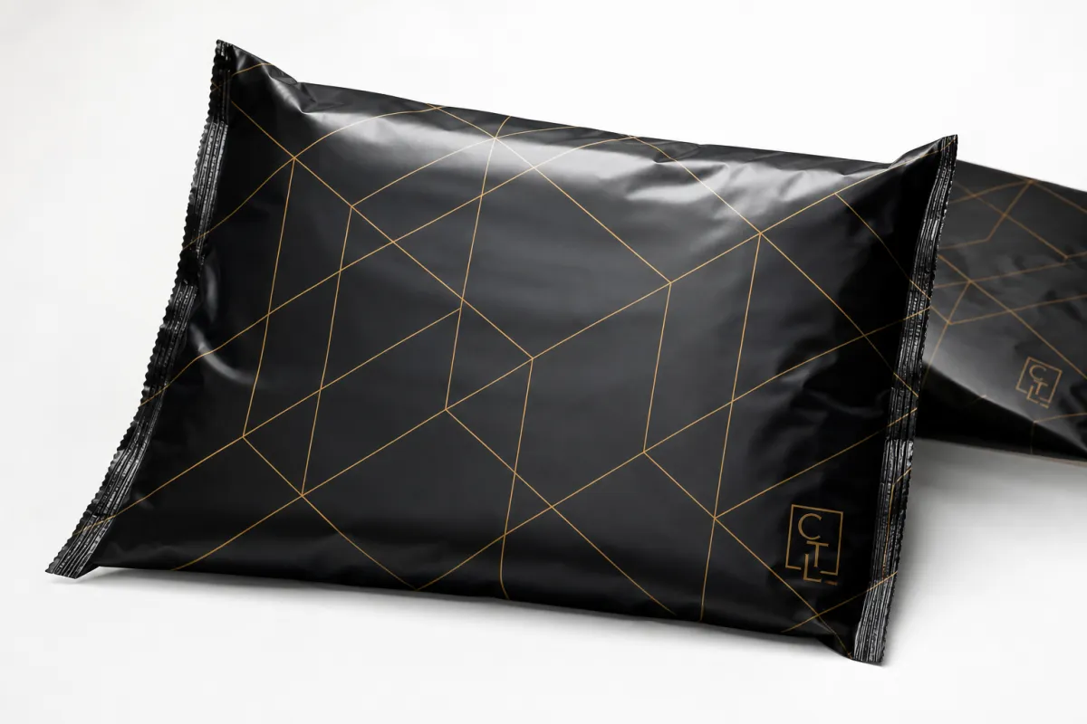
Printed poly mailers are lightweight polyethylene shipping bags with a sealed flap, chosen most often for apparel, accessories, subscription kits, soft goods, and other low-profile products that do not need rigid protection. In production, the bag itself is the substrate, which means the surface, thickness, opacity, and seal structure all affect how the artwork behaves. That is why printed poly mailers design tips need to be built around the actual bag, not just the brand style guide.
The film surface matters more than many people expect. Some poly film has a slicker gloss, some leans matte, and some uses a co-extruded structure that improves opacity and toughness. A lighter bag can be perfectly serviceable for soft apparel, while a heavier gauge is usually better for rougher parcel handling or slightly denser products. Common gauges range from about 2.5 mil to 4 mil, depending on the use case and the desired feel.
Printing on flexible film is a different discipline from designing a flyer or a carton. Flexographic and gravure-style processes are common in this space, and both reward artwork that is disciplined, high-contrast, and built with production tolerances in mind. Fine serifs, hairline strokes, and tiny reversed type can print poorly if the bag flexes or if the ink gain is a little heavier than expected. Clean spot colors usually age better in the real world than fragile detail.
Color also behaves differently on film. Screens glow; packaging reflects light. That simple difference changes the way a brand color feels in hand, especially on glossy surfaces. A rich dark blue can look sharp and premium on one substrate, then shift lighter or flatter on another if the ink laydown, opacity, or background film color changes. That is one reason I keep returning to printed poly mailers design tips that favor clarity over cleverness.
Here is the production flow in plain terms: artwork is prepared, the supplier reviews the file, a proof is issued, revisions are made if needed, approval is given, plates or print setup are completed, the bags are printed and converted, and then the finished mailers are packed for shipment. Any design choice that slows one of those steps can add time, cost, or both. Good printed poly mailers design tips make that path simpler, not more complicated.
For readers who like to check standards and packaging terminology, two useful references are the packaging.org resource library and the shipping test guidance at ISTA. Those sites are not about one specific bag style, but they are helpful for understanding how packaging is evaluated once it leaves the design file and starts facing real handling.
Printed Poly Mailers Design Tips for Material, Size, and Structure
Bag size changes the whole composition. A 6 x 9 mailer can feel crowded fast if the logo is oversized, while a 12 x 15.5 or 14 x 19 mailer gives you more breathing room for a secondary pattern, a return message, or a brand mark that needs to be seen from across a packing bench. One of the most useful printed poly mailers design tips is to match the design system to the actual footprint of the bag rather than forcing one artwork file onto every size.
Film thickness and opacity also affect how the artwork reads. A thin film may save a little material, but it can show shadows from the contents inside if the opacity is not high enough, which weakens the print presentation. A heavier bag can take more abuse and feel more substantial in the hand, though it may cost a bit more per unit. If you are mailing soft goods, I usually think in ranges rather than absolutes: lighter apparel bags often perform well around 2.5 to 3 mil, while more demanding shipping situations can justify 4 mil. That judgment is part of practical printed poly mailers design tips, not just packaging theory.
Seam placement deserves real attention. Side seams, bottom folds, and adhesive flap zones are all places where artwork can distort or disappear if the layout is too ambitious. A logo that looks centered on a flat mockup may end up visually off once the bag is formed and sealed. That is why safe margins, bleed allowance, and a clear no-print awareness zone are not boring technicalities; they are what keep the final mailer from looking slightly crooked or incomplete.
Finish matters as well. Glossy surfaces can make color look brighter and more saturated, but they can also introduce glare under warehouse lights or storefront lighting. Matte surfaces usually feel a little quieter and more premium, and they can soften reflections, though some colors will appear less punchy. If the brand tone is minimal, natural, or understated, a matte look can help. If the brand is loud, playful, or highly visual, gloss may fit better. Good printed poly mailers design tips take finish seriously because finish changes perception even when the artwork stays the same.
I have had proofs where the only change was moving a logo half an inch farther from the flap, and the whole bag suddenly looked more balanced. That kind of small adjustment does not feel dramatic on screen, but on a formed mailer it can be the difference between a package that feels intentional and one that feels a little off.
A few structure checks are worth making before a job moves forward:
- Keep logos and key text away from the seal and flap area.
- Use bold shapes that survive bending and stacking.
- Confirm the printable area against the actual dieline, not a generic template.
- Leave enough contrast so the mailer is readable in poor light.
- Test whether the artwork still looks balanced when the bag is filled.
That kind of preflight review is one of the most practical printed poly mailers design tips I can give. If the design works on the real bag, under real lighting, with real product inside, it is probably ready to move. If it only works as a mockup, it probably needs more work.
Need a sense of how these choices translate into a finished order? For many buyers, the best starting point is one clean logo, a single accent color, and a bag size that leaves generous breathing room. That combination almost always looks more confident than a crowded layout trying to do too much.
Printed Poly Mailers Design Tips for Cost, MOQ, and Pricing
Pricing is where artwork decisions become very real. The main cost drivers are usually print color count, bag size, film thickness, quantity, finish, and any special features such as reinforced seams or custom sizing. If you want practical printed poly mailers design tips, start by asking what part of the design actually adds value for the customer and what part is only adding ink and setup work.
The smallest runs tend to carry a higher unit price because setup costs are spread across fewer bags. Larger runs usually bring the Price Per Unit down, sometimes dramatically. At 5,000 pieces, a simple one-color mailer might land around $0.18 to $0.28 per unit, depending on size and specification. A two-color design may sit closer to $0.22 to $0.35, while a more coverage-heavy three- or four-color layout can move toward $0.28 to $0.48 or higher. Those numbers shift with film gauge, bag dimensions, freight, and the supplier's production method, but they are a realistic planning range for a standard run.
| Mailing Option | Best For | Typical Unit Cost at 5,000 Pieces | Design Impact |
|---|---|---|---|
| 1-color logo print | Simple branding, budget control, fast approval | $0.18-$0.28 | Strong contrast, clean type, very low risk of visual clutter |
| 2-color layout | Brands needing a logo plus one accent or message | $0.22-$0.35 | More flexible than one color without making setup overly complex |
| 3-4 color design | Patterned branding, richer identity systems, retail presentation | $0.28-$0.48+ | Higher setup sensitivity, more proofing, more risk of registration issues |
| Full-coverage artwork | High-visibility branding, large launches, premium unboxing | $0.35-$0.65+ | Visually strong, but more ink coverage and more production variables |
That table is not a quote sheet; it is a planning tool. The big lesson behind printed poly mailers design tips is that more visual complexity does not automatically improve the package. If a single-color logo already communicates the brand cleanly, adding three more colors may not help the customer at all. It may only raise cost and make approval slower.
MOQ matters too. Smaller orders are possible in some programs, but unit pricing usually gets less favorable under roughly 1,000 to 2,500 bags because the setup burden is not spread out. A buyer trying to stay inside budget often gets better value by simplifying the design than by trimming the quantity too far. In practice, the best cost-saving move is often to keep the mark bold and reduce ornamental detail.
Hidden pricing variables show up more often than people expect. Proofing charges, plate or setup charges, custom color matching, shipping, and last-minute revisions can all affect the final number. If a brand insists on a very precise Pantone match, that may require more care than a standard process color build. If the design is built with clean spot colors, the pressroom usually has an easier time, and the order often moves with fewer surprises. That is another place where printed poly mailers design tips save money without making the product feel cheap.
One more point that buyers sometimes miss: the most expensive design is not always the one with the highest unit price. A complex, slow-to-approve design can cost more in labor, delays, and reprints than a slightly simpler version that goes through first proof approval and prints cleanly. Good printed poly mailers design tips protect the budget by reducing friction at every step.
Printed Poly Mailers Design Process, Timeline, and Lead Time
The cleanest production schedules usually begin with a clear brief. The supplier needs the bag size, quantity, color count, file format, target ship date, finish preference, and any must-keep brand colors before the work starts. From there, the artwork is reviewed for printability, a proof is issued, and any corrections are handled before production begins. Those steps sound simple, but they are the backbone of reliable printed poly mailers design tips.
Lead time stretches when a file is not press-ready. Low-resolution logos, missing dielines, unclear color references, or artwork that ignores the actual printable area all add back-and-forth. The same thing happens when a buyer requests changes after proof approval. If the design team treats the proof as a near-final manufacturing document instead of a rough concept, the whole order tends to move faster.
A realistic turnaround conversation often sounds like this: artwork review may take a day or two, proofs and revisions may take another day or several depending on response speed, production may take about 12 to 15 business days after approval for a standard run, and freight adds its own clock. Sampling can add three to seven days, depending on the process and the supplier's schedule. That is not slow; it is simply how a customized package moves through manufacturing when everyone wants the result to look right.
Press-ready files matter more than many buyers realize. Vector logos in AI, EPS, or clean PDF format are ideal because they hold edges well and scale without blurring. Raster art should be high resolution, typically 300 dpi or better at final size, especially if there are fine edges or text. Pantone references should be labeled clearly if spot color is required. Bleed and safe margins should be built into the layout before the file ever reaches the proof stage. The smoother the file, the cleaner the process, which is one of the most useful printed poly mailers design tips for teams working against a launch date.
Here is a simple preflight checklist that helps avoid timeline surprises:
- Confirm the exact bag dimensions and printable area.
- Send vector artwork whenever possible.
- Label brand colors with Pantone or approved print references.
- Check the safe zone around seams, flap edges, and folds.
- Review the proof under the same lighting the bag will likely face in use.
- Approve only after the layout is checked on the actual bag format.
If your order supports a launch window, holiday peak, or subscription roll-out, build in extra time for proofing and freight. A common mistake is treating the shipping date as the approval date. Those are not the same thing, and the difference can be several business days or more. Careful printed poly mailers design tips help teams see that gap early instead of discovering it on a Monday morning when the warehouse needs bags on Wednesday.
Common Mistakes That Hurt Printed Poly Mailers Designs
The most common mistake is trying to do too much. A mailer is not a billboard, and it is not a social post that can rely on a zoomed-in view. Tiny text, dense patterns, thin strokes, and gradient-heavy artwork may look polished in a digital file, but they are risky once they move onto flexible film. Strong printed poly mailers design tips almost always push back against the temptation to pack everything into one surface.
Another frequent problem is forgetting about the structure of the bag. I have seen well-made logos land too close to a seam, or a pattern get cut off by the flap area, and the result is a package that looks slightly off even if the print quality itself is good. That is not a press failure; it is a layout failure. The dieline is part of the design, not an afterthought.
Color drift is another trap. Artwork built for screen viewing can look brighter, darker, or flatter once it is printed on film, especially if the original file relied on RGB color values or had no clear print reference. A buyer may approve a beautiful mockup and then wonder why the bag feels different in hand. That is why I always favor a proof process that focuses on the actual bag, not only on the computer image. It is one of the most reliable printed poly mailers design tips for avoiding disappointment.
Shipping abuse changes the look of the package too. Bags get stacked, slid across tables, pressed inside cartons, and handled by multiple people before they reach the customer. A layout that depends on pristine surfaces or perfect alignment can lose its polish fast. Better to design for a little wear than to depend on a perfect first view. In the packaging trade, that mindset saves both reputation and reprint dollars.
Skipping a physical sample review is another avoidable mistake. A sample can reveal scale issues, glare, unexpected color behavior, and how the artwork sits on the bag once it is filled. A screen mockup cannot show those things with enough accuracy. If the order is large enough to matter to the brand, the sample is worth the time. That habit sits near the top of my list of printed poly mailers design tips because it catches expensive problems before volume production starts.
Below are a few failure points that come up again and again:
- Artwork with too much fine detail for flexible-film printing.
- Type that is too small to stay readable from a normal viewing distance.
- Ignoring safe margins around the flap, seams, and folds.
- Choosing a color system that does not translate well from screen to press.
- Approving a layout without checking it on the real bag size.
For brands that want the package to feel premium, the fix is usually not more decoration. It is better contrast, cleaner spacing, and tighter control over the production file. Those are the kinds of printed poly mailers design tips that keep the package looking intentional after thousands of bags have moved through the system.
Expert Printed Poly Mailers Design Tips and Next Steps
If I had to boil the whole subject down to one sentence, it would be this: design the mailer for the customer experience first, then make sure the artwork can be produced cleanly. That order matters. The brand message should be easy to recognize, but the bag still has to print well, seal well, and ship well. That balance is the heart of practical printed poly mailers design tips.
Start by deciding the one thing the mailer must communicate. Does it need to feel premium, fast, sustainable, playful, minimal, or promotional? Once that decision is made, the artwork can follow with much more clarity. A luxury brand may use a restrained mark, soft color, and generous negative space. A youth-focused ecommerce label may lean into brighter contrast and a bolder secondary pattern. Both can work, but they succeed for different reasons.
Then build a simple spec sheet before requesting quotes. Include the exact size, estimated quantity, number of print colors, artwork files, preferred finish, shipping window, and any brand colors that must stay accurate. If the supplier has to guess, the process slows down. If the supplier gets a clean brief, the proof tends to improve faster. That is one of the most useful printed poly mailers design tips because it helps both sides avoid rework.
I also recommend comparing the proof against a real packing scenario. Put the sample inside a typical product, look at it in natural light and indoor light, and see whether the logo still reads from several feet away. If the design only looks strong in a digital mockup, it is not ready. If it still looks clear after handling, filling, and stacking, then it is probably ready for production.
A quick checklist for the final review helps keep the job on track:
- Is the brand mark readable in two seconds or less?
- Does the layout respect seams, flap zones, and folds?
- Are the colors chosen for print, not just for screen display?
- Has the sample been checked under real lighting?
- Does the unit price still fit the target budget?
- Has the supplier confirmed the lead time after proof approval?
One more thing that experienced buyers understand: if the order needs to survive a tougher parcel journey, ask whether the packaging can be evaluated against a relevant transport test method such as an ISTA-style drop or vibration workflow. Not every mailer needs formal testing, but the discipline of thinking that way often uncovers weak points before they become returns. That kind of care pairs well with printed poly mailers design tips because it treats the package as a working shipping tool, not just a brand canvas.
So the next move is straightforward. Tighten the artwork, confirm the production specs, request Pricing and Lead Time, and approve only after the print layout has been checked on the actual bag format. That process keeps the design honest, and honestly, it keeps a lot of headaches out of the warehouse. Good printed poly mailers design tips are not about making the bag flashy; they are about making the bag clear, durable, and ready to do its job every time it leaves the dock.
Frequently Asked Questions
What should I prioritize when applying printed poly mailers design tips?
Start with readability. A clean logo, strong contrast, and a layout that holds up at arm's length usually beat crowded artwork on flexible packaging. After that, confirm the printable area, seam zones, and color count so the design fits the bag construction instead of fighting it.
How many colors work best for printed poly mailers design tips on a budget?
Fewer colors usually keep setup simpler and unit pricing more manageable. A one-color or two-color design often looks sharp if the palette is chosen well, and it can still feel premium when the logo, spacing, and finish are handled carefully.
What file issues cause the most problems with printed poly mailers design tips?
Low-resolution logos, missing dielines, and artwork built without bleed or safe margins are the biggest trouble spots. Vector files and clearly labeled color references make proofing and production much smoother, especially when the order has a tight schedule.
How do printed poly mailers design tips affect turnaround time?
Simple, press-ready artwork usually moves faster because it needs fewer revisions and less back-and-forth. Late color changes, unclear specs, or file fixes can add days to the approval and production timeline, which is why clean prep helps so much.
Can printed poly mailers design tips help lower total packaging cost?
Yes. Simplifying artwork, matching the design to a standard size, and ordering a quantity that improves unit cost can all help. Better planning also reduces waste from reprints, proof delays, and last-minute spec changes, which is where many hidden costs show up.


