Buyer Fit Snapshot
| Best fit | Printed Pouches with Cmyk projects where brand print, material claims, artwork control, MOQ, and repeat-order consistency need to be specified before quoting. |
|---|---|
| Quote inputs | Share finished size, material target, print colors, finish, packing count, annual reorder estimate, ship-to region, and any compliance wording. |
| Proofing check | Approve dieline scale, logo placement, barcode or warning zones, color tolerance, closure strength, and carton packing before bulk production. |
| Main risk | Vague material claims, crowded artwork, missing packing details, or unclear freight terms can make a low unit price expensive after revisions. |
Fast answer: Printed Pouches with Cmyk: Film, Print, MOQ, and Carton Packing should be specified like a repeatable production item. The safest quote records material, print method, finish, artwork proof, packing count, and reorder notes in one written spec.
Production checks before approval
Compare the actual filled-product size with the drawing, then confirm tolerance on folds, seals, hang holes, label areas, and retail display edges. Reserve space for logos, QR codes, warning copy, and material claims before decorative graphics fill the panel.
Quote comparison points
Review material grade, print process, finish, sampling route, tooling charges, carton quantity, and freight assumptions side by side. A quote is only useful when the supplier can repeat the same color, closure quality, and packing count on the next order.
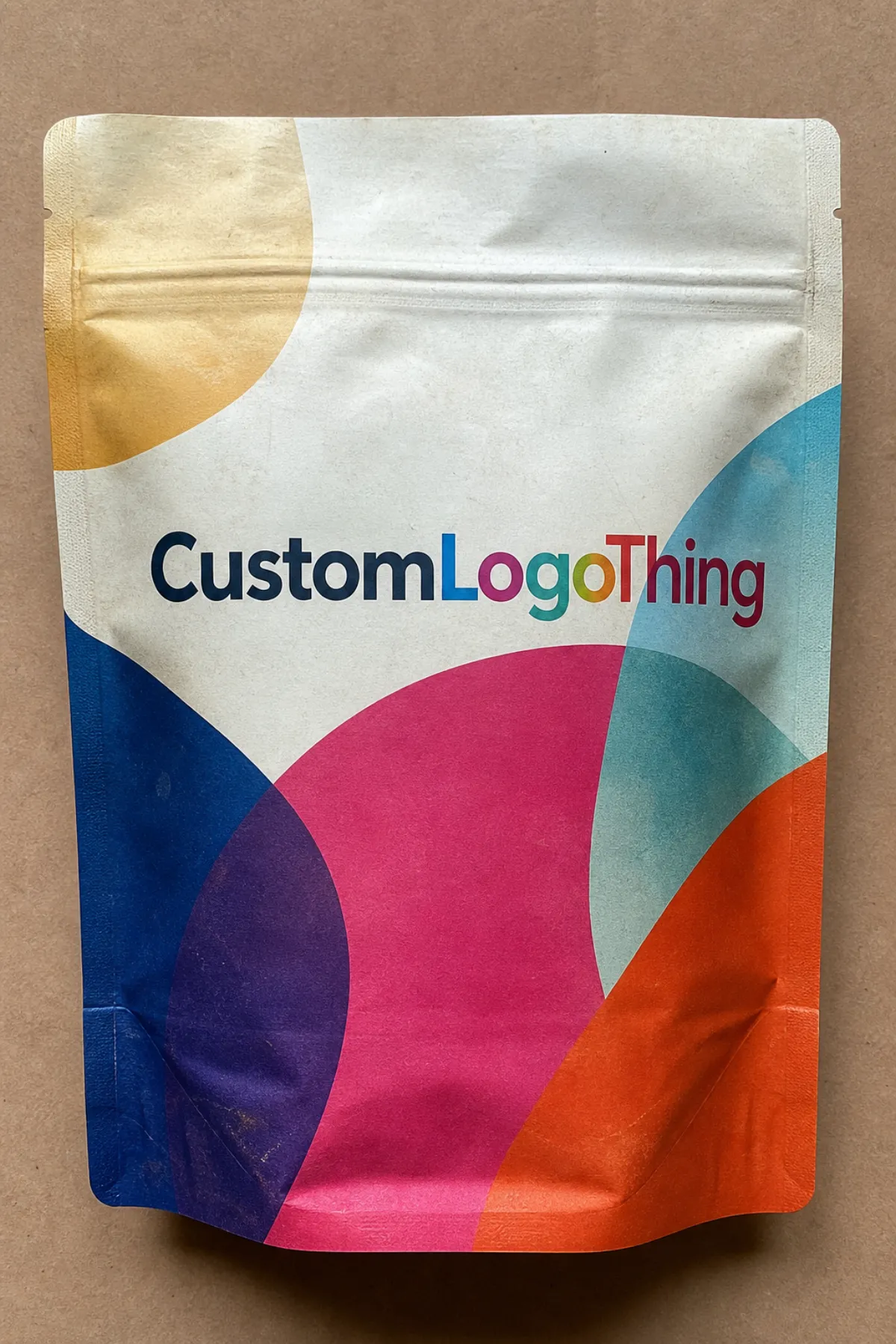
Printed Pouches With CMYK: How to Get Color Right Every Time
Printed pouches with CMYK can look perfect on screen and still arrive looking flatter, darker, or slightly off in a way that annoys everyone who approved the file. That is rarely a sign that the printer “messed it up.” More often, the real problem is upstream: file prep, substrate choice, proofing, or a finish that changes the way the color reads.
If you are buying flexible packaging for snacks, coffee, supplements, pet products, or cosmetics, CMYK is the standard process for full-color artwork. It handles photos, gradients, layered graphics, and subtle shading better than a single ink color. The catch is that the same design can behave very differently on gloss film, matte film, kraft-style laminate, or metalized stock.
So yes, printed pouches with CMYK are dependable. They are also picky. Teams that get repeatable results treat color as a production decision, not decoration.
What Printed Pouches With CMYK Really Mean for Brands
CMYK stands for cyan, magenta, yellow, and black. Those four process colors combine in tiny dots to build the final image. That is why a photograph, gradient, or complex logo can be printed without assigning a separate ink to every shade. For printed pouches with CMYK, that flexibility is the entire point.
From a packaging buyer’s perspective, the biggest advantage is versatility. If your pouch includes a product photo, ingredient panel, flavor band, and a few soft gradients, CMYK can handle all of that in one setup. Spot colors still matter, though. If one brand color has to stay extremely tight across multiple runs or suppliers, a spot ink may hold that standard better than process color alone.
The tradeoff is control. CMYK behaves less like a fixed paint chip and more like a recipe. Change the substrate, ink density, lamination, or press calibration, and the result shifts. That is why a pouch can look rich on one structure and dull on another, even when the artwork file never changes.
The practical split looks like this:
- CMYK works well for photos, gradients, textures, and multi-color brand graphics.
- Spot color works better when one brand color must stay extremely consistent across runs and suppliers.
- White ink or a white base matters on clear, metallic, or dark films because it changes how the colors appear.
- Finish matters because matte, gloss, and soft-touch surfaces change perceived saturation more than most teams expect.
On a screen, everything is a little flattering. Backlit displays make color look brighter than printed film under store lighting. That is why printed pouches with CMYK usually need more proofing discipline than a website graphic or social media post. A pouch is not judged in a controlled design studio. It is judged next to ten competing products under bad retail lighting.
That is the first lesson: the artwork is only one part of the result. Substrate and proofing decide whether the design lands cleanly or gets lost in translation.
How Printed Pouches With CMYK Are Printed
The workflow is straightforward, even if the machinery behind it is not. First, the artwork is checked and separated into process colors. Then prepress adjusts the file for the chosen structure and print method. After approval, the printer outputs the image, cures or dries the ink, and converts the printed web into finished pouches.
Digital printing is often the fastest route for shorter runs, launch samples, and designs that may still change before the market settles. Flexographic printing usually makes more sense for larger quantities, especially when a brand expects repeat orders and wants better unit economics over time. Offset printing is more common in cartons and labels than in finished flexible pouches, but it still matters as a comparison point because it shows how much print method affects color behavior, line clarity, and setup cost.
The color build itself is simple enough. Cyan pushes blues and greens. Magenta gives reds, pinks, and purples their body. Yellow brightens warm tones. Black controls depth, contrast, and text sharpness. Small shifts in ink density can change the whole feel of the pouch. A slightly heavier black can make a design look premium and grounded, or it can crush detail into a dark block. Print does not care about anyone’s mood board.
On clear, metallic, or dark films, a white base layer usually sits underneath the CMYK image. That layer is not decorative. It determines how much light bounces back through the artwork, which is why the same red can look vivid on one pouch and muted on another. If the white underlay is too light, colors wash out. If it is too heavy, they can look chalky or overbuilt.
Registration and calibration matter just as much. If the press is not aligned properly, fine text gets fuzzy, small icons blur, and gradients band instead of flowing. Screen settings, ink viscosity, drying time, web tension, and press speed all influence the result. Good printers do not guess their way through those variables. They control them.
A clean CMYK pouch run usually depends on a chain of small decisions, not one dramatic fix:
- Artwork is built in the correct color mode and at the right resolution.
- The dieline is used accurately so the graphics stay inside safe zones.
- Color expectations are reviewed against the chosen film and finish.
- A proof or sample is checked before full production.
- The press run is monitored so the first good result can be repeated across the whole order.
Treat the proof like a contract, not a screenshot. If the color, finish, and safe zones are wrong on paper or film, the bulk run will not magically fix the design later.
For brands ordering printed pouches with CMYK, that workflow is the difference between “close enough” and “we need another run.” The better the prepress work, the less the press has to compensate.
Key Factors That Change Color, Finish, and Readability
Packaging teams often talk about color as if it lives alone. It does not. Color sits on a surface, under a finish, and inside a structure that folds, seals, and ships. That combination changes how the eye reads the pouch the second it leaves the printer.
Substrate choice is usually the biggest variable. A matte film absorbs light differently than a gloss film. A paper-like laminate adds warmth and usually softens saturation. A metalized structure reflects more light and can make colors look punchier or more temperamental, depending on the underprint. If a brand compares two samples side by side without noticing the substrate change, it is easy to blame the printer for a difference caused by the material.
Finish has the same kind of power. Soft-touch lamination can make a pouch feel expensive, but it also tends to mute color a bit. Spot gloss over matte can create sharp contrast and help certain elements pop. Gloss overall usually gives the deepest visual saturation, though it can also show scuffs more easily. That is why print finishing should never be treated as a last-minute add-on. It affects both appearance and durability.
Artwork rules are where a lot of good designs go sideways. Tiny text below safe thresholds can fill in during print. Thin lines can break apart. Low-resolution images can look fine on a desktop and terrible once enlarged for a pouch. If the design uses rich black, it needs to be built carefully so dark areas do not swallow barcode-like detail, nutrition copy, or small legal text.
For practical packaging design, I usually tell teams to think in terms of viewing distance and handling distance. A front panel that reads well from three feet away may still fail once the pouch is picked up and inspected at arm’s length. That second viewing distance is where font size, contrast, and image sharpness get exposed.
Structural placement matters too. Seams, bottom gussets, zipper tracks, and tear notches can distort logos or cut through copy. The best artwork in the world can still look clumsy if a key line crosses a seal area or if a brand mark lands too close to a fold. On a flexible pouch, the canvas bends. Design for that reality.
There are a few places where teams usually overcomplicate things:
- Using too many small type sizes instead of simplifying the hierarchy.
- Trying to force a perfect screen color match without checking the film and finish.
- Placing critical brand marks near the edges, seals, or zipper path.
- Using photos with weak contrast and then wondering why the pouch feels flat.
Good packaging design is not just about making the pouch attractive. It is about making it survive production. The design should still read well after ink gain, lamination, trimming, and filling.
If you want an outside reference point on packaging and sustainability claims, the FSC site is useful for understanding certified fiber claims, while the ISTA resources are helpful when you need to think about package handling and shipping tests. Those standards do not design the pouch for you, but they do keep the packaging conversation grounded in real conditions.
For brand teams, the best habit is simple: design for the pouch you will actually receive, not the file preview on a calibrated monitor. That sounds obvious, which is usually how packaging mistakes sneak in.
Cost, Pricing, and MOQ for Printed Pouches With CMYK
Pricing for printed pouches with CMYK is driven by a handful of obvious things and a few less obvious ones. Material choice, pouch style, size, print method, finish, and order quantity all move the number. So do windows, resealable zippers, tear notches, rounded corners, gussets, and custom dimensions. Packaging buyers usually know the big items. The little items are where the quote starts wandering.
The easiest way to understand pricing is to think in fixed setup cost plus variable unit cost. Setup does not disappear just because the artwork is beautiful. Proofing, prepress, ink calibration, press setup, and converting all have to happen before the first finished pouch rolls off the line. Once that work is spread across more units, the unit price drops.
Minimum order quantity, or MOQ, affects the math directly. Lower MOQ is useful for launches, market tests, seasonal products, and short shelf-life campaigns. The tradeoff is a higher cost per pouch because the setup cost gets divided across fewer pieces. Higher quantities usually improve unit pricing, but only if storage, cash flow, and demand justify the extra volume.
Here is a practical Comparison for Buyers evaluating printed pouches with CMYK:
| Option | Typical MOQ | Typical Cost Shape | Best Fit | Tradeoff |
|---|---|---|---|---|
| Digital printing | 500 to 3,000 units | Higher unit cost, lower setup burden | Launches, frequent design changes, smaller SKUs | Great flexibility, but less favorable pricing at scale |
| Flexographic printing | 3,000 to 20,000+ units | Lower unit cost as volume rises | Established SKUs, repeat orders, stable branding | More setup and less forgiving if art changes late |
| Short-run hybrid approach | Varies by supplier | Middle ground on cost and volume | Seasonal lines, pilot runs, regional tests | Not always available, and specs can vary widely |
For rough budgeting, many buyers see short-run Custom Printed Pouches land somewhere around $0.20 to $0.70 per unit in small quantities, depending on pouch size, structure, and finish. Larger runs can drop below that, sometimes substantially, but only when the specs are stable and the run is large enough to absorb setup costs. If the pouch includes a zipper, a premium laminate, or complex print finishing, the number climbs. There is no magic price. There is only a quote with all the variables in it.
Ask these questions before comparing vendors:
- Does the quote include prepress, proofing, and one revision round?
- Is the zipper, tear notch, and custom size included or priced separately?
- What finish is quoted: matte, gloss, soft-touch, or spot gloss?
- Are there fees for color matching, extra plates, or special white ink work?
- How much does a reorder cost compared with the first run?
If a quote looks suspiciously low, something is usually missing. Maybe it leaves out finish, shipping, or structural options. Maybe the MOQ is higher than you expected. Maybe the printer is assuming a generic file and will charge later when the artwork needs real prepress work. Cheap quotes are often unfinished quotes.
For many brands, the smarter move is not to chase the lowest number. It is to compare the same brief across two or three suppliers and see what changes. A better pouch at a slightly higher unit cost can outperform a cheaper one if the color stays consistent and the shelf presentation is stronger.
Process and Timeline: From File Prep to Delivery
A clean order does not start at the press. It starts when the file is opened. If the artwork is sloppy, the timeline stretches before production even begins. Buyers who understand the sequence tend to get calmer projects and fewer surprise delays.
Here is the usual order of operations for printed pouches with CMYK:
- File prep and review - The printer checks color mode, resolution, dieline alignment, bleed, safe zones, and font handling.
- Proofing - A digital proof or printed sample is shared for color, layout, and copy review.
- Approval and corrections - Any changes are made before the run is locked in.
- Print setup - Ink calibration, material loading, registration tuning, and finishing setup happen here.
- Production - The pouches are printed, dried or cured, laminated if needed, and converted.
- Inspection and shipping - The finished order is checked, packed, and sent out.
In many projects, proofing and revisions take longer than the actual printing. That surprises people, but it should not. Press time is only one slice of the calendar. Color approval, copy changes, and finish decisions are what slow the job down.
Realistic timing depends on the supplier and the complexity of the pouch, but these ranges are common:
- Simple digital short runs: often 7 to 12 business days after approval.
- More complex custom runs: often 12 to 20 business days after approval.
- First-time projects with multiple revisions: 3 to 5 weeks is not unusual.
- Rush jobs: possible in some cases, but they usually cost more and leave less room for color correction.
Holiday demand, raw material sourcing, and color corrections can all stretch lead time. If the pouch requires special laminates, unusual finishes, or an imported film structure, add extra time. If the artwork is clean, the proof is approved quickly, and the material is in stock, the job can move much faster.
That is why launch planning matters. If a product has a firm retail date, build backward from the delivery deadline and leave room for the proof cycle. Do not assume a rush order will fix a late design. It usually fixes nothing except the printer’s mood.
One useful rule: if packaging is part of a campaign launch, the artwork brief should be finalized before the sales plan starts getting louder. The print calendar has no sympathy for last-minute marketing optimism.
Common Mistakes That Ruin Printed Pouches With CMYK
The failures are usually boring. That is what makes them expensive. Most bad pouch jobs do not collapse because the printer forgot how color works. They collapse because someone skipped a basic check and hoped the press would fix it. It will not.
First mistake: sending RGB art. Screens use RGB. Press uses CMYK. If a file stays in RGB too long, the colors can shift during conversion, especially bright blues, greens, and vivid oranges. Some changes are subtle. Others are brutal. The fix is simple: convert intentionally and inspect the result before approval.
Second mistake: using dark backgrounds without enough contrast. Deep colors can make a pouch look premium, but they also eat detail. Tiny white text on a dark field can survive, but only if the type is large enough and the background is printed cleanly. If the design relies on thin lines or low-contrast copy, the pouch can become hard to read from a shelf or counter.
Third mistake: approving only on screen. A monitor is not the pouch. It is not even close. Screens are bright, backlit, and usually more forgiving than print. A proof in real light is where weak contrast, muddy neutrals, and over-dark shadows show up.
Fourth mistake: ignoring bleed and safe zones. Artwork that looks fine on a flat file can get clipped by trims, seals, and folds. This is especially annoying when a logo lands near the edge and loses a few millimeters in production. Those few millimeters are enough to make a premium pouch look careless.
Fifth mistake: changing finish late. A finish change can alter the entire feel of the printed pouch even if the artwork does not move one pixel. Matte, gloss, and soft-touch do not just change the touch. They change contrast, glare, and perceived richness.
There is also a mistake people make with brand colors. They assume every red, blue, or green can be reproduced as if the packaging world were a Pantone chart with infinite patience. It is not. Some colors can be matched closely in CMYK. Others need spot color support, especially if the brand needs repeatable precision across multiple packaging lines.
If your design depends on one exact logo color, ask for a hard proof or a matched sample. Do not rely on a laptop preview and a vague hope. Hope is not a color standard.
For buyers managing multiple SKUs, the safest habit is to set a packaging checklist before the artwork goes out. Confirm the color mode, bleed, dieline, safe area, finish, and any exact brand color requirements. That checklist is boring. It also saves money.
Expert Tips and Next Steps for Better CMYK Pouches
The best way to improve printed pouches with CMYK is not to overdesign them. It is to control the variables that actually matter. Clear file prep, realistic color expectations, and the right proofing step will do more than any decorative effect ever will.
Start with a simple packaging checklist:
- Artwork in CMYK, not RGB.
- High-resolution images, ideally 300 dpi at final size.
- Bleed included and safe zones respected.
- Fonts outlined or embedded.
- Brand colors reviewed against the final substrate and finish.
- Barcode, nutrition, and compliance text checked for legibility.
If color accuracy matters more than speed, ask for a printed proof or a sample pouch. That is especially useful for coffee, premium snacks, cosmetics, and health products where color is part of the shelf identity. A proof lets you see how the image behaves on the actual material instead of guessing through a monitor.
Do not crowd critical design elements near seals, zippers, and folds. Build breathing room into the layout. A cleaner layout is easier to print, easier to inspect, and easier for customers to read. If the artwork needs to carry a lot of information, use hierarchy instead of squeezing everything into the same visual weight.
Compare quote options with the same artwork brief. That one step exposes a lot. One supplier may include a better finish, another may be pricing a higher MOQ, and a third may be bundling prepress differently. If you do not compare the same spec, you are not comparing prices. You are comparing assumptions.
For launch timing, leave room for one review round and one proof round at minimum. If the design is new, assume there will be a correction. That is not pessimism. That is packaging reality. The calendar gets shorter after approval, not before.
If the pouch is part of a product line, keep your structure and finish choices consistent across SKUs unless there is a good reason to vary them. A family of pouches looks stronger on shelf when the visual system holds together. Different flavor colors are fine. Random changes in gloss level, contrast, or zipper placement are not.
And if you are still deciding between printed pouches with CMYK and a spot color-heavy approach, the decision usually comes down to this:
| Decision Point | Choose CMYK When | Choose Spot Color When |
|---|---|---|
| Artwork style | You need photos, gradients, or multiple tones | You need flat color blocks and a strict brand match |
| Run size | You want flexible, variable, or shorter runs | You have a stable SKU with repeat production |
| Brand control | Close color consistency is acceptable | The color must stay extremely tight across launches |
| Budget | You need broad artwork flexibility without extra inks | You can justify extra setup for precise color control |
The best pouch programs do not force one answer for every product. They use CMYK where it makes the most sense and spot color where precision matters enough to pay for it.
The practical sequence is simple: send a press-ready file, ask for a proof, confirm the finish and MOQ, and approve production only after the sample looks right in real light. That is the cleanest path to printed pouches with CMYK that match the brand instead of just flattering the design file.
FAQ
Are printed pouches with CMYK good enough for exact brand colors?
Usually yes for full-color graphics, gradients, and photo-heavy branding. For a strict brand color, ask whether a spot color, matched proof, or tighter press standard is needed. The final result still depends on the film, finish, ink density, and printing method, so expect some variation unless the process is tightly controlled.
Why do printed pouches with CMYK look darker than my screen?
Screens are backlit, while printed pouches are viewed in reflected light. That alone makes the same artwork look less bright in real life. Matte films and soft-touch finishes usually mute color more than gloss surfaces, so if the design needs to stay open and readable, lift the midtones and avoid heavy shadow blocks.
What file should I send for printed pouches with CMYK?
Send a press-ready PDF, AI, or layered design file with the artwork converted to CMYK. Include the dieline, bleed, safe area, and any notes on finishes or color-sensitive areas. Outline fonts or embed them, and check image resolution before you hand it off, because low-res art gets expensive fast.
How does MOQ affect printed pouches with CMYK pricing?
Lower MOQ usually means a higher unit cost because setup is spread across fewer pouches. Higher quantities usually reduce the per-pouch price once print preparation is already paid for. Ask for quote breaks at the quantities you might actually reorder, not just the lowest number the supplier can technically make.
How long do printed pouches with CMYK usually take?
Clean files move faster, while messy artwork and multiple proof rounds slow everything down. Proofing, approval, and material sourcing can take longer than the actual print run. Rush jobs are possible, but they usually cost more and leave less room for color correction, which is a fun way to spend money badly.
Printed pouches with CMYK are dependable when the artwork, substrate, finish, and proofing step all line up. Ignore one of those pieces and the result starts drifting. Control them and the pouch looks like it belongs on the shelf, not like it was rescued from a laptop preview. The takeaway is simple: lock the file, confirm the proof in real light, and do not approve a CMYK pouch until the material, finish, and color behavior all agree with the brand.


