Printed Snapback Caps Artwork Checklist for Sports Team Stores sounds like an administrative chore, but the real job is risk control. Most bad cap orders do not fail because the blank cap was poor. They fail because the artwork never got tested against the method, the crown shape, the stitch limits, or the proofing process that turns a logo into sellable retail inventory.
Sports team stores make that problem louder. A one-off merch order can survive a little fuzziness. A seasonal team launch cannot. You are managing sponsor logos, school colors, player numbers, size runs, and a deadline that is usually tied to a game, a fundraiser, or a release date that already has customers waiting. A good checklist keeps those moving parts from colliding.
The buyer mindset matters here. You are not asking whether the art looks impressive on a screen. You are asking whether it can be produced cleanly, reordered later, and sold without explaining away flaws. That is why a practical printed snapback caps artwork checklist for sports team stores is less about design taste and more about production discipline.
Printed Snapback Caps Artwork Checklist for Sports Team Stores
The blunt version: if the art is messy, the order will be messy. A snapback cap can be a strong retail item, but it will not rescue a low-resolution logo, a vague proof, or a file that only works at billboard size. The checklist exists to catch those mistakes before anyone burns time or money.
For team-store programs, the checklist also keeps everyone aligned on the details that matter after the mockup looks "good enough." Front-panel size, side placement, closure type, logo hierarchy, sponsor lockups, and whether the design should stay flat or follow the curve of the crown all affect how the cap will actually look in hand. A coach may care about identity. A retail buyer may care about shelf appeal. A decorator cares about whether the file can be built without guesswork. The checklist has to satisfy all three.
Most failures are not dramatic. They are small mismatches that pile up: the proof uses screen color instead of a production color reference, the logo came from a website download, the lettering is too fine for the chosen method, the side mark lands on a seam, and nobody signed off in writing. Each issue sounds minor. Together, they create delays that are expensive for the order and irritating for everyone involved.
One clear approval is better than five rounds of "small" comments from five different people. In team-store work, unclear ownership is usually the first thing that slows production.
The checklist also changes the way the order is framed. Instead of asking, "Can you put our logo on a cap?" the buyer asks, "Can this logo survive the decoration method, placement, and quantity we need?" That question is sharper. It forces the order away from assumptions and toward production realities.
What Your Artwork File Must Include
A usable file set starts with the right format. Vector artwork is the standard for a reason: AI, EPS, and editable PDF files keep edges clean and prevent the artwork from falling apart when it is scaled. A JPG from a website can be a reference, but it should not be the only file unless you are prepared to pay for cleanup that should have been avoided from the start.
For decorated snapbacks, the file should also include outlined fonts, clean paths, and a version that still reads at front-panel size. A wordmark that looks sharp at 12 inches wide can lose its shape at 2.5 inches. That is where tiny taglines, hairline borders, and crowded mascots disappear into the stitching or the patch weave.
Color is another place where buyers get tripped up. A monitor shows light, not production ink, thread, or patch material. Pantone references are useful when the method supports them, but the proof should also say what was actually selected for production. If the decoration method uses thread or patch stock, ask for the closest available match rather than assuming the exact screen color can be duplicated.
When I review cap artwork, these are the items that should be settled before approval:
- Logo source: original vector file, not a screenshot or social media crop.
- Placement: front, left side, right side, back, or closure area.
- Size: final width and height for each decorated location.
- Color reference: Pantone, thread match, print values, or approved patch colors.
- Text handling: outlined, simplified, or removed if the lettering is too small.
- Special notes: gradients, thin outlines, border lines, trademark marks, and anything that cannot be altered.
Text needs a separate warning. On a curved crown, tiny lettering gets ugly fast. As a practical rule, anything below about 0.2 inches tall for embroidery is risky, and even larger copy can crowd out once a logo is stitched or heat-applied. If the design depends on small wording, ask whether it should be enlarged, simplified, or cut before the proof is signed off. A cleaner cap is better than a technically accurate one that nobody can read.
Most team-store programs also have a separate packaging or insert requirement, and that should stay separate from the cap artwork itself. If the order includes retail packaging, it is smarter to document sustainability claims with a real standard than with vague language that sounds impressive. For paper-based materials, FSC is a useful reference point when the claim actually matters.
Decoration Methods and Placement Rules
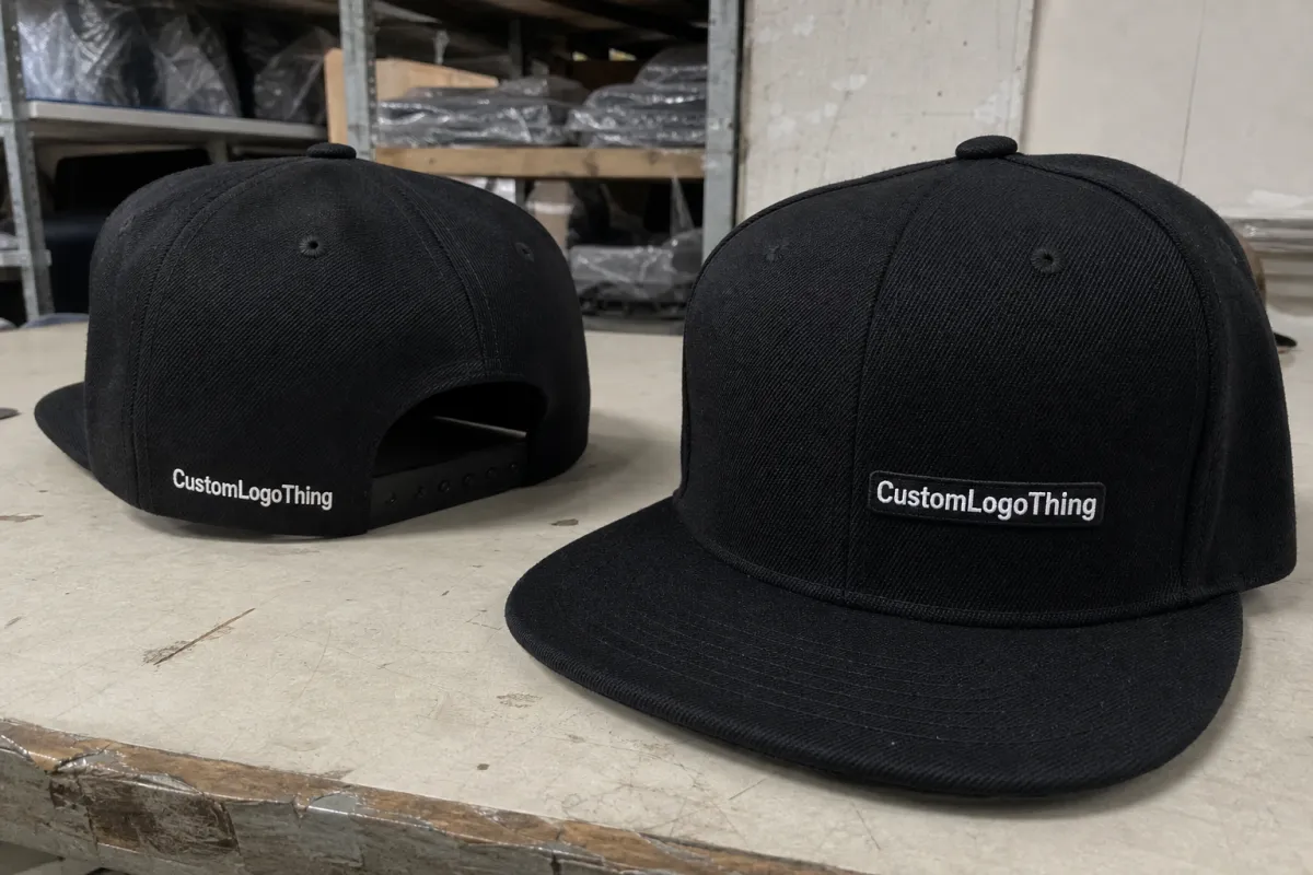
Snapback caps can be decorated several ways, and the art needs to fit the method instead of fighting it. Embroidery is still the most common option for sports team stores because it feels durable and looks premium. Woven patches, leather patches, PVC patches, and heat-applied graphics all have a place too, but each one changes the rules.
Embroidery wants bold shapes, clean spacing, and reasonable stitch counts. Once stitch counts get high, usually around 8,000 to 10,000 for a front logo, the cap starts to feel heavier and the price usually climbs with it. Woven patches can hold more detail than embroidery, but tiny lettering still breaks down faster than buyers expect. PVC patches work well for simple logos with strong outlines and a sports-heavy look. Leather patches are strongest when the design can be reduced to a few clean marks. Heat-applied graphics can carry more nuance, but they still need a file that prints cleanly and respects the curve of the cap.
The cap itself matters more than many proofs admit. A front panel is not a flat sheet. The crown curves, seams interrupt the image, and fabric behavior changes depending on the structure. Most team-store snapbacks are structured six-panel caps with a flat brim and a snap closure, often in polyester twill, cotton twill, acrylic blends, or recycled synthetics. Those materials do not all take decoration the same way. A design that looks balanced on a digital mockup can still sit too low, clip a seam, or distort once it is stitched or pressed.
For planning purposes, these are the basic placement rules I use:
- Front embroidery: best for bold team marks, often kept around 2.25 to 2.75 inches wide for cleaner placement.
- Side placement: useful for secondary marks, but the design should be smaller and simpler so it does not fight the seam.
- Back area: good for names, numbers, or small identifiers, though the closure can reduce usable space.
- Complex logos: often need simplification or patch treatment if they include gradients, tiny type, or layered effects.
Two details get ignored too often: stitch density and negative space. Dense art can become stiff and heavy, especially on a low-profile or soft-structured cap. Art with too little open space fills in fast, and the result is usually a logo that looks muddy from a few feet away. A solid checklist forces those issues into the open before sample approval instead of after the run is finished.
For shipping-heavy programs, packaging and distribution also matter. If caps are going out in club packs, retail cartons, or mixed orders, they should be handled like product, not loose merch tossed into a box. Transit testing standards from ISTA are a useful reference when the order has to survive real movement instead of a clean handoff at the dock.
Pricing, MOQ, and Unit Cost Drivers
Team-store buyers usually ask the same first question: what will this cost? Fair question. The answer depends on decoration method, quantity, setup work, and how much cleanup the artwork needs before production starts. Asking for one all-in number before the art is reviewed usually hides the real cost drivers.
Blank snapback caps often land in a rough range of $4 to $10 per unit, depending on fabric, structure, and blank brand. Decoration then gets added on top. Simple embroidery may add about $1.25 to $3.50 per cap. Woven patches often land around $1.75 to $4.00. PVC patches can sit around $2.50 to $5.50. Heat-applied graphics are often lower on the decoration side, but setup and proofing still apply. Those numbers move with quantity, stitch count, color count, and coverage. Pricing is rarely mysterious once the real inputs are visible.
Minimum order quantity changes the economics fast. A small run can look cheap until setup, digitizing, patch tooling, and proof time are included. Once the order gets larger, the setup cost spreads out and the unit price usually settles down. That is why a 24-piece store order often feels expensive while a 250-piece replenishment order usually looks much more reasonable.
| Decoration option | Typical setup burden | Common unit range | Best use | Main watch-out |
|---|---|---|---|---|
| Embroidery | Digitizing, stitch approval | $1.25-$3.50 | Bold team logos, classic cap look | Tiny text and fine detail can disappear |
| Woven patch | Patch art cleanup, border approval | $1.75-$4.00 | Sharper detail than embroidery | Very small copy still gets messy |
| PVC patch | Mold or tooling, color lock | $2.50-$5.50 | Clean shapes, sport-heavy branding | Needs simplified art and strong outlines |
| Heat-applied graphic | Artwork prep, print setup | $0.90-$2.25 | Lower-cost runs, more color detail | Durability and hand-feel vary by material |
Do not let the quote hide the details. Ask for product cost, decoration cost, setup cost, and shipping as separate lines. If the supplier bundles everything into one number, you lose control over revisions and you have fewer clues when the price changes later. Clear line items make method comparisons much easier and make fake bargains easier to spot.
Artwork Process, Timeline, and Turnaround
The artwork process should be boring. Boring means predictable. You submit files, someone checks the art, a proof comes back, you approve or request revisions, and production starts. Every extra loop costs time, and team-store launches usually do not have much of it.
A simple file can often be reviewed in 1 to 2 business days. If the logo needs cleanup, that can stretch to 3 to 5 business days. If the decoration method involves a sample patch, a color correction, or a more detailed mockup, add another few days. Production after approval commonly lands in the 7 to 15 business day range, depending on quantity and method. Rush orders are possible, but they usually get delayed by slow approvals rather than factory capacity.
The fastest buyers are not the loudest buyers. They are the ones who answer clearly and designate one decision-maker. Multi-person approval chains are the usual culprit. Somebody wants the mascot darker. Somebody else wants the sponsor larger. A third person notices the name font and wants it matched to a jersey that is already out of stock. The calendar loses every time.
Here is the cleanest workflow:
- Submit the original logo file and any brand references.
- Confirm cap style, color, and decoration method.
- Review the digital proof for size, placement, and color notes.
- Request one round of changes only if needed, and keep them specific.
- Approve in writing so production can move without guesswork.
If the cap launch is tied to a season opener, fundraiser, or merchandise drop, build backward from the date you actually need inventory in hand. Leave room for proof corrections, not just manufacturing time. A smart schedule includes shipping days too, especially if the order crosses state lines or sits behind other jobs in a busy week.
One more practical point: if you expect reorders later in the season, keep the approved proof, final art files, and placement notes together. Nothing slows a second run more than trying to recreate a design from memory after three people have "just one small change."
Step-by-Step Approval Checklist for Team Stores
Here is the approval pass I would use before releasing a team-store cap order. It is not glamorous. It works.
- Verify the source file. Make sure the logo came from an official brand package, not a web screenshot or old social media graphic.
- Check the art quality. Confirm vector format, outlined type, and clean edges before anyone starts proofing colors.
- Read every word. Spelling errors on team names, mascots, sponsor names, and player identifiers are expensive and completely avoidable.
- Confirm placement. Front, side, back, and closure areas should be marked clearly, with the final size listed for each one.
- Lock the production method. Embroidery, patch, or heat-applied graphics should be named in writing, not assumed from a mockup.
- Check colors. Use Pantone references, thread notes, or approved patch colors so the final run does not drift.
- Name one approver. One person signs off, even if several people review internally first.
- Save the proof. Keep the final approved version and the order notes in one place for later reorders.
That last step matters more than people think. Reorders go faster when the supplier can pull the same cap, artwork, and placement notes without rebuilding the file chain from scratch. If a team store is going to restock, it should restock from a clean record, not from whatever got buried in email last month.
If the proof does not say exactly what was approved, it was not really approved. It was just viewed.
Be strict about what changes after approval. A lot of problems start when someone says, "We only moved the logo a little." On a curved cap, little changes can be the difference between balanced and awkward. Lock the art before production release. That is the point of the checklist.
Common Mistakes That Trigger Reprints
The classic reprint triggers are boring, which is annoying because boring mistakes cost real money. Tiny text, thin outlines, wrong file format, and low-resolution images are still the most common failures. They keep happening because someone always thinks the logo will be "fine once it is on the cap." Usually it will not be fine.
Embroidery has its own failure modes. Overcrowded letters fill in. Thin internal spaces disappear. Complex shading turns into a muddy patch of thread. If the design includes multiple color transitions or very small details, it should be simplified before production, not after the first sample looks rough.
Placement errors are sneaky. A logo can sit too low on the crown, drift into a seam, or crowd a side panel where the cap curves too sharply. Mockups do not always reveal that well, especially if the proof was rushed or the art was scaled to look "balanced" rather than positioned precisely.
Team-store-specific mistakes are even more painful because they are public. Outdated mascots. Wrong sponsor lockups. Old season branding. Player numbers pulled from the wrong roster. A reprint charge is annoying, but a room full of unsellable caps is worse. That inventory sits there as a reminder that somebody skipped the checklist.
The real cost is bigger than the correction invoice. You lose launch timing. You lose trust with the buyer. You may need another approval round, another shipment, and another explanation about why the "simple" order was not simple. That is why a printed snapback caps artwork checklist for sports team stores should be treated like production insurance, not busywork.
Expert Tips and Next Steps Before You Order
Before you approve, do one final preflight pass. Put the art file, the proof, and the order form side by side. Check the decoration method, placement, color references, size, and quantity line by line. If anything drifts between those documents, fix it before production release.
Keep a master file package for future orders. That package should include the approved artwork, color references, placement notes, cap style, and any supplier comments about what had to be simplified. Reorders go faster when the record is complete and nobody has to rebuild the art from memory.
If the logo is complex, ask for a sample image or sample cap before you approve the full run. That does not mean every order needs a sample. It means the complicated ones do. Spending a little on a proof is cheaper than learning that 100 caps were too detailed to read cleanly on a curved front panel.
From a buyer's point of view, the best orders are the ones that get boring after approval. No mystery files. No color debates. No "we thought the sponsor would be bigger." Just a clean package, a clear record, and a product that matches what the team store expected.
If you keep the checklist in play from the first file review through final sign-off, you cut the noise out of the order and give yourself a much better shot at a clean launch. That is the part people skip right before they pay for it.
What should I send for a printed snapback caps artwork checklist for sports team stores?
Send a vector logo if you have one, plus brand color references, placement notes, and the cap color you want. Include the decoration method too, because embroidery, patch work, and heat-applied graphics all need different file prep. If all you have is a low-resolution image, expect cleanup work before production can start.
How do I know if my team logo is too detailed for a snapback cap?
If the logo has tiny text, thin lines, crowded details, or gradients, it is probably too detailed for a clean cap application. Embroidery and patch methods need bold shapes and enough spacing to stay readable on a curved crown. Ask for a simplified production version before you approve the proof.
What affects the price of printed snapback caps for team stores?
Decoration method, number of colors, setup work, blank cap quality, and order quantity drive most of the cost. Small runs usually cost more per unit because setup gets spread across fewer pieces. Special finishes, custom patches, and rush timing can raise the final price quickly.
How long does approval and production usually take?
Simple artwork can move fast, but revisions and multi-person approvals often slow the process. Sampling, patch development, and color matching can add days or even weeks depending on complexity. The fastest turnaround usually happens when one clear approver replies quickly and decisively.
Can I reuse the same art for reorders later in the season?
Yes, if you save the approved artwork, color notes, placement details, and cap style used. Keep the final proof and any supplier comments together so the next order matches the first one. Reorders go much smoother when the artwork package is complete and nothing has to be rebuilt.