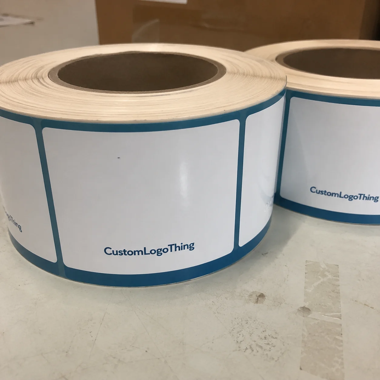
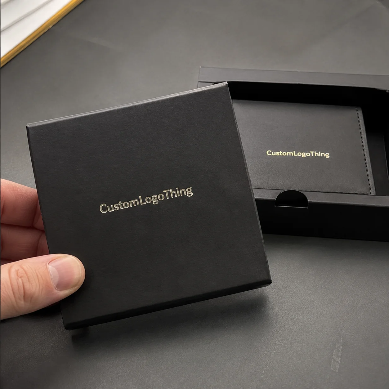
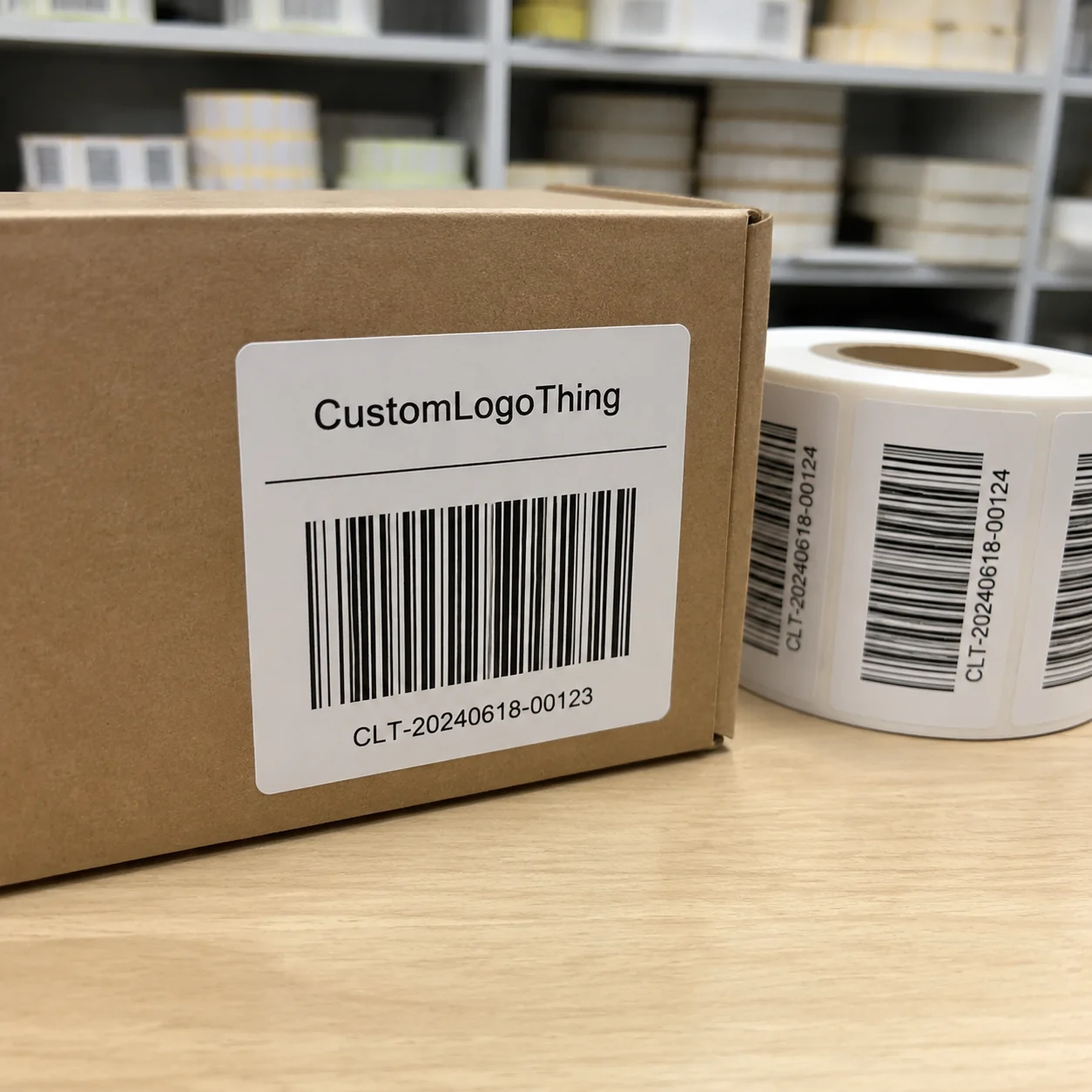
A printed woven labels Quote for Skincare should tell you more than a price per thousand. It should also reveal whether the label will suit the container, the pack format, the artwork detail, and the conditions it will face after it leaves production. A label that looks refined in a proof can still fail on a jar shoulder, a gift pouch, or a folded insert if the fabric structure, fold style, or finish is wrong for the job. That is why good quoting starts with the product, not just the artwork.
Skincare packaging asks a lot from a small component. The label may need to sit on a tube, wrap onto a pouch seam, be tucked into a box insert, or hang from a gift set without looking bulky. It also needs to stay readable under bathroom lighting, survive handling during packing and shipping, and match a brand system that often depends on restraint rather than heavy ornament. When the package itself is premium, the label has to support that impression without drawing attention for the wrong reasons.
Why skincare labels fail when the fabric choice is wrong
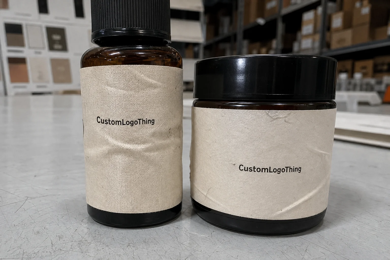
The most common label problems are not dramatic; they are small distortions that add up. A weave that is too open softens the logo edges. A body that is too stiff makes the label lift awkwardly on a curve. A bulky edge can catch the eye in a way that makes the pack look less finished, even if the rest of the design is strong. On a compact skincare pack, those details matter because there is often very little room for visual correction once the label is attached.
Moisture is another practical concern. Skincare products are frequently stored in bathrooms, travel kits, and refill stations where condensation, handling, and repeated contact are part of normal use. A label designed for dry, flat packaging may not hold up well if it is placed on a curved bottle, a soft pouch, or a secondary package that is handled often. The right construction keeps the label legible and stable without creating extra work during filling or assembly.
Printed woven labels are often chosen for secondary packaging and premium brand details because they offer a cleaner presentation than many basic tags. They are especially useful when the artwork includes small type, fine lines, or a restrained logo that needs precision rather than texture. Buyers comparing a printed woven labels Quote for Skincare are usually balancing that level of detail against how the label will actually function in production.
From a buyer’s point of view, the best label is rarely the most elaborate one. It is the one that looks right on the finished pack, runs reliably through the line, and lands at a cost that fits the launch plan. That means the quote should reflect the real use case: sewn, folded, inserted, attached, or packed loose for later application.
Printed woven label construction and finish options
Printed woven construction begins with a woven base and then applies the brand artwork through a print process or a print-like finish, depending on the supplier’s method. The base material, weave density, and finishing choice all influence the final appearance. Tighter weaves usually support finer detail, while softer or more open constructions can feel lighter but may soften tiny letterforms. That tradeoff is important in skincare, where a clean logo and small product text often carry the whole visual system.
Two labels with the same dimensions can behave very differently once they are produced. A finer face can help small icons and thin serif type stay legible. A smoother backing can make the label feel more premium against packaging materials like satin pouches or coated cartons. On the other hand, a denser construction may raise unit cost and reduce flexibility on curved or narrow surfaces. The better choice depends on where the label will sit and how visible it needs to be.
Common finish styles include center fold, end fold, loop fold, and straight cut. Each one changes the way the label lays on the product and how much of the artwork remains visible. Center fold is useful when the label must wrap around an edge or tuck into a seam. End fold hides the raw edge and can feel cleaner on soft goods or premium packaging inserts. Straight cut is simple and cost-efficient, but it is not always the best option if the label will be handled often.
Skincare brands typically use printed woven labels in a few practical places:
- Sewn into cosmetic pouches or travel kits
- Inserted into tissue wraps or box liners
- Attached to refill pouch closures
- Used on gift-with-purchase items
- Added to outer sleeves or secondary packaging details
One detail that gets missed often is the reverse side. If a label folds, the back can affect how the package looks during packing and shipping. That matters when a brand wants a clean presentation from every angle. Artwork scale matters too. A logo that looks sharp on screen may blur if the weave is too coarse for the lettering size or if the label is asked to carry too much information in too small an area.
That is especially true when a label needs to include care notes, a batch reference, or a short handling instruction. Trying to fit a logo, micro text, and a decorative border into a tiny space usually creates a crowded result that is hard to read. Clean spacing does more for the final package than adding extra elements.
Material choice should also match the way the pack is assembled. A label that will be sewn or stitched into a pouch needs a different edge treatment than one that will sit inside a folded carton or be tied onto a gift set. If the production method is unclear at the quoting stage, the supplier may price conservatively to protect against rework. That usually means a higher quote than necessary.
Specifications buyers should confirm before requesting a quote
The cleanest path to an accurate Printed Woven Labels Quote for skincare is to send complete specifications the first time. At minimum, that should include finished size, fold style, artwork file format, color count or print method, background color, and whether the labels will be delivered loose or on rolls. If any of those details are missing, the quote may look competitive at first and then change once the production team has to fill in the gaps.
Thread density and fabric texture deserve more attention than many buyers give them. Minimal skincare branding often uses slim typography, tight letter spacing, and restrained color. That style can look elegant, but only if the material supports it. A finer weave usually keeps small lettering more readable. A more open construction may be fine for larger branded pieces, but skincare packaging often needs cleaner edges because the artwork is doing most of the work in a small visual field.
It also helps to explain the use environment. Will the label be exposed to moisture? Will it wrap around a curved container? Will it be seen from the front only, or from both sides? Is it going into a pouch, a folded carton, or a gift set? These details influence material choice, fold style, and whether a simple construction will do the job. If the label needs to fit into a larger brand system, include the related packaging specs as well so the quote reflects color and sizing consistency.
Artwork prep is another place where delays start. Vector files are the safest option because they keep edges sharp and scale cleanly. Pantone references are useful if color match matters; CMYK can work for certain printed effects, but it does not always give the most controlled result on woven material. Designs with ultra-fine serifs, gradients, or metallic-looking tones should be reviewed carefully because they may not translate the way they do on screen or on coated paper.
“If the label brief is incomplete, the quote usually is too. The questions that save time are rarely glamorous: size, fold, file type, and where the label actually sits on the pack.”
For brands that manage quality standards tightly, packaging testing may also sit alongside label approval. Woven labels are not typically specified by a single universal skincare rule, but they do need to survive handling and shipping conditions that are similar to broader packaging distribution tests. General resources from ISTA can help frame packaging durability expectations, and sustainability references from EPA packaging resources can be useful when material selection is part of a broader sourcing decision.
Printed woven labels quote: cost, MOQ, and unit price factors
Cost depends on a handful of variables, most of which are easy to predict once the spec is clear. Size, weave density, fold style, print complexity, edge finishing, quantity, and packaging format all affect the final number. If the labels need to be sorted in a specific order, banded into bundles, or packed for retail-friendly distribution, that adds labor and can shift the unit price.
MOQ, or minimum order quantity, is usually tied to production efficiency rather than an arbitrary sales rule. Small runs can be done, but the unit cost is often higher because setup, proofing, and finishing labor are spread across fewer pieces. As quantities increase, the price per label usually drops because the fixed work is distributed more efficiently. That does not mean a larger order is always the right move; it simply means buyers should understand where the price breakpoints sit before they plan a launch.
For practical comparison, a simple printed woven label at 5,000 pieces will usually sit in a different price band than the same label at 20,000 pieces, especially if folding or detailed finishing is involved. The exact numbers vary by construction and artwork complexity, but short-run pricing almost always feels higher per unit than repeat-order pricing. A tiered quote is the most useful format because it shows the cost curve instead of just one number.
| Option | Typical use | Relative unit cost | Best for |
|---|---|---|---|
| Simple straight-cut printed woven label | Basic brand mark, low-detail icon | Lower | High-volume packaging with simple artwork |
| Folded printed woven label | Seam applications, tucked presentation | Moderate | Pouches, inserts, premium secondary packs |
| Fine-weave custom label with detailed print | Small text, refined logo, premium finish | Higher | Luxury skincare, gift sets, brand systems with strict visual control |
The lowest quote is not always the least expensive choice in practice. If a label frays, reads poorly, or looks mismatched beside the carton or pouch, the cost of rework can erase the savings quickly. That is especially true in skincare, where packaging often needs to support a premium shelf price and a polished unboxing experience.
When asking for pricing, include the dimensions, quantity tiers, artwork file, application method, and target delivery date. If several SKUs share similar tooling or the same fold style, mention that too. Shared specs can sometimes simplify setup and improve pricing across the range. For brands comparing broader label formats, our Custom Labels & Tags page is a useful place to review construction options before finalizing a brief.
Process and timeline from artwork review to delivery
The usual workflow is straightforward, but each step depends on getting the previous one right. It starts with the inquiry, moves through file review and proofing, then sample approval if needed, followed by production, finishing, quality control, and shipment. A clean process matters because skincare launches often depend on several packaging components arriving in sync: jars, closures, cartons, inserts, and labels.
Delays usually come from the same few places. Artwork that is not vector-ready slows proofing. Fold orientation that is not clearly specified can trigger back-and-forth. Container dimensions that are still changing make it hard to confirm fit. If the packaging form is not final, a label may need to be reworked after the first proof, even if the artwork itself is simple.
Production time depends on the order. Repeat orders with confirmed specifications tend to move faster because the setup is already established. New constructions, custom color matching, and detailed approval rounds take longer because there is more to verify before production starts. A reorder can sometimes move on a tighter schedule, while a first-time label for a launch usually needs a wider planning window.
Most buyers can shorten the schedule by approving proofs quickly, confirming quantities early, and aligning the label delivery date with filling and assembly. If the launch is tied to seasonal sets or retailer deadlines, build in buffer time. Even a well-run order can slip if approvals move slowly. That is not a production issue so much as a planning one.
Quality control should not be treated as an afterthought. A useful check includes color consistency, fold accuracy, cut or edge finish, readability of small text, and overall label count against the purchase order. For skincare, one more visual check is worth doing: make sure the label looks clean under bright light, not just in neutral proof lighting. A label can pass inspection on a desk and still look off once it is attached to reflective packaging.
For brands considering material sourcing across the wider pack, FSC-certified paper components may also enter the discussion, especially if the label sits inside a carton-based system or a mixed-material set. General information about certification is available through FSC if sustainability claims are part of the brief.
Why packaging buyers choose a specialized label manufacturer
Packaging buyers do not choose label suppliers the way a casual shopper chooses a decorative accessory. They need a manufacturer that understands small-format branding, how readability changes with material choice, and how a label behaves once it moves from the proof stage into real packaging. That practical knowledge matters in skincare because the product often relies on subtle visual cues rather than large graphics.
Consistency is one of the biggest reasons buyers stay with a specialized partner. A repeat order should match the original color, fold, and sizing as closely as possible, especially when the labels are part of a product family. If one SKU comes back slightly darker, slightly wider, or folded differently, the line starts to look uneven. Careful manufacturing control helps avoid that drift.
Technical guidance at the quoting stage is another advantage. A good label manufacturer can suggest a simpler fold, a cleaner weave, or a more efficient size without harming the final presentation. That is not about cutting quality; it is about choosing specs that fit the package, the budget, and the way the product will actually be sold and handled.
Clear communication also matters. A specialized team is more likely to ask for the details that prevent avoidable mistakes: where the label sits on the pack, whether it will be folded or sewn, how small the type is, and whether the artwork needs to match an existing line. Those questions may feel tedious, but they are usually what makes the difference between a quote that looks good and one that actually works.
Next steps to request an accurate custom quote
If you need a Printed Woven Labels Quote for skincare, start with the basics: logo file, finished size, label type, quantity, fold or finish preference, and application method. Add a short note about where the label will live on the product, whether that is a jar, pouch, carton, or gift set. The clearer the use case, the easier it is to match the construction to the packaging.
Reference photos help more than most buyers expect. A picture of the container, sleeve, or pouch gives context on scale, texture, and finish level. Two labels can be the same size on paper and still behave differently once they are attached to a curved bottle or placed inside a premium box. Visual reference often sharpens the quote faster than a long email thread.
Ask for pricing at multiple quantities. A launch order of 5,000 pieces may make sense now, but a replenishment run at 10,000 or 20,000 may bring the unit cost down enough to affect the decision. Tiered pricing gives a more realistic view of budget planning than a single number ever will.
From there, confirm proof timing and ask for a production schedule that fits filling, assembly, and shipping. That turns the quote into a workable purchase plan instead of a loose estimate. If you want to compare label structures before placing an order, the easiest next step is to review the specification set carefully and match the label to the pack instead of the other way around.
For skincare brands, the best label choice is usually the one that reads clearly, fits the package cleanly, and arrives on time without adding extra work on the line. A complete brief leads to a faster, more accurate quote and fewer surprises once production begins.
FAQ
What should I include when requesting a printed woven labels quote for skincare?
Provide finished size, quantity, artwork file, fold style, color references, and how the label will be used on the package. If the label will touch moisture, wrap around a jar, or sit inside a gift set, mention that so the material and finish can be matched correctly.
Are printed woven labels better than embroidered or satin labels for skincare packaging?
Printed woven labels are often preferred when the design needs finer detail, smaller text, or a cleaner, more modern look. Embroidery is usually too raised for compact packaging applications, while satin can work well but may not hold tiny details as sharply.
What is the usual MOQ for printed woven labels for skincare brands?
MOQ depends on the label size, construction, and finishing requirements, but it is commonly based on production setup efficiency rather than one fixed number. Higher quantities usually reduce unit cost, so it is worth asking for pricing at multiple volume tiers.
How long does production usually take after approval?
Timeline depends on artwork readiness, complexity, and order size, but production begins after proof approval and confirmation of all specs. Repeat orders generally move faster than new custom constructions because the setup and approval steps are reduced.
Can printed woven labels be used on moisture-prone skincare packaging?
Yes, but the best choice depends on how the label is applied and whether it will face handling, condensation, or bathroom storage conditions. A label with the right weave, finish, and attachment method will stay more legible and professional over time.