Retail merch caps logo placement guide for retail buyers
A Retail Merch Caps logo placement guide should start with a simple reality: a logo that looks perfectly centered on a screen can shift once it meets a curved crown, a seam, and a brim. That shift is not cosmetic. It changes how shoppers read the cap from a rack, in a product photo, or across a store aisle.
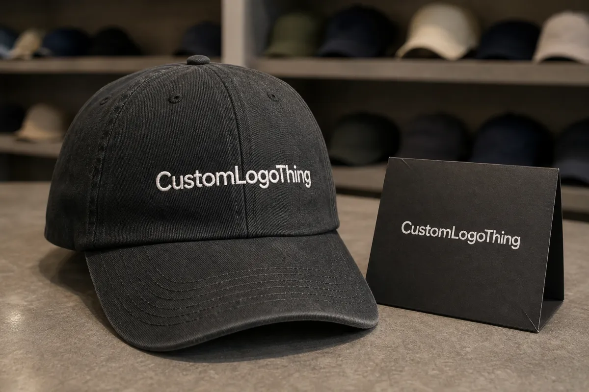
Placement is not just a decoration decision. It affects how quickly a shopper recognizes the brand, whether the cap reads premium or promotional, and how well the item performs in thumbnails where the image may be smaller than a postage stamp. Front-center placement gives the fastest brand read. Side placement feels quieter and more fashion-led. Back placement is useful for repeat customers or event merch. Visor placement can work, but only when the logo is simple enough to survive the angle.
That distinction matters because retail caps behave differently from blank promotional hats. A buyer is not only choosing where the logo sits. They are deciding how the cap will sell, how it will photograph, and how much tolerance the production run has for variation. A front hit that feels balanced on a tech pack may still look too low once it is stitched into a finished crown.
Experience shows that many placement problems come from treating the cap like a flat canvas. It is not flat. It is a three-dimensional object with seams, tension, and a very short attention window from the shopper. The best placement is the one that survives all three.
How cap panels, brims, and closures change placement
Cap structure sets the limits before the artwork ever reaches digitizing. Structured six-panel caps with firm front buckram hold embroidery in a predictable way. The front panel stays upright, so the logo usually lands where the buyer expects it to land. Unstructured caps are more forgiving in comfort, but less forgiving in placement. They collapse, flex, and tilt, which can make the same logo sit lower or read smaller once worn.
Panel construction is a bigger issue than many first-time buyers realize. A center front seam can split letters, cut through a monogram, or distort a narrow symbol if the design is too wide. On some caps, that seam is part of the look. On others, it is a constraint that should be avoided. A clean front panel gives more room for embroidery, patch application, and accurate spacing.
Brim shape matters as well. A flat brim creates more visual room above the edge, while a pre-curved brim pushes the logo closer to the wearer's line of sight. That can help visibility, but only if the mark stays far enough from the curve to avoid a compressed look. On a retail shelf, a cap that sits too close to the brim often feels crowded. The artwork may be technically correct and still look wrong.
Closures change the usable real estate at the back. Snapbacks usually give the cleanest back placement because the closure is predictable and visually tidy. Strapbacks can work, but the strap and hardware add texture. Fitted caps remove the adjustment zone altogether, which can make the back panel look more premium and less useful for a second logo location. If a back mark matters, it should be planned against the closure from the start.
Decoration method also changes what is possible. Flat embroidery is the most common choice for retail caps because it is efficient and easy to repeat. Puff embroidery adds depth and a more pronounced retail feel, but it needs room around the edges. Woven patches are a good answer for detailed logos, especially when small type or thin lines would otherwise collapse in thread. Print can work for graphic-led headwear, though it is usually chosen for a deliberate fashion look rather than a conventional retail cap.
Visibility, brand balance, and stitch limits that drive the final layout
The strongest placement is usually the one a shopper understands first. For store shelves, front-center still wins most of the time because it gives immediate recognition. For event wear, a side hit can work because people see the cap at an angle. For ecommerce, the question changes again: does the logo still read in a thumbnail, and does it hold up when the image is enlarged?
That is why simpler marks often outperform detailed ones on caps. Bold lettering, clear icon shapes, and generous negative space tend to stitch cleanly and photograph better. Thin outlines and dense crests are risky at cap scale. A design that looks elegant on a vector file can become noisy once it is translated into thread. As a practical rule, logos in the 2.25 to 3.25 inch range often work well on the front panel, but the real limit depends on the cap profile, seam placement, and the amount of detail in the art.
Stitch count is part of the layout decision, not just a cost item. A complex design with too many color changes can slow production, increase thread breaks, and make the final result less crisp. Most buyers are better off asking whether the logo can be simplified before asking whether it can be enlarged. On a retail cap, a cleaner mark usually looks more expensive than a busier one.
Brand balance matters too. Some lines need the cap to carry the brand loudly because the hat is the hero product. Others use the cap as a supporting item alongside tees, hoodies, or tote bags. In that case, a smaller side mark or a restrained front hit may fit the assortment better. There is no universal rule, only a match between placement and the role the product plays in the collection.
A cap logo does not need to be the biggest element on the item. It needs to be legible at a glance, stable on a curved surface, and consistent with the rest of the line.
For packaging and transport, caps usually travel better than buyers expect, but inserts, polybag size, and carton fill still affect presentation. If your program includes retail-ready cartons or inserts, the ISTA testing framework helps assess whether the package protects shape during shipping. If the inserts or cartons need certified paper sourcing, the FSC standard is the right reference point for chain-of-custody claims.
Logo placement cost, pricing, and unit-cost tradeoffs
Center-front embroidery is usually the easiest placement to quote and repeat. It is simpler to digitize, easier to hoop, and less likely to require special handling. That does not mean every front hit is cheap, but it does mean the process is more predictable. Once the logo moves to the side, back, or multiple locations, labor and setup tend to rise.
Buyers often ask why one cap quote is only a little higher than another even though the logo location changed. The answer is usually in the process detail. A side placement may require a different hoop size or a more exact alignment step. A back placement may need more care because of the closure. Add puff embroidery, patches, metallic thread, or a second location, and the price moves again.
Typical retail cap programs usually show the following cost behavior:
| Placement option | Typical retail fit | Relative cost | Buyer tradeoff |
|---|---|---|---|
| Center-front embroidery | Best for fast brand recognition and shelf visibility | Lowest to moderate | Most efficient, easiest to approve, and usually the least risky |
| Left-side placement | Best for quieter branding or lifestyle assortments | Moderate | Less visible at distance, but often cleaner in product photography |
| Back placement | Best for snapbacks, event merch, and repeat-brand audiences | Moderate to higher | Works best when the closure leaves enough uninterrupted space |
| Multi-location placement | Best for premium drops or fashion-led assortments | Highest | Stronger brand presence, but more setup time and more room for inconsistency |
A real quote usually includes more than the decoration line. Buyers Should Expect digitizing, sample or sew-out cost, stitch count adjustments, rush fees, patch creation, special thread, and minimum order quantities to affect the final price. For a plain front embroidery run of 5,000 pieces, a broad working range of about $0.18 to $0.28 per unit at scale is common. A more complex multi-location cap can move into the $0.35 to $0.75 range or higher, depending on decoration method, order size, and how much artwork cleanup is required. Those are planning numbers, not promises.
The higher-cost option is not automatically the wrong one. A cap that looks too small in photos or too plain on shelf can underperform even if the decoration cost is low. The more useful question is whether the placement improves sell-through enough to justify the added spend. That is the calculation buyers should make before release, not after inventory lands.
Production steps and turnaround: from digitizing to ship date
Cap production moves through a chain, and every step can affect placement. First comes art review, where the supplier checks whether the logo can be drawn at the requested size. Then digitizing converts the art into stitch instructions. After that, the placement mockup shows the logo on the actual cap style. If the buyer requests a sample sew-out, that adds another checkpoint before bulk production starts.
The sample stage is where weak placement decisions tend to surface. A logo might be too wide for the front panel, too low for the brim curve, or too detailed for clean stitching. That information is useful, but it also creates a revision cycle. For a straightforward run, a clean approval process may move from artwork to ship date in roughly 12 to 15 business days. More complex orders, especially those with patches, multiple placements, or finish changes, usually take longer.
Timeline risk is predictable. Late artwork changes require re-digitizing. Thread substitutions may need new approval. Seasonal production loads slow things down around product launches, retail resets, and gifting windows. If the cap needs to arrive for a store opening or a hard launch, buffer time is not optional. A cap that lands after the campaign has started has already missed part of its job.
Photo proofs are fast, but they are not enough for every program. A stitched sample is slower and costs more, but it shows the actual thread pull, curve behavior, and visual balance. For higher-volume retail orders, the sample usually pays for itself because it exposes issues before the full run is committed.
Step-by-step placement checklist before you approve samples
The cleanest approvals start with the blank cap, not with the art file. Confirm the body style, closure, panel count, and decoration method first. A placement that works on a structured six-panel snapback may fail on an unstructured five-panel strapback, even if the logo is identical.
- Measure the safe zone on the front panel and mark the centerline.
- Check the distance from the logo to the brim curve and the top seam.
- Compare the approved logo width with the actual crown height.
- Review the mockup from the front, a 45-degree angle, the side, and on-head.
- Confirm the logo reads clearly in retail lighting and in thumbnail-sized images.
- Approve only after the sample matches the spec sheet and the intended sales channel.
That sequence sounds basic because it is. It also catches most placement errors before they become expensive. The on-head view matters because a cap can look centered on paper and still feel too low once worn. The angled view matters because shoppers usually do not see caps straight on. They see them as they pass a rack, turn a head, or scroll through a listing.
If you are managing several colorways, keep the visual position consistent across the assortment. The logo does not have to use the same decoration method on every color, but it should sit in a similar place so the line feels deliberate. Small shifts between colors are easy to miss in approval and easy to notice in a retail set.
Common cap logo mistakes that make retail merch look off
The most common mistake is placing the logo too low. When the brim crowds the mark, the cap starts to look heavy and compressed, especially in product photography. Another frequent issue is overloading the space with detail. Small text, thin rules, and dense crests often turn into an indistinct block once the file is converted to thread. That is not a bad machine run; it is an artwork scale problem.
Orientation causes trouble too. A logo may read well from the front but lose clarity from the wearer's right side. That matters for social content, retail display angles, and any program where the cap is photographed from more than one direction. Buyers who approve only the flat mockup often miss that issue until the sample is already sewn.
There is also an assortment problem that gets overlooked. If one cap uses a large front hit, another uses a tiny side mark, and a third carries only a back placement, the collection can feel accidental. That is not always wrong, but it needs a reason. Otherwise the product line looks pieced together rather than planned.
One more problem shows up in revisions. Buyers sometimes hope the first production run can fix a weak placement. Sometimes a small correction is possible. Often it is not. Once the logo size, stitch count, and panel position are locked, meaningful changes cost more than they did at the sample stage. Placement is one of the easiest decisions to overlook and one of the hardest to recover later.
Expert fixes and next steps for a cleaner final approval
If the artwork feels crowded, simplify before you resize. Remove unnecessary outlines, reduce the number of thin elements, and favor stronger shapes. If the brand needs more presence, increase the visual mass through a patch, a bolder type weight, or a slightly larger front-panel mark. That usually creates a better retail result than trying to force too much detail into the same footprint.
Ask for a stitched sample or a detailed photo proof before bulk approval, then review it under the same lighting the cap will face in retail. Store lighting can flatten contrast. Phone flash can make thread shine harder than it will in real use. Natural light can hide density issues. The same sample can look excellent in one setting and underwhelming in another, so test it in the environment that matters.
Lock the placement in a spec sheet that includes logo width, stitch count, distance from the brim, and any second-location marks. That protects both sides. The supplier has a clear production target. The buyer has a clean approval record. If the order repeats later, that sheet also keeps the next run from drifting by a few millimeters and turning into a bigger dispute.
The practical rule is simple: place the logo where it sells, not just where it fits. A cap program works best when structure, artwork, and buyer intent line up before the first stitch is sewn. Confirm the blank, check the sample, and keep the final spec tight enough that the same cap reads well on shelf, on head, and in a photo grid.
What is the best logo placement for retail merch caps?
Center-front is usually the safest choice when the goal is fast recognition at shelf distance or in product photos. Side or back placement can work when the brand wants a quieter look, but the logo must stay readable at a smaller size. The best placement depends on cap structure, logo shape, and whether the cap is meant for retail display or everyday wear.
How do structured and unstructured caps affect logo placement?
Structured caps hold a front logo more consistently because the crown has more support behind the stitching. Unstructured caps flex more, so the same logo can sit lower, look softer, or appear slightly distorted after wear. If the artwork is detailed, structured caps usually give buyers more reliable results.
Does side placement cost more on merch caps?
Often yes, because side placement can require extra setup care and is less efficient than a simple front-center run. If the design needs a second location, the unit cost usually rises with added stitch time, digitizing, or patch work. The quote should show whether the premium comes from placement, decoration method, or order quantity.
What should I send for an accurate cap placement quote?
Send vector artwork, cap style, target quantity, color count, and the preferred logo placement location. Include any sample image, spec sheet, or retail reference photo so the supplier can judge size and visibility correctly. The more exact the placement brief, the fewer revisions you need before production.
How long does a retail cap sample and approval cycle usually take?
The timeline depends on digitizing, sample stitching, revision speed, and the production queue. A clean approval cycle is faster when the buyer locks the art early and avoids last-minute placement changes. Rush orders are possible, but they usually raise cost and reduce room for revision.


