Retail trucker Caps Logo Placement can decide whether a cap looks intentional or slightly off, even when the artwork is strong. On a structured front with mesh behind it, the logo affects proportion, shelf appeal, and how the cap reads in product photos and in hand.
Placement also affects approval speed. A logo that sits too low, too wide, or too close to a seam may need revisions before production can start. For retail programs, those extra rounds matter because they add time without improving the end result.
Why retail trucker caps logo placement changes the whole silhouette
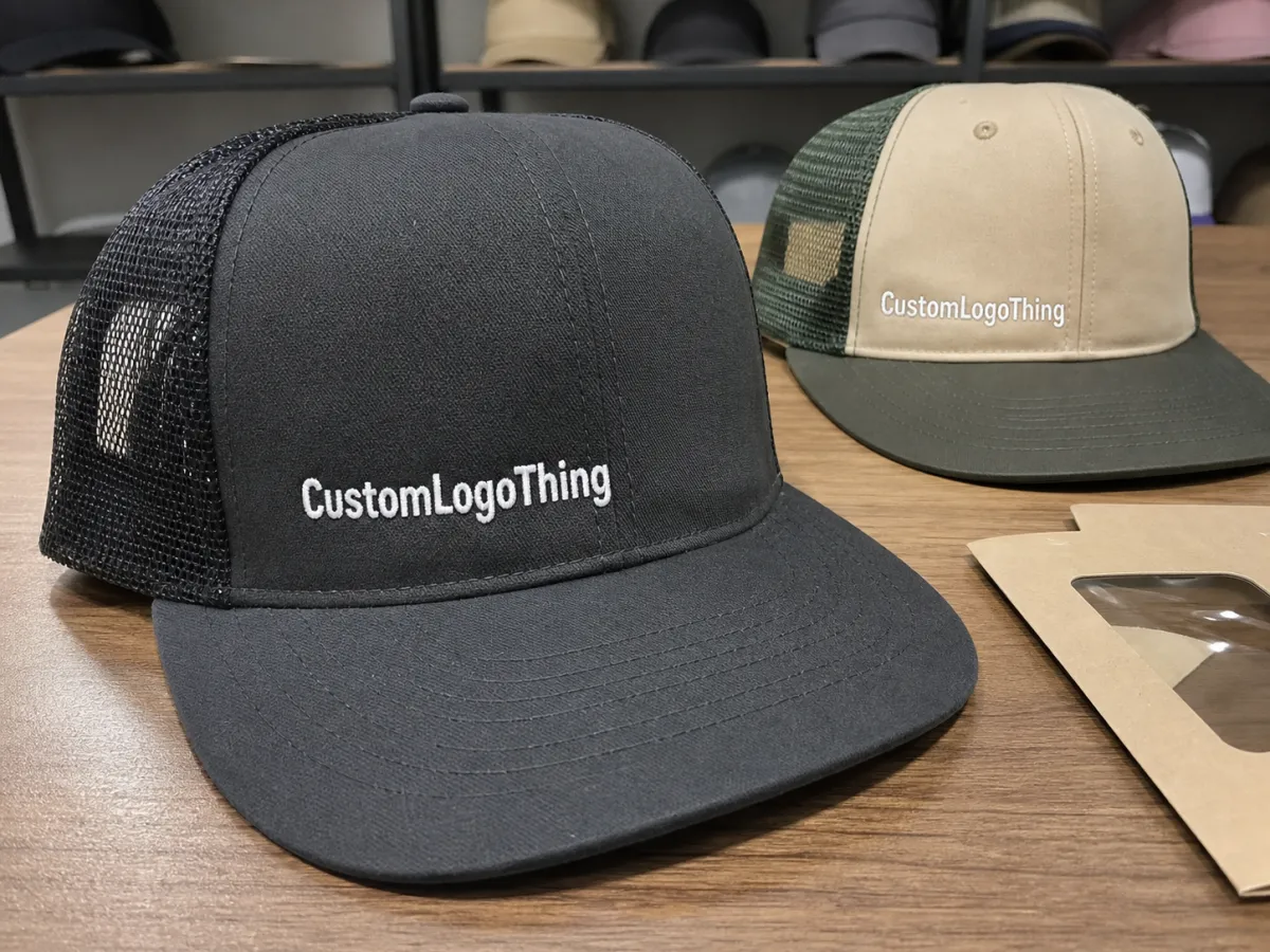
A trucker cap has a simple visual structure: a front panel that acts like the display surface and a mesh back that keeps the shape light. Because of that contrast, the logo changes more than decoration. It changes the cap's balance.
A centered mark on a tall structured crown usually feels clean and retail-ready. The same art placed too low can look compressed. A mark that is too wide can crowd the front panel and make the cap feel more promotional than finished.
Retail buyers notice proportion quickly. Shelf appeal depends on what the eye catches first, and the eye usually reads balance before stitch count or decoration method. If the logo fits the front panel naturally, the cap feels easier to sell.
That is why placement should be planned against the cap silhouette, not just the art file. The same logo often looks better when it leaves space above the seam and around the edges. On a structured cap, even a small vertical shift can change the read more than expected.
A flat proof can hide the way a crown curves. Once the cap is formed, the visual center may move slightly, and the logo may sit higher or lower than the mockup suggested.
Product pages flatten the cap visually, while in-hand display shows the crown angle, seam transitions, and bill projection. A placement that looks fine online may still feel crowded in person, so the best retail presentation usually plans for both views at once.
How placement works on structured trucker caps
The anatomy of a trucker cap limits what can be done cleanly. Most styles use a structured foam or twill front, mesh sides and back, and a curved or flat bill. Seams matter because embroidery, patches, and transfers all react differently when they approach a ridge or transition.
There are a few common logo zones. Center front is the safest and most familiar choice for retail because it reads quickly and photographs well. Slightly raised front can feel more premium on taller crowns. Offset placement can work for fashion-driven lines, but the balance has to be deliberate. Side placement is useful for secondary branding, though it rarely solves the main visibility problem.
Decoration method changes how placement performs. Embroidery adds texture and durability, which suits bold logos with clean edges and moderate detail. Woven patches are better when the artwork contains small type or crisp line work that thread would blur. Printed patches handle gradients and more illustrative graphics. Heat-applied transfers can be useful for flatter front panels and faster sample cycles, provided the fabric and temperature tolerances are compatible.
As a rule, detailed logos need more breathing room. Thin strokes, tiny letters, and layered graphics may fit technically, but fit is not the same as clarity. If the mark is crowded near the seam or edge, it will usually look tighter in production than it does on screen.
| Decoration method | Best for | Typical add-on cost per cap | Notes |
|---|---|---|---|
| Embroidery | Bold logos, simple shapes, durable retail presentation | $0.65-$1.50 | Cost rises with stitch count, thread colors, and overall size. |
| Woven patch | Fine detail, small type, sharper edges | $0.80-$1.75 | Useful when thread would soften small elements. |
| Printed patch | Multi-color graphics, gradients, illustrations | $0.90-$2.00 | Works well when the design is more visual than text-heavy. |
| Heat-applied transfer | Flatter graphic looks, quicker sample cycles | $0.70-$1.60 | Depends on panel finish and careful temperature control. |
The best option is not always the lowest-cost option. A buyer comparing retail trucker Caps Logo Placement should ask one practical question: does the logo still read from three to six feet away? That is the distance that matters most on shelf, in a display wall, and in a quick glance from a customer moving past the fixture.
Cost, pricing, and unit value drivers you should compare
Pricing starts with the blank cap, but the blank is only part of the story. A plain trucker cap may be inexpensive or mid-range depending on structure, foam density, mesh quality, and bill finish. Decoration adds its own cost, and that is where most of the real decisions happen.
The main price drivers are straightforward. Stitch count affects embroidery labor. Patch complexity affects tooling and artwork prep. Color count can increase thread changes or print setup. Digitizing is often a one-time charge for embroidery, but better art files reduce cleanup time. Quantity matters too, since setup costs spread more efficiently across larger runs.
Placement can influence cost in less obvious ways. If the logo crosses a seam, runs larger than the panel can comfortably support, or requires exact alignment around a curve, production may need extra handling. That labor does not always show up as a separate line item, but it still affects the quote.
If the program includes hang tags, cartons, inserts, or retail packaging, the cap should be priced as a complete item. Presentation damage can erase the value of clean decoration if the cap arrives crushed or distorted. For shipping and distribution, the testing guidance from the International Safe Transit Association is a practical reference. For paper-based inserts or carton sourcing language, the Forest Stewardship Council is a reliable benchmark.
Typical retail run pricing often falls into these ranges:
- Simple centered embroidery on a standard cap: often $0.65-$1.25 added per unit at mid-to-higher quantities.
- Detailed patch work with clean edges: often $0.80-$1.75 per unit.
- Multi-location decoration or larger stitched areas: often $1.25-$3.00 per unit.
- Digitizing, artwork cleanup, or patch setup: commonly a one-time $35-$90 range, depending on complexity.
That is where unit value matters more than sticker price. If a slightly higher-cost placement gives a cleaner retail look, fewer sample revisions, and less risk of an awkward final shape, the extra spend may be easier to justify than the cheapest quote on paper.
Process and turnaround: from artwork to approved sample
A well-managed order usually follows a predictable path. First comes artwork review, where the supplier checks file quality, line weight, color structure, and whether the logo can be built cleanly at the intended size. Next comes placement guidance, because the front panel dimensions and seam structure tell you more than a flat art file ever will. Then the proof appears, followed by sample approval, production, finishing, and shipment.
Vector files move faster. A crisp AI, EPS, or PDF file usually means less cleanup and fewer questions. Low-resolution JPEGs or PNGs often create delays because the supplier has to trace shapes, estimate edge quality, or request missing elements.
Approval protects both sides. It lets the buyer confirm logo width, height, centering, color match, and seam clearance before production begins. It also helps the supplier avoid rework. A sample that ignores construction limits can create expensive corrections later.
Lead time depends on complexity. Straightforward centered embroidery with final art in hand may move through proofing and sample prep in about 7-12 business days, then production after approval. More involved work, such as a new patch build, unusually precise placement, or multiple revision rounds, can push the cycle to 12-20 business days or more.
If timing matters, state the retail trucker caps logo placement clearly in writing. A note like "keep the logo centered and 1 inch above the seam" prevents guesswork, and guesswork is where delays begin.
Step-by-step method for choosing the right logo position
Start with the retail goal. Is the cap meant to feel premium, sporty, promotional, or fashion-forward? That question should control the placement choice more than habit does. A structured foam-front cap can support a bolder mark. A softer profile usually looks better with more open space.
Next, measure the usable front-panel area. Do not assume the logo should fill it. Check the seam line, the panel width, crown height, and where the visual center lands once the cap is worn. On some caps, the actual center and the visual center are not the same point.
Then ask for two views: one flat lay and one head-form mockup. The flat lay helps with spacing and centering. The head-form view shows how the crown curves in use. Those views often expose different problems, and a logo that looks balanced in one view may not work in the other.
After that, check scale, stitch density, and seam clearance together. The logo should read from a few feet away, not just from six inches away on a monitor. That simple shelf-distance test catches a lot of overly busy placements before they turn into expensive samples.
- Define the retail objective before discussing decoration.
- Confirm the cap structure and front-panel dimensions.
- Review mockups in both flat and worn views.
- Check seam clearance, logo scale, and visual balance.
- Approve only after the cap still reads clearly at shelf distance.
That sequence sounds basic, but it is where many orders slip. Buyers focus on the art and forget that the cap is a shaped product, not a flat signboard.
Common mistakes that create crooked art or extra revisions
One common mistake is placing too much detail too low on the panel. The seam line and crown curve can distort the art, and small text near the edge may become hard to read. Thin lettering, tight kerning, and fine outlines are the first things to suffer.
Another mistake is approving artwork without accounting for construction. A logo can look balanced on a clean digital file and still feel awkward on a real cap if the crown is shorter than expected or the panel shape is more angular than the buyer imagined. That mismatch is one of the biggest reasons revision rounds expand.
Oversized front graphics can also hurt retail appeal. A cap does not always benefit from maximum coverage. If the decoration dominates the entire front, the product may read as promotional rather than retail-ready. In many cases, a slightly smaller and cleaner mark sells better because it respects the cap shape and leaves visual air around the art.
Another avoidable problem is vague placement language. "Center it" is not enough when the buyer actually means "center it above the seam, start 0.75 inches below the crown top, and do not let any artwork touch the mesh transition." Production teams cannot guess at that level of intent.
The fix is simple: write down what matters. Logo width, logo height, seam clearance, preferred method, and any do-not-cross zones should be part of the first brief. Clear instructions keep the order from becoming a moving target.
Expert tips and next steps for a cleaner retail order
Use a placement sheet. It does not need to be fancy, but it should record the logo width, height, the distance from the crown seam, the decoration method, and any no-go zones around the mesh transition or side seams. That one document can save a surprising amount of time when the sample comes back for review.
If the design is sensitive, ask for one primary sample and one comparison mockup. Seeing two options side by side often makes the better choice obvious. Sometimes the difference is only a quarter inch of height or a slightly narrower width, but those small shifts can dramatically improve how the cap reads on shelf.
Match the cap style to the customer mindset. A structured foam-front cap can carry a bolder front mark because the panel itself frames the artwork. A softer profile usually benefits from a calmer layout that leaves more open space and lets the shape do some of the work.
Before the order is released, confirm the final artwork, quantity, ship date target, packaging needs, and approved placement one more time. If the team has already aligned on retail trucker caps logo placement, the run usually moves with fewer surprises and less rework.
For repeat programs, keep a record of the approved front-panel dimensions, stitch count, patch specs, and artwork version so future orders stay uniform even if the run size changes. That discipline is what keeps a retail line looking consistent from one season to the next.
Strong placement is part design judgment, part production discipline, and part respect for how the cap is built. Get those three pieces aligned, and the cap usually looks sharper, sells cleaner, and causes fewer problems after sampling.
Where is the best retail trucker caps logo placement for shelf appeal?
Center front is usually the safest starting point because it reads quickly on shelf and in product photos. A slightly higher placement can feel more premium on structured caps, while a lower placement can look crowded if the crown is short. Seam lines and panel shape should always be checked before production is approved.
Does trucker cap logo placement change the price?
Yes, placement can affect cost if the design crosses seams, needs special alignment, or requires a larger stitched area. More complex decoration methods and higher stitch counts usually raise the unit cost more than simple centered placements. A proper quote should cover the finished decoration, not just the cap blank.
How do I choose between embroidery and patches for trucker caps?
Embroidery works well for bold, simple logos that need texture and durability. Patches are often better when the art includes small text, detailed lines, or multiple colors that need sharper edges. The right choice depends on how the logo should look from a distance and how much flat space the front panel provides.
What affects turnaround on custom retail trucker caps?
Artwork readiness, sample approval speed, and decoration complexity are the biggest drivers of lead time. New artwork setups, patch development, and revision cycles can add days before production begins. If timing matters, send final files and placement notes early so the supplier can quote accurately.
What should I check before approving the final placement?
Check logo size, centering, seam clearance, and whether the mark still reads clearly on a curved crown. Review the placement on a mockup or sample in both close-up and shelf-view conditions. Confirm that the approved layout matches the retail trucker caps logo placement you want across the full order.


