Embroidered Baseball Caps Logo Placement That Looks Intentional
A change of less than half an inch can separate a cap that feels retail-ready from one that looks like a rushed giveaway. That is why embroidered baseball Caps Logo Placement deserves more attention than the average buyer gives it. On paper, the logo is the same. On a curved crown, with seams, buckram, and thread thickness in play, the result can change fast.
Embroidered Baseball Caps Logo Placement Basics
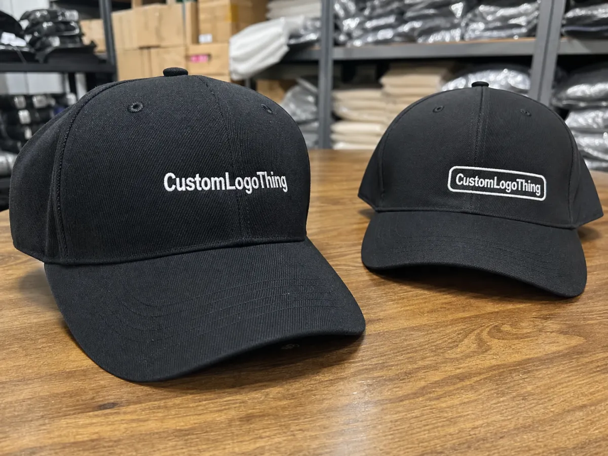
Buyers often start with artwork. Production teams start with location. That difference matters more than people expect. A logo can sit front and center, drift slightly off-center, move to a side panel, arch across the back, or tuck above the closure. Each position changes visibility, comfort, and the way the cap wears over time.
Front-center placement is the most legible and the most familiar. Off-center front placement feels more styled and less promotional. Side placement can make a cap look cleaner from the front, which is useful for lifestyle merch and some retail programs. Back or closure placements usually serve as secondary branding, event identification, or small sponsor marks. They are rarely the main visual decision.
The practical constraint is not just style. Embroidery behaves differently from print. Thread has volume. Panels curve away from the viewer. Seams interrupt clean shapes. A logo with thin strokes, small text, or delicate outlines may lose clarity if it sits too close to the front seam or crosses a panel transition. That is why embroidered baseball Caps Logo Placement is partly a design question and partly a construction problem.
A cap can be embroidered correctly and still look wrong if the logo sits one seam too close.
For most buyers, the right placement balances recognition, cap comfort, stitch count, and the way the cap will actually be worn. A retail cap can handle a quieter logo. A trade show giveaway usually needs stronger front visibility. Workwear needs durability and legibility first. The right answer depends on who will wear it, how often, and how close people will be when they see it.
How Placement Is Measured on a Baseball Cap
Manufacturers do not guess at placement. They use reference points: the center seam, the bill line, the front panel edges, the crown height, and the closure area. On a structured six-panel cap, the front panels hold their shape and the logo usually reads more cleanly. On an unstructured cap, the same logo can shift visually as the fabric collapses slightly. A measured location on a spec sheet does not always read like the same distance on the wearer.
Digitizing turns flat artwork into stitches. The digitizer decides stitch direction, density, underlay, and pull compensation, then maps that to a curved surface. That process is invisible to most buyers, but it is where a lot of quality lives or dies. A simple wordmark can usually sit closer to a seam than a detailed icon. A fine serif font, a thin outline, or tiny lettering often needs more open space so the embroidery can breathe.
Good decorators pay attention to how the cap is built before they lock in placement. Common variables include panel count, crown height, the presence of buckram, and whether the cap is low-profile or mid-profile. A low-profile cap has less vertical room, so logos can look wider and flatter than expected. A taller structured cap can carry a larger mark without feeling cramped.
- Front center: best for high visibility and symmetrical branding.
- Off-center front: useful for a more styled, less standard look.
- Side panel: works well for secondary marks and cleaner front panels.
- Back arch or above closure: better for small identifiers, event branding, or support logos.
A simple rule helps: bold, symmetrical marks belong where the viewer expects them, while detailed marks need more open space or a simplified lockup. If the logo is important but visually busy, many decorators will recommend a reduced embroidery version instead of forcing the full artwork into a tight area. That is usually the cleaner production choice, not a compromise.
Placement Variables That Change Visibility and Wear
Size and proportion come first. A logo that is too wide for the crown can feel top-heavy, while one that is too small can disappear into the cap. For adult caps, front embroidery often lands around 2.25 to 3.5 inches wide, though structured caps can usually carry slightly larger art than low-profile caps. That range is not a hard rule. It is the shape of normal production. The cap still has to look like apparel, not signage.
Structure and fabric matter just as much. Buckram-backed fronts hold stitching cleaner because the panel resists collapse under the needle. Softer, unstructured caps can show more distortion, especially when the fabric is washed cotton, brushed twill, or lightweight garment-dyed cloth. Repeated stitching on a soft crown can pull the surface slightly, which is one reason dense logos sometimes look heavier than the artwork file suggests.
Material choice changes the result as well. Cotton twill usually accepts embroidery cleanly. Recycled polyester panels can look sharp, but the hand feel and sheen may make thread contrast appear stronger. Trucker caps with mesh backs offer less usable embroidery space in the rear panels, which is why most back logos on those styles stay small. Foam-front caps can work well for bold logos, but they are less forgiving if the placement is off because the front panel has its own visual volume.
Panel layout creates more limits than many buyers expect. Seams can cut through letters. Vents reduce usable space. Curved crowns shorten the visible height at the edges. Even the closure matters. A logo too near the strap can run into hardware or wear faster from friction. Side-panel embroidery is often best kept to initials, short words, or simple symbols because the space is smaller and the curve is less predictable.
Audience should guide the placement decision. Trade show caps need instant readability from a few feet away. Retail caps can use quieter off-center or side branding if the cap itself carries the look. Team gear often needs front visibility for photos, sideline viewing, and sponsor recognition. Workwear adds another layer: the embroidery should survive sweat, repeated wear, and cleaning without fraying at the edges.
Thread contrast is a small decision with a large effect. High-contrast thread can improve legibility without making the logo larger. Tone-on-tone embroidery can make a cap feel more premium and less promotional, especially on darker blanks. That is useful when the cap needs to stay understated but still branded.
There is also a practical production angle around packaging and shipping. If caps ship with printed inserts, cards, or cartons, FSC-certified paper is a sensible standard for those components; see FSC-certified paper standards. For bulk shipments, especially when cartons stack high or travel long distances, ISTA test methods are a useful reference for thinking about vibration, compression, and damage risk before the goods leave the warehouse.
Cost, MOQ, and Unit Pricing for Logo Placement
Price starts with stitch count, but placement changes the rest of the math. A simple front-center logo may need one hooping setup and a straightforward digitizing path. A side-panel layout or wraparound back treatment can require more positioning time and more machine handling. If the logo needs 3D puff embroidery, special backing, metallic thread, or extra thread colors, the cost moves again. Buyers sometimes compare embroidery quotes as if they were the same product. They are not.
| Placement option | Typical visibility | Typical add-on cost per cap | Best fit |
|---|---|---|---|
| Front-center, simple 1-color logo | High | $2.25-$4.00 | Giveaways, team gear, broad brand awareness |
| Off-center front | Medium-high | $2.50-$4.50 | Lifestyle merch, fashion-forward branding |
| Side panel | Medium | $3.25-$5.25 | Secondary marks, understated branding |
| Back arch or above closure | Medium-low | $2.75-$5.00 | Support branding, event marks, sponsor IDs |
| 3D puff or wraparound layout | High, but more specialized | $4.50-$7.50 | Bold retail looks, athletic styling |
MOQ changes the per-unit picture quickly. Many shops work best at 24, 48, or 100 pieces, depending on cap style and decoration complexity. Below those levels, setup and digitizing fees take up a larger share of the order. At 200 to 500 pieces, the unit rate usually improves because the same prep work is spread across more caps. A buyer ordering 36 caps and a buyer ordering 360 caps will not see the same economics, even if the placement is identical.
Ask for line-item pricing. The quote should separate the blank cap, digitizing, embroidery, proofing, rush fees, and freight. If those pieces are bundled together, it becomes hard to tell whether a front-center logo is actually cheaper than a side-panel layout or whether the blank style is driving the difference. Clear pricing makes the placement decision easier and avoids surprises after approval.
One more practical note: a low headline price may hide later charges for extra colors, difficult hooping, or a second approval round. A slightly higher quote with fewer change fees can be the better deal if the artwork is at all complex.
Process, Timeline, and Production Steps
The workflow is predictable, but only if the artwork is ready. It usually starts with artwork review, then digitizing, then a placement mockup, then a sew-out or sample if needed, then approval, then full production, and finally packing. That sounds simple. It rarely feels simple if the logo keeps changing. The cleanest orders are the ones where the cap style is locked, the artwork file is usable, and the placement has been approved before the first stitch file is built.
Most delays come from a handful of familiar problems. A buyer sends a low-resolution file instead of vector art. The cap style changes after the proof is drawn. Thread colors get revised more than once. The logo placement is approved on a generic template and then rejected on the actual cap because the crown height is different. Each issue is fixable. Each one adds time.
For a standard order, a typical timeline after proof approval is often around 10 to 15 business days. Complex orders can take longer, especially if they involve specialty thread, multiple placements, 3D puff, or sample stitching. Rush orders are possible in many shops, but rush service usually narrows the window for revision. If placement is still uncertain, rushing is a bad place to discover that the logo is too wide or too close to a seam.
Speed improves when three decisions are made early: exact logo width, exact distance from the seam, and exact cap style. With those locked, the digitizer can build the stitch file once instead of reworking it later. That matters because a small width change can affect stitch density, thread consumption, and the way the logo sits on the crown. In embroidery, "close enough" often becomes the most expensive phrase in the order.
If the caps are for a retail launch or a fixed event date, approve the sample as soon as it arrives. Do not stretch the schedule with extra rounds of opinion unless there is a real issue. Once the sample looks right on the actual cap, the run should become repetition, not redesign.
Common Placement Mistakes That Trigger Rework
The most common mistake is also the easiest to miss: the logo is too low or too wide. When a mark crowds the brim, it feels compressed. When it spreads into the side panels, it can hit seams and distort. A cap should look balanced from a few angles, not just from the front in a flat proof.
Too much detail causes another round of trouble. Tiny text, hairline outlines, and dense shading rarely survive the jump from screen to thread. Embroidery is not print. It cannot hold every nuance of a vector file, especially on a small crown. Buyers who simplify early usually get cleaner results than buyers who try to preserve every line and then revise after the sample comes back.
No physical mockup is another expensive miss. A screen proof is helpful, but it is not enough on its own. The same logo can look correct in a rectangle and awkward on a curved structured front panel. Placement should be checked on the exact cap style whenever the order matters. The eye reads a cap from angles and distances, not from a spreadsheet.
Wearer perspective gets overlooked more often than it should. A logo may look balanced on a table and then sit too high once the cap is on a head. A side mark can disappear when the wearer turns slightly. A back arch may be hidden by hair or by the closure. The cap does not stay still long enough to be judged from one angle alone.
One disciplined habit prevents a lot of rework: compare the artwork at close range, arm's length, and six to ten feet away. That is close to how branded caps are actually seen. If the logo fails at one of those distances, the placement probably needs a second look.
Expert Checks Before You Approve an Order
Before you sign off, run a short checklist. Confirm the logo width, the distance from the seam, the thread colors, the cap profile, and the target audience. That may sound basic, but it catches many avoidable problems. If the cap is structured, the logo can usually sit more confidently on the front. If it is low-profile, the same logo may need to shrink slightly to keep the balance right.
Ask for a mockup on the exact cap style, not a generic hat template. A five-panel foam cap, a structured six-panel trucker, and a washed dad cap do not behave the same way. Crown height alone can change the visual balance enough to make a logo feel perfectly placed or slightly off. That is why Embroidered Baseball Caps logo placement should be judged on the actual product, not on an image that only resembles it.
A useful approval check is simple: compare the logo on the mockup, on the sample cap, and in a quick photo taken from a few feet away. If it reads well in all three, the placement is probably safe. If it only works on the mockup, the decision is still theoretical.
Final approval step: confirm the placement in writing, confirm the production timing, and confirm that the approved sample is the one the production team will follow. That single note reduces back-and-forth later, especially if several people are weighing in on the same order.
One last caveat: the best placement is not always the most visible one. Sometimes a logo belongs front and center. Sometimes the better answer is a smaller side mark or a restrained front treatment that leaves the cap itself to do the talking. The right choice is the one that matches the cap style, the wearer, and the job the cap has to do. Get those three aligned, and the logo stops feeling attached. It starts looking built in.
Where should embroidered baseball caps logo placement go for the best visibility?
Front-center placement is usually the easiest to read from a distance and the most familiar for buyers. If the design needs a subtler look, off-center front or side placement can work, but the logo still needs to avoid heavy seams and abrupt curve lines. The best spot depends on how the cap will be used: team gear, retail merch, and giveaway caps do not all need the same level of visibility.
How big should the logo be on embroidered baseball caps?
Logo size should follow the crown height and available panel space, not just the artwork file size. Simple marks can often stay smaller and still read well, while detailed logos usually need more room or a simplified version. Always approve the artwork on the exact cap style so the final size looks balanced on the wearer, not just on a flat template.
Does cap logo placement change pricing or MOQ?
Yes. More complex placements can raise cost because they may require extra setup, more stitch time, or specialized digitizing. MOQ changes the math too: smaller quantities often carry a higher unit cost because setup fees are spread across fewer caps. Ask for a line-item quote so you can compare front, side, and back placements before you lock the order.
How long does the embroidered baseball caps logo placement process take?
The timeline usually includes artwork review, digitizing, proof approval, production, and packing. Simple placements with clean artwork move faster than jobs that need multiple revisions, specialty thread, or sample stitching. You can shorten turnaround by approving cap style, placement dimensions, and thread colors early.
Can I use side or back placement on a baseball cap?
Yes, side and back placements are common when the front panel needs to stay clean or the logo is secondary branding. These spots usually work best with simpler artwork because the available space is smaller and the panel shape is more restrictive. Check the cap structure first, because seams, closures, and crown shape can make some back or side placements harder to stitch cleanly.

