Five Panel Caps logo placement looks straightforward on a flat artboard and much less straightforward on an actual cap. The same artwork can read sharp, promotional, or oddly low depending on the crown height, seam layout, and decoration method. That is why buyers who treat placement as a finishing touch often end up revising proofs, reordering samples, or accepting a result that feels slightly off.
The appeal of a five-panel cap is the front panel itself. It gives the logo a cleaner field than many seam-divided styles, so the brand mark can read more clearly from a few feet away and hold up better in product photography. That advantage only shows up, though, if the logo size and position respect the shape of the cap rather than fighting it.
For bulk orders, five panel caps logo placement is not just a design call. It affects decoration Cost, Lead Time, approval rounds, and how the finished cap will look in real use. A smart placement decision saves more money than a clever mockup ever will.
What five panel caps logo placement really means
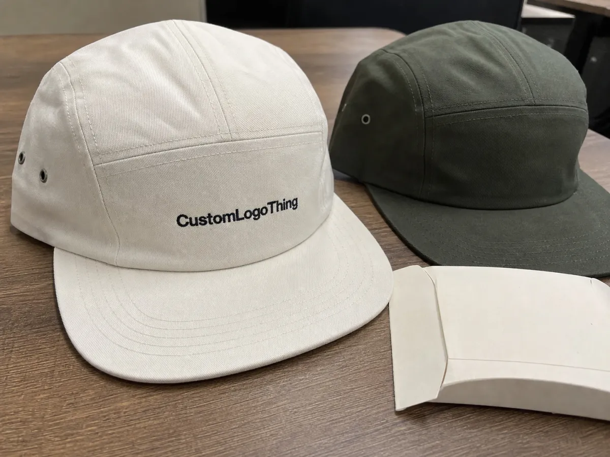
A five-panel cap uses one front panel, two side panels, and two rear panels. That construction creates a broad front area with no center seam running straight down the middle, which is the main reason these caps are popular for branding. The front panel becomes the natural home for the logo, especially if the design needs a clean, uninterrupted surface.
That does not mean any logo can sit anywhere on the cap. The front panel still curves, the brim still changes the sightline, and the crown still changes shape once a person wears it. A proof that looks centered on a computer screen can drift visually once the cap is on a head, especially if the logo sits too low or extends too close to the seam lines.
Decoration method changes the placement logic too. Embroidery works well for bold lettering and simple marks because thread adds texture and stands up to repeated wear. Woven patches preserve finer edges and small type more reliably. PVC patches can create a stronger dimensional look, but they add weight and cost. Print and heat transfer can be useful on smoother caps, though the result is usually less premium and less durable than stitch-based decoration.
That is why five panel Caps Logo Placement should be handled as a production decision, not only a creative one. The best choice is the one that stays legible, can be repeated consistently, and does not create avoidable setup problems in the factory.
How the front panel shape changes visibility
The front panel on a five-panel cap is wider than many buyers expect, but it is still not a flat rectangle. The usable area changes with crown depth, fabric stiffness, visor curve, and whether the cap is structured or soft. A logo that fits comfortably on a trucker-style cap may look crowded on a low-profile cotton cap, even if the art file itself does not change.
Centered placement remains the safest default because the eye expects balance. It also reduces approval risk across a run, which matters more than people think once dozens or hundreds of caps are involved. A centered front mark usually photographs better, wears better, and gives the supplier a cleaner target for digitizing or print placement.
There are times to raise the logo slightly. Tall wordmarks often need more vertical breathing room so the letters do not feel pinned between the brim and the top of the crown. Icons can sit a little higher and still feel intentional. Off-center placement can work for fashion-led programs or streetwear drops, but it needs a clear reason. If the art direction is not explicit, it can look like a mistake instead of a style choice.
Negative space matters as much as size. A logo that stretches too close to the edges of the front panel can feel cramped, even if the overall width technically fits. On the other side, a design that is too small can disappear once the cap is viewed from several feet away. For retail, events, and staff uniforms, readable at distance usually beats large on paper.
Structured caps hold their shape better, so the placement window stays more predictable. Unstructured caps flex with the wearer, which can make the logo sit lower or appear slightly warped after repeated use. That is one reason a proof should always be checked on a cap image, not only on a flat template.
A flat mockup can hide a lot. The cap may look centered on screen and still feel low, crowded, or crooked once it is stitched on a curved crown.
Key factors that determine the best location
The logo itself is the first filter. Wide wordmarks generally work best on the front panel because the eye can read the whole mark in one pass. Compact icons can sit a bit higher and still hold balance. Stacked logos often need a narrower width so the lines do not crowd each other or run into the crown curve. Thin strokes and tiny text demand even more caution; the placement may be right, but the decoration method has to carry the detail.
End use changes the decision. Retail caps need a polished look that survives close inspection on a product page or shelf. Staff uniforms need immediate recognition from a distance. Giveaways usually need cost control first, which often means simpler artwork and a placement that avoids expensive complexity. Sports and event merchandise is judged quickly and from awkward angles, so visibility matters more than decorative cleverness.
Color contrast is a quiet variable with a loud effect. Dark thread on a dark cap can vanish after a few feet, especially under indoor lighting. Light-on-dark generally reads better for front-panel branding, though strict brand palettes can make that harder. If the logo is stitched, the thread spec should be approved using actual references or thread charts, not words like “navy” or “bright red,” which can mean different things to different suppliers.
Brand rules matter too. Some companies need exact placement consistency across every reorder, especially if caps are part of a uniform system or a retail line that will be replenished later. In that case, it is worth defining the acceptable placement window in millimeters or by photo reference. That upfront discipline avoids a painful round of “close enough” approvals later.
There is also a simple reality of customer viewing distance. A cap logo often needs to work at arm’s length, from across a room, and in motion. A placement that looks refined in a close-up proof can become too delicate in real life. That is why many buyers ask for both a centered mockup and a worn mockup before they commit.
What makes a blank cap easier to decorate
Not every five-panel cap behaves the same under needle, ink, or heat. Fabric content, front-panel structure, closure type, and crown profile all affect how the final logo sits. A soft cotton twill cap, for example, will drape differently from a foam front trucker, and that changes how the eye perceives the same placement.
Structured fronts are easier to spec because they hold the decoration area more consistently. A cap with buckram or a firmer front panel keeps the logo from dipping into the curve of the crown as much. Unstructured caps can still look excellent, but they need more careful sizing and more honest expectations about how the cap will look after a few wears.
Closure style matters as well. Snapbacks, straps, and fitted backs all change how the rear of the cap sits, which affects the front panel tension. A tighter fit can slightly flatten the crown; a looser fit can change how low the logo appears. It sounds minor until a buyer compares samples side by side and realizes the same placement has a different feel on each blank.
Fabric texture also affects finish quality. A heavy twill or brushed cotton can soften fine edges, while smoother fabrics can support cleaner embroidery or print. Foam fronts often handle bold, simple logos well, but they can expose poor digitizing quickly if the stitches are too dense. Mesh-backed styles usually breathe better, yet the front panel still needs the right stitch balance so the design does not pucker.
A practical buyer should ask for the blank cap spec before approving placement. Crown height, front-panel width, material weight, and closure style are not decorative details; they are part of the placement decision. Blank caps in bulk can range widely in cost, roughly from about $2 to $8 wholesale depending on structure and fabric, and the most premium options can sit above that. The decoration choice can matter just as much as the blank.
Cost, pricing, and MOQ by decoration method
Front-center decoration is usually the baseline quote. Move the logo to a side panel, add a second location, or ask for a mark that crosses unusual curvature, and labor starts climbing. The cap itself may be inexpensive. The decoration work is where pricing changes quickly.
These are practical planning ranges for bulk orders, not fixed rates. Artwork complexity, quantity, cap blank, and finish quality all move the number.
| Decoration method | Typical unit add-on | Best for | Main tradeoff |
|---|---|---|---|
| Embroidery | $0.40-$1.20 | Bold logos, text, classic retail looks | Fine detail can soften |
| Woven patch | $0.55-$1.40 | Sharper edges, small type, clean borders | Patch shape adds setup |
| PVC patch | $0.90-$2.10 | Structured, dimensional branding | Higher cost and longer lead time |
| Print or heat transfer | $0.30-$0.85 | Simple runs, lighter artwork, lower entry cost | Less texture and lower premium feel |
Setup charges can matter as much as the decoration itself. Embroidery digitizing often runs $25-$75 per logo, depending on stitch complexity and the number of revisions. Patch tooling can add $80-$250. Print or transfer setup is usually lower, but there can still be charges for art cleanup, color matching, or placement proofing. A clean quote should separate blank cost, decoration cost, setup, and sample or strike-off fees.
MOQ changes the unit price in a way that catches many buyers off guard. A 50-piece test order often looks expensive next to a 500-piece reorder because the setup is spread across fewer units. That does not make the smaller order a bad idea. It often protects the budget by catching a placement problem before the run gets large. For first-time buyers, a smaller test can be the cheapest way to learn what the cap really wants.
The logo itself can also affect cost. A dense embroidery file with many stitch points takes longer to sew and can increase the chance of thread breaks or puckering. A patch with a simple outline is easier to produce than a patch with tiny interior details. If the supplier is asking for a slight artwork simplification, that is not always a downgrade; sometimes it is the difference between an efficient production run and a noisy one.
One more budget line gets ignored more often than it should: revisions. Some suppliers include one mockup round and charge for additional redraws, especially if the logo is resized repeatedly or moved across the panel several times. That is normal. What matters is knowing the rule before the design process starts.
Process and turnaround: from mockup to shipment
The cleanest orders follow a familiar sequence: artwork intake, cap spec review, digital mockup, approval, sample or strike-off, production, and shipping. If one step is rushed, the whole schedule can wobble. The most common delay is not the factory floor. It is approval friction caused by low-resolution art, vague placement notes, or a logo file that needs to be rebuilt before anyone can proceed.
For a straightforward embroidery order, a realistic schedule is often 12-15 business days from proof approval to shipment. Patch orders usually run longer, closer to 15-25 business days, because the patch itself adds a separate production stage. If a sample or strike-off is required first, add another 3-7 business days. Rush orders can compress the window, but they usually narrow the room for revisions, fine-tuned color matching, and special packing instructions.
The proof type matters. A standard proof shows the logo. A placement proof shows the logo on the actual cap crown with the panel lines and brim relationship visible. That second proof is usually worth more than a polished render because it reveals whether the mark needs to move 4-6 mm higher, shrink slightly, or shift left or right to avoid visual drift. On a cap, a few millimeters can change the whole read.
QC should happen before production, not after. Good checks include stitch density, thread direction, registration against the centerline, edge quality on patches, and how the logo sits under daylight rather than only under a monitor glow. If a sample looks acceptable only in one light source, it is not ready.
Packaging and transit deserve attention too. Caps that leave the factory looking sharp can arrive flattened or distorted if cartons are overpacked or the inner arrangement is loose. Teams that care about presentation usually ask for carton counts, pack method, and any insert or polybag requirements before the order moves forward. Distribution standards from groups like ISTA are useful for thinking about how the shipment will actually travel.
Budget calendar time, not just unit cost. If a launch, event, or uniform rollout has a hard date, leave room for at least one revision cycle and one shipping buffer. Tight schedules punish vague instructions more than they punish expensive caps.
Common mistakes that make logos look off-center
Too low is the classic error. A logo that drops toward the brim can disappear into shadow, especially on a curved cap or under fluorescent light. Once the wearer moves, the mark can start reading as hesitant rather than branded. That is a small positioning mistake with a big visual cost.
Ignoring stitch paths is another frequent problem. A design can sit numerically in the middle of the panel and still look wrong if it clashes with seam lines, panel taper, or crown curve. The eye responds to shape and balance before it responds to measurements. Seam-aware placement beats exact centering on paper.
Small artwork creates a different kind of failure. Thin fonts, tiny taglines, and low-contrast elements can vanish on textured fabric. A cap is not a business card, and it cannot carry delicate information forever. If the design depends on tiny details to make sense, a patch or print may be the better route.
Mockups can also mislead. A cap rendered flat will always look more forgiving than one worn on a head. The crown shifts, the brim casts a shadow, and the curved surface changes the appearance of spacing. A single sample often resolves what five rounds of email cannot.
If a proof looks close enough, ask one more question: will it still look balanced from six feet away, under bad light, on a moving person?
Finally, do not assume one placement works on every five-panel blank. A five-panel trucker, a soft cotton cap, and a structured promotional cap all behave differently. The same artwork can feel centered on one and slightly off on another. The cap body and decoration method should be reviewed together, or the final result may look almost right in a way that still bothers the buyer.
Expert tips and next steps for a first order
Start with one primary placement and one backup. That gives the supplier a clear target and still leaves room for a practical adjustment if the first position clashes with the cap structure. It also keeps the quote cleaner. Three or four maybe-options tend to create revision loops that cost more than they save.
Send five things up front: the cap style, the logo file, the target placement, the quantity, and the deadline. Add color standards if they exist. If you know the exact decorated width you want, state it. A good supplier can work without every detail, but a specific brief reduces corrections and avoids wasted proofs.
Review the first proof on a physical cap photo whenever possible. Screen-based approvals can hide proportion problems that show up instantly on a real crown. If the logo needs to move, move it before sample approval. After production begins, even a small shift can mean extra labor, delayed shipment, or a cap that is acceptable only on paper.
Ask about stitch count if the logo will be embroidered. Many small cap logos fall into the roughly 5,000-8,000 stitch range, while larger or denser designs can climb above 10,000. More stitches are not automatically better. If the design can be simplified without losing its identity, the result is often cleaner and faster to produce.
One practical rule works better than a long checklist: choose the most readable placement first, then adjust only if cost, brand rules, or production limits force a change. That keeps the decision grounded. It also prevents the familiar trap where a team spends two weeks chasing a prettier position that is harder to stitch, harder to approve, and harder to reorder later.
If a cap program is meant to repeat, lock the placement standard before the first bulk run ships. Reorders are where weak specs start to cost real money. A good placement standard gives the next buyer, the next supplier, and the next season the same reference point.
- Compare two mockups side by side: centered front and your second-best placement.
- Ask for unit cost on the same cap blank and the same decoration method.
- Request one proof with the panel lines and brim relationship visible.
- Approve only after checking how the logo reads at arm’s length.
- Lock the final five panel caps logo placement before the production schedule starts.
That last step keeps the project from drifting. Once the placement is fixed, bulk orders become much easier to manage, and the choice stops being guesswork. It becomes a repeatable buying decision.
Where should a logo sit on a five-panel cap?
Most logos belong on the main front panel, high enough to clear the brim curve but not so high that the mark feels detached from the crown. Compact icons can sit a little lower, while tall wordmarks usually need extra breathing room. Centered placement is the safest default unless the design is intentionally asymmetrical.
Is embroidery or a patch better for five-panel cap logo placement?
Embroidery works best for bold, simple artwork and gives the cap a classic textured finish. Patches are stronger for fine detail, tight lettering, or logos that need a crisp border. If the art has thin lines or small type, a woven patch often reads more cleanly at arm’s length.
How much does five-panel cap logo placement affect cost?
Front-center decoration is usually the lowest-cost baseline. Side, back, and multi-location decoration add labor, setup, or extra application charges. In many orders, MOQ and digitizing shift the price more than placement alone, so an itemized quote is the fastest way to see the real difference.
What logo size works best on the front of a five-panel cap?
Use the widest safe width that still leaves clean margins on both sides. Keep text large enough to read from a few feet away, because tiny taglines rarely survive the curve of the crown. If the logo has detail, ask for a scaled mockup or sample before production.
Can I place a logo on the side or back of a five-panel cap?
Yes, but side and back marks work better as secondary branding than as the main message. They fit small icons, initials, sponsor marks, or internal identifiers well. For retail and giveaway programs, the primary logo usually still belongs on the front panel.


