Buyer Fit Snapshot
| Best fit | Review Custom Floral Embossing Techniques for Packaging projects where brand print, material claims, artwork control, MOQ, and repeat-order consistency need to be specified before quoting. |
|---|---|
| Quote inputs | Share finished size, material target, print colors, finish, packing count, annual reorder estimate, ship-to region, and any compliance wording. |
| Proofing check | Approve dieline scale, logo placement, barcode or warning zones, color tolerance, closure strength, and carton packing before bulk production. |
| Main risk | Vague material claims, crowded artwork, missing packing details, or unclear freight terms can make a low unit price expensive after revisions. |
Fast answer: Review Custom Floral Embossing Techniques for Packaging should be specified like a repeatable production item. The safest quote records material, print method, finish, artwork proof, packing count, and reorder notes in one written spec.
Production checks before approval
Compare the actual filled-product size with the drawing, then confirm tolerance on folds, seals, hang holes, label areas, and retail display edges. Reserve space for logos, QR codes, warning copy, and material claims before decorative graphics fill the panel.
Quote comparison points
Review material grade, print process, finish, sampling route, tooling charges, carton quantity, and freight assumptions side by side. A quote is only useful when the supplier can repeat the same color, closure quality, and packing count on the next order.
Review Custom Floral Embossing Techniques for Packaging
If you review custom floral embossing techniques on a flat proof, nearly every sample looks expensive. That is the easy part. The harder part shows up once the artwork moves onto a real carton, sleeve, or soft-touch wrap, where petals can flatten, stems can blur together, and a delicate bloom can start to look more like a tired stamp than a luxury detail. From a packaging buyer's point of view, that mismatch is exactly why you need to review custom floral embossing techniques before a full run leaves the press room.
My short verdict stays simple. Blind embossing is usually the cleanest choice for subtle floral art. Foil embossing wins when the flower needs to be seen from across the shelf. Deep debossed relief works best when tactile drama matters more than microscopic detail. Once the artwork gets too dense, too fine, or too ambitious for the stock, the press will expose the problem without apology. Packaging always does. That is why smart teams review custom floral embossing techniques with board samples in hand, not only digital mockups on a screen.
Below, I break down what each finish does well, where it falls apart, and what it tends to cost. You will also get a practical look at sampling, timelines, unit pricing, and the stock choices that hold up in real product packaging. If your project involves Custom Packaging Products, custom printed boxes, retail packaging, or branded packaging for a seasonal launch, this comparison should save you from the usual expensive surprises.
Review Custom Floral Embossing Techniques: Quick Answer
If you only need the fast answer, here it is: review custom floral embossing techniques with the end use in mind, not the render. A floral pattern that looks graceful on a screen can turn soft on coated paperboard, and a design that feels refined on a rigid carton may vanish on a thin sleeve. In practice, the best method depends on how much detail the flower carries, how close the customer will hold the package, and whether the finish has to survive die cutting, folding, gluing, and shipping.
Blind embossing is the safest premium choice for floral work with broad petals, controlled line weight, and strong negative space. It gives texture without shouting. Foil embossing is better when the brand wants shelf impact, metallic shine, or a clear visual read from three to six feet away. Debossing works well for botanical looks that should feel engraved, rustic, or heirloom-inspired. And if you want both texture and sparkle, a combo method can look excellent, as long as the artwork is simplified before you review custom floral embossing techniques in production.
The main tradeoff is detail versus durability. The more intricate the flower, the more likely the petals will crush, the center will blur, or the leaf veins will disappear once production starts. Thin paperboard and heavily coated stocks make that problem worse. At the same time, overly shallow dies can make a floral motif look flat and cheap, which defeats the whole point of embossing. Good packaging design is not about squeezing in every petal. It is about choosing the right amount of relief for the stock, the budget, and the packaging format.
For premium boxes, the strongest results usually come from a simplified floral medallion, a repeated border, or a single oversized blossom. For labels and sleeves, small motifs need extra restraint. If you want a technical reference point, real production teams often test against ISTA package testing guidance for transit durability and look at FSC-certified paper options when the brand story includes responsible sourcing. That is the unglamorous part. It also happens to be the part that saves money.
| Method | Look | Best Stock Fit | Detail Limit | Typical Added Cost at 5,000 Units | Best Use |
|---|---|---|---|---|---|
| Blind embossing | Soft, refined, tactile | Uncoated or lightly coated board, 300-450gsm | Medium to high detail, if simplified | $0.03-$0.08 per unit | Luxury boxes, wedding packaging, minimalist branding |
| Foil embossing | Shiny, high contrast, gift-ready | Rigid board, smooth coated stock | Medium detail; fine veins can vanish | $0.06-$0.15 per unit | Retail packaging, confectionery, seasonal promotions |
| Debossing | Pressed-in, architectural, grounded | Thicker board, textured board | Good for bold outlines, weaker for tiny petals | $0.04-$0.10 per unit | Artisanal boxes, botanical brands, heritage looks |
| Combo embossing plus foil | Dimensional and decorative | Smooth premium board with strong caliper | Moderate detail only; alignment matters | $0.10-$0.25+ per unit | Gift boxes, cosmetics, premium launches |
| Multi-level tooling | Deep, sculpted, premium | Heavy board, stable paperboard | Best with simplified floral art | $0.12-$0.30+ per unit | Hero packaging, collector boxes, display pieces |
That table is the blunt version. The honest version is even simpler: plain floral embossing is usually the easiest path to a clean sample and a clean production run. The more the design tries to do, the more the press has to behave perfectly. Presses, naturally, are not famous for reading briefs.
Review Custom Floral Embossing Techniques: Top Options Compared
When I review custom floral embossing techniques for packaging projects, I look at five things first: line clarity, depth, stock compatibility, sampling stability, and how the finish behaves once the box is assembled. That order matters. A pretty sample that collapses during folding is not premium. It is expensive disappointment dressed up as branding.
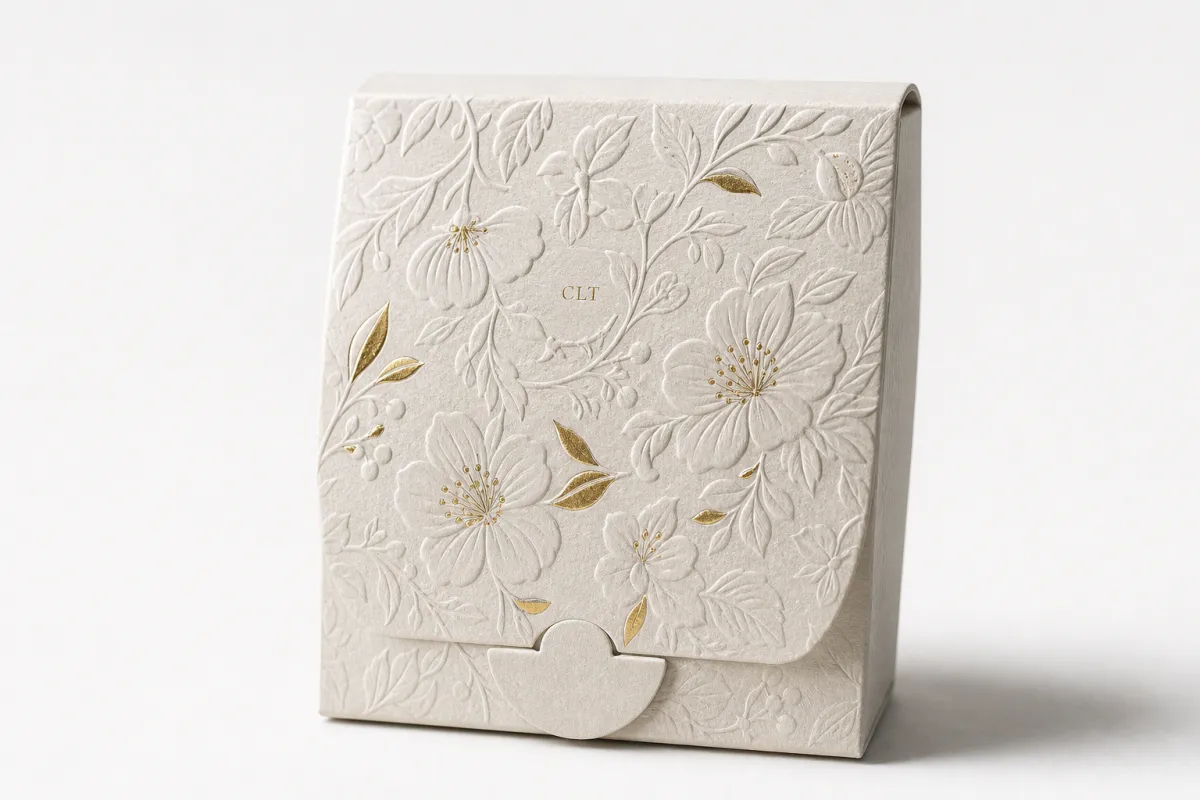
Blind embossing is the quiet winner for brands that want elegance without visual noise. It works best with flowers that have broad petals, generous negative space, and a clear silhouette. Think single blooms, stylized blossoms, or floral borders with breathing room. It is the most forgiving method for product packaging because the texture carries the design even when the light is low or the print coverage is minimal. If your goal is package branding that feels refined, blind embossing is usually the place to start when you review custom floral embossing techniques.
Foil embossing changes the whole conversation. The flower is no longer just tactile; it catches the eye. Warm gold, soft rose gold, and matte silver are the usual suspects because they read as premium without looking too loud. Foil can still hide weak depth, though. If the die is shallow, the metallic layer may look attractive for a moment, then the floral form loses dimension fast. That is why I tell buyers to review custom floral embossing techniques on the exact substrate they plan to use, not a substitute sheet pulled from the sample room.
Debossing gives a more architectural, pressed-in feel. It is excellent for botanical packaging that wants to feel grounded, vintage, or artisan-made. I like it for herbal brands, wellness boxes, and heirloom-style retail packaging because the impression feels deliberate. The drawback is cost and size. Deep debossing on oversized floral art can turn into a tooling workout, and if the artwork includes too many tiny veins, the result becomes muddy. In plain terms, the die will show you exactly how much patience your design deserved.
Combo embossing plus foil is where brands often overspend and still get the right result. It can be beautiful when the art is simple enough to support both texture and shine. The problem is registration. Once you stack multiple effects on a floral motif, any slight shift between the foil and the relief becomes visible. That is why combo work rewards restrained artwork, stable board, and a supplier that knows how to review custom floral embossing techniques without pretending every detail will survive intact.
Multi-level embossing is the most sculptural option. It creates depth in layers, which can make a flower look almost carved. Done well, it is excellent. Done carelessly, it looks overworked. Multi-level tooling is most useful for hero pieces, collector packaging, or Custom Printed Boxes where the embossing is the main event. It is less friendly to tiny repeat patterns or very fine floral linework, because the extra levels multiply your risk of distortion and increase the odds of sample churn.
Here is how I would rank the common methods for different buyer goals when you review custom floral embossing techniques:
- Best subtle luxury: blind embossing on uncoated or lightly coated board.
- Best shelf pop: foil embossing with a simplified floral silhouette.
- Best tactile story: deep debossing on thicker, stable stock.
- Best premium presentation: combo embossing plus foil, if the budget can handle it.
- Best sculpted drama: multi-level tooling for limited or hero packaging runs.
The stock matters as much as the method. A 350gsm C1S board can behave very differently from a 450gsm uncoated board. Soft-touch lamination can be gorgeous, but it can also mute sharp floral texture if the die is not tuned correctly. Heavily coated stocks often need more pressure to get the same definition, which raises the risk of crushed detail. That is why a serious packaging buyer always reviews the sample on the intended final material, not whatever the supplier had lying around.
One more thing most teams miss: dense botanical artwork gets hard to read once it is reduced. A bouquet that looks majestic at full size can turn into a crowded mess on a small tuck box. If the floral layout includes tiny petals, leaf veins, overlapping stems, and border filigree, expect simplification. That is not a design failure. It is part of the production reality when you review custom floral embossing techniques for real packaging runs.
For custom printed boxes, the safest approach is usually to pair a simplified floral die with a restrained print layout. For wedding packaging, a blind embossed blossom or border often feels more expensive than a crowded foil pattern. For confectionery and seasonal gift sets, foil embossing usually earns its keep because it reads quickly at retail. For boutique apparel, a soft-touch sleeve with one clean floral medallion can be enough. Different jobs need different levels of drama, and that is kinda the whole point.
Detailed Reviews: What the Samples Really Show
The sample is where the truth shows up. I can review custom floral embossing techniques from photos all day, but the real answer comes from running your fingers over the board and checking how the impression behaves in angled light. That is where weak petals, muddy edges, and shaky registration stop pretending to be acceptable.
Blind Embossing Sample Notes
Blind embossing usually looks best when the floral art is broad, confident, and not overloaded with tiny information. A flower with large petals and clean outer edges will hold a stronger tactile profile than a detailed botanical illustration full of veins and seed dots. The sample should feel crisp without looking overly aggressive. If the impression is too shallow, the flower disappears under print and coating. If it is too deep, the paperboard can distort and the surrounding panel starts to wave. That balance is the whole game when you review custom floral embossing techniques for premium packaging.
What I like most here is the way blind embossing supports quiet branded packaging. It does not fight the print. It sits on top of it. That makes it ideal for wedding invitations, cosmetic sleeves, gift boxes, and premium inserts where the texture is supposed to do the talking. The downside is clear: if the floral drawing depends on fine linework, blind embossing will not rescue it. It will expose every weakness in the artwork and every shortcut in the die making.
Foil Embossing Sample Notes
Foil changes the mood immediately. A floral motif in gold can feel rich and celebratory, while rose gold softens the look and silver reads more modern. The best samples have enough depth that the foil catches on the raised points and leaves the lower areas clean. That creates contrast. Without that contrast, the foil becomes decoration pasted over a flat idea, which is not the same thing at all.
Foil embossing is strong for retail packaging because it reads fast. On a shelf, a customer notices shine before texture. That is useful if your product needs visibility, especially in cosmetics, confectionery, candles, and holiday gift packaging. Still, the sample can fool you. Some foils hide an underdeveloped die, and the design may look impressive until you tilt it under harsher light or fold the panel into shape. Then the weak relief shows up immediately. This is why I always tell teams to review custom floral embossing techniques under both soft and direct lighting.
Debossing and Deep Relief Sample Notes
Debossing works best when the floral design wants to feel pressed, carved, or archival. It adds a more grounded personality to the packaging, which is useful for artisanal foods, botanical skincare, and heritage-inspired product packaging. On the sample, I look for even pressure and clean inner edges. If the center of a flower sinks too far, the shape gets tired. If the depression is too soft, the effect vanishes after print and lamination.
Deep relief is where costs can creep up. Bigger dies need more precision, and more precision means more setup time, more testing, and more chances for rejection during approval. On thick board, the result can be beautiful. On weaker stock, the relief can collapse or create an unwanted warp around the design. That is the tradeoff. Nice things are rarely free, and the press certainly keeps receipts.
Multi-Level Tooling Sample Notes
Multi-level embossing gives the most dimensional flower effect, but it also exposes the art direction. If the sample looks fantastic, the design was probably simplified correctly. If it looks crowded or lumpy, the artwork tried to do too much. Multi-level tools reward strong hierarchy. The central bloom should lead, the petals should step outward, and the smaller details should support the composition instead of fighting it.
This method is popular for hero packaging because it creates a memorable tactile moment. It also creates the highest risk of production drift. If the board changes, the press pressure changes, or the die wears unevenly, the levels can start to look inconsistent. That is why buyers should review custom floral embossing techniques with at least one sample on the final stock and, if possible, one sample after folding or gluing. Flat samples are useful. Finished samples are better. Actual assembled packaging is best.
“A floral embossing sample is only useful if it survives the real box. Anything else is decoration for the sample room.”
That quote may sound blunt, but it is the honest version. Packaging design lives or dies on production behavior, not on a studio render. If you are building a flower motif for branded packaging, I would rather see a modest design that survives 10,000 units than a fragile showpiece that falls apart at the first press adjustment.
Process, Timeline, and Production Steps for Floral Embossing
When teams review custom floral embossing techniques, they often underestimate the production steps. The finish may look simple. The process is not. Artwork cleanup, die making, sample approval, stock testing, and mass production each have their own failure points. Miss one, and the schedule stretches. Miss two, and you start negotiating with your launch date like it owes you money.
The first step is vector cleanup. Floral art that looks pretty in a PDF often contains lines that are too thin for die cutting and embossing. Tiny stems, crowded petals, and tight leaf clusters almost always need simplification. That is not a criticism of the artwork. It is a manufacturing adjustment. If the detail is too delicate, the impression will either break apart or vanish. Good prepress teams know this, and they clean the file before the die maker ever touches it.
Next comes tool design. The die maker has to translate the line art into a physical surface that can press cleanly into board. For a simple blind embossing job, the tooling stage might take a week or so once the final art is approved. For a multi-level floral die or a combo foil setup, expect longer. Sampling may take one round, or three, depending on how ambitious the artwork is and how close the first test gets to the target. This is where buyers should review custom floral embossing techniques with a healthy dose of patience.
Timeline pressure usually shows up in three places: first sample, revision round, and final approval. If the design includes foil, the alignment step can slow everything down. If the packaging also needs printing, die cutting, folding, and glue-up, the sequence gets even more sensitive. A common production window for straightforward floral embossing might be 12-15 business days from proof approval to sample, then another 7-14 business days for production, depending on quantity and plant load. Add foil or deeper relief and those numbers move. Not wildly, but enough to matter.
Stock testing is non-negotiable. The same floral die can look crisp on one board and soft on another. A 300gsm coated stock may keep detail nicely, while a softer uncoated sheet may absorb the pressure and blur the petals slightly. That is why the production sample should use the exact final stock whenever possible. If the team swaps paper after approval, they are not making a small change. They are changing the behavior of the entire finish.
Pressure settings matter too. Floral artwork with overlapping elements is more likely to show uneven depth or registration issues if the press is rushed. When foil and embossing are combined, even a slight shift can make the flower look off-center. That is why experienced suppliers check the fit under real conditions rather than assuming the first pass will be perfect. It usually is not. The machinery has standards. The paper has opinions.
If the project involves shipping-critical product packaging, I also recommend checking the package against transit expectations such as ISTA 3A style testing or similar distribution checks. The embossing may look perfect in the press room and still scuff, flatten, or crack after handling. That does not mean embossing is fragile by default. It means packaging has to be designed for the route it will actually travel, not the one everybody hopes it takes.
Cost, Pricing, MOQ, and Quote Reality
Pricing is where a lot of floral projects go from exciting to annoying. When you review custom floral embossing techniques, you need to separate the finish cost from the packaging cost, because suppliers sometimes bundle them in ways that make comparisons useless. A clear quote should show die charges, sample fees, setup costs, unit pricing, revision allowances, and any rush premiums. If you only see one neat number, assume something is missing.
The main cost drivers are predictable. Die complexity matters. Embossing depth matters. Foil coverage matters. Number of colors matters if print is part of the job. Stock thickness matters because heavier board usually supports cleaner relief, while thin board can require more careful tuning. Custom matched tooling also adds cost if the design needs a specific male and female set. That is especially true for multi-level floral relief, where the die has to be built to hold several depth zones without crushing the edges.
For buyers trying to budget realistically, here are the ranges I would use as a rough planning guide for a 5,000-piece run:
- Simple blind embossing: often the lowest-risk option, with tooling and setup usually landing in the lower range of the job.
- Foil embossing: commonly adds moderate cost because foil setup and registration checks take time.
- Deep debossing: often costs more than a basic blind emboss because the die work needs tighter control.
- Multi-level floral tooling: usually sits at the top end because it takes more engineering, sampling, and adjustment.
At the unit level, simple blind embossing can sometimes add about $0.03-$0.08 per unit at around 5,000 pieces. Foil embossing may land around $0.06-$0.15 per unit. Multi-level or foil-heavy floral work can move into the $0.12-$0.30+ range, especially if the design is large or the stock is demanding. Those are practical planning numbers, not promises. Different factories price setup and tooling differently, and quantity changes everything. Still, if a quote is wildly below those bands, someone is either simplifying the job too much or hiding a cost somewhere.
MOQ behavior matters as much as the unit cost. Lower quantities usually carry higher per-piece pricing because the die, setup, and approval costs are spread across fewer units. That is why a 500-piece seasonal run can feel absurdly expensive compared with 5,000 pieces. It is not because the supplier is being dramatic. It is because the math refuses to be romantic. If you need short runs, keep the floral design simpler and focus on one premium effect instead of three.
A good quote should also tell you what happens if revisions are needed. Ask whether one or two sample changes are included. Ask whether the die can be adjusted without a fresh tooling charge. Ask whether rush turnaround changes the sampling sequence. If the quote is vague, the final invoice will not be. That is one of the first things I tell buyers who want to review custom floral embossing techniques without getting trapped in a budget mess.
One practical note: some brands spend too much on complex floral tooling when the rest of the package does not support it. If the paper stock is thin, the printing is flat, and the structural box is generic, a deep emboss may feel out of place. Strong package branding comes from the whole system, not one fancy finish pretending to carry the load. If you need more of the system, build from the structural side first and use Custom Packaging Products to keep the finish choices aligned with the box style.
How to Choose the Right Floral Embossing Method
Start with the brand goal. If the packaging needs to feel luxurious, quiet, and expensive without shouting, blind embossing is usually the right answer. If the flower has to catch attention on a retail shelf, foil embossing makes more sense. If the brand story is artisanal, botanical, or heritage-inspired, debossing can support that mood better than a shiny finish. And if the launch is meant to feel premium in a more obvious way, combo methods may be worth the extra setup.
Artwork style should make the decision easier, not harder. Fine botanical illustration is beautiful on paper and often annoying in production. Bold floral medallions, single blossoms, and stylized leaves behave better because they keep their shape when the die is pressed into the board. Dense bouquets are the most likely to create problems. They need separation, negative space, or simplification before the design enters the die room. That is not killing the concept. It is making it manufacturable.
Match the finish to the customer experience. If the package will be held close, opened slowly, and photographed by the buyer, tactile depth matters more than flash. If it has to sell from a distance, visual contrast matters more than touch. That is why I often recommend blind embossing for elegant unboxing and foil embossing for retail packaging. One is for the hand. The other is for the shelf. Most good packaging needs both, but not always in the same ratio.
Stock and finish pairing is where many teams slip. Uncoated or lightly coated boards usually hold embossing better because the fibers respond cleanly to pressure. Slick, heavily coated finishes can reduce crispness unless the die depth is tuned carefully. Soft-touch lamination can be lovely, but it can soften edge definition if the floral details are too small. If the project includes die cutting as part of the structural build, watch the crease and cut lines too. A floral pattern placed too close to a fold can crack or distort after assembly.
Here is a simple vendor checklist I use when I review custom floral embossing techniques for a client project:
- Ask for a sample on the exact final stock.
- Confirm the minimum line width and smallest petal size.
- Request die depth guidance before approving the artwork.
- Ask for unit pricing at several quantities, not just one.
- Check whether sample fees and setup costs are separate.
- Compare one premium option and one budget option side by side.
If a supplier cannot answer those questions clearly, the project is not ready. A good quote should make the decision easier. A sloppy one just hides risk behind a friendly tone and a blurry mockup. Packaging people have seen that movie. It usually ends with rework.
For brands building custom printed boxes or seasonal retail packaging, I would also recommend checking the floral motif against the rest of the visual system. If the typography is heavy and the illustration is delicate, the package may feel split in two. If the structure is bold and the embossing is minimal, the finish can feel underfed. Strong packaging design aligns the structure, print, and embossing so the box does not argue with itself.
Our Recommendation and Next Steps
My recommendation is direct. Choose blind embossing when you want understated premium packaging, foil embossing when you need shelf presence, and combo methods only when the budget can absorb the tooling complexity. That is the cleanest way to review custom floral embossing techniques without getting lost in the romance of the sample room. Pretty samples are nice. Repeatable production is better.
If you are still choosing, gather two or three samples and test them under real conditions. Look at them in store lighting. Hold them at arm's length. Then hold them in your hand for ten seconds and see which finish still feels intentional. A floral emboss that looks impressive in a photo but dull in person is not worth much. This is exactly why teams should review custom floral embossing techniques on physical packaging, not on a flat render floating in a presentation deck.
Before you approve production, request a proper spec sheet. It should include board type, finish type, die depth guidance, foil coverage, MOQ, sample fees, unit pricing at quantity breakpoints, and the turnaround estimate from approval to shipment. If the supplier cannot put those details in writing, the risk is yours. That is not a business model. It is a trap dressed as convenience.
Also, do not approve a flower pattern just because it looks good before folding. Folded, glued, and packed cartons behave differently. A floral border that looks elegant on a flat sheet can break across a crease once assembled. A good approval process checks the sample in the actual box format, ideally after die cutting and final finishing. That is the only version that matters.
In practice, the best results come from simple decisions made early: simplify the art, Choose the Right board, match the finish to the use case, and give the press room enough room to do its job. If you do that, the embossing will feel premium instead of fragile. If you do not, you will spend more money explaining why the sample looked better than the shipment.
The most practical takeaway is this: review custom floral embossing techniques on the final stock, in final lighting, after folding, before you sign off on production. Pick one primary effect, simplify the flower until it can survive the press, and only then lock the quote and quantity.
FAQ
What is the best floral embossing method for premium packaging?
Blind embossing is usually the safest premium choice when you want texture first and decoration second. Foil embossing works better if the floral pattern needs shelf shine and stronger visual contrast. The right answer depends on stock and artwork detail, not just the look on a screen. If the flower is dense or tiny, review custom floral embossing techniques on the intended board before you commit.
How much does custom floral embossing usually cost?
Costs depend on die complexity, foil coverage, stock choice, and order quantity. Simple blind embossing is usually cheaper than multi-level or foil-heavy floral tooling. For planning, a basic blind emboss may add only a few cents per unit at larger runs, while detailed combo work can move much higher. Ask for sample, setup, and unit pricing separately so the quote is actually comparable.
How long does the floral embossing process take?
Expect time for artwork cleanup, die making, sampling, approval, and production. Detailed floral artwork usually adds revisions because fine petals and stems need simplification. Straightforward jobs can move faster, but foil, deep relief, or structural changes will add time. Rush jobs are possible, though they usually cost more and leave less room for sample fixes. That is one more reason to review custom floral embossing techniques early.
Is blind embossing or foil embossing better for floral designs?
Blind embossing is better for subtle, tactile, high-end floral work. Foil embossing is better when the flower needs to stand out visually from a distance. If the artwork is dense, foil can mask weak depth, so test both before deciding. The choice should follow the product packaging goal, not the prettiest mockup.
What should I check before approving a floral embossing sample?
Check line clarity, petal depth, and whether the texture survives on the exact stock you will use. Inspect the sample under real lighting and after folding or gluing if it is a box format. Confirm the quote, MOQ, and turnaround before final approval so there are no surprises. If anything looks vague, ask the supplier to review custom floral embossing techniques with the final materials, not substitutions.

