Buyer Fit Snapshot
| Best fit | Rigid Boxes with Logo projects where brand print, material claims, artwork control, MOQ, and repeat-order consistency need to be specified before quoting. |
|---|---|
| Quote inputs | Share finished size, material target, print colors, finish, packing count, annual reorder estimate, ship-to region, and any compliance wording. |
| Proofing check | Approve dieline scale, logo placement, barcode or warning zones, color tolerance, closure strength, and carton packing before bulk production. |
| Main risk | Vague material claims, crowded artwork, missing packing details, or unclear freight terms can make a low unit price expensive after revisions. |
Fast answer: Rigid Boxes with Logo: Structure, Print Proof, Packing, and Reorder Risk should be specified like a repeatable production item. The safest quote records material, print method, finish, artwork proof, packing count, and reorder notes in one written spec.
Production checks before approval
Compare the actual filled-product size with the drawing, then confirm tolerance on folds, seals, hang holes, label areas, and retail display edges. Reserve space for logos, QR codes, warning copy, and material claims before decorative graphics fill the panel.
Quote comparison points
Review material grade, print process, finish, sampling route, tooling charges, carton quantity, and freight assumptions side by side. A quote is only useful when the supplier can repeat the same color, closure quality, and packing count on the next order.
Rigid Boxes With Logo change the mood of a product before anyone touches the product itself. They have weight. They have presence. The lid lands with a little authority, and the branding sits right there where people can see it. That is why rigid boxes with logo keep showing up around gifts, cosmetics, premium electronics, collector sets, and presentation kits where the packaging has to do more than protect the contents. It has to earn its keep.
From a buyer's perspective, rigid boxes with logo are not just containers. They are part of the product experience. They control movement, frame the reveal, and put the brand mark in front of the customer at the exact moment attention is highest. Folding cartons can be efficient and perfectly fine for plenty of jobs. Rigid packaging plays a different role. If the structure is right, the logo does not look slapped on. It feels integrated, like the whole box was built around that one clean first impression.
For brands working with Custom Logo Things, the real question is not whether rigid boxes with logo look good. They do. The real question is which structure, finish, and spend level make sense for the product without paying for decoration that only flatters a mood board. I have seen teams overbuild packaging because the prototype looked fancy in a meeting. The meeting is not the customer. The shelf is not the customer either. The actual answer starts with the build, the cost drivers, and the details that still matter after the box has been handled a few times.
What Rigid Boxes with Logo Are and Why They Stand Out
Rigid boxes with logo are set-up boxes made from thick paperboard or greyboard that keeps its shape instead of folding flat like a standard carton. The core usually falls somewhere around 1.5 mm to 3 mm thick, though the right board caliper depends on the product weight, the shipping route, and the feel the brand wants in the hand. An outer wrap of printed paper, specialty stock, or coated material turns that plain structure into a branded surface. The logo does the rest. It tells the buyer what kind of product this is before the box opens.
That structure matters. A folding carton can be smart and cost-efficient, but rigid boxes with logo bring more presence. The walls hold up better, the edges look cleaner, and the package feels deliberate instead of disposable. For luxury candle sets, skincare collections, subscription kits, collectible goods, and high-value accessories, that extra stiffness supports the price instead of fighting it. I have watched a plain product jump a price tier in the customer’s mind just because the box had some weight and the closure felt intentional.
Logo placement matters just as much as box type. On rigid boxes with logo, branding can sit on the lid top, the base sidewall, the inside cover, a belly band, an outer sleeve, or an insert. A centered foil mark on the lid feels formal and direct. A logo on the inside cover slows the reveal and gives the box more drama. A belly band or sleeve adds another branding layer without complicating the main box. Each location changes how the customer reads the package, and each one sends a slightly different signal.
Plenty of people miss this part: rigid boxes with logo are not automatically luxurious just because they are rigid. The box still needs a fit that makes sense, a finish that matches the brand story, and a logo that stays readable at real-world viewing distance. A giant box with weak artwork can feel generic fast. A smaller box with a crisp logo, a clean wrap, and a tight closure often feels more expensive than it really is. That is the trick, and it is not very mysterious.
Compared with folding cartons, rigid boxes with logo make the strongest case when the product benefits from a premium reveal, extra protection, or a gift-ready presentation. That is why they show up so often in launches, special editions, corporate sets, and retail displays where the packaging is part of the product value, not just the shell around it.
"A rigid box should feel like it belongs to the product. If the lid opens awkwardly or the logo gets lost in the design, the whole thing starts looking uncertain."
For sourcing teams, the practical question is not whether rigid boxes with logo are attractive. The real test is whether the product, margin, and channel can support the structure. If the answer is yes, the packaging becomes a useful brand asset instead of a cost line that makes everyone stare at the spreadsheet a little too long.
How Rigid Boxes with Logo Are Built
Rigid boxes with logo usually start with a greyboard or chipboard core. That core gets cut into panels, scored, and assembled into the box body. An outer wrap goes on next. That wrap might be printed paper, coated art paper, textured stock, kraft-style paper, linen-look wrap, or another specialty material. Most people notice the wrap first, but the core is what gives the box its shape and strength.
The assembly process matters because the wrap has to lay flat, the corners have to fold cleanly, and the edges need enough adhesive control to avoid bubbles or lifting. On a good production run, the corners stay sharp, the lid sits square, and the whole box feels even. On a rushed or poorly specified run, the corners telescope, the paper wrinkles near the folds, and the box starts looking cheaper than the spec sheet promised. Specs are easy. Good execution is the annoying part.
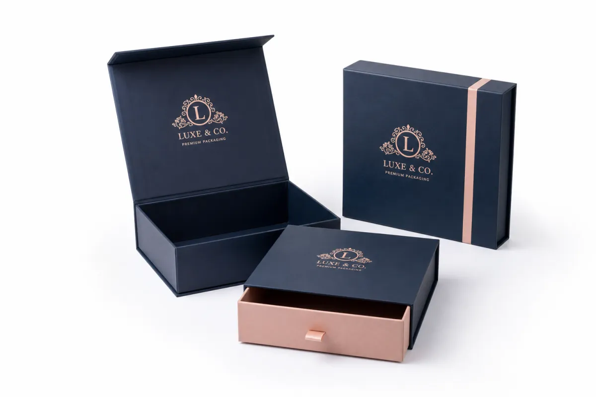
Several structure styles show up again and again in rigid Boxes With Logo:
- Two-piece lid-and-base boxes - classic, sturdy, and easy to understand for retail and gift use.
- Magnetic closure boxes - strong for high-end presentation, especially when the reveal should feel controlled.
- Drawer boxes - useful when the product slides out on a tray, which can create a neat reveal sequence.
- Collapsible rigid boxes - better for storage and shipping efficiency when the box still needs a premium look.
Finishes are where rigid boxes with logo move from plain structure into brand language. Soft-touch lamination can make the surface feel velvety and quiet. Matte lamination keeps the look calm and modern. Gloss sharpens color and contrast, though it tends to show wear sooner. Foil stamping adds metallic emphasis to the logo. Embossing raises the mark for tactile depth, and debossing presses it into the surface for a more restrained effect. Spot UV can highlight a logo or pattern, but use it with care. Too much contrast and the box starts yelling.
The inside matters too. A rigid box with a plain interior can still work, but once the inside cover, insert, or tray is printed or wrapped, the package feels more coordinated. That is why brands often choose rigid boxes with logo for products that need a stronger unboxing arc. Even a simple two-piece box becomes more memorable when the product sits in a cut-to-fit insert, the lid opens cleanly, and the logo appears again on the inside.
Inserts are not filler. Good inserts hold the item in place, reduce movement during transit, and help the customer understand where everything belongs. They can be made from EVA foam, molded pulp, paperboard, corrugated board, or flocked trays, depending on the product and the level of presentation needed. For heavier or fragile products, the insert becomes part of the protection system, not just a nice-looking extra.
For brands that care about responsible sourcing, it is worth asking whether the paper wrap can be FSC-certified and whether the insert can be adjusted to reduce plastic content. The Forest Stewardship Council explains certification clearly at fsc.org, and that kind of documentation can help when a buyer needs packaging that supports a sustainability claim without sounding vague or convenient.
If the product will ship through a tougher route, ask about transit testing. Packaging standards from groups such as ISTA are useful references when you want packaging that can survive drop, vibration, and compression exposure before it reaches the customer. Rigid boxes with logo can look polished and still fail in shipping if the structure is too light for the route.
Key Factors That Shape Cost and Appearance
Cost for rigid boxes with logo comes from more than print coverage. The biggest variables are box size, board thickness, wrap material, logo decoration, insert complexity, and the amount of handwork involved in assembly. A compact two-piece box with a simple printed wrap costs far less than a magnetic closure box with a foil logo, embossed mark, custom insert, and interior print. That gap is not cosmetic. Every added feature brings material handling, setup time, or finishing labor with it.
Quantity matters a lot. At lower volumes, setup cost gets spread across fewer units, which pushes the unit price up. A small run of rigid boxes with logo can still make sense for a launch or limited edition, but the buyer should expect a higher per-box cost than a larger replenishment order. Once the order size climbs, tooling, proofing, and setup start to sting less on a per-unit basis. That is why many brands try to forecast farther ahead instead of buying only enough to survive the next shipment.
Artwork changes the economics too. Full-coverage color on the wrap usually needs tighter print control than a simple one-color logo. Foil stamping across a large area takes more tooling and more care than a small corner logo. White ink on a dark wrap adds print passes. Embossing or debossing may require matched dies. If the logo appears on multiple surfaces, each surface has to be aligned and checked. That means more coordination and more chances for someone to make the file slightly worse in the name of speed.
Shipping and storage deserve attention early because rigid boxes with logo are bulkier and heavier than folding cartons. Even collapsible rigid boxes still use a more substantial core than a standard printed carton. That affects pallet count, freight cost, warehouse space, and sometimes inbound handling. A buyer can underbudget a packaging program by focusing on unit price and ignoring the physical footprint of the finished boxes. The warehouse will absolutely notice later.
To keep expectations grounded, here is a practical comparison of common rigid box styles. These are broad market ranges, not fixed quotes, and the final number can move with size, finish, and quantity.
| Rigid box style | Typical use | Approximate unit price at mid-volume | Notes |
|---|---|---|---|
| Two-piece lid-and-base | Gift sets, cosmetics, accessories | $1.20-$3.50 | Often the most balanced option for cost and presentation |
| Magnetic closure | Premium retail, launches, VIP kits | $2.50-$6.50 | Uses more assembly and usually feels more elevated |
| Drawer style | Jewelry, small electronics, curated kits | $2.00-$5.50 | Good for a reveal moment, but slide fit must be tuned carefully |
| Collapsible rigid | E-commerce, storage-sensitive programs | $2.20-$5.80 | Can reduce shipping volume, though assembly complexity may rise |
Those numbers move quickly if a project includes specialty paper, a large interior print area, custom foam, satin ribbon pulls, or advanced finishing. A 350 gsm or 400 gsm printed wrap over a 2 mm board is a common starting point for many branded projects, but the final spec should still follow the product's weight and how the box will be handled. A heavy serum bottle has different needs than a lightweight apparel accessory. Packaging does not care about wishful thinking.
One more practical factor is visual restraint. A plain kraft wrap with a single debossed logo can feel more refined than a crowded design with three foil colors and too many graphic elements. The eye reads confidence in spacing. The hand reads confidence in structure. That is why rigid boxes with logo usually land best when the design does one or two things well instead of trying to perform every trick in the catalog.
Step-by-Step Process and Timeline for Rigid Boxes with Logo
The cleanest rigid boxes with logo projects start with discovery, not artwork. First, define the product dimensions, total weight, fragility concerns, retail setting, shipping method, and the kind of unboxing moment the box needs to support. A box for a luxury gift set does not need the same structure logic as a box that will be stacked in retail cartons and pushed through a fulfillment center all day. The use case tells you what should be built.
After that, structural work begins. The box style, insert layout, and logo placement should be locked down before print approvals. A dieline review catches a lot of problems early. On rigid boxes with logo, small changes in lid depth, magnet position, or insert fit can alter the final experience more than people expect. If the logo sits too close to a hinge, a wrap seam, or a closure edge, it may disappear once the box is assembled. Great in mockup. Annoying in reality.
Next comes proofing and sampling. Depending on the supplier and the complexity of the order, this may involve material swatches, printed proofs, a plain structural sample, or a pre-production sample with the actual logo and finish. That step matters because color, paper texture, foil brightness, and corner wrapping all interact. A logo can look perfect on screen and still feel too small, too shiny, or too close to the edge once it is on the box. Screens are cheerful liars.
For practical planning, a typical timeline often looks like this:
- Briefing and quote - 1 to 3 business days if the specs are clear.
- Dieline and structure review - 2 to 5 business days depending on revision rounds.
- Sampling or proof approval - 3 to 10 business days, longer if special finishes are involved.
- Production - often 10 to 20 business days for standard builds, with more time for complex features.
- Packing and shipping - add transit time plus any warehouse receiving window.
That timeline stretches when the job includes specialty paper, custom inserts, magnetic closures, multiple foil colors, or a very tight color target. Rigid boxes with logo are not the place to cram every step unless the artwork is already approved and the structure is simple. Skipping proof time may save a few days, but it can cost far more if the insert fit is wrong or the logo lands in the wrong place.
Think of the process as a chain of decisions rather than a single order. One choice affects the next. A thicker board changes the wrap behavior. A deeper lid alters the reveal. A larger insert shifts package weight and freight class. Even the choice between matte and soft-touch can affect how fingerprints show during handling. Good planning keeps those details aligned instead of leaving them to luck and optimism.
If you are sourcing through a packaging supplier, it helps to ask for the dieline, a finish recommendation, and a sample plan in writing. If you also want to compare packaging components, the product pages at Custom Packaging Products can help narrow down the style before you commit to final art. Clear inputs lead to cleaner rigid boxes with logo, and cleaner input usually means fewer revisions later.
Common Mistakes That Hurt Rigid Boxes with Logo
One of the most common errors with rigid boxes with logo is measuring the product too early or too loosely. A box that is even a few millimeters too large can let the item shift, which hurts both protection and presentation. A box that is too tight can crush corners, stress closures, or make the lid feel awkward to remove. The right fit gives the product enough clearance for easy placement without wasting space or acting like it has something to prove.
Another frequent issue is logo placement that looks fine on a flat layout but fails in the assembled box. A logo can get lost under the lid lip, sit too close to a fold, or disappear into a heavy design field. Small logos are especially vulnerable when the finish is matte or the paper has strong texture. Thin serif fonts, delicate line work, and low-contrast color choices may need more size or more contrast than the first mockup suggests.
Skipping samples is risky, especially with rigid boxes with logo. A finish that looks clean in a render may reflect light differently on an actual substrate. A paper wrap that seems smooth in the spec sheet may show grain once it is wrapped around corners. Even insert tolerances can shift if the product has slight manufacturing variance. A sample tells you whether the box feels right in the hand, not just whether the file looks good on a monitor.
Overcomplicated specs can hurt the program in another way. Some brands pile on every premium effect they can think of - foil, embossing, soft-touch, full interior print, ribbon pulls, custom foam, and a magnetic closure - then realize the product margin cannot survive the result. That is not packaging strategy. That is budget erosion with a nice finish. Rigid boxes with logo should support the product, not compete with it for attention and spend.
Here are a few practical warning signs to watch for:
- The box size was chosen before final product measurements were confirmed.
- The logo is small enough to vanish once the lid is on a shelf or in a hand.
- The insert looks impressive but adds more cost than product value.
- The finish was selected for trend appeal instead of brand fit.
- The project has no sample checkpoint before full production.
There is also a hidden mistake that shows up in transit. Some teams spend heavily on the visual side and then underbuild the protective side. If the product is fragile, the insert needs to stop movement, the box needs enough board strength, and the shipping method needs to match the structure. That is where testing earns its keep. If the route is rough, ask for a transit plan that considers compression, vibration, and drops, not just a nice photo on a desk.
Rigid boxes with logo usually fail for boring reasons, not dramatic ones. The logo is 5 mm too low. The insert is 2 mm too loose. The foil color is too bright for the brand tone. The board is strong enough for display but not strong enough for freight. Small production details. Big consequences. Packaging loves that kind of trick.
Expert Tips for Better Structure, Print, and Finish
The best rigid boxes with logo succeed because they are designed for touch as much as sight. A customer may only glance at the lid for a second, but they feel the closure, the edge wrap, the lift of the lid, and the texture of the finish. If the tactile experience feels clean, the box signals quality before the logo gets a second look.
My first recommendation is to match the finish to the brand story. Matte finishes feel calm and restrained. Soft-touch finishes feel more luxurious in a tactile sense, although they can show scuffs if the box gets handled heavily. Foil stamping works well when the logo needs emphasis, but it should be applied with intention, not as a default move because someone wanted to make the deck look expensive. Embossing and debossing are especially useful for rigid boxes with logo because they add depth without demanding extra color.
Another useful rule is to keep the exterior and interior experience in the same design family. If the outside is minimal, the inside should not suddenly turn loud unless the reveal is part of the strategy. A coordinated interior can be as simple as a printed logo on the inside lid, a tone-on-tone pattern, or a tray that matches the outer wrap. A mismatched interior can make even a strong exterior feel unfinished, which is a weird place for a premium box to land.
Production-minded artwork choices matter more than many teams realize. Keep critical text inside safe zones, leave enough bleed for wrap edges, and avoid placing important graphic details where corners will fold. On rigid boxes with logo, corner wraps and hinge areas are not neutral spaces. They are active build zones. The artwork has to work with the structure, not bully it into submission.
Color control is another place where discipline pays off. A logo may look right on a monitor and still need adjustment on paper because matte wraps absorb light differently from gloss stocks. Dark boxes can need white underprint or a carefully chosen ink system to keep the logo crisp. If the logo is the main point of recognition, request a physical sample or printed proof so the color target gets checked before a full run starts.
Here is a practical production checklist that helps rigid boxes with logo come out cleaner:
- Confirm final product dimensions before the dieline is approved.
- Keep important artwork away from folds, hinges, and seam lines.
- Match finish level to handling conditions, not just shelf appearance.
- Check whether the wrap paper can hold sharp corner turns without cracking.
- Ask whether the insert needs a paper wrap, print, or protective lining.
There is a quiet advantage to simplicity. A restrained box with one confident logo, a good paper choice, and a neat closure often outperforms a more elaborate concept that feels overworked. In packaging, restraint reads as control. Control reads as value. That is the whole trick, and it is not very glamorous.
If you want a practical middle ground, try one premium feature and one structural feature. Pair a soft-touch wrap with foil on the lid, or use an embossed logo on a drawer box with a printed interior tray. That approach keeps rigid boxes with logo focused, memorable, and easier to budget. You do not need every finish in the catalog. Honestly, that usually just makes the box look nervous.
For broader sourcing or to compare structural options for your next run, it can help to review the available components through Custom Packaging Products and then narrow the spec based on product weight, retail display, and freight reality. The right combination is rarely the most complicated one. Usually, it is the one that knows when to stop.
What to Do Next Before You Order
Before you place an order for rigid boxes with logo, gather the numbers that actually shape the quote: product dimensions, unit weight, fragility concerns, target quantity, and the shipping environment. If the product will move through e-commerce, retail shelving, corporate gifting, or a hybrid path, that changes the structure recommendation. A good quote starts with real use cases, not just a box size scribbled on a note and someone saying, "roughly this."
Decide which part of the package should do the heaviest branding work. Some projects only need the lid logo. Others benefit from full exterior wrap printing, an interior mark, or a printed insert. The right mix depends on budget and brand behavior. If the customer opens the box once and stores it, the lid may matter most. If the box becomes part of the long-term product ritual, the inside details matter more. Rigid boxes with logo reward that kind of planning.
Ask for the supporting documents before you approve anything: a dieline, a material recommendation, a finish list, and a sample or proof plan. If the order includes multiple components, make sure each one is named clearly. That includes the board thickness, wrap stock, closure type, insert material, and any foil or embossing detail. Ambiguity is where packaging errors like to hide. They are patient that way.
A final spec review should answer three questions plainly. Does the box fit the product without forcing it? Does the branding read clearly at the distance customers will actually see it? Can the box be shipped, stored, and handled without breaking the budget or the schedule? If the answer is yes to all three, the project is usually in good shape.
Here is a simple decision sequence that works well in practice:
- Confirm product measurements and weight.
- Choose the rigid box structure that fits the use case.
- Pick one or two finishes that support the brand tone.
- Review the dieline and insert layout carefully.
- Approve a sample or proof before full production.
- Check shipping plan, carton count, and storage needs.
If you are still comparing options, remember that rigid boxes with logo are worth the spend when the packaging helps sell the value of the product, protects it during handling, or turns the unboxing into part of the brand experience. They are not always the cheapest choice, and they should not be. They are the right choice when structure, print, and presentation all need to work together.
Handled well, rigid boxes with logo can make a product feel careful, credible, and premium without looking overdone. That is the sweet spot: a strong structure, a clear logo, a finish that suits the brand, and a build that holds up in real use. When those pieces line up, the packaging stops feeling like an extra cost and starts acting like part of the product itself.
The actionable move is simple: lock the product dimensions, choose the box style, and approve a sample before you spend on full production. Do that, and you avoid the usual mess - wrong fit, fuzzy branding, and a box that looks expensive until it gets shipped.
Frequently Asked Questions
How much do rigid boxes with logo usually cost?
Cost depends on size, board thickness, paper wrap, logo decoration, inserts, and finishing methods such as foil or embossing. A simple two-piece box at mid-volume might sit in the low single digits per unit, while a magnetic closure style with custom insert and premium finish can move higher quickly. Higher order quantities usually lower the unit price because setup and tooling costs are spread across more boxes. The most accurate quote comes from exact dimensions, product weight, and the specific look you want to achieve.
What artwork files do I need for rigid boxes with logo?
Vector files are best for logos because they stay sharp at any size and make placement easier across box panels. A dieline with labeled safe zones helps confirm where the logo, text, and finishing effects will sit on the finished box. If your artwork includes color-critical branding, request a proof or sample so you can check alignment and color before production. That extra step is especially useful when the logo will be foiled, embossed, or printed on a dark wrap.
How long does a rigid boxes with logo order take?
Timeline depends on sampling, artwork approval, material availability, and whether the box uses specialty finishes or custom inserts. Simple structures move faster than complex magnetic or drawer styles, especially when multiple production steps are involved. Build extra time for proof review and shipping if you need a precise launch date or retail delivery window. If the schedule is tight, finalize the structure and artwork first so the order does not get delayed by avoidable revisions.
Are rigid boxes with logo worth it for small runs?
They can be worth it when the product price, gift value, or retail presentation justifies a premium unboxing experience. Small runs often carry a higher per-box cost, so it helps to prioritize the highest-impact features and avoid unnecessary extras. If budget is tight, focus on smart structure, clean branding, and one strong finish instead of stacking too many embellishments. A well-made simple box is usually better than an overdesigned one that drains margin.
What finish works best for rigid boxes with logo?
There is no single best finish; the right choice depends on the brand personality, product category, and how the box will be handled. Matte or soft-touch finishes feel refined, foil adds emphasis, and embossing or debossing gives the logo tactile depth. A good rule is to match the finish to the product story so the box looks intentional rather than overdesigned. If the product is handled often, ask about scuff resistance and fingerprint visibility before you commit.


