Chocolate Embroidered Beanies Material Thickness Guide: Why the Same Chocolate Beanie Can Look Premium or Cheap After Embroidery
A chocolate beanie can look rich, warm, and expensive on a mockup, then lose all of that once the logo goes on. The fabric is doing half the visual work before the needle even starts. After embroidery, that work gets tested hard. A tight, well-chosen knit keeps the logo clean. A soft, airy, or overly stretchy one makes the same logo look smaller, fuzzier, and a little underfed.
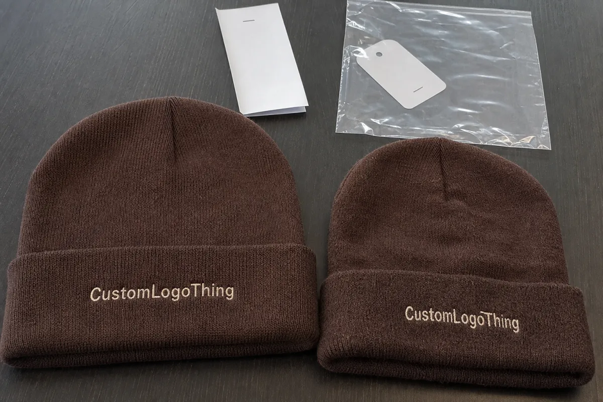
That is why a chocolate Embroidered Beanies Material thickness guide matters before sampling, not after a production run is already locked. Two blanks can feel similar in hand and still behave very differently under embroidery. Chocolate tones make those differences easier to see because backing show-through, seam bulk, and stitch distortion stand out against the dark surface. The darker the knit, the less room there is for sloppy construction to hide.
Thickness is also a misleading word. Buyers often use it to mean warmth, but for embroidery the real issue is structure. A heavier-feeling knit can still be too loose. A lighter one can stitch beautifully if the loops are compact and the surface recovers well. The best blank is not the plushest or the cheapest. It is the one that lets the logo stay sharp after hooping, stitch-out, shipping, and wear.
How Fabric Weight, Knit Density, and Stretch Control Embroidery
Fabric weight, knit gauge, and loop density get mixed up all the time. They are related, but they are not interchangeable. Weight tells you how substantial the beanie feels. Gauge describes the knit construction, such as 7-gauge or 12-gauge. Density tells you how tightly the yarn loops sit together. For embroidery, density usually matters more than raw weight. A 95-gram beanie with a tight surface can outperform a 120-gram beanie that feels loftier and opens up under the needle.
Acrylic is common because it is consistent, affordable, and usually recovers its shape better than many natural-fiber options. Cotton can feel softer and more breathable, but it can also relax more after wear, which gives the logo more movement to deal with. Blends sit somewhere in the middle and can work well when the yarn mix is chosen for structure instead of just hand feel. If the logo includes small lettering, tight knit density matters even more. Fine letters need a surface that will not swallow the edges.
Stretch recovery is the part people underestimate. A beanie that grows out of shape during wear will ask the embroidery to move with it. That rarely ends well. If the front panel is too stretchy, the letters can spread, the outline can warp, and the underlay may show at the edges. Placement matters too. A logo sitting too close to the cuff fold or a seam has less stable fabric to work with, which is asking for trouble.
Hooping, stabilizer choice, and stitch direction also matter, but thickness still sets the floor. Thin and tight is often easier to embroider than thick and loose. The opposite sounds comforting. It usually produces a mess. On chocolate beanies, even a slight shadow from backing can be visible if the blank is too light in structure or the stitching is too dense for the knit.
There is one more practical detail buyers miss: some beanies look smooth until the machine starts punching them. Then the rib variation, yarn slubs, and seam bulk show up. That is not a defect by itself. It is just what knitted fabric does under pressure. If the blank is barely holding together before embroidery starts, the result will show it.
Choosing the Right Thickness for Warmth, Fit, and Everyday Wear
The right thickness depends on how the beanie will actually be used. A giveaway for a winter event can work on a lighter blank if the artwork is simple and the wear cycle is short. Retail merch needs more than that. Customers notice drape, recovery, edge finish, and whether the hat feels awkward after an hour. Staff uniforms sit in the middle. They need to look decent, fit a range of heads, and survive repeated wear without the logo getting tired first.
Thicker, softer knits feel cozy. They also reduce the clean embroidery zone. That tradeoff shows up fast with small text, thin outlines, and monograms below about 5 mm tall. Plush surfaces can swallow the edge of a letter or make a logo look slightly broken even when the digitizing is good. A medium-density blank often gives the cleanest result because it keeps enough structure without turning the hat stiff.
A beanie that feels thicker is not always better for embroidery; density beats loft when the goal is a sharp logo.
Audience changes the answer too. A ski shop may prefer a warmer, heavier hand feel, even if the logo has to be larger. A streetwear buyer might care more about a flatter, cleaner front panel. Corporate orders usually want the middle ground: presentable, comfortable, and repeatable across the whole run. Chocolate makes all of this more obvious because dark brown can look expensive with the right thread, but it also exposes weak contrast and underlay mistakes faster than lighter colors do.
My rule is simple: choose the thinnest blank that still supports the logo size and placement you need. That usually gives a better fit, less bulk under the cuff, and fewer embroidery issues. It also keeps the hat from feeling overbuilt, which matters more than most first-time buyers expect.
For most standard embroidery jobs, midweight acrylic or a dense acrylic blend is the safest starting point. For fashion pieces or colder-weather retail, a heavier rib knit can work if the logo is bold and the thread size is forgiving. Plush knit is the hardest to control. It can look great in photos, then turn vague the moment the stitch pattern gets detailed. Pretty fabric, annoying production. Classic combo.
Cost, MOQ, and Unit Price: What Thickness Does to the Quote
Thickness changes pricing in more than one place. The blank itself may cost more if it uses denser yarn, a higher-quality blend, or a heavier knit construction. But the blank price is only one part of the total. Stitch count, digitizing, sample approvals, and the number of production passes can matter just as much. A 6,000-stitch logo on a stable blank is a different job from a 10,500-stitch crest on a soft knit that needs more stabilizer and usually a better sample.
MOQ changes the math too. Small runs carry more setup cost per piece because digitizing, sampling, and approval time are spread across fewer hats. Larger runs usually lower the unit price, assuming the blank is already available. If the chocolate shade is specialty stock, there may be a sourcing premium. That happens a lot when the buyer wants a specific brown rather than whatever happened to be in the catalog this week.
| Blank Type | Typical Feel | Embroidery Behavior | Approx. Blank Cost | Best Use |
|---|---|---|---|---|
| Midweight acrylic, tighter knit | Warm, balanced, not too bulky | Usually handles small logos well | $1.40-$2.20 | Giveaways, staff programs, clean retail basics |
| Heavy rib knit | Substantial and cozy | Good for bold marks, less ideal for fine text | $2.20-$3.60 | Outdoor wear, colder climates, value-plus programs |
| Cotton blend, medium density | Soft with a natural hand | Can stitch cleanly if the knit is tight | $2.00-$3.40 | Retail merch, lifestyle brands, comfortable daily wear |
| Plush or lofted knit | Very soft, fashion-forward | May hide detail and raise backing visibility | $2.60-$4.20 | Large logos, relaxed fashion looks, premium feel |
A realistic small-to-mid run might land somewhere like this: blank cost at $1.50-$3.80, digitizing at $35-$85, embroidery at $1.20-$3.00 per piece depending on stitch count, and sample charges from free to about $40 if revisions are needed. If the order uses a premium chocolate blank or a specialty yarn, add a bit more. The lowest quote is not always the best value. The cheapest order on paper can get expensive fast if it needs rework, re-sampling, or a second production pass because the first sample looked good only under forgiving lighting.
Packaging can shift the quote too. If the beanies are going retail or direct-to-consumer, the carton and insert choices matter. Corrugated cardboard is still the default because it protects the product without complicating the shipper. Inside the carton, kraft paper, recycled fillers, or molded inserts can keep hats from shifting around. If sustainability claims matter, ask whether the board is FSC certified and whether any paper content includes post-consumer waste. Those details do not make embroidery better, but they do keep the final package from feeling like an afterthought.
Production Steps and Lead Time for Embroidered Beanies
A clean order usually moves through six steps: spec sheet, blank selection, digitizing, sample approval, production, and packing. Each step sounds simple until the blank changes. If the supplier has to source a specific chocolate knit or test more than one construction, lead time grows before the first stitch is sewn. That is why a good quote should name the exact blank, not just the color family.
Sampling is where most schedules get saved or blown up. Fast buyer feedback shortens turnaround more than trying to rush the embroidery line. If the proof sits in inboxes for three days, the timeline slips even if the machine team is ready to go. A typical sample window is several business days, then production often adds one to three weeks depending on stock, order size, and how detailed the logo is. Imported blanks, specialty yarns, and complicated artwork can push it further out.
The sample should always be inspected on the same blank that will go into production. Check stitch clarity, edge smoothness, stretch recovery, and backing visibility under bright light. If the proof was made on a different gauge or with a different stabilizer, it is only a rough reference. A loose proof does not prove a stable final run. It just proves that the sample looked fine once.
Quality control should be boring and repetitive. That is a compliment. Ask for photos of the front and back of the sample, then compare the stitch path, thread tension, and seam interaction. If the logo crosses a rib or a cuff fold, make sure the design is centered after stretch, not only when the beanie is laying flat on a table. Flat lies. Fabric remembers tension.
Shipping and packing need their own check. If the order is leaving in master cartons, ask how the cartons are tested for transit stress. The International Safe Transit Association publishes common test methods at ISTA. For paper-based packaging claims, the Forest Stewardship Council is the reference for chain-of-custody paperwork and forest management labeling at FSC. Neither one improves stitch quality. Both help keep the rest of the order from turning into avoidable drama after it leaves the facility.
Good milestone tracking is unglamorous and useful: proof date, approval deadline, production start, quality check, pack-out, and ship date. If a supplier cannot give you those points, the order is being run on optimism. That is not a process.
Common Thickness Mistakes That Make Logos Look Cheap
The biggest mistake is choosing the warmest-feeling blank instead of the best embroidery platform. Buyers do it all the time. The hat feels nicer in hand, so it gets approved. Then the logo comes back compressed, fuzzy, or too small for the surface. Fine text disappears first. Thin line art is usually next.
Ignoring stretch recovery creates another mess. If the knit opens up under tension and does not snap back cleanly, the logo can pucker after wear, washing, or being stuffed into a bag. This is easier to miss flat than on a head. A sample can look acceptable on the table and then show distortion once the fabric is stretched into normal use. That is why thickness by itself is not a useful verdict.
Chocolate blanks also punish weak contrast choices. Some thread colors vanish against dark brown. Others feel too bright and harsh. Muted gold, cream, tan, off-white, or a restrained orange can work well depending on the logo. Black thread often disappears. Neon can look loud in a way that does the beanie no favors. Test the thread on the actual blank, not on a screen render that has never seen daylight.
Another common miss: approving a proof from the wrong gauge or a different vendor and assuming production will match. It will not. A chunky 7-gauge knit and a smoother 12-gauge knit take the same logo very differently. If the sample blank is not the production blank, the sample is only a style reference. Useful, yes. A production standard, no.
If the sample was stitched on the wrong knit, it is a style reference, not an approval standard.
Placement errors cause just as much damage. A logo too close to the cuff fold can warp. A logo too low can disappear when worn. A logo too wide can collide with seam lines and panel transitions. None of those problems look dramatic in a spec sheet. They look expensive when the cartons open.
There is also the issue of overdigitizing. To force detail into a soft or loose knit, some designs get packed with too many stitches. That can make the surface stiff, distort the fabric, and create a patchy shine where the thread sits on top of the yarn instead of into it. A cleaner logo with fewer stitches usually reads better than a dense version that is trying too hard.
Expert Next Steps Before You Request a Quote
If you want the cleanest result, ask for four data points before anyone prices the order: weight or GSM, gauge, fiber content, and stitched sample photos on the exact blank. Those details tell you more than a polished mockup ever will. I would also ask for the estimated stitch count and the intended embroidery size in inches or millimeters. A logo that looks simple on screen can get dense quickly once it is digitized.
Before you approve the quote, pin down the revision policy, blank availability, and shipping method. If the order needs paper-based packaging, specify whether you want FSC certified board, post-consumer waste content, or a sturdier recycled option that can still survive transit. That may feel like a packaging conversation, but it affects the way the order lands with the customer. A good beanie in a crushed box still feels cheap.
Here is the fastest way to screen a supplier:
- Request two or three swatches of the chocolate blank.
- Compare them in daylight for stretch, hand feel, and edge clarity.
- Ask for one stitchout on the actual production blank.
- Confirm blank availability, MOQ, and reorder timing.
- Lock the pack method before production starts.
The buyers who get the best results tend to ask technical questions early. That is the real lesson here. Choose the blank that supports the logo, not the one that only feels impressive in your hand. Dense enough for stitch clarity. Flexible enough for fit. Consistent enough for repeat orders. That is the whole job.
If you only remember one thing from this chocolate embroidered Beanies Material Thickness guide, make it this: the best beanie is not the thickest one. It is the one that gives the embroidery a stable surface, keeps the fit usable, and still looks like the same hat after the third wear, not just on sample day.
What thickness is best for chocolate embroidered beanies?
A midweight, tightly knit blank usually gives the best balance of warmth, comfort, and stitch clarity. If the logo has small text, avoid overly plush or loose knits that can blur the edges. Ask for a stitched sample on the actual chocolate blank before you commit to a full run.
Do thicker embroidered beanies always hold logos better?
Not always. Thickness helps only when the knit is dense enough to support the stitches without stretching out. Too much loft can hide detail, raise the backing, or cause puckering around the design. Stabilizer choice and hooping quality still matter as much as thickness.
How does beanie thickness change the unit price?
Thicker blanks can cost more, but embroidery stitch count and setup often have a bigger effect on the final unit price. Low quantities usually carry higher per-piece costs because sampling and setup are spread across fewer hats. A sourcing premium may apply if the chocolate blank is specialty stock or not widely available.
What is the normal lead time for custom embroidered beanies?
Sample approval often takes several business days, and production commonly adds another one to three weeks depending on stock and order size. If the exact chocolate blank is not in inventory, sourcing can add time before embroidery even starts. Fast approvals from the buyer usually have the biggest impact on turnaround.
How can I tell if a chocolate beanie is too thin for my logo?
Check whether the knit stretches enough to distort the logo or let the backing show through. Ask for a sample stitchout and inspect it under bright light for flattening, puckering, and edge clarity. If small letters break apart or the shape looks soft after stretching, the blank is probably too thin.


