The phrase wedding Woven Label Beanies Material thickness guide sounds like a production memo, but the decision is mostly visual. A label can feel premium in the hand and still look clumsy on a soft knit. That mismatch shows up fast in photos, on heads, and in the little keepsake boxes people actually keep.
For wedding favors and bridal party gifts, the right thickness is not the heaviest one available. It is the one that adds polish without flattening the beanie’s natural drape. That sounds simple. It usually is not.
You are not just choosing a label. You are choosing how the whole beanie reads from arm’s length, in a close-up, and after a few hours of wear. In practice, the best result usually comes from a balanced profile, clean stitch work, and a label construction that respects the fabric instead of fighting it.
Why Thickness Changes the Look and Feel of Wedding Beanies
Thickness changes more than hand feel. It affects silhouette, edge definition, and how “finished” the beanie looks when someone picks it up out of a box. On a soft knit cap, a label with too much body can sit proud of the fabric like a patch. That might work on a streetwear beanie. For wedding use, it can read as stiff or overly promotional.
Buyers usually ask about the wedding Woven Label Beanies material thickness guide because they are trying to solve three things at once: comfort, photo appeal, and presentation. A bridal party beanie may be worn once, photographed often, and kept as a memento. So the label has a strange job. It needs to be seen, but not dominate. It needs to feel intentional, but not hard.
Thickness in woven labels comes from thread density, weave structure, and any backing or finishing process. A denser weave can sharpen tiny text and fine logo lines, but it also stacks more material into the same footprint. Add a thicker backing, and the profile rises again. The result may be a more substantial label, but not always a better one.
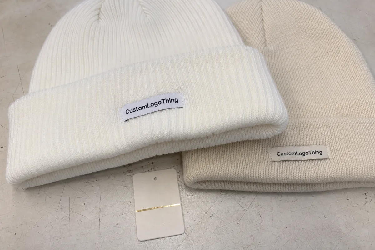
A label can look expensive in a swatch book and still feel wrong on a rib-knit cuff. The fabric decides more of the outcome than the label sample does.
That matters in weddings because the audience is close. Guests hold the item, model it for photos, and compare it with ribbons, favor boxes, and welcome-bag inserts. If the label looks heavy, the whole piece starts to feel less considered. The goal is not the thickest construction. It is the most convincing one.
How Woven Labels Behave on Knit Beanies
Knit beanies are unforgiving in a useful way. They expose bad proportions quickly. A woven label sits differently on a folded cuff than it does on a smooth panel, and that is why the same label can look soft on one cap and bulky on another. Placement matters as much as material.
On a folded cuff, the edge of the label may be visible from the side. If the construction is thick, the label can create a little shelf. On a flat-front beanie, the same label may lie closer to the surface and appear less intrusive. On slouch styles or fine-gauge knits, the fabric relaxes more, so a heavy label can tug or pucker the surrounding stitches. That is why the wedding Woven Label Beanies material thickness guide has to be judged on the actual blank, not just in isolation.
Fold-over, end-fold, and flat labels all change the apparent thickness. A fold-over label adds a double layer at the seam, which can make even a light weave feel firmer. End-fold labels hide the raw edge, but the folded ends also create tiny raised points. Flat labels look thinnest, yet they can reveal more of the edge treatment if the stitching is sloppy. In other words, the visible profile is not just the weave; it is the whole attachment system.
For minimalist wedding branding, a lighter profile often disappears into the knit in a good way. For bold monograms or script logos, a slightly more structured label can act like a frame and sharpen the artwork. The trick is matching the label’s body to the beanie’s visual weight. A chunky cuff can take more presence. A soft, drapey beanie usually cannot.
Key Factors That Determine the Right Thickness
The first factor is the beanie fabric. Chunky rib knits, fisherman's-style knits, and other heavier textures can carry more structure without looking overbuilt. Fine-gauge knits and slouch caps usually need a lighter, flatter label. That is the first filter, and it is the one many buyers skip.
Second, look at label size. Small labels are less forgiving. A compact 1.5-inch-wide label with a dense weave can feel stiff very quickly, while a larger label has more surface to distribute detail without turning into a hard badge. This is one reason buyers often reconsider size and thickness together instead of separately.
Third, examine thread count and artwork complexity. Fine lettering, tiny wedding dates, and delicate script need enough weave density to stay legible. If the artwork is too detailed for the chosen thickness, the label can look muddy or compressed. Sometimes the smarter move is to simplify the art before increasing the label body. That usually delivers a cleaner result.
Backing changes the equation too. Sew-on labels are the lightest choice, because they rely on stitching rather than extra adhesive or coating. Iron-on or adhesive-assist options add convenience, but they can increase firmness and change the feel on the knit. For a favor item that is mostly decorative, that might be fine. For a beanie meant to be worn, it deserves more scrutiny.
Comfort matters where the label touches skin. A cuff label may brush the forehead, temple, or ear area depending on how the beanie is worn. If the edge is too firm, wearers notice it immediately. In wedding settings, people are often wearing the cap with styled hair, makeup, or earrings, so even a small scratch point becomes memorable for the wrong reason.
Color contrast and logo style also influence perceived thickness. High-contrast artwork makes edges appear sharper, which can make a moderate label feel more substantial. Low-contrast tonal branding often benefits from a cleaner, lighter build. Elegant script usually wants a crisp edge; bold block lettering can tolerate more body. That is why the wedding woven label Beanies Material Thickness guide has to be treated as a visual spec, not just a manufacturing spec.
Step-by-Step Guide to Choosing the Best Thickness
Start with the use case. A welcome-bag insert for out-of-town guests does not need the same durability as a beanie that will be worn through an entire wedding weekend. Bridal party gifts, hotel favors, and branded merchandise each carry different expectations. If the beanie is mainly a keepsake, the focus should lean toward appearance and comfort. If it will be worn repeatedly, the thickness needs to survive stretch and handling.
- Gather the exact beanie blank, not a similar one.
- Ask for two or three label thickness options in the same artwork.
- Check each sample on the actual knit under natural light.
- Stretch the cuff gently to see whether the label puckers or pulls.
- Photograph the sample from arm’s length and close-up.
- Lock a final spec sheet with label size, thickness, placement, and stitch style.
That photo step matters more than most buyers expect. Wedding approvals often happen on screens, not in person. A label that looks elegant up close might disappear in a group shot, while a slightly thicker one may read better from six feet away. You want both the tactile impression and the visual read to hold up.
Ask for a sewn sample, not only a loose woven label. Attachment changes everything: edge stiffness, drape, and how the beanie behaves when stretched. A loose swatch can tell you whether the artwork is readable. It cannot tell you how the final item will sit on the head. For that, the label has to be mounted on the real cap.
Once you settle on the sample, write down the spec in plain language and keep it in one place. That means thickness, dimensions, placement from seam or hem, thread colors, stitch count if relevant, and the approved beanie color. One tidy spec sheet prevents guesswork later, especially if the order crosses teams or the wedding timeline shifts.
Cost, Pricing, MOQ, and Quote Factors to Expect
Thickness affects price because denser labels use more thread and often take more careful finishing. Heavier constructions can also require tighter tension control in production, especially if the artwork has small type. That said, the cost difference is not always dramatic. In many cases, the real jump comes from setup, revisions, and minimum order quantity rather than the label body alone.
For woven labels, common MOQs often land around 500-1,000 pieces per artwork, though smaller runs can price higher. At the unit level, the difference between a light and medium build may be just a few cents, but those cents stack quickly across a wedding party order or a larger guest-gift run. A buyer looking only at label price can miss the bigger picture: a slightly better label may reduce the chance of rework, and that is where the real savings show up.
| Thickness profile | Typical feel | Best fit | Typical price impact | Buyer risk |
|---|---|---|---|---|
| Light profile | Soft, flexible, low bulk | Fine-gauge knits, slouch beanies, minimalist branding | Baseline to +$0.02 per unit | May lose edge definition on small text |
| Medium profile | Balanced body and drape | Most bridal party gifts and wedding favors | About +$0.02-$0.05 per unit | Needs good stitch placement to avoid puckering |
| Structured profile | Firmer, more noticeable edge | Chunky rib knits, bold monograms, premium presentation | About +$0.04-$0.08 per unit | Can feel stiff or sit too proud on soft knits |
When you request quotes, ask for itemized pricing by label size, thickness, backing, and application method. That lets you compare apples to apples. One supplier may quote a lower unit price but include a thicker backing that changes the feel. Another may look higher on paper but produce a cleaner finish with less risk of visible bulk. The quote line that matters is the one tied to the sample you approved.
Revision charges also deserve attention. A thickness change after proof approval can trigger a new loom setup, a second sample, or a reproof. That hidden cost is why many smart buyers lock the physical sample early, especially if the order is tied to a wedding date and the budget has little room for surprises.
If you are also packaging the beanies in boxes or favor sets, keep the presentation budget separate. Corrugated cardboard mailers, FSC certified kraft paper wraps, and inserts made from recycled materials or post-consumer waste can raise the perceived value without changing the label spec itself. A buyer can spend less on the cap label and more on a clean presentation system, including biodegradable packaging where it makes sense.
For shoppers building the whole item from the label up, start with Custom Labels & Tags and treat the beanie finish, box, and insert as one coordinated package rather than separate decisions. That keeps the visual language consistent.
Production Steps, Lead Time, and Approval Timing
The normal flow is straightforward: artwork prep, digital proof, sample approval, bulk weaving, cutting, sewing, and final QC. The trouble usually appears in the middle. If the artwork is complex, if metallic thread is involved, or if a custom backing is added, the lead time grows. Thickness changes can do the same thing because they often alter weave tension and finishing requirements.
For a wedding order, the practical rule is simple: approve the sample before the beanies are ordered in bulk. That sounds obvious, but it is one of the most common schedule errors. Buyers sometimes place cap orders too early, then discover the label needs a different thickness, which forces a second round of decisions while the calendar keeps moving.
As a rule of thumb, physical samples usually need their own window. Digital proofs can move quickly, but the sewn sample is the real checkpoint. For most projects, it is wise to allow enough room for one revision cycle before bulk production starts. Wedding-season demand can stretch queues even further, so a cushion of extra business days is not overcautious; it is normal planning.
Lead times for woven labels commonly run around 7-15 business days after approval, then sewing or application adds more time depending on order size and placement. If the order includes multiple beanie colors or mixed label versions, that can add another layer of coordination. A simple order can move fast. A slightly messy one can lose a week with almost no visible progress to show for it.
If the beanies are being packed for shipping, the packaging side deserves the same level of control. Transit packaging for multiple venues or guest drops may be worth checking against ISTA guidance, especially if the order includes boxed sets or fragile add-ons. Packaging engineers often refer to the test methods listed at ISTA when they want confidence that cartons survive real handling. That is less about the label itself and more about protecting the finished presentation.
For eco-minded wedding programs, ask whether outer wraps, tissue, or insert cards can be made from FSC certified paper stock. The FSC standard is one simple way to show that the packaging story matches the brand story. It will not fix a bad label choice, but it can make a good one feel more considered.
Common Mistakes That Make Labels Look Too Heavy
The first mistake is choosing a label because it looks elegant in isolation. Swatch books are deceptive. They flatten the context. A woven label that feels refined between your fingers may become visibly stiff once it is stitched to a knit cuff. That is why the wedding Woven Label Beanies material thickness guide always needs a real-beanie test, not just a material sample.
The second mistake is ignoring stretch. Knit beanies move. If the label does not move with them, the fabric around it can ripple or tighten. That creates an uneven look, and it is more obvious in wedding photography because guests often adjust their caps, turn their heads, or wear them longer than a quick promotional handout.
Third, buyers sometimes try to keep tiny artwork intact by increasing density instead of simplifying the design. That can backfire. Small script, thin borders, and micro-icons often read better after simplification than after a thicker weave. Better artwork beats brute force almost every time. If the logo is too detailed for the space, scale it back before you thicken the label.
Fourth, do not test only on one beanie color. Contrast changes perception. A black label on a cream knit can look sharper and more substantial than the same label on charcoal. Texture also matters. A fuzzy yarn surface tends to swallow edge details, while a cleaner rib knit shows them more clearly.
Finally, do not skip a wear test. Hold the beanie, stretch it, then put it on and move around for a few minutes. What feels fine in the hand can still tug or scratch once it touches skin. A label that passes the comfort check is usually the one that earns the premium look too, because it stays flat, quiet, and well behaved on the cap.
Expert Tips and Next Steps Before You Order
If you want a cleaner decision, ask for two thickness options on the same artwork and compare them on the exact beanie blank. That gives you a real touchpoint instead of guessing from photos. I would also compare the sample with the same stitching thread that will be used in bulk, because even a small thread-color shift can change how thick the label appears against the knit.
Keep one master spec sheet and make it the only source of truth. List the beanie style, label dimensions, thickness, placement, attachment method, approved colors, and any packaging notes. That might sound administrative, but it is the fastest way to stop tiny assumptions from turning into expensive corrections.
For higher-visibility moments, such as bridal party gifting or a hotel welcome set, a short pilot run can be worth the extra effort. It gives you one more chance to review placement, comfort, and perceived thickness before the full order goes live. In packaging terms, that is similar to checking a carton prototype before committing to a full print run. The goal is to catch misalignment early, while the fix is still simple.
One useful habit: think of the label and the surrounding presentation together. A beanie shown in a well-sized corrugated cardboard gift box, wrapped with FSC certified kraft paper, or paired with biodegradable packaging inserts can carry a slightly lighter label and still feel premium. The whole system does the work, not just one part of it.
If you keep the wedding woven label beanies material thickness guide centered on fabric behavior, comfort, and sample approval, you will avoid most of the costly misprints and last-minute redesigns that slow wedding orders down. The right thickness is rarely the most dramatic one. It is the one that makes the beanie look finished, photograph well, and feel good enough that people actually keep wearing it.
How thick should wedding woven label beanies be for a premium look?
Choose a thickness that feels structured but still bends with the knit, usually enough to stay crisp without creating a hard edge. Chunkier cuffs can handle a little more body, while lightweight or slouchy knits usually need a softer profile. A sewn sample on the actual beanie is the safest way to judge the result.
Does a thicker woven label make beanies look more expensive?
Often yes, but only when the thickness supports the artwork instead of overpowering the knit. Premium perception comes from balance: clean edges, readable detail, and a label that sits flat on the fabric. If the label is too stiff, it can look less refined because it adds bulk and distracts from the beanie itself.
What label thickness works best on stretchy knit wedding beanies?
A lighter profile usually works best on highly stretchy or fine-gauge knits, because it moves with the fabric and reduces puckering. Avoid oversized labels or heavy backing that may pull at the cuff. Test stretch and recovery after sewing so you can see whether the label keeps its shape without stressing the beanie.
How does label thickness affect price and MOQ for wedding beanies?
Thicker labels can cost more if they require denser weaving, special finishing, or more careful setup. MOQ matters too, because smaller runs often carry higher unit pricing and less room for revision. Ask for itemized quotes so you can compare thickness, size, and application method separately before you approve the order.
What should I send a supplier before ordering wedding woven label beanies?
Send exact beanie blank details, label size, logo artwork, preferred placement, and the thickness range you want to compare. Include photos or references for the look you want, plus any comfort or photo-style requirements. Request a sewn sample and confirm the approval deadline so the production schedule stays on track and the final order matches the sample you approved.


