Small Retail Paper Bags Logo Placement Guide Basics
A small paper bag does not give a logo much room to recover from bad placement. Put the mark too low and it disappears into the bottom fold. Push it too high and the handles eat the top of the design. Center it on the flat file without checking the finished shape, and the bag can still look oddly off once it is folded, filled, and carried.
That is why a Small Retail Paper Bags logo placement guide is not just a design nicety. Placement affects visibility, print tolerance, perceived quality, and how the bag looks in the real places it will be seen: checkout counters, event tables, boutique shelves, customer photos, and someone’s hand on the way out the door.
Small bags are brutal. On a large shopping bag, a 10 mm shift may barely register. On a 5 x 3 x 8 inch gift bag, that same shift can push artwork close to a side gusset, under a handle patch, or into a crease. Every part of the structure competes for space: front panel, back panel, side gussets, bottom fold, glue seam, top reinforcement, handle area, and safe margins.
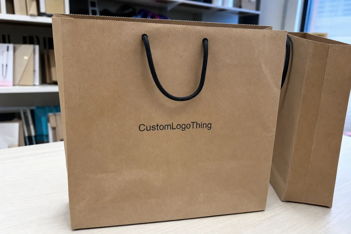
For most retail orders, the front panel does the main job. It faces the customer at handoff and usually gets the best visibility in photos. The back panel can carry a website, short care note, QR code, or smaller brand mark. Side gusset printing can look sharp on premium bags, but only if the artwork is designed around folds instead of pretending the side panel behaves like a flat poster. It does not.
Placement should be decided alongside bag size, paper weight, handle style, ink coverage, and product use. A jewelry bag with tissue paper needs different balance than a candle bag holding a heavy jar. A twisted paper handle changes the upper print zone. A die-cut handle removes part of it. Natural kraft lowers contrast compared with white kraft or coated stock.
The best logo placement usually looks obvious after the bag is made. Funny how much work it takes to make something look obvious.
How Logo Placement Works on Small Paper Bags
The artwork file is flat. The finished bag is three-dimensional. Most placement mistakes live in that gap.
A standard bag dieline shows panels, fold lines, glue zones, handle reinforcement areas, trim, and sometimes bleed. Once the bag is converted, the front panel stays visible, the gussets fold inward, the bottom folds up, and the top edge may flex around the handles. A good layout treats the dieline as a construction map, not a blank rectangle waiting for decoration.
Common logo positions include centered front placement, slightly above-center placement, upper-third placement, lower-center placement, side gusset marks, repeat patterns, and small back-panel details. Centered front placement is the safest choice for many boutique bags. Slightly above center often looks better once handles are added, because the top hardware pulls visual weight upward. Upper-third placement can feel more premium on taller narrow bags when the lower area stays quiet.
Lower-center placement is trickier. It can work on short luxury gift bags, especially with a compact emblem or foil stamp, but it needs enough clearance above the bottom fold. For many small bags, 15-25 mm above the bottom crease is a practical minimum. More is better if the product inside is heavy, because weight can pull the bag downward and make a low logo look even lower.
Handles change the layout fast. Twisted paper handles usually come with patches or reinforcement zones that sit behind the upper front panel. Rope handles can dominate the top third visually. Die-cut handles take away printable space entirely, especially on fold-over euro-tote styles. If the bag has a reinforced top fold, do not push artwork into that crease unless the design intentionally accounts for it.
Safe zones are not complicated. Keep the logo away from folds, seams, bottom creases, handle patches, and edges where small production movement will be visible. Bleed is extra artwork that extends beyond a trim or fold edge, useful for backgrounds and patterns. Logos usually need breathing room more than bleed. A brand mark jammed into a fold looks like nobody checked the proof. Because probably nobody did.
Printing method also affects placement tolerance. Flexographic printing is common for larger paper bag runs and efficient repeat production. Screen printing may suit smaller specialty runs or heavier ink coverage. Hot stamping uses a foil die, heat, and pressure, so clean shapes and even pressure areas matter. Digital proofs are useful for layout approval, but a screen cannot fully show paper texture, ink absorbency, foil pressure, or how the bag reads while carried.
Practical rule: judge logo placement on the finished bag shape, not just the flat file. If the mark reads clearly when the bag is folded, stacked, filled, and held by the handles, the placement is probably close.
Key Specs That Decide the Best Logo Position
Start with bag size, usually listed as width x gusset x height. A 6 x 3 x 8 inch bag and an 8 x 4 x 10 inch bag may both be sold as small retail bags, but their front-panel print windows are not even close. The usable panel is smaller than the full height because the top fold, handles, bottom fold, and safe margins all take a bite.
As a rough starting point, the main logo often works well at 35-55% of the front panel width. That range is useful, not sacred. A fine-line script logo may need extra width to stay readable. A bold square emblem may look confident at a smaller size. The better test is actual viewing distance: can someone read the mark from 3-6 feet away without squinting?
Logo shape matters. Horizontal logos need width and usually sit best slightly above the vertical midpoint. Circular, square, or stacked marks can sit comfortably in the center or upper third. Tall vertical marks need more caution because they can crowd both the handle zone and bottom fold. If the logo includes a tagline, check the tagline separately. Tiny taglines are where good bag layouts go to suffer.
Paper color changes contrast. Natural kraft works well with black, dark green, navy, deep red, and dark brown. Pale beige, light gray, thin gold ink, and low-opacity pastels can look weak on brown stock. White kraft gives cleaner contrast for CMYK artwork and brighter spot colors. Tinted stock can be attractive, but it needs a contrast check at the distance customers will actually see it. Coated papers hold sharper edges than uncoated kraft, though they often cost more and can change the tactile feel.
Paper weight also matters. Many Small Retail Paper Bags fall somewhere around 100-170 gsm, depending on size, handle style, and use. Lightweight kraft may be fine for jewelry, stationery, or small cosmetics. Heavier paper is smarter for candles, jars, boxed gifts, and products with corners. A heavier bag may hold shape better, which helps the logo stay flat and readable. A flimsy bag can wrinkle across the print area. Not exactly the luxury signal most brands are chasing.
Fine lines, small type, reversed-out marks, metallic foil, and large ink blocks need extra care. A 0.25 pt hairline may look elegant in a PDF and break up on textured stock. Reversed white type inside a dark ink flood can fill in if the letters are too small. Foil stamping can look excellent on boutique bags, but foil likes clean geometry, sensible spacing, and enough surface area for even pressure transfer. If the foil area is too close to a fold, expect inconsistency.
Product category should guide the final placement. Jewelry, fragrance, and cosmetics bags often look best with a restrained logo and generous blank paper. Bakery bags may need stronger contrast because grease-resistant liners, flour dust, or frequent handling can soften the design. Apparel bags can carry a larger logo, but small boutique sizes still need margin discipline. Candles and jars add weight, which can change how the bag hangs from the handle and how low the logo appears in use.
Production Steps, Proofing, and Timeline for Placement Approval
A typical custom paper bag order follows a predictable sequence: size selection, material selection, logo file review, dieline setup, artwork positioning, digital proof, approval, printing, converting, packing, and shipping. Placement decisions should be final before proof approval. That is the cheap moment to fix them.
After plates, screens, foil dies, or stamping blocks are made, small changes can become expensive. Moving a logo 8 mm on a proof is usually simple. Moving it after tooling may mean remaking a plate or foil die. That can add cost, delay the order, and create a lot of avoidable email. Always fun.
Review the proof with production eyes, not just brand eyes. Check the distance from the top edge, clearance from the bottom fold, left and right margins, handle interference, front-versus-back labeling, logo orientation, ink color, and any notes for foil or embossing. If the logo is supposed to sit 30 mm below the top fold, ask for that dimension on the proof. If placement is tight, request a marked dieline with fold lines visible.
Lead times vary by supplier, order size, paper availability, printing method, finish, and artwork readiness. A simple one-color print on a stocked kraft bag can move faster than a custom-size coated bag with foil stamping and two-sided artwork. Many made-to-order paper bag projects land around 12-25 business days after proof approval, but that is not a universal promise. Rush orders may be possible. They also leave less room for careful proofing, which is usually where the preventable mistakes live.
| Production Step | Buyer Review Point | Typical Risk if Rushed |
|---|---|---|
| Bag size selection | Confirm width x gusset x height and handle style | Logo judged on the wrong panel size |
| Artwork setup | Send vector AI, EPS, or print-ready PDF files | Jagged edges, missing fonts, weak line quality |
| Proof review | Check logo scale, margins, folds, print side, and color notes | Correct print, poor finished appearance |
| Tooling or plate making | Approve only after placement is final | Added setup cost for late changes |
Build time for artwork cleanup into the schedule. Delays often come from missing vector files, unresolved colors, unclear print sides, late bag-size changes, or a logo position reviewed on a cropped mockup instead of a marked layout. If a supplier asks for a cleaner file or clearer placement note, that is not busywork. It is how they avoid guessing.
Cost, Pricing, and MOQ Effects of Logo Location
Logo location affects price when it changes the number of printed panels, ink coverage, plate requirements, foil area, registration difficulty, or setup time. Moving a front logo slightly higher or lower usually does not change the unit cost. Printing another panel often does.
The simplest order is a one-color logo on the front panel. It gives a clean retail look, keeps setup controlled, and avoids unnecessary registration issues. Front-and-back printing is a moderate upgrade, especially if both sides use the same ink color and similar artwork. Gusset printing, wraparound patterns, border designs, large ink floods, metallic foil, embossing, and tight multi-color registration all require more care. More care tends to cost money. Shocking, I know.
Minimum order quantity depends on bag type, stock status, printing method, finish, and customization level. Stock-size printed bags usually have lower minimums than fully custom bags. Foil stamping, special paper colors, custom handles, custom dimensions, and unusual finishes often require higher setup commitment.
As a directional range, larger-quantity Small Retail Paper bags with simple one-color printing may land around $0.18-$0.45 per unit. Specialty finishes, lower quantities, heavier paper, foil stamping, two-sided printing, and freight can push that higher. Treat any broad price range as a starting point, not a quote. Material markets, shipping, order quantity, and decoration method can swing the final number quickly.
| Logo Location Option | Typical Cost Impact | Best Use |
|---|---|---|
| One-color front-panel logo | Lowest setup complexity | Boutiques, gifts, jewelry, cosmetics |
| Front and back logo | Moderate added cost | Events, retail chains, bags seen from both sides |
| Gusset mark or side detail | Higher layout care and possible setup cost | Premium branding with visible side panels |
| Full pattern or wrap print | Higher ink coverage and registration control | Seasonal packaging, launch kits, strong shelf display |
| Foil or embossing | Tooling and pressure setup required | Luxury retail, beauty, jewelry, special gifts |
For a cleaner quote, share final dimensions, quantity, paper color, logo file, print colors, desired placement, finish, and delivery location. Be specific about “gold.” Gold ink and metallic gold foil are not the same product, not the same setup, and not the same price. The same goes for “both sides” versus “front only.” Those details should not be discovered after the estimate is approved.
The cheapest unit price is not always the best value. If the logo sits too low, loses contrast on kraft paper, or crowds the handles, the bag may save a few cents and still look cheap every time a customer carries it. Congratulations, you bought a discount on brand visibility.
Step-by-Step Placement Checklist Before You Order
Use this checklist before approving artwork or requesting final pricing. It is intentionally practical. Nobody needs a 40-page theory document to place a logo on a small bag.
- Choose the exact bag size. Confirm width x gusset x height. A 1 inch change in height can shift the visual center on a small bag.
- Confirm the handle style. Twisted paper, rope, ribbon, and die-cut handles all affect the upper print zone differently.
- Identify the main viewing moment. Decide whether the bag is mainly seen at checkout, carried in public, placed on a shelf, used for event gifting, or photographed during unboxing.
- Pick the primary logo zone. Most small retail bags work best with a centered, slightly above-center, or upper-third front-panel logo.
- Set safe margins. Keep clear space from the top edge, bottom fold, side gussets, handle patch, and glue seam. For many small bags, 10-20 mm is a sensible starting point.
- Check the logo at actual size. Print the proof if possible, trim it roughly to the front panel, and view it from a few feet away.
- Confirm the artwork format. Send vector AI, EPS, or print-ready PDF files. Outline fonts and specify Pantone, CMYK, foil, embossing, or spot-color notes.
The point of this small retail Paper Bags Logo Placement guide is simple: decide how the bag will be seen, then put the mark where it stays readable after folding, filling, and carrying. Screen zoom is a terrible judge. Actual size tells the truth faster.
For sustainability-related orders, ask about paper sourcing and documentation before the artwork is finalized. FSC certification may matter for brands that need chain-of-custody support; more information is available from the Forest Stewardship Council. If transit performance matters for packed event kits or prefilled retail bags, ISTA testing concepts can help frame drop, vibration, and shipping expectations; see the International Safe Transit Association.
Common Logo Placement Mistakes on Boutique Bag Orders
The most common mistake is placing the logo too close to the bottom. On the flat proof, it can look grounded and elegant. On the finished bag, it may fall into the bottom fold or look heavy once the bag is filled. Deep gussets make this worse because the bottom structure takes up more visual space.
Oversized logos are another repeat offender. Bigger is not automatically more premium. On small paper shopping bags, a logo that crowds the edges can make the packaging feel cheaper, even when the paper and print quality are fine. White space is not wasted space. It is part of the design.
Do not assume the front and back panels are identical on every bag style. Depending on construction, one side may have a cleaner surface while the other carries a seam, fold memory, or handle reinforcement detail. Ask which panel is recommended for the main logo before approving the proof.
Thin type, fine lines, and low-contrast ink can disappoint on textured kraft paper. A delicate gray logo may look refined on a monitor and nearly invisible on brown stock. If the logo includes small text under 6 pt, review it carefully. For flexographic printing on absorbent paper, clean vector artwork and sensible line weights matter more than wishful thinking.
Border designs cause more trouble than many buyers expect. A frame placed 8 mm from every edge can be perfect in the file and still look uneven after normal folding or cutting tolerance. Materials have measurable tolerances. Customers judge crooked-looking borders emotionally. They are not going to admire the math.
QR codes, social icons, and small URLs need restraint. They should not sit near folds, handles, or gusset transitions. If a QR code is required, test it at printed size and leave enough quiet space around it. A code that looks trendy but fails to scan is just decoration with commitment issues.
The final mistake is skipping proof review because the order “looks simple.” Simple orders still need checking. The printer may place the artwork exactly where the approved file shows it, even if that file never accounted for the handle area, bottom fold, or finished proportions. Printed correctly and designed poorly is still poorly designed.
Actionable Next Steps for a Clean, Retail-Ready Layout
Before contacting a packaging supplier, gather the essentials: bag dimensions, quantity, paper color, handle style, logo file, print color, and preferred logo location. Those details let the supplier quote the job more accurately and prepare a proof that answers real production questions.
Mark up a simple front-view sketch or screenshot with approximate placement. It does not need to be pretty. A box saying “logo centered 2 inches below top” is more useful than asking for “nice placement.” Nice means nothing in production. Measurements mean something.
Tell the supplier what the bag will hold. Jewelry, candles, cosmetics, bakery goods, gifts, and boutique apparel place different demands on paper weight, handle strength, and visual balance. A light product may allow a delicate placement. A heavy jar may pull the bag shape down enough to make a low logo look awkward.
Keep the decision order practical: bag size and material first, logo position second, ink or foil color third, finish fourth, shipping timeline fifth. A finish like soft-touch lamination or foil stamping can be beautiful, but it will not rescue a logo sitting in the wrong place.
Ask for a proof showing the logo relative to handles, folds, gussets, and the bottom crease. A cropped preview of the logo alone is not enough. If the design includes a border, repeat pattern, secondary text, QR code, website, or social icons, request an actual-scale review and keep the smallest details away from structural folds.
Choose one strong brand moment. Small bags rarely benefit from a logo, slogan, website, social handle, care note, and decorative icon all fighting on the same panel. One clean front-panel logo, printed with the right scale and contrast, usually does more than five tiny details scattered across the surface.
A useful placement guide turns into clear order specs: exact bag size, print side, logo scale, safe margins, colors, material notes, finish details, and approval comments. Put those in writing before production. Your finished bags have a much better chance of looking intentional from the checkout counter to the customer’s hand.
FAQ
Where should a logo go on small retail paper bags?
For most small retail paper bags, the safest logo position is centered on the front panel and slightly above the vertical midpoint, with clear space from the handle area, side folds, and bottom crease. Very short bags may look better with the logo closer to true center than the upper third. The key is keeping the mark readable after the bag is folded, filled, and carried.
How large should my logo be on a small paper shopping bag?
A useful starting point is 35-55% of the front panel width, depending on logo shape and bag size. Horizontal logos often need more width, while stacked or emblem-style marks can work smaller. Always check the proof at actual scale because a logo that looks balanced on a monitor can feel oversized on a compact finished bag.
Does logo placement change the cost of custom paper bags?
Basic front-panel placement usually does not change cost beyond the selected printing method. Printing on multiple panels, adding gusset artwork, using large ink coverage, or choosing foil and embossing can increase pricing because setup, tooling, registration, or production handling becomes more involved. Provide exact placement notes during quoting to avoid soft estimates.
What artwork file is best for small retail paper bag logo printing?
Vector artwork is usually best, such as AI, EPS, or a print-ready PDF. It scales cleanly and keeps edges sharp. Fonts should be outlined, colors should be specified, and fine lines should be checked before printing on kraft or textured paper. JPEG and PNG files may help with previews, but they are often not ideal for final production unless resolution and quality are strong.
Can I print my logo on both sides of small retail paper bags?
Yes, many small retail paper bags can be printed on both front and back panels. Specify this during quoting and proofing because two-sided printing may affect unit cost, setup, and production time. If the budget is tight, one strong front-panel logo is often better than several small details with weak impact.

