A cap can look polished on a product sheet and still disappear on a barbershop shelf. That is why a snapback Caps Logo Placement guide for barbershop retail shelves has to start with sightlines, lighting, and the way customers actually browse near the register. In a shop that sells clippers, pomade, beard oil, and a few impulse items, the logo has only a second or two to earn attention.
That short window changes everything. A front panel that reads cleanly from four to six feet away is usually worth more than a clever placement that only makes sense up close. The best choice is not always the most decorative one. It is the one that still looks intentional after it has been curved, stitched, packed, hung on a hook, and viewed under warm or cool store lighting.
Why barbershop shelves change the placement decision
Barbershop retail is a mix of grooming supply, local identity, and quick gift-buying. That is a very different setting from general apparel retail. A customer may notice a cap while paying for a haircut, glance at it near a mirror, and make a decision before they ever hold it. If the logo sits too low, fights the brim, or blends into the crown color, the cap loses its first sale: the glance.
That is why placement should be treated as a shelf decision, not only a branding choice. The same snapback can feel like a low-cost add-on or a premium retail item depending on how clearly the mark reads at the distance customers actually stand. On counter racks, the front panel often faces slightly downward. On wall hooks, the brim can block the lower portion of the crown. On a shelf under pendant lighting, dark thread can disappear into a dark crown. On a bright window wall, glossy thread can flare and flatten detail. Visibility is more fragile than a mockup suggests.
Most buyers do not need a cap that tells a long story. They need a cap that says enough at a glance. A clean, centered front mark usually does that job better than a crowded layout. Small changes often outperform expensive redesigns. Moving a logo a few millimeters, removing a secondary line of text, or simplifying a fine outline can improve shelf readability without changing the body, closure, or panel count.
On a barbershop shelf, the logo is the first handshake. If that handshake is weak, everything after it has to work harder.
There is also a practical buying angle. A lot of these caps are purchased as gifts, loyalty pieces, or quick upsells. The customer is not studying them like a fashion buyer would. They are deciding fast. A structured six-panel snapback gives the front a flatter canvas than a softer cap, which helps, but only if the decoration sits within the panel geometry instead of colliding with seam lines.
How logo placement reads from the aisle
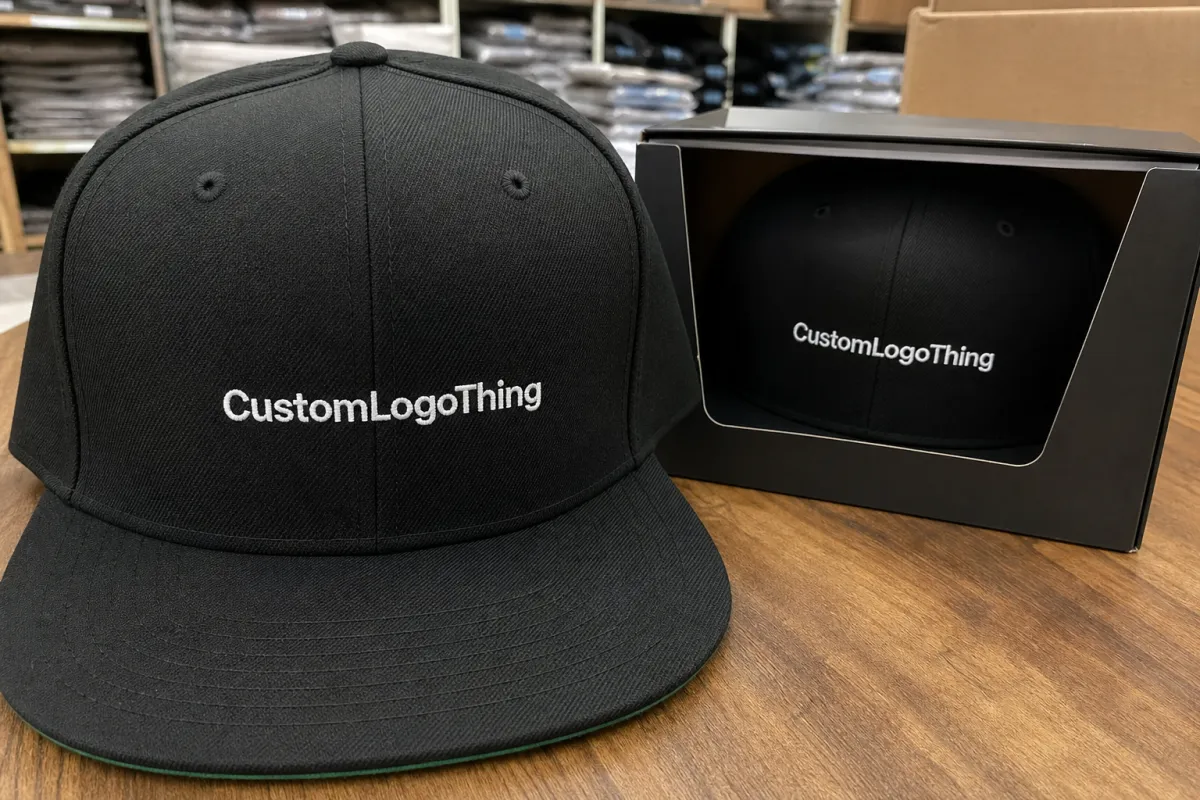
It helps to think of a snapback as five readable zones: front panel, left side, right side, back closure, and underbill. Each zone has a different job on shelf. The front panel is the main billboard. It carries the primary brand cue and should be the easiest part to read from a short distance. Side placement works best for a support mark, a limited-run note, a small local reference, or a second visual cue that does not compete with the main logo. The back closure can matter if the hardware itself is part of the product story, but it usually stays secondary. The underbill is almost never the right place for shelf-first merchandising.
Distance changes how each decoration method behaves. Flat embroidery usually reads faster from across the room because the stitch edges stay crisp. Woven patches handle fine detail better and can feel more premium in hand. Puff embroidery adds dimension, but it also increases the risk of a logo feeling heavy if the artwork is too detailed. Printed graphics can work, yet they need stronger contrast and clean art files to avoid looking washed out under shop lighting. A logo that looks sharp on a white screen may vanish on a black cap if the thread color sits too close to the crown color.
The placement itself should match the cap’s structure. A six-panel snapback gives you a broad front area, but the seams still matter. If the design crosses a seam awkwardly, it can look misaligned even when the artwork is technically centered. Flat front decoration is usually the safest choice for retail shelves. A small side emblem can add value if it stays quiet. Two competing placements rarely help unless the cap is meant to look intentionally layered and the art direction is very controlled.
- Front panel: best for the primary brand mark and fast aisle recognition.
- Side panel: best for limited runs, small references, or secondary cues.
- Back closure: best only if the hardware or rear view matters to the story.
- Underbill: usually too hidden for retail shelving.
Pricing, MOQ, and decoration choices that shape the budget
Placement affects cost because every extra visual decision adds setup time and approval steps. Embroidery stitch count matters. Thread color changes matter. Patch materials matter. A single front logo is simpler than a front logo plus a side cue, and a patch on a curved panel usually needs more prep than a smaller flat mark. Metallic thread, dense 3D puff, and multi-layer stitching tend to raise the quote faster than buyers expect.
For small and mid-size runs, a front embroidery often adds about $1.20 to $2.40 per unit. A woven patch often lands around $1.60 to $3.25. Puff embroidery can run about $2.50 to $4.80 depending on size, stitch count, and how much of the design needs foam support. Adding a second placement zone usually adds another $0.60 to $1.50. These are practical ranges, not promises, but they help show the trade-off: a stronger shelf read often costs less than a full redesign and more than a blank cap with a simple label.
| Decoration choice | Shelf read | Typical added cost per unit | MOQ and timing impact |
|---|---|---|---|
| Flat front embroidery | Clean, familiar, fast to read | $1.20-$2.40 | Often 48-100 units; standard turnaround |
| Woven patch | Sharper detail, more premium feel | $1.60-$3.25 | Often 100 units or more; patch sourcing can add days |
| 3D puff embroidery | Bold, high-impact, less subtle | $2.50-$4.80 | Often 50-100 units; digitizing and sampling matter more |
| Front plus side placement | Strong if the side cue is restrained | +$0.60-$1.50 | Usually a larger setup job; expect longer approvals |
MOQ often changes with the decoration method. A simple embroidery order may begin around 48 or 50 units. A custom patch program often pushes the minimum closer to 100 because the supplier has to absorb tooling and material setup. If the cap body itself is custom, the minimum can climb again, especially when buyers want a unique colorway, a matching undervisor, or specialty closure hardware.
There are hidden costs too. Digitizing often runs $25 to $75. Sample fees may sit between $40 and $120 depending on whether the factory sends a pre-production sample or a decorated prototype. Revision rounds are another quiet cost because each artwork change can trigger another proof cycle. Freight can shift sharply based on carton count and destination. For a run of 100 to 300 caps, a retail-ready landed price often ends up around $7 to $14 per cap before domestic distribution, though the final number depends on the blank quality and how much decoration the shelf needs to justify the price point.
That is why the lowest quote is not always the best buy. A simpler design that reads clearly at the register can outperform a more complicated piece that looks expensive in a rendering but gets lost in the shop.
Production steps and turnaround for retail-ready caps
The production path is straightforward, but each handoff can add time. It starts with artwork intake. Then comes digitizing, where the logo is translated into stitch paths or patch artwork. Next is mockup review. After that, the supplier may produce a sample or pre-production proof. Once that is approved, production begins, then quality control, then final packing. If any step is rushed, the schedule usually slips later instead of sooner.
Simple front embroidery on existing cap colors can often move through the system in 12 to 15 business days after proof approval. More custom-heavy orders, especially those with patch sourcing or multiple placement zones, often need 18 to 25 business days. Add sampling, and the calendar gets longer. A first sample may take 5 to 10 extra days, and a revision can easily add another week if the placement needs to shift or the stitch density needs to be adjusted.
Color matching is usually the slowest variable. Black and white are simple. Pantone-matched thread, custom dye lots, and unusual patch backing material all take more checking because the supplier has to confirm the decoration still reads correctly on the cap body. Fine text can also slow things down. If the logo includes tiny words, narrow outlines, or layered threads, a second digitizing pass is often needed. That is not a problem if the buyer knows it early. It becomes a problem when the caps are needed for a weekend promo and the proof is still being argued over.
Packaging deserves some attention too. If caps are packed with inserts, polybags, or small cartons for retail presentation, transit testing should not be an afterthought. Suppliers that reference the methods used by ISTA are usually thinking about drop, vibration, and compression before the shipment reaches a store shelf. That matters with structured crowns, raised patches, and any design that can crease in transit.
Good file prep cuts delays. Send vector artwork. Confirm the exact cap color. Note thread preferences. Mark placement constraints on the mockup. If the supplier has to chase missing details, time gets spent on back-and-forth instead of production. A complete brief is not glamorous, but it is one of the best ways to protect a launch date.
Step-by-step placement checklist before you place the order
Measure the display before approving the art. Not roughly. Measure it. Shelf depth, eye-line height, hook spacing, and hanging clearance all affect what the customer sees first. On a counter rack, the front row often sits 8 to 12 inches below eye level, which means the logo may need to be a little larger or a little higher than it would be on a wall hook. A deep shelf can hide the lower half of the crown, which is exactly why logos placed too low disappear into the brim line.
- Measure the display depth and the normal viewing angle.
- Decide whether the cap faces out, tilts, or hangs by the closure.
- Choose the most readable logo zone before discussing artwork tweaks.
- Check the logo against the cap color and the shelf backdrop.
- Test it under the store lighting, not only on a screen.
- Approve the mockup only after the logo feels balanced with the brim, crown, and hardware.
The visual test has to happen in context. A black cap with dark embroidery may look sharp on a white mockup and nearly vanish against a walnut shelf. A white cap with a pale patch can wash out under cool LEDs. The real question is not whether the design looks good online. It is whether the logo reads in the store environment where the cap will actually sell.
One practical rule usually holds up: make the main logo readable from 4 to 6 feet away, then let the second glance reveal detail. That keeps the cap useful both as a shelf item and as something a customer might inspect more closely. If the presentation includes a hang tag or insert card, keep it small and readable. A clean FSC-certified tag can support the retail story, and the standard language at FSC is useful when buyers care about paper sourcing, but the tag should never distract from the cap itself.
Approve only when the composition feels balanced. If the logo fights the brim curve, seam line, or closure hardware, it will still feel off in the hand even when the mockup looks fine. A shelf test is not about chasing perfection. It is about removing the small friction that keeps a customer from reaching for the product.
Common mistakes that make branded caps hard to sell
The most common mistake is also the easiest to spot: placing the logo too high, too low, or too small. Too high, and the crown looks crowded. Too low, and the brim steals attention. Too small, and the cap reads like a blank with a tiny afterthought. In a barbershop, where people often decide quickly, that weak read can cut sell-through even if the cap quality is perfectly fine.
Overdesign is another problem. Too many placement zones can make a premium cap look noisy instead of refined. Buyers sometimes assume more decoration means more value. In practice, the opposite is often true. A front logo, a small side cue, and a clean back closure can feel deliberate. Add a second side mark, a large text block, and a contrast patch, and the cap starts to feel busy. That is a risk on shelves where the product has only a few seconds to earn a touch.
Color mistakes matter just as much. Thread that blends into the cap body, a patch border that disappears into the shelf background, or a closure color that competes with the logo all make the design harder to read. The problem is rarely the artwork alone. It is the combination of color, lighting, and viewing angle. Fluorescent lighting can flatten reds. Warm lighting can mute blues. If the palette is already tight, the shelf can erase the contrast.
Skipping a sample is another expensive shortcut. On-screen mockups are useful, but they are still flat. A real cap has curve, texture, shadow, and hardware. A sample often shows that the logo needs to move 3 to 5 mm or that the thread weight is too heavy for the panel size. Those are small corrections, but they are the ones that keep a run from feeling undercooked.
One more mistake shows up when brands design for social media first and shelf visibility second. A cap that photographs well is not always a cap that sells well on a retail wall. Social content rewards detail. Shelf selling rewards clarity. Those are different briefs.
If the cap cannot be understood from three steps away, the shelf has to do too much work.
Display tips for counter racks and wall shelves
Use one dominant logo placement and one secondary cue only if it adds clarity. That is the cleanest rule to keep in mind. The dominant mark should do the heavy lifting. The secondary cue should support the story, not start a new one. In barbershop retail, restraint usually looks more expensive than clutter because it lets the customer read the cap in one glance.
Counter racks and wall shelves need different treatments. Counter racks should use the most readable front panel because customers see them up close while paying. Wall shelves can handle slightly bolder contrast because the viewing distance is longer. If the shelf is crowded with grooming products, the snapback should sit in a small visual pocket instead of competing with everything around it. Strong display work is often about blocking and spacing, not only branding.
Pair the cap with presentation that feels deliberate. A small hang tag, a folded insert card, or a neat polybag can make the product feel ready for retail without adding visual noise. If the shop leans into premium grooming goods, tighter palettes and cleaner symmetry usually read better than high-contrast graphics with too many color breaks. Two colors on the cap plus one accent on the patch often works better than a six-color design that only makes sense at arm’s length.
Rotation matters too. Bestsellers should sit at eye level, not on the lowest hook. Reserve louder placements for limited runs or premium drops that can justify the extra energy. A store with three or four versions should test which logo position draws the first touch. A one-week shelf test is usually enough to show whether the front mark, the side cue, or the patch orientation is doing the selling.
Review the shelf the way a customer sees it. Stand at the aisle, the register, and the chair area. If the logo still reads cleanly from all three positions, the placement is probably right. That simple habit saves a lot of reorders that would otherwise turn into inventory headaches.
Briefing notes and shelf testing
Start by deciding what the cap needs to do. Is it an impulse pickup, a local branding piece, or a premium merch item tied to the shop identity? The answer changes the placement choice before anything else does. An impulse item needs a quick read. A premium item can afford a more nuanced side cue. A local brand signal often benefits from a clear front mark plus a modest secondary reference.
Then gather the basics: logo file, preferred cap color, target quantity, budget range, shelf photo, and deadline. Without that context, the supplier is guessing. With it, the supplier can recommend whether flat embroidery, patch work, or a second placement zone makes sense. If the cap will sit near the register or on a visible wall display, ask for both a mockup and one physical sample. The sample is where the real shelf test happens.
Compare price, turnaround, and placement clarity side by side before approval. Those three factors usually tell the whole story. If a slightly higher quote gives you a cleaner read at 5 feet and a more retail-ready finish, that is often the better buy. If the faster quote forces a weak logo size or a crowded front panel, the savings are not real.
That is the practical value of this snapback Caps Logo Placement guide for barbershop retail shelves. It gives the cap a better chance to read fast, look considered, and hold its value on a crowded shelf without pretending that every decoration choice is equal.
Frequently asked questions
Where should snapback caps logo placement go for barbershop retail shelves?
Front panel placement usually gives the fastest read from the aisle. A small side mark can support the brand story without competing with the main logo. Back placement works best only if the cap is often worn backward or sold as a detail-driven style.
What logo size works best on snapback caps for shelf visibility?
Use a size that stays readable from several feet away, not just in a close mockup. Simple logos can usually run larger and cleaner than detailed art. If the design looks busy at thumbnail size, it will usually read poorly on a retail shelf.
Does side logo placement help snapback caps sell better in a barbershop?
Side placement can help when the front logo is already doing the main branding job. It is useful for edition marks, local references, or subtle premium cues. It should not replace a strong front panel if the cap needs quick shelf recognition.
How does logo placement affect pricing and MOQ on custom snapbacks?
More placement zones usually mean higher setup and production costs. Complex embroidery, patches, and special threads can raise the unit price. MOQ often changes with decoration method because each setup adds labor and tooling.
What should a shop send before ordering custom snapbacks with logo placement?
Send the logo file, preferred cap color, target quantity, and budget range. Include a shelf photo or display measurement so placement can be judged in context. Add your deadline early so the supplier can map the right production timeline.


