The Performance Golf Caps logo placement guide is really about managing a moving target. A cap is not a flat signboard. It stretches, curves, rebounds, and sits differently depending on head shape, crown construction, and the decoration method chosen. A logo that looks perfectly centered in a proof can still land too high, feel crowded, or lose clarity once it is stitched onto a moisture-wicking crown.
That is why placement affects more than style. It changes how readable the mark is from a distance, how clean the decoration looks up close, and how much production risk sits in the order. On performance caps, those three things are tied together. If the logo sits too near a seam, stitch quality can suffer. If it is too large for the crown, the cap can feel heavy or distorted. If it is too small, the branding disappears in photos and on the course.
The best buying decisions usually start with a simple question: where will this cap be seen most often? Sponsor gifts, pro shop retail, team orders, and tournament merchandise all need slightly different answers. A logo placed for a shelf display does not always work for action photography, and a decoration that looks restrained on a mockup can look timid in person.
What Performance Golf Caps Logo Placement Really Changes
Performance caps are built from materials that behave differently than cotton twill. Polyester blends, stretch panels, mesh inserts, and sweat-wicking finishes all affect how decoration sits on the surface. The same logo can look bolder on a structured front panel and noticeably smaller on a softer crown because the fabric recovers around the stitches. That is the first reason placement matters so much.
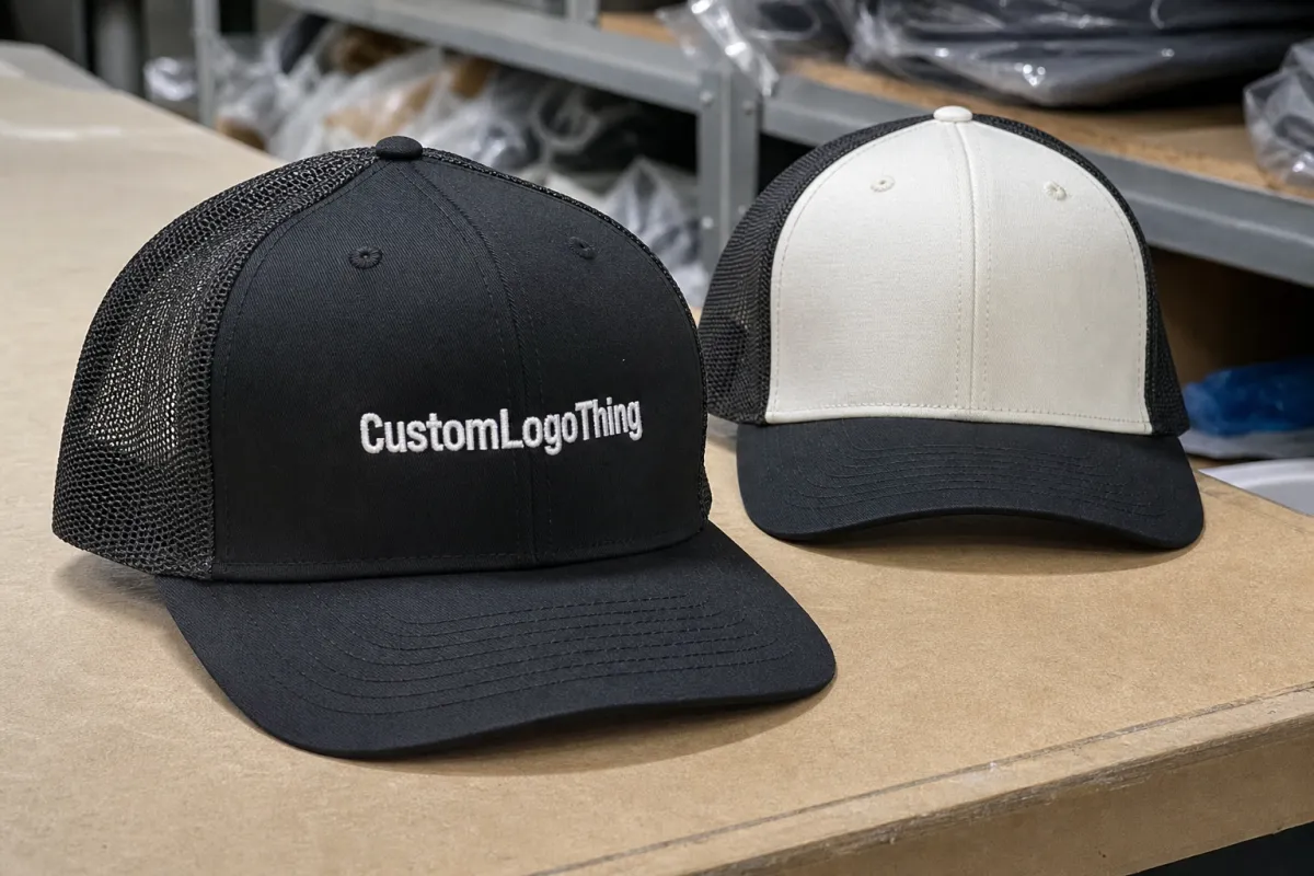
Visibility is the most obvious concern. Front-center decoration usually gives the clearest read in photos, at a distance, and while the wearer is moving. Side-panel branding can look sharp in a product mockup, but it often disappears when the golfer turns, bends, or follows through. For event buyers, that can mean a logo is technically present but practically invisible.
Decoration quality comes next. Embroidery handles a lot, but not everything. Heat-applied patches and transfers can work well on performance fabric, yet they have their own limits around curve, stretch, and seam clearance. Too close to a vent or seam, and the finish may lift earlier than expected or show slight distortion. That is not a defect in the artwork so much as a mismatch between design and cap structure.
The cleanest placement is usually not the biggest available space. It is the one that stays readable in the hand, at arm's length, and across a fairway.
Experienced buyers tend to think in that order: brand visibility first, manufacturability second. That saves reproofs and reduces the odds of approving a layout that looks fine on-screen but awkward on the finished cap. It also helps keep the quote aligned with the final build, because placement decisions can change stitch count, patch size, and setup time.
How Logo Placement Works on Performance Golf Caps
Think of the cap as a set of zones rather than one continuous surface. The front panel is the prime location because it gives the strongest visual balance. The upper crown can support a small mark or a secondary element. Side panels are better for subtle branding. The back closure area can handle tiny text or an icon, but it is usually support branding, not the main story.
Cap construction changes what each zone can handle. Structured caps keep their shape, so embroidery usually looks crisp and consistent. Semi-structured styles allow a little more give, which can help with moderate-size logos as long as the design is not overly detailed. Unstructured performance caps are softer and more relaxed, but that softness can make dense embroidery or thick patches feel top-heavy.
Fabric behavior matters just as much. Slick polyester does not hold thread exactly like cotton. Stretch panels can rebound after embroidery tension is applied, which is useful for wear but tricky for decoration. A very dense stitch fill may pucker. A very light logo may get visually lost against the sheen of the fabric. Buyers often focus on artwork and forget that finish and texture change how large the logo appears.
Viewing angle is another quiet factor. Wearers see the cap from below and slightly ahead of them. Spectators see it from the side or across a room. Cameras flatten the crown differently again. A logo that looks centered on a flat template can sit too high once it is worn. Good proofs should show front-on, three-quarter, and worn views, not just a single flat mockup.
There is also a packaging angle that gets overlooked. If caps are packed too tightly or shipped without proper crown support, the front panel can deform before the customer even opens the carton. That matters because a bent crown changes how the logo reads. For multi-product programs, the same care used for cap transit can be applied to carton testing and material selection, especially if the order includes recycled packaging or certification requirements.
Choosing the Right Panel, Height, and Scale
The most useful way to choose placement is to decide what the logo must accomplish. Retail caps usually need quick visual impact. Team caps need repeatable placement across many units. Sponsor caps need legibility from a distance, sometimes under uneven lighting or in motion. Those goals overlap, but they do not point to the same size or position every time.
As a starting point, front-center embroidery on many Performance Golf Caps often lands around 2.25 to 2.75 inches wide. Smaller side-panel marks may work better around 1.25 to 1.75 inches wide. Those are practical starting ranges, not fixed rules. Crown height, logo shape, and decoration method can move the number in either direction. A wide horizontal wordmark needs more room than a simple emblem. Thin lettering needs more breathing space than bold, compact shapes.
Height deserves as much attention as width. A logo placed too close to the seam line can look cramped even if the artwork itself is clean. A safe clearance of several millimeters often helps, but the exact distance depends on the cap pattern and the decoration method. If the crown includes perforations or laser-cut vents, allow more room. Those features interrupt stitch flow more quickly than most buyers expect.
Cap style changes the answer again. Structured caps can support a stronger front block and a slightly larger visual presence. Semi-structured caps usually look better with a balanced, moderate-size logo. On unstructured performance caps, oversized branding can feel heavy because the fabric drape is already relaxed. In that case, a smaller mark often looks more premium than a large one.
For buyers comparing options, the practical tradeoffs usually look like this:
| Placement option | Typical visual effect | Best use case | Main risk |
|---|---|---|---|
| Front-center | Strongest visibility, most balanced in photos | Team orders, sponsor caps, retail branding | Can look oversized on a low crown |
| Front offset | Modern and slightly less formal | Lifestyle retail or secondary branding | Can look accidental if not measured carefully |
| Side panel | Subtle and style-driven | Minimal branding or secondary mark | Less visible in action shots |
| Back mark | Discrete and compact | Small sponsor tag or event identifier | Too small for detailed artwork |
A useful rule for any Performance Golf Caps logo placement guide is simple: decide the viewing distance first, then size the logo around that reality. A mark meant to be read across a course needs more presence than a logo meant only for close-up retail handling.
Cost, Pricing, MOQ, and Quote Drivers
Pricing on custom golf caps tends to follow a few predictable drivers. Decoration method is the first. A simple front embroidery is usually the most economical choice, especially at scale. Patch applications, mixed decoration, or high-stitch-count logos raise the price because they add setup time, labor, or both. The cap body itself also matters: a premium performance panel, sweatband upgrade, or recycled material option can push the base cost upward before decoration is even added.
Minimum Order Quantity has a direct effect on per-unit pricing. On smaller runs, the setup cost gets spread across fewer caps, so the unit price rises. On larger runs, that overhead becomes less visible. As a practical buying range, a straightforward one-location performance cap might land around $8 to $14 per unit at lower quantities, while larger runs can drop into the $4 to $8 range depending on body cost, stitch count, and vendor structure. These are market-style estimates, not fixed quotes, but they help buyers sanity-check proposals.
The easiest way to compare offers is to separate cap cost from decoration cost. That makes the build clearer and exposes where the money goes. A supplier quote that bundles everything into one line can still be valid, but it is harder to judge whether the price difference comes from the blank cap, the stitch complexity, or the placement choice.
| Decoration setup | Relative price impact | Why it moves cost | Good for |
|---|---|---|---|
| Single-color front embroidery | Lowest | Few thread changes and simpler setup | Team orders and corporate giveaways |
| Multi-color front embroidery | Moderate | More thread changes and longer run time | Brand logos with modest color detail |
| Woven or faux leather patch | Moderate to higher | Patch production and application labor | Detailed logos or premium retail caps |
| Two-location decoration | Higher | Additional setup and registration checks | Sponsored programs and retail capsules |
For an accurate quote, send the supplier the cap style, quantity by color if relevant, logo file, preferred decoration method, and exact placement. If you already know the logo should sit 12 mm below the seam or 2.5 inches wide on the front panel, say that up front. That level of detail reduces revision cycles and helps keep the spec aligned with the sample.
Some programs also carry a small upcharge for sustainability-focused components, such as recycled yarn content or certified packaging. That is usually not the largest cost driver, but it should be visible in the quote so buyers can compare one program against another without hidden differences.
Process, Timeline, and Lead Time From Proof to Ship
A straightforward production path usually moves through artwork review, placement mockup, quote approval, proof approval, setup, decoration, inspection, and packing. The sequence sounds tidy, but the schedule only stays tidy if the placement decision is final before production begins. A late-stage move from front-center to front offset can require a fresh proof and, in some cases, a new stitch file.
Lead time depends on decoration method and artwork readiness. Embroidery can move fairly quickly once digitizing is approved. Patch-based programs may need extra sampling or separate material lead time. Transfer methods bring their own cure or adhesion checks. In many orders, the slow part is not the actual manufacturing run. It is the approval loop before the run. A clear decision on day one can save nearly a week of back-and-forth later.
There are a few common bottlenecks. Missing vector art slows digitizing. Weak file quality makes the logo harder to simplify for cap size. Unclear color references create avoidable disputes. Thin type can require a second pass because letters that work on a screen do not always survive on a small crown. None of this is unusual, but it does affect scheduling.
When a supplier gives lead time, ask what portion is setup and what portion is production. A quoted 12 business days might include four days of proof handling, which means the factory may only spend eight days making the caps. That distinction matters when the order is tied to a launch date, golf outing, or tournament weekend.
Step-by-Step Placement Review Before Production
Start with the file, not the mockup. Confirm the logo is in vector format and that the text treatment is ready for production. Tiny strokes, fine taglines, and cramped letter spacing are the first things to break down at cap scale. If a slogan is not essential, remove it before decoration. On performance caps, less is often better.
Next, map the design to the actual panel. Measure the safe zone from the seam, vent line, crown edge, or any transition in fabric. A centered mark is not enough by itself. It should fit the body pattern without crowding the construction. Good proofs show exact width and placement distance, not a vague "centered" note.
Then review the logo from more than one angle. A front view is necessary, but a three-quarter view often reveals whether the mark sits too high. A worn view shows how the cap behaves in real use. That matters because performance fabrics can compress or lift the decoration depending on fit and crown shape.
Finally, confirm the production sheet. It should list the decoration method, logo width, placement distance, thread or print colors, quantity breakdown, and the fallback plan if the first sample is not quite right. That fallback might be a smaller width, a simpler fill, or a shift in placement. A careful performance golf Caps Logo Placement guide becomes useful only when those details are written down.
If the order is time-sensitive, ask for a physical sample or at least a dimensional reference before full production. A small sample run is far less expensive than reworking a large batch. That is not caution for its own sake. It is how experienced buyers protect margin and delivery timing.
Common Mistakes That Hurt Fit, Visibility, and Wear
The most common mistake is approving placement by eye only. A logo can be mathematically centered and still sit too high on the head because the crown changes how the eye reads the shape. Curved surfaces do that. They compress the view and make flat mockups feel more generous than the finished product.
Oversizing artwork on lightweight performance fabric is another frequent problem. Dense embroidery on thin material can cause puckering, stiffen the front panel, or change the way the cap drapes. The result may still be usable, but it often feels less premium than the buyer expected. If the artwork requires a very high stitch count, it should usually be simplified before approval.
Seams and transitions cause trouble as well. A logo that crosses a side seam or sits too close to a perforated panel can distort when the needle path changes or when a patch edge lands on an uneven surface. This becomes more obvious on mixed-material caps where a solid front panel meets mesh or stretch back panels. The surface looks continuous to the buyer, but it does not behave that way in production.
Skipping sample review is the last big mistake. One poor placement decision may not ruin a single cap, but it can repeat across a team order or a full merchandise run. A strong approval step should cover placement, decoration method, visibility, and physical balance, not just color and price.
In practice, the best results usually come from slowing the process down just enough to measure twice. Buyers who ask for the largest possible logo often end up with the least attractive one. Buyers who ask for the most stable placement usually get a better-looking cap and fewer surprises at delivery.
Expert Tips, Approval Checks, and Next Steps
A practical way to choose placement is to build a simple matrix. Start with cap style, then match it to audience and viewing distance. Structured caps can handle a stronger front mark. Semi-structured caps usually look best with moderate sizing and careful vertical placement. Unstructured performance caps often need a lighter decoration approach, especially if the brand uses a long wordmark or fine lettering.
For approvals, a digital proof is useful, but it should not be the only checkpoint. If the order matters, ask for a physical sample or at least a dimensional reference. That step is especially valuable for sponsor programs, retail launches, and team buys where consistency matters more than speed. A small adjustment before production can prevent a much larger correction later.
Keep the approval list short and specific:
- Vector logo file and correct text treatment
- Exact cap style and crown type
- Placement location and measured width
- Decoration method and thread or print colors
- Quantity by color or size
- Deadline, event date, or ship window
That checklist protects the buyer from vague assumptions and gives the supplier enough detail to price accurately the first time. For the performance golf caps logo placement guide question, that is usually the difference between a clean order and a round of revisions.
My advice is straightforward: send the art, cap style, quantity, placement, and deadline together, then compare the quote against the proof before signing off. If the logo needs to read clearly in motion, not just on a flat screen, the placement deserves as much attention as the artwork itself.
Where should a logo sit on performance golf caps for the best visibility?
Front-center placement usually gives the strongest visibility for photos, event branding, and sponsor recognition. If the crown is tall, the seams are prominent, or the cap has perforations, moving the logo slightly lower or a touch off-center can keep it from looking too high.
What is the best performance golf caps logo placement for team orders?
Most team orders use a front-panel placement because it keeps branding consistent across players and viewing angles. If the front panel is narrow or heavily shaped, a smaller front-offset or side-panel mark can work, but it will not read as strongly during play.
How does logo size affect pricing on custom golf caps?
Bigger or more complex logos usually raise cost because they require more stitches, longer setup, or a larger patch build. Two-location decoration also increases price, especially on low-quantity orders where setup costs have less volume to absorb them.
How long does the process usually take after approving the logo placement?
Lead time depends on artwork readiness, decoration method, and whether a sample or proof revision is needed. Fast approvals shorten the schedule. Changes to placement, colors, or logo complexity usually add time.
What should I send for an accurate performance golf caps logo placement quote?
Send vector artwork, cap style, quantity, preferred placement, color counts, and any deadline or event date. Include whether you want embroidery, a patch, or another decoration method so the quote matches the actual build.

