Stationery Brands Soft Touch Poly Mailers Artwork Proof Checklist
A soft-touch mailer can make a stationery order feel considered before the customer even opens it. It can also reveal every weak spot in the production file, which is why a stationery brands Soft Touch Poly Mailers artwork proof checklist is not just paperwork. It is the last practical checkpoint before artwork, material, color, and shipping realities meet on press.
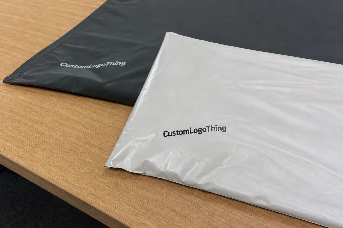
Stationery brands tend to live in restrained details: cream instead of white, dusty rose instead of pink, sage that cannot look mint, navy that must stay deep rather than sliding toward purple. Fine serif type, delicate icons, small QR codes, return instructions, and quiet brand marks often sit close to seals, folds, or shipping label zones. Those details behave differently on flexible polyethylene film than they do on a coated insert card or a paper belly band.
A poly mailer is not a flat poster. It folds, stretches slightly during packing, reflects light unevenly, and carries a coating that can soften contrast. The proof needs to account for those physical conditions, not only the artwork seen on screen.
Soft Touch Poly Mailers Artwork Proof Checklist Basics
For stationery brands, the proof checklist prevents a familiar and expensive surprise: the file looks refined in a PDF, then prints darker, flatter, or softer than expected once the ink, film, and finish interact. Flexible packaging introduces variables that a screen proof cannot fully communicate.
Treat the proof as a packaging system check. The system includes film color, white ink underprint, print sequence, flap placement, seal zones, trim edges, fold behavior, and panel orientation. One misplaced back-panel logo may barely register on a loud apparel mailer. For a brand selling planners, note sets, invitations, or premium paper goods, the same mistake can make the unboxing feel careless.
Small color shifts matter here. Many paper goods brands rely on subtle palettes: ivory, blush, sage, terracotta, charcoal, warm gray, and deep navy. These colors often carry more brand recognition than a large graphic does. A slight warmth shift can make a cream brand color look yellowed. A navy with too much red can drift toward plum. A metallic-style accent, if printed as simulated ink rather than foil, may lose the crisp highlight buyers expect.
Proofing rule: if the detail helps a customer recognize the brand, it belongs on the checklist. If it only decorates the layout, it can usually tolerate more production variance.
The most useful checklist separates non-negotiables from acceptable variation. Non-negotiables might include the approved logo file, URL spelling, barcode readability, QR code placement, return address, and correct front/back orientation. Acceptable variation may include a slight sheen difference in the coating or normal print registration movement within the supplier’s stated tolerance, often around 1–2 mm on flexible packaging.
A strong checklist also names who approves what. Design may approve brand color and typography. Operations may approve size, closure, and packing workflow. E-commerce may approve shipping label compatibility and scan zones. If one person signs off everything without checking the practical use case, errors can pass through cleanly dressed as approvals.
How the Proof Process and Timeline Usually Unfold
The proof process starts with clean source files. That usually means vector logos, outlined or packaged fonts, high-resolution images if any are used, and a dieline that matches the exact mailer size. A Custom Poly Mailer file should include bleed, safe area, trim line, closure flap, seal zone, and front/back panel labels.
Preflight comes next. The supplier or production team checks file size, image resolution, color mode, font status, spot color instructions, white ink layers, and elements too close to seals or trim. Artwork near a fold or heat-sealed area deserves more caution than artwork sitting in the center of the front panel. The substrate moves enough to punish tight borders, especially on smaller bags.
A digital proof normally follows. It should show placement, copy, color builds, and panel mapping clearly enough that a buyer can compare it line by line against the order brief. For soft-touch mailers, the proof should also identify the finish, print side, film gauge, and whether the design uses white underprint. Without those notes, a buyer may approve the right artwork under the wrong assumptions.
If revisions are needed, consolidate feedback into one round whenever possible. One marked PDF, one comment list, and one final decision-maker will usually move faster than scattered emails from design, operations, retail, and leadership. Small changes sent over several days can add more delay than the actual file correction.
Timeline risk often comes from approval lag rather than press time. A digital proof may be turned around in 1–3 business days, while internal review takes a week because several people check different parts of the file separately. After approval, a custom production run may take roughly 12–20 business days depending on quantity, finish, print complexity, and queue, plus transit. Rush timelines may be available, but they usually leave less room for sampling and revision.
For a campaign launch, subscription box drop, or wholesale restock, build in a proofing buffer. Five business days is a sensible minimum for one proof round and one revision round. Add more time if the brand color is critical, the order includes multiple sizes, or the design uses low-contrast artwork.
Cost, Pricing, and MOQ Triggers to Watch
Unit cost drops as quantity rises, but the curve is not perfectly linear. Small orders carry the heaviest per-bag penalty because setup, proofing, press preparation, and material waste are spread over fewer pieces. A 500-piece custom run may look expensive per unit; a 5,000-piece run often becomes more practical, even with the same artwork.
For soft-touch poly mailers, typical pricing can range from about $0.18–$0.45 per unit at mid-sized quantities, depending on dimensions, film thickness, print coverage, finish, and shipping destination. Small trial runs may sit above that range. Larger repeat orders can fall below it. The exact spec matters as much as the quantity.
MOQ can change by size, film gauge, print complexity, and finish. A simple one-color logo mailer may clear a lower minimum than a fully printed mailer with edge-to-edge artwork, white ink backing, and specialty coating. Soft-touch finish adds handling because the tactile layer has to be compatible with the printed film and cure or convert cleanly before packing.
Here is a practical way to compare common order scenarios before requesting a quote from Custom Poly Mailers.
| Order Scenario | Typical MOQ Pressure | Estimated Unit Cost Range | Main Proofing Risk |
|---|---|---|---|
| One-color logo, standard size, soft-touch finish | Lower to moderate | $0.20–$0.34 at 5,000 pieces | Logo placement and finish appearance |
| Full-panel artwork with brand pattern | Moderate | $0.26–$0.42 at 5,000 pieces | Color density, bleed, and panel mapping |
| Multiple sizes with matching artwork | Higher due to separate setups | $0.24–$0.48 depending on size split | Version control across dielines |
| Specialty effects, metallic simulation, or tight color target | Higher | $0.35–$0.60+ depending on complexity | Color match, contrast, and extra proof rounds |
Pricing also moves when you add color-count complexity, white ink layers, metallic effects, physical samples, or extra proof rounds. A revised proof may not look like a major cost, but it can affect both the schedule and the invoice, especially if production art has already been prepared.
The cleanest quote compares like for like: exact dimensions, film thickness, finish type, print coverage, quantity, delivery destination, and whether the project requires a revised proof after first review. If one quote includes a physical sample and another does not, those quotes are not equivalent.
Specs That Decide Whether the Proof Is Usable
Check dimensions first. A mailer that is slightly off in width, gusset, or flap can throw off the design balance, especially if the artwork depends on symmetry or centered typography. A 10 x 13 inch mailer and a 10.5 x 14.5 inch mailer do not simply scale from one another; the flap, seal strip, and usable artwork zones may all change.
Film thickness matters too. Many e-commerce poly mailers fall around 2.5–3.5 mil, with heavier options used for stronger opacity or improved transit performance. Stationery items are often flat, rigid, and cornered, so the bag has to resist puncture from notebook edges, card sets, or paperboard mailer inserts. If the product is heavy or sharp-edged, ask how the mailer has been tested. Transit testing frameworks from ISTA are useful reference points for packaged-product distribution, even when a brand is not running a formal lab test.
Bleed and safe area matter more on flexible packaging than on a flat paper proof. Trimming and sealing can shift the visible margin just enough to make a border look uneven. Narrow perimeter borders deserve caution on poly mailers. They look elegant in mockups and become less forgiving once the bag is converted, stacked, packed, and sealed.
Fine text, line art, and barcode-style elements need special attention because soft-touch finishes can reduce contrast. Thin strokes may appear softer. Pale gray type may become too quiet. QR codes should be tested at actual size, ideally with several phones, and placed away from folds, seams, and the closure flap. A QR code that scans on a PDF may fail once printed on a curved or textured surface.
Panel mapping should be unmistakable in the proof. The buyer needs to know where the front, back, side seams, and closure land so logos, legal copy, QR codes, and return instructions do not end up on the wrong surface. If the proof does not label panels, request a revised version before approval.
Sustainability claims require a separate check. If the mailer uses recycled content, recyclable labeling, or paper inserts packed with the order, the claim should be reviewed against the actual materials. FSC certification applies to forest-based products, not plastic mailers; the organization’s guidance is available at fsc.org. Loose claims can create compliance problems, especially when packaging and inserts are discussed together in one design file.
Step-by-Step Proof Review Before Approval
A disciplined proof review is not glamorous. It is a checklist, a ruler, and a refusal to rely on memory. That is exactly why it works.
- Start with the dieline. Compare the artwork placement against every panel. Confirm orientation, fold lines, seal zones, trim edges, and any manufacturing tolerance zones.
- Check size at actual scale. Print the proof at 100% if possible, even on office paper, to judge type size and visual weight. A logo that looks modest on a monitor can dominate a small mailer.
- Read every line of copy. Brand names, URLs, addresses, care instructions, SKU codes, social handles, and legal notes often remain in draft form after the design looks finished.
- Compare against approved brand files. Use the master logo, color builds, icon set, and type standards. Do not compare from memory or from an old mockup.
- Review color builds. Check CMYK values, spot color notes, white ink instructions, and areas where the base film color may influence the final appearance.
- Scan operational details. Make sure the shipping label area, closure strip, tear strip if used, and packing workflow are not compromised by the design.
- Document acceptance criteria. State what is approved, what was adjusted, and what should trigger a pause before production continues.
The last step is the one many teams skip. A clear approval note might say: “Approved for 10 x 13 inch soft-touch poly mailer, 3 mil film, front logo centered, back pattern approved, QR code must remain above rear seam, color acceptable within standard production tolerance.” That sentence gives production and customer service a reference point if questions arise later.
Use the checklist as a shared document, not a private design note. The buyer, designer, fulfillment lead, and vendor should be looking at the same facts. Version control matters. File names like “final_FINAL_revised2.pdf” are where preventable errors tend to hide.
If your team orders other branded materials at the same time, align the proof review across product types. A soft-touch mailer, rigid insert card, tissue sticker, and thank-you card may all show the same logo differently. The goal is not perfect uniformity across different substrates; it is controlled consistency. For broader packaging planning, the Custom Packaging Products page is a useful starting point for comparing formats.
Common Mistakes That Create Reprints or Delays
Approving color from a monitor alone is the classic mistake. Screen brightness, device calibration, and ambient light can all make a soft-touch proof look warmer or sharper than the printed result. A laptop at full brightness can make muted blush look clean and airy. Printed on soft-touch film, that same blush may look dull or peachy.
Skipping a material reference is another expensive shortcut. A design that looks clean on coated paper may lose contrast on a soft-touch plastic surface, especially when the artwork uses pale ink, delicate type, or low-contrast tonal patterns. For color-critical brands, a physical sample or close material match can be worth the added step.
Teams also get burned by version confusion. If file names, proof dates, and comment threads do not match, the wrong revision can move forward with no one noticing until packaging is already in motion. That mistake is painfully ordinary. It does not require a disorganized company, only two similar PDFs and a rushed approval email.
A less obvious mistake is ignoring the operational timeline. A proof can be technically correct and still cause a miss if approval arrives after the planned ship window or before inventory planning is ready. Packaging is not finished when art is approved. It still needs production, quality checks, packing, freight, receiving, and sometimes kitting.
Another common issue is placing important graphics too close to the adhesive strip, seam, or shipping label area. A beautiful back-panel message may be partly hidden by the flap once the bag is sealed. A social handle may land under the carrier label. A return instruction may sit in a zone that stretches during packing.
- Too close to trim: keep key text and logos inside the safe area, often at least 3–5 mm from critical edges, depending on the supplier’s dieline.
- Too small: avoid ultra-light type below roughly 6–7 pt on soft-touch film unless the supplier confirms readability.
- Too many approvers: collect comments from the team, then assign one final signer.
- Too much faith in mockups: lifestyle renders sell the concept; production proofs manufacture the bag.
If you are evaluating packaging changes across several launches, studying finished examples can sharpen the eye. The Case Studies section can help teams compare how packaging decisions show up after production, photography, and fulfillment.
Expert Tips Before You Send the Order
Ask for an annotated proof whenever the artwork includes small type, layered colors, simulated foil, repeating patterns, or placement near the edge. Specific notes prevent vague feedback later. “Move logo up slightly” is risky. “Move logo up 4 mm and keep centered on the front panel safe area” is useful.
If the project is color critical, request a physical sample or close material match before approving the full run. That extra checkpoint is often cheaper than a reprint. A small sample fee can feel annoying on a purchase order, but it is minor compared with scrapping thousands of mailers because the brand color drifted too far.
Send one final instruction set with the order. Include quantity, dimensions, film gauge, finish, artwork version, ship-to location, required delivery window, and the exact person authorized to approve a revision. If the order includes multiple sizes, list each size separately with its matching artwork file. Do not expect the supplier to infer the split correctly from a casual email thread.
For stationery brands, a final “customer view” check is worth doing before sign-off. Pack a sample product into a plain mailer of similar size. Place a shipping label where it would actually go. Then compare the proof. Does the logo still show? Does the back-panel message survive? Will the mailer look intentional in a doorstep photo, or will the shipping label cover the best part?
Use this stationery brands soft touch poly mailers Artwork Proof Checklist as the final sign-off sheet before releasing production, then archive the approved file set for the next reorder. Keep the approved proof, source artwork, dieline, quote, order spec, and any color or material notes together. Reorders should be easier, not a fresh search through old emails.
The practical win is simple: fewer surprises. A good proof review will not eliminate every production variable, because flexible packaging always has tolerances. It will catch the errors that usually cost the most: wrong size, wrong version, weak contrast, buried copy, missed bleed, and late approval. For a brand built on paper, precision, and visual calm, that is part of the product experience.
FAQs
What should stationery brands check first in a soft touch poly mailers artwork proof?
Start with size, panel orientation, and bleed before judging color or texture. Then confirm logo placement, fine type, QR codes, legal copy, and any elements near seams, trim lines, or the closure flap. Structure comes first because even perfect color cannot fix artwork placed on the wrong panel.
How does a soft-touch finish change artwork on poly mailers?
The finish can mute contrast and make colors appear deeper, softer, or flatter than they do on screen. Thin fonts, pale tints, and delicate linework need extra review because the coating can reduce legibility, especially on flexible film with any curve or reflection.
What affects cost and MOQ for artwork proof mailers?
Quantity, size, film thickness, print complexity, and finish are the main drivers of MOQ and unit price. Extra revisions, specialty inks, white underprint, physical samples, split shipments, and tighter deadlines can also raise the quote. Compare quotes using the same dimensions, artwork count, finish, and delivery assumptions.
How long does the proof and production timeline usually take?
A digital proof is often ready in 1–3 business days, but approval timing usually controls the full schedule. Once the proof is signed off, production and shipping follow the vendor’s normal turnaround and transit window, commonly several business weeks for custom printed soft-touch mailers.
Can I approve a proof if the artwork is right but the color looks off?
Only approve it if your brand can accept that color variance and the finish still meets your standard. If the mailer is color critical, ask for a revised proof, physical sample, or close material reference before approval. Color doubts rarely improve after full production.


