Buyer Fit Snapshot
| Best fit | Sustainable Display Cartons with Logo projects where brand print, material claims, artwork control, MOQ, and repeat-order consistency need to be specified before quoting. |
|---|---|
| Quote inputs | Share finished size, material target, print colors, finish, packing count, annual reorder estimate, ship-to region, and any compliance wording. |
| Proofing check | Approve dieline scale, logo placement, barcode or warning zones, color tolerance, closure strength, and carton packing before bulk production. |
| Main risk | Vague material claims, crowded artwork, missing packing details, or unclear freight terms can make a low unit price expensive after revisions. |
Fast answer: Sustainable Display Cartons with Logo: Board, Finish, Dieline, and Unit Cost should be specified like a repeatable production item. The safest quote records material, print method, finish, artwork proof, packing count, and reorder notes in one written spec.
Production checks before approval
Compare the actual filled-product size with the drawing, then confirm tolerance on folds, seals, hang holes, label areas, and retail display edges. Reserve space for logos, QR codes, warning copy, and material claims before decorative graphics fill the panel.
Quote comparison points
Review material grade, print process, finish, sampling route, tooling charges, carton quantity, and freight assumptions side by side. A quote is only useful when the supplier can repeat the same color, closure quality, and packing count on the next order.
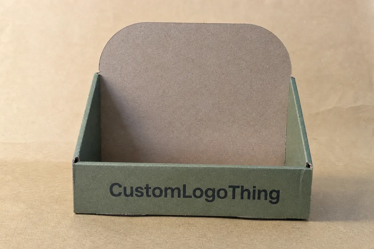
Sustainable Display Cartons with Logo: Smart Packaging
A shelf carton has three jobs at once: protect the product, sell the product, and make the material story believable in a few seconds. That is why sustainable display cartons with logo keep showing up in brand briefs. Retail teams want packaging that earns shelf space without piling on extra material, extra ink, or extra drama.
From a buyer's point of view, the best display carton is not the one with the loudest eco claim. It is the one that survives handling, reads cleanly from arm's length, and fits the retailer's fixture without a pile of add-ons. If the box looks responsible but fails on shelf, it misses the point. If it looks polished but wastes material, the sustainability story starts to fall apart.
Packaging decisions get practical fast. Board grade, die-cut shape, print coverage, and display orientation all affect cost and performance. The logo matters too. A strong logo placement can carry the pack. Too much ink, too many coatings, or a clumsy structure can create waste without helping sell-through. Pretty is not the goal. Selling is.
What Sustainable Display Cartons With Logo Do On Shelf
Display cartons live close to the sale. They sit on counters, shelves, endcaps, and temporary retail fixtures where the pack has to earn attention fast. That job is very different from transit packaging. A shipper can hide in the back room. A display carton is on display, which means every crease, color choice, and fold line gets judged in public.
Sustainable display cartons with logo often outpull plain brown cartons because they combine merchandising and material communication in one unit. The pack has to protect the product, signal the brand, and hint that the packaging was built with lower impact in mind. If those three things come through clearly, the carton helps both retailer perception and consumer trust.
Usually, "sustainable" in this category means one or more of these choices:
- Recyclable board such as paperboard or corrugated board that fits common recovery streams.
- Responsibly sourced fiber backed by FSC or similar chain-of-custody documentation.
- Reduced ink coverage that keeps the pack more fiber-forward and avoids heavy solids.
- Water-based or low-migration coatings chosen for the product category and retail setting.
- Structural efficiency that removes unnecessary inserts, plastic windows, or layered components.
That last point carries more weight than many brands expect. A smaller carton with smarter geometry can save more material than a larger box with a green badge printed on the front. Sustainability starts with structure, not slogans.
The format usually lands in one of a few display styles: counter display cartons, shelf-ready trays, open-front cartons, hanging cartons, or retail cartons with tear-away fronts. Each one solves a different merchandising problem. A counter unit needs a small footprint and easy top-up access. A shelf-ready tray needs side walls that hold shape through replenishment. Hanging formats need clean hang holes and enough stiffness to resist curling under load.
Retailers care about more than appearance. They care about replenishment speed, case pack efficiency, and how the packaging behaves after it reaches the shelf. A carton that looks elegant in a render but arrives crushed, bows under product weight, or makes the product hard to face forward will not help sell-through. The best sustainable display cartons with logo get judged on shelf appeal and operational discipline at the same time.
Packaging reality check: the strongest eco story is the one the carton can support physically. If the structure fails, the environmental message loses credibility fast.
For brands trying to justify a packaging change, the question is rarely "Can we make it sustainable?" The real question is whether the carton can be sustainable and still win on shelf. That changes the whole brief.
How Sustainable Display Cartons With Logo Work
The carton is a system, not a single panel. It has an outer structure, fold lines, locking tabs, product cavities, and print surfaces that turn the pack into a small billboard. Strong designs give each part a job instead of asking every surface to do everything.
Board choice sets the tone. Natural kraft board signals lower processing and suits brands that want an earthy, understated look. Coated white board does the opposite. It gives sharper contrast and stronger logo reproduction. If the brand uses bright colors or fine type, a white or lightly coated surface often works better because it improves legibility without forcing heavy ink coverage. For food, beauty, wellness, and specialty retail, that clarity can matter a lot.
Sustainability also has a structural side. A carton that folds from one blank, uses minimal glue, ships flat, and avoids extra inserts usually reduces both material use and freight volume. That can lower cost and cut waste at the same time. A plastic window may look nice, but if the product can be seen through an open-front design or a well-shaped aperture in the paperboard, the carton can deliver the same merchandising effect with fewer parts.
Logo placement deserves more thought than it usually gets. The logo should be visible at the most likely viewing distance, not just centered for a mockup. On a crowded shelf, the top third of the panel often has the strongest visibility, especially if the product sits below eye level. If the retailer's planogram crowds the lower face, a strong top band or header may work better than a large centered lockup.
Print treatment shapes perception too. Heavy ink coverage can bury the texture of recycled board, while a restrained layout can make the material feel more honest and premium. Soft-touch lamination creates a luxe feel, but it does not always match a lighter sustainability story if the application does not need it. Water-based varnishes, matte finishes, and controlled spot color often hit a better balance than flashy finishing that adds cost without much payoff.
There is a tradeoff buyers should not ignore. More decoration does not always equal more value. A carton can feel premium through proportion, type hierarchy, and clean print control. It does not need foil, a full-bleed coating, and multiple inserts to get there. Sometimes the strongest move is simpler structure and tighter design discipline.
Performance testing matters because retail is unforgiving. A display carton may face stacking pressure, temperature swings, and constant handling by staff or shoppers. If the board caliper is too light, side panels can bow. If the locking tabs are badly placed, the tray may open during replenishment. If the front cut-out is too aggressive, the product may lean or topple. Sustainability does not excuse basic engineering mistakes.
Standards and practical testing help here. Packaging teams often reference ISTA test protocols for transit and distribution validation, especially when the carton is traveling inside a larger case or shipper first. For fiber sourcing and recovery context, the EPA recycling guidance is a useful baseline for understanding how paper packaging fits collection systems. Neither replaces product-specific testing, but both keep the decision grounded in more than a trend deck.
One more practical detail: "recyclable" does not mean the same thing everywhere. Local collection rules, coatings, glued inserts, and contaminant thresholds can change how a pack is handled after use. A supplier who can explain those limits clearly is worth more than one who just stamps a recycling icon on the dieline and moves on.
Cost, Pricing, MOQ, and Quote Drivers
Price follows the specification, not the word "sustainable." A simple recyclable board carton can be cost-efficient. A complex display format with layered construction, specialty coatings, or multiple print passes can move into a much higher bracket. The label does not set the price. The engineering does.
Most quote drivers are predictable:
- Board grade and caliper, including recycled content or virgin fiber mix.
- Carton size, because larger blanks use more sheet area and affect nesting efficiency.
- Print complexity, especially if the design uses multiple colors, fine screens, or large solid areas.
- Finishing such as aqueous coating, matte varnish, embossing, or specialty lamination.
- Structural complexity, including tear-away fronts, locking tabs, and shaped windows.
- Assembly requirements, such as hand packing, gluing, or added inserts.
- Tooling and dieline setup, especially for first runs.
MOQ changes the math quickly. A 2,000-piece run usually carries a higher per-unit price than a 10,000-piece run because setup and tooling are spread across fewer units. That does not mean small brands should avoid the format. It means they should Choose the Right level of complexity for the volume. A simpler structure, fewer colors, and standard dimensions can keep the project workable at low volume.
Here is a practical way to compare options. These are typical market ranges, not promises, and the final number depends on region, spec, freight, and supplier capability.
| Carton Style | Typical Best Use | Common Price Driver | Relative Unit Cost | Sustainability Advantage |
|---|---|---|---|---|
| Plain recyclable paperboard display carton | Light products, simple shelf presentation | Low print coverage, minimal finishing | Low | Simple structure, easy recycling path |
| Printed kraft display carton | Natural brands, lower-ink visual identity | Board texture and print contrast | Low to medium | Often uses less ink and fewer coatings |
| Coated white retail display carton | Beauty, wellness, premium consumer goods | Sharper graphics, higher print control | Medium | Can still be recyclable if coatings are compatible |
| Shelf-ready tray with tear-away front | Retail replenishment and case-to-shelf workflows | Structural die-cut complexity | Medium to high | Reduces secondary handling and can lower waste |
| Enhanced display carton with insert or window | Products that need visibility or position control | Extra components and assembly | High | Can still be responsible if every component is justified |
For many brands, a realistic starting point for a printed recyclable display carton might land around $0.18 to $0.45 per unit at 5,000 pieces, depending on size and coverage. At smaller quantities, the figure can climb quickly, sometimes doubling once tooling, setup, and shipping are added. Larger runs often compress the unit price, but they also raise inventory risk if the design changes later.
That is why value beats sticker price. A carton that costs a few cents more but protects the product, improves shelf conversion, and reduces rework can lower the true cost of launch. A cheaper carton that collapses in transit or looks off-brand on shelf becomes expensive in ways that never show up in the quote.
When you request a quote, ask for the details that matter:
- Exact board spec, including thickness and fiber content if available.
- Final dimensions and orientation on shelf.
- Print method, number of colors, and finish.
- Whether the quote includes tooling, sampling, and dieline work.
- Lead time by stage, not just a single total number.
- Freight assumptions and any packaging documentation provided.
If a supplier cannot explain how their material story fits real recycling or sourcing standards, the claim is too thin. FSC chain-of-custody, recycled content disclosure, and clear end-of-life guidance are more useful than vague "eco-friendly" language. The logo on the carton should reinforce the brand, not cover for a weak sustainability claim.
Production Process, Timeline, and Lead Time
The production path looks simple on paper, but the delays usually hide in the handoffs. A typical project starts with a brief that includes product dimensions, unit weight, shelf format, brand assets, and sustainability priorities. From there, the supplier or converter creates a structural concept and dieline, then the artwork team adapts the graphics to the blank.
Proofing comes next, and that is where many projects slow down. If the logo sits too close to a fold, if the barcode lands where a retailer will reject it, or if the legal copy is too dense for the panel size, revisions start. Each revision can add a few days. If the structure itself needs changes, the schedule stretches further.
The usual sequence looks like this:
- Product and retail brief.
- Structural concept and dieline creation.
- Artwork placement and prepress review.
- Digital proof or physical sample approval.
- Board sourcing and production scheduling.
- Printing, die-cutting, folding, gluing, and finishing.
- Pack-out, palletization, and shipment.
Timing depends on complexity. A simple fold-out carton with approved artwork may move through production faster than a shelf-ready tray with tear-away panels and special coatings. In many cases, a straightforward domestic run can finish in roughly 2 to 4 weeks after proof approval, but that depends on supplier capacity, region, and freight mode. Add inserts, specialty inks, or structural revisions, and the clock changes.
Seasonality matters too. Plants get busy before major retail resets, holiday launches, and promotional periods. Freight becomes its own variable when ocean or ground capacity tightens. A buyer who waits until the final artwork deadline has very little room to fix a problem if the carton spec changes.
Sample approval is another hidden time sink. A digital proof can confirm color placement and copy flow, but it will not tell you how the carton behaves once it is loaded. A physical mockup or structural sample catches fit, stability, and shelf visibility issues much earlier. It also lets the team check how the logo reads from a few feet away, which is how shoppers actually see the pack.
The safer approach is to build buffer into the launch plan. If the retail date is fixed, the carton schedule should move backward from that point rather than forward from the design handoff. A few extra days for approvals costs far less than missing a sales window.
One useful rule: do not approve a final file until barcode placement, legal copy, and retailer requirements have been checked together. A carton can look finished and still be wrong. Late corrections are almost always more expensive than one more review cycle.
There is also a practical distinction between a "sample" and a "check." A sample tells you whether the carton can be made. A check tells you whether it can survive the actual retail job. Those are not the same thing, and treating them as the same thing causes mistakes.
Step-By-Step Guide To Ordering The Right Cartons
The cleanest projects start with the product itself. Measure the item, not just the idealized SKU. Weight matters. Fragility matters. So does how the carton will sit in a retail fixture, because a unit built for a deep shelf will not always work as a counter display or hanging pack.
Define the sustainability goal in plain language. "Eco" is too vague. Better options include recyclable paperboard, FSC-certified sourcing, reduced material use, a lower-ink layout, or removal of unnecessary plastic components. If the goal is brand-facing and not compliance-driven, say so. If the goal is to satisfy a retailer packaging policy, say that too.
Then choose the display style that matches the channel. Counter display cartons fit checkout zones and small-format stores. Shelf-ready trays work better for organized retail replenishment. Hanging cartons help when floor or shelf space is tight. Open-front retail cartons make sense when visibility matters more than full-panel graphics. The channel should shape the structure, not the other way around.
A good packaging brief usually includes the following:
- Exact product dimensions and total packed weight.
- Target retail channel and shelf position.
- Brand colors, logo files, and copy hierarchy.
- Material preference, including board type and any sourcing requirements.
- Print finish preferences and anything to avoid.
- Quantity forecast for first run and reorder assumptions.
Before production, request samples or a structural mockup. That one step can reveal issues that artwork files never show. Is the product too loose in the cavity? Does the front face hide too much of the item? Does the logo disappear once the carton is angled on shelf? A sample makes the tradeoffs concrete.
Testing should include real handling, not just visual review. Put the sample on a shelf, lift it, restock it, and move it through a shipping case if that is part of the workflow. If the carton is supposed to replace a plastic display tray, compare the two side by side. The point is not to admire the prototype. The point is to find out whether the carton survives the actual use case.
Only after that should the final artwork be approved. Review the barcode, legal text, recycling symbol if used, and any retailer-specific copy. Then confirm that print contrast still works on the chosen substrate. A logo that looks sharp on screen may flatten on kraft board, while a dark solid may absorb more ink than expected and lose detail.
After launch, track sell-through and damage rate. A sustainable carton that looks beautiful but underperforms does not deserve a second run. A modest-looking carton that moves product cleanly and cuts waste may be the better long-term choice. The first run is a test, not a verdict.
For teams buying sustainable display cartons with logo for the first time, a pilot run is usually the smartest path. It gives real store data before the brand commits to a larger inventory block. That matters more than a polished sample table ever will.
Common Mistakes Brands Make With Sustainable Display Cartons
Overbuilding is probably the most common mistake. Brands add board thickness, extra inserts, windows, coatings, and structural features until the carton stops being efficient. The result is often a higher price and a weaker sustainability story. More material is not automatically more protection. Sometimes it is just more material.
Another frequent error is designing without checking retailer rules early. Shelf dimensions, barcode placement, display height, and replenishment limits can vary by account. If those requirements show up late, the packaging team may need to revise the carton after artwork is already done. That creates delay and cost, and it can put the brand plan out of sync with the store reality.
Designing for a rendering instead of a real shelf is another trap. On screen, a large logo can look balanced. On a crowded retail shelf, that same logo may sit too low, read too small, or land too close to a fold line. Product visibility can also disappear if the front opening is too small or if the carton sits behind other items. Shelf testing solves more problems than a polished mockup ever will.
Vague eco claims are a credibility risk. If the carton says sustainable but the supplier cannot support the claim with sourcing details, recycling guidance, or material specs, the packaging turns into a liability. Buyers are more skeptical now, and retailers usually are too. A grounded claim beats a broad one every time.
Skipping physical testing is expensive. A carton may pass visual review and still fail in shipment or on shelf. Common issues include crushed corners, weak folds, over-creased panels, and product movement inside the pack. These problems often show up after the first production run, which is exactly why a pilot helps.
There is also a subtler mistake: treating sustainability and branding as opposing goals. They are not. A clean logo, disciplined color use, and well-chosen board can create a premium look without adding more components. In many cases, the strongest packaging is the simplest one that still meets retail demands.
For brands that want a reality check, the question is simple: would this carton still make sense if the sustainability claim disappeared? If the answer is no, the design may be leaning too hard on messaging and not hard enough on function.
One buyer scenario shows this clearly. A cosmetics brand may want a rigid, coated carton because it photographs well for e-commerce. On shelf, though, that same format may be too bulky for the retailer's tray system and too costly for the forecasted volume. A lighter paperboard display carton with a smaller logo band can actually perform better, provided the print stays crisp and the product sits securely.
Expert Tips And Next Steps For Your First Run
Start with a shelf test, not a render review. Put sample cartons in the actual retail environment, or as close to it as you can get, and compare visibility, readability, and handling against the current pack. That one step often shows whether the logo needs to move, whether the opening is too deep, or whether the carton needs a stronger base.
Standardize wherever possible. If one carton size can serve multiple SKUs, the supply chain gets easier. If the board grade can stay consistent across product lines, reorder planning gets simpler. If the print rules are repeatable, the team spends less time reworking artwork for every launch. Consistency is not boring. It saves time and money.
Ask for documentation early. Material sourcing notes, recycling guidance, and any chain-of-custody details should be part of the project from the start, not an afterthought. That matters even more if the brand wants to speak publicly about sustainable display cartons with logo or print the claim directly on-pack. A claim backed by documents is stronger than one built on assumptions.
For brands new to the format, a pilot run is often the safest move. Set clear success metrics before production begins. Damage rate, retailer feedback, pack-out speed, and sell-through during the first replenishment cycle all tell you something useful. That gives the team room to adjust the structure before committing to a larger volume.
It also helps to compare quotes on the same specification. Two suppliers can look wildly different on price if one includes tooling, freight, or a stronger board and the other does not. Normalize the quote first, then judge value. The cheapest carton on paper may become the most expensive once rework and returns are counted.
Here is a compact checklist for the first run:
- Define the product size, weight, and shelf format.
- Choose the board and finish based on function first.
- Request a structural sample or mockup.
- Confirm logo visibility from retail viewing distance.
- Review recycling, sourcing, and retailer compliance details.
- Build in a buffer for proof changes and freight delays.
One more practical point: do not try to solve every packaging goal in one carton. If the brief asks for premium appearance, low material use, strong transit performance, and the lowest possible price, something has to give. The smart move is to prioritize the two or three outcomes that matter most for the launch and design around them.
That is where a good supplier conversation pays off. A converter who understands shelf-ready packaging can usually point to where material can be saved, where structure should stay, and where print can be simplified without hurting the brand. The best sustainable display cartons with logo are rarely the most complicated ones. They are the ones that are honest about their job.
If you are building your first spec, start by locking the shelf format, the board choice, and the logo placement before anyone talks about embellishment. That sequence keeps the carton grounded in the real retail environment instead of a presentation board.
Closing Thoughts
Sustainable display cartons with logo are not just nicer-looking boxes. They are a practical tool for brands that need retail presence, product protection, and a credible material story in the same package. The cartons that perform best usually follow the same pattern: simpler structure, clear logo hierarchy, sensible board selection, and enough testing to avoid surprises on shelf.
If you are planning a first run, keep the brief tight, compare quotes on identical specs, and test the sample where the carton will actually live. That is the fastest path to a pack that feels responsible without sacrificing retail impact. For most brands, that balance is the whole point of sustainable display cartons with logo.
The actionable takeaway is straightforward: define the shelf job first, then build the carton around it. If the logo is not readable at retail distance, the board cannot hold shape, or the material claim cannot be backed up, the design is not ready. Fix those three points before approving production.
What makes sustainable display cartons with logo different from standard retail cartons?
They are built to do more than ship. The structure has to support merchandising, branding, and product protection at the same time, while still using materials and finishes that fit a lower-impact packaging brief. The strongest versions combine shelf visibility with a cleaner material story instead of treating sustainability as an add-on.
Which materials work best for sustainable display cartons with logo?
Recyclable paperboard and corrugated board are common choices because they are lightweight, printable, and widely used in retail packaging. The right material depends on product weight, shelf life, display format, and how sharp the logo needs to look. A good supplier should explain whether recycled content, virgin fiber, or a coated finish is the better fit.
What drives the quote for sustainable display cartons with logo?
Board grade, carton size, print coverage, finishing, structural complexity, and quantity are the main pricing levers. MOQ matters because setup costs are spread across fewer units in small runs. Freight, sampling, tooling, and any special sustainability documentation can also change the final number.
How long does the production timeline usually take?
Simpler cartons with approved artwork can move faster than complex formats that need structural work or specialty finishing. In many projects, the slowest steps are sample approval, dieline revisions, and late artwork edits rather than the press run itself. A realistic schedule should include buffer time for approvals, testing, and shipping.
Can small brands order sustainable display cartons with logo at a low MOQ?
Yes, but the unit price is usually higher because setup and tooling are shared across fewer cartons. Small brands can control cost by simplifying the structure, limiting print complexity, and standardizing dimensions. A supplier can often suggest a pilot run that balances budget with enough volume to test retail performance.


