A digital proof is the first place a tea logo patch beanie stops being an idea and starts acting like a production job. That matters. A logo can look clean in vector form and still miss the mark once it is scaled to a cuff, pushed against rib knit, or converted into a patch with real material limits.
The proof is not a courtesy preview. It is the working contract between art, production, and the buyer who will get blamed if the result is off. A good review catches the expensive stuff early: wrong size, bad placement, unreadable text, weak contrast, and patch methods that cannot support the artwork as drawn.
Why a Digital Proof Matters Before Patch Production
A beanie is a less forgiving canvas than a flat shirt panel or a tote. The fabric stretches. The crown curves. The cuff folds. Seams can steal visual space. That means a logo that looked perfectly centered on screen can shift once the decoration is mapped onto the actual garment.
For tea branding, the risk is usually in the details. Thin script, small leaf marks, stacked words, or delicate linework can collapse when they are pushed into embroidery, woven construction, or a small molded patch. The proof is where you find out whether the design survives contact with the real process.
If the proof is vague, production fills in the blanks. That is how avoidable mistakes get made.
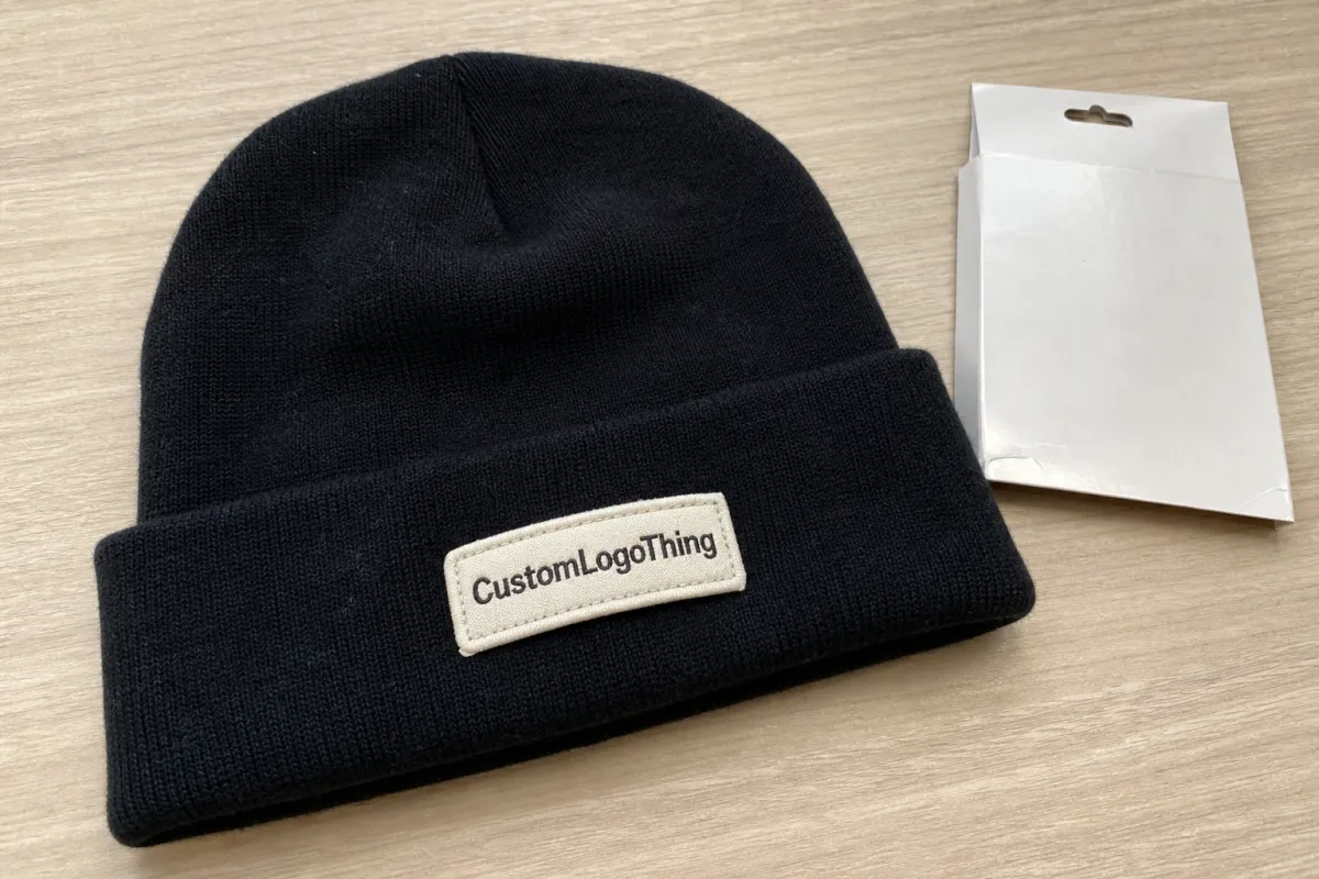
The point is not just to approve something that looks nice. The point is to approve something that can be built cleanly, repeated consistently, and attached without distorting the beanie. A sharp proof should show the patch shape, the decoration method, placement reference, size, backing, and any limits on color or detail.
That also makes quote comparisons more honest. Two suppliers can show the same mockup and still be pricing very different builds. One may be quoting a simple embroidered patch. Another may be quoting a woven badge with a tight border and a sew-on finish. If you do not review the proof carefully, you end up comparing artwork, not production reality.
For buyers who want a deeper breakdown of construction options, the notes on our Manufacturing Capabilities page help explain how the build method changes the final result. The right choice depends on the art, the fabric, and how much detail the patch needs to hold.
Tea Logo Patch Beanies Digital Proof Checklist
Use this checklist like a production review, not a formality. It is meant to catch the things that are hard to fix after approval.
- Confirm the art is clean. Vector artwork is best for logos with hard edges. If the file is raster-based, it should be high resolution and free of jagged curves, stray points, missing fills, or blurry text.
- Check the final scale. The patch should fit the beanie without crowding the cuff, crossing a seam, or overwhelming the knit texture. A size that looks modest on a screen can feel huge on a cap-sized front panel.
- Review placement in context. Ask where the patch sits: centered on the cuff, offset on the front panel, or aligned to a fold or seam guide. Placement should be tied to a real landmark, not just "front center."
- Verify the decoration method. Embroidered, woven, printed, PVC, leather, and mixed-material patches each handle detail differently. Fine text that works in one method may fail in another.
- Match colors to the base beanie. A tone that reads clearly on white can disappear on heather gray, olive, or black. Contrast matters more on knit goods than on flat mockups.
- Inspect edge finish and backing. Merrowed borders, laser-cut edges, heat-seal backing, adhesive backing, and sew-on finishes all change both appearance and durability.
- Read the proof notes carefully. Any note about simplified gradients, thread substitutions, material changes, or reduced detail needs to be visible before sign-off.
- Ask for one marked-up revision if the proof is unclear. A visual correction is faster than trying to interpret vague language after approval.
For retail programs, ask for a proof that shows true proportion to the beanie, not just a floating badge on a white background. The difference between a 2.25-inch patch and a 3-inch patch is obvious once it sits on rib knit. So is the difference between a bold logo and one that depends on hairline spacing.
Patch type matters just as much as artwork. Embroidered patches look strong and direct, but they are not built for tiny type. Woven patches hold tighter detail, though they still need clean scaling. PVC can give a crisp raised look, but the art often needs simplification. Leather feels premium, but subtle contrast can be hard to judge on screen.
| Patch type | Best use case | Typical price impact at scale | Main proof risk |
|---|---|---|---|
| Embroidered | Bold logos with simple shapes | $0.18-$0.32 per unit on larger runs | Fine text may close up |
| Woven | Small details and tighter line work | $0.22-$0.38 per unit on larger runs | Very small type still needs review |
| PVC | Raised branding with strong color blocks | $0.35-$0.70 per unit depending on shape | Complex art may need simplification |
| Leather | Premium feel with limited detail | $0.28-$0.55 per unit | Low-contrast art can look flat on screen |
Those ranges are broad for a reason. Quantity, tooling, patch shape, border style, color count, and hand finishing all move the number. A 300-piece order usually carries a higher unit cost than a 5,000-piece run because setup is spread across fewer units. A custom die-cut shape or special backing adds more.
Freight and packing also matter. If the beanies are retail-bound, the job may need tagged folding, individual bags, carton labeling, or a packaging spec that keeps the patches from scuffing in transit. For general transport standards, organizations like ISTA and broader material references such as Packaging school resources are useful context points, even if the final spec is much simpler than a lab test sheet.
How the Approval Process Works From File Upload to Sign-Off
The process usually starts with the source files. Production checks whether the logo is vector, whether fonts are outlined, whether images are embedded properly, and whether the artwork needs cleanup before a proof can be built. If the file is messy, everything slows down. That is not a moral failure; it is just how artwork prep works.
Next comes the digital proof. The supplier places the patch on a beanie template so size, placement, and orientation can be judged in context. Good proofs show measurements and the product surface. Better ones make the decoration method obvious, because a flat floating badge does not tell you much about how the patch will actually sit on knit fabric.
This is the stage where the checklist earns its keep. If the text is too small, the border is too heavy, or the patch feels off-center, fix it now. Once the proof is approved, it stops being a draft and starts being the reference point for production.
For more complex logos, a second approval step can be worth the time. That can mean a stitched sample, a physical patch sample, or a pre-production photo. It is especially useful when the art includes metallic thread, multiple color breaks, tiny lettering, or a finish that changes how light hits the surface.
A practical approval workflow looks like this:
- Upload clean art and brand notes.
- Confirm patch method, size, and quantity.
- Review the digital mockup with measurements.
- Return revisions in one clear round.
- Approve only after size, color, placement, and construction match the order intent.
Keep the reviewers focused. One person should own art accuracy, one should own brand fit, and one should own timing. If everyone comments at once, the proof turns into a negotiation instead of a decision.
Cost Drivers That Affect Quote Accuracy
Quote accuracy depends on how much the supplier knows up front. The big drivers are patch method, logo complexity, number of colors, quantity, border style, and whether the patch needs a custom shape. A one-color embroidered badge is straightforward. A six-color woven patch with tiny type and a cut contour is not.
Minimum order quantity matters too. Lower quantities push the unit price up because setup and prep costs are spread across fewer pieces. Bigger runs usually improve unit economics, although they can also introduce more inspection time if the art is complicated or the color matching is strict.
Here is the kind of breakdown that helps buyers compare quotes without guessing:
| Quote element | What it covers | Why buyers should care |
|---|---|---|
| Setup charge | Art prep, digitizing, mold or screen setup | Can change the math a lot on small runs |
| Sample or proof charge | Physical sample, test build, or detailed mockup | Reduces the risk of expensive approval mistakes |
| Decoration cost | The patch itself and application labor | Usually the biggest unit price driver |
| Freight | Packaging, transport, and delivery | Can be significant if the timeline is tight |
Fine detail raises cost for a reason. Small lettering, gradients, layered art, metallic thread, and special backing materials all add work somewhere in the chain. That may mean extra digitizing, more inspection, or a slower application process. None of that is automatically bad. It just needs to be understood before the buyer approves the order.
If sustainability is part of the program, packaging should be discussed alongside decoration. FSC-certified paper components may matter for retail programs, and recycled or reduced-plastic packing can also change the handling spec. The patch gets the attention, but the packaging still shapes the buying experience.
Timeline, Lead Time, and Revision Windows
A realistic timeline has five parts: artwork review, proof creation, buyer revisions, production, and shipping. None of those steps is long by itself. Together, they can stretch fast if the artwork needs cleanup or the approval chain is slow.
That is the part many buyers underestimate. Lead time is not only a factory issue. It is also a response-time issue. A proof that sits for three days waiting on one internal comment can do more damage than a busy production line.
If a sample is involved, add time. A digital proof can move quickly. A physical sample has to be made, checked, shipped, and reviewed. For tea logos with fine typography or texture-sensitive details, that extra step can prevent a whole production run from being wrong.
Seasonal beanie programs need even more margin. Once cold weather hits, the same materials, the same decoration slots, and the same ship windows get crowded. Planning backward from the delivery date is safer than assuming a normal turnaround will still hold. A schedule with one careful revision is useful. A schedule that assumes no revisions is fantasy.
Keep the records together as well. Save the final proof, the revision notes, the approval date, the quantity, and the patch method in one place. If a question comes up later, nobody should have to reconstruct the approved version from memory or dig through old email threads.
As a rough planning guide:
- Artwork review: 1-2 business days
- Digital proof creation: 1-3 business days
- Buyer revision round: 1-3 business days, depending on internal approvals
- Production: often 12-15 business days after approval, depending on quantity and method
- Shipping: varies by destination and freight choice
Those are planning ranges, not promises. They shift with season, order size, and how ready the art is at the start. Still, they are far more useful than hoping the job will somehow finish faster than the schedule allows.
Common Proof Mistakes That Create Rework
Color is the first trap. Screens lie. One laptop makes navy look black. Another warms up gray. None of that tells you how the patch will look against the actual beanie fabric. If color matters, compare against a printed reference or a agreed PMS target, not just a monitor.
Size is the second trap. A logo can look perfectly legible at full zoom and still fall apart once it is reduced to patch scale. That happens often with tea marks that use fine script, narrow leaf outlines, or stacked subtext. Small type is where good-looking art goes to die if nobody checks final size.
The beanie surface itself gets overlooked more than it should. Rib knit stretches. The cuff fold changes the visible area. Seams pull the eye. A patch that looks balanced on a flat template may sit differently once it is on a real hat. Proofs should be read in context, not as detached graphics.
Incomplete notes create another kind of trouble. If the proof does not clearly show backing, thread color, edge finish, or the exact placement rule, ask for clarification before approval. The missing detail is usually what causes the rework later.
There is also the boring failure: wrong quantity, wrong ship-to instruction, wrong packaging note, wrong version number. The logo can be perfect and the order can still stall because the job ticket and the proof do not match. That kind of mistake is common, and it is avoidable.
Expert Tips and Next Steps Before You Approve
Print the proof if you can, or put it beside a physical beanie. Screen-only review misses scale cues. Fabric changes the way a logo reads. Ribbing gives the patch a different visual weight than a flat mockup does.
Ask for a close crop when the design has small lettering, layered detail, or a border that needs to land neatly on the edge. Close-up review often exposes spacing problems that disappear in the full mockup. If the logo depends on gradients or metallic effects, ask how those will be translated into the final patch method. No guessing. Guessing is expensive.
Separate brand approval from production approval. Marketing may like the look. Production still has to decide whether the artwork can be built within the chosen method, budget, and schedule. Those are related questions, but they are not the same question.
A clean approval habit helps:
- Save the final proof PDF.
- Keep revision notes with the approval email.
- Record date, quantity, and patch method in one file.
- Use the same version number across purchasing, artwork, and receiving.
For buyers comparing patch styles, the safest move is to match the decoration method to the design before the proof gets approved. That is where the construction notes on the Manufacturing Capabilities page can be useful. A logo that looks fine as a mockup may need simplification once it is mapped to a real patch and a real beanie.
The simplest version of the advice is also the most useful: use the tea Logo Patch Beanies digital proof checklist as the final gate. Check art, size, placement, color, construction, timeline, and packaging notes. Approve only when all of it is clear. That is how you protect the brand and avoid paying twice for the same mistake.
What should a tea logo patch beanies digital proof include?
It should show the logo at final size, the patch shape, the exact placement on the beanie, and the decoration method. Strong proofs also note backing, edge finish, and any color references that affect production.
How do I check color accuracy on a beanie patch proof?
Compare the proof against a calibrated screen or a printed reference, not just a laptop display. Contrast against the base beanie fabric matters just as much as the logo color, because a shade that works on white can disappear on dark knit goods.
Can a digital proof show if the patch will fit a rib-knit beanie?
Yes, if it includes a scaled mockup that shows the patch relative to the cuff or front panel. It still helps to compare that mockup to an actual beanie shape, since ribbing and seams can shift the visual balance.
What slows down proof approval and production the most?
Missing artwork files, unclear placement instructions, and slow buyer responses are the biggest delay factors. Complex logos with fine text, multiple color breaks, or special patch materials usually need more review time too.
Should I approve a proof if the logo text is very small?
Only if the proof confirms the text will stay legible at final size in the chosen patch method. Small type can blur or close up during stitching or weaving, so ask for a larger mockup or simplify the art if needed. Use the tea Logo Patch Beanies digital proof checklist one last time before you sign off, and most of the avoidable rework stays out of the order.


