Buyer Fit Snapshot
| Best fit | Custom Letterpress Logo Labels That Look Premium projects where brand print, material claims, artwork control, MOQ, and repeat-order consistency need to be specified before quoting. |
|---|---|
| Quote inputs | Share finished size, material target, print colors, finish, packing count, annual reorder estimate, ship-to region, and any compliance wording. |
| Proofing check | Approve dieline scale, logo placement, barcode or warning zones, color tolerance, closure strength, and carton packing before bulk production. |
| Main risk | Vague material claims, crowded artwork, missing packing details, or unclear freight terms can make a low unit price expensive after revisions. |
Fast answer: Custom Letterpress Logo Labels That Look Premium: Material, Adhesive, Artwork, and MOQ should be specified like a repeatable production item. The safest quote records material, print method, finish, artwork proof, packing count, and reorder notes in one written spec.
Production checks before approval
Compare the actual filled-product size with the drawing, then confirm tolerance on folds, seals, hang holes, label areas, and retail display edges. Reserve space for logos, QR codes, warning copy, and material claims before decorative graphics fill the panel.
Quote comparison points
Review material grade, print process, finish, sampling route, tooling charges, carton quantity, and freight assumptions side by side. A quote is only useful when the supplier can repeat the same color, closure quality, and packing count on the next order.
Tips for custom letterpress logo labels usually start with design, but the strongest labels are rarely about decoration alone. A pressed impression changes how a package feels in the hand, and that physical depth gives even a small label a calmer, more finished presence than a busy print treatment often can. The effect is subtle, though it lands quickly; people sense quality before they have time to study the typography or color.
Premium candles, spirits, skincare, gourmet food, stationery, and boutique mailers all benefit from that first tactile contact. A label is not just a sticker sitting on a surface. It becomes part of the product’s opening moment, the place where packaging starts carrying the brand story in a real, touchable way. The most useful tips for custom letterpress logo labels point toward discipline: Choose the Right stock, keep the artwork clear, and let the press do the work it does best instead of asking it to mimic digital print.
The market is crowded with brands chasing texture, which makes restraint even more valuable. A clean debossed mark on the right paper can communicate more confidence than a layout packed with gradients, multiple effects, and extra color that do not add anything useful. If your larger packaging system already includes Custom Labels & Tags or a broader line of Custom Packaging Products, the label should support the same visual language rather than pulling away from it.
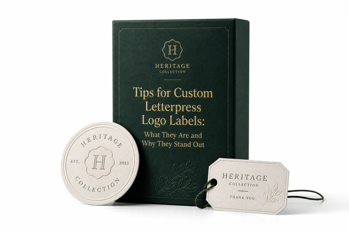
Tips for Custom Letterpress Logo Labels: What They Are and Why They Stand Out
A letterpress label is created by pressing an inked or blind image into thick stock so the mark sits below the surface instead of resting flat on top of it. That impression is the whole appeal. It adds shadow, texture, and a quiet sense of craft that flat print cannot replicate. Among the most practical tips for custom letterpress logo labels is remembering that the premium feel comes from depth just as much as from ink, and in many cases depth matters more.
Small labels often look more luxurious than larger printed pieces because the eye and hand both register the press mark. The buyer notices the weight of the stock, the texture of the paper, and the slight catch of the impression under a fingertip. Those small signals matter in retail packaging. A white cotton label on a candle jar can communicate quality more clearly than a crowded label with metallic ink and too many graphic details.
Custom letterpress logo labels work especially well for products where touch reinforces the story. Candles are a natural fit because the label should feel as calm and crafted as the scent profile. Spirits and craft beverages use the same logic, though the label also needs to hold up under colder conditions and frequent handling. Skincare, gourmet food, stationery, and premium mailers all gain something when the label adds a physical cue to the brand promise.
Restraint is another reason these labels stand out. The best tips for custom letterpress logo labels usually sound less like “add more” and more like “take away what does not earn its place.” Small monograms, simple icon marks, short product names, and clean typographic layouts often outperform dense compositions. Letterpress rewards confidence. It does not need to shout to be noticed.
A letterpress label should feel deliberate: enough impression to read as premium, not so much depth that the letters break, halo, or lose their edge.
That is why many brands treat letterpress as one part of a broader packaging system. The label can echo the paper used in custom printed boxes, repeat a color from the shipper, or mirror the typography of the website and inserts. In practice, the strongest tips for custom letterpress logo labels are the same ideas that improve the rest of the identity: keep the system consistent, then let one tactile detail carry the emotion.
The job of the label matters too. On a shelf, it may have only a few seconds to communicate class, category, and credibility. In a mailer, it may be the first surface a customer touches after opening the box. That makes it a small piece of packaging with a lot of responsibility.
How Custom Letterpress Logo Labels Are Made
The production path for custom letterpress logo labels is direct, but each step affects the result. It usually begins with artwork cleanup, then moves into plate or die creation, press setup, ink selection, printing, drying, trimming, and inspection. Every stage feels simple until a detail is off. That is why practical tips for custom letterpress logo labels always include careful file prep and proof review.
Letterpress works differently from offset or digital printing because the design is physically pressed into the substrate. The image does not just sit on the surface. It creates a debossed or letterpressed depth that you can see at an angle and feel with a fingertip. On thicker stocks, the effect can stay subtle and elegant; on softer papers, it can become more pronounced. In either case, the impression becomes part of the brand language.
Shape matters as well. Square, round, oval, and custom die-cut labels can all work, yet each shape carries different production considerations. Simple geometries usually print cleaner and trim more efficiently. A custom die-cut can look beautiful, though it may raise setup costs and increase the chance of edge issues if the design sits too close to the cut line. For many brands, one of the most useful tips for custom letterpress logo labels is to choose the simplest shape that still fits the product.
Registration deserves special attention whenever the design includes multiple colors or layered elements. Letterpress does not forgive sloppy alignment. The press operator needs precise placement so each pass lands where it should, and even a small shift can make the logo appear muddy or careless. Multi-color labels can work, but they call for more setup and more patience. A single-color mark often produces the cleanest result because the eye can focus on texture instead of alignment.
There is a technical reason letterpress has such a distinct look. Pressure compresses the fibers in the stock, which is why paper choice matters so much. The result is tactile, but it can also expose weaknesses in the material. Thin, overly smooth, or coated substrates usually fight the process rather than support it. That is why another one of the essential tips for custom letterpress logo labels is to choose a stock that wants to be pressed.
Brands that care about sourcing may need paper certification as much as print quality. FSC-certified options help support responsible forest management, and that can matter when the label sits inside a broader sustainability claim. If that is part of the packaging strategy, it is worth checking supplier documentation rather than assuming every “eco” paper carries the same meaning. More on the certification side is available through FSC.
When labels travel inside corrugated secondary packaging, transit testing should stay on the checklist. The larger packaging system may need to survive vibration, drops, compression, or humidity changes before the label ever reaches a customer. Standards and test methods from groups such as ISTA provide a useful reference point when a product has to hold up in shipping as well as on display.
Key Design and Material Factors for Custom Letterpress Logo Labels
The stock is where many jobs succeed or fail. Cotton papers, textured uncoated stocks, and thick label papers usually hold the impression best. They also create the soft tactile quality that makes the label feel refined in the hand. If the goal is to read as polished rather than flashy, most of the value sits here. The most effective tips for custom letterpress logo labels start with the substrate, not the font.
Thickness matters, but not in the simple “thicker is always better” way. A stock in the 18 pt to 32 pt range may work well for some labels, while a 200 gsm to 350 gsm paper fits others depending on the application. The real question is whether the stock can take an impression without buckling or collapsing at the edges. A softer stock can show more depth, while a harder stock may hold crisper lines. The best result depends on the brand mood and the product surface.
Artwork limits should be discussed early. Fine lines can fill in. Tiny reversed type can disappear. Gradients do not translate the same way they do in digital print. Busy logos with delicate internal detail often look better after simplification for press work. One of the most honest tips for custom letterpress logo labels is to ask whether every line in the artwork still matters at one inch wide. If it does not, remove it.
Color strategy needs the same discipline. Letterpress often rewards strong contrast and limited palettes. Black on cream, deep green on natural stock, warm gray on white, or one richly inked accent can carry more authority than a full spectrum. The reason is simple: the eye already has texture to process. If the design adds too many competing signals, the label loses clarity. Package branding becomes a craft decision as much as a graphic one.
Durability is not optional. A beautiful label that smears after refrigeration or rubs off under handling does not help the brand. If the product will sit in a damp cooler, rest in a bathroom, or face frequent touch from retail staff, the adhesive and ink system need to match that reality. Grease, condensation, abrasion, and UV exposure can all affect the finish. One of the more practical tips for custom letterpress logo labels is to test the label for the actual use case, not the ideal one.
Curved surfaces add another layer of complexity. Jars, bottles, and tins can all accept letterpress labels, but the label needs enough flexibility to conform without lifting at the edges. A rigid stock may look excellent on a flat sample sheet and still behave badly on a rounded container. That is why a physical sample on the real package is worth more than a screen rendering.
There is a packaging design lesson here that gets overlooked often: the label should support the product story, not overwrite it. Candles and soaps usually benefit from quiet, earthy stocks because the material hints at natural ingredients or hand-poured production. Gourmet food may want a cleaner, more structured label because legibility matters against busy pantry shelves. Spirits labels often need a balance of tactile richness and shelf-distance readability. The same technique does not suit every category.
To keep the design honest, many brands use letterpress as the focal point and let the rest of the system stay restrained. That may mean pairing the label with plain but elegant custom printed boxes, or repeating the same mark on inserts, hang tags, and collateral. The result feels stronger when every piece speaks the same visual language instead of competing for attention.
Process and Timeline for Custom Letterpress Logo Labels
A realistic workflow matters because the press is only one part of the schedule. The full path usually starts with a brief, continues through file review, proofing, plate or die production, printing, drying, finishing, and shipment. For teams planning a launch, the best tips for custom letterpress logo labels include building time into the calendar before the artwork is even final.
File prep should be treated as a production step, not just admin work. Vector cleanup is almost always necessary. Fonts should be converted to outlines. Tiny details may need to be simplified. Bleeds need to be checked. Any element that sits too close to the edge or too near a fold, cut, or impression boundary needs review. A clean file can save days; a messy file can cost them.
The proof stage is where many schedules slip. Digital proofs show layout, proportion, and content, but they cannot fully show impression depth, paper texture, or ink absorption. A physical sample or hard proof is far more useful. If the brand is sensitive to surface feel, the proof should be judged in hand and under real light. Among the most useful tips for custom letterpress logo labels is this simple habit: never approve a label on screen alone if texture is part of the promise.
Timelines change with complexity. A one-color logo on a standard stock can move faster than a multi-pass job with foil, custom die-cutting, or specialty finishing. Every extra effect adds setup, drying, and inspection time. A small run might ship in about 7-10 business days after proof approval if the artwork is clean and the stock is standard. More complex work can move into the 12-20 business day range, especially if revisions or special materials are involved. Rush work can happen in some cases, though the cost usually climbs with it.
Build in buffer. That remains one of the least glamorous tips for custom letterpress logo labels, and one of the most valuable. A launch date should not depend on a proof signed at the last possible minute, or on freight arriving with no slack for delay. The better move is to leave room for one revision cycle, sample review, and shipping cushion. That is not pessimism. It is production realism.
For brands managing a larger rollout, it helps to map the label schedule against the rest of the packaging pieces. If custom labels, cartons, inserts, and outer shipping materials all move together, the slowest component sets the pace. That is especially true in branded packaging programs where one late approval can stall the whole line. A simple spreadsheet with artwork deadlines, proof dates, and ship dates often prevents more trouble than a long email thread ever will.
Communication matters just as much. The stronger the brief, the fewer surprises later. A good brief includes the intended surface, the order quantity, preferred stock feel, target ship date, and whether the label must match other components already in the system. That kind of detail makes the vendor’s job easier and improves the odds of a clean first run.
Cost and Pricing: What Custom Letterpress Logo Labels Really Cost
Pricing usually comes down to five things: quantity, number of colors, setup labor, die or plate creation, stock choice, and finishing. Shipping can matter too, especially for large or heavy paper runs. If you want accurate comparisons, ask for a quote that separates setup costs from unit cost. That is one of the clearest tips for custom letterpress logo labels because it shows how the economics shift as the order gets larger.
Small runs usually cost more per label because the setup is spread across fewer pieces. That is normal. A 500-piece order has to absorb the same plate, proof, and press prep work that a 5,000-piece order absorbs, so the unit price looks higher. Larger runs tend to lower the per-label cost, though they require more cash up front and more storage room. This tradeoff shows up across product packaging, not only in letterpress.
To make the comparison easier, here is a practical pricing snapshot. These figures are directional rather than fixed; the final quote depends on size, stock, and finish complexity.
| Label Type | Typical Order Size | Estimated Unit Price | Common Setup Cost | Best For |
|---|---|---|---|---|
| Single-color letterpress on premium uncoated stock | 1,000-5,000 pieces | $0.12-$0.28 | $85-$250 | Clean logo marks, candles, stationery, boutique retail packaging |
| Two-color letterpress with careful registration | 1,000-5,000 pieces | $0.22-$0.45 | $150-$400 | Brands that want color separation without losing tactile depth |
| Letterpress plus foil detail | 1,000-3,000 pieces | $0.30-$0.70 | $200-$500 | Premium gift items, spirits, holiday sets, hero SKUs |
| Custom die-cut label with specialty stock | 500-3,000 pieces | $0.25-$0.60 | $125-$350 | Distinctive package branding, jars, tins, mailers |
The range matters because a label that looks simple on the mockup may still cost more if it uses specialty paper or multiple press passes. On the other hand, a restrained one-color label can be surprisingly efficient. Many brands get better results by investing in stock and impression rather than stacking effects. That is one of the more valuable tips for custom letterpress logo labels: spend where the hand will notice, not where the art file gets busier.
If you are comparing vendors, ask these questions:
- Is plate or die creation included in the quote?
- Does the unit price change at 1,000, 2,500, and 5,000 pieces?
- What stock options are available at each price point?
- Are rush fees, freight, and proof charges separate?
- How many revision rounds are included before the press schedule shifts?
That last question saves time. Approval loops can quietly increase costs if they create extra setup or reproofing. In practical packaging design terms, a faster decision on artwork often saves more than haggling over a few cents per label. A brand planning retail packaging for a launch may also want to compare label costs against the total system cost of cartons, inserts, and shipper components, because the cheapest label is not always the cheapest program.
For buyers who need a broader branded system, letterpress may be only one part of the spend. A simpler label can free up budget for Custom Packaging Products that strengthen the rest of the presentation, while a premium label can support a more economical outer box. That tradeoff is worth thinking through before final approval.
One last cost point: underordering can be more expensive than it looks. A small reprint later may cost more per unit, and matching a prior run exactly is not guaranteed because paper lots, ink behavior, and press conditions can change. If the label is central to the brand, ordering a little extra the first time is usually the safer move.
Common Mistakes with Custom Letterpress Logo Labels
The most common mistake is trying to force too much detail into too small a space. Fine lines, tiny serifs, hairline borders, and miniature reversed-out text can all blur when they are pressed into stock. The file may look elegant on a monitor and still fail on paper. That is why one of the most honest tips for custom letterpress logo labels is to simplify until the mark is legible from the actual viewing distance.
A second mistake is choosing the wrong stock. Thin paper can buckle. Very smooth stock can flatten the impression. Coated stock can fight the tactile effect. The result may still print, but it will not feel like the brand paid for. When the label needs to look premium, the substrate has to support the design physically as well as visually.
The approval trap is another problem. A digital proof confirms text, size, and placement, but it does not guarantee impression depth or ink absorption. Brands sometimes approve a screen proof and later feel disappointed because the label on press is softer, deeper, or darker than expected. The fix is straightforward: ask for a sample if texture matters. That is one of the smartest tips for custom letterpress logo labels because it shifts the decision from guesswork to evidence.
Another mistake is underestimating how much the production method changes the design language. A logo built for digital ads or web banners does not always translate cleanly to press. Letterpress wants clear hierarchy, controlled contrast, and enough breathing room. If your packaging design includes a tagline, decorative border, and multiple icons, something has to give. Usually the better move is to keep the core mark and let the rest of the system support it elsewhere.
Then there is the quantity problem. Underordering a short run feels safe until the product sells faster than expected. A second run can be more expensive, slower, and slightly different from the first. The paper batch may change, the ink density may shift, and the hand-feel may not match perfectly. For a brand with a growing line, the safer move is to forecast a realistic buffer rather than chase the exact minimum.
Finally, some brands forget to test the label in context. A cream label may look beautiful on a white desk and disappear on a light jar. A black impression may look crisp in the art file and seem too severe next to a natural kraft mailer. The label should be judged next to the product, the outer packaging, and the shelf environment. That is where the real performance lives.
Expert Tips and Next Steps for Custom Letterpress Logo Labels
Start with one strong logo mark. That sounds almost too simple, but it is one of the best tips for custom letterpress logo labels because the press rewards clarity. If the logo already carries the brand, do not overload the label with extra decorative elements. Let the impression, paper, and spacing do the work. That restraint often produces the most refined result.
Ask for paper swatches, printed samples, and a physical proof whenever possible. Texture is hard to judge on a screen, and depth is impossible to feel through a mockup. A good sample lets you see how the stock behaves under light, how the ink sits, and whether the label suits the container. That matters even more for premium candles, spirits, and skincare, where the label has to match the product story.
Build a simple spec sheet before requesting quotes. Keep it short and useful: size, shape, quantity, stock preference, number of colors, adhesive needs, surface type, and target launch date. If you want to compare suppliers fairly, this one sheet prevents a lot of back-and-forth. It also helps keep the project grounded in the same facts, which matters when multiple people are reviewing packaging design decisions.
Think about the rest of the system at the same time. If the label is part of a bigger branded packaging rollout, make sure the paper tone, typography, and texture align with the rest of the set. That might mean coordinating with custom printed boxes, inserts, or a mailer sleeve so the whole presentation feels deliberate instead of assembled in pieces. The strongest package branding often looks simple because the decisions behind it were disciplined.
There is a business side to this too. A premium label can improve perceived value, but only if the execution is clean. A muddy impression, a rushed proof, or an underwhelming stock choice sends the opposite signal. That is why the most practical tips for custom letterpress logo labels keep returning to the same three points: simplify the artwork, respect the material, and give production enough time to do the work properly.
Before you place the order, compare two or three vendors, confirm setup fees, ask for a realistic schedule, and review how the label will hold up on the actual package. That process avoids most of the expensive surprises that come from treating letterpress like ordinary print. It also leads to a label that feels intentional the moment it is touched.
The cleanest next step is to choose one logo version, one stock, and one surface to test, then approve only after you have seen the proof in hand. If you rush that part, you are basically guessing; if you slow down there, the whole project gets sharper. That is the practical core of tips for custom letterpress logo labels, and it is the part that usually separates an ordinary label from one that feels genuinely considered.
Frequently Asked Questions
How do custom letterpress logo labels differ from digital labels?
Letterpress creates a physical impression in the stock, while digital labels print only on the surface. That tactile effect usually makes custom letterpress logo labels feel more premium, but it also limits tiny detail and elaborate gradients. Digital labels are often faster and cheaper for high-color artwork, while letterpress is stronger for texture-driven branding and package branding.
What stock works best for custom letterpress logo labels?
Thicker, uncoated, or cotton-based stocks usually hold the impression best and look more refined. Softer papers can show the press depth beautifully, but very thin stocks may buckle or lose edge definition. Ask for samples on the exact substrate if the label will be used on bottles, jars, or other curved surfaces. That is one of the most useful tips for custom letterpress logo labels because stock choice changes both the feel and the durability.
How long does it take to produce custom letterpress logo labels?
Simple one-color jobs can move faster, but setup, proofing, and drying still take time. Complex jobs with multiple colors, foil, or custom die-cuts usually need more approvals and production steps. A realistic timeline should include revisions, sample review, and shipping padding so the project does not stall at the end. In many cases, custom letterpress logo labels take longer than digital labels, but the result is usually better aligned with Premium Product Packaging.
What affects the price of custom letterpress logo labels most?
Quantity, number of colors, and setup time are usually the biggest cost drivers. Special stocks, foil, custom shapes, and rush production can increase the quote noticeably. Ask for both setup fees and unit pricing so you can see how the total changes at different order sizes. That makes custom letterpress logo labels easier to compare against other branded packaging options.
Can custom letterpress logo labels include foil or multiple colors?
Yes, but every extra effect adds setup complexity and can lengthen the timeline. Multi-color work depends on careful registration, and foil often requires its own setup and approval step. For the cleanest result, many brands keep the design simple and use one standout detail instead of stacking effects. That approach is often the strongest of all the tips for custom letterpress logo labels because it protects clarity.
If you want a label that feels tactile, polished, and worth the spend, the best path is usually the least crowded one. Keep the artwork disciplined, choose a stock that can carry the impression, and leave enough time for proofing and press work. Do that well, and tips for custom letterpress logo labels stop being theory and start becoming a packaging advantage that customers can see, touch, and remember.

