Buyer Fit Snapshot
| Best fit | Luxury Box Branding Packaging Sell projects where brand print, material claims, artwork control, MOQ, and repeat-order consistency need to be specified before quoting. |
|---|---|
| Quote inputs | Share finished size, material target, print colors, finish, packing count, annual reorder estimate, ship-to region, and any compliance wording. |
| Proofing check | Approve dieline scale, logo placement, barcode or warning zones, color tolerance, closure strength, and carton packing before bulk production. |
| Main risk | Vague material claims, crowded artwork, missing packing details, or unclear freight terms can make a low unit price expensive after revisions. |
Fast answer: Luxury Box Branding Packaging Sell: Board, Finish, Dieline, and Unit Cost should be specified like a repeatable production item. The safest quote records material, print method, finish, artwork proof, packing count, and reorder notes in one written spec.
Production checks before approval
Compare the actual filled-product size with the drawing, then confirm tolerance on folds, seals, hang holes, label areas, and retail display edges. Reserve space for logos, QR codes, warning copy, and material claims before decorative graphics fill the panel.
Quote comparison points
Review material grade, print process, finish, sampling route, tooling charges, carton quantity, and freight assumptions side by side. A quote is only useful when the supplier can repeat the same color, closure quality, and packing count on the next order.
Tips for Luxury Box Branding That Make Packaging Sell
Tips for Luxury box branding sound simple on paper. Then two similar products land side by side on a counter and one box makes the item feel rare while the other feels like a placeholder. The difference shows up fast. A rigid board, a controlled finish, and a disciplined logo treatment can push a product into premium territory before anyone lifts the lid. A thin carton with noisy graphics does the opposite. It looks eager to be noticed, which is rarely how luxury should behave.
Luxury box branding is the mix of structure, surface, print, and message that tells a buyer the item deserves a higher price. The box is not decoration sitting on top of the product. It is part of the product’s argument. It shapes customer perception, sharpens brand recognition, and gives the price a reason to feel justified. In premium packaging, the box is often the first proof that the brand understands its own value.
I have seen good products lose ground because the packaging looked assembled from leftovers. I have also watched a modest item jump in perceived value just because the box felt intentional in the hand. That part is real. Not mystical. Just human behavior doing its thing.
Luxury packaging is not about adding more. It is about removing the wrong things.
Tips for Luxury Box Branding: What Makes a Box Feel Premium
Tips for luxury box branding begin with a blunt fact: people judge the box before they judge the product. The first impression forms in seconds, and those seconds are expensive. A rigid structure, a restrained color system, and a clean logo lockup can make a box feel deliberate. A flimsy package with crowded art usually reads as lower value, even if the product inside is excellent. Packaging has a way of telling on the brand.
From a buyer’s point of view, luxury box branding works best when the surface does not try to do everything at once. Control matters more than clutter. The outside should signal value, but the inside has to confirm it. Opening motion, insert fit, board weight, and the sound of the closure all shape the final impression. Tips for luxury box branding matter because they influence expectation before the item appears and memory after the product has been used.
There is a clean difference between decorative packaging and strategic branding. Decorative packaging can look good in a render and still fail in market. Strategic branding changes how a product is positioned, discussed, and priced. Put two identical candles in a store, one in a basic tuck carton and one in a rigid box with foil stamping and a soft-touch coat, and the second one can often justify a higher shelf price without much resistance. That response is not mystical. It is packaging psychology, plain and simple.
Tips for luxury box branding also depend on where the box lives. A retail gift set has maybe three seconds to catch the eye. A subscription box has to survive transit and still feel special after delivery. The retail version needs shelf presence. The shipped version needs durability and a reveal that feels intentional rather than accidental. Either way, the box is part of the story, not a side character.
One useful comparison helps here. Product A uses a standard folding carton, plain stock, and a busy front panel. Product B uses a two-piece rigid box, a single-color foil mark, and a fitted insert that holds the item in place. Same product, different expectation. Product B usually feels like the premium choice because the packaging says the brand planned the experience instead of patching it together at the end.
That is why tips for luxury box branding should start with one question: what should this box communicate before anyone opens it? If the answer is fuzzy, the design tends to be fuzzy too. Fuzzy packaging almost never helps margins.
How Tips for Luxury Box Branding Work on the Shelf
Tips for luxury box branding move through a chain of judgments. The eye reacts first. The hand confirms the signal next. The opening moment seals the impression. A good package handles all three. Miss one link and the premium effect weakens. Hit each one cleanly and the box sells a lot of the product before a salesperson says a word.
Shelf presence starts with shape and contrast. A rigid box, a sleeve-and-tray construction, or a magnetic closure reads as more considered than a basic carton because the structure itself carries weight. Color works too, but not through volume. Dark neutrals, warm whites, deep jewel tones, and tightly controlled monochromes often feel more elevated than a loud palette. Restraint reads as confidence. That matters more than decoration in tips for luxury box branding because luxury buyers often read restraint as proof that the brand knows exactly what it is doing.
Typography carries just as much weight. A luxury box does not need six fonts, a crowded panel, and a slogan shouting from every side. It needs hierarchy. Brand name first. Product line second. Support text only if it earns its place. Generous spacing gives the eye somewhere to rest, and that rest tends to feel expensive. Crowded packaging has the opposite effect. It feels pressed for attention.
Consistency is where many brands slip. The outside can look polished while the inside panel, insert, and closure details tell a different story. Tips for luxury box branding work best when the whole experience feels planned from first glance to final reveal. Matching paper tone, finish level, and graphic language across every surface keeps the package coherent. A velvet insert inside a loud glossy shell often feels like two design teams fought and nobody won.
Retail packages need that consistency to support brand identity and brand consistency at the same time. Shipped packages need it to protect the unboxing experience so the delivery feels intentional. Gifting benefits too. A box that opens cleanly and looks complete gives the buyer a reason to feel good about paying more. The package says the brand respected the product, and that respect usually spreads to the product itself.
There is a practical layer to the shelf test. Boxes that will sit under bright retail lighting, travel in stacked cartons, or appear on camera should be tested in those conditions, not only on a design screen. Matte finishes can feel calm and high-end in hand, then disappear under store lights. One of the sharper tips for luxury box branding is to judge the box where it will actually live. A mockup on a monitor does not tell the whole story.
For brands that want to compare presentation across categories, the examples in our Case Studies page show how structure changes perception. That is the real takeaway here: tips for luxury box branding are not decorative advice. They are selling tools.
Key Factors That Shape Luxury Box Branding
Tips for luxury box branding become easier to use once the job is broken into parts. Structure first. Surface second. Print third. Insert design fourth. Sustainability and brand fit sit underneath all of it. If one of those pieces is off, the box can still look fine in a mockup and feel wrong in the hand. That kind of mistake costs more than people expect.
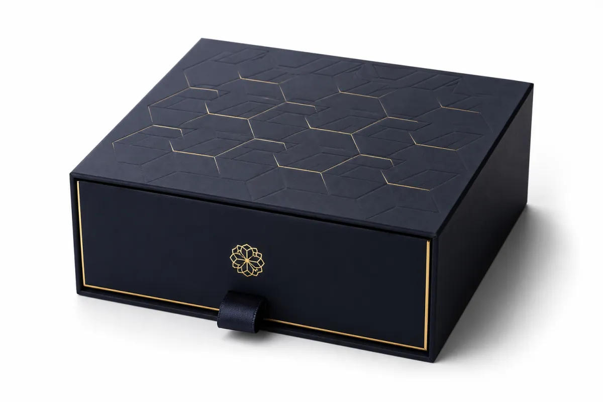
Structure sets the tone. Rigid board, magnetic closures, telescoping lids, sleeves, and custom inserts each send a different signal. A rigid two-piece box feels ceremonial. A sleeve-and-tray format feels clean and modern. A magnetic box says giftable and premium, though it also raises weight and cost. Folding cartons still belong in luxury packaging, especially for smaller items, but they need stronger art direction to avoid looking ordinary. Tips for luxury box branding usually favor structure before decoration because the structure changes perceived value before color even enters the conversation.
Finishes do the next round of work. Embossing lifts a mark. Debossing sinks it in. Foil stamping creates contrast and a bright focal point. Soft-touch coating adds a velvety feel that many buyers read as premium instantly. Spot UV can work well if it guides the eye rather than spraying shine everywhere. Matte lamination often feels more restrained than gloss, which explains why understated luxury brands use it so often. The strongest finish choice is the one that supports the brand story, not the one that simply costs more.
Typography and logo scale matter more than many teams expect. A small centered logo with generous margins can look sharper than a giant front-facing mark trying to fill every inch. Luxury packaging usually benefits from negative space. That empty area is not wasted. It signals confidence. Tips for luxury box branding work better when the logo has room and the support text stays brief.
Sustainability is part of premium branding now, whether brands planned for it or not. Buyers notice recycled content, FSC-certified paper, reduced plastic, and reusable structures. If you want to verify responsible sourcing, the FSC site explains certification clearly at fsc.org. Sustainable packaging does not mean rustic packaging. A recycled rigid box with sharp print can still feel luxurious. The best eco-friendly boxes look intentional rather than moralizing. Tips for luxury box branding should include sustainability because many luxury buyers inspect the values behind the box as closely as they inspect the box itself.
Insert design is another quiet driver of value. A custom insert that holds the product firmly and presents it cleanly can add more perceived quality than another ink color ever will. Foam, molded pulp, paperboard, and satin-lined inserts each carry different cost and presentation implications. If the item moves inside the box, the premium signal drops immediately. Nobody wants a luxury box that rattles like spare change.
One more detail: the best luxury packaging usually avoids pretending to be eco-friendly when it is only partly there. Buyers can spot greenwashing faster than brands expect. If a box uses recycled board but ships with excess plastic wrap, say so honestly and improve the weak point. Trust matters here. A slightly imperfect claim told straight is better than a polished lie.
| Finish or Structure | Typical Feel | Best For | Typical Added Cost |
|---|---|---|---|
| Soft-touch coating | Velvety, restrained, tactile | Beauty, fragrance, apparel, gifts | $0.08-$0.22 per unit |
| Foil stamping | Bright focal point, high contrast | Logos, seals, limited accents | $0.05-$0.18 per unit |
| Embossing/debossing | Dimensional, refined, subtle | Monograms, badges, signature marks | $0.07-$0.25 per unit |
| Magnetic rigid box | Ceremonial, giftable, premium | Sets, higher-ticket products, PR kits | $1.20-$4.50 per unit |
| Custom insert | Secure, organized, deliberate | Fragile items, multi-piece sets | $0.12-$1.10 per unit |
Shipping-heavy programs need testing just as much as finish choice. ISTA publishes package test methods that help brands catch corner crush, seal failure, and product movement before a full run ships. Their standards are worth reviewing at ista.org. Tips for luxury box branding are not only about looking expensive on day one. They are about still looking expensive after handling, stacking, and transit.
What Are the Best Tips for Luxury Box Branding?
The best tips for luxury box branding start with discipline. Use a structure that fits the product, a finish that supports the story, and typography that respects spacing. That sounds simple because it is. The difficulty is resisting the urge to add one more effect, one more color, one more message. Premium packaging rarely improves when it gets louder.
Think in layers. First, what does the box communicate from five feet away? Second, what does it say when the buyer picks it up? Third, what does the reveal confirm? That three-part test catches most of the weak spots. It also keeps tips for luxury box branding tied to real behavior instead of abstract taste. A box that passes the distance test but fails the hand test is not finished. It is only dressed up.
One more practical rule helps: if the product can be photographed for social media, the box needs to hold up on camera. Gloss can blow out. Fine type can disappear. Matte black can swallow detail. The best luxury box branding reads clearly in person and in a feed, which is harder than it sounds because the camera flattens small mistakes and exaggerates big ones. That is why mockups and physical samples should always be compared side by side. I have watched a box look polished on screen and then go strangely flat under daylight. Kinda annoying, honestly, but useful if you catch it early.
Luxury Box Branding Costs: What Drives the Price
Tips for luxury box branding should always include price, because design choices are not free and pretending otherwise is how budgets get wrecked. The main cost drivers are box style, board thickness, dimensions, print coverage, finish count, insert complexity, and order quantity. A simple sleeve can work within a narrow budget. A rigid box with foil, embossing, a custom insert, and a magnetic closure is another species entirely.
At lower quantities, the per-unit price climbs quickly because setup and tooling get spread across fewer pieces. At higher quantities, the unit cost drops, but the upfront spend rises and storage becomes real. That tradeoff is where many first-time buyers stumble. Tips for luxury box branding are not only about appearance; they are also about how the run size affects cash flow, warehouse space, and reorder flexibility.
A useful range helps frame expectations. A premium folding carton for a 1,000-piece run might land around $0.65-$1.50 per unit, depending on board, coverage, and finishes. A rigid two-piece box often starts around $1.20-$3.50 per unit at modest volume. A magnetic rigid box with a custom insert can move into the $2.80-$7.00 range pretty quickly. Those are not exact quotes. They are practical ranges, and the final number depends on size, labor, and the amount of finish work. Tips for luxury box branding are easier to budget once structure and surface are treated as major line items rather than minor extras.
The bigger mistake is assuming every premium effect adds equal value. It does not. A strong structural box with one clean tactile finish often creates more perceived quality than a box loaded with three competing effects. In many cases, soft-touch coating plus foil on the logo outperforms a stack of flashy treatments. Buyers read coherence as quality. Overdesigned packaging often costs more on the invoice than it earns on the shelf.
Hidden costs deserve their own line. Prototypes, dieline changes, sample shipping, plates, dies, freight, and hand assembly can all add up. If the project needs wraparound print with tight registration or a custom insert, the cost climbs again. Many brands only budget the box itself and then act surprised when sample rounds, freight, and assembly arrive. That is not a surprise. That is the invoice following instructions.
Budget by priority instead of by effect count. If the budget is tight, spend on structure, logo clarity, and one tactile detail. If the item is giftable, invest more in the opening moment and insert presentation. If the product is fragile, protect it first and decorate it second. Tips for luxury box branding work best when the box handles its real job before it performs its visual role.
For brands that need labels, seals, or secondary identifiers, our Custom Labels & Tags page can help build a consistent system without turning the packaging into a design contest. Another practical point follows from that: tips for luxury box branding are not limited to the carton. The whole packaging system affects the price you can defend.
Step-by-Step Process and Timeline for Luxury Box Branding
Tips for luxury box branding become less stressful once the process is broken into stages. The cleanest path usually moves from strategy to structural concept to artwork to prototype to revisions to production to delivery. Skip steps and the project pays for it later, usually in extra proofing rounds and a small pile of regret.
The strategy stage should define product dimensions, target retail price, quantity, budget band, and launch date. It should also answer a branding question with real precision: calm and minimal, ornate and giftable, or bold and shelf-driven? Tips for luxury box branding work best when the brief is specific enough to keep the packaging aligned with the brand identity. A vague brief leads to vague packaging. That rarely helps anyone.
A realistic timeline for a standard project often looks like this: 2-5 business days for brief and concept alignment, 3-7 business days for structure and dieline work, 3-7 business days for artwork setup and proofing, 5-10 business days for sample production, and 12-20 business days for full production after approval. Complex projects with foil, embossing, magnetic closures, or specialty inserts can take longer. Late revisions and late content changes stretch schedules quickly. Tips for luxury box branding fail more often because approval chains are messy than because the factory is slow.
Sampling is non-negotiable. A PDF can hide fit problems, coating surprises, and bad balance in contrast. A sample tells you whether the box closes correctly, whether the product sits properly, and whether the finish feels as premium as it looked on screen. That is why tips for luxury box branding always include physical proofing. People fall in love with mockups and then act shocked when the finished box behaves like a physical object. Packaging tends to do that.
If you want a cleaner brief, keep it short and practical. Include the product dimensions, weight, quantity, budget range, desired finish level, reference images, and launch deadline. Add one paragraph on what the brand should feel like in hand. Add another on what should be avoided. That one move saves time because it gives the designer an actual target instead of a fog machine made of adjectives.
Here is the kind of structure that helps:
- Product data: exact dimensions, unit weight, and whether the item is fragile, liquid, or multi-piece.
- Brand goal: prestige, giftability, minimalism, shelf visibility, or collector appeal.
- Quantity: 500, 1,000, 5,000, or a larger run that changes pricing and tooling.
- Budget band: a realistic per-unit target plus the total spend the team can approve.
- Timeline: launch date, sample deadline, and when final artwork is actually due.
That level of detail keeps tips for luxury box branding practical. It also makes packaging options easier to compare without chasing fantasy. If a box has to protect glass, feel giftable, and fit a retail display, that should be obvious from the brief. It should not show up as a surprise after the first sample. The strongest packaging programs look plain in planning and expensive in the hand.
Common Mistakes in Luxury Box Branding
Tips for luxury box branding are useful partly because the mistakes are so repeatable. The first one is overdesign. Too many colors, too many fonts, too many patterns, too many finishes. The result usually feels less premium, not more. High-end packaging is usually edited hard. It knows what to leave out. That is the part people resist because restraint feels risky until the print comes back and the restraint starts to pay off.
The second mistake is choosing finishes that fight the brand story. Flashy foil and mirror gloss can work for a loud, glamorous brand. They can also damage a calm, rare, understated identity. If the brand voice is quiet, the box should not behave like a nightclub flyer. Tips for luxury box branding work only when the box matches the emotional register of the product. A mismatch confuses customers and weakens customer perception.
The third mistake is ignoring structure. Strong artwork cannot rescue a weak box. If the lid warps, the insert wiggles, or the product looks undersized in the cavity, the premium signal fades fast. Buyers notice fit even if they cannot explain why the box feels wrong. That is why one of the most valuable tips for luxury box branding is to spend on structure before decoration. A well-built box can carry modest artwork. A bad structure makes even excellent artwork feel cheap.
The fourth mistake is skipping prototypes to save a few hundred dollars. That shortcut often costs more later. If the dieline is wrong, the insert is sloppy, or the finish bleeds in a way nobody expected, the full run turns into a repair bill. Many brands spend more fixing avoidable mistakes than they would have spent getting the sample right the first time. Tips for luxury box branding are supposed to protect margin, not create a new pile of money to burn.
A fifth mistake is treating the outside as the only surface that matters. The inside panel, lid print, and insert details are part of the story. The unboxing moment is where the brand gets to prove the promise. A plain exterior can still work if the reveal is thoughtful. A loud exterior with a sloppy interior feels inconsistent. Inconsistency is expensive in the worst way because it makes the whole brand seem less trustworthy.
For shipping-sensitive projects, it helps to remember that packaging has to survive handling before it earns the right to impress. A box that crushes easily or opens in transit is not luxury. It is a refund waiting to happen. Standards and testing matter here, not as marketing gloss but as risk control. Tips for luxury box branding should always leave room for real-world abuse, because packages do not live in design software.
Another common error is chasing savings in the wrong place. Saving $0.08 per unit by cutting the wrong finish can hurt perceived value more than it helps the budget. Spending an extra $0.10 on a cleaner logo treatment or a better insert may raise the entire presentation. That is the kind of tradeoff smart brands make. Cheap packaging is not the same thing as efficient packaging.
Expert Tips and Next Steps for Better Luxury Box Branding
Tips for luxury box branding work best when they are treated as a system, not a one-off design exercise. The smartest place to spend first is usually structure, tactile finish, and logo clarity. Those three areas move perception fast. Extra effects can help, but they are not the foundation. If the foundation is weak, every shiny add-on just makes the weakness easier to spot.
Build a packaging system that can scale. One box for one launch is fine. A box language that can carry the next two or three product lines is better. That is how brands improve brand recognition without starting over each time. Keep the typography rules, material family, and finish palette consistent enough that the next SKU feels related even when the color changes. Tips for luxury box branding become far more useful once the package behaves like part of the brand identity instead of a decorative one-off.
Test the box with real people, not only the creative team. Put it in front of retail staff, shipping staff, and a few honest customers. Ask what feels premium, what feels unclear, and what feels overdone. The answers arrive quickly. Packaging that looks elegant in a presentation can still be awkward to open, hard to restock, or too delicate for shipping. Practical feedback catches those problems before production does.
For brands building a sharper launch plan, the next steps are direct: audit the current box, set the target price band, decide which finish actually matters, request samples, compare the options side by side, and revise the brief before production starts. If the project also needs labels, seals, or hang tags, keep the system aligned so the box and the secondary packaging feel like they belong to the same brand family. The details start paying rent there.
One more practical tip: compare the current box with a physical sample, not with memory. Memory is slippery. A sample is honest. It will show whether the board feels too thin, whether the logo is too small, or whether the finish is doing enough work. Those are the details where tips for luxury box branding turn into better sales. Packaging is not supposed to be clever for its own sake. It is supposed to help the product sell at the price you want.
If you want a reference point, review packaging against actual standards and shipping realities, not only aesthetics. FSC-certified materials, shipment testing methods, and tighter quality checks can separate a box that looks premium from a box that performs premium. A luxury package should feel expensive, yes. More than that, it should protect the product, support the price, and leave the customer glad they bought it.
The most actionable version of the work is this: choose one structural upgrade, one finish, and one proofing step you will not skip. That combination catches most of the problems before they get expensive. After that, keep the palette restrained, the logo confident, and the insert fit tight. That is the kind of packaging that does not just photograph well. It earns its place in the market.
What are the best tips for luxury box branding on a small budget?
Spend first on structure, clean typography, and one strong tactile finish instead of stacking every premium effect at once. A rigid-feel presentation, even in a simpler format, usually does more for customer perception than a box packed with competing effects. Use a restrained color palette, keep the logo placement precise, and order samples before you commit to a full run. The money ends up in the parts buyers actually notice.
How do tips for luxury box branding change for eCommerce versus retail?
Retail boxes need quick shelf impact, while eCommerce boxes need a stronger unboxing experience and better shipping durability. For online orders, the inside print, inserts, and reveal moment matter more because the customer meets the package at home. For retail, the front panel, silhouette, and finish quality have to communicate value in a split second. Same brand, different job.
Which finishes work best for luxury box branding?
Embossing, foil stamping, soft-touch coating, and spot UV are the most common premium choices because they add visual and tactile impact. The best finish depends on the brand story. Understated brands usually look better with matte and subtle texture than with heavy shine. A single well-chosen finish usually beats three competing effects because the package feels more controlled.
How long does a luxury box branding project usually take?
Simple projects can move in a few weeks if artwork is ready and the structure is already defined. Custom structural work, finish-heavy boxes, or multiple sample rounds can push the schedule longer. The biggest delays usually come from revisions, proof approvals, and late content changes. If the brief is clear, the timeline gets a lot less painful.
What should I include in a packaging brief for luxury box branding?
Include product dimensions, quantity, target price, budget range, brand personality, finish preferences, and launch date. Add reference images for the look you want and examples of packaging you want to avoid. The clearer the brief, the fewer expensive revisions later. That is one of the simplest tips for luxury box branding, and one of the most ignored.

