A trade show giveaway Opp Header Bags logo placement guide sounds technical until you are standing at a booth and watching people decide, almost instantly, whether the giveaway feels polished or improvised. Clear OPP header bags do more than hold a sample or handout. They frame the item, carry the brand mark, and shape the first impression before the product is even opened.
The challenge is visual, not conceptual. A logo that looks clean on a screen can shrink, drift, or disappear once it is printed on glossy film and filled with product. Add bright exhibition lighting, busy foot traffic, and a few seconds of attention, and the margin for error gets small very quickly.
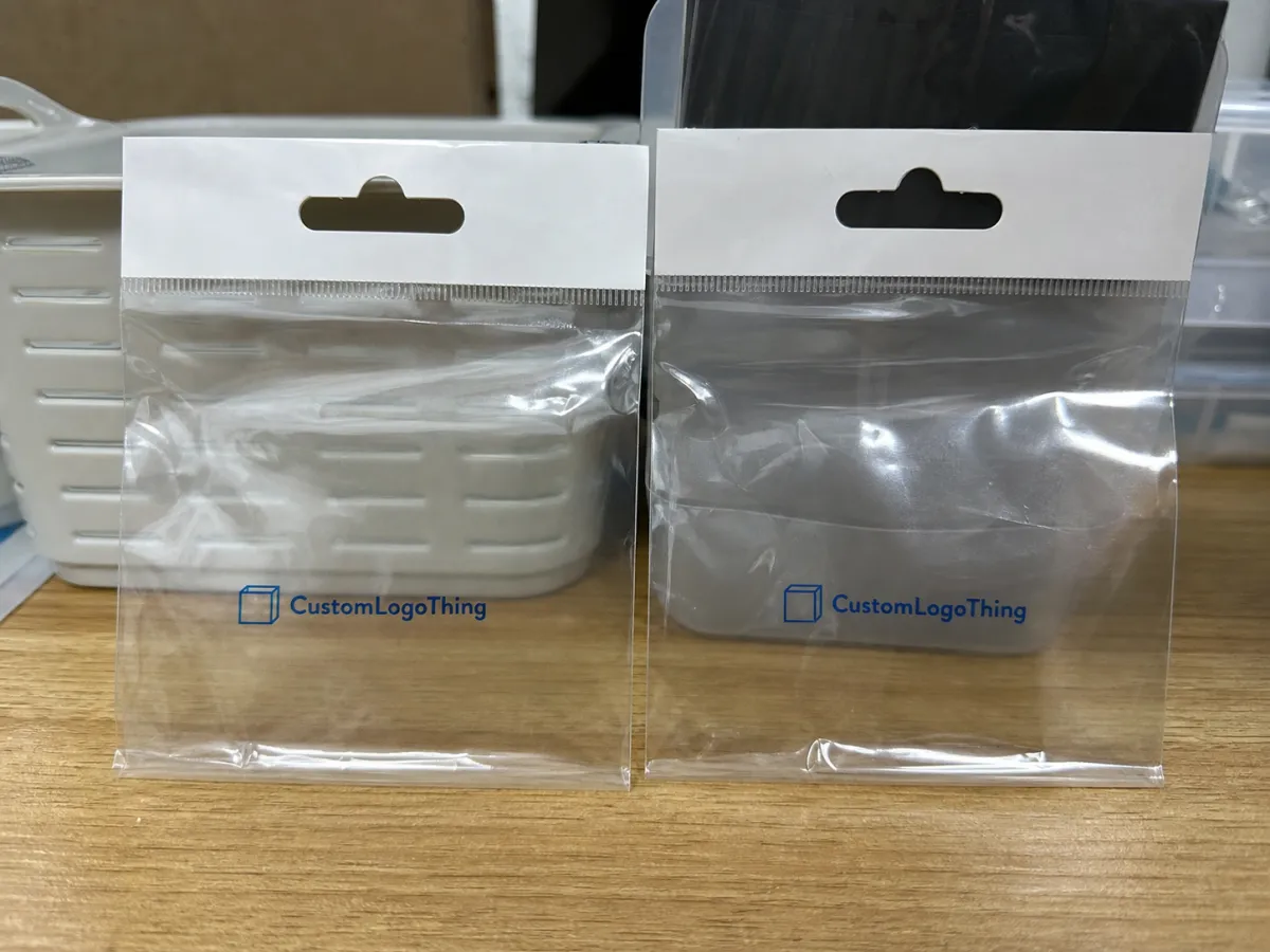
In packaging terms, an OPP header bag is straightforward: a transparent oriented polypropylene pouch with a top header area used for sealing, hanging, branding, or a retail-style presentation. In buying terms, it is less forgiving than it looks. Fill level, seal margins, the hang hole, and the shape of the giveaway all change how the print reads in the real world.
Trade Show Giveaway OPP Header Bags Logo Placement Guide: What Buyers Miss First
The first mistake is treating the bag like a flyer. A flyer gets read. A giveaway bag gets glanced at, carried, and judged from across a table. The best logo placement is not simply “visible”; it feels intentional from a distance and still looks balanced once the item inside is visible through the film.
Clear header bags create their own design rules. The header strip, seal line, hang hole, and transparent body all compete for attention. If the giveaway is a pen, snack pack, accessory, or sample kit, the contents can either support the message or block the worst part of the print. That is why bag layout deserves more attention than a typical label or insert.
There is a practical hierarchy here. If the logo sits too low, the product becomes the first thing people notice and the brand becomes secondary. If the logo is too large or pushed too close to the edge, the design feels cramped. The best placements usually leave enough room for the logo to survive three situations at once: a full bag, a half-full bag, and a quick glance under harsh show lights.
A clear bag does not need more graphics. It needs better placement.
For event buyers, the bag is part of the booth system. Booth graphics, handouts, table covers, and giveaways should look like they belong to the same brand. If one piece feels rushed, the whole presentation loses some authority. Attendees may not analyze the package, but they notice inconsistency faster than most teams expect.
How Logo Placement Works on Clear Header Bags
The header area is usually the safest place for a logo because it stays above the contents and reads clearly even when the pouch is filled. Centered placement gives a balanced, familiar look. Left-aligned placement can feel more retail-driven, especially if the brand uses a simple wordmark or a stacked icon-and-text layout.
Some buyers want a short tagline in the header. That can work, but only if the copy is genuinely brief and the type size survives real viewing distance. The cleaner the mark, the better the odds. On a transparent bag, every extra word competes with reflections, seams, and whatever is inside the pouch.
Printing lower on the bag body is a separate decision. It can work if the giveaway item is small and consistent, but it becomes risky with bulky or irregular contents. A placement that looks elegant on an empty mockup may look crowded once the actual product is inserted. That mismatch is one of the most common reasons a proof passes and the finished bag disappoints.
There are also hard limits. Hang holes, seal margins, and edge tolerances create no-print zones, and those zones are not negotiable. If the artwork hugs the top edge too closely, the finished bag can trim the mark or shift the visual center enough to make the design feel off. A proof that does not use the actual template is not much more than a rough sketch.
A useful way to think about the layout is in layers:
- Header strip for the main logo or a short message.
- Bag body for secondary information only if the contents will not block it.
- Safe area around the mark so the print does not feel jammed into the edges.
One more detail matters more than buyers expect: the exact giveaway inside the bag. A folded brochure, a pouch of samples, a bar of soap, and a small accessory all change the visual weight of the package. If the filled bag is not being mocked up, logo placement is only half-checked. That is where many approval problems begin.
Artwork Size, Contrast, and Shelf Read Factors
Good placement is only the first layer. The logo still has to be readable from booth distance, which means size, line weight, and contrast have to work together. On clear film, thin strokes disappear faster than many designers expect. Bright overhead lighting, glossy reflections, and the product itself can all erode legibility.
That is why detailed logos often need simplification for giveaway bags. Small taglines, tiny registration marks, and delicate outlines are the first things to lose clarity. A strong wordmark or a simple icon usually performs better than a design built on hairline detail. If the brand depends on multiple colors, the contrast between ink and film becomes even more important because the bag does not provide a paper-like background to hold the image in place.
Dimensions matter too. A header that is 2.5 inches tall gives a different design window than one that is 4 inches tall. Bag width, gusset depth, and seam positions all change the safe area. If the giveaway is large or oddly shaped, the body may need more breathing room so the logo does not fight the silhouette of the item inside.
Lighting is the part that gets missed most often. Glossy film picks up hot spots from show fixtures and can wash out lighter colors. Even if the artwork looks clean on a monitor, the real test is how it reads at a few feet away in an aisle where attention is moving fast. If a passerby gets one glance, the design has to land immediately.
For buyers who like a sanity check, it helps to compare the artwork against packaging standards and material expectations early in the process. The ISTA test library is useful when the bags will travel inside a kit or mailer, and the Packaging Institute remains a solid reference for general material and design basics. Shipping durability and booth presentation are not the same problem, but both matter.
Common readability choices and their tradeoffs:
| Choice | Readability | Best For | Risk |
|---|---|---|---|
| Large single-color logo | High | Fast booth recognition | Can feel plain if the layout is weak |
| Logo plus short tagline | Medium | Brands that need one supporting message | Tagline may vanish if type is too small |
| Full-color artwork | Medium to high | Brands with strong color equity | More sensitive to glare and registration drift |
| Fine-detail artwork | Low to medium | Only after simplification for print | Thin strokes can disappear on clear film |
If the event program includes recycled cartons, FSC-certified inserts, or recovery-oriented shipping materials, the bag should support that story rather than fight it. Clear OPP is visual and economical, but it is not a place to cram every sustainability claim into the design. Keep the bag focused and let the rest of the kit carry the heavier messaging. For sourcing guidance, FSC is a credible reference point.
Production Steps and Lead Time for Printed Header Bags
Good production starts with clean input. Before anyone prepares a proof, the supplier needs the bag dimensions, film type, header height, seal style, quantity, logo file format, and the intended contents. If even one of those pieces is missing, the quote may look fine while the finished bag becomes harder to use. The most useful input is not just the artwork file. It is the actual product that will live inside the pouch.
The proofing step should show the real layout on the correct template. That means checking the safe area, the no-print zones, the placement relative to the header edge, and the relationship between the logo and the item inside the bag. If the proof is only a floating graphic, ask for a mockup that includes the fill. Buyers often catch spacing issues immediately once the giveaway is shown in context.
Most production runs follow a similar sequence:
- Prepress review and file cleanup.
- Plate or setup preparation, depending on the print method.
- Printing and inline inspection.
- Curing, drying, or hold time for quality control.
- Packing, carton labeling, and shipment.
Lead time depends on more than press time. Artwork readiness, ink count, material availability, and how quickly the proof is approved all affect the schedule. A straightforward one-color order can move faster than a multi-color run, but only if the files arrive clean. A realistic planning window for many custom header bag orders is 12-15 business days after proof approval, with longer timelines possible for peak season, special film, or tighter color control.
Some buyers ask whether a standard digital proof is enough. For a simple layout, maybe. For a polished trade show package, one more mockup round is usually cheaper than a reprint. A header bag has a way of exposing small problems: type too close to the seal, a logo that sits too low, or a line that looked bold in the file and thin in the finished bag.
Cost, Pricing, MOQ, and Unit Cost Drivers
Pricing for printed header bags comes down to a few variables that matter more than most buyers expect: quantity, number of print colors, bag size, header coverage, and whether the artwork uses one side or both. Larger runs spread setup costs across more pieces, so the unit price usually drops as quantity rises. Small runs can still work for a targeted event, but the per-bag price climbs quickly when setup is divided across only a few hundred pieces.
The minimum order quantity matters for the same reason. If a supplier has a setup charge, a smaller MOQ does not remove it; it just compresses that cost into fewer bags. That is why comparing unit prices without checking the order floor can be misleading. A quote that looks low may still carry the realities of short-run production.
A practical budgeting frame looks like this:
- Simple one-color header print: usually the lowest-cost route for clean brand visibility.
- Two- or three-color branding: adds cost, but can improve clarity if the logo needs stronger contrast.
- Full header coverage or multi-side print: tends to cost more and needs tighter registration control.
- Custom size or thicker film: can raise cost faster than the artwork change itself.
For planning, a common range for a straightforward order at around 5,000 pieces is roughly $0.18-$0.28 per unit, though that can move lower or higher depending on size, material thickness, print complexity, and the amount of setup required. Lower quantities usually price higher per unit. If the bag is a secondary touchpoint, that may be acceptable. If the bag is the main giveaway vehicle, consistency and timing matter more than shaving a few cents.
Cost should never be judged in isolation. A bag that prints cleanly, arrives on time, and fits the giveaway properly will do more for the booth than a bargain run that lands late or looks muddy under show lights. The cheapest quote is not always the best value. Sometimes it is the most expensive mistake.
Common Logo Placement Mistakes on Giveaway Bags
The most common mistake is placing the logo too low. Once the product goes into the pouch, the giveaway itself blocks the brand message right when the attendee picks it up. The second mistake is crowding the header with too much text. Small type may look acceptable in a proof, then disappear the moment it meets glare, motion, and distance on the floor.
Another easy error is approving artwork without the actual product inside the bag. An empty clear pouch can make the print area look generous, while the filled bag tells a completely different story. That is especially true with odd-shaped samples, thick inserts, or anything that creates visual clutter near the center of the pouch.
Buyers also overlook mechanical details. Hang holes, seal lines, and barcode labels may seem minor, but they can affect the finished layout or make the logo look unbalanced. If the bag will be used in a retail-style setting after the event, that imbalance does not disappear when the show ends.
Shipping can create another problem. If the giveaway set is stacked, unpacked, and handled multiple times before it reaches the booth, the print needs enough margin to survive real use. Testing guidance from groups like ISTA is useful here because trade show packaging has to arrive intact, not just look good in a rendering. A design that survives the press is only halfway finished if it scuffs, curls, or shifts in transit.
Material choice matters as well. Clear OPP is light and affordable, but it is not indestructible. If the film is too thin for the contents, the bag can wrinkle, split, or lose its shape during handling. That makes placement look worse even if the artwork itself is accurate.
Expert Tips for Cleaner Approval and Better Booth Visibility
Use the strongest version of the logo on the header and leave the supporting message for inserts or booth signage. That keeps the bag focused. The pouch is doing the job of quick recognition; the rest of the messaging can live elsewhere.
Review the proof at actual size, not just zoomed in. A layout that feels balanced at 200 percent on a monitor may read very differently from a few feet away. Checking it under bright light helps too, because clear film exposes every weak stroke and every line that is too delicate for production.
A few habits make approvals cleaner:
- Ask for the template with no-print zones clearly marked.
- View the proof with the intended giveaway inside the pouch.
- Check the layout from booth distance, not only from desk distance.
- Keep one simplified logo version for packaging applications.
- Save the approved file and notes for the next reorder.
Brand consistency is easy to understate. If the bag, carton, and booth signage speak the same visual language, the display feels deliberate. If the colors drift or the logo is redrawn differently from one item to the next, the booth starts to feel pieced together. That is not a printing flaw. It is a control issue.
Material-wise, clear OPP is chosen because it shows the product, keeps weight low, and stays cost-effective for high-volume giveaways. That transparency is the advantage and the challenge. The design has to work with the film, not against it. Once that is understood, most of the placement decisions become easier.
Next Steps: Build the Spec, Request the Proof, and Order Confidently
If you are planning a trade show run, start with the basics: bag size, fill product, quantity, print file type, and target event date. Once those details are written down, the quote conversation gets clearer and the artwork review becomes far more useful. That is the point where a trade show giveaway opp header Bags Logo Placement guide becomes a production tool instead of a design note.
Ask for a mockup that shows the actual giveaway inside the bag. Then compare the logo placement against the fill level, the header height, and the available safe area. If the proof looks strong in that context, the odds of a clean delivery go up fast.
Compare price, MOQ, and lead time together. The best choice is usually the one that fits the schedule and the event plan, not the one with the lowest sticker number. If the artwork is approved early and the spec is complete, the order has a much better chance of arriving on time and looking the way it should.
Keep the approved files, template, and production notes together for reorders. That saves time on the next show cycle and helps preserve consistency from one event to the next. For buyers juggling several deadlines, that repeatability is worth more than it looks on a quote sheet.
Handled well, the placement decisions come down to a few clear rules: keep the mark visible, protect the safe area, size the art for real-world reading, and proof the bag with the actual product inside. Do that, and the package supports the booth instead of competing with it.
Where should the logo go on trade show giveaway OPP header bags for the best visibility?
Place the main logo in the header area whenever possible so the brand stays visible even if the giveaway fills most of the pouch. Keep critical text away from the seal line, hang hole, and edge margins, then review the proof with the actual product inside the bag before approving.
How much blank space should stay around a logo on an OPP header bag?
Leave enough breathing room for the mark to read clearly at a distance, especially under bright expo lighting. Pushing text or icons too close to the edges makes the design feel crowded, and the right margin depends on bag size, logo shape, and how much of the bag body the giveaway occupies.
Does logo placement affect the price of printed header bags?
Yes, larger print areas, multiple colors, and placements that use more of the header or both sides can raise unit cost. Simpler placements usually print more efficiently, especially on larger quantities where setup costs spread out better.
What is the usual process for approving artwork on custom header bags?
First confirm the bag size, material, and imprint area, then submit the logo files in the correct format. Review a digital proof or mockup against the actual template, check placement and no-print zones, and approve only after the bag is shown with the intended giveaway inside.
How long does production usually take for trade show giveaway header bags?
Lead time depends on artwork readiness, print complexity, quantity, and whether the order needs a rush schedule. Material availability and proof approval speed can matter just as much as the actual printing step, so if the show date is fixed, request the timeline early and leave room for revisions.


