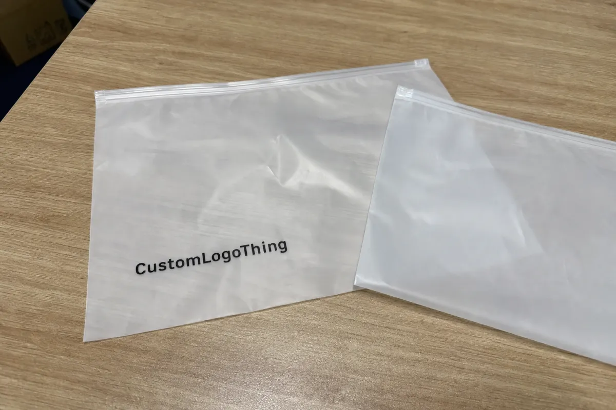
Event Merch Frosted Zipper plastic Bags Logo Placement guide starts with a plain question: can someone read the brand before the giveaway is opened? If the answer is no, the art is probably too small, too light, or sitting in the wrong part of the bag.
Frosted Zipper Bags are a familiar event format because they do several jobs at once. They package the merch, protect the contents, and carry the brand into the room before anyone has a chance to inspect what is inside. The frost softens glare and reduces clarity a little, which can make a logo feel upscale or make it disappear, depending on the print choice and position.
The practical job is not to make the bag loud. It is to make it legible, fill-friendly, and consistent with the event experience. That means thinking about zipper lines, gussets, fill height, print contrast, and production limits before anyone approves the artwork. That is the lens used throughout this event merch frosted zipper plastic Bags Logo Placement guide.
Event merch frosted zipper plastic bags logo placement guide
These bags are usually seen in motion. Guests carry them through registration, step into photos, stash them in totes, and open them later in a different light. The logo has to survive all of that. A centered mark can read instantly at check-in, while a lower placement may feel more restrained and premium if the contents are visually busy.
One mistake buyers make is treating the bag like a flat flyer. It is not flat once it is filled, and it does not stay still once the zipper closes. Seams pull artwork inward, side gussets change the visible area, and the contents can push the logo higher than expected. A proof that looks balanced on screen can read very differently on the finished pouch.
The best placement is usually the one that still makes sense when the bag is half-full, held at arm’s length, and printed on a semi-transparent surface. That sounds simple. In production, it rarely is.
In practice, the bag should answer three questions at once: who is this from, what event does it belong to, and does the print still hold up after the contents go in? If any one of those is unclear, the placement needs another pass.
How frosted bags change logo visibility and readability
Opacity changes the way artwork behaves. A light frost gives a cleaner window into the contents, which can help a dark logo look crisp. Heavier frost works more like a filter. It softens the contents, dulls pale inks, and narrows the contrast range available to the print.
That is why frosted bags reward simple marks. Thick letterforms, solid icons, and clean lockups usually outperform thin scripts and delicate gradients. A logo that looks polished on coated paper can become weak on plastic if the strokes are too fine. The same design can look excellent at three inches wide and awkward at one and a half.
Placement also changes the reading speed. Center-front is the fastest read because the eye lands there first. Lower-front placement can look more premium, but it asks the contents to do some of the visual work. Side-panel printing only works when the gusset and seam layout leave enough uninterrupted space, which is not always true on smaller bags.
- Center-front: best for registration kits, sponsor visibility, and quick brand recognition.
- Lower-front: useful when the contents should stay visually dominant.
- Side panels: viable for repeated marks or supporting text, but only if the welds leave room.
- Front and back: strong for co-branded events or retail-style packs, though usually the priciest option.
The logo has to read before the bag is opened. If it only works after a careful look, the placement is doing too much work.
Distance matters more than buyers expect. Event bags are judged from a few feet away, sometimes across a crowded table. A dark, simple imprint beats a pale, intricate one in that setting almost every time. The room is rarely quiet, and the bag is not a gallery wall.
Bag specs that change placement decisions
Before deciding where the logo goes, look at the bag spec sheet. Material, thickness, zipper style, and bag dimensions all affect the final result. Most event-grade Frosted Zipper Bags are made from LDPE or a similar blend in roughly the 4-6 mil range. Thinner film can save money, but it usually feels less substantial and may show wrinkles more aggressively after filling.
Bag width and height determine the real printable area, not the catalog photo. A 9 x 12 inch bag behaves very differently from a 12 x 15 inch bag because the extra height changes where the contents sit relative to the logo. Gusset depth matters too. A wider gusset can crowd the side print zone or shift the visible front panel after the bag is packed.
The zipper track is another constraint. Some closures sit high enough that a logo near the top edge gets crowded fast. Others leave more room but still need a safety margin so the print does not collide with the seal line. Buyers who ignore this usually discover the issue too late, after the proof has already been approved.
For event merch, the best placements are often the ones that respect the bag’s structure instead of fighting it. A little restraint at the drawing stage can prevent a messy looking final pack.
Cost, pricing, and MOQ basics for custom runs
Three variables drive most pricing: bag size, print complexity, and order quantity. Add film thickness, print side count, zipper color, packaging requirements, and freight, and the quote can move quickly. For a clean one-color front imprint on a 5,000-piece run, a common working range is about $0.18-$0.28 per unit. Front-and-back printing or broader coverage often lands around $0.24-$0.40, depending on setup and spoilage allowances.
MOQ changes the math. A 500-piece order carries a heavier share of setup cost per bag than a 5,000-piece run, so the unit price can look surprisingly high even when the design is simple. Once the run gets larger, the per-unit cost usually drops faster than buyers expect, as long as the artwork stays within standard print limits.
| Option | Typical use | Approx. price band | What changes the total |
|---|---|---|---|
| One-color front imprint | Conference swag, registration kits | $0.18-$0.28 | Bag size, frost level, imprint width |
| One-color front and back | Sponsor kits, retail handouts | $0.24-$0.36 | Extra setup, extra print pass, spoilage allowance |
| Multi-color or large coverage | Premium launches, co-branded drops | $0.30-$0.55 | Registration, slower press time, tighter QC |
| Rush production | Tight event dates | Often +10%-25% | Priority scheduling, freight upgrades, fewer proof rounds |
Hidden costs matter just as much as the unit line. Ask about plate or setup fees, proof revisions, packaging changes, split shipments, and freight. On a 5,000-unit order, a $0.03 change is already $150 before shipping enters the picture. That is why landed cost matters more than the cheapest-looking quote.
It also helps to ask for the material spec in mils, the zipper style, and whether the supplier has documented strength or seal checks. Some vendors reference ASTM-style tests for film or seal performance; others use internal QC methods. Either answer can be fine if it is clear, consistent, and written down.
Production steps, timeline, and proof approval
The process is usually simple on paper: artwork review, digital proof, sample or preproduction approval if needed, printing, quality check, and shipment. The schedule gets stretched by the back-and-forth before print begins, not by the press itself.
Most delays come from avoidable issues. Files arrive in low-resolution formats, tiny tagline text gets too small to read on frosted film, and logo versions are swapped after the proof has already been built. Every change forces another round of checking. That is normal, but it takes time.
For straightforward one-color work, a common production window is around 12-15 business days after proof approval. Add two-sided printing, special zipper colors, larger quantities, or more detailed artwork, and the schedule often moves into 15-20 business days before freight. That is not a delay story. It is how packaging production behaves when it is being done carefully.
Build a buffer for transit. A proof approved on Tuesday can still miss a Friday event if the shipment crosses the country, the carton count changes during packing, or the event team asks for a second split delivery after production begins. If the bags are part of a kit with inserts or fragile items, ask whether the cartons have been packed with transit testing in mind. ISTA-style packing logic is useful here, especially for multi-piece event sets.
One quiet rule helps more than most buyers expect: do not approve the flat mockup until you know how the filled bag will read. The flat version is only half the picture.
Logo placement factors that change the final look
A proof can hide the real problem. A centered logo on a blank bag may look perfect, then land too low once the bag is filled and the merch shifts upward. That is why placement should be judged against the contents, not against the empty outline alone.
Four variables do most of the work: logo size, safe margins, ink contrast, and fill level. A mark around 2.5 to 4 inches wide often performs better than a very small crest or a long thin tagline. The exact size depends on the bag and the contents, but the direction is usually the same. Thin strokes disappear sooner than buyers expect, especially on a heavily frosted surface.
- Safe margins: keep art away from the zipper track, seal lines, and side welds.
- Fill level: place the main mark where it will still read after the contents go in.
- Font weight: choose a heavier version of the logo if the original design is delicate.
- Ink contrast: dark inks usually outperform light inks on frosted plastic at event distance.
Front-only printing is the cleanest option for quick recognition. Front-and-back printing gives more brand coverage and fits co-branded events better, though it can feel busy if the contents are already visually loud. Side-panel printing can be sharp, but only when the gusset leaves enough uninterrupted space and the proof is checked carefully.
Ask the supplier for a mockup showing the logo over a filled bag if they can provide one. That one extra image can expose placement problems that a flat proof hides.
Quality checks that prevent an expensive reprint
Printing quality on frosted plastic is less forgiving than it looks. The most common problems are misalignment, low contrast, seal distortion, zipper interference, and scuffing during packing. A good QC routine catches them before the cartons leave the plant.
Start with the basics. Check that the logo is centered against the correct panel, not just centered in a digital file. Confirm that the imprint is far enough from the welds. Verify that the zipper closes cleanly and that the print does not rub against the seam when the bag is flexed. If the ink sits too close to the edge, the bag can look uneven even when the art itself is correct.
Ask for photo proofs of the first production piece if the run is important or time-sensitive. A screenshot of a flat mockup is not enough when the contents are dense or the logo relies on contrast. For larger orders, it also helps to know what the acceptable defect rate is for print shift, scuffing, or zipper inconsistency. Suppliers usually have a tolerance window, but it should be stated clearly before approval.
Light handling damage is another quiet risk. Frosted film shows scratches more easily than clear film, which means carton packing, bag stacking, and insert loading can change the perceived quality of the final product. A strong print can still look rough if the surface arrives marred.
Step-by-step logo placement workflow for buyers
The guide works best when the buyer chooses one priority before any proofing begins: visibility, premium feel, sponsor recognition, or quiet branding. Without that call, the proof tends to drift. The logo gets moved lower, then wider, then smaller, and the bag loses clarity.
- Audit the artwork. Send vector AI, EPS, or outlined PDF files whenever possible. Remove tiny details that will not survive on frosted film.
- Pick the main goal. Decide whether the logo should read fast, support the contents, or carry a co-branding message.
- Translate the goal into specs. Confirm one side or two, the target imprint width, the ink color, and the no-print zones.
- Review the proof as a user. Picture the bag filled, zipped, and handed across a crowded room. That is the real test.
Ask for the version that still works if the bag is half-full and held at arm’s length.
It also helps to compare at least two proof options. A centered logo and a slightly higher logo can both look acceptable in a file, but only one will survive the real-world combination of contents, zipper height, and arm-level viewing. That matters most for event merch bags carrying apparel, sample sets, or dense inserts that push the artwork upward.
If the bag includes printed inserts, ask whether the paper stock is traceable or certified. Many procurement teams prefer FSC-certified paper for cards and collateral because the documentation is easy to verify and simpler to defend in brand-safety reviews. The bag and the insert do not need identical sourcing, but they should feel like one package.
Common mistakes that make event bags look off
The quickest way to lose brand impact is to make the logo too small. On semi-transparent material, small details are the first thing to disappear. If the only readable piece is a tiny wordmark, the bag can look generic even when the artwork is technically correct.
Color mismatch causes a second kind of failure. A pale logo can look elegant on screen and washed out in production. A dark logo can feel too heavy if the frost is light and the contents are already dense or dark. The film tone matters. So does what is inside the bag.
- Ignoring seams and zipper hardware: the design can get cut off or shifted into an awkward position.
- Using a detailed logo at small size: thin lines and small type tend to disappear.
- Skipping a filled-bag proof: the art may look right flat and wrong in use.
- Leaving approvals until the last minute: rushed sign-off usually forces weaker placement decisions.
Late ordering is not only a scheduling issue. It becomes a branding issue because the best placement options disappear first. If the only remaining path is a smaller imprint or a rushed print method, the final bag will show it. The placement brief and the production plan should be treated as one document, not two separate tasks.
What to prepare before requesting quotes and ordering
Clean quotes start with clear inputs. Send the vector logo, exact bag size, event date, target quantity, and any placement examples that match the look you want. If the bag must include sponsor copy, legal text, or a co-branded mark, flag that early. It is easier to plan around constraints than to repair them later.
- Artwork: vector AI, EPS, or outlined PDF, plus the final logo version.
- Quantity: target run size and any backup quantity for overflow use.
- Timing: proof deadline, production window, and in-hand date.
- Placement notes: preferred side, approximate imprint area, and no-print zones.
- Packaging details: insert cards, carton labels, or split shipments if needed.
Ask for two or three proof options so you can compare logo size and position without reopening the full quote. Also ask for the landed cost. A lower unit price can disappear once freight, rush handling, or extra revisions are added. The cheapest line is rarely the cheapest order.
Request the assumptions in writing before approval. MOQ, print method, lead time, and approval cutoff should all be visible in the quote. That protects the schedule and gives your team a clean record if the event date changes.
If you are comparing suppliers, use the same checklist for each quote. That keeps the placement discussion grounded in the same variables and makes the decision much easier to defend internally.
FAQ
Where should the logo go on frosted zipper plastic bags for event merch?
Center-front is usually the safest choice because it gives the fastest read at arm’s length. Lower-front or corner placement can feel more premium if the contents are strong enough to carry the visual weight. Always check seams, zipper hardware, and filled-bag visibility before approving the proof.
What print style works best for frosted zipper bag logo placement?
High-contrast one-color art usually reads best on frosted plastic. Simple shapes and bold text outperform thin lines and tiny taglines. If the bag is heavily frosted, ask for a proof that simulates reduced contrast so you can judge the real effect.
How does pricing change for custom event merch frosted zipper plastic bags?
Unit cost is driven by quantity, imprint colors, print area, and setup fees. Rush orders and freight can change the landed price more than the bag itself. Ask for a full quote that includes production and shipping assumptions so you can compare suppliers fairly.
What lead time should I expect for frosted zipper bag orders?
Simple orders move faster when the artwork is final and the placement is straightforward. Proof revisions, special finishes, and larger runs add time before production begins. Build in buffer time for approvals and shipping so the event date stays protected.
What files should I send for the best logo placement proof?
Send vector art whenever possible, ideally AI, EPS, or PDF with outlined fonts. Include the exact logo version, any tagline text, and preferred placement notes. A clean file speeds proofing and reduces the chance of placement errors.
How do I know if the logo is too small?
If the mark relies on fine strokes, tiny type, or subtle spacing, it is probably too small for frosted plastic. A useful check is to view the proof at the size of a hand-held bag rather than on a monitor. If it looks weak from three feet away, it will look weaker in a busy event room.
Should I print on both sides?
Only if both sides have a job to do. Two-sided printing works well for sponsor events, retail-style packs, and premium kits, but it adds cost and can make the bag feel crowded. If the contents already fill the view, one strong front imprint is often the cleaner answer.


