If you are planning a trail crew kit, a festival handout, or a sponsor giveaway, a trucker cap can do more brand work than a lot of higher-cost merchandise. The mesh-back structure keeps the wearer cooler, while the front panel gives a stable surface for decoration. That balance sounds simple, but it changes how far a logo can be read, how the cap photographs, and how the finished piece feels in use. A good trucker Caps Logo Placement guide for outdoor brand promotions starts there: not with decoration for its own sake, but with visibility, wearability, and the realities of production.
Why Trucker Caps Work So Well at Outdoor Events
Trucker caps sit in a sweet spot between utility and branding. The front panel is usually structured enough to hold embroidery or a patch without collapsing, and the mesh back reduces heat buildup during long outdoor shifts. That makes the cap useful before it ever becomes promotional. People wear what feels practical, and practical items usually stay on heads longer, which gives the logo more exposure.
Outdoor environments reward straightforward shapes. Sun glare, movement, dust, and changing angles all chip away at overly detailed artwork. A cap that looks clean from six feet away often performs better than a cap that looks impressive in a design file but disappears in real conditions. If the goal is brand recognition at an event, a cap should read quickly in motion and still hold up in photos taken from a distance.
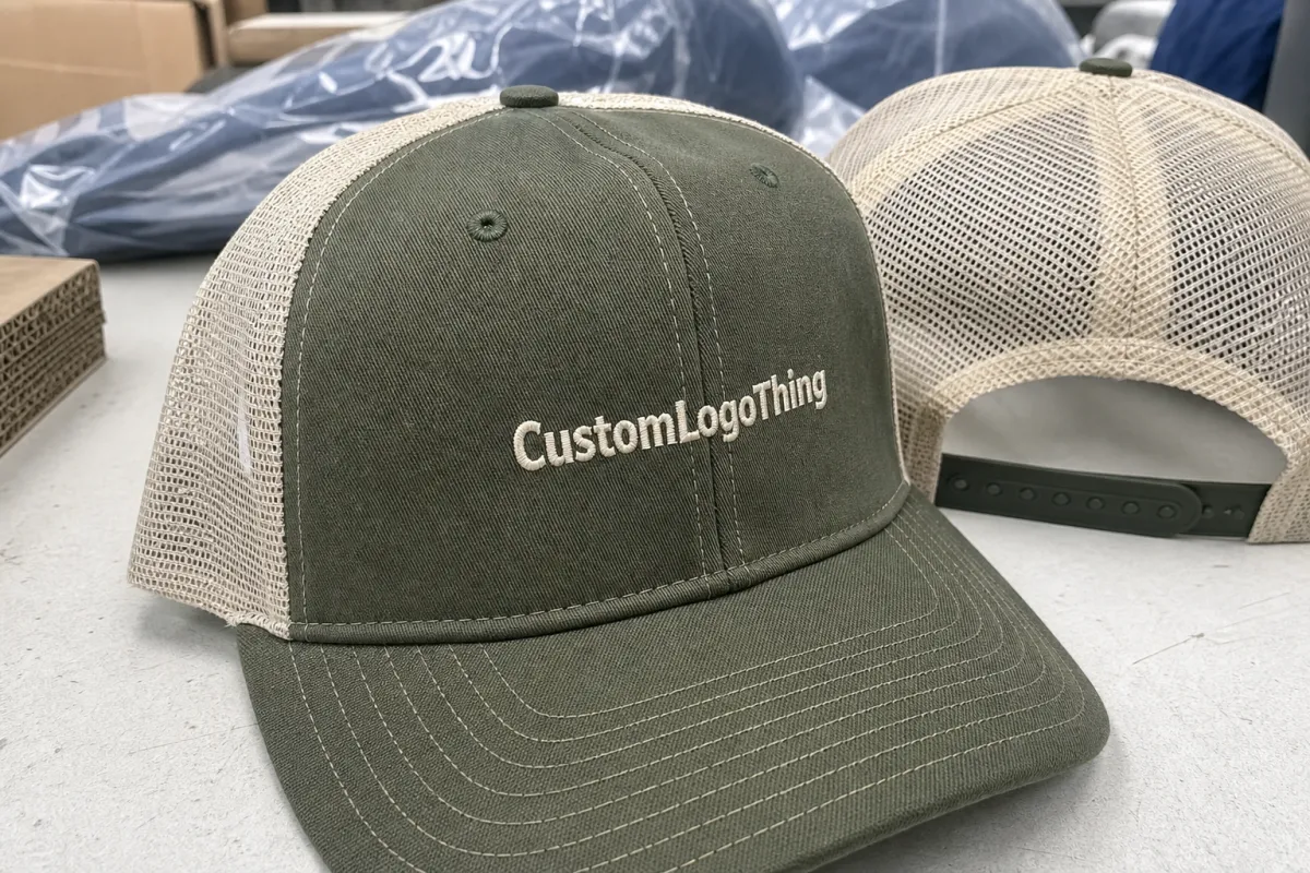
That is also why the front panel earns so much attention. It faces forward, stays centered, and gives the eye a natural landing point above the brim. Side and back placements can work, but they rarely carry the same visual weight. For outdoor brand promotions, the cap usually has one job: make the brand recognizable without asking the viewer to stop and decode it.
There is a packaging angle here too. A cap that ships in a flat, protected carton with the brim supported and the crown folded correctly arrives looking closer to retail-ready merchandise than a loose item tossed into a box. Small handling choices affect first impressions. If a cap is crushed during transit, the decoration may be fine, but the product feels less considered. Packaging groups such as the Institute of Packaging Professionals often frame this well: the structure around the product matters almost as much as the product itself.
If the logo cannot be identified from a few steps away, the cap is decoration first and promotion second.
That is a useful filter for buyers. A cap worn by staff at a booth, volunteers on a trail, or sponsors at a race should communicate quickly. The better the cap works at a glance, the less effort the audience has to spend decoding the brand.
Trucker Caps Logo Placement Guide for Outdoor Brand Promotions: Front Panel, Side Hit, or Back Hit
The front panel is the default for a reason. It gives the largest uninterrupted area, keeps the logo centered, and supports the strongest read from the front and slight angles. For most outdoor promotional programs, this is the most dependable placement for a wordmark, icon, or short campaign line. If the logo has any detail at all, the front is usually where it belongs.
That said, front placement is not just about size. The shape of the crown matters. High-profile foam-front caps can take a bolder mark, while lower-profile structured fronts may need a tighter footprint. Seams, front-panel curvature, and the transition into the mesh can all alter how a logo appears once the cap is worn. A proof that looks centered on a flat screen can sit too low or too wide on the actual cap body, which is why the mockup should be judged with the structure in mind, not only the artwork.
Side hits are useful as secondary branding. They work well for a sponsor name, a location identifier, a small icon, or a short phrase that supports the main message. Because the side panel is smaller, the design has to stay simple. A tiny mark with too much detail becomes hard to see and harder to sew cleanly. Side placement is best treated as support, not the lead story.
Back hits can be effective on caps with a fabric closure, center rear panel, or a clean patch area. They are better suited to short names, team identifiers, or a subtle brand note. Mesh, buckles, and seams complicate back decoration more often than buyers expect. If the rear of the cap is busy, the placement may look cramped even before production starts. That is not a flaw in the artwork; it is usually a structural limit of the cap style.
One practical rule holds up across most orders: place the primary logo where the viewer looks first, then decide whether a second, smaller hit actually improves the cap. If the cap is for a frontline event team, the branding should be direct. If it is for retail or staff wear, a quieter treatment may fit better. The correct placement follows the use case, not the other way around.
| Placement | Best Use | Typical Feel | Notes |
|---|---|---|---|
| Front panel | Main logo, campaign name, bold icon | Most visible, most promotional | Usually the strongest choice for outdoor events, giveaways, and retail display |
| Side hit | Secondary mark, sponsor detail, location name | Subtle, utility-driven | Good when the front already carries a large logo or needs a cleaner look |
| Back hit | Short phrase, small wordmark, team identifier | Low-key, understated | Check seam lines, mesh openings, and closure hardware before approving the proof |
Multi-brand caps need discipline. If a sponsor logo, an event name, and a brand mark are all competing for space, the result usually looks crowded. One primary placement and one secondary hit is often enough. More than that, and the cap starts to feel like a flyer instead of apparel.
Decoration method also changes the placement choice. Flat embroidery works cleanly on a front panel with enough space for stitching. A woven patch can hold smaller details and sharper edges, while PVC gives a more textured, gear-like feel. 3D puff embroidery can look strong on a broad front area, but it is usually a poor fit for tiny text or tight curves. The placement should match the decoration method, not fight it.
Cost, Pricing, MOQ, and Quote Factors to Expect
Price is shaped by more than the cap body itself. Base cap quality, decoration method, decoration size, thread count, patch tooling, and order quantity all affect the final number. A plain stock trucker with simple front embroidery will usually be cheaper than a custom patch build, but the difference is not always dramatic once setup is included. The cheapest decoration on paper can become the more expensive option after digitizing, sample work, and one-time tooling are added.
For typical orders, a decorated trucker cap in the 250 to 500 piece range often lands around $3.25 to $5.75 per cap for simple embroidery, depending on the cap blank and the logo. Smaller runs generally cost more per unit because the setup burden has fewer pieces to spread across. At 100 pieces, the same style may sit a dollar or two higher per cap. At 1,000 pieces or more, unit pricing usually improves enough to make a noticeable difference.
Patches change the math. A woven patch can add roughly $1.10 to $2.75 per cap depending on size and backing. PVC patches often cost more because of mold creation and material complexity, with a typical added range around $1.50 to $3.50 per unit. Printed patches can be efficient for gradients or photo-like detail, usually adding about $0.90 to $2.00, but the finish and durability need to be checked carefully before approving the build.
Minimum order quantities vary by supplier and decoration method, but a common pattern is 48 to 100 pieces for stock-cap embroidery, with higher minimums for custom patches or special hardware. Some programs can move faster if the cap style is already in inventory. Once the project needs a new patch mold, unusual thread matches, or a custom closure, the minimum often rises. That is normal and usually reflects the real labor behind the order rather than a markup for its own sake.
Ask for pricing that separates the base cap, decoration, and setup fees. That structure makes comparisons easier and prevents the quote from hiding small charges that matter at scale. For example, digitizing, art cleanup, additional thread colors, extra placements, and rush handling can all move the final number. If one supplier quotes a low unit price but a high setup fee, while another does the opposite, the total may end up close. The only reliable comparison is the full landed cost.
| Decoration Method | Best For | Typical Added Cost | Quote Drivers |
|---|---|---|---|
| Flat embroidery | Bold logos, clean wordmarks | $0.75-$2.25 per cap | Stitch count, thread colors, placement size |
| Woven patch | Fine detail, crisp edges | $1.10-$2.75 per cap | Patch size, border style, backing, setup |
| PVC patch | Outdoor gear look, tactile branding | $1.50-$3.50 per cap | Mold cost, color count, attachment method |
| Printed patch | Gradients, complex art, photo-like detail | $0.90-$2.00 per cap | Print area, finish, seal, quantity |
There is also a packaging cost that gets missed until late in the order. Cartons, polybags, size stickers, hangtags, and assortment sorting can all add labor. If caps are headed into retail or sponsor kits, ask how they will be packed before production begins. Bulk packing is fast and economical; individual presentation takes more handling. Neither choice is wrong, but the difference should be visible in the quote.
For shipping-heavy programs, packaging should be treated as part of product quality. A cap that survives transit with the brim intact and the front panel uncreased is more likely to be worn as intended. Transit testing standards from groups such as ISTA are useful as a general benchmark, especially when orders are moving through several hands before they reach an event site.
Process and Timeline: From Artwork Proof to Shipment
The cleanest production path usually follows the same sequence: artwork review, digitizing or patch preparation, placement proof, sample approval if needed, bulk production, and shipment. If the logo is already in vector format and the cap style is in stock, the front end of the order moves quickly. If the art file is a low-resolution image, the timeline slows down while the file is cleaned up. That is not wasted time; it is the difference between a usable proof and a cap that arrives with fuzzy edges or awkward proportions.
Standard lead times are often 12 to 20 business days after proof approval for embroidered caps. Patch-heavy builds or special finishes can extend that window to 15 to 25 business days, especially if tooling is required. Rush orders are possible in some cases, but capacity is the real constraint. A supplier can move a small order through faster only if the blank inventory, decoration line, and finishing crew are all available at the same time.
Most delays happen in the same places. Logo cleanup takes longer than expected, someone requests a placement shift after seeing the proof, thread colors need to be matched more closely, or the first mockup exposes a seam problem. A design that looks centered in a flat rendering can sit off once the curve of the front panel and the height of the crown are taken into account. That is a normal part of cap production, not a sign that the order is off track.
A sample is worth considering when the order is tied to a public event, retail launch, or sponsorship program where the cap will be photographed heavily. A small delay to confirm scale, stitch density, and placement almost always costs less than redoing an entire run. The same applies to patch builds. A patch can look precise in a file and still feel too small, too shiny, or too dense once it is attached to the crown.
Production control should include a few simple checks before the first bulk run moves forward:
- Measure logo width against the actual front-panel space, not the full cap outline.
- Check the artwork from a few feet away, then again at arm’s length.
- Confirm that seams, mesh transitions, or closure hardware do not cut through text.
- Verify thread colors or patch colors under daylight, not only on a backlit screen.
- Approve the cap body, decoration method, and placement together instead of treating them as separate decisions.
That kind of review keeps the order grounded in how the cap will actually be used. A trucker cap is a small product, but it still moves through the same production stages as larger promotional items. The more clearly each stage is defined, the fewer surprises show up after approval.
Sizing, Color, and Material Choices That Keep Logos Readable
On a structured front panel, logo width often falls in the 2.25 to 3.5 inch range for many outdoor promo orders, though the right size depends on the cap profile and the mark itself. A short wordmark may need more width than height. A compact icon can sit smaller and still read well. The point is not to fill the entire front panel. The point is to make the logo legible without forcing it into the seams or crowding the brim.
Color contrast does most of the work. A dark logo on a light cap can be crisp in bright sun, while a light logo on a dark cap may need stronger thread choice or a patch finish to keep edges visible. Glossy thread reflects more light and can shift how a logo reads at different angles. If the cap will be worn outside for long stretches, the color system should be tested in daylight, not judged only on a monitor.
The cap color itself is part of the branding decision. Navy, olive, tan, charcoal, black, and white all affect how the logo lands in photos and at a distance. Neutral does not mean invisible. A tan cap with dark embroidery feels rugged and easy to read. A black cap with a white mark can look sharper in retail photos, but it may also show dust or sweat more quickly in the field. Buyers often focus on logo artwork and forget that the blank cap changes the whole message.
Material choice matters as well. Foam-front truckers can take a bold graphic and keep their shape, while cotton twill or brushed front panels usually feel softer and more apparel-like. Polyester meshes are common for airflow and durability, but the front panel needs enough rigidity to keep the logo from warping. If the cap is intended for trail staff, event volunteers, or summer field teams, sweat resistance and sun exposure should be considered before the final proof is signed off.
Finish has a real effect on wear. Flat embroidery is durable and usually the safest route for simple artwork. Woven patches can preserve detail better than stitches in some cases. PVC patches create a tougher, molded look that suits outdoor gear branding, but they should still be checked for heat, flex, and attachment quality. If the cap needs to survive repeated use, the decoration should be chosen with abrasion in mind rather than only appearance.
The best results usually come from narrowing the spec before quoting: exact cap model, decoration method, placement size, and colorway. That makes the proof easier to review and the production team less likely to guess. In branded merchandise, fewer open questions usually mean fewer late revisions.
Common Logo Placement Mistakes That Hurt Outdoor Campaigns
The most common mistake is placing the logo too low on the crown. Once the brim enters the frame, the artwork can look compressed or partly hidden. On a flat mockup, the mark may appear centered. On a person, it can feel like it fell toward the visor. A small shift upward often fixes the problem.
Another mistake is asking too much from a small area. Thin outlines, tiny text, and detailed taglines do not survive embroidery or patch construction very well. Outdoor promotions reward strong shapes and direct language. If the design only works when a viewer zooms in, the cap is carrying too much information.
Seam structure gets ignored more often than it should. Trucker caps often combine a structured front, stitched seams, and a mesh back, which creates natural breaks in the decoration area. If the logo crosses those transitions, the shape can distort or feel off-center. That is especially true with words that need even spacing. Moving the placement a fraction of an inch can solve a problem before it becomes a production defect.
Buyers also approve artwork without checking the cap at real viewing distance. A logo that looks fine on a white background can disappear on a crowded festival floor, in strong sunlight, or in a group photo. Good proofs should be reviewed both close up and from across a room. Outdoor brand promotions live in both spaces.
The final mistake is trying to turn the cap into a billboard. A logo, a slogan, a website, a social handle, and a sponsor line can all feel useful individually. Put them together on a trucker cap and the result often looks cluttered. One primary mark, one secondary note if needed, and enough breathing room around both usually create a better outcome than a cap packed with every available detail.
That restraint is not aesthetic minimalism for its own sake. It is a production choice. Cleaner layouts are easier to stitch, easier to inspect, and easier for wearers to accept as something they will actually put on.
Production Checklist for a Clean Outdoor Promo Order
Before pricing goes out, decide on one primary placement, one decoration method, and a realistic quantity. That simple structure makes the quote more accurate and the proof faster to approve. If the cap is meant for field staff, retail, or a one-day promotion, say so up front. Use case changes the smartest placement choice more than many buyers expect.
Ask for a placement mockup that shows the cap from the front and a slight angle. Then confirm the logo size, thread or patch colors, and how the mark sits relative to the seam lines. If there is a second logo or sponsor mark, make sure it does not compete with the main brand. A clean layout is usually the result of clear priorities, not extra design flourishes.
Packaging and fulfillment deserve the same attention. Confirm whether the caps will be bulk packed, polybagged, banded, or labeled individually. If the shipment is going to multiple event sites, ask for carton labels that make sorting easy. Those details do not change the look of the cap, but they can change how smoothly the order moves once it arrives.
Timelines should be clear before approval. A complete schedule covers proof turnaround, expected production start, estimated completion, and shipping method. If the order needs inserts, retail-ready packaging, or special handling, those requirements should be locked in before the run starts. Production works better when the cap, the packaging, and the shipping plan are treated as one system.
Done well, the trucker Caps Logo Placement guide for outdoor brand promotions is really a reminder to match the decoration to the cap structure and the actual use of the item. That keeps the logo readable, the product comfortable, and the order easier to produce. Clean outcomes usually come from a few careful decisions made early, not from a last-minute rescue.
What is the best logo placement on trucker caps for outdoor brand promotions?
The front panel is usually the strongest choice because it gives the clearest brand read from a distance. Side and back placements work better when the logo is secondary, the message is short, or the cap needs a quieter look.
How big should a trucker cap logo be for outdoor event visibility?
A useful starting point is a logo width of about 2.25 to 3.5 inches on many structured fronts, though the cap profile and artwork shape matter. The right size is the one that reads clearly without crossing seams or crowding the brim.
Is embroidery or a patch better for trucker caps logo placement?
Embroidery works well for bold, simple logos and usually feels integrated into the cap. Patches are a better fit when the design needs fine detail, a more textured look, or a premium outdoor feel.
How do MOQ and unit cost change with different cap placements?
Extra placements and more complex decoration methods usually increase setup time, which raises unit cost. Larger quantities reduce per-cap pricing because setup is spread across more pieces, while smaller runs carry more overhead per item.
What should I approve before production on a trucker cap order?
Check the logo size, placement, colors, decoration method, and cap model on the proof. Confirm the timeline, quantity, and any packaging or finishing instructions before the run starts.


