Five Panel Caps Logo Placement Guide for Bulk Orders
The Five Panel Caps logo placement guide starts with a simple idea: the front of a five-panel cap is not just a blank surface waiting for a logo. It is a shaped structure, usually with a single front panel, a crown curve, side seams, and a brim line that all affect how a mark will actually read once the cap is worn. That is why a logo can look centered on screen and still feel slightly off on a finished sample.
Buyers usually notice the difference only after the first proof. A logo that is a quarter inch too low can crowd the brim. A logo that is too wide can make the front panel look compressed. A logo that is too tall can climb into the taper and lose its balance. The five-panel build is forgiving in some ways, but not in the sloppy way that hides mistakes. It tends to reveal them.
For team apparel, retail drops, events, and corporate merch, placement is not a cosmetic detail. It affects readability, perceived quality, and how expensive the cap feels. A well-placed logo can make a mid-priced blank look considered. A misplaced one can make a premium cap feel rushed. That gap often comes down to measurements, not taste.
A centered logo is not always a visually centered logo. On a five-panel cap, the eye reads the crown shape first, then the seam lines, then the logo itself. Proofs need to be judged on the cap, not just on the artwork file.
Five Panel Caps Logo Placement Guide: What the Front Panel Actually Gives You
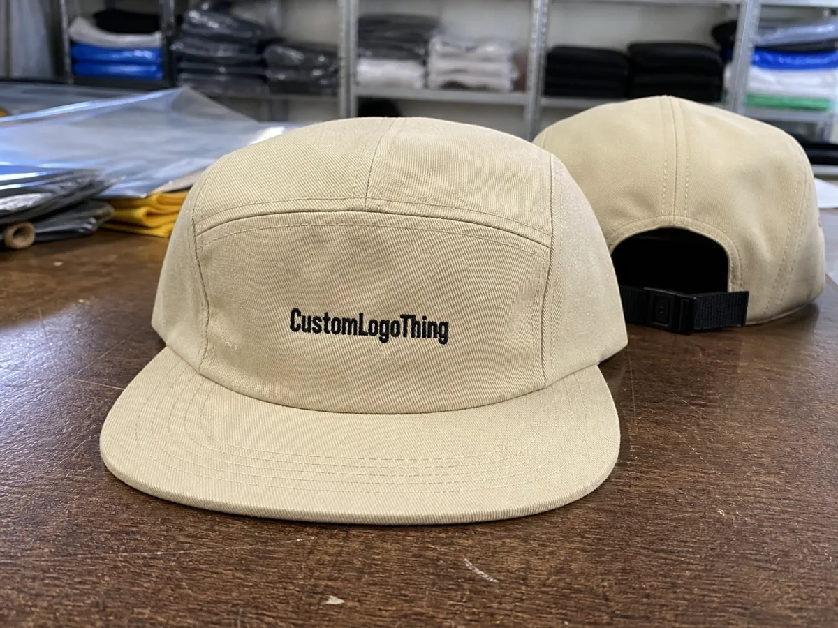
A five-panel cap usually gives you one uninterrupted front panel, and that is the reason many brands choose it in the first place. Compared with a six-panel cap, there is no center seam running through the main artwork area. That opens up cleaner placement for logos, wordmarks, and patch graphics, especially when the design needs to stay intact across the front.
Still, the panel is not flat in the way a sign panel is flat. The crown rises, the fabric pulls toward the sides, and the lower edge curves into the brim. Those shifts matter more on soft, unstructured caps, where the front can flex as the wearer moves. On a structured five-panel cap with buckram or foam backing, the panel holds shape better, but the visible area still narrows toward the edges.
That is why a placement that looks mathematically perfect can fail visually. A logo centered on the front panel may appear slightly low if the brim is steep. A logo placed exactly halfway up the panel may look high if the crown is shallow. The eye judges the cap as a three-dimensional object, not a rectangle. Good placement works with that shape instead of fighting it.
For most bulk orders, the cleanest result comes from treating the center front as a zone rather than a point. The logo needs enough clearance from the brim, enough margin from the side seams, and enough breathing room to avoid the cap feeling crowded. On a busy order schedule, that often matters more than pushing the artwork as large as possible.
The front panel also interacts with material choice. A cotton twill cap accepts embroidery differently than a brushed polyester or a nylon performance cap. Heavier fabrics hold stitch definition well, while slicker fabrics can show puckering if the backing and tension are not right. Soft caps, structured caps, and foam-front caps all ask for slightly different placement decisions. A useful guide has to account for that, or it becomes more decorative than practical.
How Front Panel Shape Changes Logo Size and Balance
Size is only useful when the shape supports it. On five-panel caps, the usable front area depends on crown depth, panel height, the curve above the brim, and whether the cap is structured or relaxed. A logo that fits on paper may still feel unbalanced if it is too close to the lower edge or too near the sides.
A good starting point for many decorated caps is a logo between roughly 4.25 and 5.25 inches wide and 1.75 to 2.25 inches tall. That is not a universal rule. A flat embroidery design can often be a little wider, while a dense wordmark may need to be smaller to keep letter spacing clean. A large icon with open space can look bigger than a technically larger design that is packed with detail.
Here is the practical way decorators often think about the front panel:
- Center front: best for primary branding and logos that must read quickly.
- Slightly raised center: useful when the lower edge needs to clear the brim curve.
- Low front above the brim: works for small marks, but crowding becomes obvious fast.
- Side placement: better for secondary marks, flags, or small identifiers than for main logos.
The balance problem gets sharper with tall artwork. A vertical lockup can run out of room sooner than a wide one, especially on low-profile caps. Wordmarks with thin letters also behave differently from bold block lettering. Thin letters need room to stay legible after stitch compression. Bold letters can take more visual weight, but if they are too wide, the ends may creep toward the seam lines and flatten the design.
Material and construction influence the visual size too. A structured cap often makes the same logo look more official because the front stays firm and repeatable. A soft front can make the logo feel more casual, but it also changes how the eye reads the edges. In production, that can shift the acceptable placement by a few millimeters. That small number matters. On a cap, 3 mm can be the difference between “centered” and “slightly off.”
For buyer planning, the safest approach is to ask for the actual usable placement zone, not just the cap width. Front-panel width, crown height, and the distance from the brim to the bottom of the decoration should all be confirmed before approval. Those numbers do more work than a vague “center front” note ever will.
Decoration Method, Artwork Type, and Stitch Detail
Decoration method often decides the placement strategy before the artwork does. Flat embroidery, 3D puff, woven patches, leather patches, and printed patches all behave differently. They handle small text, sharp corners, gradients, and edge detail with different levels of success. That means the same logo may need a different safe area depending on the finish.
| Decoration method | Best for | Typical setup | Bulk unit impact | What to watch |
|---|---|---|---|---|
| Flat embroidery | Bold logos, simple text, durable workwear branding | $25-$60 digitizing | $0.90-$2.50 added per cap | Thin lettering can close in if the stitch count is too dense |
| 3D puff embroidery | Large simple letters, sports styling | $30-$70 digitizing | $1.25-$3.25 added per cap | Not suitable for small details or tight curves near the brim |
| Woven patch | Sharper edges, fine detail, cleaner artwork | $35-$85 artwork setup | $1.40-$3.25 added per cap | Needs enough border space so the patch does not feel cramped |
| Leather patch | Premium lifestyle looks, tonal branding, simple marks | $40-$90 tooling or setup | $1.75-$4.00 added per cap | Fine lines and tiny type usually disappear or lose clarity |
| Printed patch | Gradients, color blends, detailed graphics | $30-$75 print setup | $1.25-$3.50 added per cap | Edge finish and adhesion matter if the cap will see heavy wear |
The table helps, but the logo still decides the outcome. A dense emblem with tiny letters should not be treated like a simple icon. A patch can preserve detail that embroidery would blur, but the patch border needs room, and that border changes the visual footprint on the cap. A leather patch can look expensive and calm, but it can also flatten a brand if the artwork depends on color variation or fine text.
Stitch density deserves more attention than it usually gets. A design with 7,000 stitches behaves very differently from one with 12,000 stitches. More stitches mean more machine time, more thread movement, and a higher chance of stiffness on soft fronts. Dense artwork can also pull the fabric slightly if the backing is not matched to the cap structure. That is not a defect in the cap so much as a mismatch between design and material.
Backing choice matters here. A light cap often needs a lighter stabilizer to avoid a cardboard feel. Heavier structured caps can tolerate firmer backing and still keep the front looking clean. If the front panel is too soft for the stitch load, the logo can ripple. If the backing is too heavy, the cap loses comfort and shape. The best result is usually somewhere in the middle, where the decoration stays crisp without turning the front into a board.
For quality control, the production team should check the final sew-out for thread tension, registration, and edge pull before bulk runs start. On patch programs, the test should include border consistency and adhesion, especially if the patch will be sewn onto a textured front. If the order is for retail resale, a wash or wear test on the sample is a cheap way to catch problems before they become a 300-piece headache.
Shipping and packaging details matter too. Caps lose shape in transit if cartons are crushed or if the brims are packed too tightly. For programs that need stronger transit standards, the test methods published by ISTA are a useful reference. If the order includes paper inserts, hang tags, or retail backers, FSC-certified stock may matter for sourcing and claims review.
Process and Turnaround: From Artwork Review to Shipment
The production path for decorated caps is usually straightforward, but only if the artwork is clean from the start. Most orders move through artwork intake, placement mockup, proof approval, sampling or sew-out, bulk production, finishing, and packing. Each step is small. Together they decide whether the cap arrives looking controlled or improvised.
Artwork issues are the most common delay. Vector files make digitizing faster. Low-resolution files do not. If the logo has to be rebuilt, the proof may take another pass, and the schedule moves. Changes after the first proof can also slow the order. Shifting the logo by a few millimeters is easy. Rebuilding the placement three times is not.
Typical timing looks something like this: 1-2 business days for clean artwork review, 5-10 business days if a sample or sew-out is required, and around 12-15 business days for straightforward bulk production after proof approval. Complex patch programs, higher quantities, or cap styles with multiple decoration locations can stretch beyond that. Rush production may be possible, but only if the decoration method and shipping window can realistically support it.
What should be locked before production starts? The front placement, artwork size, thread colors or patch materials, cap color, and the exact decoration method. If those pieces are still moving, the run is still not ready. That sounds basic, but the bulk of avoidable problems come from skipping one of those decisions or assuming it will be fixed later.
The proof itself should show more than the logo. It should show the cap style, crown profile, approximate placement in inches, and how the artwork sits relative to the brim. For a five-panel cap, that extra context is not cosmetic. It prevents the buyer from approving a flat graphic that looks right in isolation but wrong on the actual product.
Cost, Pricing, MOQ, and Quote Drivers for Cap Orders
Cap pricing is driven by a few repeating variables: decoration method, quantity, stitch count or print complexity, cap blank quality, and finishing requirements. Buyers can influence most of those pieces. A simple one-color embroidery run will price very differently from a multi-color patch with special backing. Quantity matters too. A 50-piece order rarely gets the same unit economics as a 500-piece run, because setup costs are spread over fewer caps.
Minimum order quantities vary by supplier and by decoration method. Many decorated cap programs start somewhere around 24 to 50 pieces. That range is common because setup takes nearly the same effort whether the run is small or large. At 100 pieces and above, the unit cost usually becomes easier to manage. For patch programs and custom molded elements, the MOQ can be higher because the tooling cost needs more volume to make sense.
Placement itself can affect price. Larger logos take more stitch time. Denser stitching slows the machine. Multiple decoration locations add labor and setup. If the logo has to be enlarged to keep the text readable, that can also increase cost. In some cases, a patch is cheaper than dense embroidery because it reduces machine time and preserves detail with less rework.
A serious quote should separate one-time costs from per-unit costs. Ask for:
- Sample charges: sew-out, patch proof, or preproduction sample pricing.
- Production charges: per-cap decoration cost at the actual quantity.
- Artwork or digitizing fees: especially important for embroidery and puff work.
- Shipping: carton count, packed weight, and transit method.
- Finishing: tags, folded packing, inserts, backing, or retail prep.
The landed cost matters more than the headline number. A quote that looks lower on the unit line can carry a larger setup fee. Another quote may look more expensive at first, yet win once sample charges, shipping, and artwork revision costs are included. For bulk buyers, the useful comparison is total delivered cost, not the first number that arrives by email.
Lead time and price move together more often than suppliers admit. A tighter deadline can push production into a faster queue or require a simpler decoration method. That is one reason practical buyers make the placement decision early. If the logo position is still changing after digitizing, both the schedule and the budget can get messy quickly.
Common Placement Mistakes That Make Caps Look Misaligned
The biggest mistake is centering only on the seam or only on the brim. Those are construction references, not always visual ones. A logo can be perfectly centered by pattern and still look slightly off once the cap is worn. The crown rounds. The front relaxes. The eye notices the shape before it notices the measuring tape.
Placing the logo too low is another frequent problem. Once the art runs into the brim curve, the lower edge feels cramped and the whole cap looks compressed. Too high creates a floating effect. The logo no longer feels tied to the front panel; it looks like it was added as a separate object. The strongest placements usually sit high enough to clear the brim line but low enough to remain anchored to the face of the cap.
Oversizing causes its own damage. A logo stretched to the limits of the panel can force the outer edges close to seams or stitching transitions, and that can flatten the design. Undersizing is quieter but just as common. The proof may look clean on a screen, yet the logo disappears from normal viewing distance. Caps are read from several feet away. If the artwork depends on a close look to make sense, it is probably too small.
Reusing one placement across every cap blank is another shortcut that fails more often than people expect. A fitted sample, a relaxed dad cap, and a structured five-panel trucker do not share the same front shape. The same artwork location can work beautifully on one and drift on another. Production blanks have to be checked on their own terms.
- Do not center only on the seam: check the full front panel balance.
- Do not push the logo into the brim curve: leave enough clearance for the lower edge.
- Do not overfill the panel: keep margins so the cap still looks clean in motion.
- Do not reuse one location across every blank: confirm the actual cap style first.
Quality control should catch those problems before bulk production. A good sample review checks placement, stitch coverage, thread color, patch edge finish, cap symmetry, and how the decoration sits when the crown is flexed by hand. That last one matters more than it sounds like it should. A cap can look perfect on the table and drift once it is worn.
Expert Tips and Next Steps Before You Approve the Proof
The cleanest approvals usually start with measurements, not opinions. Ask for the front panel width, usable height, and the exact distance from the brim to the bottom of the logo. Those numbers make the proof easier to judge and give the decorator a clear target. If the supplier cannot supply those measurements, the proof deserves a second look.
Request a digital mockup for placement and a physical sample or sew-out when the order size justifies it. The mockup shows proportion. The sample shows reality. Thread density, fabric stretch, patch edge behavior, and crown stiffness do not always translate from screen to fabric. On five-panel caps, that gap can be large enough to matter.
Compare the artwork against the cap color and material, not against a white background. A navy cap with white thread behaves differently from a tan cap with tonal stitching or a black cap with a leather patch. Contrast changes readability. Texture changes how premium the cap feels. The same logo can read as bold, quiet, or busy depending on those variables.
Before approval, a practical buyer usually checks five things: method, size, placement, production timing, and landed cost. That short list saves more money than an expanded design discussion does. If one of those five is vague, the final cap often shows it.
- Confirm the decoration method.
- Confirm the logo size and placement in inches.
- Confirm thread colors, patch material, or print method.
- Confirm sample timing and bulk turnaround.
- Confirm the quote includes setup, shipping, and artwork fees.
Handled this way, the Five Panel Caps logo placement guide becomes a production tool rather than a style note. That is the real payoff: fewer revisions, fewer surprises, and a cap that looks intentional the moment it leaves the box.
Where should a logo be placed on five-panel caps for the cleanest look?
Centered front placement is the usual starting point, but the final position should account for the brim curve, the crown height, and the cap's seam map. A logo often needs to sit slightly higher than buyers expect so it clears the brim without losing connection to the front panel. The proof is the best place to confirm the visual balance.
How big should a logo be on a five-panel cap?
Many orders land in the 4.25 to 5.25 inch wide range, though the right size depends on the artwork and decoration method. Simple marks can usually run larger than detailed text because they stay readable without crowding the panel. The usable area on the actual cap matters more than the dimensions of the file.
Is embroidery or a patch better for five-panel cap placement?
Embroidery works well for bold, simple logos that need durability and a stitched-in feel. Patches are better for small details, cleaner edges, or artwork that needs more visual precision. The best choice depends on how much room the front panel gives you and how much detail the logo needs to hold.
What affects the price of five-panel cap decoration the most?
Quantity, decoration method, stitch count or print complexity, and setup fees are the main cost drivers. A small order with custom artwork often costs more per cap because the setup is spread across fewer pieces. A full quote should show one-time charges separately from per-unit pricing so the real total is easy to compare.
How long does a five-panel cap order usually take?
Clean artwork can move through review in 1-2 business days, and a sample or sew-out can add another 5-10 business days. Bulk production often lands around 12-15 business days after proof approval for straightforward embroidery. Patch work, larger quantities, and rush requests can extend that schedule.


