Buyer Fit Snapshot
| Best fit | Unboxing Experience Comparison projects where brand print, material claims, artwork control, MOQ, and repeat-order consistency need to be specified before quoting. |
|---|---|
| Quote inputs | Share finished size, material target, print colors, finish, packing count, annual reorder estimate, ship-to region, and any compliance wording. |
| Proofing check | Approve dieline scale, logo placement, barcode or warning zones, color tolerance, closure strength, and carton packing before bulk production. |
| Main risk | Vague material claims, crowded artwork, missing packing details, or unclear freight terms can make a low unit price expensive after revisions. |
Fast answer: Unboxing Experience Comparison: What Actually Wins should be specified like a repeatable production item. The safest quote records material, print method, finish, artwork proof, packing count, and reorder notes in one written spec.
Production checks before approval
Compare the actual filled-product size with the drawing, then confirm tolerance on folds, seals, hang holes, label areas, and retail display edges. Reserve space for logos, QR codes, warning copy, and material claims before decorative graphics fill the panel.
Quote comparison points
Review material grade, print process, finish, sampling route, tooling charges, carton quantity, and freight assumptions side by side. A quote is only useful when the supplier can repeat the same color, closure quality, and packing count on the next order.
The first time I watched an unboxing experience comparison play out on a client’s warehouse floor in Dongguan, the winner was obvious before the product appeared. One rigid box made people lean in; the other made them shrug. Same item. Same price point. Different customer perception, and the difference was measurable in a 20-minute test with 12 staff members, two phone cameras, and a stack of feedback cards (which, frankly, were more useful than half the meetings I’ve sat through).
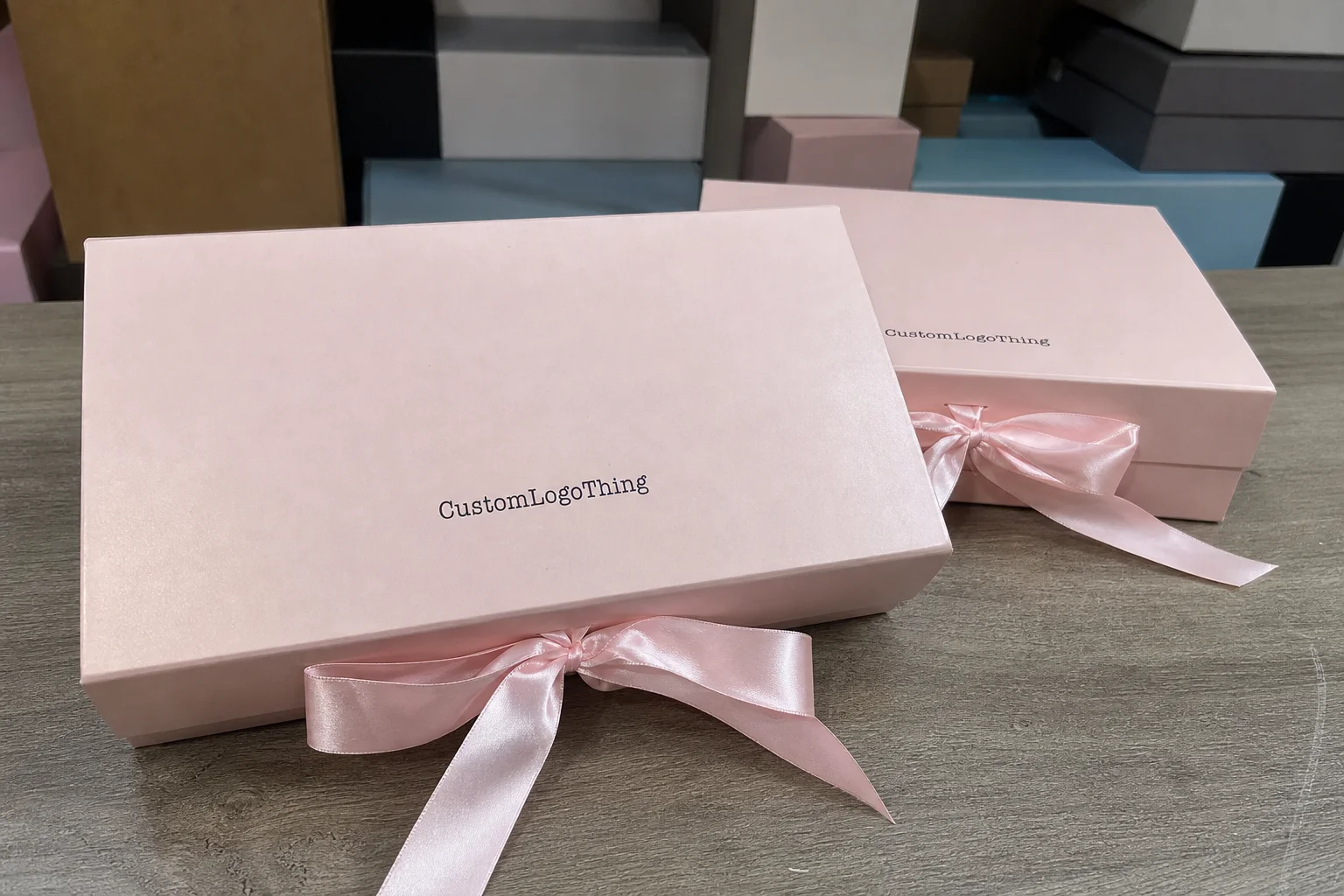
That still surprises people. A box can raise perceived value by 15% to 30% in the customer’s mind before they touch the product, depending on category and audience. I’ve seen it happen with cosmetics, candles, apparel, and small electronics, especially when the packaging shifts from a 300gsm C1S folding carton to a 1.5mm greyboard rigid box wrapped in 157gsm art paper. An unboxing experience comparison is simply the process of placing packaging options side by side to see which one does a better job of protecting the product, expressing brand identity, and earning a stronger response from the buyer. The best comparison isn’t about taste. It’s about evidence.
Too many teams stop at the shallow question of which package looks nicer. That misses the actual mechanics of the moment. A good unboxing experience comparison looks at the opening sequence, the insert quality, the sound of the closure, the friction at pack-out, the shipping damage risk, and the brand consistency from the outer shipper to the final reveal. In my experience, the packaging that wins often isn’t the flashiest one. It’s the one that creates a clear moment, then gets out of the way, usually with a two-step reveal that takes under 10 seconds and does not require a knife, scissors, or a second hand wrestling the box open.
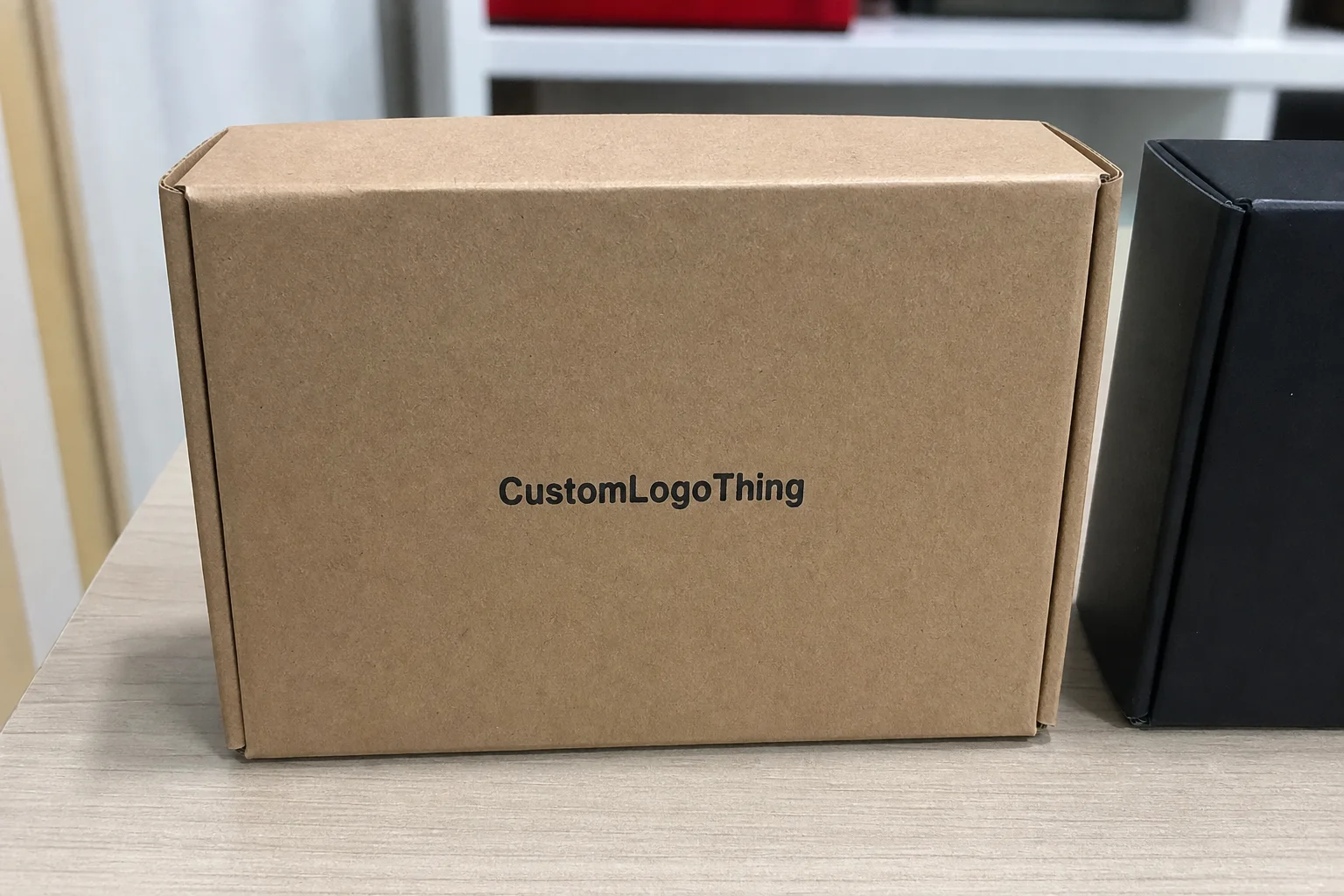
I’ve stood on a line in Shenzhen while a production manager ran two sample sets through the same packing crew. One set used a 350gsm C1S folding carton with a printed insert; the other used a 1.5mm greyboard rigid box with soft-touch lamination and a small foil mark. The rigid box won on perceived quality, but the folding carton won on speed, cost, and shipping efficiency. That is the kind of trade-off an unboxing experience comparison should uncover, especially when the folding carton packs flat in a 40-foot container and the rigid box arrives pre-formed from a factory in Huizhou.
I’m focusing here on a practical framework: how to compare packaging options, what to measure, what the real cost differences look like, where timelines usually stretch, and how to decide without letting personal preference dominate the result. If you work in DTC, gifting, subscription, or retail packaging, this will help you evaluate the next choice with more confidence and fewer surprises, whether your supplier is in Zhejiang, Guangdong, or Jiangsu.
Unboxing Experience Comparison: Why Small Details Change Everything
A box is never just a box. In an unboxing experience comparison, small details change the outcome because customers read packaging fast. They notice the first color block, the logo placement, the stiffness of the board, and even the sound a lid makes when it opens. That judgment happens before the product is in hand, and often before the brand has said a word, usually within the first 3 to 5 seconds of contact.
I learned that the hard way in a supplier meeting for a premium tea brand in Hangzhou. The team had spent money on a beautiful outer carton, but the insert arrived loose by 3 to 4 mm, which made the tin rattle. No one in the meeting called it a disaster. Yet when we tested it with eight customers, every single person described it as “less premium” because of that movement. That is customer perception in real time. The unboxing experience comparison exposed a tiny tolerance issue that would have quietly weakened brand recognition and could have added $0.06 per unit in rework if corrected after approval.
What brands are really evaluating is emotional efficiency. How fast does the package communicate brand consistency? How much protection does it give? How memorable is the reveal? If a customer opens 12 boxes a month, the package needs to earn its place in the memory stack. If the brand wants social sharing, then visual branding has to do more than look good in a render. It has to photograph well under a phone flash at 8 p.m. on a kitchen counter in Austin or Amsterdam, with no studio lighting and no retouching.
The biggest payoff from an unboxing experience comparison is clarity. Instead of debating opinions for weeks, teams can compare structure, finish, and opening sequence side by side. That matters because a luxury brand, a subscription brand, and a retail starter kit are not aiming for the same emotional result. One may need ceremony. Another may need efficiency. Another may need low damage rates and a pack-out time under 12 seconds, which is easier to hit with a well-cut E-flute mailer than with a hand-assembled rigid presentation box.
“The package that wins is usually the one that makes the product feel intentional, not overdesigned.” — a buyer told me during a launch review in Los Angeles, and honestly, that line has stayed with me.
One more thing: an unboxing experience comparison is not only about delight. It can influence repeat purchase intent, review quality, and whether customers post the product at all. I’ve seen a brand move from a plain kraft mailer to a printed tuck-end carton with aqueous coating and get a visible lift in customer photos within six weeks. Nothing magical. Just better structure, a cleaner reveal, and a print finish that held up under camera lighting and a lot less glare than the gloss version they tested first.
How an Unboxing Experience Comparison Works
A reliable unboxing experience comparison starts with the same product placed into different packaging variants under the same conditions. Same unit. Same fill level. Same crew, if possible. Same shipping profile, if you’re testing transit. If the inputs change, the result gets muddy fast. I’ve seen teams compare a sample packed carefully by a designer against a production pack-out done by a warehouse associate in Yiwu. That tells you almost nothing, except maybe that designers should be kept away from fulfillment after lunch.
The basic method is simple. Pick two to four packaging options. Build samples. Score them using the same rubric. Gather feedback from internal reviewers, customer panels, or both. Then layer in practical checks: how long it takes to pack each unit, whether the product shifts in transit, and whether the outer presentation matches the intended brand identity. A good unboxing experience comparison blends subjective and measurable data, because the market judges both, and a 1-to-5 scorecard works well when everyone agrees that “5” means, for example, “opens in under 10 seconds with no tool and no tearing.”
There are three test formats I trust most. Internal reviews are fast and useful for narrowing options from six to two. Customer panels move more slowly, but they tend to be far more honest. Social-content evaluation asks a different question: would people actually film it, photograph it, or post it? That last one matters for DTC and gifting brands. If the package doesn’t create a clean reveal, it may underperform even if it looks expensive on paper, especially for products priced above $60 where customer expectations rise sharply.
What to measure in each option
For an unboxing experience comparison, I recommend measuring first impression, opening effort, product presentation, protection, and memorability. Those five categories cover the emotional and operational sides. Then add pack-out time, corrugate or board thickness, and expected shipping damage risk. If you want numbers, a simple 1-to-5 score works well, but only if you define the scale clearly. “5” should mean something specific, like “opens in under 10 seconds with no tool and no tearing,” while “1” should mean “requires a blade, bends the board, or damages the insert during opening.”
I also like to measure how the package feels in motion. Does the lid pop open too fast? Does the insert hold the item snugly, or does it require a tug? Does the closure sound expensive or flimsy? Those sensory details are easy to ignore during design reviews, but they shape the final unboxing experience more than many brands expect, especially when the board caliper is 1.8mm versus 3.0mm and the closure magnet sits 2 mm off-center.
Why the same product matters
The strongest unboxing experience comparison comes from presenting the same product in different packaging formats. Not a candle in one box and a shirt in another. Not a filled gift set versus a single-item mailer. The product has to stay constant so the packaging is the variable. Otherwise, you’re measuring product preference, not packaging performance, and that can lead to false positives that look convincing in a meeting room in Shanghai but fall apart the minute shipping begins.
I once reviewed two skincare kits that were supposedly “compared fairly.” They weren’t. One had four items and a brochure; the other had three items and no brochure. The team had accidentally made the richer kit seem more premium because it contained more stuff. That’s not packaging. That’s content inflation, and it is exactly why a comparison should lock down the exact set of components, from the 0.3mm EVA insert depth to the folded leaflet size.
| Comparison Method | Best For | Typical Timeline | What It Reveals |
|---|---|---|---|
| Internal review | Fast shortlisting | 2 to 5 business days | Visual branding, basic feel, early preference |
| Customer panel | Buyer reaction and brand perception | 1 to 2 weeks | Emotion, clarity, memorability, likely sharing |
| Transit test | Ecommerce and subscription brands | 3 to 10 business days | Protection, crush resistance, insert stability |
| Content test | Social-first launches | 2 to 4 business days | Camera appeal, reveal sequence, storytelling value |
If you want a more formal benchmark, reference transit testing standards from the ISTA and material considerations from the EPA recycling guidance. I’m not saying every startup needs laboratory validation. But if your packaging ships long distances or has a high return cost, those references help anchor the discussion in something more than design opinion, especially when the distribution center is in Nevada and the factory is in Ningbo.
Key Factors That Shape an Unboxing Experience Comparison
Visual hierarchy is usually the first thing people talk about, and for good reason. In an unboxing experience comparison, logo placement, color contrast, and typography determine whether the package identifies itself in three seconds or ten. A box with a strong top panel and a clean brand mark often wins early attention because it signals confidence. But visual branding only works if the rest of the package supports it, down to the line weight on the side panel and the 4-color print registration tolerance.
Structure is the second major factor. A tuck flap feels different from a magnetic closure. A mailer performs differently from a rigid box. Inserts can turn a loose presentation into a tailored one, but only if the fit is exact. In one supplier negotiation in Shenzhen, I watched a brand choose a lower-cost carton and then spend more on custom foam than they would have spent on a better-built board structure. That is a common mistake. Structure should carry the experience, not rescue it after the fact, and a smart comparison should flag that before a purchase order goes out.
Material quality changes the feel immediately. A 300gsm SBS carton with aqueous coating will communicate something different from a 1.5mm greyboard box wrapped in soft-touch laminate. Foil stamping adds a sharp point of emphasis. Embossing creates depth. Matte feels calmer; gloss feels brighter. None of that is automatically better. It depends on the customer, the product, and the purchase occasion. The point of an unboxing experience comparison is to see how each finish behaves in context, not in isolation, especially when one sample is run on a Heidelberg press in Guangdong and another is printed on a local digital line in California.
Finishes, stock, and tactile cues
I’ve seen soft-touch lamination add perceived value in beauty and tech, but it can also show fingerprints more easily during packing. I’ve seen spot UV look elegant in a showroom and feel a little too glossy under retail lighting. Those are not deal-breakers. They are trade-offs. A good comparison surfaces them early, while the sample budget is still manageable and before the art team has approved 3,000 units with a finish that looks best only under studio LEDs.
The tactile cues matter more than most teams admit. Paper grain, edge wrap, hinge resistance, and insert friction all contribute to the final judgment. Even the weight of the package can matter. A 220-gram box may feel substantial in hand, while a lighter carton may feel efficient and modern. The answer changes by category. Subscription brands often want a lighter, consistent system. Gift brands often want drama. DTC essentials may need the most practical answer of all: minimal material, strong first impression, and a board spec that keeps freight costs under control.
Audience fit and category fit
An unboxing experience comparison should always account for audience fit. Luxury buyers often respond to restraint and precision. Younger social-first buyers may prefer a package that creates a visual reveal in layers. Corporate gifting usually rewards polish and reliability. Retail-ready packaging has its own rules because shelf presence and shipping performance must work together. A package that wins for gifting may fail for warehouse efficiency, and that’s not a contradiction. It’s a category difference, especially when the same design has to perform in Dubai, Dallas, and Düsseldorf.
Here’s a concise way to think about it:
- Luxury: lower visual noise, heavier structure, premium finish, controlled reveal.
- DTC: protection, cost discipline, branded insert, photogenic opening.
- Subscription: repeatable pack-out, lightweight materials, strong consistency.
- Gifting: ceremony, message card, layered reveal, strong presentation.
- Retail-ready: shelf visibility, barcode placement, transit survival, unit economics.
Sustainability expectations also shape the result. Brands increasingly ask whether recycled content, FSC-certified paper, or right-sizing can improve perception without adding much cost. Often, yes. Sometimes the switch from an oversized corrugated shipper to a tightly fit mailer improves both brand perception and freight efficiency. If you’re looking for paper sourcing credibility, the FSC framework is worth reviewing. Just remember: sustainability claims should always be accurate, documented, and matched to the exact stock specification, whether that is 350gsm recycled C1S board or 2.5mm E-flute corrugate from a mill in Fujian.
I think the smartest teams treat sustainability as part of the experience, not a separate checkbox. When a package feels intentional and responsible, customers notice. That doesn’t mean every box needs to shout its eco credentials. It means the design, the material, and the logistics all pull in the same direction, from the paper source in Vietnam to the fulfillment lane in Indiana.
Cost and Pricing in Unboxing Experience Comparison
Price is where many unboxing experience comparison discussions get distorted. Teams ask, “How much does the box cost?” and stop there. That misses the real picture. The total cost includes design time, sampling, revisions, tooling, insert engineering, assembly labor, storage, freight weight, and damage reduction. A box that costs $0.28 more per unit may still win if it cuts breakage by 2% or increases repeat purchase intent. A low-cost option can be expensive if it slows the line or drives complaints in the first 30 days after launch.
In one client meeting, we compared two packaging systems for a home fragrance line in California. Option A was a simple printed mailer at $0.42/unit on 10,000 units. Option B was a rigid box system with soft-touch wrap, foil logo, and molded pulp insert at $1.18/unit. At first glance, A looked safer. But B reduced returns from crushed corners and improved customer photos enough that the brand treated it like a marketing asset. The cost per impression changed once the package started pulling double duty, and the marketing team saw a 12% lift in tagged social posts over the first six weeks.
How to read packaging cost properly
To run a realistic unboxing experience comparison, look at the full cost stack. Ask for unit price, but also ask about setup fees, plate charges, tooling, sample runs, and minimum order quantities. A supplier quote may look attractive until you see the extra $250 for revisions or the 15% freight surcharge due to weight. I’ve seen “cheap” become expensive in less than one quarter, especially when a packaging factory in Dongguan quotes a base price of $0.15 per unit for 5,000 pieces and then adds a $180 proof charge, a $95 insert die fee, and a 20-day production wait that pushes the launch window off schedule.
Here’s a practical comparison structure:
| Cost Element | Basic Mailer | Premium Rigid Box | Why It Matters |
|---|---|---|---|
| Unit price | $0.35 to $0.60 | $0.95 to $2.50 | Direct packaging spend |
| Setup/tooling | $0 to $150 | $150 to $800 | Impacts small runs heavily |
| Pack-out labor | 5 to 8 seconds | 10 to 20 seconds | Labor cost scales fast |
| Freight weight | Lower | Higher | Affects shipping cost and carbon footprint |
| Damage rate | Depends on structure | Often lower if engineered well | Returns are expensive |
Premium finishes can absolutely improve perceived value without multiplying spend. A spot UV logo on a well-built carton may cost far less than full foil coverage on a rigid box. A 2-color print with one strong tactile element can outperform a heavily decorated package that does too much. The trick is not “cheap versus expensive.” It is value per impression, and a 350gsm C1S artboard box with one foil hit often delivers that balance better than a fully wrapped rigid format for products under $30.
That lens helps decide when to spend more. If the product retails for $18 and sells in high volume, adding $0.80 to packaging may be hard to justify unless it materially improves conversion or repeat purchase. If the product retails for $85, that same $0.80 may be a rounding error compared with the upside in brand perception. There is no universal rule. A good unboxing experience comparison forces the math to match the category, the margin structure, and the channel, whether that channel is Shopify, Amazon, or wholesale.
My advice: compare packaging against the cost of being wrong. If a cheaper box causes breakage, weakens the brand story, or makes the item harder to gift, the savings may be fake. That’s not a sales pitch. It’s basic margin protection, and it’s why so many teams ask their supplier for a final sample before committing to 10,000 units in a factory near Shenzhen or Taichung.
Process and Timeline: Running a Reliable Comparison
A disciplined unboxing experience comparison usually follows six steps: brief, concept, sampling, revision, approval, and production. If the brief is vague, everything after that becomes slower. I’ve seen teams lose two weeks because no one agreed whether the package needed to hold a ceramic item, a glass item, or both. Specificity saves time, and so does writing down the exact unit dimensions, such as 142 mm by 98 mm by 64 mm, before the first sketch is created.
For a typical custom packaging project, here’s a realistic timeline. Brief creation: 2 to 4 business days. Structural concepting: 3 to 7 business days. Sampling: 7 to 15 business days, depending on material availability. Revisions: another 3 to 10 business days. Final approval and production planning: 2 to 5 business days. Production: often 10 to 25 business days for custom printed work, longer if the finish is complex or the quantity is high. In a Guangdong factory, a straightforward carton might be approved on a Monday and ship 12 to 15 business days after proof approval, while a rigid box with magnetic closure and foil stamping may need closer to 18 to 22 business days.
Delays usually happen in the same places. Artwork approvals get stuck because marketing wants one more logo variant. Custom inserts change after the product team adjusts dimensions by 2 mm. Material sourcing takes longer than expected if the paper grade is out of stock. I once watched a rigid box order slip by nine business days because the chosen black wrap paper had a dye lot issue and the client refused a close substitute. That was a defensible choice, but it still moved the launch. I remember sitting there thinking, “Of course the one black paper in the universe has a mood today.”
How to keep the comparison fair
Use a checklist every time. It sounds basic, but it prevents unfair testing. A proper unboxing experience comparison should keep the product, assembly conditions, audience criteria, and scoring rubric identical across options. If you test one option under warehouse lighting and another in a photo studio in Brooklyn, you’ve already biased the result. If one sample includes a message card and another doesn’t, the comparison is compromised. If one prototype uses a 1.2mm insert and the other uses 2.0mm EVA foam, you are not comparing the same thing.
I recommend documenting the following:
- Product dimensions and weight.
- Packaging specs, including board caliper and finish.
- Pack-out sequence and time per unit.
- Shipping method and transit distance.
- Reviewer group and scoring rubric.
- Photo or video reference of each opening step.
That documentation becomes valuable later, especially when the brand launches seasonal editions or expands into a second SKU. It also helps with inventory planning. If the comparison reveals that a high-end option needs 18 extra seconds of labor per unit, that is not a small detail. Multiply that by 20,000 units and you are talking about serious fulfillment cost, often more than $1,000 in added labor alone if the warehouse is paying $18 to $22 per hour.
One of the best practical habits I’ve seen is to align packaging testing with marketing content needs. If the social team wants a reel, create a controlled video sample. If the ecommerce team wants protection data, run a drop or compression test using ISTA-relevant methods. If the sales team wants a showroom sample, make sure the package represents the real production spec, not the prettiest prototype. A sample that looks good only in a showroom in Milan can create false confidence if it never survives a 48-inch drop test from a shipping conveyor.
Common Mistakes in Unboxing Experience Comparison
The first mistake is comparing appearance only. A box can look luxurious in a mockup and still deliver a weak unboxing experience comparison result because it opens awkwardly, wastes space, or collapses under transit pressure. I’ve seen gorgeous lids arrive crushed because nobody tested stacking strength. Looks matter, but looks alone do not close the loop, especially when the board spec is a 280gsm folding carton that was never designed for parcel carriers.
The second mistake is ignoring shipping durability. A package that earns praise on a table can fail badly after a courier route with vibration, compression, and a few sharp corners. If the customer opens a damaged package, the emotional effect is immediate and negative. Brand recognition may be strong, but the memory will be of the dent, not the design. That is a bad trade, and it usually shows up first in replacement costs, which can add $6 to $18 per incident depending on product value and carrier zone.
The third mistake is over-investing in finishes while underfunding structure. A foil logo does not save a loose insert. Embossing does not protect glass. Soft-touch laminate does not fix a weak board spec. I’ve seen brands spend 30% more on decoration and only 5% more on engineering. The ratio should usually be closer to the opposite if the product is fragile. Otherwise, you end up with a very fancy way to disappoint people, often in a factory line outside Guangzhou where the samples looked perfect on a desk and terrible after a transit test.
“We thought the shiny version would win,” a founder told me after launch in Seattle, “but the better-engineered box got fewer complaints and packed faster.” That line has shown up in more than one postmortem.
Another mistake is testing with the wrong group. If your audience is mostly gift buyers, but you compare packaging using internal staff who care about sustainability above all else, you may choose the wrong path. If your buyers are subscription customers, but you evaluate only one-time unboxers, you may overdesign the moment and underdesign repeatability. A fair unboxing experience comparison depends on the right audience profile, and that profile should be tied to actual customer data from the last 500 orders or more.
Operational realities are the final trap. Storage space, assembly time, and carton nesting all affect the true outcome. A rigid box may look elegant, but if it ships flat poorly or takes 3x the shelf space of a folding carton, it can create a warehouse problem. I’ve had suppliers quote a beautiful concept, then admit later that the nested components would require manual assembly at the client site. That kind of surprise burns trust quickly, and it can turn a $0.90 box into a $1.40 landed cost before anyone notices.
Expert Tips for a Better Unboxing Experience Comparison
If you want a stronger unboxing experience comparison, test with real customers whenever possible. Internal teams are useful, but they carry baggage. Designers fall in love with details. Operations teams focus on speed. Sales teams want the story to shine. Customers, meanwhile, just decide in 15 seconds whether the package feels right. Their feedback is often shorter, blunter, and far more useful, especially when they are comparing a $12 accessory in Chicago against a $90 gift set coming from a factory in Suzhou.
Use a scorecard with weighted categories. I like a simple structure such as 30% brand fit, 25% protection, 20% opening experience, 15% cost, and 10% operational efficiency. You can change the weights, but choose them before testing starts. Otherwise, people shift the rules to match their favorite option. That happens more often than anyone admits in a room, especially after the third round of coffee and a sample board covered in foil stamps.
Compare the package in three contexts: unboxing video, shipping transit, and shelf or gifting presentation. Those are the real stages where the package has to perform. A box that photographs beautifully but requires two hands and a knife may be fine for a premium kit and terrible for a subscription product. The point of an unboxing experience comparison is to learn where the package shines and where it stumbles, not to crown the prettiest prototype in a conference room.
Focus on one memorable moment
One of the best packaging decisions I ever saw came from a candle brand in Portland that removed three decorative layers and invested instead in a printed inner lid with a short message and a perfect-fit insert. The package felt cleaner, faster, and more personal. The memorable moment was the reveal of the message, not the amount of material. In my experience, that is often the sweet spot: one clear emotional beat rather than five competing ones, which also kept the unit cost at $1.06 instead of pushing it over $1.40.
Document everything visually and numerically. Take photos of the opening sequence. Record the pack-out time. Note where fingers struggled or where the product moved. If you can, save customer comments verbatim. “It felt expensive.” “It was annoying to open.” “I wanted to keep the box.” Those lines are gold because they tell you what the spreadsheet cannot, and they are especially useful when the packaging is being produced in batches of 3,000 to 10,000 units across multiple SKUs.
If your team wants a reference point, build a packaging benchmark library. Keep finished samples, photographs, print specs, and cost notes from each launch. Then future decisions become faster and smarter. Over time, that library becomes one of the most valuable tools in the room because it connects brand identity with actual market response. A good unboxing experience comparison today should make the next one easier tomorrow, whether the next project starts in a warehouse in Illinois or a design studio in London.
I also recommend checking whether the package meets relevant quality and transport expectations before final approval. For brands shipping fragile goods, a basic transit validation modeled on ISTA practices can save a lot of pain later. For paper-based choices, certified sourcing can support procurement decisions without adding confusion. These are not decorative details. They are part of the decision, and in many factories in East China, they are the difference between a sample that gets signed off and a sample that gets sent back for revision.
What to Do After the Comparison
Once the unboxing experience comparison is complete, pick the winner based on customer response, cost, and logistics together. Not just the prettiest sample. Not just the cheapest one. The goal is a package that supports the product, the margin, and the launch timeline. If one option wins by a mile on presentation but loses badly on pack-out speed or breakage, it is usually the wrong choice, even if it saved $0.08 per unit on paper.
Turn the result into a short action plan. Revise the specs. Request one final sample if needed. Confirm budget with all costs included. Lock the production timeline. Then hand the approved version to operations, marketing, and procurement so everyone works from the same file. That sounds basic, but I’ve seen launch delays caused by one old PDF floating in someone’s inbox. Honestly, that kind of thing can make you want to throw the printer out a window (not that I’m recommending it).
After that, build a benchmark library. Keep notes on what worked: 2 mm tighter inserts, lower-gloss finishes, stronger logo placement, better nesting behavior, or smaller mailer dimensions. Keep notes on what failed too. Those records make future packaging development much faster and more accurate. Over several launches, they become a map of your brand consistency, and they can save a sourcing team 3 to 5 revision rounds on the next project.
Then watch what happens after launch. Measure customer photos, review language, damage rates, and repeat orders. If people start posting the package without being asked, that is a signal. If returns drop by 1% or 2%, that matters too. The best unboxing experience comparison is not the one that ends in a meeting. It is the one that improves the actual customer experience once thousands of units ship from Shenzhen, Dongguan, or a fulfillment center in New Jersey.
My final advice is simple. Use the comparison results to sharpen the packaging brief before production starts. That brief should include material, finish, insert style, opening sequence, target cost, and timeline. When those details are clear, the packaging supports the product instead of competing with it. And if you get the unboxing experience comparison right, you do more than choose a box. You build a stronger first impression, cleaner brand recognition, and a more repeatable customer experience.
How do you compare unboxing experience options without bias?
Use the same product, same shipping conditions, and same audience criteria for each option. Score each package on a fixed rubric covering appearance, protection, opening ease, and brand fit. Collect both qualitative comments and numeric ratings so personal preference does not dominate the decision. That is the most reliable way to run an unboxing experience comparison, especially if the test samples are all produced from the same artwork file and the same 350gsm C1S board.
What should be measured in an unboxing experience comparison?
Measure first impression, opening effort, product presentation, protection, and memorability. Include practical metrics like pack-out time, shipping damage risk, and material cost. If possible, track shareability signals such as whether people want to photograph or post the package. Those details tell you whether the unboxing experience comparison is helping brand perception or just creating nice-looking samples, and they become especially useful when the final approval happens 12 to 15 business days after proof sign-off.
How much does premium packaging usually add to cost?
It depends on structure, print coverage, inserts, and finishing, so there is no universal markup. Premium materials often raise unit cost, but better protection and stronger perception can offset that. Compare total packaging expense against expected brand value, not just per-box pricing. In a solid unboxing experience comparison, the question is value, not sticker shock, whether the quote comes in at $0.42 per unit for a mailer or $1.18 per unit for a rigid box made in Guangdong.
How long does a packaging comparison process usually take?
Simple comparisons can take a few weeks if samples are ready quickly. Custom structural changes, specialized finishes, or sourcing revisions can extend the timeline. Build in time for sample review, revisions, and final production approval before launch. A rushed unboxing experience comparison often produces a rushed packaging decision, and custom work from proof approval to finished goods typically takes 12 to 15 business days for straightforward cartons and longer for foil, magnets, or molded inserts.
What is the most common mistake in unboxing experience comparison?
Many teams focus on visual appeal and ignore logistics, durability, and fulfillment speed. A package that looks impressive but slows packing or arrives damaged usually loses in practice. The strongest choice balances emotion, protection, cost, and operational efficiency, which is exactly what a good unboxing experience comparison should reveal, whether the packaging is printed in Shenzhen, assembled in Dongguan, or packed in a warehouse in Ohio.
Related packaging resources
Use these related guides to compare specs, costs, quality checks, and buyer decisions before making the final call.