Waterproof Apparel Mailers Logo Placement Guide: What Buyers Often Miss
A mailer can look clean on a screen and still feel off once it is packed, sealed, labeled, and stacked for shipment. That is why a Waterproof Apparel Mailers logo placement guide matters in practice. The logo may land across a fold, sit under a shipping label, press into a flap edge, or wrinkle over a bulky sweatshirt, and suddenly the package reads less like branded packaging and more like a rushed afterthought.
Waterproof apparel mailers are usually made from co-extruded or laminated polyethylene film, commonly LDPE, HDPE, or blended structures selected for puncture resistance, moisture protection, and opacity. They are flexible, not rigid. That difference changes everything. A carton holds its shape; a mailer shifts with garment volume, sealing pressure, and handling. A design that looks centered on a flat dieline may look lower, wider, or more crowded after the bag is filled.
The biggest mistake is treating logo placement as a graphic-design exercise only. It is a packaging decision, a fulfillment decision, and a print-production decision at the same time. If the warehouse applies a 4 x 6 inch label in a fixed spot, that label is part of the layout. If the product is a hoodie rather than a T-shirt, the filled profile changes the visible front panel. If the bag has a return strip or tear notch, those features claim space too.
Buyers will also see a few terms that matter on proofs. The front panel and back panel are the main print surfaces. The flap folds over the opening and usually carries adhesive. The safe zone is the area where important artwork should stay clear of cut lines, welds, and folds. The print area is not the same as the full bag size, and the no-print zone is not optional decoration; it exists because conversion equipment needs room to seal and trim the film.
Practical rule: design for the packed parcel, not the empty template. Flexible film always changes once garments create pressure and shape.
The sections below focus on the choices buyers usually need to make before artwork is approved: where the logo should sit, how size and label placement affect readability, what a normal proofing timeline looks like, and which details change price more than most people expect.
How Logo Placement Works on Waterproof Poly Apparel Mailers
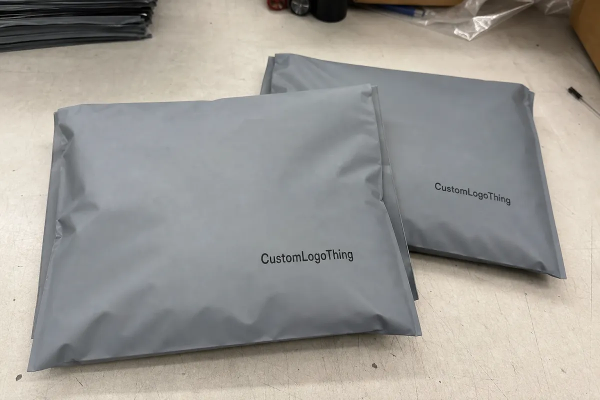
A typical waterproof poly mailer has a front panel, back panel, fold-over flap, permanent adhesive strip, release liner, and sealed side edges. Some include a perforated tear strip or a second adhesive line for returns. Those extra features are useful for Apparel Brands That process exchanges, but they also reduce usable artwork space and introduce more areas where a logo can be interrupted.
Printing usually happens before the mailer is converted into its finished shape. The film is printed while flat, then dried or cured depending on the ink system, then cut, folded, sealed, and packed. That sequence matters because a logo positioned too close to a cut line on the flat layout may end up looking visually off once the flap is folded and the bag is filled. Even a small shift can change the balance of the final package.
Most Custom Poly Mailers are produced with flexographic printing, while some larger or more specialized runs use gravure-style methods. Surface printing places ink on the outside of the film. Reverse printing traps ink between layers in laminated structures, which can improve rub resistance. Not every film supports every method, and print quality depends on film treatment, ink chemistry, opacity, and cure consistency. A supplier may check dyne level on treated film because ink adhesion depends on surface energy as much as layout.
Orientation also affects the final result. Some brands want the logo visible as soon as the mailer comes out of a mailbox or sorting bin. Others prefer the cleanest branded face to appear after the carrier label has been applied. In a warehouse setting, that label position is often dictated by the packing workflow, not by the designer’s preference. If the line always applies labels to one side, the artwork should be planned around that habit instead of against it.
Safe zones exist for a reason. Keep critical logo details away from welds, cut edges, perforations, adhesive strips, and fold lines. Flexible film can move slightly during conversion, and those movements are ordinary. A 3 mm shift may not matter in a background pattern, but it can make a fine border, tagline, or emblem look uneven.
Surface finish changes the conversation too. White and light gray films usually give strong contrast for dark inks. Black films and metallic films often need a white underbase if the logo uses lighter colors. Matte finishes reduce glare in warehouse lighting and often make simple artwork easier to read. Gloss can be attractive, but only if contrast is strong enough to survive handling and overhead reflections.
One useful habit is to judge the logo at three levels. First, look at the flat proof at arm’s length to check balance. Second, reduce the artwork to the size it will appear on a phone screen, because that is close to the distance many people first notice a package. Third, imagine it partly covered by a label or slightly distorted by a folded garment. That third check catches a surprising number of weak decisions.
Key Placement Factors: Bag Size, Seals, Labels, and Print Area
The first rule is simple: scale the logo to the usable front panel, not the overall bag dimensions. A 10 x 13 inch mailer does not offer a full 10 x 13 inch branding field. Once the flap, side seams, and bottom fold are accounted for, the clean printable area is smaller. On a 6 x 9 inch bag, losing even half an inch to a seal line can make a centered logo feel crowded very quickly.
Shipping labels are often the largest graphic on the package. A standard 4 x 6 inch thermal label can dominate a small mailer, especially if marketplace labels, routing labels, return labels, or customs documents are part of the workflow. The logo should be placed with that label in mind from the start. If the label lands in an unexpected location, the package can look cluttered even if the print itself is clean.
Garment bulk changes the shape of the finished mailer. A single T-shirt usually stays flat enough that a centered front-panel logo reads well. A hoodie, denim jacket, or multi-item order creates rounded pressure points that stretch the film and warp the visual field. Artwork that crosses those high-tension areas can ripple or curve, especially if it uses thin type or large solid blocks.
Flap and seal zones deserve special care. Logos should generally not cross the adhesive strip, release liner, tear strip, return strip, or flap fold unless the artwork is deliberately built for that structure. Large background graphics can sometimes move through those areas, but the main logo should not. Fulfillment teams fold flaps quickly and in volume, and bulky garments can pull the sealed edge into a curve, which makes artwork near that line look uneven.
Edge tolerances are part of the medium. Film webs move a little, heat seals compress, and cutting stations operate within normal production tolerance. For many custom Printed Poly Mailers, keeping key artwork at least 0.25 inch from cut edges and seal lines is a sensible starting point, though the supplier’s dieline should always take priority.
Readability is just as important as coordinates. Tiny taglines below 6 pt, fine lines below roughly 0.25 mm, and narrow reversed-out details can fill in or break apart on polyethylene film. QR codes need quiet space and enough size to scan after the bag flexes. Glossy film can reflect warehouse lights, so a subtle tone-on-tone logo may look refined in a mockup and nearly disappear on the packing bench.
It also helps to think in zones rather than exact centering. The upper third often works well for branding because it stays visible above a folded garment. The center panel is reliable for simple marks. The lower third is riskier if labels, inserts, or routing stickers live there. If the label must sit in a predictable place, that decision should be made before the logo is locked, because label overlap is one of the most common production surprises.
| Placement Option | Best Use | Cost Effect | Production Watchout |
|---|---|---|---|
| One-color logo on main panel | Clean brand mark for T-shirts, leggings, and light apparel | Usually the most economical print choice | Confirm the shipping label will not cover the logo |
| Two-sided logo placement | Brands that need visibility even if one side receives a label | Often higher because of added print coverage or setup | Check front and back orientation on the dieline |
| Repeat pattern | Small icons, monograms, or lifestyle branding | Varies by coverage and ink count | Pattern spacing must tolerate cutting variation |
| Full-coverage artwork | Bold retail-style presentation | Typically higher ink usage and more proofing care | Avoid tight registration across folds and seals |
Step-by-Step Process and Timeline for Approving Artwork
Start with the buying details before anyone opens a design file. Choose the mailer size, garment use case, film color, logo version, number of print colors, and intended placement. A buyer ordering custom poly mailers for folded tees may choose a different layout than a buyer shipping sweatshirts, because thickness changes how the front panel presents after sealing.
- Select the structure: confirm size, film thickness, flap type, adhesive, return strip, and any tamper-evident feature.
- Prepare artwork: send AI, EPS, or editable PDF files when possible, with fonts outlined and colors identified.
- Review the dieline: check cut lines, side seals, flap position, adhesive strip, perforations, safe zones, and no-print zones.
- Confirm label clearance: compare the logo position against the actual 4 x 6 inch label, marketplace label, or warehouse label template.
- Approve before setup: request revisions before plates, cylinders, or production setup are finalized.
Vector artwork is preferred because it keeps edges clean at production size. Outlined fonts prevent substitution issues. Pantone references, CMYK builds, or manufacturer-approved ink references help reduce color guesswork, although exact color matching on polyethylene still depends on film color, opacity, ink system, and print method. That is not a flaw in the process; it is how flexible packaging behaves.
The proof stage is where placement becomes real. The supplier lays your artwork onto a flat template that shows how the mailer will be cut, folded, sealed, and trimmed. Look at that proof at actual scale if possible. If the logo is 7 inches wide on a 10-inch panel, print it on paper at full size and hold it against a bag that matches the intended size. That simple check catches oversized marks, awkward spacing, and logos that are technically centered but visually unbalanced.
For most custom waterproof mailer orders, artwork review can move in a few business days once files are clean. Production after approval often falls in the 12 to 20 business day range, depending on quantity, material, print complexity, and factory capacity. Freight changes the final delivery window. Air, sea, and domestic trucking each introduce different lead times, and those differences matter more than the design team usually expects.
The delays that slow a job down are usually ordinary. Missing vector files, unclear placement instructions, late color changes, and proofs approved before the label workflow is confirmed create avoidable friction. If the fulfillment team applies labels differently than the marketing team assumed, the finished bags may still match the proof and still feel wrong in use.
For buyers who need a stronger validation step, ask whether the supplier can reference simple packaging tests. ISTA-style transit thinking is useful for apparel mailers because it forces everyone to consider drop, vibration, compression, and scuffing, not just a flat proof. For material comparisons, thickness and tensile references tied to ASTM methods can be helpful. Those numbers do not replace a live sample, but they make supplier-to-supplier comparisons much clearer.
Cost, Pricing, MOQ, and Unit Cost Effects of Logo Placement
Logo placement is usually part of normal artwork setup, but the choice can still change total cost. A small one-color logo on one panel is very different from two-sided artwork, edge-to-edge coverage, multiple spot colors, or a design that needs tight registration near a fold. More ink, more plates, more setup checks, and more press attention can all raise the unit price.
For a common custom printed waterproof apparel mailer, a basic one-color print at 5,000 pieces might sit somewhere around $0.18 to $0.35 per unit depending on size, film thickness, print coverage, and freight. Smaller quantities often cost more per piece because setup is spread across fewer bags, while larger programs can reduce unit cost once the press is running steadily. Heavier coverage, metallic inks, white underbase, and return-strip printing usually add cost.
MOQ matters because setup is where the economics begin. If a supplier needs plates, cylinders, or additional registration checks, a 1,000-piece order may not look very different from a 5,000-piece order in artwork effort, even though the run is much smaller. That is why many buyers see a better price once they move from a small test quantity to something closer to their real production volume.
Placement also affects waste risk. A design that sits too close to the flap or edge may force a reproof, and a reproof can cost more than the original adjustment if production has already been scheduled. In practical terms, a simple layout with a centered logo often gives the best ratio of brand impact to cost. If the business goal is consistency across thousands of parcels, restraint usually performs better than a crowded layout.
If you need a tighter quote, send the supplier these details up front: exact size, film color, thickness, logo dimensions, number of print colors, intended label location, monthly volume, and whether you need a return strip or tear line. That information usually leads to a more accurate price range, fewer revisions, and a better chance of landing in the right MOQ tier without surprise charges.
Common Logo Placement Mistakes That Make Mailers Look Unfinished
The most common mistake is centering the logo without checking the sealed structure. A mark can be mathematically centered and still look low because the flap, adhesive strip, and top fold remove visual space from the upper edge. The eye reads the finished package, not the blank layout.
Another problem is over-designing a flexible package. Too many lines, small type, or thin borders make a mailer feel busy and harder to read from a distance. Apparel packaging usually works better with one strong icon, one clear wordmark, or a restrained two-color layout than with a crowded composition that has to survive handling, label placement, and film movement.
Low contrast is a quiet problem. Gray ink on a translucent white film may look polished on a mockup, then disappear once warehouse lighting hits it and a label sits nearby. If the goal is quick brand recognition, contrast should come first. Subtlety can work, but only if the supplier confirms the print sample still reads clearly under real light.
Some buyers also ignore the backside. If the front receives the brand mark and the back receives the shipping label, that sounds logical until the warehouse packs the mailer upside down or rotates the stack during fulfillment. It is safer to decide which side carries the logo, which side carries the label, and how the bag is oriented on the line before artwork is locked.
Finally, do not approve artwork from a tiny screen alone. Print a proof on paper, mark the label area with tape, and lay it over a folded garment or a similar flat item. That physical check often shows exactly why a mailer looked fine digitally and wrong in reality.
Practical Tips for Cleaner Print Results
Keep the design simple enough to survive the machine. On film, simplicity is not a compromise. It is often the clearest sign that the buyer understands the medium. A solid logo with a clean outline usually holds up better than a delicate emblem that depends on perfect micro-registration across a flexible surface.
Ask for a physical sample if the order matters. A print strike on the actual film, even if it is not the final production method, tells you a lot about contrast, ink density, and how the logo sits beside the heat-seal zones. If the sample looks borderline, revise it before the full run.
Align the branding with the packing workflow instead of fighting it. If the warehouse team always applies shipping labels to a specific corner, place the logo where it remains visible without forcing awkward handling. That small operational choice often makes the final package feel cleaner and more premium than a fancier layout that gets hidden in transit.
For repeat apparel programs, create a master spec sheet that records the approved logo position, exact panel, label zone, print colors, and dieline version. That document saves time on reorders and reduces the chance that a new buyer, designer, or purchasing manager changes something that had already been approved. It is a simple habit, but it prevents a lot of rework.
Ask how the supplier controls print consistency from run to run. Good suppliers monitor ink viscosity, web tension, curing, and registration, then compare against the approved sample. That matters because a mailer is a high-volume packaging item, not a one-off display piece. The tighter the spec sheet, the easier it is for the plant to repeat the result.
What to Send Before Requesting a Quote
If you are about to request pricing, do not send only a logo and hope the supplier fills in the blanks. Send the dieline, preferred bag size, film color, quantity, intended label size, and a note on whether the logo must stay visible above the folded garment. That is the fastest way to turn a vague inquiry into a useful quote.
Ask for a proof that shows the mailer at actual scale. If possible, request one version with the shipping label and one without it. Seeing both layouts side by side makes it much easier to judge whether the logo will remain visible in your normal fulfillment flow. That is especially helpful for marketplace sellers and multi-channel apparel brands, where the same mailer may be packed by different teams.
If the order will repeat, confirm the reprint path now. Save the approved artwork version, the dieline revision, the color references, and the accepted placement notes. That small amount of paperwork keeps future reorders fast and reduces the chance of accidental changes that alter the brand presentation.
The package does not need to shout. It needs to look intentional, survive handling, and show the brand clearly when the customer first sees it. That is the real value of a strong waterproof apparel mailers Logo Placement Guide: it connects design, production, and fulfillment so the finished bag reads correctly from the press sheet to the packed parcel.
FAQ
How big should the logo be on a waterproof apparel mailer?
There is no single size that works for every bag, but most buyers start by fitting the logo to the usable front panel and leaving room for the flap, side seals, and shipping label. A medium logo often reads better than an oversized one because it gives the package more tolerance for movement and label placement.
Can I print on both sides?
Yes, if the label workflow and dieline support it. Two-sided print can improve visibility, though it usually adds cost and requires more careful placement review.
Do matte bags print differently than gloss bags?
They can. Matte film usually reduces glare and may help readability, while gloss film can make colors appear brighter. The right choice depends on the logo color, contrast, and the kind of apparel you ship.
What file format should I send?
Vector files such as AI, EPS, or editable PDF are best. They keep edges crisp and make scaling easier for the supplier.
What is the most common reason a proof gets delayed?
Usually it is missing print instructions, unclear logo placement, or label clearance questions that were not answered before the proof was created. A detailed brief prevents most of that back-and-forth.
If you keep the dieline, shipping label, and packed garment shape in mind from the start, the artwork becomes easier to approve and far more reliable in production. That is why a good waterproof apparel mailers logo placement guide is less about decoration and more about making the package function well in real use.


