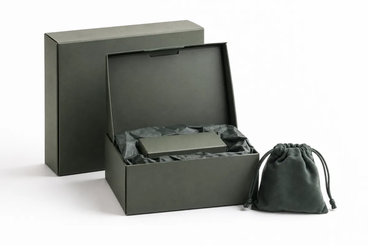
Buyer Fit Snapshot
| Best fit | Brand Packaging Hierarchy projects where brand print, material claims, artwork control, MOQ, and repeat-order consistency need to be specified before quoting. |
|---|---|
| Quote inputs | Share finished size, material target, print colors, finish, packing count, annual reorder estimate, ship-to region, and any compliance wording. |
| Proofing check | Approve dieline scale, logo placement, barcode or warning zones, color tolerance, closure strength, and carton packing before bulk production. |
| Main risk | Vague material claims, crowded artwork, missing packing details, or unclear freight terms can make a low unit price expensive after revisions. |
Fast answer: Brand Packaging Hierarchy: Material, Print, Proofing, and Reorder Risk should be specified like a repeatable production item. The safest quote records material, print method, finish, artwork proof, packing count, and reorder notes in one written spec.
Production checks before approval
Compare the actual filled-product size with the drawing, then confirm tolerance on folds, seals, hang holes, label areas, and retail display edges. Reserve space for logos, QR codes, warning copy, and material claims before decorative graphics fill the panel.
Quote comparison points
Review material grade, print process, finish, sampling route, tooling charges, carton quantity, and freight assumptions side by side. A quote is only useful when the supplier can repeat the same color, closure quality, and packing count on the next order.
If you have ever stood in front of a shelf and felt your eyes bounce from carton to carton without settling on a clear first choice, you already understand what brand packaging hierarchy is trying to solve. I remember a retail reset in Dallas where 14 SKUs from one personal-care line all showed up in the same silver foil, the same 16-point type family, and the same crowded block of claims; shoppers kept grabbing the package that read fastest, not the one with the most features. That is what brand packaging hierarchy means in practical terms: a visual order that tells people what matters first, what comes second, and what should stay quietly in the background.
In practice, what is brand packaging hierarchy is not just logo placement or a polished front panel. It is the way structure, materials, color, typography, finishes, and copy work together so a customer can understand a product family in a few seconds, whether the package is a 350gsm C1S artboard folding carton, a 24pt rigid box, or a pressure-sensitive label on a 500ml bottle. A strong hierarchy helps premium items feel premium, entry-level products feel approachable, and seasonal or limited editions stand apart without breaking the brand system. For Custom Packaging Products, that distinction affects shelf navigation, marketplace click-through, and the unboxing moment in ways that show up in revenue, returns, and reorder speed.
Most brands underinvest here because hierarchy looks simple from a distance. Then the team gets into a supplier meeting in Shenzhen or Dongguan and the conversation turns into a debate over whether the brand name belongs at 18 points or 22 points, whether a matte coat should cover the whole sleeve or stop at the front panel, and whether a line extension deserves its own color family. Those choices are the work. That is what brand packaging hierarchy really controls.
What Is Brand Packaging Hierarchy? A Practical Definition
What is brand packaging hierarchy? It is the ordered visual system that tells customers which products are flagship, standard, seasonal, limited, or entry-level at a glance. I use the word "ordered" on purpose. If every package in a range shouts at the same volume, nothing gets heard, and the shopper has to do extra work just to decode the lineup. That extra work costs you time, attention, and usually the sale, especially when the product sits in a crowded aisle at a Target store or inside a 1,200-pixel marketplace thumbnail.
I still remember a client meeting with a beverage brand that had six SKUs, all printed on identical Custom Printed Boxes with the same dark green field, the same metallic logo, and the same copy block. The sales director thought the uniformity looked elegant. On shelf in Portland, Oregon, it looked like a wall. We fixed the hierarchy by enlarging the master brand on the flagship carton, softening the secondary SKUs, and using one bright orange accent only for the seasonal flavor. What is brand packaging hierarchy in that case? It was the difference between a collection and a pile.
The hierarchy shows up through more than logo placement. Structure matters because a rigid carton, a tuck-end box, and a mailer each create a different reading pattern, and a 1200D rigid board does not behave like a light 14pt folding carton. Materials matter because 350gsm C1S artboard sends a different signal than an uncoated kraft substrate or a 157gsm coated art paper wrap. Color matters because contrast pulls the eye before copy ever gets read. Typography matters because one bold headline outranks four smaller claims. Finishes matter because soft-touch lamination, spot UV, hot foil in copper or silver, and blind embossing all catch attention in different ways. Copy hierarchy matters because the customer cannot absorb six benefits, two ingredients, and a compliance panel in one glance, especially when the package is sitting under warm retail lighting at 3200K.
From a business angle, what is brand packaging hierarchy matters because it improves retail packaging performance and e-commerce clarity at the same time. It gives shoppers a faster route to the right product, keeps brand identity consistent across channels, and makes product packaging easier to scale. I have seen brands cut approval cycles from 18 days to 9 days by locking the hierarchy first and then varying only the two elements that actually need to change, usually the flavor cue and the variant name.
"We did not have a design problem. We had a priority problem." That was how a packaging manager in Atlanta put it to me after a failed line review, and she was right.
That sentence comes up more often than people admit in the packaging industry. What is brand packaging hierarchy is really a decision system for attention, and attention is scarce. The shelf is crowded, the Amazon thumbnail is tiny, and the unboxing moment is over in seconds. A package either communicates its role fast, or it asks too much of the buyer, and that extra friction can cost a brand 3 to 7 percentage points in conversion on a busy retail planogram.
What Is Brand Packaging Hierarchy Across the Shelf?
What is brand packaging hierarchy across the shelf? It is the way a product family makes itself legible from three feet away, which is roughly the distance most shoppers hold a package in a supermarket aisle before deciding whether to take it off the shelf. The customer usually reads a package in sequence: category first, then brand, then tier or variant. If that order gets scrambled, the wrong thing takes the spotlight. A shopper should know whether they are looking at a shampoo, a conditioner, or a styling treatment before they have to decode the ingredient story.
The strongest systems usually behave like editorial layouts. Not every element deserves equal weight. In a magazine spread, the headline is not the same size as the caption, and the caption is not the same size as the footnote. Packaging should act the same way. What is brand packaging hierarchy if not a way to assign visual rank? The flagship SKU gets the strongest contrast and the cleanest face. Supporting SKUs stay related, but they are clearly subordinate. Seasonal items can borrow the core system and still get one signal color, like a Pantone 802C green or a warm metallic gold, so the shopper can spot them quickly.
One of my favorite examples came from a factory floor visit in Shenzhen, where we reviewed 24 cartons in a single family under fluorescent lights that sat around 4100K. The samples looked fine on screen, but on the line table three of them disappeared because they used nearly the same blue tone and the same 14-point subhead. We changed the hierarchy by boosting the brand bar on the main item, shrinking the variant block on the secondary item, and pushing the compliance text lower by 8 millimeters. The line started reading in seconds instead of minutes. That is what brand packaging hierarchy does when it is built correctly.
Channel matters too. Retail packaging has to work from a distance and often under ugly lighting in stores that run 3500K to 4000K fixtures. E-commerce packaging needs stronger close-up cues because the customer sees the listing image or social ad before they ever touch the box, and a 6:5 crop can swallow details that looked large in the design file. Unboxing experience changes the job again: the outer mailer may carry the brand story, while the inner insert or tissue pattern carries the emotional payoff. When the same hierarchy logic runs across all three moments, the brand feels intentional rather than patched together.
Another detail that gets missed often: hierarchy can be expressed through restraint. If a premium SKU has the largest logo, the brightest foil, the deepest emboss, and the busiest claim stack, the design stops reading premium and starts reading noisy. What is brand packaging hierarchy in that case? It is not more decoration. It is clearer emphasis, often achieved by reducing the front panel to two dominant elements and letting everything else support them.
That is why I often compare packaging hierarchy to a retail map. Shoppers do not want to solve a puzzle. They want the shortest route to the right item, whether they are standing in a pharmacy in Chicago or scrolling a category page on a phone with a 390-pixel-wide viewport. The faster the path, the better the conversion.
The Key Factors That Shape Packaging Priority
What is brand packaging hierarchy shaped by? Start with brand architecture. A master brand, a sub-brand, and a product line do not all deserve the same level of prominence. If the master brand is the trust anchor, it needs stronger placement. If the product line is the hero, its name may carry more weight. If the sub-brand is a premium extension, it may need a different finish or structure, but still sit under the main identity. That balance is the center of package branding, and it often becomes clearer when you compare a $12 core SKU with a $48 prestige version in the same assortment.
Consumer perception is the next filter. A $9 hand cream and a $48 hand cream cannot usually wear the same visual language without confusion. Price tier, purchase frequency, target audience, and education burden all affect what should dominate. A repeat grocery item can live with a simpler hierarchy because people already know what they are buying. A new skincare serum often needs more explanation, especially if it includes a 30ml bottle, a retinol percentage, and a clinical claim that needs a footnote. What is brand packaging hierarchy if not a way to match that explanation to the buyer's patience level?
Structure shapes priority too. A folding carton, a rigid gift box, a mailer, a label, and an insert each have different space and handling constraints. Secondary packaging can strengthen hierarchy when it holds the family together and creates a clean opening sequence. It can weaken hierarchy when every component competes for attention. I have seen a sleeve, a tray, and an insert all fight for the same headline treatment on a luxury candle set packed in 2,500-piece batches in Guangzhou. The result was expensive and confusing, which is a terrible combination and a very expensive way to learn a basic lesson.
Production realities matter more than many design teams expect. A two-color flexo label, a four-color offset carton, and a digitally printed short run will not behave the same way under the same brand rules. If you want spot UV, embossing, or metallic foil, you have to know where those finishes actually move the eye, and where they just add cost. For brands planning a strong hierarchy across Case Studies, the production path usually decides which ideas survive contact with the budget, especially when the print quote changes from $0.22 to $0.37 per unit after finishing is added.
What to prioritize first
When I build a hierarchy map, I usually rank the system in this order: brand name, product family, variant name, benefit claim, and compliance text. That order changes if the line is highly regulated or if the market already recognizes the product name better than the master brand. What is brand packaging hierarchy in those cases? It is a controlled set of trade-offs, not a rigid formula that pretends every category behaves the same way.
Here are the main variables I keep in front of the team when we are reviewing a launch in Minneapolis, Nashville, or Long Beach:
- Brand architecture - master brand, sub-brand, and product-line roles.
- Channel - shelf, DTC, marketplace thumbnail, or subscription unboxing.
- Tier - entry, core, premium, seasonal, or limited.
- Material and finish - board grade, coatings, foil, embossing, or spot UV.
- Production method - offset, flexo, digital, or hybrid short-run work.
For parcel-tested packaging, I also look at the shipping standard early. If a mailer needs to survive distribution abuse, I want to know whether the team is working toward ISTA 3A or a similar test profile from ISTA. If the package uses fiber-based material and the client wants a better sustainability story, I check FSC availability at FSC. Those choices do not just affect compliance; they change what brand packaging hierarchy can visibly express, from the stiffness of a 32pt SBS board to the texture of an uncoated 400gsm kraft wrap.
Step-by-Step Process and Timeline for Building It
What is brand packaging hierarchy in execution? It is a process. And if the process is sloppy, the final system will be too. I usually begin with an audit of the current lineup. That means laying every SKU on a table, whether it is a carton, label, pouch, or mailer, and asking one blunt question: what should a shopper see first? The answer should be obvious within seconds. If it is not, the system needs work, especially when the assortment includes 12 SKUs and the only differences are fragrance, size, and channel.
Step one is to identify the gaps. I look for tiers that are too close together, products that look more important than their margin justifies, and seasonal items that accidentally dominate the shelf. Step two is to define the brand rules. That includes logo size, color family, typography scale, finish limits, and how much room the product name gets. Step three is to map each SKU into the hierarchy so every item has a job instead of an opinion. What is brand packaging hierarchy at this stage? It becomes a blueprint, often built in a spreadsheet before it ever reaches Adobe Illustrator.
In a negotiation with a supplier in Dongguan, I had a client insist on five separate foil colors for eight SKUs. The plant manager quietly ran the numbers on a single sheet of paper and showed us the unit cost jump from $0.18 to $0.31 on a 5,000-piece run. We reduced the foil set to two colors, shifted one tier into emboss only, and saved enough to fund a better insert printed on 300gsm coated board. That was a useful reminder: hierarchy is not just visual. It is operational.
After the rules are set, I move into dielines and prototypes. That phase usually takes 7 to 10 business days for an uncomplicated carton system and 12 to 15 business days if the structure changes or the art needs multiple fit checks. If the brand is reviewing Custom Printed Boxes for a multi-SKU launch, I expect at least one round of physical samples. On screen, everything looks balanced. On press, type can shrink, foil can shift, and dark backgrounds can swallow detail. There is no substitute for handling the sample under real light, even if the sample room in Los Angeles is colder than it has any right to be.
The timeline usually looks like this, assuming approval comes back in one round and not three:
- Audit and hierarchy mapping - 2 to 5 business days.
- Brand rules and messaging order - 3 to 7 business days.
- Dieline and layout development - 5 to 10 business days.
- Prototype and sample review - 7 to 15 business days.
- Final approval and print prep - 3 to 7 business days.
Where do delays happen? Usually in approvals. A brand team decides on Tuesday that the serum needs a new claim, the sales team asks for a shelf badge on Thursday, and the compliance team rewrites the footnote on Friday. Suddenly the entire hierarchy shifts. I have seen that happen three times in one month with the same client based in New Jersey. What is brand packaging hierarchy supposed to do in that environment? It is supposed to stay coherent even while the message changes.
If you want fewer surprises, lock the visual rules before the artwork gets too polished. That single move saves more time than most people expect, especially when the vendor is quoting a 12- to 15-business-day production window from proof approval and not from the first email.
Brand Packaging Hierarchy Cost and Pricing Factors
What is brand packaging hierarchy worth financially? More than many teams think, because it can lower costs in some places and raise them in others. A clear system often reduces waste by standardizing dielines, consolidating color usage, and keeping the same board spec across the family. That matters when a brand is shipping ten or more variants and does not want every package to behave like a one-off project, especially when the line moves through a 3PL in Dallas or a fulfillment center in Ohio.
Costs rise when the hierarchy demands too many special moves. Premium coatings, specialty substrates, embossing, foil, and extra print passes all add expense. So do short runs and versioned artwork. If one tier gets a rigid box, another gets a sleeve, and a third gets a mailer, the structural spread can become expensive fast. What is brand packaging hierarchy in cost terms? It is a series of decisions about where to spend and where to stay consistent, and it can be the difference between a $0.15 unit and a $0.62 unit on a 5,000-piece run.
| Hierarchy Approach | Typical Structure | Estimated Unit Cost at 5,000 Pieces | Best For | Timeline |
|---|---|---|---|---|
| Standardized | Same dieline, same board, limited color variation | $0.18 to $0.26 | Fast-moving core SKUs, budget control | 12 to 15 business days |
| Balanced | Shared structure with selective foil, emboss, or spot UV | $0.28 to $0.42 | Mixed tiers, stronger shelf presence | 15 to 20 business days |
| Premium | Custom structure, specialty substrate, multiple finishes | $0.48 to $0.85 | Gift sets, flagship launches, prestige lines | 20 to 30 business days |
Those figures are directional, not a quote. Still, they show the pattern. A more disciplined hierarchy can keep a system in the standardized or balanced band, which is where many growth brands want to live. The cheapest package is not always the cheapest choice if it confuses shoppers, weakens retail packaging impact, or forces reprints because the SKU roles were never clear.
I saw this during a buyer review for a beauty line that wanted every SKU to look premium. The finance lead kept asking why the packaging bill was rising faster than revenue. The answer was simple: the line had no hierarchy, so every package tried to be the hero. Once we split the flagship from the core range, the team could reserve the expensive embellishments for the product that needed them most. What is brand packaging hierarchy if not a budget discipline in disguise?
There is also a hidden cost in poor navigation. A confusing shelf system increases returns, slows replenishment decisions, and makes the sales team spend more time explaining the lineup. When that happens, the package is not only a print asset; it is a bottleneck, and it can drag down sell-through in the first 30 days of launch.
Common Mistakes That Break the Hierarchy
The first mistake is visual sameness. If every SKU looks equally important, the shopper cannot tell the difference between the flagship, the core item, and the entry-level product. I see this most often in families that use the same font sizes, the same color balance, and the same finish on every carton. What is brand packaging hierarchy without difference? It is just repetition, and repetition disappears fast in a shelf set with 60 or 80 competitors.
The second mistake is overdesign. Too many icons, too many claims, too many textures, too many competing colors. A package can become so busy that the main message disappears. In one client review, the front panel had 11 elements, including three badges, two foil treatments, and a diagonal texture that pulled the eye away from the product name. We removed five items, enlarged the category name, and the whole thing read better within hours. The designer did not love it at first, but honestly, the shelf did not care about feelings.
The third mistake is system drift across formats. The carton says one thing, the mailer says another, and the label says something else entirely. That fragmentation makes the brand feel improvised. The best branded packaging systems carry the same logic across every touchpoint, even if the actual structure changes. A rigid gift box can still share the same hierarchy rules as a mailer or a sleeve, even if one is printed in offset litho in Suzhou and the other is produced digitally in California.
The fourth mistake is a mismatch between packaging signal and price point. If the carton looks like a prestige line but the shelf price says entry level, the buyer feels a disconnect. The reverse is true too: a high-margin product wrapped in cheap-looking product packaging can undercut confidence before the shopper even tastes, opens, or tests it. What is brand packaging hierarchy supposed to do here? It should align the visual promise with the commercial promise, ideally within a range that supports the target shelf price like $14.99, $24.00, or $58.00.
Red flags I watch for
- Every SKU uses the same dominant color and no clear secondary cue.
- The logo, product name, and benefit claim all fight for first place.
- One format looks premium while another looks like a placeholder.
- The hierarchy changes without a reason from carton to mailer to label.
- Compliance text is so large that it crowds out the product story.
One quick test helps. Put the packages on a table, step back six feet, and ask two people who were not in the design meeting which product is the hero. If they hesitate, the system is not working yet. That test has saved me from more bad launches than any presentation deck ever has, and that is saying something, especially on projects where a 2-point type shift changed the entire shelf read.
Expert Tips and Next Steps to Put It Into Action
What is brand packaging hierarchy you can actually use tomorrow? Start with a matrix. I map each SKU by tier, margin, channel, audience, and required visual priority. That one page usually exposes the problems faster than a dozen opinions. If the highest-margin item is visually buried, or the core SKU looks weaker than the limited edition, the matrix makes it obvious, whether the assortment has 4 SKUs or 44.
Then test the system in the places where it will live. Shelf mockups matter because distance changes perception. Thumbnail previews matter because many shoppers meet the package online first, often in a 640-pixel product tile. Side-by-side lineup reviews matter because brand families are judged as groups, not isolated items. I have seen a lineup look polished in a design file and chaotic on a shelf board because the type scale was wrong by just 2 points. Two points. That tiny number can create a mess that is annoyingly hard to explain after the fact.
Document the rules before the line grows. Define logo size minimums, color use, typography scale, finish limits, and what can never change. If the brand wants flexibility, create controlled zones for variation: one color band for flavor, one badge for limited editions, one finish for the flagship. What is brand packaging hierarchy if not a set of rules that lets the system expand without falling apart? I have found that a single page of guardrails can prevent 90% of the chaos that shows up in month four of a launch.
For teams starting from scratch, I usually suggest this sequence:
- Audit the current range and identify the least legible SKU.
- Decide which product should own the strongest packaging design.
- Build one prototype system and test it on shelf and on screen.
- Roll the rules across the rest of the lineup before adding new SKUs.
That sequence keeps the work practical. It also saves money because you are not inventing a new design language for every launch. If you need a broader view of format options, material choices, and finishing paths, the right starting point is often a review of Custom Packaging Products paired with a real-world look at what similar brands have done in Case Studies, especially when the factory quotes are coming out of Guangdong or Zhejiang.
My blunt advice: do not let the phrase "what is brand packaging hierarchy" stay theoretical. Turn it into a checklist, a lineup review, and a production rulebook. The brands that win do not just make attractive packages; they make packages that explain themselves quickly, support the brand identity, and keep the system coherent as the catalog grows from 6 SKUs to 36.
If you are rolling out a new line, I am gonna tell you the same thing I tell clients on day one: decide the hierarchy before you fall in love with the artwork. Once the order of importance is clear, the package gets easier to read, cheaper to produce, and much less likely to drift when the next SKU shows up.
What is brand packaging hierarchy in simple terms?
It is the order of importance built into packaging so shoppers instantly know what is flagship, secondary, or entry-level. What is brand packaging hierarchy really doing is using visual signals like size, contrast, finish, and typography to guide attention in seconds, whether the package is a 16oz bottle, a 100ml serum jar, or a 24pt folding carton.
How many tiers should a brand packaging hierarchy have?
Most brands work best with three to five clear tiers instead of trying to create a separate look for every product. The right number depends on assortment size, price spread, and how different the products are in the customer’s mind, so what is brand packaging hierarchy for one brand may be too simple or too complex for another, especially if the line includes core, premium, and limited-edition SKUs.
How do you choose which product gets the strongest packaging design?
Lead with the product that carries the brand story, highest margin, or strongest strategic role in the line. Use the most prominent visual treatment for the SKU that needs the fastest recognition at shelf or in search results, then keep the supporting products related but clearly less dominant, such as reserving foil and emboss for a flagship item priced at $32 while the $14 core item stays simpler.
How much does brand packaging hierarchy affect cost?
A clear hierarchy can cut costs by standardizing materials, layouts, and print specifications across multiple SKUs. Costs rise when every tier needs unique finishes, structures, or artwork versions, and the biggest financial risk is not print price alone but packaging that confuses buyers or weakens conversion, which can turn a $0.21 carton into a $0.39 carton before freight.
How long does it take to build a packaging hierarchy system?
A simple refresh can move from audit to prototype in a few weeks, while a full multi-SKU system often takes longer. Timeline depends on approval layers, artwork complexity, sampling needs, and whether structural changes are involved, so what is brand packaging hierarchy usually gets faster only after the rules are defined first, with many teams landing in a 12 to 15 business day proof-to-sample window.
If you want the short version, what is brand packaging hierarchy is the discipline that keeps packaging legible, commercial, and scalable. I have seen it rescue shelf performance, reduce rework, and make a product line feel much more intentional, which is why I treat it as one of the first strategic decisions in any packaging project.

