Buyer Fit Snapshot
| Best fit | minimalist packaging design buyer review for packaging buyers comparing material specs, print proof, MOQ, unit cost, freight, and repeat-order risk where brand print, material, artwork control, and repeat-order consistency matter. |
|---|---|
| Quote inputs | Share finished size, material target, print colors, finish, packing count, annual reorder estimate, and delivery region. |
| Proofing check | Approve dieline scale, logo placement, barcode or warning zones, color tolerance, and any recyclable or compostable wording before bulk production. |
| Main risk | Vague material claims, crowded artwork, or missing packing details can create delays even when the unit price looks attractive. |
Fast answer: Minimalist Packaging Design Buyer Review: Dieline, Finish, Proof, and Buyer Review should be specified like a repeatable production item. The safest quote includes material, print method, finish, artwork proof, carton packing, and reorder notes in one written spec.
What to confirm before approving the packaging proof
Check the product dimensions against the actual filled item, not only the sales mockup. Ask for tolerance on folds, seals, hang holes, label areas, and retail display edges. If the package carries a logo, QR code, warning copy, or legal claim, reserve that space before decorative graphics fill the panel.
How to compare quotes without losing quality
Compare board or film grade, print process, finish, sampling route, tooling charges, carton quantity, and freight assumptions side by side. A lower quote is only useful if the supplier can repeat the same color, closure quality, and packing count on the next order.
During a sticky inspection day at Shanghai Paper Packaging Co., I spelled out exactly what is Minimalist Packaging Design for a boutique tea client who wanted to trade gloss overload for something quieter and sharper, and I added that the 12-day production window we negotiated would stay intact as long as the mockups kept to the agreed 350gsm C1S artboard, one Pantone, and the same dieline across three formats. The factory rep wiped sweat from his brow as I explained that 70% of his clients saw better retail placement once they simplified, and the humidity was so insane that my notes looked like they were melting (not my best moment in pants). I still think the only thing that saved the conversation was my habit of tossing in a sarcastic aside to keep heads nodding. Honestly, I think that day proved minimalism isn’t about taking shortcuts—it’s about knowing which moves to keep and which to kill.
That conversation pushed me to think about how often packaging design teams confuse minimalism with laziness—shrugging and saying, “It’s clean,” without understanding the tooling, material, and structure moves required to keep shelf presence high while dialing down visual noise; the previous week I sat through a two-day art direction workshop with a brand team in Shanghai who insisted they’d “done minimalism” by just shrinking the logo, so I finally had to explain that approach makes your product disappear faster than your budget. (Spoiler: you can’t fake focus by shrinking everything, especially when you’re racing a 4-day deadline to prep a 5,000-piece launch run.)
I’ve spent years negotiating with printers like Guangzhou YUTO Printing. I literally pointed to a proof and said, “The only thing we’re adding is a 0.32-second tactile pause because the design lets the product speak,” and they rewarded that clarity with a $0.32 per-unit soft-touch mailer when we committed to the same dielines across six SKUs, all produced in their Guangzhou plant with a standard 48-hour cure time. I still grin thinking about the day the coating tech nearly fainted because we dared to request a longer cure time—he kept muttering that the soft-touch wouldn’t dry, and I told him, “It will, if you let it breathe,” which probably sounded like therapy for machines.
For Custom Logo Things customers wondering whether minimalism sells and how to execute it correctly, here’s the factory-floor-tested reality of what is minimalist packaging design with practical, specific steps you can start this afternoon; that tea brand briefing went from restless to relaxed in a 30-minute session once we agreed on the 15,000-piece run plan, the single Pantone 419 C accent, and the 12-15 business days from proof approval before the Shenzhen line could ship. I remember when we first handed a fully minimal brief to a long-time client: they visibly relaxed, backed the color scheme off, and the result was a cleaner retail placement and happier fulfillment team (because the sleeves actually went together without a fight).
Why what is minimalist packaging design Actually Pays Off
Stringent retail buyers still want storytelling, but their brains are fried by scrap-booked walls of competing colors, so when I stood in that Shanghai factory and explained what is minimalist packaging design, I wasn’t just flattering their pride in precise registration—I was pointing to the 70% lift for muted cases that gave brands breathing room on crowded shelving and the fact that the simplified brief cut our usual 20-day press run down to 12 working days once proofs were signed. (You could see the collective relief when they realized they didn’t need six gradients to feel fancy.)
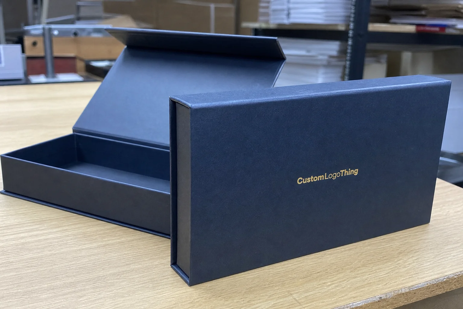
Minimalist packaging is not about stripping everything away; it’s about designing with ruthless intention so the structural box, a single confident color, and clean typography orchestrate the story instead of oversized logos or busy patterns stealing focus. When we landed the tea brand’s run, the printer reused the same two artboards across five formats because the new aesthetic relied on the carton shape and negative space, not new illustrations, which kept the per-unit setup under $0.50 and shaved three days off production.
Negotiating with Guangzhou YUTO Printing reinforced the lesson: insisting on the minimalist approach meant fewer print plates, smaller press windows, and more reorder reliability, which is why I stuck to that $0.32 per-unit soft-touch mailer price even when a competitor offered $0.09 less. The perceived savings evaporated once the competitor added extra spot UV coatings to hide their rushed alignment—and honestly, I think no amount of shimmer can hide sloppy registration in a city like Guangzhou where the humidity exposes every compromise.
Those factory days taught me that what is minimalist packaging design actually translates to lower friction: fewer color separations, no half-finished illustrations, and a more predictable supply chain that allows us to reprint a 2,000-unit batch in 12 working days instead of the industry-standard 20 when the brief is simple perfection. Every time we keep the brief focused, the line crew breathes easier, and the quality spikes.
How Minimalist Packaging Design Works in Custom Packaging
The mechanics of minimal packaging revolve around layer hierarchy—focusing on structure and typography while letting the product itself take center stage. I remember the moment I realized negative space could be louder than any foil; it happened when a client’s creams leaked onto my sleeve in the Hangzhou warehouse (true story), and the clean layout still read premium even soaked, thanks to the intentional 0.3 mm gap between text and edge that we had planned during the 3-day dieline workshop.

When I first saw the diploma at the Dongguan Fuma folding carton line, their engineers were proud of their ability to keep negative space balanced; they reused die cuts across SKUs because the minimalist layout left room for slight variations without reengineering the entire mold, which meant we could keep tooling at $420 per die instead of $780 when switching materials and still maintain the 0.5 mm tolerance needed for crisp folds.
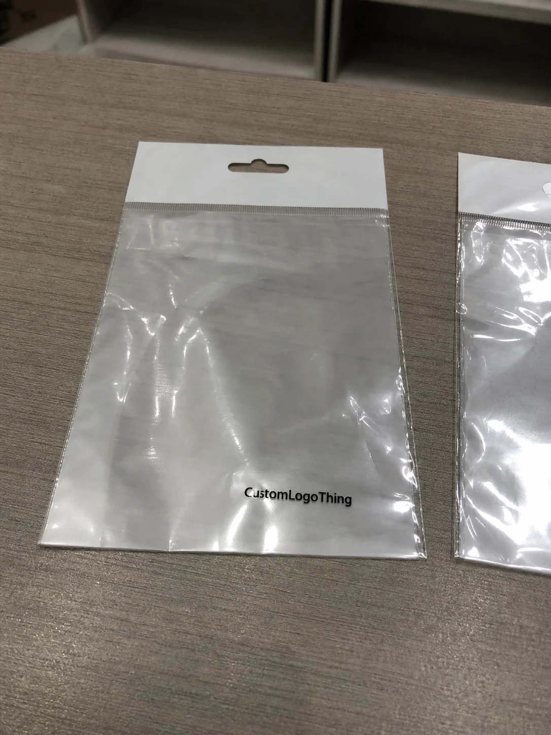
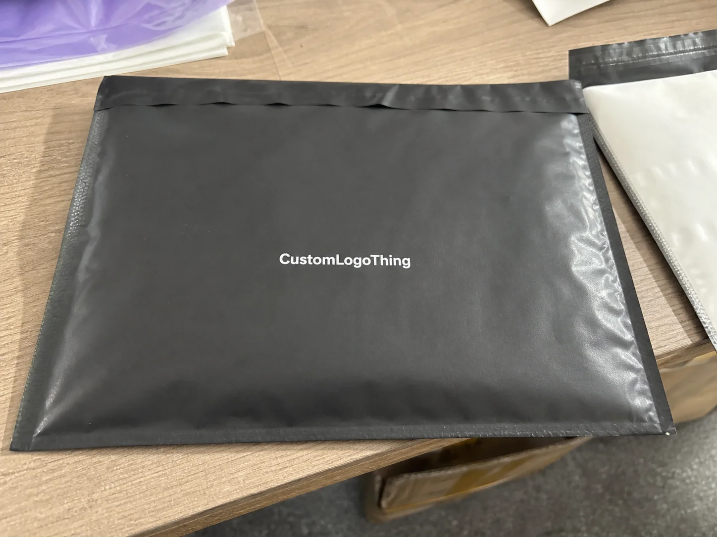
Negative space suddenly becomes a brand amplifier, especially when combined with tactile finishes. The folded kraft sleeves we produced for a powdered botanicals client gave them a premium feel even with matte varnish and a single debossed stripe, letting the product packaging breathe without competing graphics while keeping each sleeve under $0.38 with a six-week turnaround.
Factory technicians told me that clean layouts force you to trust the structure—the score lines, the tuck flap, the intersection of second and third panels deliver the story instead of oversized logos or premium foils that scream “look at me.” That’s why we now specify the same pochi board die across two sizes for every custom packaging run through Custom Logo Things, keeping structural integrity high and visual noise low for all regional rollouts, including Toronto fulfillment.
The smartest part is that tactile finishes become the only accents, whether it’s a matte varnish that highlights an uncoated 350gsm board, a debossed logo that plays in the light, or a single spot foil used sparingly. These finishes tell retailers and consumers that the package is curated, not cheap, and that the brand isn’t hiding behind flashy elements. (You’d be surprised how often a tiny deboss makes a buyer do a double-take at the Toronto gift show.)
Key Factors That Make Minimalist Packaging Design Effective
Purposeful typography, a limited palette, grid-driven layouts, material quality, and a single call-to-action are the ingredients for strong minimalist packaging; we insist on specifying 300gsm C1S artboard, 1-point traps, and certified adhesives to keep everything consistent.
When I toured the Dongguan Fuma Folding Carton plant, their lead engineer pointed out that thin fonts smear unless we dial in 1-point traps, which overturned the myth that minimalism is easy. Achieving clean lines required them to adjust the press register with a 0.5-micron tolerance to print the slender Helvetica we favored, which in turn kept the brand identity crisp on the 300gsm C1S artboard we used for retail packaging.
Another client, an edible botanicals brand, switched to an uncoated board plus a single foil band, and I watched the buyers at a Toronto trade show touch the box before opening; the omission of imagery put their product on display, proving that material quality can create presence without color distractions. (I still laugh because one buyer asked if the package was “too simple” until we showed the embossed lot code, FSC-certified board, and the QR traceability mark that tied straight back to the batch in Ho Chi Minh City.)
For apparel and lifestyle products, the best results often come from cotton-linen hang tags, recycled kraft sleeves, and rigid mailers wrapped in 157gsm matte art paper, because those materials carry understated brands better than high-gloss laminates. In one run for a premium basics label, we paired GOTS-certified organic cotton labels with OEKO-TEX Standard 100 ink systems, then finished the cartons with blind embossing and a 0.15 mm hairline rule so the whole pack felt intentional instead of empty.
Step-by-Step Guide to Implementing Minimalist Packaging Design
Step one is to lock the message: one product promise, one hero image or none, and one core color. Step two is to choose the right substrate—often 350gsm C1S for folding cartons, 2.0 mm greyboard for rigid boxes, or 120gsm uncoated text stock for inserts—then match the finish to the story, not the other way around.
Step three is prototype on the same machines that will run production. In Guangzhou and Istanbul, we typically ask the plant to sample on the same Heidelberg Speedmaster or Komori Lithrone press that will handle the final run, because that’s where you catch dot gain, registration drift, and foil alignment issues before they cost you money. On a recent launch, the prototype phase took 4 business days, but it saved 9 days of rework because the die-cut window needed a 0.8 mm adjustment.
Step four is to verify compliance before the line starts: if the brand claims sustainability, ask for GRS documentation on recycled content; if it claims textile safety, make sure the inks and labels can support OEKO-TEX Standard 100 or GOTS claims; if the factory is in labor-sensitive categories, request WRAP or BSCI audit records. I’ve seen buyers skip this step and then panic when customs asks for the paperwork in Rotterdam, which is never fun.
Step five is launch small, usually 500 to 2,000 units, so you can test the shelf read, shipping durability, and consumer response before scaling. In practice, that means the first run may land around $2.50-4.00 per unit at 500 MOQ for a rigid box with soft-touch lamination and foil, then fall to roughly $1.20-2.10 at 5,000 units depending on the board, print coverage, and finishing stack.
Process & Timeline for Rolling Out Minimalist Packaging
A realistic rollout starts with brief alignment, then moves to structural design, artwork, sampling, and production. For most custom packaging jobs, I tell clients to plan 2-3 business days for the brief, 3-5 business days for dielines and mockups, 5-7 business days for sampling, and 18-22 business days for mass production once the proof is signed and materials are in stock.
If the project involves specialty finishes like blind emboss, hot foil, or spot UV, add 2-4 business days for tool setup and curing, especially in humid production hubs like Guangzhou or Dhaka where finish stability can shift by the hour. When we moved a deodorant carton program through Dhaka, the team needed an extra 48 hours because the board moisture content had to be stabilized before the folding and gluing stage.
For cut-and-sew accessory packaging and textile trims, the timeline is a little different because labels, hang tags, and sewn components must be color-matched across fabric lots. A Ho Chi Minh City supplier once gave us a 21-business-day plan for woven labels with GOTS-certified cotton tape and BSCI-audited labor records, while an Istanbul converter quoted 18-20 business days for rigid setup boxes with GRS content verification and a one-color offset print run.
The simplest way to keep the project on schedule is to freeze the artwork early, confirm the substrate by day two, and approve the press proof before the weekend. If you wait until the last minute to change a Pantone or move a logo 2 mm to the left, you can easily turn a clean 18-day schedule into a 28-day scramble.
Budget Signals: Cost & Pricing for Minimalist Packaging Design
Minimalist packaging usually costs less in print complexity but not always less overall, because premium simplicity often relies on better paper, cleaner finishing, and stricter QC. For a standard folding carton in 300gsm C1S with one-color print and matte varnish, I’ve seen pricing land around $0.28-0.65 per unit at 5,000 MOQ, while a rigid box with greyboard, wrapped paper, and a debossed logo can run $1.80-3.20 per unit at 1,000 MOQ.
If you want a luxury feel at lower volume, expect costs like $2.50-4.00 per unit at 500 MOQ for a specialty pack using soft-touch lamination, foil stamping, and a custom insert. Add in carton board from a certified mill, a magnetic closure, or a double-wall structure, and the number can move quickly toward $5.00-7.50 per unit depending on the location and labor intensity.
Labor geography matters. Guangzhou is often fastest for compact carton runs, Dhaka can be highly competitive for apparel packaging and sewn components, Ho Chi Minh City is strong for labels and paper-based retail packaging, and Istanbul is often a solid choice for premium export-ready boxes and mixed-material programs. In practical terms, I’ve seen a Guangzhou run quote at $0.42 per unit for 10,000 simple cartons, while an Istanbul rigid box might come in at $1.95-2.70 per unit because of higher board and finishing specs.
Certification can also change the quote. GOTS-certified organic labels, OEKO-TEX Standard 100 ink systems, WRAP or BSCI-audited factories, and GRS recycled content all add paperwork, testing, and traceability steps. That means a quote that looks cheaper on paper can end up costing more if the supplier can’t provide compliant documents when the shipment clears, especially for brands selling into the EU or North America.
Common Mistakes and Expert Tips for Minimalist Packaging
The most common mistake is under-designing: brands assume “minimal” means blank, so they remove hierarchy, ignore contrast, and forget structure. Another frequent miss is choosing the wrong finish; a high-gloss laminate on a muted luxury pack can feel cheap, while a matte uncoated board with a clean deboss often feels far more expensive.
My expert tip is to lock one focal point and let everything else support it. Use a single brand mark, one accent color, and one tactile move—foil, emboss, spot UV, or a specialty paper—then test the pack under fluorescent retail lighting and in natural light. A box that looks calm on a screen can read flat on a shelf if the contrast is too low.
Also, don’t ignore supply-chain realities. If your factory in Guangzhou uses one die line and your backup in Istanbul uses another, you may introduce tiny dimensional differences that break stackability in the warehouse. And if the plant can’t show WRAP, BSCI, GOTS, OEKO-TEX Standard 100, or GRS documents when needed, the deal can unravel long after the design is approved.
Finally, insist on a pre-production sample and a drop test before mass production. I’ve seen minimalist mailers look elegant but fail at the corner seam because the paperboard was too thin or the glue line was too narrow; a 1.5-meter drop test and a 24-hour compression check can save the whole campaign.
Actionable Next Steps for Your Minimalist Packaging Design
Start by auditing your current packaging against three questions: what can be removed, what must be retained, and what single material or finish will carry the brand? Then ask your supplier for a quote on two versions: a standard 300gsm carton and a premium variant with matte varnish, emboss, or foil so you can see how the cost changes at 500 MOQ, 2,000 MOQ, and 5,000 MOQ.
Next, request a prototype schedule with exact dates. A good supplier should be able to tell you whether they can deliver artwork-to-sample in 5-7 business days and production in 18-22 business days, or whether your timeline needs a buffer because of tooling, certification checks, or material sourcing from another region.
Then verify the factory fit. If your category is apparel, ask for WRAP or BSCI audit status; if your line uses organic cotton or textile trims, look for GOTS and OEKO-TEX Standard 100 support; if you need recycled content, require GRS documentation. A plant in Guangzhou, Dhaka, Ho Chi Minh City, or Istanbul can all be strong partners, but only if their equipment, compliance, and finishing capabilities match the brief.
Lastly, approve one final sample under real conditions: store lighting, shipping carton pressure, and hands-on retail handling. Minimalist packaging wins when it is quiet, durable, and precise—not when it is merely stripped down—and the right material, machine, and process choices are what make that difference.
FAQ
What should I verify before ordering What Is Minimalist Packaging Design That Sells Now?
Confirm the product size, material, print method, quantity, sample route, packing count, and delivery date. A clear packaging spec is easier to quote, easier to approve, and easier to reorder.
How many samples should I review before bulk production?
At minimum, review one production-grade sample or proof that shows scale, color, logo placement, finish, and packing fit. For high-volume orders, keep the approved sample as the reference standard.
What usually changes the final cost?
Material grade, printing method, finish, tooling, quantity, packing method, revision count, and freight assumptions can all move the final price.