Why This Woven Label Beanies Logo Placement Guide Starts With a 1-Inch Shift
A woven label Beanies Logo Placement guide sounds overly narrow until a buyer approves a clean digital mockup, receives the first sample, and realizes the logo disappears once the cuff is folded on an actual head. One inch can do that. On a flat proof, the label may look centered, crisp, and retail-ready; on a stretched rib-knit cuff, it can sit too low, curve around the forehead, or fall into the shadow created by the fold.
Beanies are not flat advertising panels. A cap front panel has structure. A folding carton has a fixed print area. Even a hang tag behaves predictably once the die line is approved. A beanie moves, stretches, compresses, and changes shape by wearer, yarn type, rib construction, cuff depth, and styling choice.
Most logo placement problems are not caused by bad artwork. They are caused by loose measurement. The label may be well woven, the color match may be reasonable, and the beanie itself may be perfectly wearable, but if nobody confirms cuff height, center front, side seam, fold line, and intended wearing style before bulk sewing begins, the finished run can still look uneven.
For clarity, a woven label is a sewn branding piece made from threads, usually damask, satin, or taffeta. It is different from direct embroidery, which stitches into the beanie fabric. It is different from a leather or faux-leather patch, which adds thickness and a more rugged surface. It is also different from heat transfer branding or printed care labels, which bring their own limits on stretch, wash durability, and texture.
This guide is written from a buyer's point of view: where to place the label, how large it should be, what each beanie style changes, which quote details matter early, and which checks prevent a full run of winter hats that look slightly off before anyone can explain why.
Buyer reality check: if the placement cannot be described in measurements, it cannot be repeated reliably across 500, 5,000, or 50,000 beanies.
How Woven Labels Work on Cuffed, Slouchy, and Fisherman Beanies
The beanie silhouette decides how much logo space you actually have. Three shapes cover most custom orders: cuffed beanies, slouchy beanies, and fisherman beanies. Each gives the label a different visual field, and each creates a different distortion risk once the hat is worn.
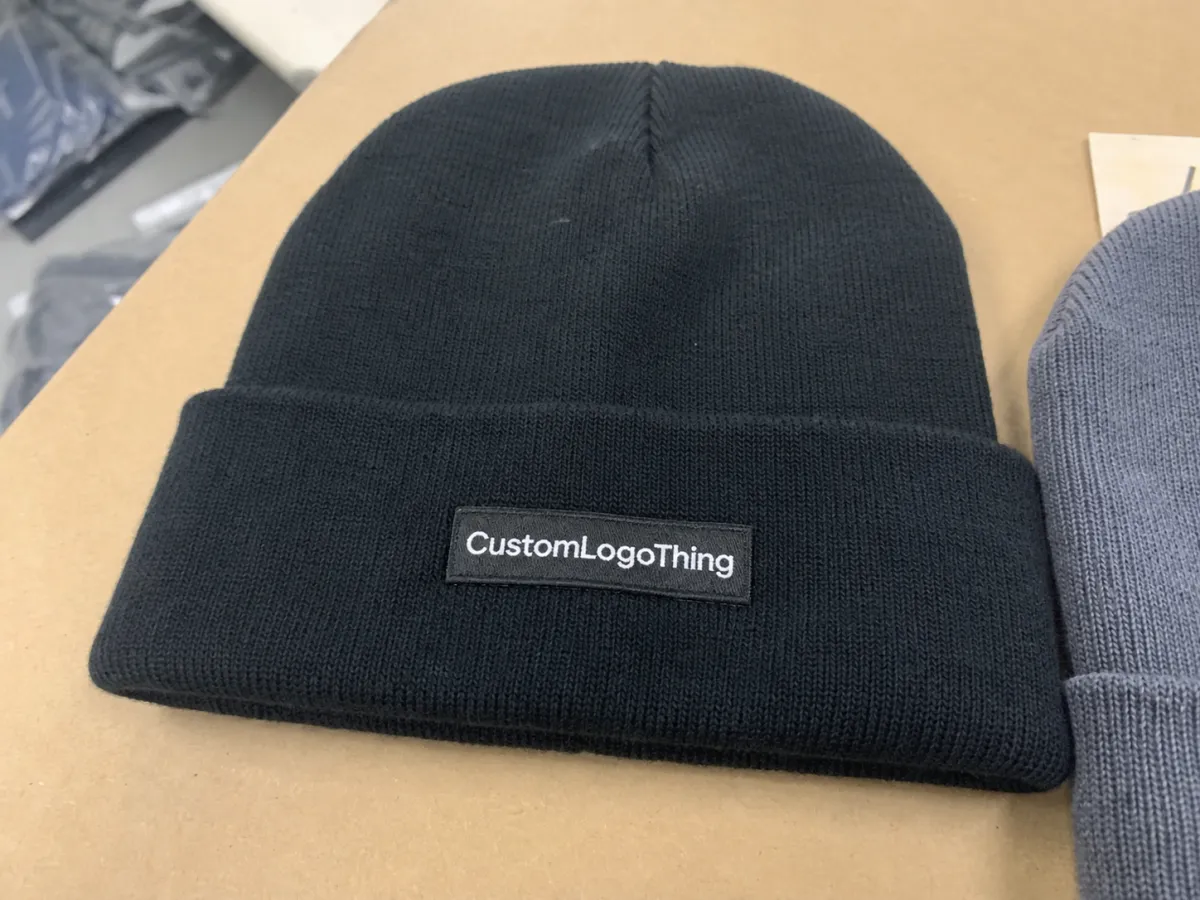
Cuffed beanies are the most placement-friendly. The folded cuff creates a defined branding zone, often 2.5 to 3.5 inches tall on common retail styles. A mid-size woven patch can sit front-center with enough room above and below for stitching. For merch, campus shops, corporate gifting, outdoor staff apparel, and event uniforms, this is usually the safest structure because the label has a stable home.
Slouchy beanies are less predictable. The logo may sit lower on the head, drift off-center, or wrinkle if it is placed where the fabric looks best on a table rather than where it naturally rests when worn. A smaller patch, side label, or low-profile tab often performs better than a tall front patch, especially on a loose-gauge knit with more drape.
Fisherman beanies have a shorter profile and often a shallower cuff, sometimes around 1.75 to 2.25 inches. That smaller field changes the math. A tall label can overpower the hat or crowd the fold edge. Clean artwork, compact dimensions, and careful vertical placement matter more than trying to preserve every element from a full-size brand mark.
Label construction changes the result as much as the hat shape. Flat sew-on labels work well for patch-style branding. Center-fold labels create a small folded tab look. End-fold labels hide raw ends and produce a neat edge. Loop labels can sit over a cuff edge for a boutique or streetwear feel. Patch-style woven labels remain common for retail because they make the logo feel intentional, almost like a badge rather than an afterthought.
The weave quality deserves early attention. Damask labels can hold smaller detail than many lower-density options, but tighter weave density can increase cost and sometimes adds proofing time because the artwork has to be translated more carefully into thread. If the logo has fine text, thin outlines, or a small icon, review the label specs alongside the beanie specs, not after the hat style has already been locked. Custom Logo Things' Custom Labels & Tags category is a useful reference point for comparing label constructions before a beanie order moves into sampling.
Placement Factors That Decide Visibility, Comfort, and Retail Appeal
Front-center placement is the default for practical reasons. It photographs cleanly, reads quickly, and matches what buyers expect from branded winter accessories. If the beanie is for ecommerce, a ski club, a brewery merch table, a school store, or a corporate gift kit, front-center usually gives the strongest visibility with the lowest alignment risk.
Side placement is quieter. It suits premium retail, outdoor brands, fashion-led drops, staff uniforms, and corporate programs where recognition matters but the beanie should not feel like a billboard. The tradeoff is straightforward: side labels can look more refined, but they are easier to miss in product photos, group shots, and event footage.
Cuff height is the measurement buyers underestimate most. A deep cuff can support a larger woven patch, often around 1.5 x 2.5 inches or 1.75 x 3 inches depending on the knit and logo shape. A shallow cuff may need a small tab label around 0.5 x 1.5 inches or a compact patch around 1 x 2 inches. The exact number depends on the beanie, but the rule stays consistent: leave breathing room above and below the label so it looks placed, not squeezed.
Safe area matters in woven artwork. If the logo includes text, an icon, or a border, leave margin so the sewing line does not crowd the brand mark. A practical safe area is often 1/8 inch inside the edge, sometimes more for thick borders or high-contrast thread. Tiny text below roughly 5 to 6 points may close up during weaving, especially on lower-density labels or designs with multiple color changes in a small area.
Color contrast is another quiet culprit. A black beanie with charcoal thread can look expensive up close. In warehouse uniforms, event giveaways, or ecommerce thumbnails, it can disappear. Higher contrast branding usually works better for giveaways, sports teams, staff apparel, and retail photography. Tonal branding can be right for premium gifting or fashion collections, but only if reduced distance visibility is accepted from the beginning.
Comfort deserves the same attention as visibility. A scratchy backing, thick edge, or poorly placed stitch can create complaints even when the front looks correct. If the label penetrates the cuff and the wearer feels rough thread on the inside, the beanie may fail in use. Ask whether the backing, stitch method, and inside finish have been checked on the actual beanie, not just on a loose label sample.
| Placement Option | Best Use | Typical Label Size Range | Risk to Watch |
|---|---|---|---|
| Front-center cuff patch | Retail, merch, corporate gifts | 1 x 2 in. to 1.75 x 3 in. | Too tall for cuff depth |
| Side cuff label | Premium apparel, staff uniforms | 0.75 x 1.5 in. to 1.25 x 2 in. | Less visible in photos |
| Loop label over cuff edge | Boutique, streetwear, subtle branding | 0.5 x 1 in. to 0.75 x 1.5 in. | Alignment and fold consistency |
| Oversized woven patch | Statement merch, limited drops | 2 x 3 in. or larger | Puckering, stiffness, visual imbalance |
Production Steps and Timeline From Artwork to Finished Beanies
Placement is not only a design decision. It is a manufacturing instruction. The usual process starts with the buyer submitting logo files, then the supplier reviews the artwork, recommends a label type and beanie style, creates a digital proof, provides a sample or pre-production photo, and starts bulk sewing after approval.
Vector artwork is the cleanest starting point. AI, EPS, SVG, or vector PDF files usually translate better into woven labels than low-resolution PNG or JPEG images. A 300 dpi raster image may look acceptable on screen, but weaving is not printing. Thread has physical width. Gradients, hairline borders, shadows, distressed textures, and photographic effects usually need to be simplified before they can be woven cleanly.
Proofing should be specific rather than decorative. Confirm the label width and height. Confirm the distance from the cuff bottom, usually measured from the lower folded edge to the bottom of the label. Confirm centerline alignment, thread colors, fold type, stitch color, and whether the beanie shown in the proof is the exact style and color being ordered.
Lead times vary by supplier, season, and freight method, but the sequence is predictable. Artwork review may take 1 to 2 business days if the file is clean. Label weaving can add several business days. A sewn sample adds more time because the label must be produced, applied, photographed or shipped, and approved. Bulk sewing, finishing, packing, and freight drive the final schedule. A reorder using an approved control sample should move faster than a first order, but only if the same beanie style, label construction, and placement are being repeated.
Risk rises when buyers change thread colors after proofing, switch from a cuffed beanie to a fisherman style, or skip sample approval to save a few days. That shortcut can be expensive. A seasonal order for holiday gifting, winter retail, ski events, campus programs, or employee uniforms should carry buffer time because yarn availability, label loom scheduling, sewing capacity, and shipping lanes can tighten at the same moment.
If the beanies ship as part of boxed kits, broader packing and transport planning may also matter. The International Safe Transit Association offers useful distribution testing principles for cartons and packed goods. If paper hang tags, sleeves, or retail cartons are included, FSC certification may be relevant for buyers tracking responsible fiber sourcing.
Cost, MOQ, and Quote Variables Buyers Should Check Early
Woven label beanie pricing is shaped by two products: the beanie and the label. That is why unit price alone can mislead. One quote may include label weaving, sewing, sampling, polybagging, carton packing, and freight. Another may show a lower unit cost but exclude several of those items.
The major cost variables are predictable: beanie material, knit weight, cuff style, label size, weave quality, number of thread colors, fold type, sewing complexity, order quantity, sample needs, packaging, and shipping. Acrylic beanies often price differently from wool blends, recycled polyester, or heavier rib-knit styles. A larger damask patch with six thread colors will not cost the same as a simple two-color tab label.
MOQ behavior is usually logical. Custom woven labels become more economical as quantity increases because setup, loom preparation, and sewing setup spread across more units. A 100-piece order can carry a noticeably higher label share per unit than a 1,000-piece run. That does not mean small orders are impossible; it means the quote should be read with setup and application costs in mind.
Unit cost tradeoffs deserve scrutiny. A larger label can improve shelf impact, yet it can raise thread use, sewing time, and defect risk if placement must be extremely precise. Saving $0.06 per label may look efficient on a spreadsheet. Losing visual consistency across a retail run can cost far more in perceived value.
Ask for a line-item quote. Separate the beanie blank, woven label production, label application, sample, packaging, cartons, and delivery. If relabeling, hang tags, individual polybags, size stickers, barcode labels, or carton marks are required, call them out before comparing suppliers. The Custom Labels & Tags page can help buyers separate the label decision from the beanie decision before approving a full quote.
| Quote Variable | Typical Buyer Question | Why It Changes Cost |
|---|---|---|
| Label size | Can this logo fit a 1 x 2 in. patch? | Larger labels use more thread and sewing time |
| Thread colors | Can we reduce from six colors to four? | More colors may increase setup and approval effort |
| Fold type | Should we use flat, end-fold, or loop labels? | Different constructions affect finishing and sewing |
| Sampling | Can I approve a sewn sample photo? | Samples add time but reduce bulk-run risk |
| Packaging | Are polybags, hang tags, or cartons included? | Finishing steps add labor and materials |
Common Logo Placement Mistakes That Make Beanies Look Off
The first mistake is approving placement on a flat mockup only. A beanie can look balanced in a front-view rendering and still fail on a head form. Ask for a worn-angle photo if the order is new, the label is large, the knit is stretchy, or the placement is not front-center.
The second mistake is using a label that is too tall for the cuff. If the patch crowds the fold edge or sits too close to the top of the cuff, the branding feels accidental. A 1.75-inch-tall label may work on a deep cuff and look cramped on a fisherman beanie.
Off-center placement is more common than buyers expect. Side seams, rib changes, cuff joins, and even the way the beanie is pressed for photography can shift the apparent centerline. A measurement standard such as "center front, bottom of label 0.5 inch above cuff bottom" is much stronger than "place logo in the middle."
Detailed logos create another trap. Woven labels can hold impressive detail, but thread is still thread. Fine taglines, thin outlines, tiny registered marks, and delicate gradients can close up during weaving. The result is not premium. It is muddy. Simplify before production, especially for labels under 2 inches wide.
Stretch is the final test. A label sewn too tightly can pucker the knit around the edges. Loose stitching can lift after wear or washing. Placement can also fail if the buyer never defines the wearing style. A logo intended for a folded cuff may land strangely if customers wear the beanie unfolded, and a slouchy style may shift the patch lower than expected.
The practical fix is to treat placement as a production control issue. A logo position is not finished because it looks good in a mockup; it is finished when the measurement, sample, and approval reference all match.
Expert Tips for Cleaner Samples, Photos, and Bulk Orders
Request a physical sample or detailed production photo for first-time orders. Be especially firm about this if the label is large, colorful, tonal, or placed anywhere other than front-center. A sample can reveal distortion that a digital proof hides.
Photograph the sample from straight-on, side, and worn angles. Ecommerce thumbnails expose contrast problems. Event photos expose distance-read problems. Retail displays expose crooked placement because several beanies sit together, and the eye quickly spots inconsistency. A single front-view image rarely tells the whole story.
Keep a placement spec sheet. It should include label width, label height, distance from cuff bottom, horizontal center point, stitch color, approved beanie style, approved beanie color, thread colors, and fold type. One page is enough. The point is control, not paperwork for its own sake.
Simplify artwork before weaving. Increase small text size. Remove unnecessary gradients. Thicken fine lines. Choose thread colors that survive warehouse lighting, outdoor shade, and phone photography. A logo that looks refined in a brand guideline PDF may need adjustment for a 1.25-inch woven patch.
Match contrast to the use case. Contrast works for merch, giveaways, sports programs, trade shows, and staff apparel where recognition matters. Tonal labels can suit premium retail, fashion drops, and executive gifting, but subtlety must be the goal rather than a surprise discovered after the first photos are taken.
Order extra units for events or retail launches. Reorders may face dye-lot variation, label batch differences, or longer seasonal lead times. Even a small buffer of 3% to 5% can help cover last-minute additions, damaged units, photo samples, or replacements.
Keep one approved production sample as the control reference. Store it with the spec sheet. For repeat orders, that sample can prevent debates about whether the label should sit higher, lower, brighter, darker, larger, or smaller.
Build a Beanie Placement Brief Before You Request Samples
A placement brief does not need to be complicated. It needs to be measurable. Choose the beanie silhouette, define the cuff height, select the label type, set the label dimensions, mark preferred placement, confirm logo simplification, and specify thread colors. That small document can save days of back-and-forth.
Prepare three files before requesting a quote: vector logo artwork, a reference image showing desired placement, and a quantity breakdown by beanie color or size if applicable. If the order includes hang tags, individual bags, cartons, barcode stickers, or retail labeling, include those requirements too. Packaging details affect handling time, freight dimensions, and final landed cost.
Ask the manufacturer four direct questions:
- What label size fits this cuff without crowding the fold?
- Will the logo remain legible when woven at that size?
- Can I see a sample photo on the actual beanie style and color?
- Which changes affect cost or lead time?
The strongest supplier response will not be only a low unit price. A capable partner asks about use case, wearer, artwork detail, placement tolerance, packaging, and timeline. That curiosity is quality control, especially for a product that stretches, folds, and changes shape in use.
Use this Woven Label Beanies logo placement guide as a starting point, then convert it into exact specs: label size, cuff measurement, centerline, stitch method, thread colors, sample approval, and reorder control. A one-page placement brief gives the buyer and manufacturer the same reference for proofing, sampling, bulk production, and future reorders.
FAQ
What is the best placement for a woven label on beanies?
Front-center on the cuff is usually the safest placement because it is visible, easy to align, and strong for retail photos, merch programs, and corporate gifts. Side placement works better for subtle branding, fashion-focused beanies, or premium programs where the logo should feel less promotional. Confirm the final choice on the actual beanie style because cuff height, rib texture, and stretch can change how the label reads.
How big should a woven label be on a cuffed beanie?
A practical label size depends on cuff depth, but the label should leave clear space above and below so it does not crowd the fold or seam. Small tab labels suit understated branding, while mid-size woven patches work better when logo visibility is the priority. If the logo has small text or fine lines, increase the label size or simplify the artwork before weaving.
Does woven label placement affect beanie cost?
Yes. Placement can affect cost when it changes sewing time, requires tighter alignment, uses a larger label, or calls for special fold styles. Front-center placement is often more efficient than unusual angled, side, or multi-label placements. Ask for a quote that separates the label, sewing, sample, packaging, and shipping costs so placement-related charges are visible.
How long does it take to produce woven label beanies?
Timing depends on artwork readiness, label weaving, sample approval, beanie availability, bulk sewing, finishing, packing, and shipping method. A first order usually needs more time than a reorder because the logo must be translated into thread and placement must be approved. Seasonal demand can extend lead time, so winter launches, holiday gifts, and event orders should be planned with buffer time.
Should I choose woven labels or embroidery for beanie logo placement?
Woven labels are a strong choice for detailed logos, consistent brand patches, and retail-style presentation. Embroidery can look classic and durable, but very small text or complex artwork may become bulky on knit fabric. Choose based on logo detail, desired texture, budget, and whether the beanie should feel like branded merch, retail apparel, or a premium gift.