A Zipper Pouches for Apparel logo placement guide sounds oddly specific until the first production run lands and the logo sits half-hidden behind the zipper track. Or it looks centered on an empty pouch, then slides visually off-center once a hoodie goes inside. Great. Now the packaging is arguing with the product.
“If the logo fights the zipper, the garment loses the first impression.” Small issue in a PDF. Loud issue on a shelf.
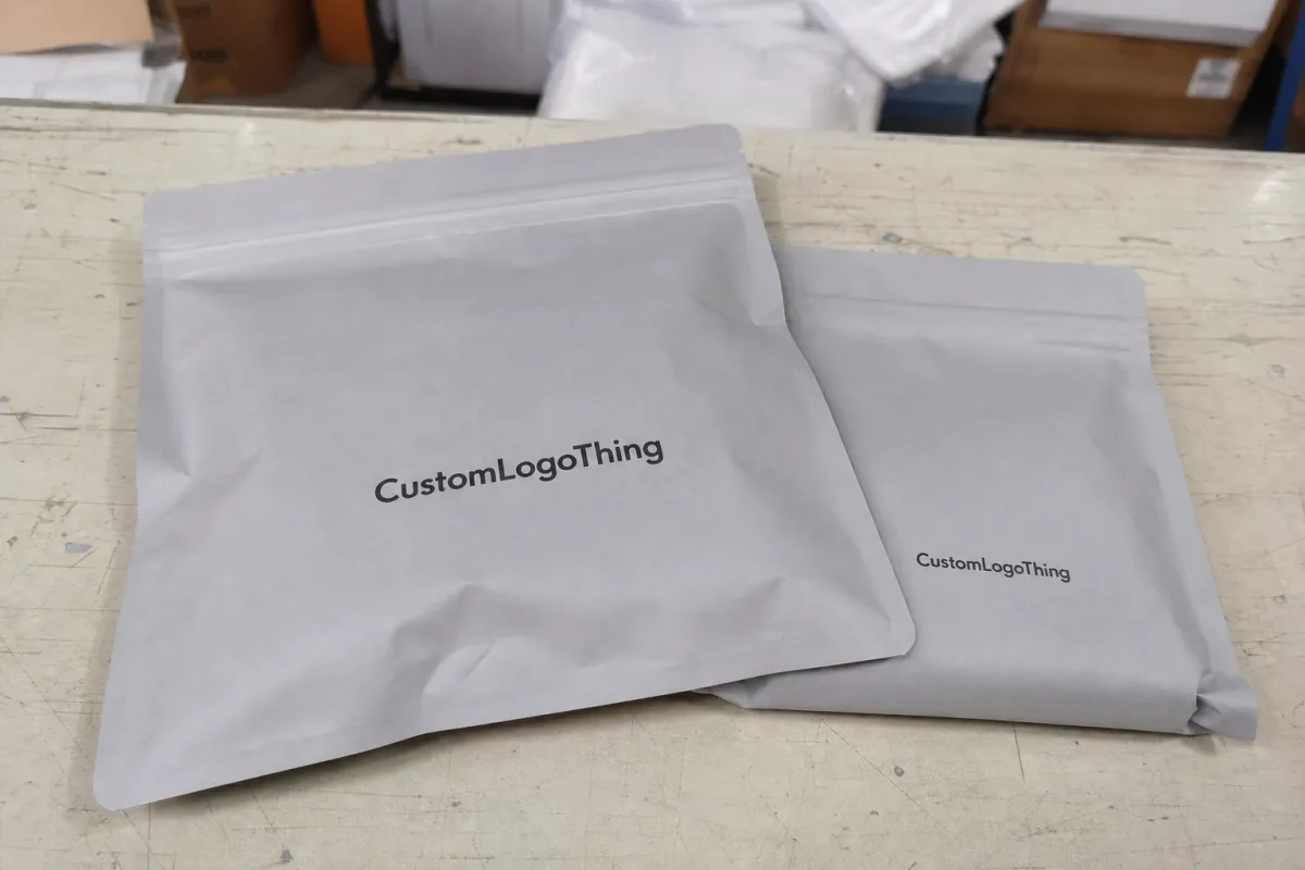
Apparel zipper pouches are usually reusable plastic bags made from PE, LDPE, EVA, PVC, or mixed plastic films. They are used for T-shirts, hoodies, socks, swimwear, uniforms, underwear, activewear, sample kits, and promotional apparel sets. The basic job is protection and presentation. The harder job is making the pouch look intentional after fabric has shifted, folded, compressed, and created lumps exactly where the design file assumed everything would stay flat.
That is the real production problem. Printed graphics stay fixed. Apparel does not.
Logo placement affects brand recognition, scanability, product orientation, retail display, e-commerce photography, and whether the pouch feels reusable or disposable. A clear placement brief helps the supplier quote accurately, sample correctly, and print once. A vague “put the logo in the middle” brief often leads to proofs that look fine and finished bags that do not.
Zipper Pouches for Apparel Logo Placement Guide: What Buyers Miss
Most buyers start with the artwork. Better buyers start with the packed pouch. That one change prevents a lot of ugly surprises.
A logo centered on the flat bag file may land too high after a folded tee is inserted. A mark that looks balanced on a blank front panel may drift into the visual weight of the zipper once the pouch is filled. A perfect mockup on a white background may become unreadable when dark navy fabric sits behind clear plastic.
Retail judgment is quick. A shopper does not study a pouch like a brand team studies a deck. They glance, register the mark, check size or color, and move on. If the logo is blocked by glare, a barcode, a hang hole, or a bulging fold, the brand signal weakens before the garment is even touched.
Reusable pouches raise the stakes. A restrained, well-spaced logo can make the bag feel worth keeping for travel, storage, or laundry organization. A crowded layout with a loud mark, size sticker, barcode, warning copy, and zipper all fighting for the same small panel usually gets thrown away. That is not a moral failure. It just looks cheap.
The other missed issue is SKU variation. A T-shirt folds flatter than a fleece hoodie. Socks stack differently from swimwear. Uniform sets may need a larger pouch, but not always a larger logo. A strong placement plan gives each product family a consistent visual language without forcing every item into the same rigid template.
How Logo Placement Works on Apparel Zipper Pouches
A typical apparel zipper pouch has a front panel, back panel, zipper track, side seals, bottom seal, and sometimes a hang hole, vent hole, slider, handle, or gusset. Those features define the real print area. The outer dimension is not the same as the usable design space.
Critical artwork should stay away from zipper ridges and heat seals. Ink can distort near raised or compressed areas, and even a technically straight logo can look crooked when it sits too close to a seam. Allowing a small safety margin is boring, yes. It also saves reprints.
Front-panel placement usually gives the strongest shelf recognition. It works well for retail tees, activewear, underwear, and apparel basics where the brand needs to read quickly. Back-panel placement can make sense when the front needs to stay clean, when the garment graphic should remain visible, or when labels and regulatory copy need their own zone.
Clear pouches create another layer of decision-making because the garment becomes part of the design. A black logo may look sharp over a white tee and vanish over a charcoal hoodie. Frosted LDPE or matte EVA softens that contrast problem and reduces visual clutter. Opaque pouches place more responsibility on the printed mark because the product is no longer visible.
Material changes print behavior too. Glossy PVC can reflect store lighting and create glare over fine lettering. Frosted PE usually gives a quieter, more retail-friendly surface. EVA often feels softer and more premium in hand, though it may cost more than basic PE. Recyclable PE can be a practical choice, but ink adhesion, rub resistance, and film treatment still need checking before approval.
Print method matters. Screen printing suits bold one- or two-color marks and moderate runs. Gravure works better for high-volume repeat production and detailed coverage, though setup costs are higher. Digital printing can help with sampling, short runs, or variable graphics, but not every film handles it equally well. Hot stamping can look crisp and polished, especially in metallic finishes, but it needs a flat zone and simple artwork. Put foil too close to a zipper track and the premium effect disappears fast.
Orientation is part of placement. A vertical pouch hanging from a peg, a horizontal pouch stacked in a carton, and a flat pouch photographed for e-commerce do not share the same visual center. The first viewing angle should drive the logo position, not the designer’s screen.
Key Placement Factors: Size, Material, Fold, and Retail Display
Pouch size controls logo scale, but not in the lazy “bigger bag, bigger logo” way. A small sock pouch needs a compact mark that reads fast. A T-shirt pouch can carry a mid-size logo without feeling crowded. Hoodie packaging often needs stronger contrast because the packed garment creates more bulk behind the print.
The aim is not maximum logo size. It is legibility at the expected viewing distance.
Fold geometry matters as much as pouch dimensions. If the logo sits over the thickest folded area, the print may wrinkle, bow, or catch light unevenly. A flatter zone usually looks cleaner. That means buyers should ask for the intended fold pattern, not just the garment size. A medium tee and a fleece hoodie can both be “apparel,” but they behave nothing alike inside plastic.
Display mode should be decided before artwork approval. Flat shelf stacks reward upper-third placement because the top part of the pouch is most visible. Peg-hung pouches need the mark below the hang hole and far enough from the hardware to avoid visual clutter. Carton-packed wholesale goods may need the logo oriented for quick identification during picking and receiving. E-commerce packaging has another set of rules: the pouch may appear in product photos, unboxing shots, or open-carton images rather than on a store fixture.
Information hierarchy is less glamorous and more useful. The logo has to share space with size stickers, SKU labels, barcodes, suffocation warnings, recycling marks, country-of-origin details, and sometimes return labels or insert cards. If those items are added after the pouch proof, they often cover the cleanest part of the design.
For high-volume apparel programs, placement can affect durability perception. A mark positioned away from the highest-friction fold area often looks fresher after packing, shipping, and store handling. That does not mean the ink is magically stronger. It means the artwork was not placed where abrasion was most likely.
Process and Timeline: From Artwork File to Approved Sample
A clean project follows a practical sequence: choose pouch style and material, confirm folded garment size, map the safe print area, submit vector artwork, review the proof or dieline, approve a sample, then release bulk production. Problems usually start when the order skips straight from logo file to mass print.
The most useful artwork package includes the actual folded dimensions. Not just “men’s hoodie” or “women’s tee.” Send folded height, folded width, approximate packed thickness, and whether the garment will be polybagged first, wrapped in tissue, or packed directly into the pouch. If the pouch ships in a mailer or carton, mention that too. Compression can change how the packed pouch looks when the customer opens it.
Typical timing depends on material, print method, quantity, and finishing. Artwork review may take 1 to 2 business days if the files are clean. Sampling can take several days for standard materials and longer for custom films, foil, specialty zipper styles, or matched color approvals. Bulk production timing varies widely, but buyers should expect longer queues when using custom pouch sizes, multi-color printing, high-volume gravure, or special finishes.
Be cautious with exact turnaround promises made before the supplier has asked basic questions. Material thickness, zipper style, pouch size, color count, and print coverage all affect scheduling. So does whether the order needs a physical pre-production sample or only a digital proof.
Approval checkpoints should be specific. Confirm the dieline, logo size, logo coordinates, color reference, zipper location, seal clearance, label zone, barcode area, and orientation of the pouch when packed. Then review the sample with actual apparel inside. Photograph it the way a shopper or receiver will see it: hanging, stacked, flat in an online listing, or packed in a carton.
For shipment-sensitive programs, basic transport testing is worth considering. Drop, vibration, and compression exposure can reveal scuffing, zipper stress, corner wear, or ink rub before a full run ships. ISTA publishes test guidance at ISTA.
If the overall packaging system includes paper inserts, cartons, recycled claims, or certified sourcing claims, check those requirements before print approval. FSC resources are available at fsc.org. The pouch does not need a lecture. It does need to fit the rest of the packaging story without creating claim problems.
Pricing, MOQ, and Unit Cost Trade-Offs for Logo Placement
Logo placement looks like design, but it can move the quote. Print area, color count, setup, material waste, registration tolerance, and whether artwork gets close to seams all affect cost. A simple one-color front-panel mark on a stock pouch is usually the lowest-risk option. A large two-color logo, metallic finish, edge-to-edge graphic, or placement near the zipper adds setup pressure and reject risk.
For apparel buyers, complexity usually costs more than ink. Custom pouch size, nonstandard film, special zipper color, slider hardware, gussets, hang holes, and multiple print passes can push pricing faster than a modest logo adjustment. At low quantities, setup costs dominate. At higher quantities, unit price often drops because artwork prep and machine setup are spread across more pieces.
MOQ depends on the supplier, material, and print method. Stock pouches with basic screen printing may be available at lower minimums than custom-size pouches or gravure-printed runs. Custom films, color-matched materials, and specialty finishes often require larger commitments because the supplier has to buy or run material specifically for the order.
| Placement option | Best use | Cost pressure | Visual result |
|---|---|---|---|
| Centered front-panel logo | Retail tees, basics, athleisure, boutique apparel | Low to moderate | Clean, balanced, easy to scan |
| Top-third logo | Stacked shelf displays, stockroom identification, warehouse pickup | Low | Strong visibility from above |
| Lower-corner logo | Graphic-heavy garments, premium lifestyle apparel, clear-front packs | Moderate | Quiet branding that keeps the garment visible |
| Back-panel logo | Minimal front presentation, label-heavy packs, reversible display needs | Moderate | Cleaner front view with more room for product information |
A slightly smaller logo can lower cost without weakening the brand. It may reduce ink coverage, improve registration consistency, and keep the print away from zipper or seal interference. The logo can look more expensive because it has breathing room. Annoying, but true.
Hidden costs deserve attention. Resampling after late artwork changes costs time. Bulky pouch sizes can increase freight. Poor placement can lead to reprints. Adding separate labels later may increase labor and slow packing. For a usable quote, send pouch dimensions, film type, thickness, quantity, zipper style, print colors, logo file, preferred placement, apparel type, folded measurements, display method, and target delivery date.
Step-by-Step Logo Placement Guide for Apparel Brands
Step 1 is measurement. Fold the actual garment the way it will be packed and measure height, width, and thickness. Then compare those numbers to the pouch’s usable front face, not the outer size. Seals, zipper tracks, hang holes, and gussets reduce the print-safe area.
Step 2 is choosing the first view. Decide whether the pouch will be seen hanging on a peg, stacked on a shelf, flat in a mailer, displayed in a carton, or photographed for an online listing. The first view determines the logo’s natural reading position. A layout that looks perfect in a factory photo can look upside down or oddly low in an e-commerce image.
Step 3 is mapping no-print zones. Mark the zipper, side seals, bottom seal, hang hole, gusset folds, barcode area, size label, and warning copy. Step 4 is choosing the placement strategy. Centered logos work for clean retail presentation. Lower-corner logos help when garment graphics need to remain visible. Top-third logos suit stacked displays. Back-panel logos keep the front quieter.
Step 5 is setting scale by viewing distance. Boutique apparel can usually carry a quieter mark. Wholesale, uniforms, teamwear, and fulfillment-heavy programs often need faster identification. That does not always mean a larger logo; sometimes it means stronger contrast or a cleaner background.
Step 6 is testing contrast against real garment colors. Check black, navy, white, heather gray, and any seasonal bright color likely to sit behind the logo. Clear pouches need this test most. Frosted and opaque pouches still benefit from it, especially with white ink, metallic ink, or low-contrast brand colors.
Step 7 is reviewing the pouch with contents inserted. Look for distortion, glare, fold interference, barcode conflicts, label overlap, and whether the logo still feels intentional once the fabric shifts. If the pouch will be reused, check the appearance after opening and reclosing it several times. A zipper pouch that looks good only before the first use is not doing much for the brand.
The process is methodical because apparel packaging punishes guessing. A supplier can produce a better result when the brief shows the garment, fold, final view angle, print-safe area, and label requirements before the first proof is built.
Common Logo Placement Mistakes That Make Pouches Look Cheaper
The first mistake is centering the logo on the empty pouch instead of the filled pouch. Once apparel goes inside, the visual center shifts. The second mistake is printing too close to the zipper. That area bends, reflects light, and competes with the brand mark.
The third mistake is ignoring garment color. A dark logo over dark apparel inside a clear pouch can disappear under warehouse or retail lighting. A white logo may look sharp on black fabric and weak on pale gray or white garments unless the pouch material provides enough separation.
The fourth mistake is oversizing the logo until the pouch reads like a giveaway item instead of retail packaging. Premium apparel often benefits from restraint. There is a reason expensive packaging tends to use space deliberately instead of shouting across every inch of plastic.
The fifth mistake is adding secondary information too late. Size stickers, barcodes, warning copy, and inventory labels can cover the best part of the layout if nobody reserves space for them. The sixth mistake is approving only a flat digital mockup. Plastic has glare, thickness, seams, zipper ridges, and movement. A screen image cannot show all of that.
The seventh mistake is forcing one placement across every apparel category. Socks, tees, hoodies, swimwear, intimates, and uniforms create different shapes inside the pouch. A single universal template may look efficient in a spreadsheet and messy in production. A family of related placements usually works better: same brand rules, adjusted position by pouch type.
The bigger lesson is simple. Cheap-looking packaging is not always caused by cheap material. Often it looks cheap because the design ignored how the product behaves inside the bag.
Next Steps: Build a Placement Brief Your Supplier Can Quote
Start with a placement brief, not a vague request for “logo zipper bags.” Include apparel type, folded size, pouch size, material preference, film thickness if known, quantity, zipper style, and how the finished pouch will be displayed or shipped. If the line includes multiple product types, separate them. A hoodie pack and a sock pack should not share the same assumptions.
Add a simple marked-up sketch. Show the preferred logo location, no-print zones, label areas, barcode space, hang hole, and whether the logo should face the zipper or bottom seal when packed. Send vector artwork whenever possible, along with Pantone or CMYK references, minimum logo size rules, clear-space requirements, and any contrast restrictions from the brand guide.
Ask for a proof on the actual pouch dimensions. Generic bag templates hide too much. If the order is large enough to hurt if it goes wrong, request a physical sample or at least a production-realistic print sample on similar material. Test it with several garment colors and one thicker item if the line includes hoodies, fleece, sweatpants, or multi-piece sets.
Before approval, define tolerance. How far can the logo shift and still pass QC? What color variance is acceptable? Should the supplier send production sample photos before completing the full run? Who approves changes if the zipper, pouch size, or label position has to move?
A good Zipper Pouches for Apparel logo placement guide is not decoration advice. It is a production control tool. It helps the supplier price the job, helps the buyer compare quotes, and keeps the final pouch from looking like the logo was dropped onto plastic five minutes before the deadline.
Where should a logo go on zipper pouches for apparel?
For most folded apparel, the safest choice is the front panel, away from the zipper, side seals, hang hole, gusset folds, and label area. The upper third works well for stacked retail displays, while a centered mark often fits premium apparel better. Test placement with the actual folded garment inside the pouch before approving production.
How large should a logo be on custom apparel zipper bags?
The logo should be large enough to read at the expected viewing distance, but not so large that it collides with seams, glare, labels, or garment bulges. Start with the visible flat area after the garment is inserted, not the full outside dimension of the pouch. For premium apparel, a smaller, well-placed logo often looks more expensive than an oversized one.
Does zipper pouch material affect apparel logo placement?
Yes. Clear plastic makes the garment color part of the design, while frosted or matte materials improve contrast and reduce visual clutter. Glossy films can create glare over dark, fine-line, or metallic logos, especially under retail lighting. Material choice also affects ink adhesion, print sharpness, rub resistance, and whether an underbase may be needed.
What information is needed to get a quote for apparel logo zipper pouches?
Provide pouch dimensions, material, thickness, quantity, zipper style, print colors, logo file, target logo location, and delivery deadline. Include folded apparel measurements and photos if possible, especially for hoodies, fleece, kits, uniforms, or bulky garments. Tell the supplier whether the pouch is for retail display, e-commerce shipping, wholesale packing, or reusable customer storage.
How do I avoid reprints when ordering zipper pouches with a logo?
Approve a dieline that clearly marks no-print zones, zipper location, seals, hang holes, labels, barcode areas, and warning copy. Review a sample or realistic proof with actual apparel inserted, not only a flat empty mockup. Confirm color references, logo orientation, print tolerance, material specs, and whether production sample photos are available before the full run.


