If you are comparing a beer Printed Poly Mailers material sample guide, the first thing that usually surprises buyers is how much the real bag differs from the proof. A rendering can make the logo look crisp, the white look bright, and the layout look perfectly centered. Then the physical sample arrives and the questions start: Does the film feel too slick? Does the seal close with a clean press? Does the artwork still read clearly after the bag is flexed, stacked, and handled five or six times in a row?
That gap between screen and substrate matters. For beer brands, the mailer is often visible before the product, so the outer package has to do more than protect contents. It needs to support the brand, move well on the packing line, and survive the trip without scuffing into something generic-looking. If the shipment includes bottles, cans, glassware, apparel, or inserts, the packaging decisions get even more consequential because the outer mailer has to work with the rest of the packout instead of fighting it.
There is also a compliance caveat worth saying plainly: if the shipment contains actual alcohol, the mailer is only one layer of the larger shipping setup. State and carrier rules can affect what can be shipped, how it is labeled, and what the outer package needs to do. For merchandise and accessories, the packaging decision is simpler. For beverage-related shipments, the packaging has to fit the legal path as well as the visual one.
The useful way to approach a sample is not to ask whether it looks nice in isolation. Ask whether the material, print, size, and closure all fit the way your team works. That is where a beer Printed Poly Mailers material sample guide earns its place: it turns a vague packaging idea into a testable object.
“A sample is valuable only if it tells the truth about production. If the film, print, or seal behaves badly once it is handled, that is the problem to solve.”
Beer printed poly mailers material sample guide: what buyers notice first
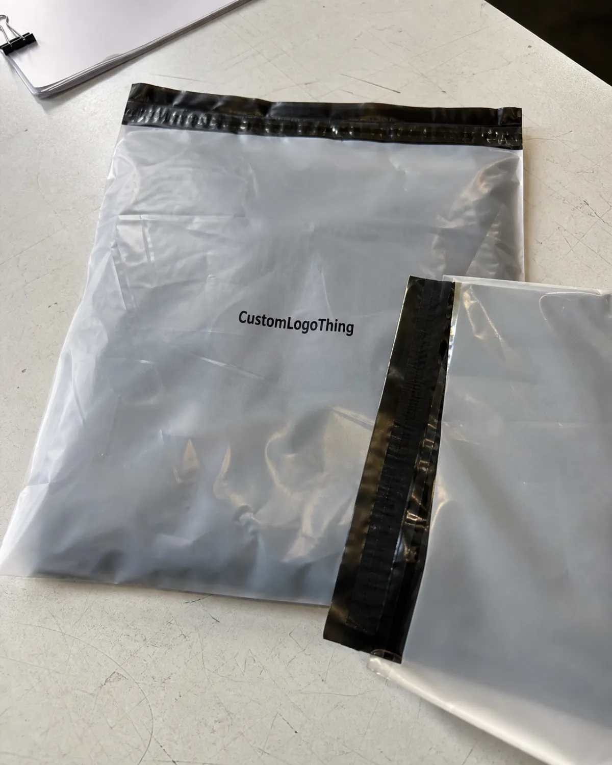
The first surprise is usually feel. A mailer that looked balanced in a mockup may arrive with a film that is too soft, too glossy, or too slippery for fast handling. That does not just affect comfort. It affects throughput. A packer closing a few test bags can tolerate a finicky surface; a packer closing hundreds of units a shift will feel that friction immediately.
The second surprise is surface behavior after movement. Fine text that looked sharp on screen can blur at the edges once the film bends. A logo that looked bold on a flat proof may rub faintly after one pass against a carton edge. Bright white film often increases contrast, while translucent or tinted film can soften color and make dark type appear lighter than expected. The change is subtle on one piece and obvious across a full stack.
The third surprise is how much presentation depends on the packout. A mailer around a lightweight merch kit feels tidy. The same size around a bottle insert or mixed promotional bundle can look strained if the dimensions were guessed instead of measured. That is why teams comparing samples should pack the actual item, not a placeholder based on weight alone.
For brewery and beer-adjacent brands, the outer bag is rarely just a shipping skin. It can be part of a subscription drop, event kit, retail fulfillment program, or seasonal campaign. If the first impression is a bag that wrinkles badly, closes unevenly, or prints with weak contrast, the customer sees less discipline in the whole system. That effect is bigger than many buyers expect because packaging does not get interpreted as a single component; it gets read as a signal of how the brand handles detail.
A useful sample review also compares the mailer against the rest of the packaging line. If the project includes cartons, inserts, or another branded outer pack, the mailer should sit comfortably beside those materials. A loud glossy bag paired with a matte carton can feel disconnected. A bag that is too plain can make a carefully designed kit look unfinished. Those judgments are visual, but they are also operational. Packaging that photographs well and packs badly is still a problem.
How a sample exposes film, print, and seal behavior
A physical sample shows the material in a way no spec sheet can fully capture. You can feel whether the poly film is stiff or pliable, hear whether it makes a crisp rustle or a softer crinkle, and see how it reacts when folded. Those clues sound minor until a team has to move thousands of units. Then the difference between a forgiving film and a stubborn one shows up as speed, scrap, and fatigue.
Print quality deserves the same scrutiny. Check ink density, registration, and the readability of small text after the bag is flexed. Beer graphics often use strong contrast, narrow fonts, or tight linework. Those choices look clean on a monitor, but they expose weak press control very quickly. If a sample shows banding, hairline misregistration, or color drift under light, assume those issues will be more visible on a full run than they were on the proof.
The seal is often where the hidden cost lives. An adhesive flap that closes crooked or lifts at the edge can slow the packer and create avoidable returns later. Open and close the sample more than once. Press it flat, wait a minute, then inspect the edge again. If the closure curls, grabs too aggressively, or leaves a wrinkle near the flap, that is not cosmetic. That is line friction.
One practical comparison method is simple and worth repeating because it catches different failures:
- Hold the sample under bright light and look for pinholes, haze, and thin areas.
- Flex the corners and edges to see whether the print cracks or scuffs.
- Press the seal, reopen it, and check whether the closure still looks clean.
- Rub the surface against a carton edge or another sample to judge abrasion resistance.
Materials claims need the same discipline. If the packaging program includes recycled content, FSC-certified paper elsewhere in the line, or a switch away from heavier formats, the sample is where those claims meet reality. Some buyers compare poly film with kraft paper mailers or other fiber-based options for adjacent shipments, but those materials do not perform the same way. Moisture resistance, weight, print effect, and packing footprint all change. The right choice is not the one with the best slogan; it is the one that matches the product and route.
Material, gauge, and closure details that change performance
Most of the difference between samples starts with the build. Film gauge, resin blend, opacity, slip, and closure type all affect how the mailer feels on the line and how it survives after shipment. Two bags can look nearly identical in a photo and still behave very differently once they are filled, stacked, and sealed.
Gauge is the easiest place to start. A lighter film in the 2.0-2.5 mil range often feels flexible and lowers cost, but it can puncture more easily and show surface wear sooner. A midweight film around 2.5-3.0 mil usually hits the most familiar balance between handling and protection. Once the film moves above 3.0 mil, it starts to feel firmer and more premium, though the added stiffness can make folding and stacking less comfortable for some packing lines.
Closure style matters just as much. Permanent adhesive, peel-and-seal flaps, tamper-evident closures, and reclosable formats all change operator behavior. A strong adhesive is not automatically better if it grabs too early or misaligns during application. A weak adhesive may feel easy in the hand but become a reliability issue after transport. The sample should prove that the flap closes straight, holds, and still opens the way the package design intends.
Print also interacts with substrate in ways that are easy to underestimate. A bright white film tends to sharpen contrast and keep dark artwork readable. A translucent or lightly tinted bag can soften the same design and reduce saturation. That matters when the brand relies on a specific red, navy, or black to carry recognition across the packaging system. If the design includes gradients, fine typography, or barcode elements, the sample should be treated like a working prototype, not a decorative proof.
| Sample construction | Typical feel | Strength points | Tradeoffs |
|---|---|---|---|
| Lightweight poly film, about 2.0-2.5 mil | Flexible, lighter in hand | Lower cost, easier folding, less bulk | More prone to puncture and surface scuffing |
| Midweight poly film, about 2.5-3.0 mil | Balanced and familiar | Better protection and a more substantial look | Higher cost, slightly stiffer feel |
| Heavier poly film, 3.0 mil and above | Firm, premium, more rigid | Stronger puncture resistance and better rough-handling tolerance | More expensive, can be bulkier on the line |
| Poly with recycled content | Varies by resin blend | Supports sourcing goals and recycled-content claims | Color, clarity, and finish can vary more from run to run |
Size fit is the other major variable. Too tight and the bag strains, the seal pulls, and the print can distort near the edges. Too loose and the product slides around, which makes the pack feel sloppy and can create corner wear in transit. Leave room for inserts, paperwork, and labels. A bag that looks fine when empty may act very differently once a bottle pack or merch kit is inside.
Step-by-step sample review for artwork, fit, and handling
Start with the product. Put the real item, or a very close stand-in, into the sample and see what happens. A single bottle insert behaves differently from a mixed kit with cardboard, paper, and a small accessory. If the package includes glass, the fit test becomes even more important because the bag should not force pressure points against the corners or seals.
Then review the art against the actual trim and closure zones. Keep key text away from folds, seams, and adhesive areas. A logo that disappears into a fold line is a layout problem, not just a print issue. Check the front, back, and flap separately, because many designs look balanced until the last fold hides a headline or makes the logo feel off-center.
After that, use the same handling path the team will use later. Fill the sample, close it, stack it, and move it through the kind of staging the real order will face. Watch for scuffing at the corners, drag on the seal, and slippage in the hands. That is where labor cost hides. Five extra seconds per pack sounds trivial. Over several thousand units, it is a measurable expense.
Do not stop at one visual check. Inspect the sample under warehouse light, inspection light, and, if possible, under the lighting the packaging team actually uses during packout. Color shifts that seem small in a design room can become obvious on a line. A muted red can look brownish. A dark outline can blur into the background. The sample is there to expose those issues before they become inventory.
A final approval checklist keeps the process grounded:
- Compare the color to a physical reference, not a screen.
- Confirm logo position, barcode placement, and any legal text.
- Test the seal for straightness, strength, and easy-open behavior.
- Inspect the bag after handling for rub marks, whitening, or edge stress.
- Save one approved sample for future reorder comparisons.
If your program includes cartons or inserts, compare those pieces alongside the mailer. A branded poly bag, printed insert, and corrugated outer shipper should feel like one package family, not three unrelated purchases. That consistency often shows up most clearly in photographs, but it starts with the sample room.
Cost, pricing, and MOQ: what changes the quote
Pricing moves with a few predictable factors: film gauge, dimensions, print coverage, color count, and order volume. Small custom runs usually carry a higher unit price because setup, prepress, and press time are spread across fewer pieces. That does not mean the quote is padded. It means the fixed work has fewer units to absorb it.
MOQ is the second lever buyers need to understand. Depending on the print method and construction, a custom order might start in the low hundreds for a simple format or climb into the several-thousand range for a more complex one. Full-bleed prints, two-sided artwork, specialty adhesives, and custom sizes tend to push the minimum upward. If the supplier is quoting a sample-only run, expect the per-unit cost to rise again because it is a one-off build.
Color complexity matters more than many teams expect. A one-color logo on a single side is easier to produce than a dense background with fine copy on both sides. Tight color matching can add cost too, especially if the mailer needs to sit comfortably beside printed cartons, labels, or inserts that already carry a brand standard. A quote that looks cheap on paper may be built on looser tolerances or thinner film.
In many packaging programs, moving from a simple standard run to a custom, full-coverage design can change the price by 10-25 percent or more, depending on quantity and construction. Heavier gauges, specialty adhesives, and recycled-content resins can move the number further. That range is not a promise; it is a reminder to compare like with like.
A clean way to frame the quote is this:
- Lower cost: standard size, lighter film, limited print coverage, higher volume.
- Middle range: custom size, midweight film, controlled color, moderate quantity.
- Higher cost: heavier film, full coverage print, specialty closure, tighter tolerance control.
If the brand is also reviewing paper-based shippers, recycled-content options, or FSC-certified materials in other parts of the line, keep the comparison honest. A poly mailer and a kraft-based shipper solve different problems. One may resist moisture better and weigh less; the other may better fit a sustainability story or a retail presentation. Price alone cannot decide that tradeoff.
Process and timeline: from request to approval
The cleanest process starts with the spec request. Ask for the film gauge, dimensions, closure type, print method, finish, and target quantity. Then confirm the artwork format and the review schedule. That order sounds basic, but it prevents the most common delay: everyone assuming someone else already approved a detail.
For standard constructions, sample turnaround is often fast enough to keep the project moving in a week or two, depending on transit and press schedules. New sizes, revised film blends, or special closure requirements can stretch that timeline. If the sample needs revision, add another cycle before production. Two rounds are common when the first build reveals a fit issue or when the brand wants to tighten print placement after seeing the sample in hand.
Internal timing matters as much as supplier timing. A sample can arrive quickly and still sit for days if the right people are not available to review it. Build in time for operations, design, and procurement to look at the same piece under the same light. If the calendar is tight, set the review date before the sample ships. That keeps the process honest.
One practical habit helps keep decisions from drifting: write down what changed between the proof and the approved sample. If the bag became 1 inch longer, if the seal moved, or if the color shifted to match a carton better, record it immediately. The best approvals are the ones that can be checked six months later without anyone guessing.
If the package line includes multiple formats, this is also the stage to decide whether the mailer really belongs in the same program as other outer packaging. Some orders work better with a mailer; others perform better in a corrugated box or paper-based shipper. The sample should make that decision clearer, not more confusing.
Common mistakes and practical checks that prevent reorders
The most common mistake is approving by appearance alone. A bag can look strong and still fail when loaded. Another frequent error is judging color from a monitor. Screen settings, file compression, and ambient light all distort what people think they are seeing. If color matters, compare the physical sample to a real reference under neutral light and decide there.
Another trap is ignoring the seal behavior after the first open-and-close cycle. Some closures look fine on the first press, then curl, lift, or wrinkle once they have been handled. That is the sort of failure that does not show up in a polished mockup but will show up in a packing room. Reopen the sample, press it again, and inspect the edge line after a short wait.
Document the sample carefully. Measure the finished size, photograph it on a neutral background, and note the film gauge, finish, closure style, and any handling issues. Keep one approved bag sealed and labeled. That single reference helps settle future reorder questions faster than a long thread of emails. It also protects against memory drift, which is common when teams revisit a seasonal design months later.
Watch the orientation of the print. Artwork can be technically correct and still feel wrong if it sits too high, too low, or just a little off-center relative to the fold and flap. The same goes for seal alignment. A slight walk in the closure may be acceptable in some programs, but it should be documented before production. If the sample shows damage from transport, do not ignore it. Some handling problems only appear after the piece has traveled, been unpacked, and flexed again.
These habits tend to pay off:
- Test with the actual product, not a guess based on weight.
- Compare samples under the same light each time.
- Check the bag after rubbing, stacking, and box loading.
- Save notes on film, closure feel, and print behavior for reorders.
If sustainability claims are part of the packaging brief, keep them specific. Do not describe the mailer as recycled, recyclable, or certified unless the specification and documentation support it. A clear material statement is more useful than a broad claim that cannot be verified later. Packaging programs stay credible when the facts are easy to trace.
Next steps for comparing samples and placing the order
Begin with a short internal test using the real product. Pack it, close the mailer, and move it through the actual workflow instead of only reviewing it on a desk. That one step reveals more than a pile of comments. If the film slips, if the seal fights the packer, or if the bag feels cramped, the team will feel that problem every day.
Then compare the approved sample with the final production spec sheet line by line. Buyer, designer, and supplier should all be reading the same film gauge, dimensions, print method, and closure details. If the sample required a change, capture it in writing before the order is released. That prevents the familiar post-approval confusion where everyone remembers the bag a little differently.
Use a simple approval note to close the loop. List the accepted construction, the acceptable color range, and any open questions. If the order has a reorder risk, note the approved sample reference and store it with the spec. A Beer Printed Poly Mailers material sample guide is only useful if it helps turn review into a repeatable decision.
The sample should make the buying decision sharper, not more emotional. If the mailer holds the load, prints cleanly, seals evenly, and supports the packing workflow, you have a workable spec. If not, fix the weakest point before production starts. The best packaging choices are rarely dramatic. They are the ones that survive inspection, fit the line, and remain consistent when the reorder comes around.
What should a beer mailer sample tell me before I order in bulk?
It should show the real film feel, closure behavior, and print quality, not just the artwork on a screen. Use it to check fit with the actual product, plus any scuffing, stretching, or seal problems during handling.
How many printed poly mailer samples should I compare?
Compare at least one sample for each film thickness or construction you are seriously considering. If color or finish matters, ask for a side-by-side review under the same lighting so differences are easy to see.
Does a sample always match the final production run?
Not always, so confirm the exact film, dimensions, closure, and print method before approval. If the sample is a mockup, request a production-grade version when color accuracy and durability are important.
What drives the price of custom beer poly mailers?
Film gauge, dimensions, print coverage, number of colors, and order quantity are the biggest pricing levers. Special finishes, custom sizing, or tighter tolerance requirements can raise the quote and the unit cost.
How long does sample approval and production usually take?
Standard samples may be ready in about a week or two, but complex builds can take longer. Build in time for one revision round if the first sample reveals a fit, color, or closure issue.


