Beer Printed Poly Mailers Digital Proof Checklist for Buyers
A proof can look polished on a laptop and still fail on a real poly film. The Beer Printed Poly Mailers Digital Proof Checklist exists for that gap: shine, stretch, and ink gain can turn a neat screen image into a production problem if nobody catches the differences early.
For buyers, the real job is not simply approving artwork. It is protecting the order from the failure points that show up most often in production: misread copy, weak contrast, incorrect panel orientation, a logo too close to the seal, or a barcode that scans beautifully in a PDF and fails in the warehouse.
If your team is also comparing packaging formats, the broader catalog at Custom Packaging Products and the dedicated options for Custom Poly Mailers are useful reference points while the proof is still in motion.
Beer Printed Poly Mailers Digital Proof Checklist Basics
A digital proof is a visual approval tool, not a color guarantee. That distinction matters more on poly mailers than on paper because the substrate is glossy, flexible, and a little unforgiving. A white field that feels calm on screen can show glare on film. A dark logo can pick up reflection. A fine line can disappear once the bag is folded, sealed, stacked, or handled under warehouse lights.
That is why the beer Printed Poly Mailers Digital Proof checklist should begin with the simplest question: does the layout survive the bag, or only the monitor?
In practice, buyers use the proof as a risk filter. It catches copy errors, logo placement problems, seam-safe zone issues, barcode readability, and panel orientation before production starts. It also forces internal alignment. Brand teams care about color and placement. Operations cares about carton count, pallet count, and shipping date. Legal or compliance owners care about claims, addresses, and any small print that cannot drift.
A good proof approval is less about optimism and more about discipline. If the team cannot explain exactly what changed from version to version, the order is not ready.
For recycled-content claims, compostable language, or FSC references on related packaging, the proof file should be treated as a document trail, not a marketing poster. If the bag itself does not carry a certification, do not let the artwork imply one. That is where clean internal sign-off saves embarrassment later.
Practical packaging buyers also look at the physical shape of the mailer, not just the print area. A 2.5 mil mailer and a 3.0 mil mailer may accept the same artwork, but the thicker film can feel stiffer, seal differently, and show slightly different ink laydown. Matte finishes mute glare and help type read more cleanly. Gloss finishes often make branding feel richer, though they also expose every contrast mistake. Those small differences are why proof review should include the material callout, not only the design file.
Helpful external references include the technical guidance at ISTA for distribution testing and the broader packaging standards context from Packaging.org. Those sites will not replace a supplier proof, but they do help a buyer think beyond graphics and into real shipment performance.
Proof Process and Approval Timeline
The workflow is usually more linear than buyers expect. File upload comes first. Then the supplier checks the dieline, print area, and usable margins. After that comes the annotated proof, which may show notes about logo placement, bleed, white underprint, or a questionable line of copy. A revision round may follow. Only after final approval does the job get released for print setup and scheduling.
The fastest approvals happen when the input package is complete. That means final artwork, a confirmed dieline, Pantone targets if color matters, the exact quantity, bag size, closure type, and the shipping destination. The more of that information you send up front, the less time the supplier spends guessing. Guesswork is what creates back-and-forth, and back-and-forth is what stretches a simple proof into a long one.
For simple layouts, same-day review is realistic. For more complex runs, two to four business days is common once revisions start moving between stakeholders. If there are multiple decision-makers, add time. A proof that sits in one inbox for 24 hours can push production back more than a minor art correction ever will.
The lock-in point matters. Once approval is given, changes often become expensive because plates, print setup, and production scheduling may already be reserved. A small typo caught before release is cheap. A typo caught after release is a reprint conversation, and that conversation is never pleasant.
Buyers who run seasonal promotions or launch-based packaging should build internal review time before requesting a production slot. A clean timeline looks boring on paper. That is usually a good sign. It means the approval path is clear and the order is not relying on a last-minute scramble.
Typical review stages often look like this:
- Upload and preflight: 0-1 business day for file checks and basic proof setup.
- Annotated proof: 1 proof round for most clean files, more if artwork needs correction.
- Final sign-off: same day if comments are consolidated and one owner approves.
- Production release: immediately after approval, assuming the quote and specs are already locked.
One additional timing wrinkle: if a quote includes white ink, multiple spot colors, or heavy coverage on dark film, production may require a more careful setup. That does not mean the job is difficult; it does mean the prepress team needs clear instruction. Complex artwork is not a problem by itself. Unclear instruction is.
Specs That Change Color, Fit, and Readability
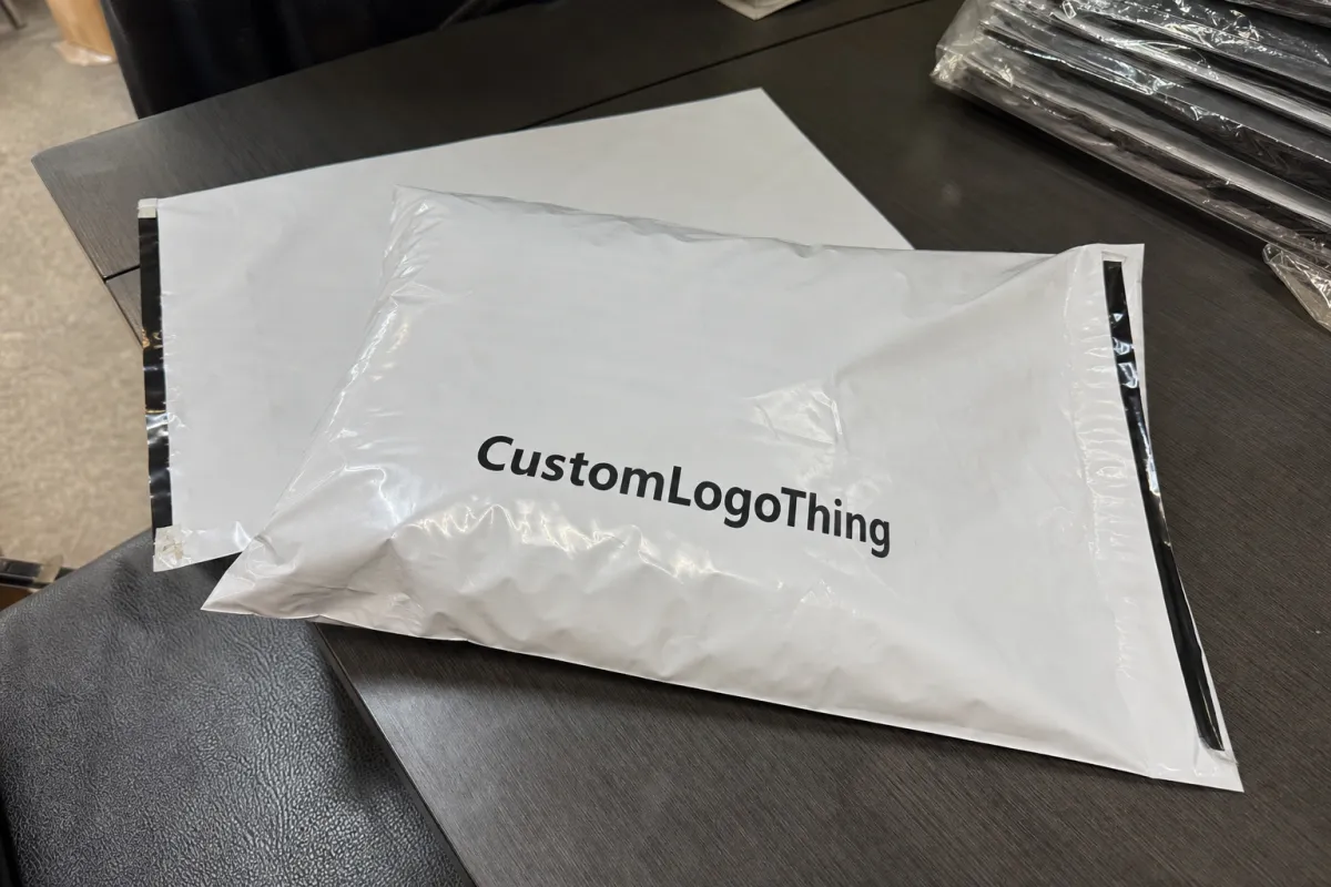
Poly mailers are not paperboard cartons. That sounds obvious, but the implications are bigger than many buyers expect. Film thickness, opacity, bag size, gusset depth, and seal placement all influence how a proof should be read. A 2.0 mil mailer and a 3.0 mil mailer may share the same artwork, yet they do not always share the same visual finish or handling behavior.
Color shift is another frequent surprise. Saturated brand colors often print differently on poly than on coated paper because the substrate is more reflective and less forgiving. White underprint, ink coverage, and the amount of dark fill on the bag all affect the result. A brand blue can look tighter and deeper with the right white base. The same blue can look washed if the build is too thin.
Artwork placement needs real attention. Keep logos away from seals. Leave margin around edges. Check any repeating pattern so it tiles cleanly across the front panel and does not create a visible seam where the mailer folds. If the design carries small legal text, QR codes, recycling marks, or a return address, the proof should be inspected at actual reading distance, not only at zoomed-in screen scale.
One practical check is the end use. A mailer used for direct-to-consumer orders gets handled differently from a bag used in a warehouse or retail back room. That changes what can fail. A beautiful design can still be hard to scan, hard to label, or hard to stack. The proof should reflect that use case.
Buyers also need to watch the relationship between size and composition. A large bag with a narrow artwork panel can make logos feel lost in space. A smaller bag with a full-bleed design can feel crowded if there is no breathing room around the seal zone. For mailers with gussets, side panels deserve the same scrutiny as the front face. They often carry less visible information, yet they affect how the final bag reads in a carton or on a shelf.
- Film gauge: thicker film usually handles better, but it can change feel and print behavior.
- Opacity: higher opacity reduces show-through from contents and improves background consistency.
- Safe zones: logos and fine copy need room away from seals, folds, and edges.
- Contrast: black type over dark art is a common failure point unless the proof is checked carefully.
- Scanability: QR codes and barcodes should be verified at practical size, not imagined size.
- Closure type: adhesive strip placement can affect the top margin and the usable print area.
If your packaging program includes paper components or inserts with FSC language, confirm those claims separately. A proof for a printed mailer is not permission to extend certification language to a different item in the packout.
Pricing, MOQ, and Unit Cost Drivers
There is a simple pattern in custom packaging pricing: larger runs usually lower the unit cost, but they also raise the stakes on demand forecasting. A buyer might save money per unit by moving from 5,000 to 10,000 pieces, yet that only helps if the inventory will move.
For a typical custom poly mailer quote, the biggest drivers are run quantity, number of print colors, bag size, print coverage, and whether the design needs white underprint or unusually dense ink. Rush timing and revision rounds can also move the price. A clean proof reduces both the risk and the quote noise.
Material choice matters as well. Virgin polyethylene and recycled-content film are not priced the same, and neither are matte, gloss, or frosted finishes. A mailer with a simple one-color logo on a standard white bag will usually price below a full-bleed, multi-color design on a specialty film. If the bag includes a custom perforation, extra adhesive feature, or higher-barrier construction, the unit cost climbs again.
As a rough commercial guide, here is how pricing often behaves for Printed Poly Mailers with straightforward artwork:
| Run Size | Typical Quote Behavior | Approx. Unit Cost Pattern | Best Use Case |
|---|---|---|---|
| 5,000 pieces | Higher setup share, more visible impact from revisions | $0.18-$0.35 each | Testing a new design or a limited promotion |
| 10,000 pieces | Better spread on setup and print prep | $0.12-$0.24 each | Steady e-commerce volume |
| 25,000 pieces | Strong unit economics if storage and demand align | $0.08-$0.16 each | Established programs with predictable turnover |
These are practical ranges, not promises. A dense, full-bleed layout will land higher than a simple one-color logo. A larger bag may cost more than a standard size. Special ink effects, custom closures, and expedited freight can move the quote further.
MOQ matters because it changes the buying decision. A lower minimum gives flexibility. A higher minimum improves economics but forces better planning. That tradeoff is exactly why a strong beer printed poly mailers digital proof checklist saves money: it helps the buyer approve the right order once, rather than paying for a correction later.
Price clarity also improves when the supplier gets clean specifications. If the bag size, artwork version, quantity, and destination are all known before quoting, the supplier can compare apples to apples. If not, every quote hides assumptions. A quote that looks cheap can become expensive once revision time, upgraded film, and shipping are added back in.
For many buyers, the more useful question is not only unit price but landed cost. Freight, carton configuration, and storage space all affect the real number. A slightly higher unit price can still win if the packaging ships flatter, stacks better, or reduces damage in transit.
Step-by-Step Approval Checklist for Print-Ready Files
Good proof review is methodical. The best teams do not rely on memory, and they do not let five people make five different kinds of comments in one thread. They use a checklist, then they assign one person to own the final yes.
Start with the file itself. Confirm that the artwork is the latest version, the dimensions match the approved dieline, fonts are embedded or outlined, and linked images are intact. If a supplier has to repair the file before proofing, that repair should be visible and logged. Hidden edits create confusion later.
Next, read the content line by line. Check the brand name, product name, URLs, return address, and any legal copy. If a claim must match a compliance note, this is the moment to compare the wording. One missing word on a package can turn into a customer service issue or a brand complaint.
Then inspect the layout logic. Does the logo sit where the eye lands first? Is the type hierarchy clear? Is the design still readable if the mailer is stacked in a carton or folded over at the lip? A proof should answer those questions. If it does not, the layout needs work. Small details matter more than most teams expect, especially when the printed area is interrupted by seals, folds, or a gusset edge.
After that, check the technical notes. Confirm color references, bleed, white ink areas, die lines, and any special instructions related to print setup. A proof with clean notes is easier to release and easier to archive. It also reduces the odds that a new teammate will misread the job later and reuse the wrong version.
- Confirm the version: only the latest file should be reviewed.
- Check dimensions: verify width, height, gusset, and safe area against the dieline.
- Review copy: names, URLs, claims, and contact details need a slow read.
- Inspect placement: logo position, type size, barcode area, and seal clearance all matter.
- Approve once: one owner signs off, then the final PDF is stored with the quote record.
A simple approval packet works best: final art file, proof PDF, quantity, quote number, and written notes. That bundle makes the record clean, which becomes useful later if the project expands or the same bag is reordered.
For teams with multiple launches, assign a backup reviewer. People travel. Calendars fill. The proof still needs a decision.
One extra safeguard is to keep a written note of what the proof does not cover. If color matching to a retail standard is being deferred to a physical sample, say so. If the barcode will be verified again against live inventory labels, write that down. Those small notes sound dull, but they reduce disputes later.
Common Mistakes That Trigger Reprints
The biggest mistake is approving from a phone screen. Brightness, scale, and compression all distort the image. A file that feels balanced on a handset can look cramped, dull, or too busy once printed on film. If the team only reviewed it on a phone, the proof process was already too casual.
Another classic error is mixing up proof types. A digital proof helps with layout, copy, and placement. It does not replace a material sample if color accuracy, gloss, or finish is critical. Buyers sometimes assume a digital view is enough because the artwork looks close. Close is not the same as controlled.
Version control failures are expensive too. One person updates the logo, another person changes the URL, and nobody confirms which file is final. That is how an otherwise normal job turns into a reprint story. In packaging, ambiguity is a cost center.
Overcomplicated designs also invite problems. Too many fonts, tiny legal text, and low-contrast elements all increase the chance of failure. A design that looks rich on a desktop monitor may be too fussy for production and too hard to inspect on arrival.
The most costly mistake is approving before the quantity, shipping needs, and package dimensions are aligned. If the order size is wrong or the ship date is unrealistic, the proof becomes irrelevant because the business decision behind it was never stable.
- Do not rely on color seen on a backlit screen.
- Do not approve without the dieline in front of you.
- Do not let multiple people approve different versions in parallel.
- Do not treat a proof like a marketing mockup.
- Do not skip a scan test for any barcode or QR code.
A buyer who treats the beer printed poly mailers digital proof checklist as a control step, not a formality, usually avoids the expensive mistakes. The checklist is doing quiet work: it catches the mismatch between how the art file behaves on screen and how the bag behaves in production.
Expert Review Tips and Next Steps Before Production
One of the best habits is to print the proof at a scale that resembles the final bag and compare it against the dieline with a ruler. That sounds almost old-fashioned. It also catches mistakes that pixel-perfect screen review misses. Human eyes are excellent at spotting proportions once the file is on paper.
A two-pass review works well. First pass: branding, copy, and overall appearance. Second pass: technical details, approval notes, and version control. People miss different things depending on the lens they are using. Splitting the task reduces blind spots.
A clean approval packet should include the final art file, the proof PDF, the quantity, the quote number, and written notes about any exceptions. That record helps if the team needs to revisit the order, compare supplier quotes later, or repeat the same bag with new content.
If the launch is busy, assign a secondary reviewer before the first proof lands. That backup is not there to create debate. It is there to make sure the file does not stall because one person is on leave, in a meeting, or buried under another launch.
For buyers coordinating across categories, the production context matters as much as the artwork. A supplier’s broader Manufacturing Capabilities page can be helpful for understanding whether the job fits their equipment, timing, and print methods before the final sign-off goes out.
Close the loop by confirming the approved version, recording the sign-off date, and archiving the notes where the team can find them later. That is the difference between a one-off approval and a repeatable packaging process.
For thicker films, multi-color layouts, or full-coverage print, a buyer should also ask one more question: how will the final bag be checked on the production side? Some suppliers inspect against the signed proof only. Others also verify the first run sample against copy, layout, and color tolerances before the job continues. That extra check can save a lot of pain if the job includes dense black backgrounds, small text, or a difficult match to an existing brand palette.
From a packaging buyer’s point of view, the beer printed poly mailers digital proof checklist is not busywork. It is the cheapest place to catch errors, the fastest place to align stakeholders, and the smartest place to avoid a reprint before production starts.
What should a beer printed poly mailers digital proof checklist include?
It should include the latest artwork version, correct bag dimensions, and the approved dieline. Add color references, logo placement, legal copy, and any special print instructions. A single named approver and the proof version number should also be documented so the record stays clear.
How long does the digital proof approval process usually take?
Simple jobs can move quickly if the files are clean and feedback is consolidated. Multiple stakeholders, missing specs, or artwork revisions usually add days. The fastest approvals happen when the buyer sends final assets and a clear deadline up front.
What affects pricing the most for printed poly mailers?
Run quantity, number of colors, bag size, and ink coverage are the main drivers. Rush timing, white underprint, special finishes, and revision rounds can raise the quote. Higher MOQ usually lowers unit cost, but only if the order quantity fits demand.
Can I rely on a digital proof for color accuracy?
Not completely, because screen settings and poly film can shift the look of color. Use the proof to confirm layout, text, and placement first, then request material confirmation if color is critical. Brand colors with strict standards often need extra documentation or a printed sample.
What is the safest way to avoid reprints on custom mailers?
Use a checklist, not memory, for every proof review. Verify files, dimensions, copy, and approval version before production starts. Keep one owner accountable for final sign-off so no changes slip in after approval.
Do I need a physical sample before production?
Not for every order. For simple one-color layouts on standard white film, a digital proof is often enough to move forward. If the job depends on exact brand color, specialty film, white ink, or a new size, a sample or press check is safer than relying on screen output alone.


