Buyer Fit Snapshot
| Best fit | Brand Packaging Design for Better Shelf Impact projects where brand print, material claims, artwork control, MOQ, and repeat-order consistency need to be specified before quoting. |
|---|---|
| Quote inputs | Share finished size, material target, print colors, finish, packing count, annual reorder estimate, ship-to region, and any compliance wording. |
| Proofing check | Approve dieline scale, logo placement, barcode or warning zones, color tolerance, closure strength, and carton packing before bulk production. |
| Main risk | Vague material claims, crowded artwork, missing packing details, or unclear freight terms can make a low unit price expensive after revisions. |
Fast answer: Brand Packaging Design for Better Shelf Impact: Material, Print, Proofing, and Reorder Risk should be specified like a repeatable production item. The safest quote records material, print method, finish, artwork proof, packing count, and reorder notes in one written spec.
Production checks before approval
Compare the actual filled-product size with the drawing, then confirm tolerance on folds, seals, hang holes, label areas, and retail display edges. Reserve space for logos, QR codes, warning copy, and material claims before decorative graphics fill the panel.
Quote comparison points
Review material grade, print process, finish, sampling route, tooling charges, carton quantity, and freight assumptions side by side. A quote is only useful when the supplier can repeat the same color, closure quality, and packing count on the next order.
Brand Packaging Design Tips for Better Shelf Impact
Brand packaging design tips matter because the package speaks before anyone on the sales team gets a word in. Shoppers give it seconds, not minutes. In a crowded aisle or a tiny product thumbnail, the package has to carry the brand story, the price signal, and the trust signal at once. No pressure, right?
What Brand Packaging Design Tips Really Solve
Brand packaging design tips are not just about making a package look polished. They make the product easier to understand, easier to trust, and easier to choose. A good package does a lot of quiet work: it signals category, sets expectations about quality, and hints at whether the brand sweats the details. That is a business job, not a decoration exercise.
Picture three similar products on a shelf in plain cartons. One is packed with cluttered copy. One disappears under store lighting because the color choice was optimistic. One uses clean type, enough contrast, and a structure that feels deliberate in the hand. Most buyers will not compare all three in detail. They scan, judge, move on. Brand packaging design tips help you win that scan by making the right message obvious fast.
Those choices affect more than the first sale. They shape perceived price point, giftability, and repeat purchase behavior. A package that feels well made can support a higher shelf price. A package that feels thin or confusing can make a product seem cheaper than it is. Outside the box is part of the promise. Pretending otherwise is how brands end up with pretty packaging that still sells like homework.
The package should support one story from top to bottom. Typography, imagery, material finish, and the opening experience all need to point the same way. If the brand voice is calm and technical, the box should not look playful and loud. If the product is meant to feel luxurious, the board, coating, and print treatment need to carry that feeling through the unboxing moment. Those brand packaging design tips sound simple because they are. They are also the ones people skip right before a painful reprint.
How Brand Packaging Design Tips Work in the Real World
Brand packaging design tips work best when they follow the shopper's path, not the designer's canvas. The journey starts with a glance online or on shelf, then moves into recognition, trust, purchase, unboxing, and finally reuse or disposal. Each step asks something different from the package. Miss one step and the whole experience feels weaker than it should.
The first job is attention. That might come from a bold color block, a distinctive structure, or a front panel that reads clearly from six feet away. The second job is recognition. Once the shopper notices the package, they need to know what it is without digging for the product name in tiny type. The third job is trust. Clean alignment, consistent materials, and claims that do not shout over each other all help there.
Visual hierarchy keeps that from turning into noise. A shopper should find the product name first, then the variant, then the benefit statement, then any required regulatory information. If every line on the panel fights for attention, the eye has nowhere to land. Strong brand packaging design tips always push for hierarchy because hierarchy is what keeps retail packaging readable under pressure.
Structure and material matter just as much as graphics. A premium coating on flimsy board can feel inconsistent the moment someone picks the box up. The same problem shows up with custom printed boxes that look sharp on screen but crush too easily, scuff in transit, or open in a way that feels awkward. Package branding is not only visual. It is tactile, structural, and mechanical.
For ecommerce, the package has to do even more. It needs to survive shipping, photograph well in a listing, and still feel intentional in the unboxing moment. One design may need to perform in retail shelves, subscription kits, shipping cartons, and social thumbnails at the same time. Brand packaging design tips are strongest when they account for all of that together instead of optimizing for one channel and hoping the rest stay polite.
A package can look premium in a mockup and still fail in real use if the board flexes, the flap crushes, or the print contrast disappears under store lighting.
I have seen that happen more than once. The render looked gorgeous. The prototype looked slightly less gorgeous. The finished run looked great until it sat under fluorescent retail lights and half the copy vanished. That is the part a lot of teams miss. The screen is not the shelf.
If you are comparing formats, the Custom Packaging Products page is a useful starting point for seeing how folding cartons, mailers, and rigid styles change the brand message. It is a practical way to turn abstract brand packaging design tips into decisions you can actually manufacture.
Key Factors Behind Strong Brand Packaging Design Tips
Brand packaging design tips work best when the package matches the brand personality with discipline. Minimal, playful, technical, luxurious, and eco-conscious are all valid directions. Each one needs different visual cues. A minimalist skincare carton may rely on soft neutrals, restrained typography, and generous white space. A consumer tech box may need stronger contrast, sharper geometry, and clearer feature callouts. The wrong mood can make a product feel off before anyone opens it.
Color strategy deserves more respect than it usually gets. A favorite palette is not enough. The colors need contrast, category fit, and a finish that supports the message. Deep matte black can feel rich on a rigid box, yet the same tone may swallow copy on a small folding carton. Soft kraft stock may signal natural ingredients, but only if the print and typography stay clear enough to read at a glance. Good brand packaging design tips treat color as identity and usability at the same time.
Typography carries more weight than people expect. At small sizes, a typeface can hold the line or fall apart. The main product name should be readable from a practical viewing distance, and the secondary copy should support it without competing. That means paying attention to line weight, spacing, contrast, and how much text the panel can truly carry. A pretty typeface that dies in production is not a good choice for product packaging, no matter how charming it looked in the deck.
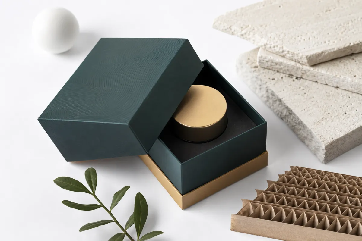
Materials and construction turn the concept into something that can be held, stacked, and shipped. Folding cartons, rigid boxes, corrugated shippers, labels, and inserts each change the experience in a different way. An 18pt SBS carton feels different from a 24pt rigid setup, and a 32 ECT corrugated mailer sends a different message than a lightweight printed sleeve. Those choices affect appearance and handling, so brand packaging design tips should always include the physical side of the build.
Sustainability needs to be practical, not performative. Recycled content, right-sized packaging, fewer components, and clear disposal messaging all help, but the package still has to protect the product and present the brand well. FSC-certified paperboard can be a strong option for many projects, and the certification details are outlined at FSC. Credible claims only help when the material story and the actual packaging design support each other.
Here is the plain truth: brand packaging design tips become more valuable, not less, when the business is balancing identity, shipping, and cost. The package has to earn its place. If it looks good but wastes material, confuses the buyer, or causes damage in transit, the design is not doing its job. Pretty does not excuse failure.
Brand Packaging Design Tips: Process and Timeline
Brand packaging design tips are easier to use when the process is clear from the start. Begin with discovery. Define the audience, product dimensions, fill weight, shelf environment, shipping conditions, claims, compliance needs, and budget before any artwork starts. If those basics are fuzzy, the design team will be guessing, and guessing tends to show up later as rework.
From there, move into concept design and structural review. At this stage, the dieline matters as much as the visual layout because the folds, flaps, closures, and insert positions all affect how the package reads and functions. A good mockup can reveal whether a logo lands too close to a fold, whether text gets lost on a side panel, or whether a window cut will weaken the board. These are the details that make brand packaging design tips practical instead of theoretical.
Proofing catches the expensive mistakes early. I like to think in terms of fit, legibility, and finish. Does the product sit correctly inside the box? Can someone read the key panel without squinting? Does the coating, foil, or lamination feel like it belongs with the brand? If the answer is no, fix it before print. A late correction on production artwork costs far more than a small revision on a proof.
A realistic timeline often looks like this: discovery and brief development, 2 to 4 business days; concept rounds, 5 to 10 business days depending on feedback speed; structural adjustments and sample approval, another 5 to 10 business days; prepress checks, 2 to 3 business days; print production, often 10 to 20 business days; finishing and assembly, 3 to 7 business days. A clean project may finish in 3 to 5 weeks from approved brief to shipped goods. A more complex run with inserts, specialty coatings, and multiple SKUs can stretch longer, because packaging likes to remind people that physics exists.
Delays usually come from the same places. Late copy changes are common. So are material shortages, slow approvals, and artwork that arrives without enough room for regulatory text. One fix is to build signoff checkpoints into the schedule and keep them tight. Another is to decide early who can approve structural changes, because a design decision and a production decision are not always the same thing. Strong brand packaging design tips save time precisely because they reduce these handoff problems.
For shipping-heavy projects, I also recommend aligning transit testing with a real protocol instead of relying on a quick desk drop. The ISTA standards are a useful reference point for parcel and distribution testing, and they help teams think about vibration, drop, and handling conditions before a product hits the lane. If the package fails in testing, that is not a setback; it is cheaper than finding out after launch.
That same discipline helps buyers compare vendors more clearly. If you want to see how structure, board, and finishing choices show up in finished work, the Case Studies page can be a helpful reference. Real production examples make brand packaging design tips easier to judge because the tradeoffs are visible, not theoretical.
Brand Packaging Design Tips for Cost and Pricing
Brand packaging design tips are tied to pricing, and that surprises some teams. The biggest cost drivers are material grade, board thickness, print coverage, special finishes, tooling, structural complexity, and order quantity. A simple-looking package can still be expensive if it needs unusual dimensions, a tight closure, or multiple production steps. On the other hand, a cleaner design can be cost-efficient if it uses standard tooling and sensible print coverage.
Simple does not always mean cheap. I have seen packages that looked minimal on the surface but needed very tight tolerances, custom inserts, or extra hand assembly to work properly. Those choices add labor, and labor adds cost. In brand packaging design tips, the goal is not just to reduce decoration. It is to reduce waste and avoid unnecessary complexity.
Here is a practical way to compare value: look at shelf impact, shipping protection, labor efficiency, and perceived product worth together. A package that costs a bit more per unit may still be the better buy if it raises perceived value enough to support a higher retail price or reduces damage in transit. Good brand packaging design tips ask, "What does the package return?" not only, "What does it cost?"
One useful rule: at 5,000 units, a standard folding carton might land around $0.45-$0.85 per unit, depending on size, board, and print coverage; a Printed Ecommerce Mailer might run $0.90-$1.60; and a rigid gift box with soft-touch lamination and wrapped chipboard may sit around $2.75-$5.50. Those are working ranges, not fixed quotes, because artwork coverage, dimensions, and finish choices shift the numbers quickly. If a vendor gives you one neat number and acts like that solves everything, be a little suspicious.
| Packaging option | Typical build | Approx. unit cost at 5,000 | Best use | Main tradeoff |
|---|---|---|---|---|
| Folding carton | 18pt SBS or CCNB, 4-color outside, aqueous coating | $0.45-$0.85 | Retail packaging for cosmetics, supplements, and small consumer goods | Less crush protection than corrugated or rigid builds |
| Mailer box | E-flute corrugated, 1-2 color print, matte or aqueous finish | $0.90-$1.60 | Subscription kits, ecommerce shipping, and branded unboxing | Thicker profile increases storage and freight volume |
| Rigid box | 1200-1400gsm chipboard wrapped with printed sheet and soft-touch lamination | $2.75-$5.50 | Premium gift sets, launch kits, and high-value product packaging | Higher labor and assembly cost |
At 10,000 units, those prices often move down by 15% to 30% if the structure stays standard and the artwork does not push extra finishing steps. That is why quote comparisons should separate design, prototyping, print, and assembly. If a supplier gives you one blended number, ask for line items. You will understand the proposal faster, and you can compare competing quotes without guessing what each one includes.
Cost control tactics are usually straightforward. Use standard dielines where possible. Keep ink coverage efficient. Reduce the number of components. Avoid unusual closures unless they serve a real purpose. Choose finishes that create impact without complicating production, such as aqueous coating or a single accent foil instead of several stacked effects. Brand packaging design tips like these often save more money than a last-minute material swap ever will.
Common Mistakes When Following Brand Packaging Design Tips
Brand packaging design tips can go wrong in predictable ways, and overbranding is one of the biggest. That is the habit of crowding every panel with claims, badges, icons, and texture until the main message disappears. The package may look busy and impressive in a file, but on shelf it becomes hard to read. More graphic elements do not automatically create stronger package branding; sometimes they just create friction.
Another common mistake is designing only for the mockup or only for the shelf. Packaging lives in more than one place. It may need to sell on a retail wall, ship in a carton, and show up as a thumbnail online. If the design only works in one environment, the team will find the weak spot later, usually after production has already started. That is why brand packaging design tips need to cover the whole experience, not just the hero render.
Weak hierarchy is a quiet problem, but it causes real damage. Tiny text, low contrast, and too many competing callouts make even a beautiful package hard to shop quickly. Under bright store lights or in a small mobile image, the details blur together. A good rule is to test the package at actual viewing distance and in grayscale, because those checks expose readability problems fast.
Material mismatch is another expensive error. A premium finish can look great in a rendering and still perform badly in real handling, shipping, or humidity. Gloss film may scuff in transit. Soft-touch lamination may show wear faster than expected. Lightweight board can bow if the product has more weight than the design accounted for. Honest brand packaging design tips always account for the real distribution environment, not just the presentation deck.
Skipping prototypes is the mistake that often hurts the most. A sample or mockup can reveal if a closure fits too tightly, if a fold interferes with graphics, or if a label panel leaves too little room for barcodes and warnings. The cost of a prototype is tiny compared with a reprint. That is especially true for custom printed boxes, where one measurement error can echo through the whole run.
In this part of the process, the best safeguard is a deliberate review. Check alignment, fold behavior, panel copy, material feel, and pack-out speed. Check them again under shipment conditions. If you need a reference point for how finished work handles real production choices, the Case Studies page is useful because it shows the tradeoffs that do not always appear in a mockup.
Expert Brand Packaging Design Tips You Can Act on Now
The best brand packaging design tips are the ones you can use this week, not someday. Start with one current package and audit it honestly. Ask whether the product name is obvious in three seconds, whether the main benefit is visible, and whether the structure actually supports the product. If any of those answers are weak, you already know where the next revision should begin.
Next, write a one-page packaging brief before you touch the artwork. Include the audience, dimensions, claims, compliance needs, budget range, target timeline, and shipping method. A brief like that keeps everyone focused, and it gives the designer and converter a shared reference point. In my experience, strong brand packaging design tips almost always begin with a brief that is shorter and clearer than people expect.
Order physical samples early. Paperboard grain, coating feel, fold memory, and print sharpness often read differently in hand than on screen. That matters for branded packaging because the hand feel is part of the brand message. If the sample feels too slick, too light, or too rigid, adjust before launch. The package should support the product story, not contradict it.
Test in the real environment too. Place the package under store lighting, hold it at arm's length, and look at it beside competing products. For ecommerce, check how it looks inside the shipper, in a listing thumbnail, and after a normal transit route. Brand packaging design tips are most useful when they are tested where the customer actually meets the package, not just in the studio.
If you are building a new line or refreshing an existing one, start by comparing a few construction options and deciding what the brand needs most: shelf presence, transit protection, giftability, or speed of pack-out. The right choice is rarely the fanciest one. It is usually the one that serves the product, the price point, and the channel with the fewest compromises.
For teams that want a practical next step, review the formats in Custom Packaging Products, then build a production brief around the structure that fits your actual use case. That sequence turns brand packaging design tips into a decision process, which is where they help the most.
One more thing: do not leave the final review to a single person staring at a screen late on a Friday. Put the box in a hand. Open it. Stack it. Ship it if you can. Real packaging has a way of exposing weak assumptions fast. That is the useful kind of annoying.
The simplest action plan is also the most effective one: Choose the Right structure, make the hierarchy obvious, confirm the material in hand, and prototype before you print the full run. If you do those four things well, the package stops being a guess and starts doing its job.
Use brand packaging design tips as an ongoing brand-building practice, not a one-time design exercise, and your boxes, labels, and mailers will do more than look finished; they will help sell, protect, and position the product every time someone sees them.
What are the best brand packaging design tips for small businesses?
Focus on clear hierarchy, one strong color system, and a package structure that fits the product without wasting material. A simple package can still feel intentional if it has one memorable detail, such as a good finish, a well-designed insert, or a satisfying opening moment. Brand packaging design tips for smaller teams work best when they prioritize clarity before decoration.
How do brand packaging design tips change for ecommerce versus retail?
Retail Packaging Needs fast shelf recognition and readable front-panel messaging, while ecommerce packaging must protect the product and still feel strong in the unboxing moment. For shipping-based products, think about board strength, print durability, and how the box looks in photos or thumbnails. For shelf-based products, focus on distance readability, contrast, and category cues under store lighting.
How much do brand packaging design tips affect pricing?
Design choices can raise or lower cost through material selection, print coverage, structure complexity, and special finishes. A more polished package can support a higher price point if it protects the product and strengthens perceived value. The most cost-effective result usually balances impact, production efficiency, and logistics instead of chasing the lowest unit cost alone.
What should be included in a packaging timeline?
Include discovery, concept development, dieline review, prototype approval, prepress, production, and finishing or assembly. Build in revision time because late copy changes and approval bottlenecks are among the most common sources of delay. A realistic schedule also accounts for material sourcing and transit time from the converter.
How do I know if my packaging design is working?
Check whether shoppers can identify the product quickly, understand the main benefit, and remember the brand after one look. Review whether the package performs in production, shipping, and display without damage or confusion. If it looks good but fails in clarity, durability, or cost control, it needs another round of refinement.
Should I follow every trend in packaging design?
No. Trends age fast, and some of them are just visual noise with better lighting. Use trends only if they support the category and the brand promise. If a trend makes the package harder to read or more expensive to produce, skip it and keep the parts that actually help sell the product.


