Buyer Fit Snapshot
| Best fit | Branded Padded Mailers for Coffee Roasters Print Finish projects where brand print, material claims, artwork control, MOQ, and repeat-order consistency need to be specified before quoting. |
|---|---|
| Quote inputs | Share finished size, material target, print colors, finish, packing count, annual reorder estimate, ship-to region, and any compliance wording. |
| Proofing check | Approve dieline scale, logo placement, barcode or warning zones, color tolerance, closure strength, and carton packing before bulk production. |
| Main risk | Vague material claims, crowded artwork, missing packing details, or unclear freight terms can make a low unit price expensive after revisions. |
Fast answer: Branded Padded Mailers for Coffee Roasters Print Finish should be specified like a repeatable production item. The safest quote records material, print method, finish, artwork proof, packing count, and reorder notes in one written spec.
Production checks before approval
Compare the actual filled-product size with the drawing, then confirm tolerance on folds, seals, hang holes, label areas, and retail display edges. Reserve space for logos, QR codes, warning copy, and material claims before decorative graphics fill the panel.
Quote comparison points
Review material grade, print process, finish, sampling route, tooling charges, carton quantity, and freight assumptions side by side. A quote is only useful when the supplier can repeat the same color, closure quality, and packing count on the next order.
Branded Padded Mailers for Coffee Roasters Print Finish
The logo gets the attention. The finish does the persuading. In a branded Padded Mailers for Coffee roasters print finish comparison, matte, gloss, satin, and soft-touch can turn the same shipment into something that feels restrained, premium, or gift-ready before anyone opens the flap.
Coffee roasters feel that difference quickly. Beans already carry a story: origin, roast level, freshness, process, maybe a little pride. The mailer becomes the first physical proof that the brand knows what it is doing. One part keeps the order safe. The other part makes the customer believe the rest of the system is just as careful. If either one slips, the package reads cheaper than it should.
A padded mailer has a rough job. It has to survive sorters, belts, delivery trucks, warehouse stacking, and the occasional person who throws parcels like they are late for something. The outer surface is what the customer sees. The cushioning is what protects the contents. That split matters because the finish changes how the package reads in hand, in photos, and under bad warehouse lighting. Coffee brands notice that because their mailers are handled often and judged fast.
"The mailer has one job in transit and one job at the doorstep. If the finish helps with both, it earns its keep."
This comparison focuses on real production decisions, not just mockups. Abrasion resistance, color shift, tactile feel, cost, lead time, and brand fit all matter. So does the part nobody wants to discuss until reorder time: whether the sample that looked expensive still looks expensive after a week in shipping.
Branded Padded Mailers for Coffee Roasters Print Finish Comparison Basics
Finish changes the emotional read of the package. Matte feels quiet, grounded, and intentional. Gloss comes off brighter and louder. Satin sits in the middle and avoids most of the drama. Soft-touch adds a tactile layer that can make a simple logo feel like a premium retail item instead of a shipping pouch. Packaging buyers know the difference. So do customers, even if they cannot name it.
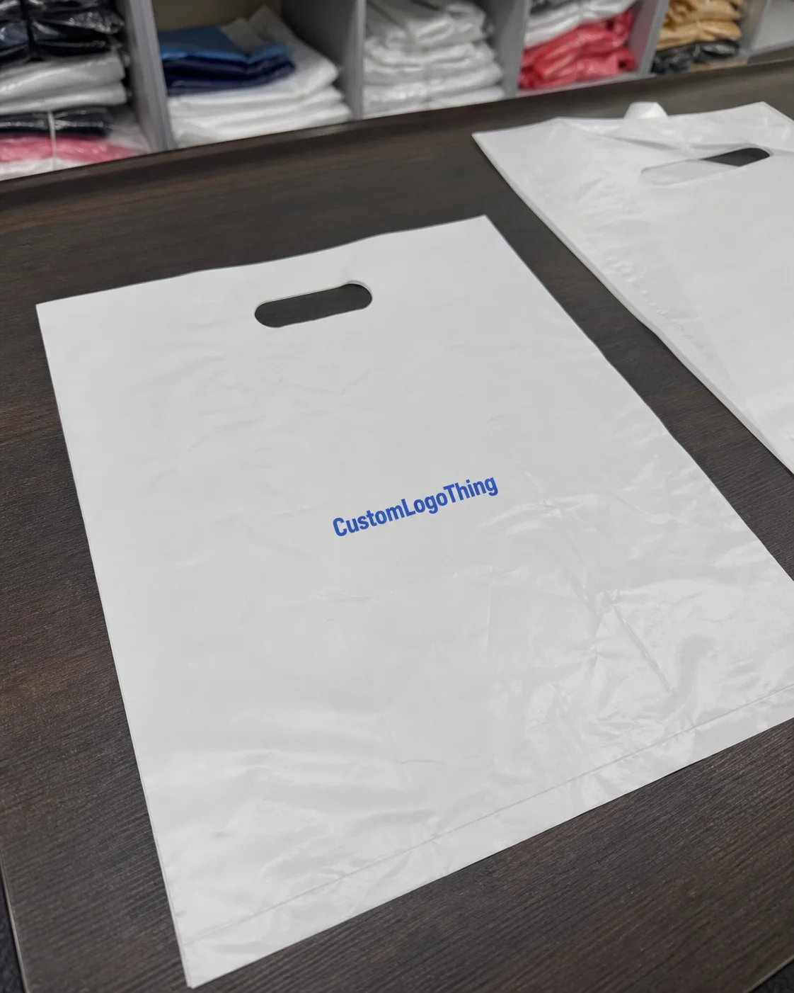
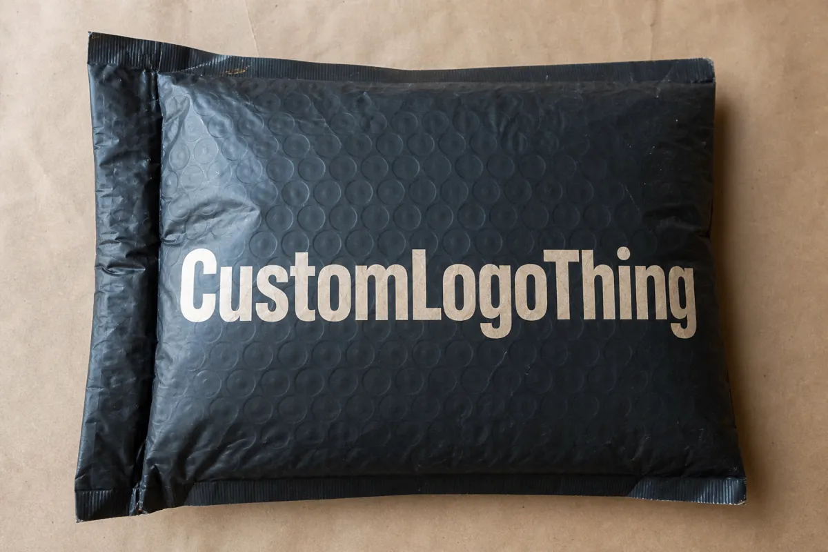
Branded Padded Mailers usually mean a cushioned outer mailer with printed branding on the shell. Bubble-lined, foam-lined, and film-layered constructions are all common. Some versions use a polyethylene shell. Others mix paper and film. The details change the surface behavior, but the brand job stays the same: protect the product, carry the message, and avoid looking like a random shipping supply.
Coffee roasters care because packaging is part of the product experience, not an afterthought. A subscription customer sees the mailer every month. A wholesale account may watch it land on the counter in front of staff and guests. A gift buyer may judge the order before breaking the seal. That is not a small detail. That is the first impression.
A clean way to compare finishes is to check five things:
- Visual effect: Does the surface deepen color, mute it, or push it toward high contrast?
- Durability: Does it hide scuffs, scratches, and rub marks from transit?
- Tactile feel: Does it feel premium, slick, soft, or just coated?
- Brand fit: Does it match the roaster's position, from specialty and direct-trade to gifting and retail?
- Production reality: Does it work with the budget, schedule, and order size?
That last point is where teams trip over their own enthusiasm. A finish that looks great in a PDF can get ugly once it is loaded onto pallets and sent through a real warehouse. Coffee packaging lives in the mess, not in a mood board.
How Print Finishes Work on Padded Poly Mailers
On padded poly mailers, the finish is not always a separate top layer. Sometimes it is built into the film. Sometimes it comes from a coating. Sometimes the tactile effect comes from lamination. That is why one supplier's matte can feel dry and flat while another supplier's matte has a softer, richer touch. Same label. Different material stack. Different result.
The most common options are matte, gloss, satin, and soft-touch. Matte cuts glare and diffuses light. Gloss reflects more light and makes artwork feel sharper and louder. Satin gives a balanced middle ground, with more life than a dead-flat matte and less shine than gloss. Soft-touch is the one that surprises buyers. It feels velvety and deliberate, which can make even a plain logo feel more premium than the artwork deserves.
Ink behavior matters just as much as the coating. A black logo on a glossy surface can look crisp and bold, especially when the design uses strong contrast. Put the same art on matte film and it often reads a little softer because the surface absorbs and scatters light. That is not a defect. It is the point. A minimalist brand may want that quieter look. A louder, more graphic brand may want gloss to push the art forward.
Print method matters too. Short runs often favor digital printing, especially when a roaster needs seasonal art or a quick packaging update. Larger orders usually make more sense with flexographic printing, where plate-based setup can keep unit pricing under control. For color-sensitive work, a combination of CMYK and spot color helps keep branding consistent from order to order. Offset printing is less common for the mailer shell itself, but the same logic shows up in inserts, labels, and supporting packaging.
Use the comparison below as a quick field guide.
| Finish | Visual Effect | Tactile Feel | Transit Wear | Typical Cost Impact | Best Fit for Coffee Roasters |
|---|---|---|---|---|---|
| Matte | Soft, low glare, understated | Smooth, restrained, clean | Usually hides scuffs well | Often the baseline option | Specialty roasters, direct-trade brands, minimalist systems |
| Gloss | Bright, reflective, high contrast | Polished, slick, familiar | Can show scratches and fingerprints sooner | Usually low to moderate | Retail pickup, bold artwork, camera-friendly branding |
| Satin | Balanced, clean, controlled shine | Smoother than matte, less slick than gloss | Moderate performance | Often close to matte, depending on supplier | Brands that want a middle path without visual noise |
| Soft-touch | Muted, premium, tactile | Velvety, distinctive, elevated | Can show rub marks if the build is weak | Usually the highest of the four | Giftable subscriptions, premium launches, seasonal sets |
A good rule is to match the finish to where the mailer will spend most of its life. Mostly in courier systems? Matte or satin usually makes more sense. Mostly in photos, unboxing clips, and social posts? Gloss gives stronger visual pop. Part of a premium ritual? Soft-touch can feel worth the extra cost if the rest of the system supports it.
That is also why strong packaging programs compare the mailer with the bag and label, not in isolation. A coordinated system feels designed. A mismatched one feels like the team bought everything on different Tuesdays and hoped nobody would notice.
Key Factors That Shape the Right Finish Choice
Brand position changes the answer
Specialty, artisanal, direct-trade, and gift-driven roasters are all selling different versions of trust. A small-batch brand with a careful origin story may need a finish that feels calm and grounded. A subscription service aimed at office gifting may need a brighter, more retail-forward presentation. Both can be right. The finish has to match the customer expectation, not the designer's favorite reference sample.
Packaging should reinforce the price point. If a coffee sells as a premium experience, a weak sheen or cheap-looking film can drag the mailer down fast. If the brand is built around restraint, education, and low-waste messaging, a glossy surface can feel off-brand. The best systems keep the same emotional tone across mailer, bag, label, and shipping carton.
Shipping conditions are not hypothetical
Coffee mailers often deal with humidity, warehouse dust, conveyor abrasion, and stacked weight. A sample that looks flawless on a desk can age badly after a week in a busy fulfillment center. Matte tends to hide transit wear better because it breaks up reflected light and softens small marks. Gloss can look sharp on day one, then reveal every rub once the package goes through a rough route. Soft-touch creates a distinct sensory experience, but some versions are more vulnerable if the coating chemistry or film structure is off.
Seasonal weather changes the picture too. Summer humidity can affect some coatings. Cold weather can make surfaces feel stiffer and less forgiving. A finish that behaves nicely in a sample room may react differently once the order gets handled by real people in real conditions. That is why route-testing beats blind faith every time.
Sustainability and perception are tied together
Buyers increasingly compare the finish against the brand's sustainability story. Heavy gloss can look luxurious, but it can also read as wasteful if the rest of the brand language leans restrained and practical. A softer matte or satin finish usually fits more naturally with recycled content claims, paper-forward packaging, or a broader low-impact message. That is not a law. It is a pattern worth respecting.
If the full pack includes FSC-certified cartons or paper labels, the surface language should stay in the same family. The FSC framework is a useful reference when the brand wants to show responsible sourcing across paper components. For transport durability and distribution testing, the methods used by the ISTA community are worth reviewing because a finish only matters if it survives the route.
Artwork can help or hurt the finish
Design decisions matter more than most teams expect. Fine typography, thin line art, and muted tonal palettes usually work well with matte or satin because the surface does not compete with the details. Bright color blocks, bold logo marks, and high-contrast layouts can benefit from gloss because the shine gives the artwork more edge. Metallic accents need special care. A metallic effect that looks premium in a file can become noisy on the wrong surface.
Some roasters use origin maps, roast-note panels, or photographic ingredient art. Those elements can be sensitive to surface choice. Busy CMYK work usually behaves better on a finish that stays out of the way. Strong spot-color logos often look cleaner on a finish that keeps contrast high and edges sharp.
That is the tradeoff nobody loves: a finish can make the package feel more premium while making small details harder to read. The opposite happens too. A calmer surface can help information stay legible, but it may lose some punch. There is no magic answer. There is only the one that fits the job.
Match the full packaging system
A mailer never shows up alone. It sits beside coffee bags, labels, tape, inserts, and website photography. A soft-touch bag with a glossy mailer can work if the contrast is intentional. If the label uses muted colors and the mailer throws hard reflections everywhere, the pack starts arguing with itself.
The best way to catch that problem is to put the physical samples together. Lay the bag, mailer, and insert on the same table. Check whether they belong to the same brand family. That one exercise catches more bad choices than a week of email threads and color swatches.
Production Process and Timeline for Print Finishes
Finish choice affects the calendar more than most teams expect. Production usually moves through artwork submission, proofing, sample approval, printing, curing or coating, packing, and shipment. If the finish is more complex, the schedule stretches because the coating or lamination stage needs tighter control. Nothing dramatic. Just more places for the clock to drift.
A practical timeline for a custom run usually looks something like this:
- Artwork intake and file check: 1-2 business days if the files are clean, longer if the color build, logo placement, or dieline needs work.
- Digital or print proof: 1-3 business days, depending on whether the supplier needs to convert CMYK, spot colors, or overprint settings.
- Sample approval: 2-5 business days if a physical sample is required, longer if the team wants multiple finishes in hand.
- Production: often 5-12 business days for standard work, with soft-touch or specialty coatings sometimes sitting near the top of that range.
- Quality control and packing: 1-2 business days, especially when color matching or finish consistency needs a careful check.
- Freight: varies by destination and method, which means manufacturing lead time and delivery lead time are not the same thing.
The usual delays are boring, which makes them dangerous. File corrections eat time. Color approval takes longer than expected. A finish change after proofing resets the queue. Someone waits on sign-off for two days because they were in meetings, and now the launch date is suddenly less relaxed. None of this is unusual. It just piles up fast when a seasonal coffee release or subscription refresh is on the calendar.
Build the packaging schedule backward from the ship date. Roast dates matter, sure. Packaging dates matter more because coffee rarely waits for the mailer to catch up. Inventory tends to punish optimism.
Rush orders can happen, but they usually narrow the options. You may lose a sample round. You may lose finish flexibility. You may lose some color correction room. That trade makes sense if the launch date is the only thing that matters. For a core subscription line, waiting an extra week is often the smarter move.
The finish itself can change the process. Gloss may need different coating controls. Soft-touch can add handling steps and a tighter QA window because the tactile layer has to feel consistent across the run. Matte is usually simpler, though simple does not mean risk-free. An uneven matte finish can look more careless than a bolder surface done well.
If the job includes matching cartons, inserts, or display pieces, the calendar becomes a system problem. A mailer that shows up on time but misses the bag finish creates extra sorting and rework. That is why many buyers review the full packaging set together. Our Custom Packaging Products and Custom Poly Mailers pages can help teams line up the broader packaging plan before anything gets locked.
Cost, Pricing, MOQ, and Quote Drivers
Pricing for Branded Padded Mailers is shaped by more than the print line. Setup, print prep, finish processing, packing, and freight all hit the quote. So do the hidden parts buyers forget to ask about: proof rounds, color matching, plate charges for flexographic work, and any extra QC tied to finish consistency. A unit price by itself tells a very incomplete story.
MOQ, or minimum order quantity, is one of the biggest levers. Smaller runs usually cost more per piece because setup is spread over fewer units. Larger runs almost always improve unit economics, especially when the design stays stable and the finish does not need unusual handling. For a standard size with one-sided branding, buyers often see ballpark pricing like this:
| Order Size | Matte / Standard Gloss | Satin | Soft-Touch | What Usually Drives the Number |
|---|---|---|---|---|
| 1,000-2,500 pieces | $0.42-$0.78 each | $0.44-$0.82 each | $0.55-$0.95 each | Higher setup share, fewer efficiencies, more proof work |
| 5,000 pieces | $0.24-$0.46 each | $0.26-$0.48 each | $0.34-$0.62 each | Better spread of fixed costs, steadier production flow |
| 10,000+ pieces | $0.18-$0.34 each | $0.20-$0.36 each | $0.28-$0.48 each | Best unit economics, but more inventory risk |
Those are ranges, not promises. Size, print coverage, film thickness, resin market movement, destination, and supplier capability all move the number. The pattern still holds: premium tactile finishes usually raise the unit cost, and larger quantities bring the price down.
Quote drivers usually fall into a few buckets:
- Print coverage: Full-bleed artwork costs more than a small logo lockup because it uses more ink and tighter control.
- Ink method: CMYK handles complex art well, while spot color can be better for repeatable brand colors.
- Finish choice: Soft-touch and specialty coatings usually cost more than matte or standard gloss.
- Sample rounds: More rounds mean more time and more pre-production cost.
- Plate or setup charges: Flexographic printing often includes tooling that digital printing may avoid on smaller runs.
- Freight: Heavy, bulky, or split shipments can change landed cost a lot faster than people expect.
Ask for tiered quotes at multiple quantities. That shows where the cost curve improves enough to justify extra inventory. A roaster moving from 2,500 to 5,000 units may find the unit price drops far enough to afford a better finish. Sometimes the opposite happens. A premium finish looks great in theory, then the cost jump is too steep for a low-volume launch, and the cleaner matte option wins.
There is also a brand consistency cost that rarely appears on the quote. If the mailer finish shifts because the supplier changes a material lot or substitutes a surface treatment, the reprint may not match the original bag or carton. That mismatch can do more damage than the price difference because it weakens the visual system and may force a faster reorder.
For more examples of how brands handle these tradeoffs, our Case Studies page shows how packaging choices affect the final impression across different product lines.
Common Mistakes When Ordering Branded Padded Mailers
The biggest mistake is trusting a digital mockup too much. Screens lie about glare, texture, and depth. A design that looks balanced on a monitor can feel too dark, too shiny, or too flat once it is printed on film. Warehouse lighting makes the problem louder. LED fixtures tend to exaggerate reflections on glossy surfaces and can make a weak finish look cheaper than it really is.
Ignoring transit wear is another common miss. Some brands approve a finish because the sample looks beautiful on a desk. The first shipment gets tossed through a sort center and the scuffs show instantly. If the package is likely to rub against other parcels or spend time in damp conditions, abrasion resistance should be part of the decision from the start.
Size mistakes cost money too. Logos, roast notes, and QR codes get approved in the abstract, then feel cramped at actual print size. Fine type can disappear on a glossy surface. Small legal copy can become unreadable if contrast is weak or the artwork stretches across a curved panel. Test the design full size. It saves the team from arguing later.
Underordering causes its own mess. Demand spikes, the reorder is rushed, and the supplier may have changed material lots or finish conditions. The second batch ends up "close enough," which is a phrase that has ruined a lot of packaging systems. That difference might not bother a warehouse floor. It absolutely bothers a brand that relies on repeat recognition or photographs every shipment.
Another overlooked issue is compatibility. Adhesives, seams, and cushioned construction need to work with the finish. A surface treatment should not weaken the seal, affect closure, or make packing harder for the fulfillment team. If the mailer slows operations, the exterior polish does not matter much.
Teams also make the packaging system too fragmented. A different finish for the mailer, another texture for the bag, and a third visual language for labels can leave the brand looking pieced together instead of designed. A cohesive system does not mean every piece matches exactly. It means the materials belong in the same room.
"A sample can look perfect on a desk and still show every rub mark after a week in a parcel cage."
That is usually how packaging trouble works. Nothing mystical. Just expensive to find late.
Expert Tips and Actionable Next Steps for a Smarter Test Run
The safest way to choose a finish is to compare physical samples under real conditions. Two or three options are usually enough for most coffee roasters. More than that, and the meeting tends to drift into taste wars instead of practical evaluation. A small sample set keeps the decision sharp.
Use the exact same artwork on every sample. Change only the finish. That keeps the comparison honest. If the design changes, the team ends up comparing two different packages and pretending the finish caused the difference. People do this all the time and then act surprised when the conclusion is useless.
Test the samples with actual coffee orders, not empty shells. Weight matters. Shape matters. A filled packet of whole-bean coffee behaves differently from a flat sample mailer. If the roaster ships multiple SKUs, use the heaviest product and the most awkward one. The mailer has to support the real line, not the easiest case.
A simple scorecard helps cut the emotion out of the choice. Use a 1-5 scale for each sample and score it on four points:
- Brand fit: Does the finish match the roaster's visual language?
- Durability: Does it hide scuffs and keep the print clean?
- Price: Does it fit the landed cost target?
- Lead time: Can the supplier hit the launch window?
Photograph the samples under different lighting. Warehouse light. Daylight. Ecommerce lighting. A matte finish can look rich in one setting and flat in another. Gloss can look expensive in one photo and noisy in another. Soft-touch can feel elegant in person and flatten out on camera. The camera sees everything, which is rude but useful.
Ask one direct operational question too: who touches the mailer most? If fulfillment staff handle it all day, a surface that feels awkward or shows grime quickly may become a problem long before customers comment on it. If the package mostly appears in unboxing content, the finish can lean harder into camera appeal.
Here is a rollout sequence that works well for coffee roasters:
- Order two or three finish samples with the exact artwork.
- Compare them against the coffee bag and label system.
- Run a short test with real filled orders.
- Score each sample on brand fit, durability, price, and lead time.
- Approve the strongest option and lock the production calendar.
- Place the first full order with a little safety margin if demand is uncertain.
That process is boring in the best way. It cuts guesswork. It also gives the team a clean record if people disagree later. Marketing may want gloss. Operations may want matte. The scorecard gives the company a way to choose with evidence instead of volume.
If you want to see how those choices play out in real packaging programs, our Case Studies section is a useful place to compare outcomes, and our broader Custom Packaging Products catalog shows how mailers fit into a larger packaging system.
Frequently Asked Questions
What is the best finish for branded padded mailers for coffee roasters?
Matte is usually the safest choice because it hides scuffs well and gives a calm, premium look without much glare. Gloss works better if the brand wants stronger color pop or a brighter retail-style presentation. Soft-touch can feel elevated, but it should be tested for wear, handling, and budget before anyone commits to a big order.
Do matte or gloss mailer finishes hold up better in shipping?
Matte often hides scratches, fingerprints, and rubbing marks better during transit. Gloss can look sharper at first, but it may show handling wear more quickly. The best test is a real shipment route, not a sample sitting under perfect lighting on a desk.
How does finish choice affect pricing and MOQ for coffee roaster mailers?
Premium finishes can raise unit cost because they may need extra processing or tighter quality control. Lower MOQs usually mean higher per-piece pricing, especially for custom print finishes. Ask for tiered quotes so you can see the price break at different quantities before you order.
How long does production usually take after artwork approval?
Timeline depends on proofing, sample approval, finish selection, and the supplier's production queue. More complex finishes or tighter color matching can add time before the order ships. Plan early for seasonal coffee launches because even a short delay can move the release date.
Can I match my coffee bags and branded padded mailers with the same finish?
Yes, and it usually makes the packaging feel more intentional and easier to recognize. Match both texture and color temperature so the bag and mailer do not fight each other under light. Request physical samples of both items together before approving the final run.
Takeaway: Pick the finish that matches the mailer's real job, not the prettiest render. For most coffee roasters, that means comparing matte, gloss, satin, and soft-touch samples with filled product, under warehouse light, against the bag and label, and against the actual launch schedule.