Buyer Fit Snapshot
| Best fit | Custom Padded Mailers for Coffee Roasters projects where brand print, material claims, artwork control, MOQ, and repeat-order consistency need to be specified before quoting. |
|---|---|
| Quote inputs | Share finished size, material target, print colors, finish, packing count, annual reorder estimate, ship-to region, and any compliance wording. |
| Proofing check | Approve dieline scale, logo placement, barcode or warning zones, color tolerance, closure strength, and carton packing before bulk production. |
| Main risk | Vague material claims, crowded artwork, missing packing details, or unclear freight terms can make a low unit price expensive after revisions. |
Fast answer: Custom Padded Mailers for Coffee Roasters: Finish Comparison should be specified like a repeatable production item. The safest quote records material, print method, finish, artwork proof, packing count, and reorder notes in one written spec.
Production checks before approval
Compare the actual filled-product size with the drawing, then confirm tolerance on folds, seals, hang holes, label areas, and retail display edges. Reserve space for logos, QR codes, warning copy, and material claims before decorative graphics fill the panel.
Quote comparison points
Review material grade, print process, finish, sampling route, tooling charges, carton quantity, and freight assumptions side by side. A quote is only useful when the supplier can repeat the same color, closure quality, and packing count on the next order.
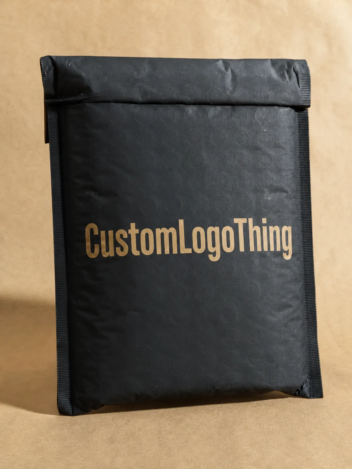
The finish is usually the first thing customers notice after the package has already been shoved, stacked, and dragged through a delivery chain that does not care about your brand story. That is why custom Padded Mailers for Coffee Roasters print finish comparison matters more than most buyers expect. A mailer can look perfect in a render and still arrive with rub marks, glare, or a tired-looking surface.
Coffee roasters use padded mailers for sample packs, merch drops, subscription orders, and small-batch bean shipments because they are light, protective, and cheaper to move than a box. Once the structure is chosen, the finish does a lot of the brand work. It changes how the logo reads, how color behaves, how the package photographs, and how premium or plain the mailer feels when a customer pulls it from the stack.
The usual finishes on the table are matte, gloss, soft-touch, and uncoated or low-coat looks. Each one pushes the package in a different direction. Matte hides handling better. Gloss makes color louder. Soft-touch feels expensive, sometimes almost velvety. Uncoated looks more natural and less polished, which suits a coffee brand that wants an honest, earthy package instead of retail theater. The right choice comes down to visual impact, scuff hiding, tactile feel, moisture behavior, and unit cost. That is the real decision set. Everything else is decoration.
A finish is not just a cosmetic choice. It is a tradeoff between shelf appeal and shipping abuse.
Custom padded mailers for coffee roasters print finish comparison
For Custom Padded Mailers for Coffee roasters, the finish does not live by itself. It sits on top of a structure that already has a job: protect coffee beans, keep merch from getting crushed, and survive a shipping route that is not gentle. Start with that. Not with a shiny mockup that looks great in a deck and falls apart in the real world.
A roaster sending 250g sample packs to wholesale prospects has different needs than a brand mailing monthly subscriptions to repeat customers. The sample pack gets judged like branded packaging in a sales conversation, where a cleaner, more premium finish can help the first impression. The subscription mailer gets handled every week and stacked in fulfillment, which means scuff resistance and legibility matter more than a fancy sheen. Same product family. Different job.
Here is the short version. Matte gives you a calmer, more modern look and usually hides wear better. Gloss makes color punchier and can make a small logo feel louder, but it also shows fingerprints and scratches more easily. Soft-touch brings a premium tactile feel, which works well for retail packaging or higher-end product packaging, though it can cost more and wear in its own way. Uncoated or low-coat finishes are the least flashy and often the most natural-looking, which suits brands that want a simpler coffeehouse feel instead of polished retail packaging.
If the mailers are part of a larger packaging system, it helps to compare them against other formats too. Some coffee brands realize they do not need a padded mailer at all once they look at the full Custom Packaging Products lineup. Others compare the structure against Custom Poly Mailers because the shipment does not need as much padding as they assumed.
That comparison matters because a finish can hide some flaws, but it cannot fix the wrong base structure. A shiny finish on a flimsy mailer is still a flimsy mailer. Packaging design should fit the delivery route, not just the mockup.
How Print Finishes Work on Padded Mailers
On padded mailers, the print finish usually sits in one of three places: directly on the outer film, under a protective coating, or over a laminated layer that changes the final surface. That stack affects more than the visual effect. It also changes abrasion resistance, color depth, and whether the mailer feels slick, dry, or soft in the hand. Buyers often ask about the finish as if it were a single layer. It is not. It is a material system.
Color behavior shifts fast once you change the finish. Gloss tends to increase the perception of saturation and contrast because light bounces off the surface. Dark coffee-brand palettes can look richer under gloss, especially deep browns, charcoal, and black. Matte lowers reflection and can soften the same palette a little, which may be exactly what you want if the brand uses muted earth tones and a restrained identity. Soft-touch behaves differently again; it reduces glare while adding a tactile quality that reads as premium without shouting.
Fingerprint visibility is another practical issue. Gloss tends to show it. Matte hides it better, though some matte finishes can burnish where they rub against cartons or conveyors. Soft-touch looks impressive in a controlled setting, but if your team handles the mailers a lot during packing, ask for a sample and test it with actual gloves, tape, and stack pressure. That is the part mockups never show you.
For ecommerce listings and social photos, gloss can be a mixed bag. It photographs well when the lighting is controlled and the art is bold. Under harsh warehouse light or a phone flash, it can flare and wash out details. Matte is easier to photograph because it reduces glare, which helps when you want the logo, roast notes, or QR code to stay readable. If the brand sells through direct-to-consumer channels and uses the mailer as part of the unboxing moment, that matters.
Finish also shapes the unboxing feel. A paper-like or low-coat surface can feel practical and close to the values of a craft roaster. A soft-touch mailer can feel more like retail packaging or a gift item. Neither is automatically better. One says, "careful and premium." The other says, "efficient and honest." Pick the one that matches the brand, not the one that looked coolest in someone else’s social post.
Where the print sits matters
If the print is applied before lamination, the finish can protect the image but also dull it slightly. If the print sits on top of the film, the design may look sharper, but abrasion can be more visible. Digital printing is often the easier path for shorter runs, variable designs, or fast-moving launch schedules. Offset printing can make sense when the run is larger and color consistency across a bigger order matters more. The finish has to match the print method, or the results can get awkward fast.
How the surface changes color
Gloss gives you punch. Matte gives you restraint. Soft-touch sits in between visually but usually feels more premium to the hand. If a roaster uses highly detailed packaging design with fine type, roast notes, and multiple logo marks, ask for a physical proof. Screen color is a liar. The printed mailer will respond to the finish, the ink density, and the substrate in ways a monitor cannot predict.
For that reason, strong branded packaging is not just about artwork. It is about how the surface carries the artwork after production, stacking, and delivery. The print finish is part of the package branding decision, not a cosmetic afterthought.
Key Factors That Decide the Right Finish
Durability should be the first filter. Coffee mailers get rubbed against cartons, dragged across tape, stacked on pallets, and grabbed by multiple hands before the customer ever sees them. If the finish shows scuffs easily, that damage often shows up right where the brand mark sits. That is annoying, and it is expensive, because you paid to advertise the flaw.
To compare durability in a practical way, think about the whole route: fulfillment table, sortation belt, outer carton, delivery truck, porch, and customer handoff. The best finish is the one that still looks intentional after that route. If you want a formal reference point for handling and abuse, transit testing organizations like ISTA are useful. If fiber sourcing matters to your material stack, FSC is worth checking when the mailer includes paper-based components.
Brand positioning comes next. A heritage roaster that sells on origin stories and craft usually wants a warmer, less glossy look. A minimalist direct-to-consumer brand may want a cleaner matte surface with a tight logo lockup. A luxury gift pack might justify soft-touch because the tactile feel supports the price. A wholesale refill program, by contrast, often needs a finish that holds up, reads clearly, and does not inflate cost for no good reason. Finish should support the story the brand is already telling.
Readability is another real-world factor. If the design uses a lot of text, roast notes, QR codes, or shipping panel instructions, too much sheen can create clutter. If the logo is simple and the color palette is dark, matte may flatten the image more than the team expects. You want the finish to help the hierarchy, not fight it. In product packaging, visual hierarchy is not a theory lesson. It is whether people can tell what they are holding in two seconds.
Moisture behavior deserves a sober look. Finish is not the same thing as waterproofing. A gloss or coated surface may tolerate light exposure better than an uncoated look, but the actual resistance comes from the material stack and seal quality. Coffee bags can shed oils, shipping environments can be humid, and condensation can happen in transit. If your mailer will touch cold storage, rainy loading docks, or sweaty hands in a retail environment, do not assume a pretty finish solves the problem.
Sustainability and end-of-life handling also belong in the conversation. Heavy coatings, mixed-material laminations, and soft-touch films can complicate recycling. A simple uncoated or low-coat finish is often easier to position as lower impact, but only if the full construction supports that claim. Otherwise it is just green theater with a nice font. Check the substrate, the adhesive, and the finish together. That is the honest way to look at retail packaging claims.
Here is a simple decision matrix you can use before requesting quotes:
- Choose matte if you want better scuff hiding, controlled glare, and a modern craft look.
- Choose gloss if your artwork needs stronger color impact and the mailers will not be abused heavily.
- Choose soft-touch if the unboxing moment matters enough to justify a higher unit cost.
- Choose uncoated or low-coat if you want a natural, restrained feel and simpler material behavior.
That is the whole game in four bullets. Everything else is a variation.
Cost, Pricing, MOQ, and Unit Cost Tradeoffs
Finish changes price because it can change coating steps, ink behavior, drying or curing time, and setup complexity. A basic surface is usually easier to produce. A specialty tactile finish takes more care and sometimes more setup waste. That is why two mailers with nearly identical artwork can come back with noticeably different quotes.
As a rough buyer's range, a standard custom padded mailer with simple print coverage might land around $0.38-$0.70 per unit at 5,000 pieces, depending on size, structure, and print coverage. Matte usually adds a modest premium. Gloss can be similar or slightly cheaper than matte on some lines. Soft-touch is the one that tends to move the price more sharply, especially if the supplier treats it as a specialty finish or extra lamination step. On smaller runs, the spread can widen fast because setup costs are spread over fewer pieces.
The table below is the practical version, not the fantasy version.
| Finish | Typical unit cost impact | Visual effect | Scuff and fingerprint behavior | Best fit |
|---|---|---|---|---|
| Matte | +$0.03-$0.07 | Soft, calm, modern | Hides handling better than gloss; can burnish if abused | Specialty coffee, minimalist branding, subscription shipments |
| Gloss | +$0.00-$0.05 | Bright, saturated, high contrast | Shows fingerprints and rub marks more easily | Bold retail packaging, high-impact launch drops |
| Soft-touch | +$0.06-$0.15 | Muted shine with a premium hand feel | Feels elevated, but wear can show in a different way | Gift sets, premium merch, higher-end direct-to-consumer orders |
| Uncoated or low-coat | +$0.00-$0.03 | Natural, understated, earthy | Less glare; may show staining or surface dirt sooner | Eco-leaning branding, heritage looks, simple mail programs |
MOQ is where the math gets real. Some finishes work well on low to mid-size runs because the equipment and setup are common. Others, especially premium tactile options, may only make financial sense once the order size climbs. If the supplier needs specialized lamination or a longer setup window, the minimum order quantity can rise. That is not a trick. It is production reality.
When a higher unit cost is worth it, the answer usually ties back to the business moment, not the finish itself. A holiday drop, influencer kit, store opening, limited coffee subscription launch, or premium sampler box can justify a stronger finish because the package is carrying marketing weight. If the mailer is just a shipping vehicle for repeat replenishment, it should not eat too much budget. Spend the money where customers will feel it.
One useful way to compare quotes is to break them into three parts:
- Base structure cost - the padded mailer itself, including size and material.
- Print and finish cost - coatings, lamination, and any specialty surface treatment.
- Freight and waste - packing efficiency, carton count, and any scrap from setup.
A quote that looks cheap because the finish is stripped back may not stay cheap once you add freight, spoilage, or a second round of samples. Likewise, an expensive-looking quote might be the better buy if it lowers handling damage or helps the brand avoid buying separate custom printed boxes for a short campaign. Buying packaging is not just about the piece price. It is about what the piece lets you do.
From a packaging buyer's point of view, the right question is not "Which finish is the prettiest?" It is "Which finish gives me the best mix of appearance, resistance, and order size fit?" That sounds less romantic. It is also how people keep their margins.
Print Process, Timeline, and Turnaround Steps
The process usually starts with finish selection, because the surface choice affects artwork prep, proofing, and production sequencing. After that comes dieline review, color setup, sample or proof approval, printing, curing or coating, finishing, packing, and shipment. If the supplier is clear, the schedule is straightforward. If they are vague, expect delays and surprise emails.
Time gets added in a few predictable places. Design revisions cost days. Color matching costs days. Physical samples cost days. Specialty effects can add more because they may need separate runs, test pulls, or extra curing time. Short runs with digital printing often move faster than larger offset printing jobs, but speed still depends on how fast the artwork gets approved and whether the finish needs extra setup.
For normal schedules, a standard printed padded mailer job often lands around 12-18 business days after proof approval. Specialty finishes or larger quantities can stretch that to 18-28 business days, sometimes longer if the supplier is juggling multiple setups. Rush orders are possible in some cases, but the price usually climbs and the finish options shrink. That is not the supplier being difficult. That is production math.
If you want a cleaner turnaround, do three things early:
- Send artwork in the right format, usually vector files with outlined fonts and clean CMYK separations.
- Approve the dieline fast so the team is not guessing about panel placement or label zones.
- Decide on the finish before sample requests multiply into a small project of their own.
That last part matters more than people think. A roaster that keeps changing the finish after reviewing proofs can blow up the schedule without realizing it. The surface choice can affect how the artwork reads, which means the finish has to be locked before production starts. Otherwise, you are paying for indecision.
There is also a difference between a normal schedule and a promise that sounds nice but will wreck your launch date. If a supplier says they can do specialty tactile work in a very short window without seeing the artwork or confirming the material stack, be cautious. Maybe they can. Maybe they cannot. In custom printed boxes and mailers alike, the safest vendors are the ones who explain the bottlenecks instead of hiding them behind cheerful language.
A good production plan leaves room for sample review, one revision round, and a realistic ship window. A bad plan assumes everything will go perfectly. That is how deadlines get sent to die.
Common Mistakes Coffee Roasters Make With Finish Choice
The first mistake is choosing from a digital mockup alone. A screen cannot show warehouse glare, phone flash, or how a matte surface changes under fluorescent lighting. A render can sell the idea. It cannot tell you whether the package will still look clean after handling. That is why sample comparisons matter.
The second mistake is picking gloss for a dark, busy layout. Gloss can make black and brown palettes feel richer, but it also shows every fingerprint and rub mark. If the design already has a lot of information on it, the extra glare can make the mailer feel loud in the wrong way. On the other hand, some brands choose matte and then complain that the mailer lacks punch. Usually the problem is not the finish by itself. It is the artwork and finish not agreeing with each other.
The third mistake is ignoring shipping abuse, moisture, coffee dust, and bag oils. Coffee roasters are not shipping bridal invitations. The packages get touched, stacked, and sometimes spilled on. Even a well-finished mailer can dull or mark faster than expected if it lives in a chaotic fulfillment environment. If your team handles open bags, roast samples, or merch inserts near the mailers, keep the setup clean. Surface contamination can make a finish look worse than it actually is.
The fourth mistake is mismatching the finish to the order volume and budget. Small brands often get seduced by the premium tactile look and end up paying too much per piece for an effect customers barely register. Bigger brands can make that spend work because volume smooths the unit economics. The key is to spend where the mailer is doing brand-building work, not just because soft-touch sounds fancy in a meeting.
The fifth mistake is overcomplicating the order. Too many variables lead to delays, proof churn, and unhappy purchasing teams. Finish, size, print coverage, and material stack should all be intentional. But if the goal is simply "a mailer that looks good and survives the trip," do not invent a harder project than you need. Good packaging design is decisive. It is not a puzzle for its own sake.
When roasters get this right, the mailer becomes a quiet piece of retail packaging that supports the coffee instead of competing with it. When they get it wrong, the finish becomes the most obvious part of the mistake. Customers notice that faster than buyers do.
Expert Tips and Next Steps for Choosing the Right Finish
Start with a small sample comparison. Request two or three finishes and look at them under warehouse light, daylight, and storefront light. If the brand photo style is controlled and polished, include a test under camera flash too. That sounds basic because it is basic. Basic still works.
Run a pilot shipment before you commit to the full order. Even 100 to 300 pieces can tell you a lot about scuffing, stacking, and how the surface behaves once people stop handling it carefully. Sample mailers are useful, but a real shipment gives you the honest version. There is no substitute for seeing the package after transit.
Tie the finish to the business problem it solves. If the problem is premium presentation, soft-touch may be worth the extra cost. If the problem is glare on dark artwork, matte probably wins. If the problem is a more natural recycled look, uncoated or low-coat is usually the better path. If the problem is customer attention in a crowded retail moment, gloss may help. In each case, the finish should answer one job clearly.
Before you approve production, build a final checklist:
- MOQ - Does the required quantity fit your inventory plan?
- Unit cost - Does the finish premium still make sense at your run size?
- Lead time - Can you absorb proofing, sample review, and production?
- Surface behavior - Does it hide scuffs, fingerprints, and glare the way you need?
- Brand fit - Does the finish match the roaster's visual identity and customer expectations?
If you are still debating between mailer formats, compare the padded option against other branded packaging choices before locking the order. For some coffee businesses, the right answer is not a premium finish at all. It is a different structure, maybe a lighter mailer, maybe a box, maybe a mixed approach across product packaging tiers. That is where smart buying starts to look boring in the best possible way.
Once the finish is selected, keep the rest of the order simple. Clear artwork, realistic quantities, and one clean production path usually beat a complicated spec sheet. The best finish choice is the one that supports the brand, respects the route, and does not force the purchasing team into a corner.
Frequently Asked Questions
Which finish works best for custom padded mailers for coffee roasters?
Matte usually hides scuffs and fingerprints best, while gloss makes colors pop more aggressively. Soft-touch feels premium but can show wear differently, so the best choice depends on shipping distance and brand style. If the mailers travel far or get handled a lot, durability and scuff hiding usually matter more than a fancy look.
Does a gloss finish cost more for coffee roaster mailers?
Usually yes, because the finish can add coating or extra production steps. The price difference depends on the supplier, order size, and whether the finish needs special setup. Ask for quotes at multiple quantities so you can see whether the finish change is a real budget hit or just a small bump.
Will a special finish change the MOQ for custom padded mailers?
It can, especially if the finish needs more setup or a specialized production line. Some premium finishes make more sense at larger volumes, where the per-unit cost starts to behave normally. Always confirm MOQ before approving artwork, because the wrong finish can force a bigger order than you planned.
How long does production usually take for printed padded mailers?
Standard jobs move faster, but proofs, samples, and finish tests can add days or weeks. Specialty finishes, large runs, and color-matching revisions usually extend lead time. The fastest way to keep turnaround tight is to approve artwork early and lock the finish before production starts.
Should coffee roasters order samples before full production?
Yes, because a screen mockup will not show scuffs, glare, or real-world color shifts. Samples help you test how the finish looks with your beans, labels, and shipping conditions. A small pilot run is cheaper than discovering the wrong finish after a full pallet is already printed.
Pick the finish that survives your route, matches your brand, and fits the order size you can actually move. That is the practical custom Padded Mailers for Coffee Roasters print finish comparison: compare matte, gloss, soft-touch, and low-coat samples side by side, then choose the one that still looks right after a real shipment, not just after approval on a screen.

