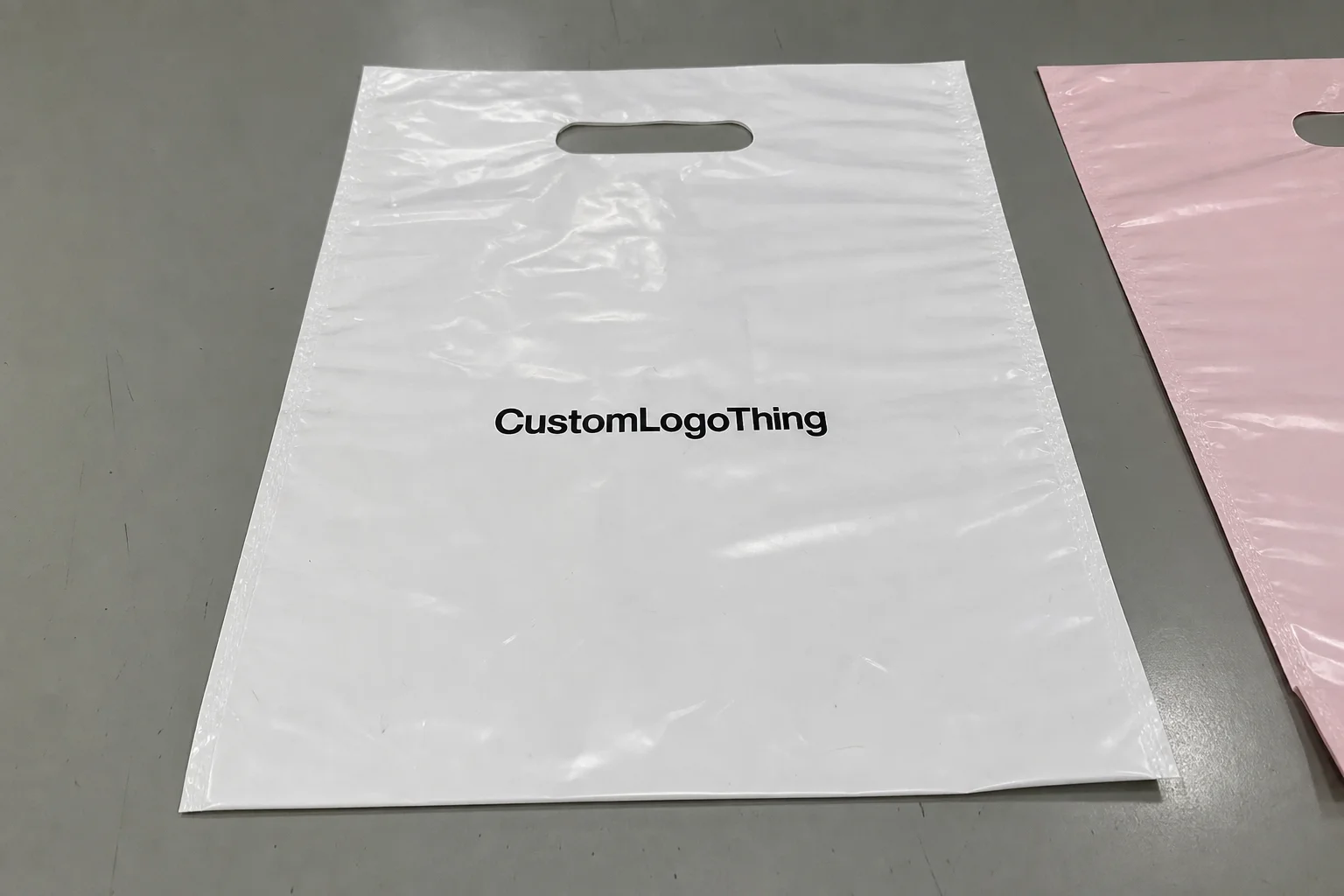
Buyer Fit Snapshot
| Best fit | Branded Padded Mailers for Sample Kits projects where brand print, material claims, artwork control, MOQ, and repeat-order consistency need to be specified before quoting. |
|---|---|
| Quote inputs | Share finished size, material target, print colors, finish, packing count, annual reorder estimate, ship-to region, and any compliance wording. |
| Proofing check | Approve dieline scale, logo placement, barcode or warning zones, color tolerance, closure strength, and carton packing before bulk production. |
| Main risk | Vague material claims, crowded artwork, missing packing details, or unclear freight terms can make a low unit price expensive after revisions. |
Fast answer: Branded Padded Mailers for Sample Kits: Finish Comparison should be specified like a repeatable production item. The safest quote records material, print method, finish, artwork proof, packing count, and reorder notes in one written spec.
Production checks before approval
Compare the actual filled-product size with the drawing, then confirm tolerance on folds, seals, hang holes, label areas, and retail display edges. Reserve space for logos, QR codes, warning copy, and material claims before decorative graphics fill the panel.
Quote comparison points
Review material grade, print process, finish, sampling route, tooling charges, carton quantity, and freight assumptions side by side. A quote is only useful when the supplier can repeat the same color, closure quality, and packing count on the next order.
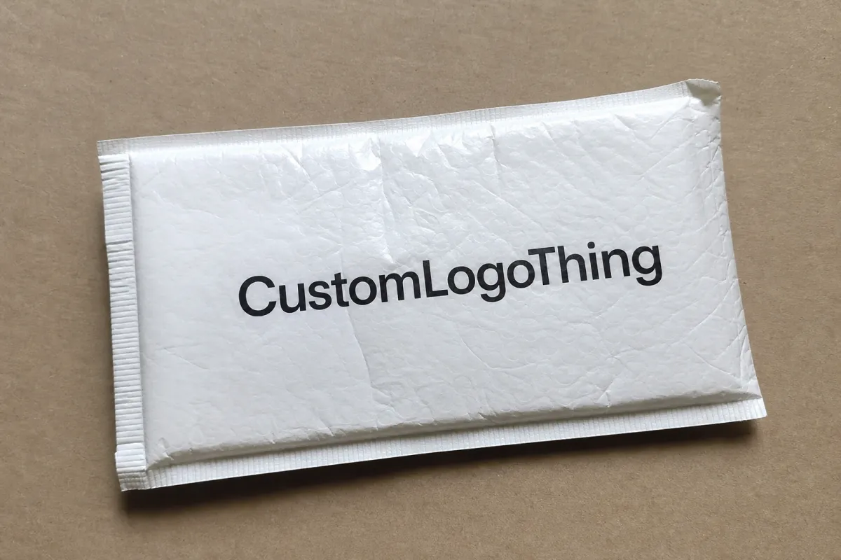
Branded Padded Mailers for Sample Kits: Finish Comparison
A branded Padded Mailers for Sample kits print finish comparison is not really about shine. It is about perception. The finish changes how the kit feels before the flap opens, before the insert gets read, and before anyone decides whether the brand feels sharp or rushed. Matte reads calmer. Gloss reads louder. Soft-touch reads expensive, sometimes a little too confidently. Same artwork. Different message.
Sample kits also get judged under unkind conditions. They sit under warehouse LEDs, ride in courier bags, get stacked on desks, and end up in photos shot with terrible lighting. A finish that looks perfect on a mockup can fail in hand if it throws glare, shows fingerprints, or dulls the artwork more than expected. Buyers notice. Sales teams notice. Prospects do too, even if they cannot explain why the package feels slightly off.
That is why the finish deserves the same attention as structure, inserts, and closure style. A mailer with the wrong coating can make a $12 sample feel like a throwaway promo. The reverse is true as well. The right finish can make a simple kit look considered, cleaner, and more valuable than the budget would suggest.
For broader packaging inspiration and implementation examples, see the Case Studies page and the broader Custom Packaging Products catalog. If the outer shipper needs to match a mailer spec, it helps to compare it with Custom Poly Mailers before locking the final system.
Why Finish Choice Can Make Sample Kits Feel Pricier Than They Are
Sample kits are an odd packaging category. They act like sales tools, product carriers, and brand statements at the same time. The padded mailer is usually the first thing people see, which means it sets expectations before the sample itself has a chance to do any work.
Matte and gloss do not just change reflectivity. They change the tone of the whole package. Matte usually makes the mailer feel quieter and more controlled. Gloss pushes color and contrast harder, which can be useful for consumer launches or beauty campaigns. But gloss also makes handling marks obvious. Tiny scuffs, corner rub, and adhesive traces show up fast. If the mailer moves through a warehouse, gets tossed in a tote, then lands on a desk, gloss tells the story of the trip.
That matters because sample kits usually carry a small system of parts, not one hero item. Inserts, cards, vials, seals, and leaflets all need to feel like they belong together. A finish that looks polished outside but clashes with the insert stock inside makes the package feel assembled instead of designed. The strongest kits read as one object from outer mailer to final tab.
A finish that looks premium on screen can still read flat in hand. Approval should happen on real materials, under real light, with real handling. PDFs are convenient. They are also liars.
If the kit is going to prospects, influencers, retailers, or trade-show contacts, the outer package also becomes camera bait. People photograph what feels intentional. Matte and soft-touch finishes usually cut glare in photos. Gloss can make saturated brand colors pop when the lighting is controlled. That tradeoff sits at the center of most finish decisions.
Branded padded mailers for sample kits print finish comparison
Once buyers start a branded Padded Mailers for Sample Kits print finish comparison, the list usually narrows to three families: gloss, matte, and soft-touch. Each changes more than appearance. It affects color depth, print clarity, scuff visibility, fingerprint pickup, and how the mailer feels in the hand.
| Finish | Visual effect | Handling and wear | Print behavior | Typical added cost per unit | Best fit |
|---|---|---|---|---|---|
| Gloss | High shine, stronger contrast, sharper color pop | Shows fingerprints and scuffs faster | Works well with bold graphics and saturated CMYK builds | $0.08-$0.22 | Beauty, consumer, promo, camera-heavy use |
| Matte | Low glare, softer premium feel, more controlled look | Hides light wear better and photographs cleanly | Can soften dark tones slightly, so ink density matters | $0.07-$0.20 | Biotech, wellness, luxury sampling, trade shows |
| Soft-touch | Velvety, tactile, upscale, often the most memorable in hand | Feels premium, but can mark if abrasion control is weak | Best for simple branding, spot color logos, restrained layouts | $0.20-$0.45 | High-value launches, VIP kits, premium direct mail |
Gloss is the loudest option. It drives saturation and can make a simple logo look vivid from across a table. That helps when the mailer has to compete with other literature or sit in a photo spread. The downside is predictable: fingerprints, edge rub, and tiny production marks become more visible. If the kit moves from packing table to courier bag to customer desk, gloss will show the route.
Matte is often the safest all-around choice. It lowers glare, gives the print a more restrained feel, and usually hides handling marks better than gloss. Typography benefits too. Small legal text, QR codes, and fine linework stay easier to read because the surface is not throwing light back at the viewer. The tradeoff is that matte can mute very dark artwork or heavy color if the ink system is not tuned properly.
Soft-touch sits in a premium lane. It can make a mailer feel noticeably more expensive without changing size or structure at all. That tactile hit is powerful. It is also not free. Soft-touch and velvety coatings often raise unit cost, need tighter print finishing, and sometimes require better abrasion control so the surface stays clean through fulfillment and shipping.
For a sample-kit program, the right finish usually depends on how the mailer will be used after production. If it is mailed once and opened in a controlled environment, gloss can be fine. If it will be stacked in a stockroom, photographed under harsh overhead lights, and opened by different hands, matte usually behaves better. If the unboxing moment needs to feel unmistakably premium, soft-touch earns its place more often than people expect.
Printing method matters too. Digital printing works well for short runs, variable copy, and faster proof cycles. Flexographic printing gets more economical at higher volumes, especially when the artwork stays stable. Offset printing usually fits inserts or sleeves better than the mailer body itself, but it still matters because the inserts and the outer pack need to read as one system. A strong finish choice keeps those parts visually aligned.
How Print Finish Works on Padded Mailers
Finish is not a single treatment. It is a stack of decisions: substrate, ink system, coating, lamination, and curing. On a padded mailer, those layers decide whether the brand color sits crisply on the surface or sinks into the structure and loses authority. A film mailer, a kraft-backed mailer, and a laminated hybrid all react differently.
Paper-based mailers are common for sample kits that need a more natural or tactile feel. A solid build might use a paperboard outer, often around 350gsm C1S artboard, wrapped to a cushioned liner, or a similar paper structure with a kraft bubble or PE bubble insert. That gives the mailer more body and better print definition. Polyethylene and other film-based mailers hold print differently. They can be excellent for durability and moisture resistance, but the print surface usually needs tighter control over ink adhesion and curing.
The print method matters too. Digital printing is useful for small to medium runs, personalization, and quicker proof cycles. Flexographic printing is common for long runs and repeated branding where cost per unit matters. CMYK builds are ideal for photos and gradients, while a spot color can keep a key brand red, green, or blue more consistent across runs. If the logo is the hero, spot color usually gives tighter control. If the layout includes gradients or photographic textures, CMYK is usually the better fit.
Ink behavior changes under finish, and that is where many teams get surprised. Gloss can deepen color and sharpen edges, but it can also exaggerate tiny layout issues because every element reflects light. Matte softens the image slightly while improving readability under mixed lighting. Soft-touch adds a tactile layer that makes the piece feel more curated, but it can also require a better match between coating and ink density so the graphics do not turn flat.
The finish also interacts with padding thickness and closure style. A mailer with a thick cushioned layer and a strong peel-and-seal strip feels different from a slim pouch with minimal loft. If the mailer squashes too easily, a premium finish will not rescue it. If the closure looks rough or the edge seal is uneven, the best coating in the world will not make the kit feel complete. Good print finishing is never only about the print face. It is the whole object.
For shipping programs that need formal handling validation, ask whether the structure has been tested against a recognized distribution profile such as those published by ISTA. Vibration, drop, and compression can change the appearance of a finish long before a customer opens the package. A mailer that survives the route but arrives visibly scuffed still fails the brand test.
Key Factors That Change the Final Look and Feel
Brand positioning is the first filter. A biotech or diagnostics sample kit usually works better with a restrained matte look because it signals clarity, order, and control. A beauty launch may need more saturation and gloss, especially if the unboxing is meant for social media. A trade-show leave-behind sits in the middle. It has to look polished in hand, but it also needs to survive being packed with catalogs, pens, and whatever else ended up in the tote.
Shipping conditions come next. Conveyor belts, carton friction, warehouse stacking, and delivery bag abrasion all change how a finish performs. Gloss shows rub marks quickly. Soft-touch can scuff if the coating is not specified carefully. Matte usually hides minor wear better, which is why it often gets picked for volume mail campaigns. If the program has rough handling in its future, spec the finish as though the mailer will be touched more than once. It probably will be.
Artwork complexity is another major variable. Heavy gradients, metallic effects, photographic imagery, and tiny legal copy all respond differently to a finish. A dark navy background on gloss may look richer than the same art on matte. Small QR codes can suffer if the coating reduces contrast. If the design leans on thin lines or reverse type, the print method and finish should be tested together, not treated as separate decisions.
Sustainability claims narrow the field fast. Some finishes and laminated structures make recycling harder, especially when mixed materials are bonded together. If the mailer is paper-based and the brand wants FSC alignment, the paper chain should be checked carefully. If a paper source is part of the spec, verify the chain-of-custody logic at FSC and make sure the claim matches the actual structure, not just the outer layer. Local recycling guidance matters too, because accepted materials vary by region more than most marketing teams expect.
The final factor is the full unboxing scene. Inserts, tissue, labels, and stickers either support the finish or fight against it. A matte mailer with a high-shine sticker can look intentional if the contrast is planned. The same combination can look accidental if the textures clash. The strongest kits usually repeat one visual idea across the components instead of stacking unrelated effects.
That is also why a wider packaging review helps. If the sample kit includes a larger shipper, a sleeve, or internal product carriers, compare the structure with the broader packaging architecture in Custom Packaging Products. If a film-based outer shipper is part of the same program, compare the finish logic with Custom Poly Mailers so the system feels planned rather than pieced together.
Process, Timeline, and Production Steps for Approval
The cleanest approval process starts with a short finish brief. Define the audience, delivery context, photo environment, sales motion, and the exact message the mailer needs to send. A lab sample kit that goes to procurement should not be specified the same way as a lifestyle launch kit sent to creators. The surface treatment should match the job.
Then request physical samples. Screens are useful for layout, but they are terrible at showing glare, texture, and color shift. A digital proof can suggest how the artwork will behave, yet it cannot replicate the way a matte coating absorbs light or the way gloss reflects a desk lamp. If the finish matters, you need a swatch, a press sheet, or a real mailer sample with the same substrate and coating stack.
A practical production flow usually looks like this:
- Confirm size, structure, and closure style.
- Choose print method: digital printing, flexographic printing, or another approved process.
- Set the color mode, usually CMYK, spot color, or a hybrid of both.
- Approve the finish family: gloss, matte, or soft-touch.
- Review physical proofing and confirm acceptable variation.
- Run production, then inspect print clarity, coating consistency, and edge wear.
- Pack, palletize, and verify that the finished mailers hold up in transit.
Timeline turns finish decisions into a real schedule quickly. A standard short run with a simple matte or gloss finish often moves in about 12 to 15 business days from proof approval when the structure is already approved and stock materials are on hand. If the job needs a custom structure, heavier ink coverage, a special laminate, or soft-touch coating, the schedule usually stretches to about 15 to 25 business days. If the design changes after proofing, add time. If the color balance needs another round because the coating changes the look, add more time.
One of the biggest schedule mistakes is approving the artwork but not the surface behavior. A team may sign off on the file while still arguing over whether the finish is too reflective, too muted, or too tactile. That creates rework at the worst possible time. The best sign-off checklist locks three things: color, finish, and tactile feel. Once those are fixed, the rest is operational.
For sample kits with fixed launch dates, I would also recommend a pilot batch. Even 100 to 250 units can reveal whether the finish scratches in the filler area, whether the adhesive strip behaves well, or whether the outer surface photographs as expected. Small pilot runs cost far less than reprinting several thousand units.
Cost, Pricing, MOQ, and Quote Variables to Compare
A branded padded mailers for sample kits print finish comparison should always be priced on landed cost, not sticker price. The quote can hide more than it shows. Base mailer cost, print coverage, finish upgrade, setup fees, freight, and spoilage all move the final number. A unit price that looks low can become expensive once the rest of the stack lands on top of it.
For a useful real-world benchmark, a 5,000-piece run of custom padded mailers with standard print coverage often lands around $0.15-$0.24 per unit for a simple paper-based structure, depending on size, number of print colors, and whether the job is one-side or full-wrap coverage. A smaller run, like 1,000 to 2,500 pieces, usually lands higher per unit because setup gets spread over fewer mailers. If the artwork covers more of the surface, or if the finish adds a coating or lamination step, the price climbs again.
For illustration, a 2,500-unit run might look roughly like this:
| Quote element | Gloss | Matte | Soft-touch |
|---|---|---|---|
| Unit print and finish add-on | $0.08-$0.22 | $0.07-$0.20 | $0.20-$0.45 |
| Setup or plate fees | $75-$250 | $75-$250 | $150-$350 |
| Typical MOQ pressure | 1,000-2,500 units | 1,000-2,500 units | 2,500 units or higher |
| Best budget outcome | Large volume, simpler artwork | Balanced volume, controlled look | High-value or premium launches |
Those numbers move by region, substrate, and print coverage, but the pattern stays the same: premium finish usually increases both unit cost and the pressure on minimum order quantity. That happens for ordinary reasons. The supplier may need extra coating steps, longer cure times, or more inspection to keep the finish consistent. That extra process time has to be paid for somewhere.
Buyers should also ask whether the finish affects reject rates. A finish that costs a little more per unit but cuts down on scuff-related scrap can be the better economic choice. If a $0.12 difference per mailer sounds tiny, multiply it by 5,000 units and it becomes $600. Add reprints, rush freight, and lost time, and the real gap gets wider. Finish should be judged as a program cost, not a decoration cost.
Side-by-side quotes help. Keep the artwork constant and change only the finish. That makes the value conversation much cleaner. If the matte option is only slightly more expensive than gloss but cuts fingerprints and improves photography, the question becomes whether the brand wants to pay for the cleaner look. If soft-touch costs materially more, the team can decide whether the tactile effect justifies the margin hit.
Do not forget freight. Sample kits often move in smaller, repeated batches, which means transport can account for more than expected. A quote with excellent unit pricing but weak freight terms can wreck a budget. Because sample programs often reorder, it is worth asking how stable the quote will be on the next run. A finish that only behaves once is not much use.
Common Mistakes When Choosing a Finish for Sample Kits
The first mistake is choosing from a screen mockup alone. A glossy rendering often looks richer online than it does in a real facility under fluorescent or LED lighting. A matte render can look muted in a browser and elegant in hand. Digital previews are useful. They are also incomplete. A lot incomplete.
The second mistake is skipping scuff testing. Some finishes look excellent on day one and disappointing after one round of packing. If the mailer is stacked, rubbed against carton edges, or handled by multiple people, the finish needs abrasion tolerance. A beautiful sample that arrives marked is still a failed sample.
The third mistake is designing for one channel only. A mailer that works well for influencer photos may be the wrong choice for a trade-show tote or a procurement review pack. The same surface can read luxurious in a controlled studio and messy in a cluttered office. Matching finish to one use case is a shortcut that tends to create another round of packaging work later.
The fourth mistake is underestimating typography risk. Tiny legal copy, QR codes, and fine type can lose contrast if the finish softens the print too much or if the ink density is light. This matters even more for regulated products or sample kits that need ingredient notes, instructions, or compliance text. If the copy matters, check it on the actual structure, not only in the artwork file.
The fifth mistake is forgetting reorder consistency. A finish that varies from batch to batch can make one launch feel like it came from a different brand. That gets very visible with branded mailers, where buyers may compare old and new runs side by side. If a program is going to scale, ask what variation is acceptable and what happens if the next run comes in slightly warmer, glossier, or more textured than expected.
For teams building a larger packaging system, reviewing real examples in Case Studies can help set expectations around what holds up in actual fulfillment rather than concept art. It also helps buyers understand where a finish upgrade is worth spending on and where the money is better used on structure, inserts, or shipping protection.
Expert Tips and Next Steps for a Finish Test Plan
The simplest test plan is usually the best one. Build a small matrix with the same artwork on gloss, matte, and soft-touch samples. Keep the insert set identical. Keep the lighting constant. Then score each option across five criteria: first impression, print clarity, scuff resistance, photo performance, and total budget impact. That gives the team a comparison that is structured enough to support a decision, but practical enough to finish in one meeting.
If the kit has to be approved by more than one department, ask each group to look at the same sample under different conditions. Marketing should see it on a desk or in a photo setup. Operations should see it after packing and stacking. Sales should open it as a prospect would. Procurement should review the cost breakdown. Each group spots different problems, and finish choice affects all of them.
A pilot run is still the best guardrail. Even a small batch reveals the things a proof cannot: how the mailer picks up fingerprints, whether the print stays stable after sealing, whether the tape strip is aligned well, and whether the finish still feels premium after shipping. A theoretical choice becomes a real one fast. If a finish looks good in a file and mediocre in the hand, it is the wrong finish.
Document the final spec with enough detail that the next order does not drift. The spec should include:
- Finish name and coating or laminate type
- Substrate description and thickness
- Print method, such as digital printing or flexographic printing
- Color standard, including CMYK or spot color requirements
- Acceptable variation and scuff tolerance
- MOQ, lead time, and reorder assumptions
That level of detail protects against small changes that become big ones at scale. It also makes the conversation easier if a supplier changes a process step or proposes an alternate coating later. Specs do not remove judgment. They make judgment visible.
If you need a benchmark for structure and material options, the broader catalog at Custom Packaging Products is a useful starting point. For teams comparing film-based shipping formats, Custom Poly Mailers can help isolate which appearance and protection goals are being met by the outer mailer versus the finish itself.
My practical recommendation is simple: start with physical samples, view them under the same lighting your customers actually use, and lock the finish only after it survives handling, shipping, and photo review. That is the cleanest way to make branded padded mailers for sample kits print finish comparison decisions less subjective and more commercial. The finish is not decoration. It is part of the product.
Frequently Asked Questions
Which finish works best for branded padded mailers for sample kits?
Matte is usually the safest all-around choice when you want fewer fingerprints, less glare, and a more controlled premium look. Gloss works better when saturated color and strong contrast are the priority, especially for camera-heavy launches. Soft-touch makes sense when tactile feel is part of the brand story, but it often raises cost and needs better abrasion control.
Does print finish change how colors look on sample kit mailers?
Yes. Gloss often makes colors look deeper and sharper, while matte can soften saturation and reduce shine. If your artwork depends on tiny type, fine lines, or precise color matching, ask for a physical proof on the exact finish you plan to buy. The same ink can look noticeably different once the substrate, coating, and lighting are all in play.
How does finish affect cost and MOQ for custom padded mailers?
Specialty finishes usually increase both unit cost and setup burden, which can push the MOQ higher. For a 5,000-piece run, a standard printed mailer often lands around $0.15-$0.24 per unit depending on size and coverage, while premium coatings can move that higher. Request a side-by-side quote for two finishes so you can compare landed cost instead of only the sticker price.
What lead time should I plan for a custom finish on sample kit mailers?
Stock finishes can move quickly, but specialty coatings, custom proofs, and extra approval rounds add time. A simple run often lands in about 12 to 15 business days from proof approval, while more complex finish work can stretch to 15 to 25 business days or more. If the launch date is fixed, lock the spec early so sampling does not push the calendar.
How do I test finishes before ordering branded padded mailers for sample kits at scale?
Order a small pilot with the same artwork and inserts, then compare the finishes under real lighting and shipping conditions. Check for fingerprints, scuffs, readability, and how the mailer photographs from the angles your customers or sales team will use. Use a simple scorecard so the team can choose the best option without relying on subjective preference alone.