Buyer Fit Snapshot
| Best fit | Branded Padded Mailers for Jewelry projects where brand print, material claims, artwork control, MOQ, and repeat-order consistency need to be specified before quoting. |
|---|---|
| Quote inputs | Share finished size, material target, print colors, finish, packing count, annual reorder estimate, ship-to region, and any compliance wording. |
| Proofing check | Approve dieline scale, logo placement, barcode or warning zones, color tolerance, closure strength, and carton packing before bulk production. |
| Main risk | Vague material claims, crowded artwork, missing packing details, or unclear freight terms can make a low unit price expensive after revisions. |
Fast answer: Branded Padded Mailers for Jewelry: Print Finish Comparison should be specified like a repeatable production item. The safest quote records material, print method, finish, artwork proof, packing count, and reorder notes in one written spec.
Production checks before approval
Compare the actual filled-product size with the drawing, then confirm tolerance on folds, seals, hang holes, label areas, and retail display edges. Reserve space for logos, QR codes, warning copy, and material claims before decorative graphics fill the panel.
Quote comparison points
Review material grade, print process, finish, sampling route, tooling charges, carton quantity, and freight assumptions side by side. A quote is only useful when the supplier can repeat the same color, closure quality, and packing count on the next order.
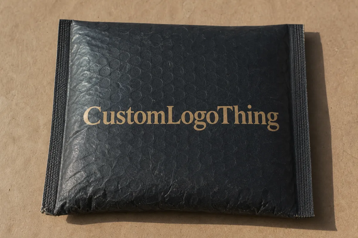
Branded Padded Mailers for Jewelry: Print Finish Comparison
Jewelry brands do not get much room for a weak first impression. The outer mailer speaks before the product does, which is why a branded Padded Mailers for Jewelry Packaging print finish comparison deserves more than a quick look at a mockup. Gloss reads loud. Matte reads controlled. Soft-touch reads expensive, at least until the surface starts rubbing against a conveyor belt. Customers notice all of that faster than most teams expect.
The outer layer is not just decoration. It has to survive sorting belts, delivery trucks, porch drops, and whatever else the parcel network decides to do with it. Jewelry may be small, but the packaging carries a lot of emotional weight. Rings, earrings, and chains often arrive as gifts, keepsakes, or self-purchases that people want to feel special. That pressure lands on the packaging first, not the product itself. A padded mailer built from paper-faced stock with a cushioning liner, or a film-faced mailer with bubble padding, has to protect and present at the same time.
Finish choice changes how color reads, how crisp the logo looks, and how quickly scuffs show up once the mailer starts moving through fulfillment. For small studios and larger retailers alike, finish is not decoration. It is part of the packaging system. Ignore it and you end up paying for a pretty proof that gets dinged up before the customer sees it.
Why Finish Choice Changes Jewelry Mailer Perception
Buyers usually do not separate the mailer from the brand. They read the shipment as one experience, and they do it fast. A clean finish suggests control and attention. A rubbed corner, dull print, or coating that looks cheap can drag the whole impression down, even when the jewelry is excellent. That is the strange math of packaging. A small material choice can change the perceived value of the order. A $48 necklace in a tired mailer can feel less considered than a $28 pair of earrings in one that looks deliberate.
Jewelry packaging gets judged harder than most categories. Apparel can get away with a little roughness. Supplements often arrive in plain cartons and nobody expects romance. Jewelry is different. It has to feel intimate, giftable, and premium the moment it lands. A pair of sterling silver studs may be easier to ship than a sweatshirt, yet the packaging pressure is usually higher. People remember how the mailer felt. They also remember if the surface looked like it had already survived a bad day.
Finish matters because it controls light, texture, and contrast. Gloss makes color louder. Matte calms the surface and cuts glare. Soft-touch adds a tactile cue that many people read as luxury before they even open the mailer. That cue matters for brands that want the outer shell to feel closer to premium custom printed boxes than to a basic shipping pouch. The finish has to support the price point, not argue with it.
Repeat orders raise the stakes. A customer may forgive a rough outer shipper once. If the same brand sends a second order in packaging that feels flimsy or inconsistent, trust starts to leak out of the experience. That loss is quiet. It does not always show up in a complaint. It shows up in weaker repeat behavior and fewer gift orders. Annoying, but real. The mailer becomes a tiny audit of your standards.
"The outside mailer is the first physical proof of your brand. If it feels generic, you have already spent some of the brand's credibility before the jewelry is even seen."
Brands that build a complete packaging set need the outer finish to match the rest of the system. A brushed-paper gift box paired with a highly reflective mailer can feel mismatched. A bold, modern jewelry line can look stronger with a flat matte exterior than with a shiny one. That kind of alignment is what separates package branding that feels designed from package branding that feels assembled from leftovers. Clean systems sell better than random nice things.
How Print Finishes Work on Padded Mailers
A padded mailer usually has three jobs: show the brand, protect the contents, and survive the trip. The printable surface may be paper-based, film-based, or a hybrid build. The finish sits on top of that surface as a coating, lamination, varnish, or an inherent texture in the stock. That top layer changes how ink sits, how color reflects, and how quickly the mailer starts looking worn. On a paper mailer, the finish might be a water-based matte coating or a film lamination. On a poly bubble mailer, the surface is usually treated so ink and coating can bond properly. Different base, different behavior. Same logo, not the same result.
The real question is not simply which finish looks best. It is which finish fits the artwork, the shipping route, and the price target. A digital print on a short run of mailers can behave differently from an offset printing job on a larger order because ink laydown, line sharpness, and surface interaction are not the same. Fine serifs, thin borders, and metallic accents all react differently depending on the finish. If the artwork includes a 6-point legal line or a hairline border, that detail usually looks cleaner on a smoother matte or gloss surface than on a heavily textured kraft face.
Gloss reflects more light. That creates punch and intensity, which helps saturated colors and bold logos. Matte diffuses light, which keeps typography more readable in mixed lighting. Soft-touch usually sits in matte territory but feels smoother and more luxurious in hand. Spot varnish or selective coating can highlight one area while leaving the rest subdued, which works nicely when a logo lockup or border pattern needs emphasis. On a jewelry mailer, a spot varnish over the logo and product line can make the brand mark pop without turning the whole surface into a mirror.
Printing method matters just as much. Offset printing usually delivers stronger consistency at higher volumes. Digital printing is often the better move for lower minimums, fast artwork changes, or testing multiple versions. Jewelry brands that run seasonal artwork, limited editions, or regional variations often prefer digital because it lowers the risk of getting stuck with obsolete inventory. Bigger, stable runs usually favor offset for price efficiency. If you are ordering 500 to 1,000 pieces, digital is often the saner choice. If you are ordering 5,000 to 20,000 pieces with the same design, offset usually becomes the better math.
No finish wins every time. A satin-coated paper mailer can look elegant on one design and flat on another. A film mailer can handle moisture better but may feel less warm in the hand. Samples are not optional here. A spec sheet does not tell you how a finish looks under office lights, in a phone photo, or after the first round of transit abuse. It also does not tell you how a black soft-touch surface shows lint after someone folds it three times before packing. Real life is rude like that.
Packaging buyers also need to compare the mailer against the rest of the system. Does it match the tone of your Custom Packaging Products? Does it sit naturally beside your Case Studies examples? If you already ship in Custom Poly Mailers, the new finish should fit the same fulfillment setup, not just the mood board. Pretty is fine. Pretty and usable is better. Nobody gets points for a beautiful SKU that jams the line.
For a wider view on transit standards and material sourcing, references from ISTA and FSC are useful starting points. They are not glamorous. They are useful, which is better. The same goes for your material spec sheet. A boring spec sheet can save a very expensive mistake.
Key Factors That Decide the Best Finish
Four questions usually settle the decision faster than any design debate. How will the mailer be handled? What feeling should the brand create? How complex is the artwork? What does the supply chain tolerate without damage, delay, or drama?
Durability comes first for a lot of jewelry brands because the mailer is the outer defense. A finish that scratches easily will not survive stacked cartons, rough conveyors, or a fulfillment team that is moving fast. Fingerprint visibility is another hidden issue. Gloss can look striking, but it also shows every touch. If your team handles the mailers before packing, or if they are photographed in-house, that matters. Moisture tolerance matters too when orders ship through humid regions or sit in transit longer than planned. A mailer that arrives with edge curl because it absorbed humidity is not premium. It is paperwork in a nicer outfit.
Brand positioning comes next. Matte and soft-touch usually fit minimal, modern, or luxury cues. Gloss feels louder and more promotional. Neither is wrong. A youthful charm brand might want sparkle. A heritage-inspired fine jewelry label might want restraint. The finish should support the same story told by typography, color palette, and inserts. If the jewelry line leans into clean silver and pale neutrals, a high-gloss shell can feel noisy. If the line is bold resin pieces or crystal drops, gloss may be exactly the right amount of drama.
Tactile experience gets underestimated all the time. Jewelry is a touch-heavy category. The customer opens the mailer, lifts tissue, unfolds a box, and expects the sequence to feel considered. Soft-touch can set that tone immediately, almost like a velvet display table. Matte is quieter, but it feels clean and calm. Gloss makes a sharper visual entrance. The right choice depends on whether the unboxing should whisper or announce itself. Some brands want a soft reveal. Some want the package to say, yes, this did cost real money.
Sustainability changes the equation too. Brands that want recyclable mailers, fewer mixed-material layers, or lower coating usage need to ask how the finish fits the base material. A finish-heavy design may look premium, but if it complicates recovery or clashes with sourcing claims, the reputational cost shows up later. Better to keep the surface as simple as possible without lowering the visual standard. A paper-faced mailer with a lighter coating will usually be easier to explain than a pile of mixed layers and a vague sustainability claim. Vague claims are cheap. Transparency is not.
Artwork complexity is the last filter. Heavy gradients, tiny legal text, thin lines, and metallic-like graphics behave differently across finishes. Gloss sharpens contrast but can increase glare. Matte protects readability but can soften saturation. Soft-touch can deepen dark artwork while slightly muting very fine details. If the logo depends on clean edges, ask for a physical sample at actual size. Screens are flattering liars. A line that looks elegant at 100 percent zoom can disappear once the coating and substrate get involved.
- Scratch resistance: matters for stacked cartons, machine handling, and repeated touch points.
- Fingerprint visibility: critical for glossy stock and for teams doing manual packing.
- Moisture tolerance: useful for humid warehouses, long transit routes, and porch deliveries.
- Artwork clarity: essential for small logos, fine typography, and line illustrations.
- Brand fit: the finish should match the jewelry line, not fight it.
Packaging professionals usually rely on testing rather than guessing. If a program is sensitive to scuffing, compression, or vibration, ask suppliers how they test against ISTA-style handling expectations or their own internal protocols. That is practical, not academic. Packaging that looks good only on a desk is not enough. A finish should survive a warehouse shelf, a corrugated outer carton, and the customer who opens it while juggling coffee.
Branded Padded Mailers for Jewelry Packaging Print Finish Comparison
A clear branded Padded Mailers for Jewelry packaging print finish comparison starts with one rule: compare the same design, same size, same artwork coverage, and same substrate. Anything else muddies the result. A dark logo on white stock is not a fair fight against a full-coverage print on kraft-style material. The base material changes the look before the finish even enters the conversation. If one sample uses a paper-faced build and another uses a film-faced mailer with a different liner, you are not comparing finishes. You are comparing two different products pretending to be twins.
Here is the simplest way to compare gloss, matte, and soft-touch:
| Finish | Visual Effect | Handling Marks | Best Use Case | Tradeoff |
|---|---|---|---|---|
| Gloss | Bright, reflective, high contrast | Shows fingerprints and scuffs more easily | Bold color, seasonal drops, eye-catching retail packaging | Can look slick or busy if the artwork is already strong |
| Matte | Muted, smooth, low glare | Hides minor wear better than gloss | Minimal, modern, everyday shipping | Color can feel softer than the digital proof suggests |
| Soft-touch | Velvety, premium, understated | Usually forgiving, but still needs abrasion testing | High-margin collections, gifting, influencer unboxings | Higher cost and sometimes longer lead time |
Gloss is the easiest finish to spot. It makes logos pop, especially when the artwork uses vivid colors or high-contrast linework. Jewelry brands with strong visual identities, seasonal campaigns, or fashion-forward positioning can use gloss to stand out in a stack of deliveries. It also photographs well under studio lights. The downside is obvious too. Fingerprints, tape marks, and corner rub show fast. A glossy mailer that gets handled heavily can lose its sharp look before it reaches the customer. If the packing team wears gloves, fine. If not, expect thumbprints.
Matte is the safest middle ground for many brands. It cuts glare, which helps with readability in home lighting, office light, and phone photography. That makes it useful for ecommerce, social content, and gift orders. Matte also hides minor imperfections better than gloss, which is a real advantage in fulfillment. It pairs well with restrained typography, black-and-white logos, and designs that lean on negative space. The tradeoff is color intensity. Saturated art can feel softer than expected, so a sample matters more than the digital proof. A deep navy can print beautifully. Or it can look like somebody washed it once too often. Samples tell the truth.
Soft-touch sits closer to the premium end of the spectrum. It feels distinct in hand, and that tactile cue can raise the perceived value of the shipment almost immediately. For higher-end jewelry, especially collections meant for gifting or special occasions, soft-touch often fits the promise better than a standard matte coat. It does deserve extra testing. The finish can look beautiful while still being vulnerable to edge wear, pressure marks, or surface polishing from repeated handling. Premium feel without durability is just expensive disappointment. A soft-touch mailer that arrives with shiny rub marks at the corners has already failed the brief.
A useful rule: choose gloss if the message should be loud, matte if it should stay controlled, and soft-touch if it should feel luxurious. Simple sentence. Real-world decision, not quite so simple. A dark logo on a soft-touch black mailer can feel elegant. The same logo in gloss can drift toward promo mailer territory. A minimal white matte mailer can look clean or clinical depending on typography and layout. Packaging design still runs the show. The finish does not rescue weak design. It just makes the weak parts easier to see.
Seasonal logic matters too. Gloss works well for launches, holiday gifting, and limited drops that need immediate attention. Matte suits core shipping materials that need to look good every day without pulling focus. Soft-touch makes the most sense when the outer package is part of the unboxing story and the margin can support the extra cost. That is the boring truth. The boring truth is usually the useful one. A holiday capsule can absorb a more dramatic finish. A year-round evergreen SKU usually cannot.
My advice is to check each finish under three conditions before you approve anything:
- Bright light: check glare, shine, and how obvious scuffs become.
- Warm indoor light: see whether the logo reads clearly and the color stays true.
- Camera flash: confirm whether the mailer photographs well for ecommerce and social use.
That small test saves a lot of unnecessary debate. If the mailer holds up in all three settings, it usually behaves well in the real world. If it only looks good in one, the finish still needs work. A finish that only works on a render is not a finish. It is a promise with nice lighting.
Cost, Pricing, MOQ, and Quote Variables
Finish choice affects price in more ways than most buyers expect. The finish itself matters, sure. So do setup time, print complexity, curing time, inspection steps, and the amount of waste tied to the run. On a low-volume custom order, those details can move unit cost more than the finish material alone. A soft-touch lamination on a small batch can cost more in setup than in material. That is not a bug. That is how production math works.
Simple matte or gloss treatments may add only a modest amount per mailer. Soft-touch or specialty coatings usually raise cost more noticeably. For many custom packaging programs, the difference may land somewhere between a few cents and a few tenths of a dollar per unit, depending on quantity, size, and artwork coverage. At 5,000 pieces, that spread can be manageable. At 500 pieces, it suddenly feels expensive because setup gets spread across fewer units. A realistic range for a standard branded jewelry mailer at 5,000 pieces is about $0.15-$0.24 per unit, depending on size, print coverage, coating, and whether you are using a paper-padded build or a bubble-lined build.
MOQ drives a lot of the math. Lower minimums usually push unit costs up and can shrink finish options because some processes are inefficient at small scale. If a supplier offers a better price on a larger run, that usually means press time, waste, and setup are being spread more effectively. That does not mean you should buy more than you need. It means you should compare savings against inventory risk. Packaging that sits too long ties up cash and can become outdated if branding changes. Nobody wants to discover six months later that the logo moved and the warehouse is sitting on 8,000 obsolete mailers.
Quotes only mean something when the terms match. Do not compare one supplier's matte 4-color mailer with another supplier's gloss 1-color mailer and call it a market check. Match the basics first:
- Mailer size and dimensions
- Outer material and inner padding spec
- Artwork coverage and number of print colors
- Finish type and any special coating or lamination
- Shipping method and carton configuration
- Any proofing or sampling fees
Ask for volume scenarios. A supplier should be able to show how unit price changes at 1,000, 3,000, and 5,000 pieces. That makes it easier to see whether the next tier is actually worth it. Sometimes a small increase in quantity lowers the per-unit cost enough to justify extra inventory. Other times the savings are thin and the conservative order is the smarter one. A good quote should show whether the break at 3,000 pieces saves $0.03 or $0.11 per unit. One of those matters. The other is just noise dressed as savings.
The cheapest quote is not always the best value. If a lower-cost finish scuffs easily, photographs badly, or makes the brand look less premium, the cost appears somewhere else. Usually in returns friction, weaker repeat purchases, or a less polished customer experience. Jewelry is sensitive to perceived value. Packaging that underperforms can erase the savings quickly. Cheap packaging is never just cheap packaging. It is a brand signal with a price tag attached.
From a purchasing perspective, this is where retail packaging judgment matters more than raw pricing. A mailer is not only a shipping container. It is part of the product presentation system. If the outer layer performs badly, the entire package loses strength. Smart buyers compare the quote, compare the outcome, and then decide which finish is actually cheaper over the life of the order. That usually means looking at damage rate, customer response, and repeat order behavior instead of only the invoice total.
Production Process, Timeline, and Turnaround
The production path is straightforward on paper and mildly annoying in real life. Artwork prep comes first. Then the supplier checks file resolution, ink separations, size, bleed, and finish compatibility. Proofing comes next, and that is where delays tend to start. A proof that looks fine on screen can reveal contrast issues, edge problems, or color drift once it is physically printed. For delicate jewelry branding, the proof stage deserves patience. It is better to argue with a proof now than with 5,000 finished mailers later.
A typical workflow looks like this:
- Artwork submission: finalize dieline, logo placement, and print coverage.
- Prepress review: confirm file quality, coating compatibility, and any setup notes.
- Sample or proof: approve the finish, color, and tactile feel.
- Production: print, coat, cure, dry, or laminate as needed.
- Inspection and packing: check scuffing, consistency, and carton counts.
- Shipment: coordinate freight or parcel delivery against launch timing.
Approval usually takes the longest. If the finish is not what the team expected, or if the logo looks too muted under a matte coating, a revision is needed. That is normal. It is also why sample lead time and full production turnaround should never be treated as the same thing. A sample might take 3-7 business days for a simple digital proof or sample run, while a full production run often takes 12-15 business days from proof approval for a standard order. Add more time for special coatings, busy seasons, or freight delays. Production schedules do not care about your launch calendar. Rude, but consistent.
Special finishes add time. Soft-touch often needs more handling. Some coated surfaces need extra drying or curing before they can be packed without mark transfer. If the order uses multiple colors, spot effects, or mixed surfaces, quality control may need another pass. That time is not wasted. It is the difference between a mailer that arrives premium and one that arrives with rub marks or uneven sheen. If the line uses a soft-touch finish over dark ink, expect the supplier to be a little more cautious. That caution is usually a good sign.
Planning backward from launch works better than hoping the purchase order will magically solve timing. If the jewelry inventory lands first and the mailers arrive late, the whole fulfillment schedule gets squeezed. Build a buffer of a few business days. More if the packaging is tied to a seasonal release, influencer drop, or retail event with a fixed date. Hope is not a schedule. Neither is "we'll see how it goes." That phrase belongs in a different department.
Brands that handle multiple SKUs often use the mailer as part of a wider packaging system. That is where coordination with custom printed boxes, inserts, or tissue becomes important. If the outer mailer arrives early but the inner packaging is delayed, the customer still sees inconsistency. The cleaner approach is to plan the full packaging stack together instead of buying it in isolated pieces. A good plan does not just get mailers made. It gets the whole opening sequence to land on the same day.
For teams that want a tighter procurement lens, the real question is not only "How fast can it ship?" It is "What path lowers risk?" A finish that takes a little longer but reduces scuffing may be the better choice. A simpler finish that ships quickly and still supports the brand story may win instead. Turnaround should fit the business model, not bully it. Fast is useful. Fast and wrong is just expensive with momentum.
Common Mistakes, Expert Tips, and Next Steps
The first mistake is choosing by mockup alone. A finish can look great on screen and fall apart in hand. The second mistake is skipping scuff testing. Jewelry mailers get handled more than people think, and the finish should be judged after rubbing, stacking, and a short transit simulation. The third mistake is approving artwork before reviewing a physical sample. Screens flatten texture and hide glare. The fourth mistake is ignoring lighting differences. Store lights, home lights, and camera flash all tell slightly different stories. That matters when the product is meant to be photographed, gifted, and remembered.
Experienced buyers often use a small scorecard. They rate visual impact, durability, cost, and sustainability on the same sheet, then compare finish options side by side. That keeps the decision grounded. It also helps when more than one team has a say. Marketing tends to want the most photogenic surface. Operations wants the most forgiving one. Finance wants the lower-cost option. A scorecard makes the tradeoffs visible instead of hidden in opinion. It is less exciting than a heated debate. Also more useful.
Testing should stay simple and real. Put an actual product in the mailer, not a dummy card. Close it the way your team closes real orders. Rub the surface lightly with clean hands. Stack a few mailers for a day. Take photos near a window and under overhead light. If possible, run a short transit test with your own packing process. That result will teach you more than a polished slide deck ever will. A live test shows if the finish fingerprints, shows edges, or dulls after a quick stack test. The glossy render on your laptop will not tell you that.
A few practical moves pay off quickly:
- Request two finish candidates, not five. Too many choices slow everything down.
- Ask for a physical sample with the actual logo size used in production.
- Check how the finish looks next to your jewelry box, tissue, and insert card.
- Confirm whether the finish changes recyclability or recovery expectations.
- Review the quote with the same quantity, same artwork, and same shipping terms.
If the goal is a premium customer experience, soft-touch is usually the strongest tactile option. If the priority is wide versatility and cleaner pricing, matte tends to win. If the brand wants immediate impact or a high-energy campaign look, gloss can be the right tool. The point is not to crown a universal winner. The point is to match the finish to the job the mailer is supposed to do. A finish can be beautiful and still be wrong. Those are different problems.
From a packaging buyer's point of view, the next steps should stay orderly: pick two finish candidates, request samples, confirm the quote, check the timeline, and place the order with the launch date in mind. That sequence cuts rework and keeps branded packaging aligned with the product plan. It also makes supplier comparisons less messy, which matters if you are buying across several categories. Clean process. Less drama. Better outcomes.
If you want the outer shipper to support the same story as your jewelry line, start with the finish that best matches your customer promise. The strongest branded Padded Mailers for Jewelry packaging print finish comparison balances look, touch, durability, and cost under real conditions, not under glossy renderings. Test gloss, matte, and soft-touch side by side, then choose the one that still looks right after handling, shipping, and one close look under a phone camera. That is the whole job. Make it look right. Make it survive. Make it worth the money.
Which finish is best for branded padded mailers for jewelry packaging?
Gloss works well if you want bright color and a more eye-catching retail feel. Matte is a strong choice for understated luxury and lower glare in photos. Soft-touch usually wins when the goal is a premium tactile experience, especially for gift-oriented jewelry lines. If you are shipping 5,000 pieces or more, the finish usually comes down to the balance between appearance and handling wear, not just the look on a screen.
Do matte and soft-touch finishes hide scuffs better on jewelry mailers?
Yes, both usually conceal minor handling marks better than high-gloss finishes. Matte tends to be the most forgiving for fingerprints and shipping rub. Soft-touch can feel premium, but it should still be tested for abrasion resistance before a full order is approved. A quick finger-rub test and a 24-hour stack test can reveal a lot before production starts.
How do print finishes affect MOQ and unit cost for custom padded mailers?
Special finishes can raise setup and material costs, which affects the per-unit price. Lower MOQs usually reduce pricing efficiency because setup is spread across fewer pieces. For many jewelry mailer programs, a standard custom run at 5,000 pieces may land around $0.15-$0.24 per unit depending on size, coating, and print coverage. The best quote compares the same size, artwork, finish, and quantity across vendors.
What turnaround should I expect for branded padded mailers with a custom finish?
Sample approval usually takes the longest because artwork and finish need sign-off. A simple proof might take 3-7 business days, while full production often takes 12-15 business days from proof approval for a standard run. Special coatings, soft-touch lamination, and peak-season demand can add time, so build in a buffer before launch.
Can eco-friendly jewelry mailers still use premium print finishes?
Often yes, but the finish has to match the base material and recycling goals. Some brands choose minimal coatings, water-based inks, or finish-light designs to stay greener. Ask for samples and confirm whether the final mailer aligns with your sustainability claims. A paper-faced build with a lighter coating can be a better fit than a multi-layer structure that looks premium but complicates recovery.


