Home fragrance Printed Poly Mailers digital proof checklist sounds administrative until the first proof lands in your inbox and the problems become obvious. A scent name can sit too close to a seam, a barcode can lose quiet space, or a muted brand color can turn muddy on polyethylene film. That is why the proof matters before a single bag is run. For fragrance brands, one missed variant name or one hard-to-scan code can turn a routine order into a reprint.
If you are comparing formats before artwork starts, our Custom Packaging Products page is a practical starting point, and our Custom Poly Mailers page shows common build options. From a packaging buyer’s point of view, the digital proof is not a courtesy step. It is the least expensive place to catch production problems.
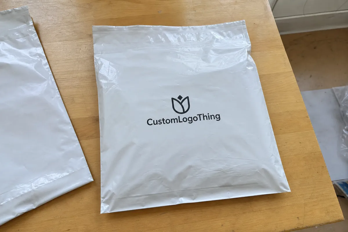
Home fragrance printed poly mailers digital proof checklist basics
The digital proof is the buyer’s final screen-based checkpoint for artwork, copy, layout, and structure before ink touches the bag. Treat the home fragrance printed poly mailers Digital Proof Checklist as a production filter, not a paperwork form. If the proof is wrong, the run will be wrong too, only now the mistake is multiplied across hundreds or thousands of units.
Home fragrance packaging is especially vulnerable because it depends on small type, narrow product families, and quiet visual systems. A reed diffuser, wax melt, room spray, and linen mist may share the same brand language, but the line that separates one variant from another is often tiny. On glossy or semi-translucent film, small text can disappear faster than most buyers expect. A soft taupe can darken. A thin white tagline can break up. A barcode that looks crisp on a monitor may be less reliable once it is mapped to the actual mailer size.
The proof has to answer practical questions, not only design ones. Does the SKU name stay away from the seal? Is the scent family obvious from a short glance? Is there room for fulfillment labels, batch marks, or a reorder sticker without covering the graphics? One seam collision can force a layout change. One missed legal line can delay a shipment. One bad proof can cost more than the bags themselves.
A proof is not decoration. It is the point where the artwork either survives production realities or fails them.
Poly mailers also sit inside a larger packaging system. Cartons, inserts, labels, and outer mailers all affect how the brand is seen and how efficiently orders move through fulfillment. A quick review of Manufacturing Capabilities can help because the proof should reflect what the plant can actually run, not what a design mockup can imagine. That distinction sounds minor until a print run is already scheduled.
How the digital proof is checked from file to final sign-off
A clean proof starts before the proof file is built. The supplier should preflight the artwork to catch missing fonts, broken links, low-resolution images, and dieline problems. Vector logos are preferred. Fonts should be outlined or embedded correctly. Raster images should sit at a usable resolution, usually 300 dpi at final size if the image is not a vector element. Bleed should be clean, typically 3 mm or 0.125 in unless the vendor specifies otherwise. Most delays come from files that were almost ready, not files that were completely wrong.
Once the files are accepted, the artwork should be placed on the actual mailer structure. That is where a flat design file becomes a bag with physical limits. Seams take space. Seals interrupt patterns. Gusset width changes what the eye sees on the front panel. A repeat pattern that looks balanced on a rectangle can feel crowded once the fold lines and edge trims appear. The proof should show where the logo begins and ends, where the barcode lands, and how much room remains on each side.
A strong home fragrance Printed Poly Mailers digital proof checklist checks each SKU line by line. One fragrance name can be off by a single word and still create a fulfillment problem or a compliance headache. A buyer should verify:
- brand name and logo scale
- scent name, pack count, and variant code
- web address and social handle
- barcode or QR code size and placement
- legal copy, warning text, and country-of-origin text
- blank space needed for fulfillment labels or batch marks
There are usually three outcomes after review. First, approve as-is if the proof matches the order and the layout survives the structure. Second, request annotated revisions if copy, spacing, or color balance needs adjustment. Third, pause for structural fixes if the design cannot survive the actual bag size or closure style. A good supplier will tell you which route you are on and why.
Think of this stage as a hard stop, not a soft suggestion. The proof has to reflect the exact bag you will receive, not an idealized rendering. The difference is often measured in millimeters, and millimeters matter in packaging more than most teams expect.
Artwork, color, and structure factors that change approval
Print method changes the way color behaves on film. So does ink coverage. So does the base bag color. A charcoal accent that looks rich in a design file can print heavier on polyethylene, especially if the film is glossy. Soft beige can drift toward gray. Pale blush can lose enough contrast that the scent name becomes harder to read than intended. This is where buyers get caught by the monitor trap: a backlit screen makes most artwork look cleaner than it will on plastic.
White ink underprint often decides whether a fragrance mailer looks finished or faded. Dark backgrounds, translucent film, and pastel branding usually need it. Without underprint, colors may sink into the substrate and look weak. With too much underprint, fine details can look chalky. The right balance depends on coverage density, the final bag color, and whether the design should feel bold, airy, or more premium. Buyers should ask for a proof view with and without underprint if the artwork includes pale typography or logo outlines.
Structure changes the visible artwork area too. Gauge thickness matters because thicker film behaves differently during sealing. Seam placement matters because the safe area is smaller than the flat dieline suggests. Closure style matters because resealable strips, peel-and-seal flaps, and tear notches can cut into the visual field. A few millimeters of extra gusset width can move the focal point on the front panel. For brands that rely on fast shelf recognition, that is not a small detail.
Barcode quiet zones and label space deserve special attention. Give barcodes enough clear space to scan reliably, and leave a practical area for fulfillment stickers so the design does not get buried at the warehouse. If the mailer will sit inside a carton or ship with inserts, those components should be reviewed together. FSC claims often belong on cartons or paper inserts rather than the poly mailer itself, so mixed-material orders need separate, accurate claim placement. For transit expectations, ISTA testing is the right reference point when a package has to survive compression, vibration, or drop risk on the way to the customer.
Material specs also shape the final approval. Most printed mailers for consumer brands fall somewhere around 2.5 mil to 3 mil, though heavier-duty shipping formats may go higher. Thinner film can save money, but it may feel less substantial and show more distortion during sealing. A thicker film can look and feel better, yet it usually adds cost and may reduce flexibility in packing. Those tradeoffs are part of the proof conversation, not just the quote.
Proof process and turnaround: what happens after you submit files
The sequence is simple, but every step matters. File submission comes first. Then preflight review. Then the first digital proof. Then buyer annotations. Then one or more revision rounds. Then final approval for production. The more complete the first file package is, the shorter the loop tends to be. The less complete it is, the more the proof turns into project management.
Here is the fastest path most buyers can follow:
- Send the final dieline, not a working draft.
- Include the exact quantity, dimensions, and SKU split.
- Provide vector artwork, final copy, and barcode files in usable formats.
- Attach Pantone references if the brand depends on spot-color discipline.
- Confirm the final approver before the proof is released.
Time is saved when the buyer sends complete specs up front. A team that includes dimensions, quantity, artwork version, and reference photos in the first email usually gets a cleaner proof faster. Missing dielines slow things down. So do conflicting stakeholders. So do late copy changes. The worst pattern is when marketing, operations, and compliance all comment separately and no one owns the final decision. That can add two or three business days per round.
First proof turnaround is usually faster than a physical sample because the work starts from the dieline and artwork files, not from a printed prototype. In many programs, 24 to 72 hours is common for the first digital proof on a straightforward run, though complex artwork or a full SKU family can take longer. Production does not begin until the final proof is signed off and archived. A fast proof is useful; a signed proof is what moves the job.
If the print run includes multiple variants, file naming needs to be disciplined. Six SKUs across three scent families and two pack counts should not live in a folder with vague labels like “final2” or “newest.” That is how one scent family ends up paired with the wrong barcode or copy block. Accurate file control is part of the home fragrance printed poly mailers Digital Proof Checklist, not a side task.
Cost, pricing, and MOQ drivers behind a custom quote
Pricing on custom poly mailers is shaped by a few predictable variables: bag size, film thickness, number of print colors, white ink usage, coverage density, and finishing requests. The deeper the ink coverage, the more press time and control the run usually needs. The thicker the film, the more material cost tends to climb. Add opaque white underprint, and the quote often moves again. None of that is mysterious, but buyers sometimes expect all custom bags to price the same. They do not.
Minimum order quantities matter because setup and prepress work get spread across fewer bags when the run is small. That pushes unit cost up. Larger runs often reduce the per-piece rate, though freight and storage can cut into the savings if the buyer is not ready to receive them. For home fragrance brands, small-to-mid runs often start around 3,000 to 5,000 pieces, with higher-volume programs moving beyond that once a SKU proves itself.
The table below gives a practical view of how proof route, price pressure, and use case tend to align.
| Option | Typical MOQ | Typical unit price | Best use case |
|---|---|---|---|
| Plain poly mailer with no custom print | 3,000-5,000 | $0.10-$0.16 | Basic shipping where branding is secondary |
| One-color branded mailer | 5,000 | $0.18-$0.28 | Simple logo work with lighter coverage |
| Full-coverage, multi-color mailer with white ink | 5,000-10,000 | $0.25-$0.45 | Retail-forward fragrance packaging with strong shelf presence |
Digital proofing itself is usually low-cost compared with sampling. In some cases it is bundled into the order; in others, extra revision work may add labor if the proof has to be rebuilt several times. Physical samples cost more because they require material, machine time, and shipping. That is why a buyer should decide early whether the goal is visual approval, material testing, or both. The more specialized the finish, the more likely a sample will help. The more straightforward the design, the more a digital proof may be enough.
Freight, carton configuration, and split shipments can also change the quote even when the print spec stays the same. A run shipped in one drop is a different logistical problem from a run split across a warehouse and a fulfillment partner. If your team is comparing options, the quote conversation should include not only artwork but also delivery pattern. The price of the bag is only part of the story.
Typical lead times are worth asking about early. Simple printed mailers may move through approval and production faster than structures with heavy ink coverage, special finishes, or multiple SKUs. If a program needs a rush schedule, that should be stated before approval. Late changes are the fastest way to convert a manageable timeline into a bottleneck.
Common proof mistakes that trigger reprints or delays
The biggest mistake is placing small type too close to seals, folds, or edges. On the screen it may look centered. On the bag, it can get stretched, clipped, or hidden once the film is sealed. A 7 pt line can turn into a near-invisible thread if it sits inside the wrong safe area. That is exactly the kind of error the home fragrance printed poly mailers Digital Proof Checklist should catch before production starts.
Another common problem is approving color on a bright monitor instead of checking how the design will land on plastic film. Screen brightness can mask weak contrast and make saturated colors look cleaner than they are. Buyers also forget that translucent or glossy substrates change the result. A soft black on screen can print as a flatter charcoal on the bag. Pastels need extra scrutiny because they lose strength quickly.
Missing content causes more delays than most people expect. Barcodes are a frequent offender. So are reorder codes, legal copy, country-of-origin lines, and handling marks. Then there is SKU confusion: scent names updated in one file but not the others, or pack counts changed in the sales sheet but not on the proof. When a proof set contains six versions, one mismatch can ripple through the entire run.
One practical fix is to mark up comments in a single round instead of sending scattered notes from multiple people. Another is to compare the proof against the current package or a real sample, not against memory. Packaging work gets messy when teams review art in isolation. It gets cleaner when the proof is judged in context.
There is also a physical detail buyers often miss: the seal zone can compress artwork enough that thin lines, borders, and small icons look distorted even if the proof seemed correct. This is especially visible on mailers with strong graphics that run close to the edge. If the brand uses a delicate frame or fine typography, leave more clearance than feels necessary.
Expert tips for cleaner approvals and stronger shelf impact
Use one standardized proof checklist for every fragrance SKU. The discipline sounds basic, but consistency is what keeps launch work from turning chaotic. A fragrance line that starts with one scent and grows to ten can drift fast if each SKU gets reviewed against a different mental checklist. One template, one approval path, one final owner. That is the cleaner way.
Ask for a contrast check on the actual bag color, not just the art file. If the substrate is white, clear, smoky, or tinted, the logo and scent name will read differently. Put the most important message where the eye lands first. Keep the front panel visually simple if you can. Move denser compliance text to the least visible area when the structure allows it. That does not mean hiding information; it means placing information where it can do its job without competing with the brand mark.
Comparing the proof to a real fulfillment photo or current package is also smart. A lot of packaging mistakes happen because the proof is judged as a flat image. In reality, shoppers and warehouse teams see the bag in motion, under different light, and often beside other products. A proof that looks neat in isolation may feel too dense once it sits next to a candle box, a room spray, or a printed insert. The bag needs to hold its own in context.
Ask your supplier what would make them reject the proof internally. Good vendors usually know the failure points better than the buyer does. If they say the barcode is too close to the seam, move it. If they flag a logo that will lose contrast on the chosen film, fix it before the press room gets involved. That is the difference between an efficient approval and a painful reprint.
One more detail matters more often than brands expect: version control. Keep a dated file name, a clean approval thread, and a single source for the final artwork. Reorders fail when teams rely on memory or old attachments. A packaging system that works for one product launch should still work six months later, even if the original marketing lead has moved on.
Next steps before you request a quote or approve production
Before you ask for pricing, gather the final dieline, copy deck, dimensions, quantity, barcode file, and any Pantone references. If you have reference photos, include them. If you know the pack-out plan, include that too. Those details make the first proof cleaner and the quote more accurate. They also reduce the odds that someone will discover a mismatch after approval, which is usually the most expensive moment in the process.
Ask the supplier to confirm proof turnaround, revision limits, production lead time, and the exact approval deadline in writing. A vague schedule is not a schedule. If the team expects a proof back in two business days, say so. If the production slot opens only after final sign-off, that should be explicit. A short internal sign-off log helps as well: name one approver, define what counts as approved, and keep the decision in one place.
If you are comparing build options or trying to understand what can be printed, sealed, or packed together, our Manufacturing Capabilities page is a useful reference. It is also worth keeping approved files with the PO and reorder notes so the next run does not start from scratch. The best version of the home fragrance printed poly mailers digital proof checklist is the one you can reuse without rethinking it every time.
For a fragrance brand, that is where the savings live: fewer surprises, fewer revisions, and fewer bags sitting in limbo because someone approved the wrong line or missed a seam. Use the proof to make the bag real before production makes it expensive.
What should a home fragrance poly mailer proof checklist include?
Confirm artwork placement, logo size, scent name, and all required copy before you approve the proof. Check barcode quiet zones, seam areas, and any legal or handling text that must stay readable. Verify the final bag size, print side, and finish so the proof matches the order you expect to receive. The best home fragrance printed poly mailers digital proof checklist is specific enough that a production operator could run from it.
How do I review a digital proof for printed poly mailers?
Zoom in to inspect type, edges, barcode clarity, and image alignment on the dieline. Compare the proof against your brand file and mark revisions in one clear round instead of sending scattered comments. Ask for a revised proof whenever structure, color, or copy placement could affect production.
What changes usually affect poly mailer pricing and MOQ?
Size, film thickness, print colors, white ink, and special finishes are the biggest pricing drivers. Lower quantities usually raise unit cost because setup work is spread across fewer bags. Rush timing, freight method, and split shipments can also move the final quote.
How long does the proof and turnaround process usually take?
A first digital proof is typically faster than a physical sample because it starts from the dieline and artwork files. Turnaround depends heavily on how quickly the buyer responds with corrections or approval. Production lead time begins only after the final proof is signed off.
What files should I send for the most accurate mailer proof?
Send vector artwork, outlined fonts, final copy, and a clean dieline whenever possible. Include Pantone references, barcode files, dimensions, quantity, and any reference photos or sample images. The more complete the files are, the fewer revisions are needed before approval.


