For printed embroidered Beanies Logo Placement for event merch brands, the real decision is not just what the decoration looks like on a screen, but where the mark lands on a soft knit surface that stretches, folds, and gets seen in motion. A beanie can make a logo feel bold and premium, or cramped and forgettable, depending on whether the artwork sits on the cuff, rides the front panel, or wraps around the side.
That is why smart buyers think about visibility, photo read, and wearability together. On knit headwear, the logo is often read from farther away than the fabric texture, so placement can matter more than how elaborate the art feels in a mockup. If you want a practical comparison point, the Custom Logo Things team and the examples in the case studies page are a good way to see how different placements actually land in real merch programs.
“If the logo cannot be read in a quick phone photo, the placement is probably too subtle for event merch.”
Printed embroidered beanies logo placement for event merch brands
On a beanie, the decoration rarely competes with the whole garment. It competes with the cuff edge, the knit ribs, the seam, and the way the hat sits on a person’s head. That is why printed Embroidered Beanies Logo Placement for event merch brands has to start with one simple question: what should people notice first?
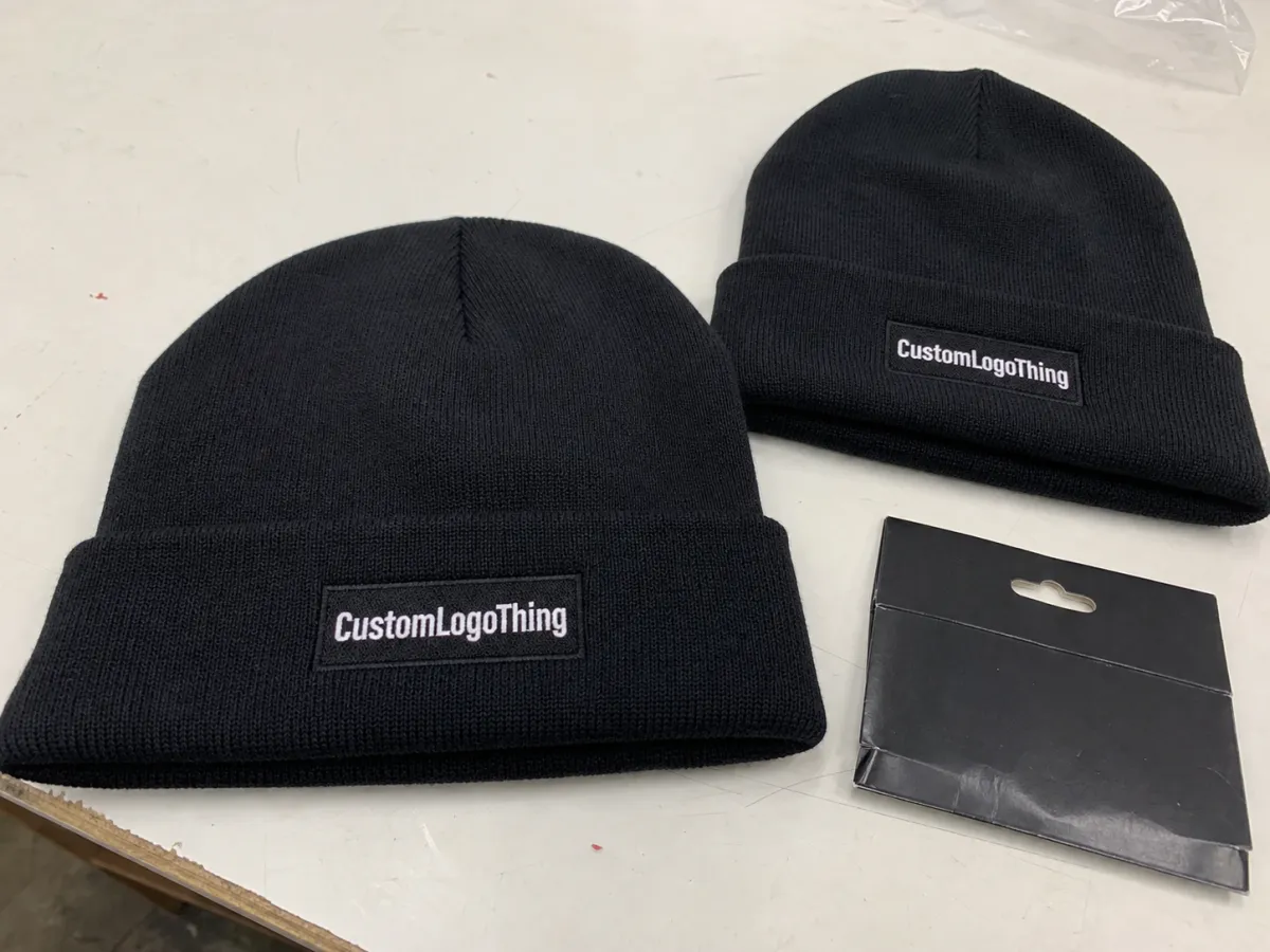
Front-center placement usually wins when the goal is fast recognition. It reads cleanly in crowd photos, merch-table shots, and quick social clips. Side placement feels quieter and more fashion-led, which can work well if the brand wants the beanie to feel like wearable apparel instead of a loud souvenir. Back placement is the most restrained of the three, and it usually makes sense only when the front of the hat needs to stay visually open.
That choice changes more than appearance. It affects how much stitch density you can use, whether small text holds up, and how much of the design survives when the cuff folds or the knit stretches. For event merch brands, the right placement should survive three realities at once: a quick grab at the merch table, shipping in a carton, and repeated wear after the event is over.
In practice, the best beanie placements are the ones that can be read in under a second. Fans do not study a knit cap the way they study a poster. They see a face, a logo, and a shape. If the decoration is buried in the texture, the merch loses value even when the stitching itself is well done.
How print and embroidery combine on knit beanies
For printed embroidered Beanies Logo Placement for event merch brands, the build matters as much as the art. A beanie can be decorated with direct embroidery on the rib knit, a printed patch, a woven label, or a hybrid setup that separates the logo into a crisp graphic and a textured accent. Each option changes how sharp the mark looks, how much detail survives, and how much the piece feels like retail apparel instead of generic giveaway stock.
Knits are forgiving in some ways and tricky in others. They move. A line that looks fine on a flat proof can compress once it lands on a soft, flexible crown. Thin strokes, tiny text, and narrow outlines are the first things to suffer. That is why a design that looks detailed on a computer screen often needs to be simplified before production starts.
Cuff placements usually give the cleanest read because the fabric sits flatter and more stable. Crown placements can work, but the logo needs enough breathing room to sit on the right part of the knit without distorting. Some logos even benefit from a slight wrap, especially if the mark is compact and the brand wants a more finished look from the side.
Ask for the practical proof set, not just a pretty mockup. A good supplier should be willing to show a digital proof, thread chart, print simulation, and, when needed, a sample showing stitch direction. That extra step catches awkward placement before production starts, which is much cheaper than discovering that the logo feels too high, too tight, or too small after the run is complete.
Pricing, MOQ, and unit cost
Pricing for beanie merch looks simple from a distance, but several moving parts sit underneath the number. Decoration method is the biggest one, followed by stitch count, number of colors, artwork cleanup, setup work, and whether the logo needs a patch, a woven label, or more than one decoration zone. On a small event run, setup often matters more than the blank itself.
MOQ changes the whole conversation. A setup fee that feels reasonable on 1,000 units can feel heavy on 100 or 250. That does not mean smaller orders are a bad idea. It just means the buyer should compare the total landed cost, not only the unit price on the quote. Freight, proof revisions, sample shipping, and rush charges can move the final number more than people expect.
| Decoration option | Typical look | Best use case | Indicative cost impact |
|---|---|---|---|
| Direct embroidery | Textured, durable, premium feel | Bold logos with limited small text | About $2.25-$4.25 per unit at mid-size runs |
| Printed patch | Sharper edges and thinner details | Compact marks, fine type, sponsor art | About $1.75-$3.50 per unit, depending on patch build |
| Woven label plus stitch | Clean, retail-leaning finish | Fashion-forward event merch | About $2.50-$4.50 per unit |
| Hybrid print and embroidery | Most flexible visual read | High-visibility merch and layered branding | About $3.25-$5.75 per unit |
Those ranges are not fixed quotes. Blank quality, yarn weight, cuff style, packaging, and production complexity all move the number. A heavier gauge beanie with a simple one-color mark may cost less than a softer knit with a layered logo system, even if the finished hats look similar from a distance.
Process, timeline, and turnaround
The cleanest production runs follow a predictable path. First comes the artwork brief, then cleanup or digitizing, then a digital proof, then sample approval if the decoration is sensitive, and finally production and shipment. That order sounds basic, but skipping one step is usually where timelines get messy.
For event merch, the approval stage matters more than most buyers expect. A beanie that looks balanced in a flat mockup can shift once it is folded, packed, and worn on a head. If logo placement is tight, ask for a proof that reflects the actual beanie color and the intended wear position. A light gray logo on a dark knit may look very different in person than it does on a white screen.
A realistic production window is often 12-15 business days from proof approval for straightforward runs, and longer if the design needs sampling, layered decoration, or a special blank that is not already in stock. Add freight time on top of that. If the goods are moving to a venue, a warehouse, or a distribution partner, build in a buffer so the pieces arrive before the event, not after it.
There are a few timing items buyers miss all the time:
- Artwork cleanup or digitizing, especially for logos that were built for print rather than stitch.
- Proof revisions, which can be quick or slow depending on how many stakeholders are signing off.
- Blank availability, since popular beanie colors disappear quickly during peak season.
- Packaging and freight, which can matter just as much as the actual decoration run.
If the order includes paper inserts or hang tags, FSC-certified paper is an easy credibility check for the brand story, and FSC explains the chain-of-custody standard well. For cartons that need to survive shipping to a venue or distribution center, ISTA is a solid reference point for transit and drop testing.
Key factors that decide the best logo spot
The best printed embroidered beanies logo placement for event merch brands usually starts with the logo shape, not the hat style. Wide logos need room. Vertical marks can sit nicely on a cuff edge or side panel. Small emblems can disappear if they are placed too far from the viewer’s natural line of sight. The goal is to match the logo geometry to the part of the beanie that gives it the most breathing room.
- Logo shape: Wide marks usually need more front width, while compact marks can sit on the cuff or side without feeling crowded.
- Visibility: Front-center placement wins in photos, but side placement can make the beanie feel calmer and more retail-oriented.
- Fabric behavior: Dense rib knits, fold-over cuffs, and stretched zones can change line weight and reduce detail.
- Brand tone: A loud merch drop and a quiet VIP gift rarely use the same placement logic.
That last point is easy to overlook. A beanie for a public merch table usually needs quick read and stronger contrast. A beanie for press kits, sponsor gifts, or premium retail bundles can be more restrained. Same blank, same logo, different decision. That is why placement discussions should include the use case, not just the artwork file.
Another practical factor is how the hat will be photographed. Stage lights, indoor event lighting, and phone cameras all flatten texture differently. If the placement depends on tiny stitching details, it may look better in person than on camera, which is the opposite of what most event merch brands want.
Common mistakes that make beanie artwork look off
Most bad beanie results do not come from bad intent. They come from squeezing too much detail into too little space. Knit headwear asks for restraint. If the logo gets shrunk too far, the decoration can turn into a soft blur once it sits on the ribbed surface, even if the vector file was technically correct.
Fine lines cause the second big problem. Tiny text, hairline strokes, and too many colors do not always survive stitch or print on a textured knit. The artwork may be perfect for a website, but not for thread. On a beanie, clarity usually beats complexity.
Seams, cuff folds, and stretch zones create the third issue. If a key letter lands across a seam, the mark can look split. If a logo sits too close to the fold line, the most important part of the art can disappear when the hat is worn. That is why a mockup should always be checked against the actual construction of the beanie, not just the artwork alone.
One more miss happens all the time: buyers approve the logo on a white background and forget to compare it to the actual yarn color. That can hide contrast problems until the finished hats arrive. A black logo on heather gray behaves very differently than the same logo on olive, bone, or deep navy.
If you want to avoid a rushed redo, ask three questions before approving the proof: Can someone read it from a few steps away? Does it still look balanced when the cuff folds? Does the logo match the brand tone once it is on the actual blank?
Expert tips for cleaner merch drops and better photos
For printed embroidered beanies logo placement for event merch brands, the cleanest merch drops usually do less, not more. Pick one hero placement and let the rest of the artwork system stay simple. A strong front cuff logo with a limited color palette will usually photograph better than a busy, multi-part decoration that tries to solve every branding need at once.
Ask for a live-angle mockup whenever possible. Flat art is useful, but a worn view tells the truth. That is where proportion, fold behavior, and contrast become obvious. If the logo gets lost at a 45-degree angle, it probably needs a larger footprint or a different part of the beanie.
One nice rule of thumb: if the decoration is meant for social sharing, keep the print or thread palette tight. Two colors often feel sharper than five. The piece reads as branded apparel instead of souvenir merch, and that usually helps event teams justify the spend.
For larger programs, a two-tier approach works well. Build one core version with simple placement for volume, then a premium version with a patch, woven label, or more refined finish for VIPs and retail. That keeps the production conversation clearer and helps the merch table feel organized instead of overcomplicated. If you want more examples of how different setups perform, the case studies are worth a look.
Honestly, the best merch programs are the ones that can be explained in one sentence. If the team cannot describe why the logo sits where it sits, the decoration probably needs another round of review before it goes to press or stitch.
Next steps for a faster, cleaner approval
If you want the quote to start on the right foot, send the supplier a vector logo, target quantity, preferred placement, beanie color, and event date in one brief. Those five inputs eliminate a lot of back-and-forth and make the first proof far more useful.
A good next step is to request two mockups: one with the main placement and one with an alternate placement. That side-by-side view makes proportion, visibility, and brand tone much easier to compare. It also reveals whether the logo needs to be slightly wider, smaller, or moved onto a flatter part of the beanie.
Before you approve production, confirm the decoration path. Print, embroidery, and hybrid builds all create a different look, a different cost structure, and a different timeline. If the event date is fixed, do not leave that decision until the end of the quote cycle.
Then do one final proof check against the actual blank color, not a generic white background. Once that passes, move the order into production and keep the approval chain tight. For printed embroidered beanies logo placement for event merch brands, that is usually the difference between a smooth merch drop and a rushed correction.
Where should printed embroidered beanies logo placement sit for event photos?
Center-front on the folded cuff usually reads best in crowd shots and branded photos. If the logo is wide, move it slightly off-center or shift to a side placement so the proportions stay clean. It also helps to test the proof under the lighting you expect at the event, because stage lights and indoor LEDs can flatten texture in different ways.
Is embroidery or print better for small logo placements on beanies?
Embroidery adds texture and a more tactile feel, while print can preserve tighter shapes and thin letterforms. For compact logos with fine detail, print or a hybrid build is often safer. For bold, simple marks, embroidery usually gives a stronger, more durable finish.
How does logo placement affect pricing on event merch beanies?
More complex placement, extra decoration zones, and higher stitch counts usually raise unit cost. Small runs feel that impact more because setup is spread across fewer pieces. Ask for line-item pricing so you can compare the blank, decoration, sampling, and freight separately.
What turnaround should event merch brands expect after approval?
Simple orders often move in about 12-15 business days after proof approval, while sample-heavy or high-detail placements take longer. Blank stock, proof revisions, and freight all affect the final date. If the merch has to arrive at a venue or event warehouse, add buffer time so the shipment is not cutting it close.
How do I choose the right placement for a wide logo on beanies?
Wide marks usually need more front width, a flatter cuff area, or a patch format so the design does not feel compressed. If the logo runs past the usable space, simplify it before production instead of forcing it into a cramped area. Side or back placement can work, but it usually shifts the beanie toward a quieter, more fashion-led look.


