People usually search for the vitamin Embroidered Beanies Material Thickness guide because they are trying to avoid a very ordinary failure: the logo looks clean on screen and awful on the actual hat. Too thin, and the knit swallows the embroidery. Too thick, and the beanie starts acting like a padded sample nobody wants to wear for more than ten minutes. Thickness decides more than comfort. It changes stitch clarity, shape retention, and how the finished piece looks once it is folded, packed, and shipped.
That matters because embroidered beanies live or die on surface behavior. The knit has to support the design without flattening the hat into a board. Buyers often focus on color or fiber first, then wonder why the logo puckers, spreads, or lands slightly off-center after production. The answer is usually sitting in the fabric structure. Yarn weight, gauge, rib depth, recovery, and stitch density all affect the final result, and they do it fast.
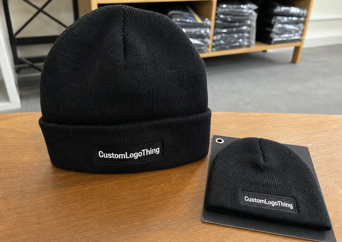
For bulk orders, thickness also affects how forgiving the product is in packing and display. A beanie with enough body holds its fold better in a carton, sits more cleanly on retail shelves, and tends to keep its shape after shipping. A lighter knit can still work, but it needs more careful logo sizing and better backing. There is no magic material. There is only a better match between the knit and the artwork.
Vitamin Embroidered Beanies: What Thickness Changes First
The first thing thickness changes is readability. Not price. Not packaging. Readability. A logo on a soft, loose knit can disappear into the valleys of the fabric, especially if the mark is small or the strokes are thin. On a denser knit, the same design usually sits cleaner and reads faster from a normal viewing distance. That is the practical heart of the vitamin Embroidered Beanies Material thickness guide: the knit decides how the embroidery behaves before anyone gets to admire the design.
Thickness is really a bundle of variables. Yarn weight, stitch gauge, rib structure, and fabric recovery all play a part. Two beanies can feel similar in hand and still produce very different embroidery results. One might stretch just enough to accept the needle and then snap back neatly. Another might relax too much after hooping and leave the logo looking slightly tired. That difference is often invisible on a product page.
There is a comfort side too. A thicker beanie usually feels warmer and more substantial, but not every customer wants bulk. A promotional giveaway often needs a lighter handfeel so people actually wear it. Retail buyers usually accept a denser knit because the shape and finish need to hold up over repeated use. Team programs sit between those extremes. The hat has to be wearable for long stretches and still look controlled in photos.
Thickness also changes how the beanie packages. More body usually means a cleaner fold, less collapse in transit, and a better first impression when the carton opens. Lighter knits can look fine, but they are easier to crush if the shipping spec is sloppy. If the product is going into kraft paper wraps, belly bands, or a recycled insert, the material needs enough structure to survive that handling without looking limp. The apparel may be soft. The presentation should not be.
The main rule is simple: pick a thickness that supports the stitch without making the hat uncomfortable. That balance matters more than a flashy fiber label. A well-chosen knit makes the embroidery look intentional. A bad one makes even a good logo look cheap.
How Embroidery Sits on Different Knit Densities
Embroidery reacts differently depending on how open or compact the knit surface is. A loose knit gives the needle an easier path, but the thread can sink between the ribs and lose definition. A tight knit offers a more stable surface, but the machine may need better tension control and more careful underlay to keep the design flat. Both ends of the spectrum have tradeoffs. Neither is automatically better.
Backing is what makes the difference between a neat logo and a puckered one. Proper stabilizer supports the stitches during production and helps the fabric recover after the hoop comes off. Underlay gives the top stitches a base to sit on, which matters more than most buyers expect when the artwork includes filled letters, small icons, or narrow outlines. Without enough structure, the knit can twist slightly and the logo will show it.
Placement matters just as much as the surface itself. A cuffed beanie behaves differently from a slouchier crown, and the same design can read very differently depending on where it lands. Logos placed near the cuff usually have more support, but deep ribbing can break apart thin text. Higher placements can look cleaner on the front panel, yet they may sit on a stretchier zone and need extra care in proofing. If the seam is close to the artwork, the risk of distortion goes up.
Very chunky knits create their own problems. They can look attractive in a lifestyle photo, but detailed embroidery often gets lost in the texture. In those cases, a woven patch, sew-on patch, or label can preserve the artwork better than direct stitching. That is not a downgrade. It is a material decision. If the knit surface cannot hold the design cleanly, forcing embroidery onto it just creates a heavier product with worse edges.
For simple marks and bold lettering, direct embroidery is still the cleanest choice. It gives a permanent tactile finish and usually feels more integrated with the beanie than a separate patch. For fine-line artwork, tiny text, or logos with narrow spacing, a patch often wins because it preserves detail. The better option is the one that respects the surface, not the one that sounds more premium in a catalog.
Fiber Blend, Gauge, and Rib Structure: The Key Variables
Fiber content gets most of the attention, but gauge usually does more of the real work. Acrylic, wool blend, recycled yarn, and cotton-rich knits all have a place. The difference is how they behave under the needle and how well they recover after stretching. A mid-gauge 1x1 rib often gives a dependable balance of stretch and support. A looser knit can feel softer, but it may wander during embroidery no matter how good the yarn sounds on paper.
Acrylic remains common for a reason. It is usually cost-stable, color-consistent, and predictable in production. That predictability helps when you need repeatable embroidery across a large run. Wool blends bring warmth and a more natural handfeel, but they can vary more from batch to batch, especially if the blend ratio changes. Recycled yarns are popular for sustainability programs, yet they still need testing for recovery and surface consistency. A recycled knit that grows baggy after a few wears is a bad branding vehicle, even if the story sounds good.
Cotton-rich beanies feel comfortable against the skin, but they often have less insulation and can relax more after use. That can make embroidery drift slightly over time if the knit does not bounce back well. For products that will be worn repeatedly, or washed more than once, fabric recovery matters as much as softness. A hat that starts sharp and ends loose does not stay on message for long.
Rib structure deserves more respect than it gets. A tight rib supports embroidery and helps the design sit flatter. A deeper rib gives texture and can look good with bold marks, but it also creates more surface variation. Thin letters may break apart across the ribs and the logo can look fragmented even if the stitching itself is technically correct. For small text, smoother surfaces are usually safer. For big marks, a visible rib can work if the artwork is simple enough to survive it.
There is always a tradeoff between softness, insulation, and logo clarity. Buyers want all three, but material science is rude about this. You usually get two and negotiate with the third. Launch merch can lean softer and lighter. Retail pieces can justify a denser knit and a more controlled shape. Team wear usually sits in the middle. The right choice depends on how the beanie will be used, not how it looks under studio lighting.
Packaging still matters here, even if it does not change the embroidery itself. FSC certified paper inserts, kraft paper banding, recycled outer cartons, and post-consumer waste content in shipper materials all affect presentation. Biodegradable packaging can make sense when the product and the transit distance fit it. Just do not pick packaging that looks responsible on a spec sheet but crushes the knit in transit. The point is protection, not virtue signaling.
For buyers who want a standards-based lens on packing and transport, the ISTA resources are useful because they focus attention on real shipping behavior instead of assumptions. Beanies are soft goods, but they still suffer from poor pack design.
Cost, Pricing, and MOQ: What Changes the Quote
Custom beanie pricing rarely comes from one line item. It is usually a stack: yarn type, knit density, embroidery size, stitch count, thread colors, packaging, sample cost, and order quantity. If one quote looks dramatically lower, ask what changed. Often the answer is a simpler knit, fewer stitches, lighter packaging, or a higher MOQ being hidden in the background.
| Spec Element | Typical Cost Impact | Buyer Notes |
|---|---|---|
| Standard acrylic knit | Lowest to moderate | Usually the most stable option for larger runs |
| Wool blend or recycled yarn | Moderate to higher | Can improve handfeel or sustainability positioning |
| Small logo, low stitch count | Lower decoration cost | Works best when the design is bold and simple |
| Large logo, dense fill | Higher decoration cost | More thread, more machine time, more risk on softer knits |
| Custom packaging | Small to moderate | Paper bands, tissue, and branded cartons add cost but improve presentation |
MOQ affects the quote because setup costs do not shrink just because the order is small. Digitizing the artwork, confirming placement, creating a sample, and running the first approval all take time. If you only order 100 pieces, those fixed costs sit on top of fewer units. If you order 2,000, they spread out. That is why low-quantity orders usually carry a higher unit price. It is not a penalty. It is math.
Sample fees can show up separately, and they should. If the logo needs digitizing for embroidery, that work happens before production starts. Some suppliers also charge for a pre-production sample or for revisions if the first proof needs adjustments. Rush orders can increase the total too, especially when the factory has to shift machine time or source a yarn color faster than normal.
For fair quote comparisons, every supplier should be working from the same specs: beanie type, yarn composition, gauge, embroidery size, stitch coverage, thread colors, and packaging format. Otherwise the quotes are not comparable. A cheaper price on a looser knit is not the same product as a higher price on a denser knit with cleaner stitch support. The cheaper option may simply be less demanding, not better value.
“If the logo is tiny, do not try to rescue it by shrinking the hat spec. Match the knit to the artwork.”
That one decision saves a lot of rework. Bad material choices lead to revised proofs, sample corrections, and sometimes a full restart. Those delays cost more than selecting the right thickness the first time.
Production Steps and Turnaround from Spec to Ship
A clean production run starts with a proper spec sheet. The factory needs the artwork file, logo dimensions, placement instructions, beanie color, thread references, packaging notes, and any label details. If the buyer is still deciding between two thickness profiles, that question should be settled before the proof stage. Guessing at this point creates avoidable revisions later.
Next comes the digital proof. That is where the design becomes a machine plan. It should show stitch path, placement, and any simplification needed for small text or thin lines. Good suppliers flag these problems early. If the logo is too fine for the knit, the proof should say so instead of pretending the machine can make the fabric behave. It cannot.
Sample approval matters more than many buyers think. The sample shows tension, color match, stitch density, and whether the logo sits in the right place once the beanie is worn, cuffed, or pulled down. A logo can be technically centered and still look wrong on the head. That is why sample checks should include actual wear position, not just a flat tabletop view.
Bulk production usually includes sourcing or knitting the blank, embroidery, trimming, inspection, finishing, and packing. For many orders, a common lead time is about 12-15 business days after proof approval. Larger runs, specialty yarns, winter peaks, or busy holiday schedules can stretch that further. If the order needs a specific launch date, build backward from that date and leave room for one revision cycle. Tight schedules always get tighter.
Shipping and packaging should be locked early too. If the program uses recycled cartons, FSC certified paper, or biodegradable wraps, those details need to be part of the order, not a last-minute add-on. Transit damage often happens because the carton is too full, too loose, or packed without thinking about how soft goods compress under weight. A beanie may look simple, but the pack-out still needs testing.
For teams that want a broader packaging reference, the Packaging School and PMMI ecosystem is a helpful place to think through materials, presentation, and transit protection. That perspective can prevent a lot of ugly surprises when the boxes reach the warehouse.
Common Mistakes That Make Logos Pucker or Blur
The biggest mistake is choosing a knit that is too loose for the logo size. Small text on a soft surface often looks fine in a proof and weak in production because the thread has nowhere stable to sit. The opposite is just as bad: a very chunky beanie with a tiny, detailed logo that simply does not have enough surface to read clearly. Both problems start with the material choice, not the machine.
Another common error is shrinking the logo instead of redesigning it for embroidery. A flat vector file that looks polished on a screen can need thicker strokes, fewer details, or a wider footprint to work on a curved knit cap. That is normal production discipline. It is not design failure. The fabric has rules, and those rules do not care how clean the brand deck looks.
Skipping a physical sample is expensive. Tension issues, color shifts, and placement errors often show up only when thread meets fabric. A sample also shows how the beanie behaves when worn, not just when laid flat. A cuffed hat can hide or reveal embroidery in a way the mockup never shows. If the sample looks wrong in the hand, bulk production will not fix it.
Overdecorating creates another set of problems. Heavy layered finishes, oversized embroidery, and multiple patches can make a beanie stiff or top-heavy. That is especially true on lighter knits. If the piece becomes uncomfortable, people stop wearing it. The branding then sits in a drawer instead of on a head, which is a pretty expensive way to miss the point.
Color checks should happen under real light, not just under warehouse fluorescents. Thread can shift warmer or cooler than expected, and packaging changes perception too. A hat wrapped neatly in kraft paper with a clean insert often feels more premium than the same hat tossed into a loose poly bag. The embroidery might be identical. The impression will not be.
For durability and transit references, ASTM-style packaging and handling tests are useful because they push the conversation toward impact, compression, and storage behavior. That is more useful than guessing. Soft products still fail when they are packed badly.
Expert Tips and Next Steps for a Cleaner Bulk Order
The easiest way to keep a bulk order clean is to build a spec sheet that lists fabric weight, gauge, rib structure, logo dimensions, stitch limit, placement drawing, thread colors, and packaging instructions. That sounds basic because it is. It also prevents a lot of expensive confusion. If you are comparing suppliers, send the same spec to each one and ask them to quote it exactly as written. Thickness differences will show up quickly.
If the material choice is uncertain, request two sample variations. One can be a denser knit with stronger recovery. The other can be softer or more open. Put them side by side, stretch them, let them relax, and check how the embroidery sits after that. The goal is not just handfeel. It is seeing how the logo behaves when the fabric moves. Photos cannot tell you that. Samples can.
Material choice should follow use case. Giveaway merch can accept a slightly lighter knit if the logo is simple and the timeline is tight. Retail programs usually need better drape, better recovery, and a more controlled finish because customers judge them harder. Team wear often sits in the middle, where comfort matters but the logo still has to read clearly across a room or in a group photo.
Before releasing production, confirm the proof, the sample, the thread colors, the packaging format, and the delivery window. If sustainable packaging is part of the brief, write it into the order. Do not leave it vague. Whether the choice is recycled board, post-consumer content, or a plain kraft paper wrap, the instructions should be explicit enough that nobody improvises under deadline pressure.
If one thing stands out from this vitamin Embroidered Beanies Material thickness guide, it should be this: thickness is not just a comfort decision. It controls stitch clarity, price, feel, shipping performance, and how the finished product ages after a few wears. Choose the knit with the embroidery in mind, not as an afterthought. That is usually the difference between a hat people keep and a hat people forget.
What thickness is best for vitamin embroidered beanies?
A medium-gauge knit is usually the safest starting point because it balances stitch clarity, stretch, and comfort. Very loose knits can let small lettering sink, while very dense knits may need larger artwork or stronger backing. A sample with the exact logo size is the quickest way to confirm the fit.
Can vitamin embroidered beanies be too thick for clean stitching?
Yes. Very chunky knits can blur fine details, especially on small logos or thin line art. The usual fix is to simplify the artwork, enlarge the design, or move to a cleaner knit surface. A physical sample will show the limits fast.
How does material thickness change vitamin embroidered beanies pricing?
Heavier or denser knits can raise unit cost because they may use more material, take more handling, or slow down stitching. Pricing also shifts with stitch count, thread colors, packaging, and whether the order sits above or below MOQ. Compare quotes using the same beanie spec and the same embroidery size.
How do I compare vitamin embroidered beanies thickness between suppliers?
Ask for yarn weight, gauge, fabric photos, and finished weight. Request the same logo placement and size on each sample so you are comparing the knit, not the artwork. Stretch the samples, let them recover, and check how the surface settles.
What should I approve before ordering vitamin embroidered beanies in bulk?
Approve the digital proof, logo placement, exact thread colors, and the sample beanie. Check that the stitches sit flat, the knit is not distorted, and the logo stays readable from a short distance. Confirm turnaround time and delivery window before releasing the order.


