Chocolate Embroidered Baseball Caps: Digital Proof Checklist
A chocolate embroidered baseball caps Digital Proof Checklist keeps a dark cap from becoming an expensive surprise after stitching starts. On screen, the logo can look balanced and crisp, then the first sew-out reveals a different story: the mark is too small for the crown, too low against the seam, or too close in color to the fabric. Chocolate is forgiving with some threads and unforgiving with others, so the proof has to catch contrast and placement issues early.
The proof is where placement, thread color, stitch method, and cap construction get tested before production begins. For buyers, it is also where budget is protected. A few millimeters, one thread swap, or a better cap structure can be the difference between a clean retail-ready hat and a run that looks crowded or dull.
Why the Proof Matters on Chocolate Fabric
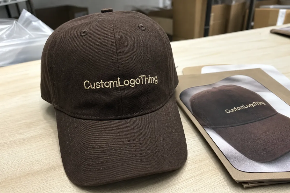
Dark brown fabric behaves differently from black, navy, or charcoal. Chocolate usually has a warmer undertone, so cream, gold, tan, and white thread can read more clearly than expected, while muted browns and soft oranges can sink into the surface. A logo that feels polished on a bright mockup may look understated on a chocolate crown. That is not an artwork problem; it is a contrast problem.
The proof exists to catch those issues before production. It shows where the embroidery will sit, how large the design will be, what thread colors are planned, and whether the cap is structured enough to hold the stitch field. A five-panel unstructured cap behaves differently from a six-panel structured cap, and a low-profile crown changes the visual weight again. If the proof ignores those differences, the finished product can drift away from the intended look.
Buyers often focus on the artwork and underestimate the blank itself. Cap fabric, crown shape, seam placement, and closure style can all change how the embroidery reads. The proof should answer one practical question: will this exact logo look right on this exact cap?
If the proof is vague, production will fill in the blanks. On embroidered caps, that is where most problems begin.
How the Proofing Workflow Works
The workflow usually starts with intake. The supplier collects the logo file, cap style, color choice, closure type, crown profile, and any notes about placement or finish. A structured six-panel cap with a curved visor is not the same canvas as an unstructured five-panel cap with a flat front. The embroidery file should be built for the one that is actually being ordered.
After intake comes the digital proof. In most cases, it includes a flat mockup of the cap, the artwork positioned on the crown, approximate size in inches or millimeters, and the planned thread callouts. Some proofs also list stitch type, density, underlay, or special treatment such as 3D puff embroidery. Those details are production instructions, not decoration.
The proof is still only a representation. A screen cannot fully show satin stitch sheen, thread texture, or the way a dense fill settles on a curved panel. It can confirm direction, though, and that is usually enough to avoid expensive mistakes. Good proofing is less about making the mockup look final and more about making the final cap follow the agreed plan.
Feedback should be specific enough to act on without guesswork. “Make it stronger” is too vague. “Increase the logo width by 0.25 inch, raise it slightly on the crown, and switch the lettering to a higher-contrast thread” gives the decorator something measurable to work from.
Specs That Change the Final Look
Embroidery is less forgiving than print. Fine lines, tiny lettering, and crowded symbols may look clean in vector art but break down once the design is reduced to cap size. A front-panel logo with too much detail often needs simplification so the needle can build solid columns and readable edges.
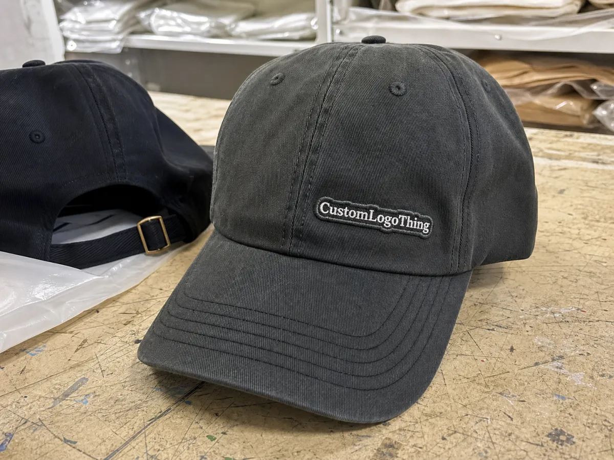
Placement changes the visual weight of the hat. Front-center embroidery is the most stable option for branding and the easiest to size correctly. Side-panel embroidery feels quieter, but it gives up space and can run into seams. A back arch above the closure works for short text or a small icon, though it is a poor place for a dense mark.
The cap build itself has a real impact on the result. Structured crowns support clean front embroidery better than soft, unstructured ones. A low-profile cap can make a design look wider than expected. Seam lines, vent holes, and panel joins can interrupt the stitch path, so the proof should identify those pressure points before anyone signs off.
Thread choice deserves the same attention. Polyester thread is common for hats because it handles wear well and keeps color fairly consistent. Rayon can have a smoother sheen, but it is less common in high-abrasion programs. Metallic thread adds shine, but it raises the risk of breakage and usually demands looser expectations on fine detail.
Backing and stitch density matter too. A dense embroidery file may look bold in a mockup, yet still buckle the front panel if the stabilizer is wrong. Light backing works for small, simple marks. Larger logos, puff effects, and heavy fills need stronger support. None of that shows up in a pretty approval image, which is why buyers should ask for the production notes, not just the artwork.
- Logo width: confirm the actual measurement, not only the visual balance.
- Thread contrast: request named colors or thread references, not vague descriptions.
- Stitch method: flat embroidery, puff, or mixed stitch changes both look and cost.
- Panel fit: check whether the design crosses seams, vents, or crown joins.
- Cap structure: verify whether the blank is structured, unstructured, low-profile, or mid-profile.
What to Check Before You Approve the Proof
Proof approval should feel like quality control, not a quick scan. Start with the artwork itself. Spelling, punctuation, spacing, and trademark symbols need to match the final source file exactly. If the logo includes a slogan or legal line, that text should be checked character by character.
Next, check scale. A proof that looks right on a monitor can still be too small once it is stitched onto a cap front. Ask for the dimension in writing and compare it to the decoration area on the blank cap. A logo that sits too low on the crown can look heavy and compressed. One that sits too high can feel detached from the panel shape.
Thread colors deserve real scrutiny. Screen color shifts with display settings, brightness, and device calibration. Thread is physical, so it reflects light differently in hand than it does in a mockup. If the brand has a standard color reference, ask for the thread code or a thread chart match.
Confirm the embroidery method too. If the proof is built for flat embroidery but the buyer expects puff, the result will disappoint even if the artwork is technically correct. The same applies to borders, underlay, and stitch density. Those details affect how crisp the final edge looks and how long the decoration will hold up under wear.
If the order includes packaging, carton labels, or inserts, ask for that information before approval as well. Decoration problems are obvious. Shipping damage is quieter and often more expensive. Packaging standards such as ISTA are useful references for buyers who need to think beyond the cap itself and protect finished goods through freight and distribution. For paper-based inserts or hangtags, FSC-certified stock is a practical option if sourcing claims matter to the program.
Keep every approval in writing. Save the final proof, the revision notes, and the approval email in the same order file. Reorders are much easier when the exact approved version can be traced without digging through old messages.
Pricing, MOQ, and Setup Fees
Pricing for embroidered caps is driven by decoration complexity more than by the blank cap alone. Stitch count, number of thread colors, placement, and artwork cleanup all affect the quote. A one-color front logo usually costs less than a multi-color design with small text, a second placement, or 3D puff. If the art has to be simplified so it can be sewn cleanly, that setup work also affects price.
Digitizing and proofing are often separate line items. Digitizing converts the artwork into a stitch file. The digital proof shows how that file will be applied to the cap. Some suppliers bundle the two. Others split them out. Either approach can be reasonable, but buyers should know which fees are one-time and which ones repeat if the artwork changes later.
MOQ changes the math more than most people expect. A small order spreads setup costs across fewer caps, so the unit price rises. Larger runs generally bring the per-piece price down because the same setup work gets diluted over more units. For many Custom Embroidered Baseball cap projects, practical minimums often land around 24 to 48 pieces, though lower quantities are possible with a surcharge or a simpler decoration plan.
The range below is a useful planning tool, not a quote. Actual pricing varies by cap brand, stitch count, thread choice, and how many times the proof has to be revised.
| Option | Typical Use | Common Price Range | Notes |
|---|---|---|---|
| Standard digital proof | Artwork review, placement approval, thread confirmation | $0-$35 | Often included with the order; usually free when the artwork is final and clean. |
| Digitizing setup | Converts logo art into a stitch file | $35-$85 | Usually one-time unless the design changes materially or a second placement is added. |
| Extra proof revisions | Placement changes, size changes, thread swaps | $10-$25 per round | Multiple rounds are often a sign that the artwork needs tighter decisions before approval. |
| Stitched sample or strike-off | Physical review before full production | $60-$150+ | Useful for dense logos, puff embroidery, or color-critical programs. |
It is usually cheaper to decide carefully up front than to revise late. A slightly higher quote that includes clearer proofing and fewer surprises can be the better buy. That is especially true if the order is time-sensitive, because every extra revision pushes production further back.
Common extras include rush service, specialty thread, a cap-style change after approval, or an artwork swap after the stitch file has already been built. Those charges are not arbitrary. They reflect the fact that the production plan has to be reworked. The cleanest way to avoid them is to lock the art before the proof is approved.
Timeline From Proof to Shipment
A standard production path usually runs in this order: artwork intake, digital proof, buyer approval, digitizing or final stitch confirmation, sample check if needed, production, inspection, and packing. Each step depends on the one before it. If the cap style is unclear or the logo file is incomplete, the proof stage slows down immediately.
Delays usually come from avoidable back-and-forth. The most common one is a proof request sent before the final logo file is ready. Another is a late placement change after approval. Thread color changes can do it too, especially if the production file has already been built.
Lead time and turnaround are not identical. Turnaround is how long the shop needs once everything is approved. Lead time includes proofing, revisions, setup, production, inspection, and freight. A simple-looking job can still take longer than expected if the proofing step is not handled carefully.
For orders on a tight deadline, the buyer should ask which step is the bottleneck: artwork approval, digitizing, machine scheduling, or shipping. That question often saves days because it reveals where the order can actually move and where it cannot. If the shipment will pass through distribution centers, packaging also deserves attention. The cap may be perfect and still arrive crushed if carton strength is ignored.
Common Errors and Practical Tips
The most common mistake is approving a mockup without checking actual cap size. A logo can look balanced at full screen and still be too tight on the crown. The second mistake is assuming screen color equals thread color. It does not. A digital image is light on a display; thread is a physical material with texture, sheen, and a different response to daylight, office lighting, and flash.
Chocolate fabric creates a third trap: buyers often underestimate contrast. A medium-tone logo that looks tasteful on white fabric can look weak on brown. If the design needs to be read from across a room, stronger contrast usually works better than subtle contrast.
It helps to ask for the proof on the exact blank cap being ordered. A structured front can hold a logo neatly. An unstructured front can make the same logo sag or spread visually. If the order uses a different closure or crown profile than the proof shows, the balance can change again.
Thin strokes, tiny letters, gradients, and crowded crests are the biggest embroidery risks. They often need simplification before stitching starts. That does not mean the logo is too weak. It means the artwork has to be translated into a format the machine can sew cleanly. A good proof makes that translation visible before anyone spends on production.
Keep the final approved proof beside the purchase record and reorder notes. If the caps are reordered six months later, that file prevents the design from drifting. Reorders often fail not because the first run was poor, but because the second run relied on memory instead of a locked spec.
FAQ
What should a chocolate cap proof checklist include?
It should confirm spelling, placement, logo size, thread colors, stitch type, cap structure, and any special effects such as puff embroidery. If the order includes seam placement, closure details, or packaging notes, those should be listed too.
How many proof revisions are normal?
One or two rounds is common when the artwork is final and the cap style is already settled. More than that usually means the design needs simplification, the size is not agreed, or the file source needs work before stitching can be approved.
Does chocolate fabric change the embroidery price?
The fabric color itself usually is not the main cost driver. Stitch count, thread changes, artwork complexity, and setup work matter more. Chocolate fabric can, however, push a buyer toward higher-contrast threads or a stitched sample, which can raise the total.
What file format helps the proof move faster?
Vector files such as AI, EPS, or PDF usually give the cleanest start because they scale without quality loss. A high-resolution PNG can help as a reference, but it should not replace a proper logo file if precision matters.
How do I know if the logo is too detailed for embroidery?
If the design has tiny text, thin lines, gradients, or tightly packed elements, it may need simplification. A useful test is whether the logo still reads clearly at the actual embroidery size and from normal wearing distance. If it does not, the proof should be revised before production starts.