Why Logo Placement on Clear Poly Bags Changes What Customers Notice First
If you have ever compared two otherwise similar retail bags and one looked polished while the other looked like a last-minute add-on, placement is usually the reason. A practical clear poly retail Bags Logo Placement guide starts with a basic fact: clear film does not behave like paper, cardboard, or an opaque mailer. The merchandise inside, the shelf behind it, and the lighting above all affect what the customer sees first.
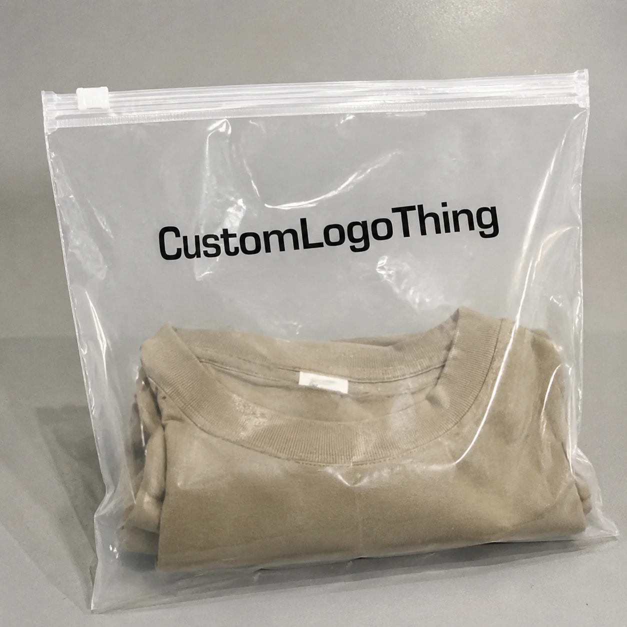
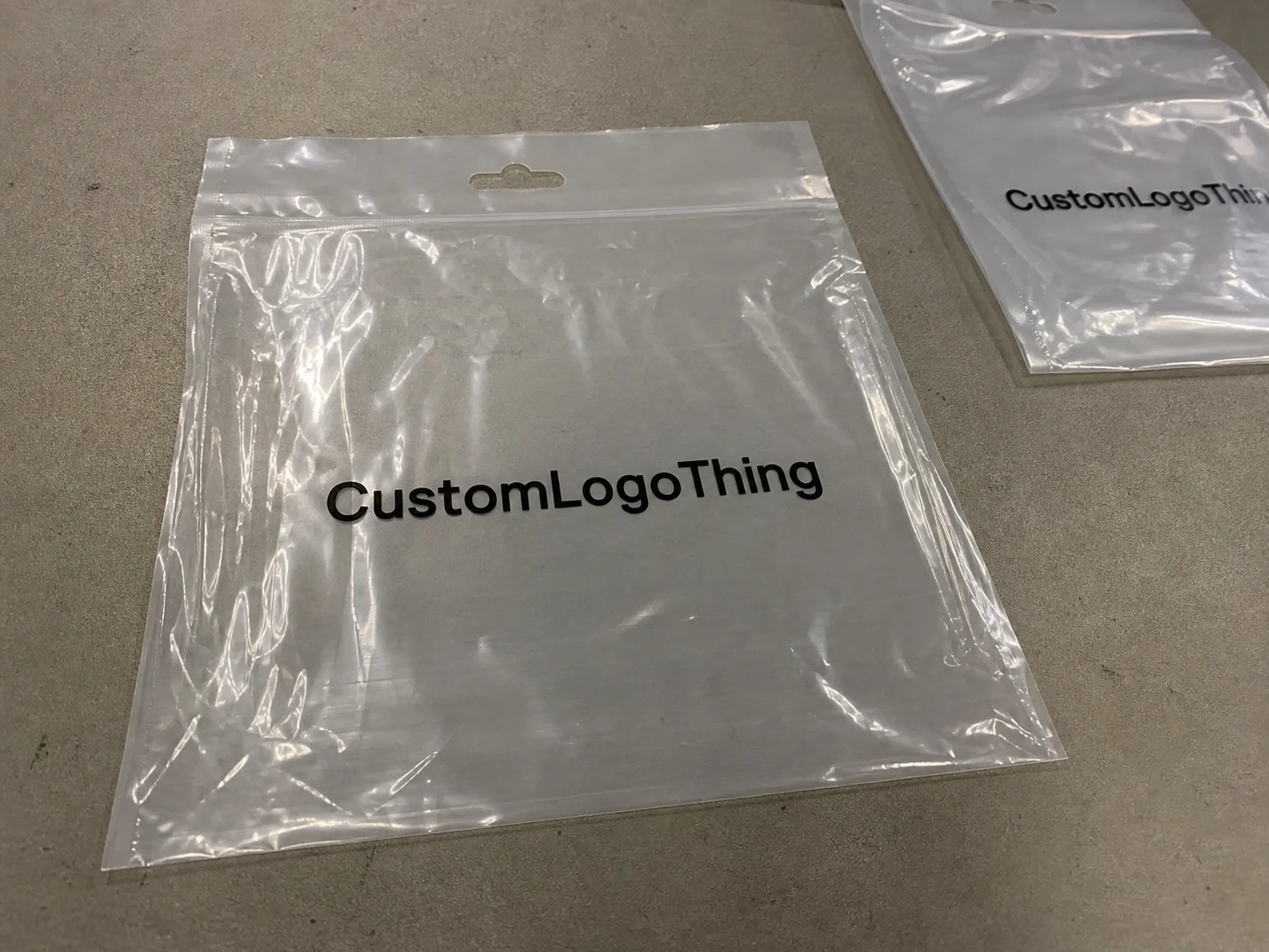
Clear poly retail bags are transparent or semi-transparent plastic bags used for apparel, accessories, gifts, and folded soft goods. They are not the same as mailing envelopes or rigid cartons. With a clear bag, the brand mark shares the stage with the product instead of replacing it. That can create a premium, floating effect. It can also make the logo disappear if the layout is too small, too busy, or placed against the wrong background.
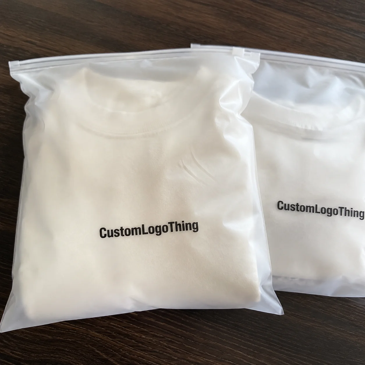
The buyer’s job is not to flood the bag with ink. It is to get visible branding without burying the merchandise. A logo over a dark garment may read sharply. The same logo over a white tee, tissue insert, or pale product can soften or vanish. That is why a good layout is judged against the actual contents, not a blank mockup on a screen.
There is another layer that often gets ignored: the way customers physically encounter the package. A bag on a hanger may be viewed from several feet away. A counter display may be seen up close for only a second or two. The logo has to work in both situations. If it only looks good when zoomed in on a design file, it is not ready.
How Logo Placement Works on Transparent Film
Most custom clear poly retail bags are printed by flexographic printing, screen printing, or, on smaller or specialty jobs, digital printing. Each method has strengths and limits. Flexo is efficient for larger quantities and tends to hold steady once plates and setup are dialed in. Screen printing can produce dense ink and stronger opacity, which helps when a mark needs to stay legible on clear film. Digital printing can work for shorter runs or faster artwork changes, although it is not the right fit for every bag supplier.
Placement and print method affect one another more than many first-time buyers expect. A centered logo with room around it is forgiving. A thin mark pushed near a seam is not. If white underprinting is used, registration becomes even more sensitive. A slight shift can show as a halo or ghosting, especially around fine text and small shapes. On transparent substrates, the margin for error is smaller than it is on labels or cartons.
The most common print zones are straightforward:
- Centered front panel for the strongest retail visibility
- Lower corner mark for a quieter, more restrained look
- Seam-adjacent branding when the bag format gives enough safe space
- Repeat pattern layout for broad brand presence across the panel
Each option changes the way the bag feels in hand and on shelf. A centered logo usually reads fastest. A lower-corner mark can feel more premium if the packaging is meant to support the item rather than dominate it. Repeat patterns are useful in fashion and gift applications, but they can turn noisy fast if the artwork is dense or the repeat spacing is too tight.
There is a catch with every transparent package: the bag folds, seals, and fills in a way that can distort the print area. A logo placed too close to a weld line may stretch or get cut off once the bag is packed. A good clear poly retail Bags Logo Placement guide always starts with the bag structure, not the logo file. The safest designs usually rely on clean shapes, good contrast, and enough empty space to keep the composition from feeling cramped.
Key Factors That Affect Placement, Visibility, and Brand Impact
Bag size sets the boundaries first. A 6 x 9 inch bag and a 12 x 16 inch bag do not offer the same usable print area once side seams, bottom seals, and any header space are accounted for. In practice, the printable zone is smaller than the finished size, sometimes by an inch or more on each side depending on how the bag is made. If a supplier provides a dieline, use it. If they do not, ask for one. Guessing from the finished measurement usually leads to a proof that looks fine in theory and fails in production.
Product shape matters just as much. A flat folded tee behaves very differently from a boxed accessory or a bulky knit item. Flat items leave more open space behind the print, which helps the logo stand out. Bulky products crowd the viewing window and can compress small artwork. Fill level changes the visual balance too. A mark that looks centered on an empty bag can end up sitting too low once the product is inside.
Retail viewing distance is another overlooked factor. When a bag hangs on a rack, the customer may see it from three to six feet away. At that distance, thin lines, delicate type, and narrow spacing fade quickly. A counter display is viewed closer, but often only briefly. That is why logo scale should be judged at the distance where the shopper will actually encounter it, not at 200% zoom on a monitor.
Contrast, ink, and brand color choices
Clear film changes how color behaves. A dark logo can look crisp on white apparel and nearly disappear on a black garment. White ink underprinting solves that in some cases, but it adds cost and can make the print feel heavier. Sometimes a simple one-color mark, especially black or deep navy, performs better than a more elaborate full-color design because it stays legible across more product colors. Many buyers overestimate how much color they need and underestimate how much contrast they need.
If the bag also carries warnings, SKU marks, or recycle messaging, readability becomes a compliance concern as well as a design one. Brand should lead, regulatory text should support, and everything else should stay out of the way. Clear retail packaging works best when the hierarchy is obvious at a glance. For general recycling and materials context, the U.S. EPA provides useful guidance on packaging and recycling communication: EPA recycling strategy resources.
Material choice matters too. Clear poly retail bags are commonly specified at roughly 1.5 mil to 3 mil, depending on the weight of the product, how the bag will be handled, and how long it needs to stay presentable in store. Thinner film can be suitable for lightweight apparel or accessories. Heavier items, or items that will be handled often, tend to benefit from more film stiffness. The wrong thickness can make even a good print look cheap because the bag sags, wrinkles, or scuffs too easily.
| Placement option | Brand visibility | Best for | Typical risk |
|---|---|---|---|
| Centered front panel | High | Retail display, brand recognition | Can compete with product visibility if oversized |
| Lower corner | Moderate | Premium feel, subtle branding | May disappear when bag is filled or stacked |
| Repeat pattern | High | High-volume branding, fashion and gift items | Can look busy if artwork is too dense |
| Near seam or edge | Variable | Special formats, narrow bags | Warping, cutoff, print inconsistency |
Step-by-Step Process and Lead Time for Getting the Artwork Right
Start by confirming the bag style, dimensions, film thickness, and whether the order is stock or custom made. Those details shape everything else. A bag that is technically the right size can still fail if the seam layout leaves too little room for the logo. If you are also comparing other packaging formats, it helps to review the full product mix with Custom Packaging Products and, for enclosed shipping applications, Custom Poly Mailers.
Next, map the print area against the actual bag structure. A proof or dieline should show safe zones away from seals, folds, and gusset transitions. This step prevents one of the most common mistakes in custom packaging: the artwork looks fine in isolation but loses usable space once the real bag is built. A logo that is too close to the edge may still print, yet it will not hold up once the bag is filled and handled.
Artwork preparation matters more than buyers usually expect. Vector files are best because they keep edges clean at production size. Thin lines should be simplified. Tiny type should be enlarged or removed. If the design sits on a dark product background, ask whether a white underbase is needed. That underbase can improve readability, but it also adds a production pass and can change the feel of the final print. A minimal logo often wins for clear bags because the film itself is already doing part of the visual work.
Proofing and production checkpoints
A reliable workflow usually looks like this:
- Confirm bag dimensions, thickness, and print method.
- Place the logo on a dieline and check safe zones.
- Prepare vector art and remove unnecessary detail.
- Review a digital proof or press-ready mockup.
- Approve ink colors, placement offsets, and tolerances.
- Move into printing, curing, inspection, packing, and shipment.
That sequence sounds simple, but it is where many rushed orders lose time. If the proof comes back with the logo too close to a seal or too small to read at shelf distance, revision is cheaper than printing a mistake. On custom packaging, a one-day delay at the approval stage can save a whole production run from becoming unusable inventory.
Lead time varies with quantity and complexity. For a straightforward one-color run, many suppliers quote about 12 to 15 business days after proof approval. Special setups, plate creation, white underprinting, multi-color work, or placement near seams can stretch that timeline. If a quote sounds unusually fast for a complicated job, ask what process step has been compressed. The honest answer is usually more helpful than the optimistic one.
For buyers who care about transport durability as well as shelf appearance, broader packaging standards can still be useful. Clear retail bags are not shipping cartons, but handling tests and drop expectations give a more realistic sense of what happens during fulfillment. ISTA standards remain a useful reference point: ISTA test standards.
Cost, MOQ, and Unit Cost: What Moves the Numbers
Pricing for custom clear poly bags usually comes down to five variables: bag size, film thickness, number of print colors, number of print sides, and ink coverage. Add order quantity and the pricing picture becomes clearer. A simple one-color front print is generally the least expensive route. Add back printing, a second color, or white underbase work, and the quote rises quickly.
MOQ matters because setup costs get spread across the run. Small orders carry a higher unit cost because plate charges, prepress work, machine setup, and inspection time do not shrink just because the run is smaller. As quantities increase, those same costs are diluted. That is why a 5,000-piece order often lands in a very different per-unit range than a 25,000-piece order even if the artwork is identical.
| Order profile | Typical unit cost drivers | Buyer takeaway |
|---|---|---|
| Small run, one-color front print | Setup fees weigh heavily; MOQ pressure is high | Best for testing, seasonal items, or niche SKUs |
| Mid-volume, one- or two-color print | Better spread of setup costs; moderate plate expense | Often the best balance of cost and visibility |
| High-volume, multi-side or underbase print | Ink coverage, registration, and QC add cost | Worth it when the bag is part of the brand experience |
For budgeting, many buyers see simple printed poly bag pricing land in the low cents per unit at higher quantities, while smaller custom runs can move into a much higher range once setup is included. A realistic quote should show the bag price, plate charge, and freight separately. If those pieces are bundled into one number, ask for a breakdown before comparing suppliers. Otherwise, you may be comparing a true production cost against a quote that hides tooling or shipping elsewhere.
Standardized artwork can also lower cost. A clean logo with strong contrast is usually easier and cheaper to produce than a design with gradients, tiny typography, or multiple placement zones. Complex art files often create more proof rounds, more registration risk, and more press time. In packaging, simplicity often saves money because it reduces variables, not because it looks basic.
Common Placement Mistakes That Make Clear Bags Look Cheap
The fastest way to make clear packaging feel low-grade is to place the logo too low. Product weight can pull the visual center down, and folds can hide the mark on shelf. The shopper should not have to lift or shake the bag to find the brand. That mistake shows up more often in rushed reorder jobs than in first-time launches, usually because someone copied the old file without checking the fill level.
Overprinting is another problem. Too much ink on clear film erases the open, premium effect that made the bag appealing in the first place. The point of transparent packaging is that the product remains part of the presentation. If the artwork covers most of the panel, the bag stops feeling clear even though the material still is.
Small logos are risky as well. A mark that looks crisp on a monitor may disappear once the bag is filled and viewed under bright store lighting. Fluorescent retail lighting is unforgiving. So are glossy shelves and reflective display cases. A logo has to survive the real environment, not just the design proof.
Artwork too close to seams can warp, crack visually, or shift during printing. And then there is the coordination issue: if the bag, insert card, hang tag, barcode, and recycle mark all compete for the same visual space, the package starts to look assembled rather than designed. The best retail packaging systems feel intentional because every element has a job.
“The strongest clear bag designs are usually the quietest ones. They give the product room, but they never let the logo get lost.”
One more issue shows up in production reviews: buyers often approve artwork at screen size instead of actual size. That can hide thin strokes, misjudge contrast, and make a logo appear larger than it will on film. A proof should be checked at true scale and, ideally, viewed with product-filled mockups. A flat file tells you almost nothing about how the bag will behave once it is packed.
Expert Tips and Next Steps for a Better Order
If you want better results from a clear poly retail Bags Logo Placement guide, start with one strong focal point on the front panel. Then decide whether secondary branding is truly needed. More print areas do not automatically mean more impact. Often they mean more clutter, more setup, and a higher quote. A clean front-panel mark is enough for many retail categories.
Request a sample or at least a virtual proof when the order is seasonal, tied to a launch, or part of a brand refresh. Review the proof at actual size, not just on screen. Hold it at arm’s length, then step back a few feet. If the logo starts to disappear in that test, the shopper will have the same problem. That simple check catches more issues than most technical review meetings.
Think about how the bag will actually be used. Will it hang on a rack, stack in a bin, or be handed over the counter? That use case should influence placement more than personal preference alone. If the brand is meant to lead, centered placement usually wins. If the merchandise should stay front and center, lower-corner placement may feel more restrained and upscale.
Before approving production, check three things: the logo position, the relationship to seams and seals, and the way the artwork interacts with barcode, recycle, or product information. If any element feels accidental, adjust it before print. Moving artwork in proof stage costs little. Re-running bags after a mistake can turn a manageable order into expensive dead stock.
For buyers building a broader packaging program, clear bags work best as part of a system rather than as a standalone fix. Compare them with labels, inserts, and outer packaging so the brand story stays consistent across channels. That consistency is what makes packaging look designed instead of pieced together from separate purchases.
Final practical step: measure the product, gather vector artwork, request a quote, and compare the proof against your shelf setup. If the size, contrast, and safe zones all work together, the bag will read clearly in store and still keep the product visible. That is the real value of a clear poly retail bags logo placement guide.
Where should a logo go on clear poly retail bags for best visibility?
Place the logo in the main front viewing area, away from seams, seals, and heavy folds. Keep it large enough to read at shelf distance, not just when the bag is held in your hand. Also consider the fill level so the mark stays visible once the product is inside.
Does logo placement change the cost of clear poly retail bags?
Yes. Extra print sides, tighter registration, and more complex artwork can raise production cost. Placement near seams or special zones may also require more setup or tighter quality control. Simpler placement usually keeps unit cost lower, especially on smaller orders.
How do I choose between center placement and corner placement?
Center placement gives the strongest brand presence and works well for retail display. Corner placement can feel subtle and premium, especially when you want the product itself to stay the focus. Choose based on whether the bag is meant to advertise the brand or quietly package the item.
What is the usual turnaround for custom clear poly bags with printing?
Turnaround depends on artwork readiness, quantity, and whether plates or proofs are needed. Simple jobs move faster than multi-color orders or complex placement requirements. Approving artwork quickly helps keep the production schedule on track.
How can I make sure my logo stays readable on transparent film?
Use strong contrast, cleaner shapes, and enough empty space around the mark. Avoid ultra-thin lines and tiny text that can vanish against the product inside the bag. Ask for a proof and check the design at actual size before production begins.