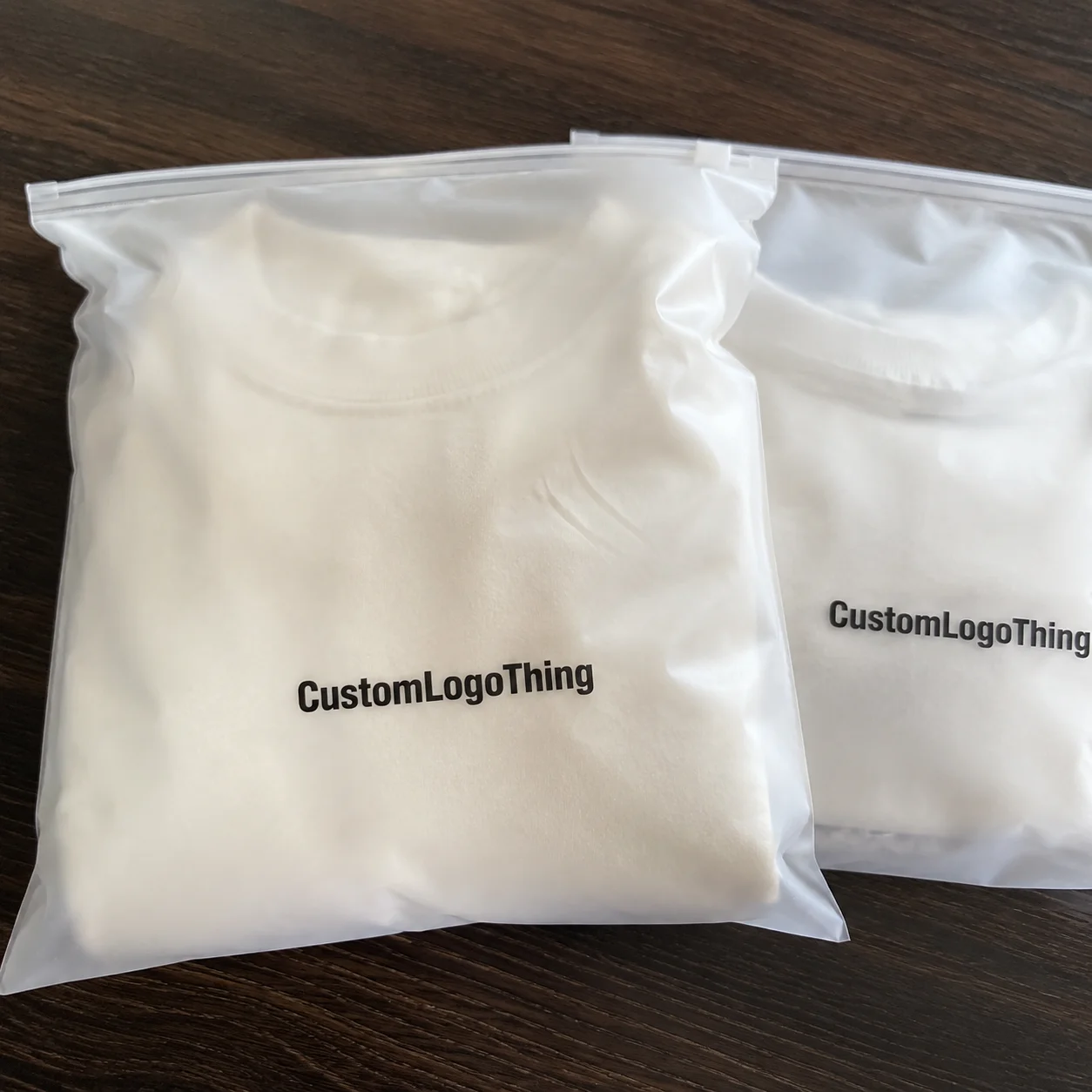
Retail launches do not get many second chances. The first physical impression after checkout is often not a shelf display, not a shopping bag, and not a display box. It is the mailer. That is why a retail launch Custom Poly Mailer Bags logo placement guide matters so much: a logo in the right zone can make low-cost shipping packaging look intentional, while poor placement can make a well-funded launch feel rushed.
From a packaging buyer’s point of view, custom poly mailers sit in an awkward middle ground. They are shipping supplies, but they also function as brand carriers, trust signals, and part of the unboxing moment. Compared with a printed carton, a poly mailer gives you less structural control and more risk of distortion. The material flexes, the seal changes the top edge, and the label may land wherever fulfillment can fit it. That means logo placement carries more weight than many teams expect.
There is a tendency to treat the mailer as a disposable cost line. That usually leads to weak design decisions. In practice, the mailer behaves more like retail packaging with a logistics job attached.
What Changes When a Retail Launch Starts Shipping in Poly Mailers
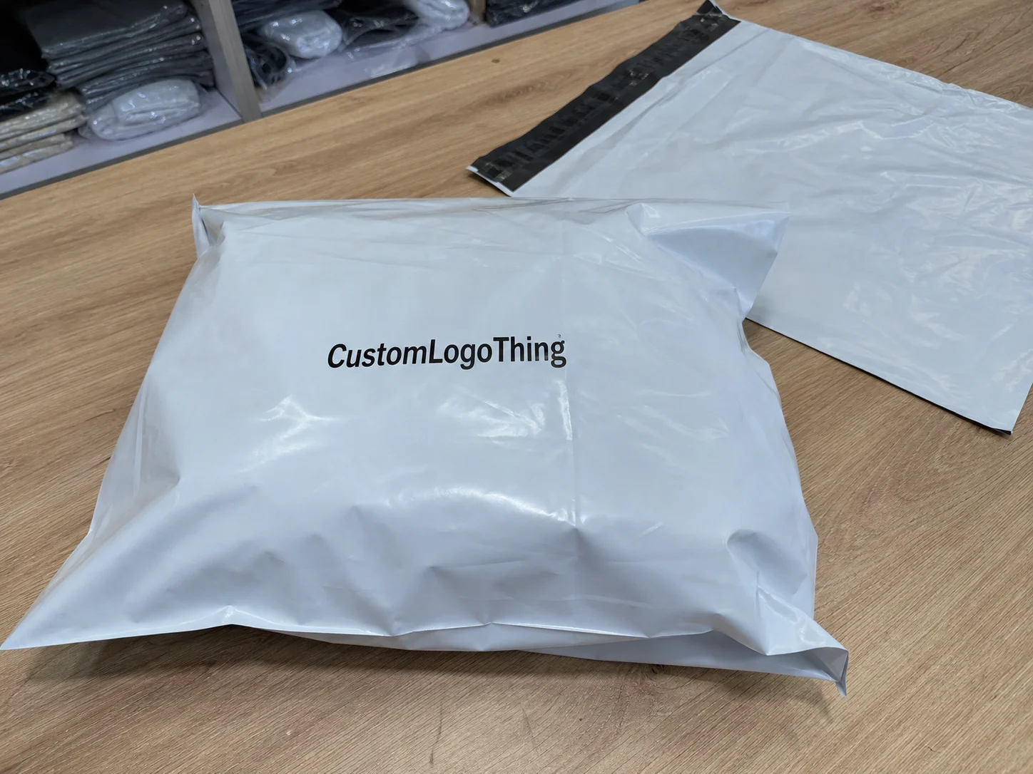
Once a launch ships in poly mailers, the package enters the brand story whether the team planned for it or not. Customers see the bag in transit, on desks, in hallway photos, and in unboxing clips before they ever touch the product. That matters because the package arrives at a moment of expectation, not casual browsing.
Custom Poly Mailer Bags are usually made from polyethylene film, most often LDPE or co-extruded blends. They are popular because they are light, inexpensive, and efficient to ship. For retail and DTC use, typical thickness often falls somewhere between 2.5 mil and 4.5 mil, with thicker film chosen for heavier contents or higher puncture risk. Unlike boxes, there are no rigid corners to anchor artwork. A logo placed too close to a seam or closure strip can bend, blur, or disappear once the bag is filled.
The practical placement zones are simple, but they do not perform equally:
- Front center: usually the clearest for brand recognition and transit visibility.
- Top flap: useful for secondary marks or short copy, though it can be affected by sealing.
- Lower corner: quieter and sometimes more premium, but easier to miss in photos.
- Back panel: good for repeat branding, returns details, or a second lockup.
If the launch is visual and image-driven, the front center usually earns its place. If the brand is aiming for a restrained look, a centered mark with generous negative space often reads better than full coverage. That is the central tension in any Retail Launch Custom Poly Mailer Bags Logo Placement guide: the bag has to move goods, but it also has to represent the brand in motion.
For broader sourcing decisions, teams often compare Custom Poly Mailers with other Custom Packaging Products to decide whether the mailer should be the hero package or just the shipping layer.
How Logo Placement Works on Poly Mailers
Placement starts with structure. Poly mailers have fold lines, seams, closure strips, and sometimes side gussets. Each one changes how artwork prints and how it looks after packing. A logo can look aligned on a flat dieline and still appear slightly skewed once the bag is filled and sealed. That is normal. The film moves.
Print method matters too. Flexographic printing is common for longer runs because it is economical at scale and handles simple graphics efficiently. Gravure can deliver fine detail and smooth ink laydown, but setup is more expensive and usually makes sense only at higher volumes. Digital printing is more flexible for lower quantities or artwork changes, though color consistency and substrate limits still need review. None of these is universally best. The right choice depends on quantity, design complexity, and how precise the logo placement needs to be.
Large logos can stretch visually on soft plastic if the film shifts during packing. Smaller repeated marks often stay more consistent across sizes. That is especially true when a brand orders multiple mailer formats, such as small and medium bags, and wants the system to read as one family instead of a set of unrelated pieces.
The safe zone should be built around the closure strip and seams. A practical rule is to keep key text and logo edges at least 0.25 to 0.5 inches away from folds, seals, and cut lines. Exact bleed requirements vary by supplier, but artwork that hugs the edge too tightly tends to reveal problems fast once the bags are packed, stacked, and labeled. When a buyer asks for full coverage, the more useful question is this: what part of the design must still read clearly after the bag is sealed and shipped?
“The proof is not the package. The filled sample is the package.”
That single check prevents more launch mistakes than any aesthetic preference ever will.
Logo Placement Factors That Affect Shelf Appeal and Shipping
Logo placement is not only about visual taste. It also affects how quickly a shopper reads the brand, how the carrier handles the parcel, and whether the package survives transit without the artwork being obscured. A mailer with strong contrast and a clear mark can act like a small billboard. A pale logo on a glossy bag can disappear under fluorescent light, camera flash, or a layer of packing tape.
Finish changes the feel of the design. Glossy film often makes colors look brighter, but it can also create glare. Matte film usually feels more restrained and can read as more premium, especially for beauty, apparel, or lifestyle launches. Transparent or semi-transparent mailers add another variable because whatever is inside becomes part of the visual field. That can work for the right product. It can also make the package feel less controlled than the brand intended.
Brand goals should shape the placement strategy:
- Luxury brands usually do better with centered logos, restrained coverage, and more negative space.
- Eco-conscious brands tend to favor simpler graphics, lighter ink coverage, and messaging that supports material choices.
- Fast fashion launches often benefit from bolder repeat marks and high-contrast color.
- Subscription brands need repeatable layouts so the mailer stays consistent across many shipments.
- Promotional retail launches can tolerate higher visual density if the goal is broad awareness.
Shipping labels and barcodes are the practical complication. If you do not plan for them, they can cover the logo or split the composition in half. That is one reason many teams reserve a label zone on the back panel or in one lower corner. It keeps carrier marks away from the hero branding and reduces the chance that a label lands on top of a carefully printed mark.
Front-only branding is simpler and usually cheaper. Full-wrap graphics create more visual impact, but they cost more, require tighter proofing, and are more vulnerable to wear. A front-only design may deliver most of the recognition at far less complexity. A full-wrap design may improve memorability, but only if the launch budget and production timeline can support the extra checks. For a retail packaging team, that is a real tradeoff, not a style preference.
| Placement Option | Brand Impact | Production Complexity | Typical Use Case |
|---|---|---|---|
| Front center logo | High | Low to medium | Most retail launches, premium minimal branding |
| Front plus back branding | High | Medium | Brands that want visibility from multiple angles |
| Full-wrap artwork | Very high | High | Campaign launches, fashion drops, high-recognition packaging |
| Corner logo with repeat pattern | Moderate | Medium | Minimal brands, repeat shipments, lighter visual systems |
For buyers comparing sustainability claims and transit performance, it helps to cross-check expectations against standards resources like ISTA and packaging guidance from the Institute of Packaging Professionals. Not every mailer needs formal testing, but if the launch is sensitive, shipping performance should be part of the art discussion.
Cost, Pricing, and MOQ Tradeoffs for Custom Mailers
Unit cost depends on size, film thickness, number of print colors, coverage, and order volume. A simple one-color logo on a standard-size mailer will usually cost less than a multi-color full-wrap design on a custom size. For reference, a basic printed mailer in a 5,000-piece run might fall around $0.18 to $0.28 per unit, depending on dimensions and print coverage. Smaller runs can move higher quickly, especially if setup work is substantial.
MOQ is where many retail teams feel the pressure. Lower minimums reduce commitment risk, which helps if the launch is still changing. But a lower MOQ almost always means a higher unit price. Larger runs spread setup costs across more bags, so cost per bag drops. That is the tradeoff: flexibility versus efficiency.
Hidden pricing variables are easy to miss because they do not always appear in the headline quote:
- Plate or setup fees for flexographic or gravure printing
- Prepress and proofing charges if artwork needs multiple revisions
- Shipping for bulky cartons of mailers
- Color matching work for brand-critical tones
- Redesign fees if a late placement change forces new production files
That is why the cost conversation should cover both the printed bag and the work around it. A low unit price can become expensive if the artwork is not final. On the other hand, overbuying a large run too early can create inventory waste if the brand is still refining the packaging design or product mix.
For a launch team, a simple decision framework is usually enough:
- Test smaller quantities if the logo system, color palette, or product lineup may still change.
- Commit to higher volume if the packaging is finalized and the mailer is part of the core brand identity.
- Choose simpler placement if the budget needs to protect other launch spend.
- Invest in full coverage if the mailer carries a major share of the visual story.
For teams comparing mailers against other formats, it helps to measure the bag against Custom Poly Mailers and alternative Custom Packaging Products by expected order volume, print coverage, and whether the package will be seen mainly in transit or at point of sale.
Process and Timeline for Artwork, Proofs, and Production
A clean launch process usually starts with a brief, not a file. The brief should specify bag size, film thickness, print sides, number of colors, target MOQ, and where the logo must sit. From there, the supplier should generate a dieline or layout template, followed by artwork placement, proof review, approval, printing, curing, packing, and shipment. Each stage has a delay risk.
Typical timing depends on print method and order complexity. Simple runs may move from proof approval to production in about 12 to 15 business days after final sign-off. More complex jobs, especially those with multiple colors, special finishes, or custom sizes, can take longer. If the first proof comes back with placement changes, add time. That is usually where launch calendars slip.
Build backward from the launch date. If product inventory arrives first but mailers are late, fulfillment slows. If the mailers arrive first but artwork is still in revision, storage space gets used up and momentum stalls. Packaging is not separate from launch planning; it is part of it.
A useful timeline checklist looks like this:
- Week 1: lock bag size, artwork, and placement zones
- Week 2: review dieline and first proof
- Week 3: approve final proof or request limited edits
- Weeks 4-5: production, curing, and packing
- Week 6: shipping, receiving, and sample inspection before launch use
If the launch is high-stakes, ask for a physical sample. A digital proof can confirm layout, but it cannot show how the film reflects light or how the ink sits on the actual substrate. If the package needs to support environmental claims, verify the language carefully. Recycled-content claims, resin certification, and surrounding packaging components are not the same thing. Some paperwork applies to the bag itself, some does not, and sloppy wording can create problems later.
Common Mistakes That Hurt Retail Launch Branding
The most common error is simple: putting the logo too close to the seal or seam. Once the bag is filled and closed, the graphic can distort or disappear at the fold. The second mistake is contrast failure. A logo that looked crisp on a monitor can vanish on glossy plastic if the color is too close to the bag color or the line weight is too thin.
Small text is another trap. Type that reads clearly at screen size can become unreadable once printed on soft film and handled in transit. If the tagline is essential to the launch, test it at actual printed size. If it is not essential, remove it. Packaging design benefits from editing more than addition.
There is also the label-crowding problem. Shipping labels, return labels, regulatory marks, and internal barcodes can drift into the logo area if no one reserves space up front. That is especially common when procurement and fulfillment are reviewing different versions of the proof.
And then there is the proof trap. A flat proof is not a filled mailer. A design can look centered on screen, then shift visually once the product sits inside the bag or the adhesive strip changes the top edge. Approving that proof without checking a filled sample is how brands end up with packaging that is technically correct and visually weak.
Material quality matters too. Thin film can wrinkle more than expected. Weak adhesive can open in transit. Poorly registered print can make a logo look blurry even if the artwork file is clean. Those are production issues, not design failures, but they show up on the package all the same. A good buyer checks for them before the run starts, not after the first complaint.
“If the logo still looks strong after the bag is filled and labeled, the placement is probably right.”
Expert Tips to Make the Logo Work Harder on Every Shipment
Design for the camera, not just the shelf. Unboxing photos often crop the package at odd angles, and the top third of the bag is frequently what appears first in frame. If the logo sits too low, it may miss the moment entirely. A centered mark in the upper-middle zone often performs well because it survives both hand carry and social media framing.
One bold hero area usually works better than trying to fill every surface. Too many graphic elements can dilute the message, especially on a flexible bag where the artwork already has less visual discipline than a box. Supporting marks can live on the back panel or near the lower edge. That keeps the front clean and the system consistent.
Always test a real sample with the product inside. Flat artwork and filled-pack artwork rarely read the same. Weight, thickness, and the way the item settles in the bag all change the visual field. If the launch includes apparel, cosmetics, accessories, or kits, test with the actual shipment contents, not a stand-in.
Think through label overlap too. Carriers add tape. Fulfillment teams add stickers. Returns labels sometimes land wherever the operator has room. A good logo placement strategy preserves brand visibility even after those additions. For retail packaging, that is not a minor detail. It is the difference between a package that looks branded and one that looks merely shipped.
One last point: do not overdesign the back panel. Buyers often ask for “just in case” artwork, but excess copy rarely helps once the mailer is in motion. Keep the front memorable, give the back a job, and leave enough empty space for the package to breathe. The best mailers feel deliberate, not crowded.
Next Steps Before You Place the Order
Before ordering, create a one-page spec sheet. Keep it concise but exact: bag size, film thickness, print sides, color count, target MOQ, preferred logo placement zones, and any no-print areas around seals or labels. That document prevents a lot of back-and-forth later.
Ask for both a digital proof and, if the launch matters, a physical sample. If the artwork includes fine lines, gradients, or small type, the sample is even more valuable. Check the bag after sealing and after filling. That is the version your customer will see.
Then align marketing, operations, and the supplier around the same final layout. Marketing wants brand impact. Operations wants speed and legibility. The supplier wants printability. A good layout satisfies all three without trying to do too much.
For a retail launch, the winning move is usually not the flashiest one. It is the placement that keeps the logo visible, avoids production errors, and survives the realities of shipping. That is how custom mailers stop acting like plain logistics supplies and start doing real brand work.
Where is the best logo placement on custom poly mailer bags for a retail launch?
The front center is usually the strongest choice because it is visible in transit and in unboxing photos. Placement should avoid seams, seals, and the closure strip so the logo stays clean after packing. If the brand wants a premium feel, a centered mark with generous white space often reads better than a crowded full-wrap design.
How do I choose between a small logo and full-coverage artwork on poly mailers?
Choose a small logo when cost control, fast production, or minimalist branding matters most. Choose full-coverage artwork when the mailer itself is part of the marketing experience and the budget allows it. A full-wrap design can increase recognition, but it also raises setup complexity and usually demands more proofing.
What affects the cost of custom poly mailer bags with logo printing?
Material thickness, bag size, number of print colors, and order quantity are the main cost drivers. Setup fees, plates, proofs, and shipping can also change the final price. Higher volume usually lowers unit cost, but only if the artwork and sizing are finalized before production starts.
How long does production usually take after I approve the artwork?
The timeline depends on print method, order size, and whether the artwork needs revisions after the first proof. Simple runs move faster than complex multi-color jobs or custom sizes. The best way to avoid delays is to approve a complete spec early and keep all stakeholders aligned before production.
What should I check before approving logo placement on a mailer proof?
Check the logo against seams, folds, and the adhesive closure area. Verify contrast, text legibility, and whether shipping labels could cover important branding. Review a filled sample if possible, because the bag changes once product is inside.