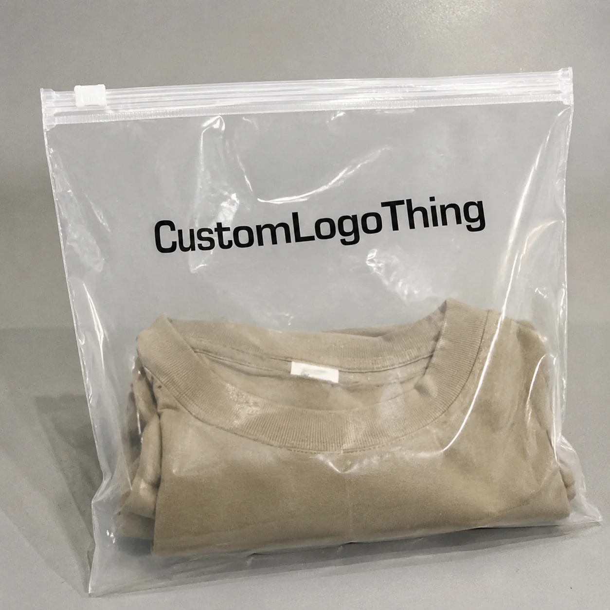
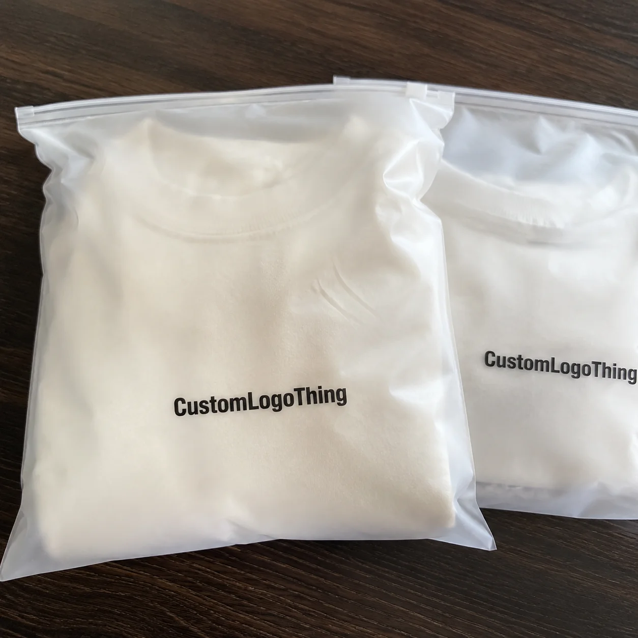
When an ecommerce customer opens a parcel, the bag itself is already speaking for the brand. That is why an ecommerce brand frosted zipper plastic Bags Logo Placement guide matters more than many teams expect. Frosted film softens glare and gives packaging a cleaner, higher-end look, but the wrong logo position can make the bag feel cramped, accidental, or visually off-center.
Frosted zipper plastic bags are semi-translucent resealable bags used for apparel, cosmetics, accessories, samples, and subscription kits. They do three jobs at once: protect the item, improve the unboxing experience, and often serve as storage after delivery. That means logo placement cannot be judged on a flat mockup alone. The artwork has to read clearly on the actual material, with the product inside and the zipper hardware in place.
From a packaging buyer’s perspective, the issue is practical rather than theoretical. Frost changes contrast, filled bags distort proportions, and print zones are less forgiving than a screen proof suggests. The decisions below focus on what actually affects visibility, cost, print quality, and production timing, so the final pack feels deliberate instead of improvised.
Why frosted zipper bags can make or break first impressions
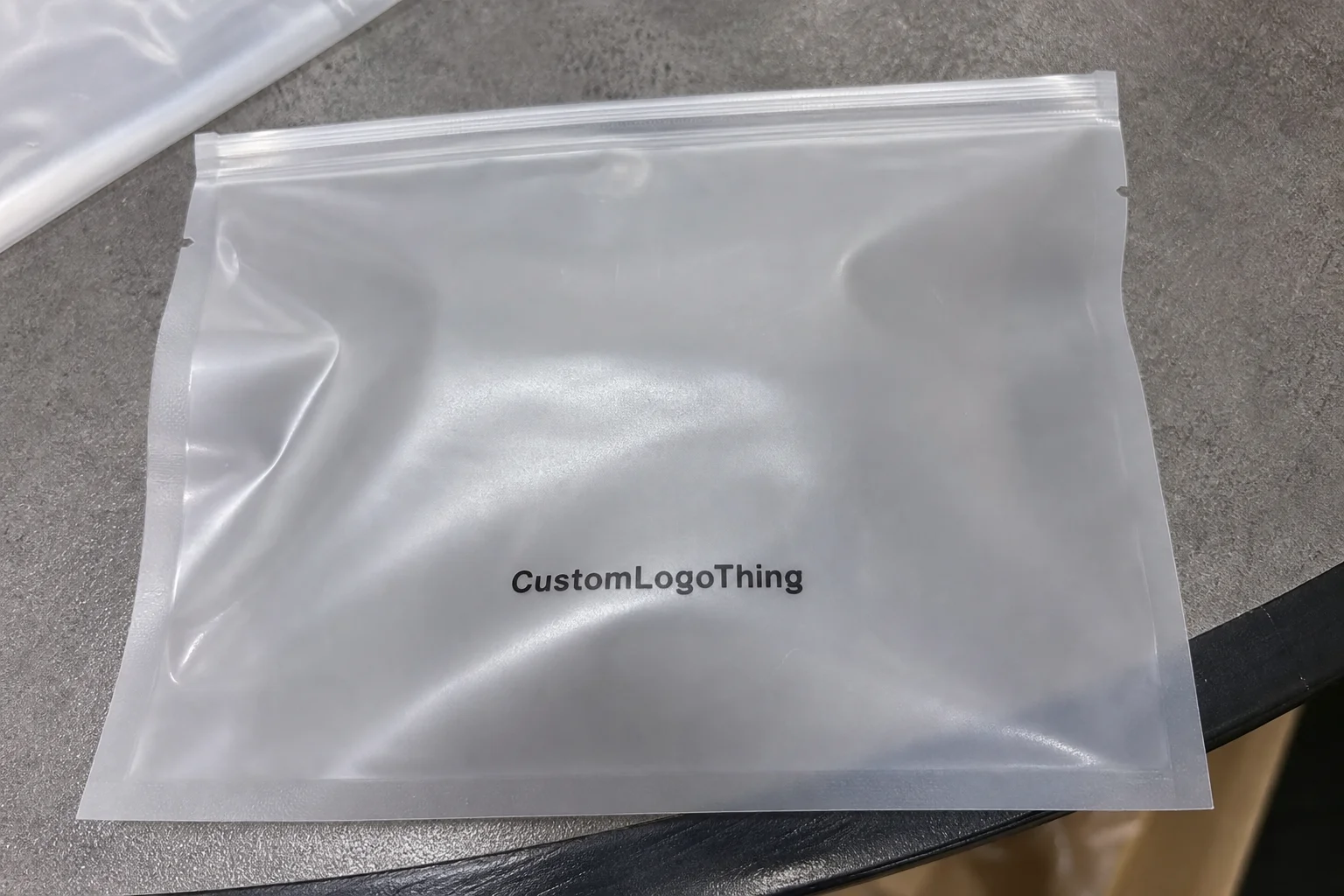
Frosted Zipper Bags sit in a useful middle ground. They feel more polished than plain clear poly bags, but they remain light, functional, and economical for ecommerce shipping. The frosted finish reduces harsh reflections, which improves presentation, yet the soft surface can flatten a logo if the placement or ink choice is wrong.
In practice, the bag is part of the brand identity whether the team planned for that or not. A centered logo with enough breathing room can raise perceived quality quickly, especially for apparel, skincare, and gift sets where the package is the first physical touchpoint. A crowded or poorly aligned mark has the opposite effect. It suggests haste, and customers notice that faster than most brands realize.
These bags are also useful because they balance protection and presentation. They keep dust out, help organize SKU bundles, and can be reused by the customer after delivery. That repeated exposure extends brand recognition, which is one reason ecommerce teams often choose printed bags over plain mailers or generic inner packaging.
Still, the material has its own rules. A frosted bag is not a printed carton, and it is not a label on a rigid box. The film flexes, the zipper interrupts the face panel, and the product inside changes the visible field. A good placement plan accounts for all of that before artwork goes to press.
The most common mistake is treating the empty bag as the final display surface. Once the product goes inside, the visible area changes, and the logo has to be designed for that real-world view.
How logo placement works on frosted zipper plastic bags
The most common print zones are straightforward: centered front logo, upper-third branding, lower-front placement, or back-panel information. Each one creates a different effect. Centered artwork usually feels the most balanced. Upper-third placement can look clean and premium. Lower-front branding is quieter and often suits minimalist labels. Corner placement works for brands that want the product to stay visually dominant.
What many buyers miss is that the zipper area, side seals, gussets, and bottom seam all interfere with clean artwork placement. If a logo crosses a seal line, it can appear warped or broken after production. If it sits too close to the zipper track, the design feels crowded, and repeated handling can wear the print faster.
Opacity and frost level matter too. A deeper frost usually hides contents better and gives the bag a more refined appearance, but it also changes how dark inks, metallic inks, and pale brand colors read on the surface. On lighter frosted film, charcoal or black usually holds shape well. Very light gray, pale gold, or soft pastel ink can disappear faster than expected.
Typical decoration methods include screen printing, flexographic printing, and labels. Screen printing often gives stronger ink deposit and better opacity, which helps on frosted film. Flexographic printing can be efficient for larger runs and repeat orders. Labels are easier to change, but they can introduce edge lift, adhesive visibility, or a less integrated look if the label stock does not match the bag surface.
The rule is simple: keep the logo away from stress points and closures, and design for the bag as it looks when filled. That means checking the visible face, not just the flat dieline. For packaging benchmarks and transport testing references, industry organizations such as the Flexible Packaging Association and ISTA are useful when product protection and distribution conditions matter.
Key factors that change logo size, visibility, and layout
Logo size is never just about brand preference. It depends on bag dimensions, film thickness, frost finish, fill level, zipper style, and whether the product is flat like a folded tee or bulkier like a bundled accessory set. A bag that looks generous in an art proof can look much smaller once the item sits inside it, which is why print size should be judged against the packed view.
One-color branding usually performs better than a detailed multi-color image when the print area is limited. Bold shapes, clean typography, and medium-weight lines hold up better on frosted film. Thin scripts and tiny text can work on paper goods, but flexible film gives less room for error, especially if the bag flexes during shipping or customer handling.
There is also a practical difference between retail-style display and discreet subscription packaging. Some ecommerce brands want the logo front and center for instant recognition. Others prefer a quieter approach that lets the product remain visually dominant. Neither is wrong; the right choice depends on brand consistency and on how the bag fits the wider packaging system.
For artwork setup, keep an eye on bleed area, safe zone, and registration tolerance. On flexible packaging, a shift of a few millimeters can move a logo from perfectly centered to slightly off. Simplifying small details often improves the result more than adding extra decoration ever will.
Material thickness also changes how the bag behaves on a packing line. A 60-micron film, for example, may feel firmer and hold shape slightly better than a thinner bag, but that extra structure can also make folds and seams more visible under ink. Buyers comparing options often look at the finished feel, yet the real test is whether the print stays legible after filling, sealing, and shipping. A beautiful sample that wrinkles under load is still a poor packaging choice.
If sustainability is part of the brief, the bag material should be considered alongside the print method. Recyclability depends on local collection systems, resin type, and contamination from inks or adhesives. For broader waste-reduction guidance, the EPA’s waste reduction guidance is a practical reference point. It does not solve every packaging decision, but it does help teams think beyond the render.
| Placement option | Best for | Typical visual effect | Practical risk |
|---|---|---|---|
| Centered front logo | Main ecommerce branding | Balanced, easy to recognize | Can look awkward if product fill is not considered |
| Upper-third logo | Fashion, cosmetics, premium kits | Clean and intentional | Too close to zipper if margins are tight |
| Lower-front logo | Minimalist or subtle branding | Quiet, modern appearance | Can disappear behind product shape |
| Back-panel information | Care instructions, brand story, SKU details | Functional and organized | Not ideal for primary brand recognition |
Step-by-step logo placement process for frosted bags
The cleanest way to manage an ecommerce brand frosted zipper plastic bags logo placement guide is to treat it like a production plan, not a design guess. Start by measuring the bag and mapping the usable print area, including the portion that remains visible after the product is inserted. A 10 x 13 inch bag does not behave the same way as a 12 x 16 inch bag once it is packed.
Step 1: Measure the bag and mark the usable print window. Include the zipper track, side seals, gussets, and bottom seam. Those are not decorative features; they are mechanical zones that can interfere with the logo.
Step 2: Decide which face is primary. If the bag will be shown flat on a shelf or in a stack, the center may work best. If it hangs, sits in a display bin, or is photographed for product pages, the upper-third may be easier to see. The best placement follows the visual orientation of the product.
Step 3: Build the artwork with correct margins. Keep the key elements, especially the brand name and icon, away from the edge of the safe zone. If the design includes a website URL, secondary line, or icon detail, make sure those elements remain readable at actual size.
Step 4: Review a filled-bag mockup, not just a flat dieline. Flat proofs help with structure, but they do not show how the logo sits against the product shape. A packed mockup reveals proportion, contrast, and whether the mark gets pushed down or stretched out by the contents.
Step 5: Confirm print method, ink color, and approval details before production starts. Once the setup is locked, changing placement or scaling can add cost and delay. A careful proof cycle is faster than fixing a problem after the run is underway.
A finished sample should also be checked for scuff resistance, zipper closure quality, and print consistency. If the bags will be stored, shipped, or handled in transit, material behavior matters as much as visual branding. That is where standards-based thinking helps, even for simpler ecommerce packaging runs.
Cost, pricing, MOQ, and unit cost considerations
Pricing for printed Frosted Zipper Bags usually changes with size, thickness, print colors, print coverage, and whether artwork appears on one side or both sides. A simple single-color logo on one panel will usually cost less than a two-sided, multi-color design with fine detail. Special effects, metallic inks, or heavier ink coverage can increase setup complexity and raise the final price.
MOQ matters a lot here. Lower quantities usually carry a higher unit cost because setup work is spread across fewer bags. Larger runs lower the price per unit, but they require a stronger commitment to artwork consistency, color approval, and order accuracy. For many ecommerce teams, the target is not the lowest sticker price; it is the cost that fits forecasted order volume and sell-through speed.
| Print approach | Setup complexity | Typical cost behavior | Best use case |
|---|---|---|---|
| Single-color direct print | Low to moderate | Usually the most economical for simple branding | Bold logos, large runs, straightforward layouts |
| Multi-color direct print | Moderate to high | Higher setup and registration sensitivity | Brands that need stronger visual identity detail |
| Label application | Low upfront, higher labor | Can raise handling cost over time | Short runs, flexible artwork changes, test launches |
Setup fees or plate charges can also appear depending on the print process. That is normal. What buyers should ask for is a clear breakdown: artwork prep, plate or screen setup, unit price by quantity, and any added cost for double-sided printing. That makes budgeting easier and avoids surprises later.
Typical market pricing varies widely by size and quantity, but buyer-side expectations are usually straightforward. A simple printed frosted zipper bag in medium quantities may land in a low unit-cost range, while smaller test orders often look expensive per piece because the fixed setup cost is spread over fewer units. If a quote seems unusually cheap, check whether it assumes one-color printing, stock sizes only, or a thinner film than the product actually needs. Savings can disappear once the order needs a second proof, revised artwork, or reprint.
The practical advice is to simplify the logo where possible and request pricing based on the actual packed use case, not just the empty bag. If the packaging is doing double duty as presentation and storage, that should be part of the quote. A bag that looks inexpensive upfront can become expensive if it forces relabeling, hand application, or rework.
Production steps, timeline, and lead time expectations
Most production runs follow a familiar sequence: artwork review, proofing, material confirmation, printing setup, production, curing or drying, inspection, and packing. The exact order can vary by print method, but the logic stays the same. If the artwork is ready and the bag size is standard, the process usually moves faster than a custom size with layered graphics.
Delays most often happen when the logo file needs cleanup, the colors need another round of matching, or the artwork simply does not fit the bag dimensions cleanly. This is why vector files matter. A clean AI, EPS, or PDF file usually saves time because the print team can scale and separate artwork more reliably than with a low-resolution image.
Lead time also depends on order size, print complexity, and whether the bags are stock or custom-sized. Simple one-color runs on standard sizes often move with fewer bottlenecks. Complex art, special inks, or higher-volume orders usually need more calendar space, especially if a sample is requested first.
For launch packaging, subscription drops, or seasonal campaigns, build in room for sample approval. A few extra days can protect the whole rollout. Faster turnaround is easier when the artwork is simple, the color is standard, and the logo placement has already been tested on a filled-bag mockup.
Lead times are often quoted too optimistically by teams trying to win an order, so buyer-side schedule padding matters. For a straightforward stock-size run with one-color printing, a short production window may be realistic after approval. For custom sizing, higher ink coverage, or a first-time order, the schedule can stretch once proofs, sampling, and packing inspection are included. The safest plan is to lock artwork early and treat the approval milestone as part of manufacturing, not admin.
Honestly, the smoothest projects are the ones where the buyer treats approval as a production checkpoint rather than a design opinion. That mindset keeps the order moving, and it usually improves print consistency across the full run.
Common logo placement mistakes that weaken the packaging
The first mistake is centering the logo without checking how the product will sit inside the bag. A perfectly centered mark on an empty bag can slide visually off balance once folded apparel, boxed skincare, or bundled accessories shift the visible area.
The second mistake is placing artwork too close to the zipper. It feels efficient on the screen, but the zipper track interrupts the design and can make the print look tight or crooked. In some cases, it also increases wear because that top edge gets handled more often.
Another common problem is overcomplicated artwork. Thin lines, tiny text, and overly detailed icons can disappear on frosted film. That is especially true when the print area is small or the bag surface has a stronger frost level. Simple does not mean plain; it usually means more legible.
Color choice causes plenty of trouble too. Pale grays, soft pastels, and low-opacity inks often lack enough contrast against the frosted surface. The bag may look fine in a digital proof, but the real material can mute the result. That is why physical samples matter so much more than screen renders.
The last big mistake is approving only a flat proof. A flat view helps check dimensions, but it does not show how the logo reads in a packed bag. If the product is the wrong thickness or shape, the imprint can shift visually. A sample viewed under normal warehouse light often catches issues that a desktop render hides.
For more buyer-side examples of packaging decisions and print considerations, the Case Studies page is a useful place to compare real project patterns.
Expert tips and next steps before you approve artwork
Use a simple hierarchy: logo first, then secondary brand details, then optional product or contact information. That sequence keeps the design readable on a flexible surface and protects brand consistency across the full packaging line. If everything competes for attention, nothing reads clearly.
Ask for a filled-bag mockup and a print-ready dieline before you sign off. The empty bag view can be misleading, especially with frosted film, because the product inside changes contrast and proportions. A good mockup makes the final placement feel real, not theoretical.
It also helps to keep a backup version of the logo with fewer details. If the bag size changes or the printable area tightens, a simplified mark can save the design. This is common with ecommerce packaging because SKU plans shift, and it is easier to adapt a clean logo than to rescue an overly intricate one.
If you are comparing materials or presentation styles, request samples printed on the actual frosted film rather than on plain paper. Paper proofs can show color intent, but they cannot show the interaction between ink, transparency, and surface texture. That is the kind of detail that separates an acceptable pack from a polished one.
Before production, confirm the final dimensions, print side, zipper position, approved ink color, quantity, and packaging timeline. Those details sound basic, yet they prevent most mistakes. For brands that care about reusable materials or packaging stewardship, FSC-certified paper inserts or guidance from FSC can be part of the wider packaging plan, even if the bag itself is plastic.
If the artwork is simple, the safe zones are clear, and the proofing process is tied to a filled-bag mockup, the ecommerce brand frosted zipper plastic bags logo placement guide becomes much easier to follow. Done well, the bag supports visual branding, improves the unboxing experience, and gives the customer a package that feels deliberate from the first glance to the final reuse.
What is the best logo placement for frosted zipper plastic bags in ecommerce packaging?
The most common choice is centered on the main visible panel, but the best placement depends on product size, fill level, and whether the bag is displayed flat or packed. Keep the logo away from the zipper track, side seals, and bottom seam so it stays clean and readable.
How big should the logo be on a frosted zipper bag?
Size it for the visible packed area, not just the empty bag, because the product inside changes the final viewing window. A bold, simplified logo usually works better than a detailed mark when the print area is limited or the film has a soft frosted finish.
Does frosted film affect color matching for printed logos?
Yes, the semi-translucent surface can soften contrast and shift how colors appear, so proofs should be reviewed on the actual material. High-contrast inks and simplified palettes usually reproduce more reliably than subtle gradients or very light brand colors.
What affects the cost of custom printed frosted zipper bags?
Bag size, film thickness, number of print colors, print coverage, and order quantity all influence pricing. Lower quantities usually carry a higher unit cost, while added setup steps or special print effects can increase upfront expense.
How long does production usually take for custom logo frosted zipper bags?
Lead time depends on artwork readiness, proof approval, material availability, and order size. Simple single-color orders on standard sizes generally move faster than complex designs or custom dimensions, especially when samples are requested first.