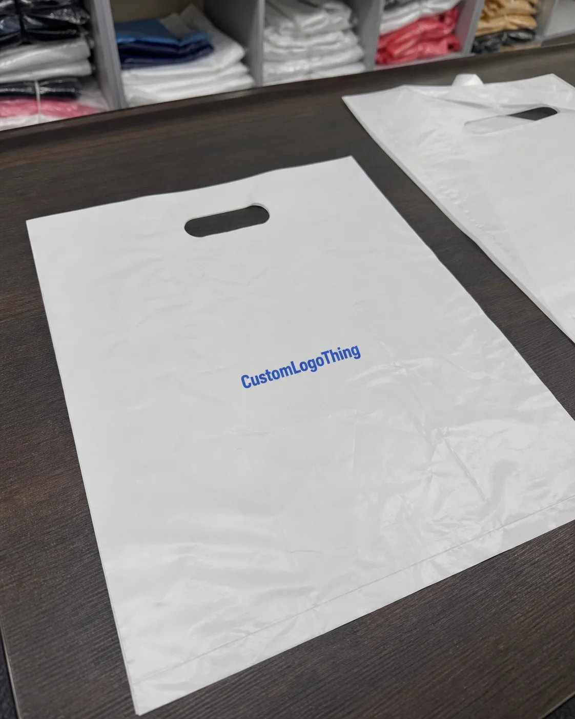
Coffee Roaster Trucker Caps Digital Proof Checklist
A cap proof can look right and still fail by a quarter inch. That is usually the difference between a clean retail piece and a box of inventory nobody wants to explain. For coffee brands, the coffee roaster trucker caps Digital Proof Checklist is the part that catches those mistakes before they turn into rework, missed deadlines, or a run that looks “almost” right from six feet away.
Trucker caps are harder to judge on screen than flat items like stickers or cards. Seams, mesh, crown height, front-panel structure, and decoration method all affect how the artwork lands in production. A proof is not decoration theater. It is a production map: where the logo sits, how much room it has, whether the chosen blank supports the art, and whether the order is actually set up the way the buyer intended.
What the checklist really does
The phrase sounds procedural, but the job is simple: prevent expensive surprises before they become physical product. A proof checklist for trucker caps is a buyer’s control sheet for artwork placement, color intent, cap style, and decoration method. If one of those pieces is wrong, the finished cap can look awkward even when the logo file itself is perfect.
The first mistake many buyers make is assuming a digital proof is a finished sample. It is not. It is a production preview. It shows where the logo will sit, what blank is being used, and how the decoration should be built. That matters because a design that looks centered on a computer can end up too high on a structured crown, too close to a seam, or too wide for the front panel once it is sewn or patched onto an actual cap.
For coffee roasters, the risk is sharper because brand marks often carry fine text, bean icons, roast notes, circular emblems, or long taglines. Those elements were usually designed for bags and labels, not for a 2.5-inch front field with a seam running through the middle. Small type can disappear quickly. Thin outlines can close up. A proof should reveal whether the art needs simplification before production starts, not after the order is packed.
A proof is not a promise of perfection. It is the cheapest place to catch the obvious errors.
That is why the checklist matters. Approving casually usually means paying later for embroidery corrections, patch remakes, or a reorder that should never have been necessary.
How digital proof approvals work
The approval process is usually straightforward, which is exactly why it gets messy. The buyer sends the logo file, cap specs, quantity, and any notes. The decorator sends back a mockup or digital proof. The buyer reviews placement, decoration method, colors, and any construction notes. If something is off, revisions happen. Once approved, production starts.
A useful proof usually confirms a few concrete things:
- Logo size and placement on the front panel, side panel, or patch field.
- Decoration method, such as embroidery, woven patch, PVC patch, print, or applique.
- Cap construction, including structured or unstructured front, mesh color, and closure style.
- Color direction, even though monitor color and fabric color will never be identical.
- Special notes, such as seam avoidance, raised stitching, border width, or edge treatment.
Just as important is what the proof does not do. It does not guarantee exact thread match on every screen. It does not show how mesh texture will read under store lighting. It does not replace a careful review from someone who can read a spec sheet and compare it against the order line by line.
Approval goes faster when one person owns the decision. Multiple reviewers often create conflicting notes: one wants the logo smaller, another wants the mesh darker, and a third thinks the patch should move up a quarter inch. That is how a simple order turns into a revision loop that costs time but adds no value.
If the vendor cannot build the cap style you want, the proof will not save the order. Confirm the production method first, then refine the artwork. The easiest place to verify that is the vendor’s capabilities page, especially if the order depends on a specific patch type, stitch method, or blank construction.
Cap specs that change the final look
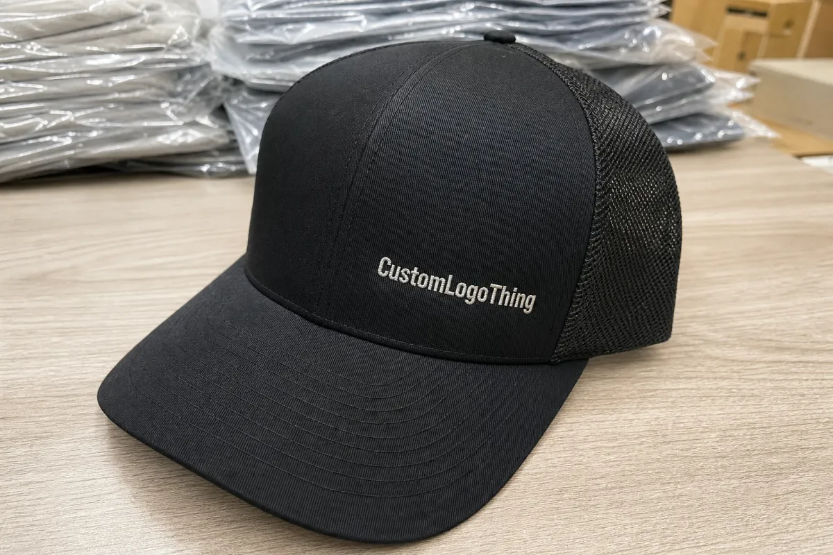
Trucker caps are not interchangeable. A structured 5-panel cap with foam backing behaves differently from a 6-panel cap with a fabric front. A snapback closure reads differently from a strap or hook-and-loop back. Flat bill, curved bill, medium crown, and tall crown all change how much usable front surface is really available for artwork.
Decoration method matters just as much. Embroidery gives texture and durability, but tiny text can blur if the art is too fine or the stitch count is too low. Woven patches handle detail better and can clean up logos with thinner lines. PVC patches hold sharp edges and bold shapes, but they do not suit every brand image. Print can be efficient for simple graphics, though it gives up the dimensional feel that stitched decoration provides.
The practical specs worth checking before approval are simple:
- Front panel type - structured, unstructured, foam, or fabric.
- Panel count - 5-panel gives a cleaner front field; 6-panel usually introduces a center seam.
- Mesh color - black, white, tan, or custom-dyed options can shift the entire look.
- Brim shape - flat, pre-curved, or lightly curved.
- Closure - snapback, strap, or hook-and-loop.
- Decoration size - most front marks land around 2.25 to 4 inches wide, depending on crown width and seam layout.
Coffee roaster artwork needs extra discipline because many identities depend on details that do not survive cap decoration well. Fine serif text, roast descriptors, multi-line taglines, and intricate bean art often need cleanup for cap use. The original logo might work on a bag, but the cap version may need a simplified lockup, thicker lines, or fewer words. That is not a downgrade. It is a production adjustment.
Sustainability questions can also belong in this review stage if the order includes tags, cartons, or retail-ready packaging. If the blank supplier uses FSC-certified paper components, confirm the claim before the order leaves proof stage. That is easier than sorting out documentation after shipment. The FSC standard can be verified at fsc.org.
Pricing, MOQ, and cost drivers
Cap pricing is mostly math, with a little drama around the edges. The biggest cost drivers are decoration method, stitch count or patch complexity, blank quality, number of colors, and how much cleanup the artwork needs. If the logo requires digitizing, vector cleanup, or a custom patch shape, the price moves. Not wildly, but enough to matter when the order is real.
MOQ changes the economics quickly. Small runs carry higher unit cost because setup and labor are spread across fewer caps. Larger runs lower the price per piece, but they also increase inventory risk. Cheap per unit is not always cheap overall, especially if the caps sit in storage longer than expected.
Common add-ons that catch buyers off guard include:
- Digitizing or vector cleanup: often $20-$75, depending on file quality.
- Extra proof rounds: sometimes included, sometimes $10-$25 each.
- Rush fees: commonly $50-$150, depending on schedule pressure.
- Special labels or hangtags: about $0.10-$0.40 per unit for simple inserts, more for custom packaging.
- Split colors or mixed variants: usually more expensive than a single clean run.
| Decoration option | Typical landed cost at 500 pcs | Best for | Tradeoff |
|---|---|---|---|
| Flat embroidery | $3.25-$5.50 per cap | Bold logos, simple text, classic roaster branding | Fine detail can blur if the stitch count is too low |
| Woven patch | $3.80-$6.20 per cap | Sharper artwork, smaller type, cleaner edges | Less textured than embroidery |
| PVC patch | $4.10-$6.80 per cap | Strong shape, high contrast, outdoor-friendly branding | Not every brand wants the molded feel |
| Print or applique | $2.90-$5.00 per cap | Simple graphics and tighter budget runs | Less depth than stitched decoration |
Before comparing vendors, confirm what the quote actually includes. Is the proof free? Is setup built in? Does the price include shipping, cartons, and any revision rounds? A lower unit cost can disappear once those pieces are added back in.
If the quote feels too light, compare it against the production capabilities being offered. A vendor that cannot explain stitch count, patch build, or cap blank options is probably not quoting the order in a way that reflects reality.
For large shipments moving through warehouses or distribution centers, carton protection matters too. Some buyers ask about ISTA-style testing logic for a reason: crushed cartons can damage caps just as thoroughly as a bad proof. The shipping method should match the order size, the route, and the retailer’s expectations.
Production steps and turnaround
The timeline is usually more predictable than the artwork. First comes art intake. Then the proof is created. If needed, revisions follow. After final approval, production starts, then quality control, packing, and shipment. When the vendor is organized and the buyer responds clearly, the process moves at a decent pace. When either side hesitates, the schedule slips fast.
Realistic timing looks something like this: simple proof revisions may take 1 to 3 business days. Production often runs 7 to 15 business days after approval, depending on decoration method, order volume, and season. Shipping adds another layer. If the caps are tied to an event, trade show, or seasonal drop, the calendar should include a buffer rather than a hopeful estimate.
The most common delay points are ordinary and avoidable:
- Missing vector artwork or a low-resolution logo.
- Slow approval from multiple internal reviewers.
- Color disputes that should have been settled before the proof went out.
- Complex decoration that needs a second layout check.
- Waiting on the final ship-to address or carton instructions.
Fast approvals usually come from a clean file package: vector art in AI, EPS, or PDF format; one decision maker; exact cap color; exact decoration method; quantity; and a single approval email with no side conversations buried inside it. That alone can remove a few unnecessary revision rounds.
When revision notes are specific, production moves faster. “Approve placement, reduce logo width by 0.25 inch, keep thread color black” is useful. “Looks close but can we make it nicer?” is not. Vague feedback forces guesswork, and guesswork is expensive in manufacturing.
Common proof mistakes
The mistakes are usually boring, which is why they keep happening. People approve low-resolution logos. They forget to confirm the cap color. They skip seam checks. They assume the proof is drawn to scale. Then the sample arrives and everyone acts surprised, as if the mockup had been hiding the problem.
Another recurring issue is feedback that is too vague to act on. “Make it pop” sounds useful to the person writing it and useless to the person building the cap. Production needs specific instructions: move the logo lower, widen the patch border, reduce thread colors, or switch the mesh from white to black. That is the difference between a quick revision and a guess.
Do not approve only on a phone if the design includes small text or tight spacing. A small screen can make thin type look more readable than it really is. Open the proof on a larger monitor if possible, or print it. The review should cover placement and readability, not just whether the mockup feels good.
Business mistakes can do as much damage as art mistakes. Some buyers forget MOQ. Some forget to verify the exact blank style. Some approve before confirming ship dates. Some never ask whether the proof reflects the actual cap model or a similar substitute. That is not a proof problem. It is a process problem.
Before signing off, compare the proof against the order sheet line by line: quantity, color, decoration method, placement, closure, delivery address, and any special pack-out instructions. If any one of those is loose, the order can drift.
How to approve faster next time
The easiest way to speed up approval is to remove uncertainty before the proof is sent. A short internal checklist works well: artwork file, cap color, decoration method, placement, quantity, deadline, and shipping details. If all seven are confirmed, the proof review becomes a verification step instead of a detective exercise.
For more complex designs, ask for an additional view. A front mockup is enough for many simple logos, but some artwork needs a side angle, a close-up, or dimension notes to show whether the mark is too high on the crown or too close to the seam. That matters most on structured trucker caps, where the panel shape changes the way the design reads at a distance.
After approval, keep a reordering sheet. Save the approved art file, cap style, decoration method, approved size, thread or patch colors, and shipping date in one place. Future runs become much easier when the brand is not relying on memory from an old email thread.
Three habits save time on repeat orders:
- Use one approval contact so comments do not conflict.
- Keep a versioned spec sheet so nobody has to guess at the build later.
- Ask for the final proof in the exact blank style that will be reordered.
Consistency matters beyond caps. If a brand already has a production standard for shirts, boxes, or tote bags, the same discipline should apply here. The fewer assumptions in the workflow, the fewer awkward surprises in the finished goods.
The real value of a coffee roaster trucker caps Digital Proof Checklist is not that it adds more paperwork. It turns a fuzzy approval into a controlled decision. Gather the logo files, name one decision maker, confirm the cap blank, and review the proof against the order sheet before approval. That is the shortest path to a clean run.
What should I check first on a coffee roaster trucker caps digital proof?
Check logo placement first, because a centered design that sits too high or too low is the fastest way to ruin the look. Then confirm cap color, mesh color, and decoration method. After that, verify that the proof matches the exact quantity and blank style you ordered.
How many revisions are normal for trucker cap digital proofs?
One revision round is common when the artwork is clean and the buyer gives clear feedback. Two or three rounds can happen if the design needs resizing, seam adjustments, or color clarification. More than that usually means the brief was too loose.
Does a digital proof show the exact final cap color?
Not always. Monitors shift color, and fabric or mesh can read differently in real life. Use the proof to confirm direction, then ask for a physical sample or a color reference if exact matching matters.
Why does MOQ change the price for coffee roaster trucker hats?
Lower quantities spread setup and labor costs over fewer caps, so the unit price climbs. Higher quantities usually improve pricing because setup is spread across the run. The tradeoff is inventory risk, which is why cheap per unit is not always cheap overall.
How do I speed up approval and avoid delays on my proof?
Send vector artwork, one clear decision maker, and exact notes on color, placement, and quantity. Reply with a single consolidated approval or change list instead of scattered comments across multiple emails. Double-check shipping details before approval so production does not stall at the finish line.