Tea woven label beanies Digital Proof Checklist for Buyers is really a production checklist, not a design exercise. A woven label may be small, but it carries most of the brand read on the finished beanie. If the size is off by a few millimeters, the fold crowds the cuff, or the thread color shifts under store lighting, the product can feel less finished than the mockup suggested.
The proof is the last low-cost chance to confirm what will actually be woven: label size, fold style, stitch position, color count, and readability at final scale. Buyers often focus on spelling, which matters, but the more common failures are mechanical. Tiny type that cannot be woven cleanly, a border that is too fine, or a placement note that was assumed instead of confirmed can all turn into expensive rework.
A proof that is "close enough" is still a risk. Once the label is woven and attached, small decisions become permanent.
What a Digital Proof Reveals Before the Beanie Is Woven
Most buyers expect the proof to catch text errors, and it should. But with woven labels, the bigger issue is translation. Digital art can show thin borders, tiny type, and soft gradients with ease. Thread cannot. A mark that looks crisp on a monitor may fail once it is converted to loom-ready art if the lines are too fine or the lettering is too small.
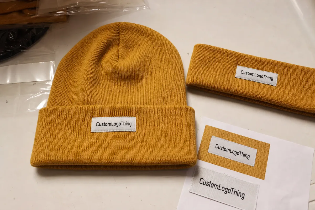
The proof should show more than the logo. It should show exact dimensions, fold style, edge treatment, backing, and attachment method. If the label will be center-folded into a seam, the proof should show the available space on each side. If it goes on a cuff, the mockup should show the cuff width, not just artwork floating on white.
The key question is whether the design survives production without losing its identity. For some logos, the answer is yes. For others, a small simplification saves the run. Thin serif fonts, narrow icons, and low-contrast layouts are the first details to challenge.
Buyers save time when they ask for the proof at actual scale, such as a scaled PDF, a ruler reference, or a mockup with dimensions visible. A screen image in an email thread is not enough when a 2 mm shift changes the finished look.
How the Digital Proof Process Works From File Upload to Approval
The process is usually straightforward, but only if the brief is complete. A typical cycle starts with final artwork upload, moves to a supplier mockup or spec sheet, then returns for review, revision, and written approval. Delays usually come from missing information, not from the software.
- Submit the artwork: Send vector files whenever possible, ideally AI, EPS, or PDF with outlined fonts. A raster file can work as a reference, but it is a weak starting point for a woven label.
- Review the mockup: Check beanie shape, label orientation, seam interference, and actual placement. Ask for mirrored views if the fold could create a reversed reading direction.
- Confirm the spec sheet: Verify dimensions, thread colors, backing, fold type, and stitching method. This is where small omissions become expensive later.
- Request revisions: Ask for changes before approval if any detail is unclear. One or two revision rounds is normal. Five usually means the brief or internal review path is unstable.
- Approve in writing: Lock the version number, file date, or reference code so production, sales, and design are using the same document.
Production-ready proofing is different from visual proofing. A visual proof helps people understand the design. A production-ready proof becomes the instruction set for cutting, weaving, sewing, and packing. If someone approves from a screenshot, that screenshot can become the only version that matters.
Most slowdowns come from the same gaps: no size note, no Pantone reference, no fold direction, or no clear answer on whether the label is meant for the cuff, side seam, or back seam. If your order includes more than one branding element, keep the language aligned across the proof, purchase order, and packaging brief. If other trim pieces are involved, the broader build options are covered on the Manufacturing Capabilities page.
Simple proofs are often turned around in 24 to 72 hours. Custom folds, correction-heavy art, or multiple approval layers take longer. Buyers run into trouble when they plan around the fastest possible turnaround instead of the most likely one.
Size, Color, and Placement Checks That Change the Final Look
Size controls readability. A woven label that looks sharp on a screen can become muddy if the type is too small or the border line is too thin for the weave density. As a practical rule, tiny script and hairline strokes are the first details to lose clarity on compact labels, especially when the final width is under about 50 mm.
Color is the second trap. Screen color is not thread color. The materials behave differently, catch light differently, and age differently. A proof can narrow the gap, but it cannot guarantee a perfect match if the yarn palette is limited. If the brand is strict about color, compare the proof with Pantone references, prior samples, or swatches from the same production run.
Placement changes how finished the beanie feels. On a folded cuff, a label that sits a few millimeters off-center can make the hat feel less deliberate. On a front panel, a seam can cut into the reading area if the label is set too high or too wide. On a side seam, the brand mark may become hard to see once the hat is worn.
There is also a visibility problem that gets ignored too often. High-contrast layouts usually survive weaving better than low-contrast, detail-heavy artwork. Dark thread on dark thread can look premium in concept and nearly invisible in reality. If a logo depends on a narrow wordmark or a small icon, simplify before approval.
For buyers comparing woven labels with other branding elements, the same logic holds across trims and tags. The proof is the moment to decide whether the mark should be bold, minimal, or simplified for small-format readability.
Cost, Pricing, and MOQ Signals to Compare Before You Approve
Pricing for Woven Label Beanies usually moves with five variables: label size, color count, weave complexity, order volume, and finishing requirements. A basic one- or two-color woven label with a standard fold is usually the least expensive option. Add tighter text, more colors, a merrowed edge, or a custom fold, and the price rises.
MOQ matters because setup costs do not shrink just because the order is small. A 300-piece run often costs more per unit than a 3,000-piece run, even when the artwork is unchanged. Smaller drops are not inherently poor decisions. They just need to be measured against inventory risk.
| Build option | Typical quote pressure | Illustrative unit impact | Best for |
|---|---|---|---|
| 1-2 color woven label, standard fold | Low setup complexity | $0.06-$0.12 per unit | Clean logos and repeat programs |
| 3-4 color label, tighter text, merrowed edge | More weaving time and proof review | $0.10-$0.20 per unit | Retail beanies with stronger branding |
| 5+ colors, satin backing, custom cut or fold | Higher finishing complexity | $0.18-$0.35 per unit | Premium drops and detailed logos |
| Extra proof rounds or rush revisions | Admin time and schedule disruption | $25-$75 per round, or a small run premium | Orders with changing artwork or internal review layers |
Those numbers are illustrative, not universal. Volume, lead time, and construction choices can move them in either direction. Still, the pattern is consistent: the headline price can look fine until revisions, sampling, or a late change turns the real cost into something different.
If the beanie needs matching hang tags, care cards, or sewn-in branding elements, the broader trim package matters too. You can review options through our Custom Labels & Tags page, which is useful when the woven label is only one part of the presentation.
Step-by-Step Review Checklist for Artwork, Specs, and Sign-Off
A clean approval process starts with file hygiene and ends with version control. The middle is where most mistakes hide. Teams that separate artwork review, construction review, and final sign-off usually avoid the worst rework cycles.
- Check file hygiene: Confirm vector artwork, outlined fonts, correct spelling, and the exact brand name that should appear on the label.
- Verify dimensions: Confirm label width and height, plus any fold allowance or seam clearance. If the proof shows a 60 x 20 mm label, the order should say the same thing.
- Confirm construction: Review fold type, weave density, backing, and attachment method. A center-fold label and a side-fold label are not interchangeable once the run begins.
- Check readability: Look at the smallest letters, numbers, and icons at actual size. If a line disappears in the proof, production will not improve it.
- Match brand standards: Compare the proof to logo rules, color references, and placement guidelines. The proof, purchase order, and internal notes should tell the same story.
- Record sign-off: Name the approver, note the date, and keep the approved file in one place. Email chains are not version control.
It also helps to define who has authority before the proof arrives. If design, sales, merchandising, and sourcing all need to review the file, state the sequence early. One person should not approve a proof and assume someone else will catch a problem later.
For shipping-heavy programs, the proof should sit beside the pack-out plan. If the beanies are going into cartons for retail distribution, checking those cartons against ISTA profiles is more useful than guessing how the pack will behave in transit. Packaging language matters too. Resources from packaging.org can help teams stay consistent when they are describing inserts, outer cartons, and retail-ready packaging.
One small but useful practice: print the proof at actual size and hold it next to the finished beanie template if you have one. Screens hide scale errors more easily than paper does.
Common Proof Mistakes That Lead to Reprints or Late Shipments
The most common mistake is approving a proof because it is "close." Close is not correct. A woven label that is slightly off in size, fold, or placement can make every unit in the run look inconsistent. Reprints are expensive. Late delivery can be worse if the product is tied to a launch window or a retail reset.
- Ignoring tiny text: Buyers zoom in on the logo and miss the microcopy, style code, or care line.
- Overlooking seam interference: The label looks fine on screen, then collides with the seam in production.
- Assuming mockup color is final: A digital mockup suggests tone, but it does not guarantee thread behavior.
- Forgetting orientation: Some labels read differently when folded or flipped, and the proof should show the final direction clearly.
- Rushing internal approval: One hurried yes can trigger a stop, revise, requeue cycle that burns days.
The proof does not forgive ambiguity. If the instruction is unclear, the machine will still make a decision.
There is a second layer of risk that gets less attention: team mismatch. Sales may promise one thing, design may assume another, and production may work from the only file that arrived on time. That is how a single note about placement turns into a shipment problem.
Another issue is overconfidence in the digital mockup. A mockup can make a weak design look stronger than it is. It can also hide a spacing problem that becomes obvious on the actual cuff. The tea woven label Beanies Digital Proof Checklist is useful precisely because it strips away the optimism and forces a colder review.
From a production standpoint, the most expensive errors are usually not dramatic. They are the quiet ones: a thread color that is slightly off, a fold that sits 2 mm too far left, a label that was approved at a size the loom could not reproduce cleanly.
Actionable Next Steps: What to Send, Confirm, and Approve
If you are preparing an order, keep the handoff tidy. Send final artwork, brand color references, exact label size, placement notes, and the target ship date in one bundle. A complete brief reduces the odds that the proof team has to infer missing details.
Before anyone approves, use one internal checklist. Not three different versions. Not a forwarded screenshot with comments buried in the thread. One list, one owner, one final sign-off. If the project is seasonal, set the response window before the proof cycle begins so the order does not drift while people wait for each other.
- Send: vector artwork, brand colors, exact label size, and placement notes.
- Confirm: fold style, thread count, backing, stitching location, and proof orientation.
- Approve: the final file version, quoted quantity, production timeline, and any exception notes.
It also helps to cap revision rounds upfront. One or two is normal. More than that usually means the brief was incomplete or the decision-makers were not aligned. Either way, the proof process is exposing the problem before production begins. If the project needs related trim components or a broader production quote, the Manufacturing Capabilities page is a practical place to compare what can be built together.
Do the last review slowly. Compare the proof to the order, not to memory. Then run the checklist one more time and approve only after size, color, placement, and version number all match the plan.
What should a tea woven label beanies digital proof include?
It should show the exact label size, artwork layout, fold style, and placement on the beanie. It should also confirm spelling, color references, backing, and any stitching notes. If the proof leaves room for interpretation, ask for a revised version before approving.
How long does the digital proof process usually take for woven label beanies?
Simple proofs are often returned in 24 to 72 hours, while revised artwork, missing specs, or multiple approvers can add time. The slowest step is usually internal review, not the proof itself. Set a clear review window so the order does not stall between design and production.
Can I check color accuracy from a digital proof alone?
A digital proof is useful for comparing brand intent, but screen color is not a perfect match for woven thread. Use Pantone references, thread swatches, or prior production samples when color matters. Treat the proof as a control document, not the final color guarantee.
What affects MOQ and unit cost for tea woven label beanies?
Unit cost is shaped by order volume, label complexity, number of colors, and finishing requirements. Lower MOQs usually mean a higher per-piece price, but they can reduce risk for test launches. Always compare the full quote, including sampling and revision fees if they apply.
What is the biggest mistake buyers make before approving a digital proof?
They approve a proof without checking dimensions, placement, and readability at actual size. They also skip internal review and assume one screenshot is enough for sign-off. A final checklist review prevents most reprints and production delays.
Used well, the checklist turns approval into a safeguard instead of a gamble. That difference shows up later, when the shipment arrives looking like the proof, not merely close to it.


